Best Beige
PPG's plain-spoken clay beige, reviewed honestly: the rooms where it feels warm and finished, the ones where it turns 1998, and what to pick instead.

Jessica has spec'd whites and neutrals for more than 300 rooms and keeps a sample wall of painted drawdowns in her studio. Every color review is checked against real reader rooms in the comments and re-tested when a formula changes. About the testing process →
- 1Anonymous20
- 2Dorian Gray39
- 3Best Beige47
- 4Agreeable Gray60
- 5Pale Oak69
The Fast Verdict
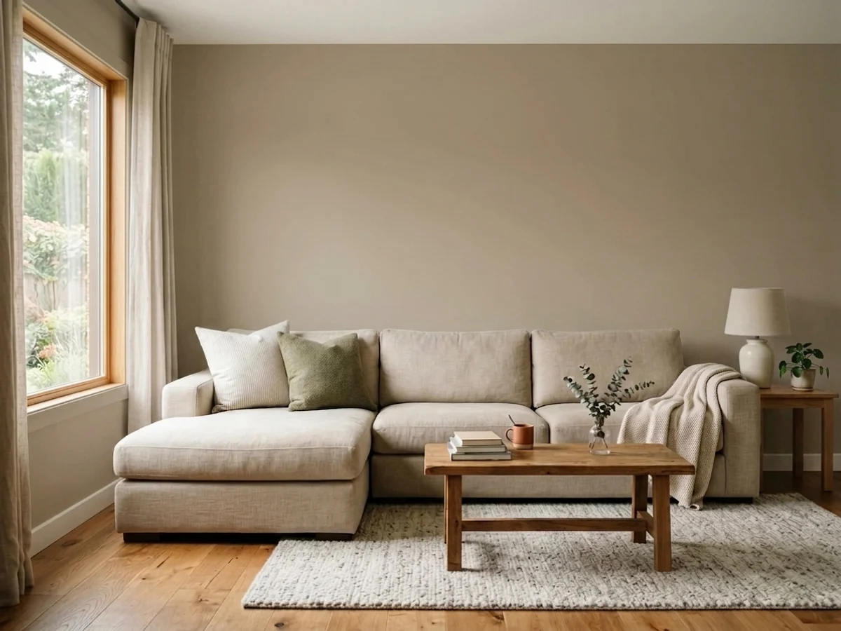
Best Beige is beige without an apology. Where most modern neutrals cut the warmth with gray so nobody can accuse them of being beige, this one stays a clay-tan the whole way through, and at LRV 47 it has enough body to actually color a room instead of just tinting it. That makes it excellent in family rooms, stairwells and on siding — and a mistake in any room where you were secretly hoping for greige.
Family rooms and dens that should feel warm and occupied · stairwells, halls and entries · home offices with real daylight · exterior siding with black or white trim · rescuing a house full of golden oak
You actually want greige · the room is dim, north-facing or windowless · your trim and floors are already tan · your finishes are cool gray marble, gray LVP and chrome
- A genuine beige — warm and committed, not a gray-hedged non-color
- LRV 47 gives family rooms and halls real depth without going moody
- Rescues golden oak trim, oak cabinets and honey floors better than any greige
- Sold everywhere: Glidden cans at Home Depot, PPG Paints stores, contractor 5-gallon buckets
- One of the few interior neutrals that is genuinely good on siding too
- Not a greige — buyers cross-shopping Agreeable Gray will find it clearly tan
- Goes flat and drab-khaki in dim, windowless or north-facing rooms
- Joins a tan-on-tan room instead of breaking it up
- Fights cool gray finishes: gray LVP, carrara-type marble, chrome
What Color Is Best Beige, Really?
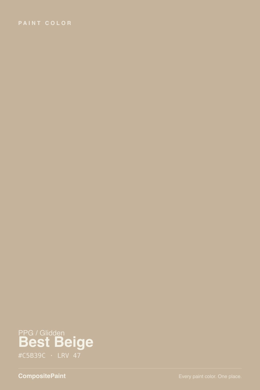
A midtone clay beige — PPG's own description calls the undertone khaki, and that is the right word. Read the color in three steps: warm first, yellow-brown second, and then a dusty earthiness that keeps it from going golden. There is no gray hedge in it. That is unusual right now: Accessible Beige, Agreeable Gray and most of the neutrals people cross-shop are beiges that had gray added until they stopped committing. Best Beige never got that treatment, so on a wall it reads unmistakably as a color, not as a very light non-decision.
At LRV 47 it sits near the middle of the scale, and that number does most of the work in deciding whether you will like it. Below about 50, a neutral stops bouncing light around the room and starts absorbing it — walls feel enclosing and warm in a room with windows, heavy and dim in a room without. Plan for the painted wall to read a step deeper and noticeably more tan than the chip, because a 2-inch chip is surrounded by white paper and your wall will not be.
Undertone in one line: warm yellow-brown, dusted with khaki — no pink, no orange, no gray. If your sample looks olive, that is cool shade light draining the yellow-red out of it; if it looks golden, that is direct west sun. Both are the same paint telling the truth about your room.
Where It Shines
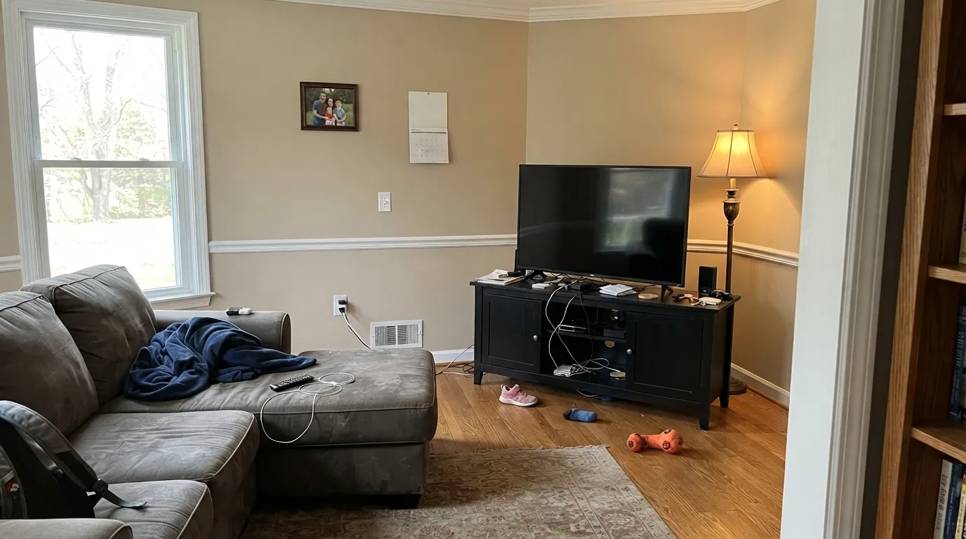
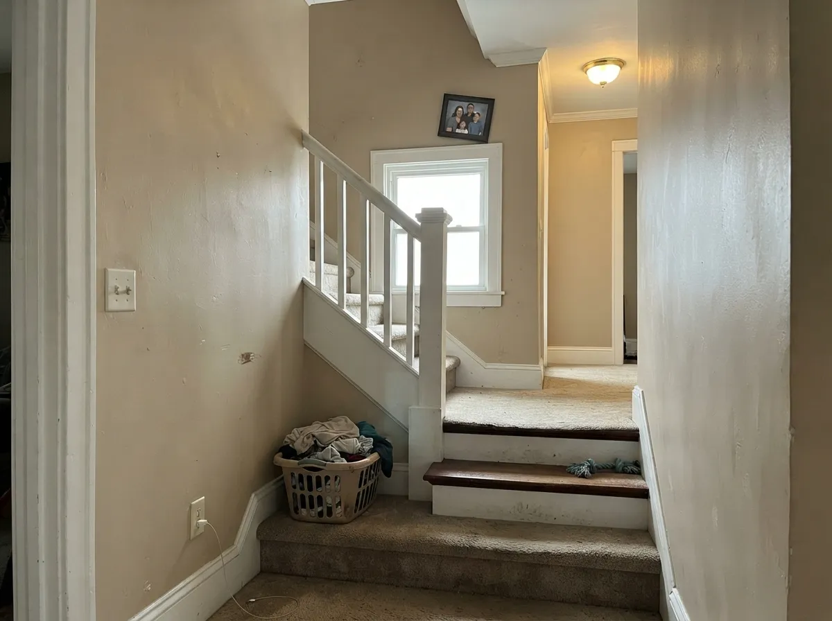
This is a color for the rooms people actually sit in. Give it a family room with a window and a lamp and it does exactly what the gray decade could not: makes the room feel occupied and warm the second you walk in, without any of the moodiness a deeper color brings. Its second life is circulation — stairwells, upstairs halls and entries, where a mid-depth warm neutral reads intentional and hides the scuffs a pale wall would broadcast. Home offices with real daylight are a quiet third. Give it crisp white trim, warm wood, black metal and cream upholstery, and it looks considered rather than default.
Where It Fails
The complaints about Best Beige are almost never about the paint — PPG sells it in Glidden cans at Home Depot and in 5-gallon contractor buckets, and coverage is not what people write about. Three situations produce nearly all the regret, and all three are visible from your couch before you buy a single sample.
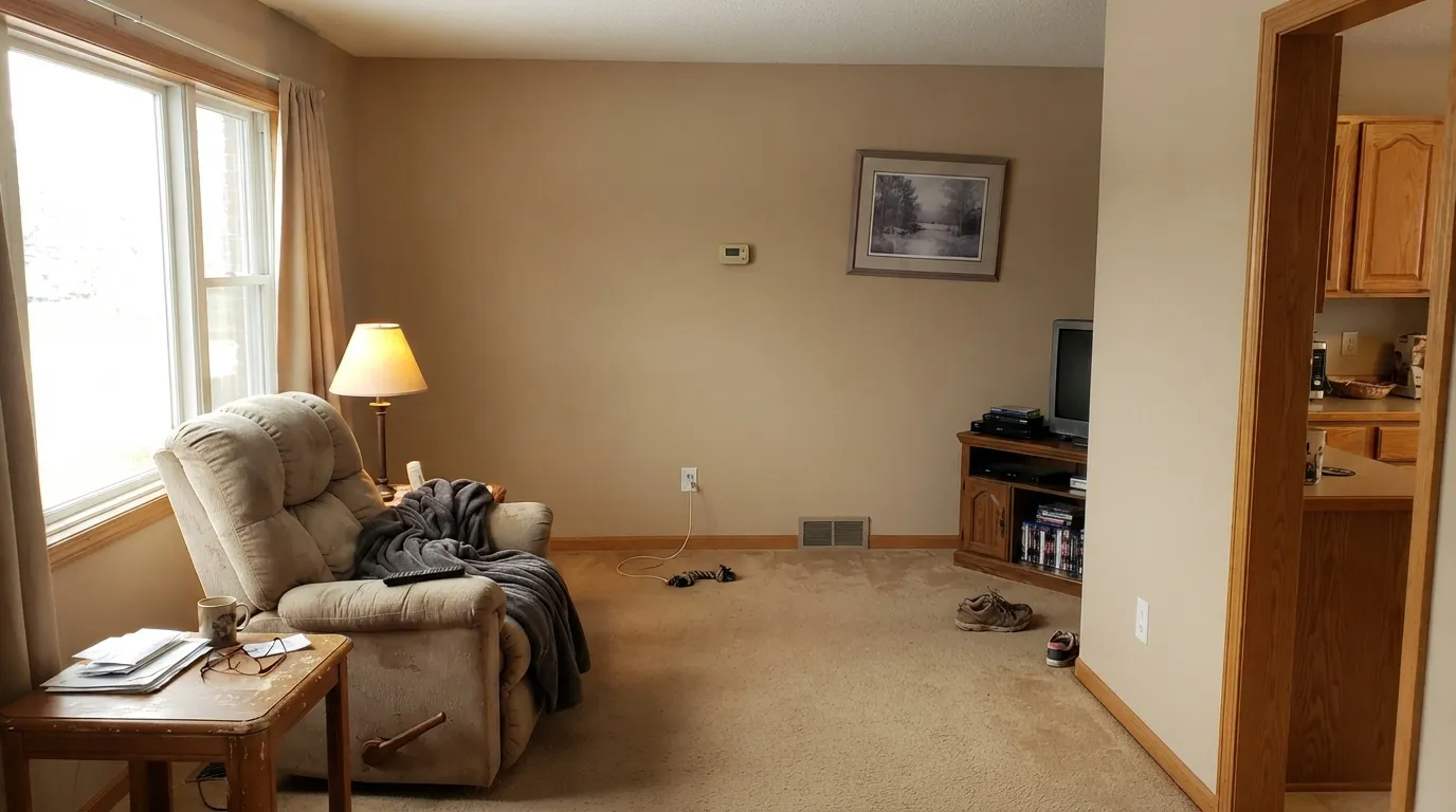
Beige walls plus golden oak trim plus tan carpet plus oak cabinets is not a color scheme, it is a 1998 rental. Best Beige is a real beige, so it will not break up a room that is already all one warm mush — it joins it. The fix is contrast, not a different beige: white trim, a genuinely dark floor or a large low-contrast rug, and at least one near-black note in the room.
The single most common mismatch. If your shortlist has Agreeable Gray or Accessible Beige on it, you are shopping for a neutral that hedges toward gray, and Best Beige does not hedge. Two walls in, it is clearly tan. That is a feature if beige is the goal and a disappointment if it was not — look at Accessible Beige for the version with the gray still in it.
LRV 47 needs light to give any back. In a windowless hall, a north bedroom on an overcast day, or a basement with two small wells, the warmth flattens and what is left reads drab khaki — the exact word people reach for is muddy. Go up the same family to a lighter beige, or accept that warm 2700K lamps are part of this paint job, not an optional extra.
Room by Room
Warm, mid-depth and forgiving of fingerprints on the light switch: this is what the color is for. Eggshell on the walls, Delicate White on trim and ceiling, one dark note in the room — a black TV console, a charcoal chair, dark built-ins. With a sectional and a lamp it reads lived-in instead of decorated.
It carries an open plan well because it is warm enough to agree with kitchen wood tones without matching them. The rule in an open plan is that the trim must stay crisp white; the moment beige walls meet beige trim across a big sightline, the whole floor flattens out.
Circulation spaces are where a mid-depth neutral pays off. It hides the marks that pale walls broadcast, it reads deliberate rather than default, and stairwells usually pull daylight from two levels, which keeps it from going drab. The one exception is the true interior hall with no window at all.
Under warm bulbs and candlelight the clay comes forward and the room goes amber-warm. It flatters walnut, brass and cream linen. Skip it if the dining room is a dim interior box that only gets used after dark with a single overhead fixture.
In a bedroom with a real window it is cocooning in the best way. In a north-facing or shaded bedroom the same paint goes flat and slightly olive by mid-afternoon. This is the one room where the sample board is non-negotiable — tape it to the darkest wall and look at it at 4pm, not at noon.
PPG describes it as a color made for the outside of the house, and it earns that. Full sun lifts it a step brighter and warmer than it looks indoors, so it reads as a clean sand-tan on siding rather than a muddy one. Details and trim pairings are in the exterior section below.
Your Light Is the Risk
Bright, steady daylight is where the clay reads clean and warm all day without tipping golden. This is the light that makes it look expensive rather than builder-standard.
Cool gray light drains the yellow-red and leaves the khaki exposed — flat, faintly olive, the version people call muddy. The most-reported disappointment with this color.
Cool and quiet in the morning, then noticeably warmer and more golden as the afternoon sun swings around. Golden hour pushes it toward tan-orange for about an hour.
2700K warm bulbs deepen the clay and make the room feel amber and closed-in, which is usually the point. Cool 4000K LEDs do the opposite and flatten it toward gray-khaki — swap the bulbs before you blame the paint.
Most complaints about Best Beige are a light mismatch. Upload a photo of your actual room and see it on your walls — then ask for the same wall in north light or evening lamps before you buy a single sample.
Need It From Another Brand?
Any paint counter can custom-tint PPG / Glidden PPG1085-4 directly. If you would rather stay in one brand's own deck, these are the closest stock matches, measured as ΔE2000. Under 2 is a difference you will not see on the wall.
| Brand | Closest color | ΔE | LRV | |
|---|---|---|---|---|
| Sherwin-Williams | Barcelona BeigeSW 7530 · Sherwin-Williams | 0.5 | 47 | Color page → |
| Behr | Canyon ViewECC-20-1 · Behr | 1.1 | 46 | Color page → |
| Benjamin Moore | Bennington GrayHC-82 · Benjamin Moore | 3.3 | 47 | Color page → |
| Valspar | Sandy TrailV134-3 · Valspar | 0.7 | 47.7 | Color page → |
| Glidden | Best BeigePPG1085-4 · Glidden | 0.5 | 47 | Color page → |
| Dutch Boy | Breakwater416-3DB · Dutch Boy | 1.0 | 46 | Color page → |
Similar PPG / Glidden Colors
The nearest shades to Best Beige within PPG / Glidden's own range, ranked by perceptual color distance — useful when you want the same look a touch lighter, darker, or warmer.
WCAG 2.1: AA is 4.5 : 1 for normal text, 3 : 1 for large text, AAA is 7 : 1.
Best Beige vs the Colors You're Also Considering
Every Best Beige sample board has the same rivals on it. The numbers show the real lightness gap — then it comes down to which risk you would rather live with.
Pick this if you are buying at Home Depot or a PPG Paints store; there is no meaningful reason to chase the SW version across town.
Sherwin-Williams SW 7037 · LRV 47Balanced BeigePick this if your painter works out of a Sherwin-Williams store — it is the same depth and nearly the same color.
Pick this when Accessible Beige keeps reading gray in your samples and you actually wanted beige.
Sherwin-Williams SW 7036 · LRV 58Accessible BeigePick this if you want the gray hedge back and a lighter room — it is the safest warm neutral there is, right up until the light goes cool.
Pick this for the lighter, cleaner, less green version; at LRV 47 it stays usable in rooms where Universal Khaki starts closing in.
Sherwin-Williams SW 6150 · LRV 40Universal KhakiPick this for the deeper, more olive-leaning take on the same khaki idea — a steady exterior color that can turn green in the shade.
Pick this if pink is your dealbreaker; Best Beige leans yellow-khaki and goes olive rather than rosy when the light turns cool.
Behr PPU4-07 · LRV 47Mushroom BisquePick this if you are already buying Behr — same depth, same aisle, a warm tan-brown that shows a pink card in cold light.
Best Beige Coordinating Colors
The rule for coordinating with Best Beige is to give it contrast, not company. It already brings all the warmth a room needs, so the partners that work are the ones that do a different job: a clean white to sharpen the edges, a paler neutral for the rooms next door, and something genuinely dark to keep the scheme from going soft. Warm metals — brass, aged bronze, matte black — are the easy part; polished chrome is the one that looks cold against it.
These are the partners that keep showing up in rooms that work:
Best Beige on Exteriors
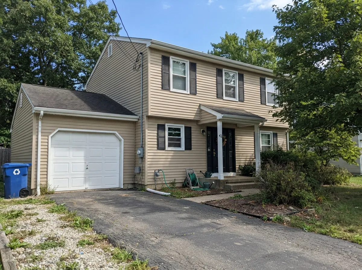
PPG markets this color as an exterior first, and the sales channel backs it up: it is stocked in exterior latex in gallons and 5-gallon buckets, in flat, satin and semi-gloss, for siding, stucco, brick and masonry. Outside it behaves better than its LRV suggests, because full sun lifts a mid-tone beige a visible step — the sand-tan you see on a sunny elevation is not the color you saw on the chip indoors.
The pairing decides everything. Black or near-black trim is PPG's own recommendation and it is the sharpest option: Iron Ore on shutters and the front door gives the facade the contrast a mid beige cannot generate on its own. Crisp white trim reads more traditional and keeps the house lighter overall. What to plan for is the shaded side — the north elevation, deep porches and anything under a wide overhang will read a full step cooler and can flash faintly olive, which is normal for a khaki beige and the reason to walk a sample board around all four sides of the house before ordering.
Best Beige With Wood Tones and Floors
Warm wood is where this color earns its keep. Golden and honey oak — the floors and trim that make greige look sour — sit comfortably against Best Beige because the wall meets the wood's warmth instead of arguing with it. Red oak, hickory, butcher block, cedar and warm LVP all work the same way. Walnut and espresso are excellent for a different reason: the dark value gives the mid-tone wall the contrast it needs to look deliberate.
The one that needs a sample first is cool gray flooring — gray-washed wood and the blue-leaning gray LVP that filled houses in the 2010s. Against a cool gray plank the wall's warmth is thrown into relief and the beige can read yellow or dated. It is not always fatal; a warm rug and white trim fix most rooms. But if the gray floor is staying and you are not adding warmth anywhere else, a greige will make your life easier.
And the honest warning that has nothing to do with wood species: the failure mode of a beige room is sameness. Beige walls, tan carpet, oak trim, oak cabinets, tan sofa — every element at the same value and the same temperature — is what people mean when they say a room looks like a rental. Best Beige is a good color inside a scheme that has a white and a near-black in it. On its own, with everything else already tan, it is the color nobody notices for the wrong reason.
Three Ready Palettes Built on Best Beige
A color is never alone on the wall. These are complete combinations in the 60-30-10 pattern, with the reason each one holds together. Every one opens in the visualizer.
PPG itself points Best Beige at Delicate White for trim, and the pairing works because Delicate White is genuinely neutral — the 41-point LRV gap gives the walls a crisp edge instead of letting a creamy trim blur into them. Cushing Green on built-ins supplies the dark note the scheme needs; grayed green and clay beige are natural neighbors in a way that navy is not.
Try this palette in your roomPPG's own exterior advice for this color is black accents, and this is the disciplined version of it: white trim keeps the facade from going heavy, and the near-black is concentrated on shutters and the door where it reads as punctuation. Three values — 47, 88 and 6 — is the classic exterior spread, and it stops a mid-tone beige house from looking flat from the street.
Try this palette in your roomThe whole-floor version: keep the bright, open rooms in the paler Whiskers at LRV 60 and step down to Best Beige where you want enclosure — the family room, the stairwell, a study. A 13-point LRV gap is enough to feel like a change of room and small enough that the handoff at a doorway never looks like a mistake, and one trim color ties it together.
Try this palette in your roomBest Beige FAQ
Is Best Beige too yellow?
It is warm, but it is not a yellow beige. The undertone is clay and khaki — a dusty yellow-brown rather than the buttery yellow that gave 1990s beige its bad name. Direct afternoon sun will push it golden for an hour, and cool north light will pull it the other way toward olive. Neither shift is extreme; both are worth seeing on a sample board before you commit.
Is Best Beige a greige?
No, and this is the most important thing to know about it. Greiges like Accessible Beige have gray mixed in so they can sit next to cool finishes without arguing. Best Beige has no such hedge — it is a straight warm beige, and on four walls nobody will mistake it for gray. Buy it because you want beige, not because you want a safe neutral.
What trim white goes with Best Beige?
A crisp, clean white, not a cream. PPG pairs it with Delicate White, and that is the right instinct: a neutral white at LRV 88 gives the walls a sharp edge, while a creamy trim white blurs into a beige wall and makes the whole room look washed. Semi-gloss on the trim, eggshell on the walls.
Does Best Beige work with honey oak floors and trim?
It is one of the better answers to that problem, with one condition. The color's warmth meets golden oak halfway, so the floor stops reading orange against the wall — this is exactly why beige survived the gray decade in oak-heavy houses. The condition is contrast: if the trim is also oak and the carpet is also tan, you get a tan-on-tan room. Paint the trim white and the whole thing works.
Is Best Beige good for a north-facing room?
This is its weak spot. North light is cool and even, and it strips the yellow-red out of a khaki beige, leaving something flat and faintly olive. If the north room is large and bright it can still work with warm 2700K lamps; if it is small, dim or shaded by a tree or an overhang, pick something lighter and let the room keep its light.
Where do I buy Best Beige, and what about the PPG15-16 code?
It is a PPG color, which means two shelves: Glidden-branded cans at Home Depot, including sample pots and contractor 5-gallon buckets, and PPG Paints stores for the pro lines. PPG also lists the color in its Harmony collection under the code PPG15-16, so you may see two numbers for the same name — order by PPG1085-4 and you will get the color reviewed here.
Have you painted with Best Beige?
Rate it — one tap helps the next reader decide.
Ask a Question