Colonial Yellow
The historic gold-yellow Sherwin-Williams rates for real walls, not just a front door — reviewed honestly: where it glows, where it goes mustard, and what to pick instead.

Jessica has spec'd whites and neutrals for more than 300 rooms and keeps a sample wall of painted drawdowns in her studio. Every color review is checked against real reader rooms in the comments and re-tested when a formula changes. About the testing process →
- 1Caramelized35
- 2Venetian Plaster42
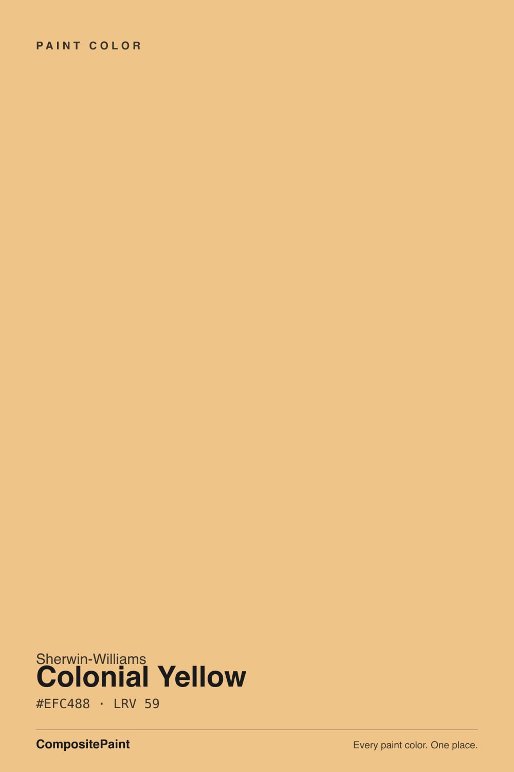
- 3Colonial Yellow59
- 4Belvedere Cream65
- 5Pumpkin Mousse71
The Fast Verdict
Colonial Yellow is what Sherwin-Williams' own historic archive calls a walls color, not an accent — and once you see it next to the deck's other yellows, you understand why. Most SW yellows are pale butter (Friendly Yellow) or built for a single door or ceiling (June Day, Bee). Colonial Yellow is a genuine gold-amber, deep enough to hold its color on four walls in real light, muted enough to avoid the citrus-bright zone. It is not a famous color — it has almost no viral moment behind it — but it is an honest, well-behaved one if you actually want a room that reads yellow.
Entryways and hallways that need warmth without being pale · farmhouse or Colonial Revival kitchens with warm wood and brass · dining rooms and dens that can carry a full-strength color · anyone who wants a wall that reads unmistakably yellow, not a yellow-tinted white
You actually want a pale butter yellow (go Hawthorne Yellow or Friendly Yellow) · your kitchen has cool gray stone counters · the room is north-facing with only cool LED bulbs · you are painting an exterior — this SKU is filed under SW's interior historic colors, not the exterior-rated New Colonial Yellow
- A real gold-amber yellow that holds its color on four walls, not just a door
- Historic, archive-sourced color with an earthy cast — never citrus-bright
- Genuinely good in entries, hallways, and dining rooms with white trim
- Flatters warm wood, brass, and traditional black accents
- Deep enough (LRV 59) to avoid washing out in a bright room
- Reads as committed yellow, not the pale butter most people picture
- Fights cool gray stone and stark-white cabinetry
- Goes flat and slightly muddy under cool LEDs or in a dim north room
- Easy to confuse by name with New Colonial Yellow (SW 2853), the exterior-rated cousin
What Color Is Colonial Yellow, Really?
A gold-amber yellow with an earthy, historic cast rather than a citrus one. Sherwin-Williams files it in its Interior Historic Colors line, under the Colonial Revival palette the company built from its own archive of early-American paint formulas — this is not a trend color chasing a moment, it is a preservation-catalog color that happens to still work in a 2026 house. That history shows in the mix: the yellow is grayed and warmed just enough that it reads like old varnished pine or aged brass rather than a fresh coat of school-bus paint.
At LRV 59 it sits in the same medium-light band as a mid-tone greige, but yellow at that depth behaves differently than a neutral does — the color stays visibly, confidently yellow instead of fading toward cream the way a paler yellow (Hawthorne Yellow, LRV 71) can in a bright room. That is the whole appeal and the whole risk in one number: it is deep enough to commit to, and deep enough that a wrong-light room will show you exactly how yellow it really is.
Undertone in one line: warm gold-amber, leaning slightly toward ochre — never a clean lemon, never green. If your sample looks flat and slightly muddy, that is cool or overcast light draining the gold out, not a defect in the paint.
Where It Shines
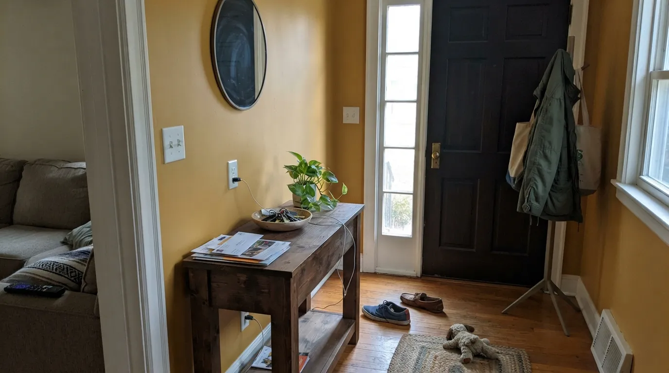
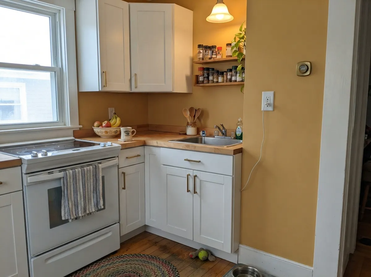
Give it warm daylight or afternoon sun and old-house bones — plaster, wood trim, brass hardware — and Colonial Yellow looks like it has always been there. It is at its best in the rooms Sherwin-Williams built the whole Colonial Revival palette for: entries, hallways, and dining rooms in a house that leans traditional, where a crisp white trim and a black or navy accent can frame the gold instead of fighting it. In a farmhouse kitchen with butcher block and unlacquered brass, it reads warm and collected rather than loud.
Where It Fails
Almost every disappointed review of a color like this comes from one of three mismatches, and none of them are the paint's fault — but if your room matches one, this specific yellow is not your color.
Colonial Yellow is closer to gold than to the soft pastels most people picture when they say "buttery." On four walls it reads as a real, committed yellow, not a cream with a warm cast. If you wanted the paler version, Hawthorne Yellow or Friendly Yellow is the color you actually pictured.
Gray quartz and cool white cabinets sit at the opposite temperature from this gold, and the two fight instead of coordinating — the counters read colder next to it, the walls read more mustard next to them. It wants warm wood, cream, and brass, not gray stone.
Every yellow this saturated depends on warm light to stay gold instead of going flat and slightly muddy — Colonial Yellow is no exception. Cool-white bulbs and overcast north daylight strip the amber out and leave a dull, mustard-adjacent color that reads worse than the chip promised. Warm 2700K bulbs are close to mandatory here, not optional.

Room by Room
The color Sherwin-Williams' own historic palette was built for: a foyer or hallway with white trim and a dark door reads warm and welcoming the moment you walk in, without the daily-living wear a bedroom or living room gets.
SW lists it for both walls and cabinets, and it earns the listing next to butcher block, brass hardware, and warm wood tones. Keep it away from cool gray stone; satin urethane-fortified enamel on cabinets for durability.
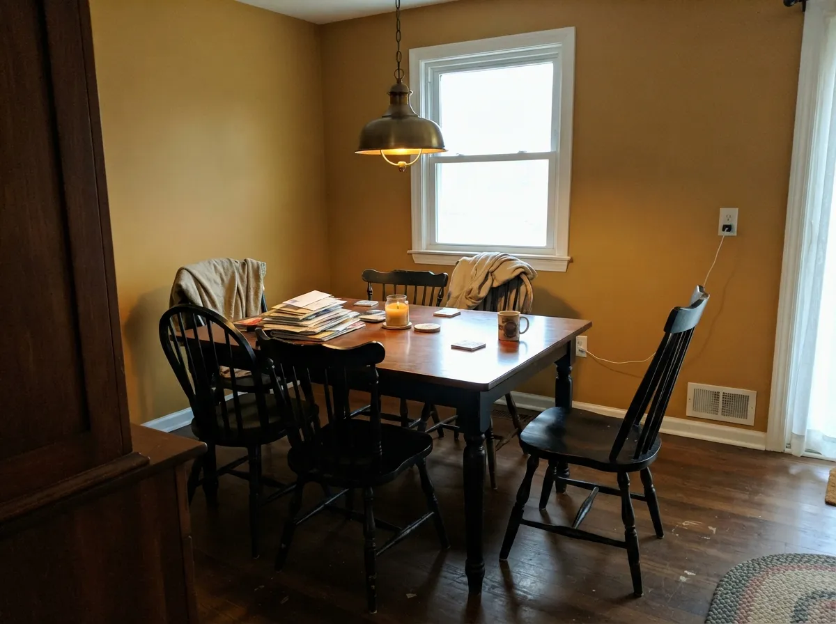
A brass chandelier and black or dark-wood chairs give the gold something to play off; it is a genuinely good full-room dining color in a house with any traditional bones.
It works, but it is more color than most people expect once it is on four walls — a den with leather and dark wood carries it better than an open, high-traffic living room where the whole family is staring at it every day.
Sherwin-Williams' suggested-use list includes bedrooms, but a gold this present is a hard color to relax into for most sleepers. If you love it, sample it on the actual wall you'll wake up facing before committing a whole room.
SW 0030 lives in the interior historic colors line. If you want this look outside, ask your store specifically for New Colonial Yellow (SW 2853), the separate exterior-rated color in the same historic collection — the two are easy to mix up by name.
Your Light Is the Risk
Direct warm sun brings the gold fully forward — this is the color at its most confident and least mustard-adjacent.
Cool gray daylight drains the amber and leaves a flatter, slightly muddy yellow. Test on the actual wall before committing a whole room.
Bright and golden at the sun hours, quieter and more earthy the rest of the day — a normal, honest shift for a color this saturated.
2700K bulbs deepen it toward amber and keep it cozy. Cool-white LEDs flatten it toward a dull mustard — swap the bulbs before you swap the paint.
Most complaints about Colonial Yellow are a light mismatch. Upload a photo of your actual room and see it on your walls — then ask for the same wall in north light or evening lamps before you buy a single sample.
Need It From Another Brand?
Any paint counter can custom-tint Sherwin-Williams SW 30 directly. If you would rather stay in one brand's own deck, these are the closest stock matches, measured as ΔE2000. Under 2 is a difference you will not see on the wall.
| Brand | Closest color | ΔE | LRV | |
|---|---|---|---|---|
| Behr | Pollen GrainsPMD-30 · Behr | 0.3 | 60 | Color page → |
| Benjamin Moore | Peach Crisp159 · Benjamin Moore | 1.8 | 58 | Color page → |
| Valspar | Delightful Moon3004-6A · Valspar | 1.1 | 60 | Color page → |
| PPG / Glidden | Gold BuffPPG1208-4 · PPG / Glidden | 2.3 | 59 | Color page → |
| Glidden | Amberwave10YY 57/377 · Glidden | 1.3 | 57 | Color page → |
| Dutch Boy | Dreamy Gold213-3DB · Dutch Boy | 1.6 | 59 | Color page → |
Similar Sherwin-Williams Colors
The nearest shades to Colonial Yellow within Sherwin-Williams's own range, ranked by perceptual color distance — useful when you want the same look a touch lighter, darker, or warmer.
WCAG 2.1: AA is 4.5 : 1 for normal text, 3 : 1 for large text, AAA is 7 : 1.
Colonial Yellow vs the Colors You're Also Considering
Every Colonial Yellow sample board has the same rivals on it. The numbers show the real lightness gap — then it comes down to which risk you would rather live with.
Pick this for real, unmistakable color — Colonial Yellow never fades toward cream the way a lighter yellow can.
Benjamin Moore HC-4 · LRV 71Hawthorne YellowPick this if you want the paler, more furniture-friendly yellow — Hawthorne stays closer to a warm off-white in good light.
Pick this when you want more gold and less pastel — Colonial Yellow holds its color where Friendly Yellow can wash out in strong sun.
Sherwin-Williams SW 6680 · LRV 76Friendly YellowPick this for a softer, pastel butter yellow that reads gentler than Colonial Yellow's amber depth.
Pick this for the color that is actually rated for full rooms — June Day is a doses color, Colonial Yellow is a walls color.
Sherwin-Williams SW 6682 · LRV 63June DayPick this for a brighter, more citrus-leaning gold that is better suited to a front door or one accent wall than a whole room.
Pick this for the brighter, more classically "yellow" read — Hay is so muted some rooms won't register it as yellow at all.
Farrow & Ball No. 37 · LRV 50HayPick this if you want yellow's warmth with almost none of the shine — Hay is deeper, chalkier, and reads closer to a tan.
Colonial Yellow Coordinating Colors
The coordinating rule for Colonial Yellow is simple: keep everything else warm or genuinely neutral, and let one dark accent do the contrast work. It pairs well with warm whites, unlacquered brass, dark wood, and a single black or navy note — and it argues with cool gray stone and stark blue-white trim. These are the partners that keep showing up in rooms that work:
The History Behind the Name
Colonial Yellow (SW 30 / SW 0030) is not a trend color — it comes from Sherwin-Williams' Interior Historic Colors line, part of a Colonial Revival palette the company built from its own archive of early-American paint formulas rather than from a current color-forecasting cycle. That is worth knowing before you buy it: there is very little viral or designer-blog buzz about this specific color, because it was never built to chase one. It has sat quietly in the historic palette for people restoring or referencing period homes.
The name causes real confusion, and it is worth sorting out before you order: Sherwin-Williams also sells New Colonial Yellow (SW 2853), a separate exterior-rated color, and Colonial Revival Yellow (SW 2830), a third related but distinct color. All three read as gold-amber yellows and share a family resemblance, but they are not interchangeable formulas — always confirm the exact SKU (SW 30 / SW 0030) at the counter if this specific review is what sent you shopping.
Colonial Yellow With Wood Tones and Floors
Dark wood is this color's best partner: walnut, espresso, and aged pine give the gold something to contrast against instead of blending into. Whitewashed or pale oak floors also work, keeping the room light overall while the walls carry the color.
The pairing to test first is honey oak or golden-toned builder floors — they sit in the same warm-yellow family as the walls, and instead of contrasting, the whole room can tip toward a single undifferentiated gold-brown wash. A darker rug or furniture layer breaks that up; if the floor is staying golden and can't be layered over, a paler yellow like Hawthorne is the safer bet.
Three Ready Palettes Built on Colonial Yellow
A color is never alone on the wall. These are complete combinations in the 60-30-10 pattern, with the reason each one holds together. Every one opens in the visualizer.
White trim keeps the gold crisp instead of heavy, and one black door supplies the single dark note a historic entry needs — the classic Colonial Revival formula this color was built for.
Try this palette in your roomAlabaster keeps the cabinets soft rather than stark-white, so they don't fight the gold; the near-black island and warm wood floor give the room the contrast a full-strength yellow wall needs.
Try this palette in your roomNavy built-ins turn the gold rich and library-like instead of cheerful; White Dove trim is warm enough not to fight the yellow the way a stark white would.
Try this palette in your roomColonial Yellow FAQ
Is Colonial Yellow the same as New Colonial Yellow?
No — they're two different SKUs in Sherwin-Williams' historic collection. Colonial Yellow (SW 30 / SW 0030) is an interior color; New Colonial Yellow (SW 2853) is a separate, exterior-rated color with its own formula. If you're painting an exterior, ask your store for SW 2853 by name, not this one.
Is Colonial Yellow warm or cool?
Warm — a gold-amber with an earthy, slightly ochre cast, never leaning green or pink. In cool north light it can go flat and a little muddy, but it never reads cold or blue.
Can I use it outside?
This exact SKU is filed under Sherwin-Williams' interior historic colors. If the goal is an exterior, request New Colonial Yellow (SW 2853) instead — it's the color built and rated for that use, even though the names are easy to confuse.
What trim white goes with Colonial Yellow?
A clean, slightly warm white — Oxford White or Alabaster — keeps the gold from looking heavy. A very stark, blue-white trim can make the yellow read dingy by comparison; keep the trim warm-neutral, not icy.
Will it look too yellow in a small room?
It can. This is a genuine gold, not a pale wash — a small, dim room will show its full saturation with nowhere for your eye to rest. It works best with some daylight and either a larger room or a lot of white trim to break it up.
Is it good for kitchen cabinets?
Sherwin-Williams lists it for cabinets, and it works well against warm wood counters and unlacquered brass hardware. Avoid pairing it with cool gray quartz or stainless-heavy modern kitchens — the temperatures clash.
Have you painted with Colonial Yellow?
Rate it — one tap helps the next reader decide.
Ask a Question