Navel
The loud citrus orange, reviewed honestly: the one wall where it earns its keep, the rooms it ruins, and what three coats of it really costs.

Jessica has spec'd whites and neutrals for more than 300 rooms and keeps a sample wall of painted drawdowns in her studio. Every color review is checked against real reader rooms in the comments and re-tested when a formula changes. About the testing process →
- 1Rookwood Terra Cotta14
- 2Determined Orange22
- 3Navel35
- 4Venetian Plaster42
- 5Colonial Yellow59
The Fast Verdict
Navel is a clean, sunlit citrus orange with a red lean — not a rust, not a terracotta, not a muted clay. It is the orange that actually looks like an orange. That honesty is the appeal and the entire problem: on one wall, a door or a set of shelf backs it is cheerful and expensive-looking; on four walls it stops being decor and starts being weather. Buy it for a surface, not for a room.
One wall in a playroom or kids' room · front doors that need to be seen from the sidewalk · kitchen islands, pantry doors, the back of open shelving · anyone who wants a real color and is willing to keep it to one surface
You want the whole room in it · your floors, brick or oak trim already lean orange · the room is dim and north-facing · you repaint reluctantly — this goes on in three coats and comes off with a shellac primer
- A real, clean orange — not a rust or a beige pretending
- One wall or one door does the whole job for the price of a quart
- At LRV 35 it hides scuffs and fingerprints in kids' spaces
- Loves warm whites, pale oak, deep green, navy and aged brass
- Reads intentional and slightly witty rather than trendy
- Overwhelming on four walls — the classic orange regret
- Fights honey oak, orange brick and terracotta tile
- Pigment-heavy: tinted primer plus two to three coats to look even
- Expensive to undo — orange bleeds through white without a blocking primer
What Color Is Navel, Really?
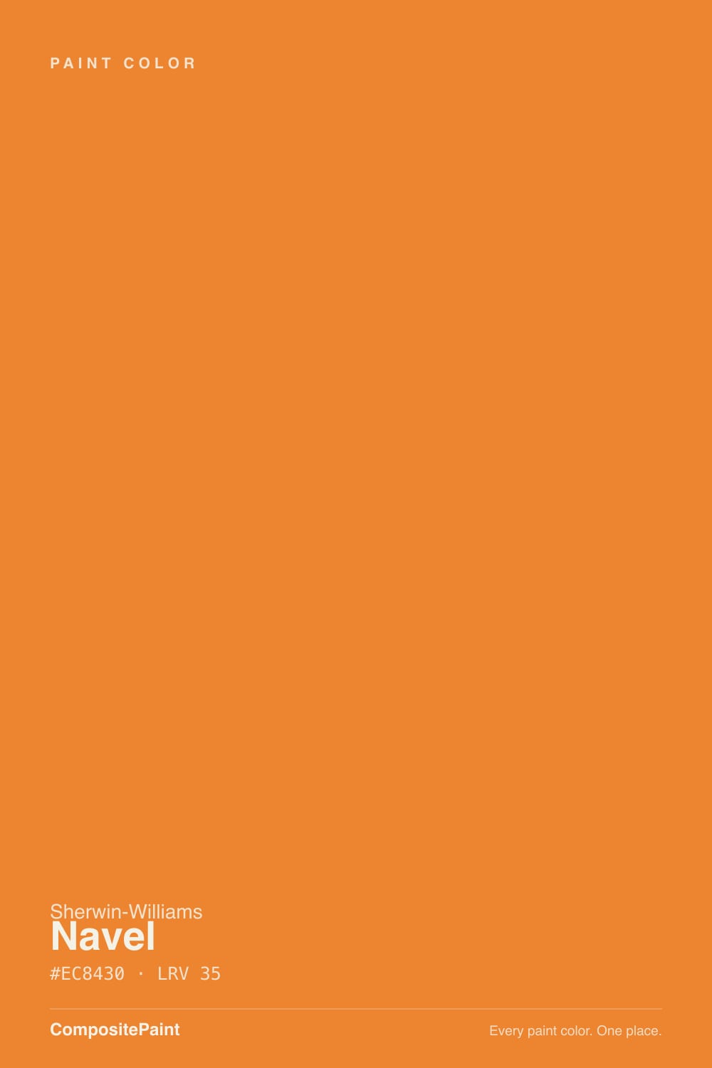
A saturated red-leaning orange — the citrus end of the family, not the earth end. Sit it next to the oranges people usually end up buying and the difference is obvious: Cavern Clay is a dusty terracotta at LRV 24, Caramelized is a soft caramel at LRV 35, and both have been grayed down so they behave like neutrals. Navel has not been grayed down at all. Its hue sits around 27 degrees, right where orange starts borrowing from red, and the saturation is left at full strength. That is why it photographs as pure fruit-peel orange while its shelf-mates photograph as beige with a mood.
At LRV 35 it is a genuine mid-tone, which surprises people twice. First on the chip: it looks brighter than 35 sounds, because saturation reads as brightness to your eye long before light reflectance does. Then on the wall: a full wall of it absorbs about two-thirds of the light hitting it, so a room that was already dim gets dimmer and the orange goes heavy and pumpkin-ish. Bright rooms get the clean citrus. Dark rooms get a very committed sunset.
Undertone in one line: red-orange, no brown, no yellow rescue. If your sample looks rusty on the wall, that is warm lamplight or a red-brown floor bouncing into it; if it looks almost yellow, that is direct midday sun blowing it out. Neither version is muddier or softer than the chip — this color does not have a quiet setting.
Where It Shines
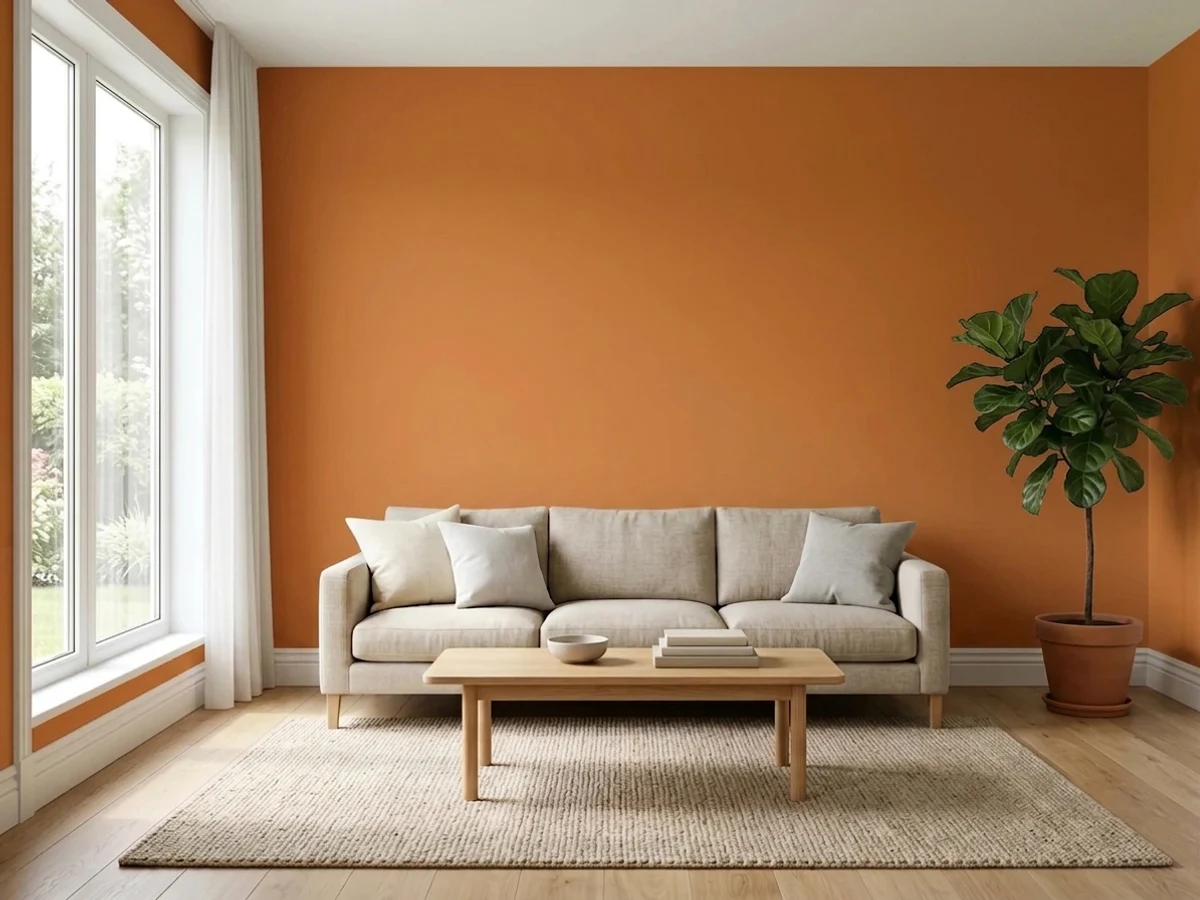
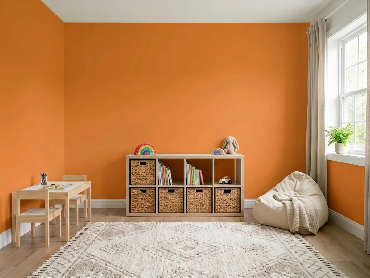
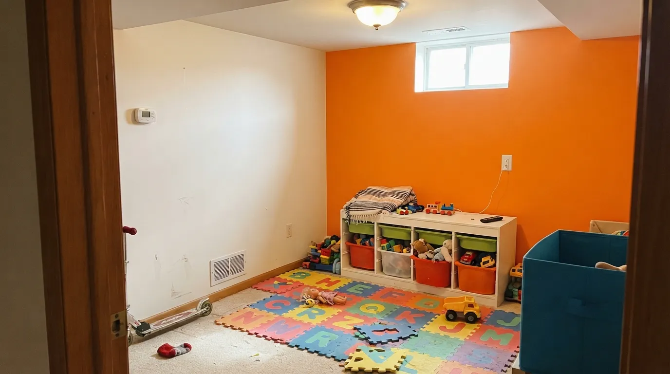
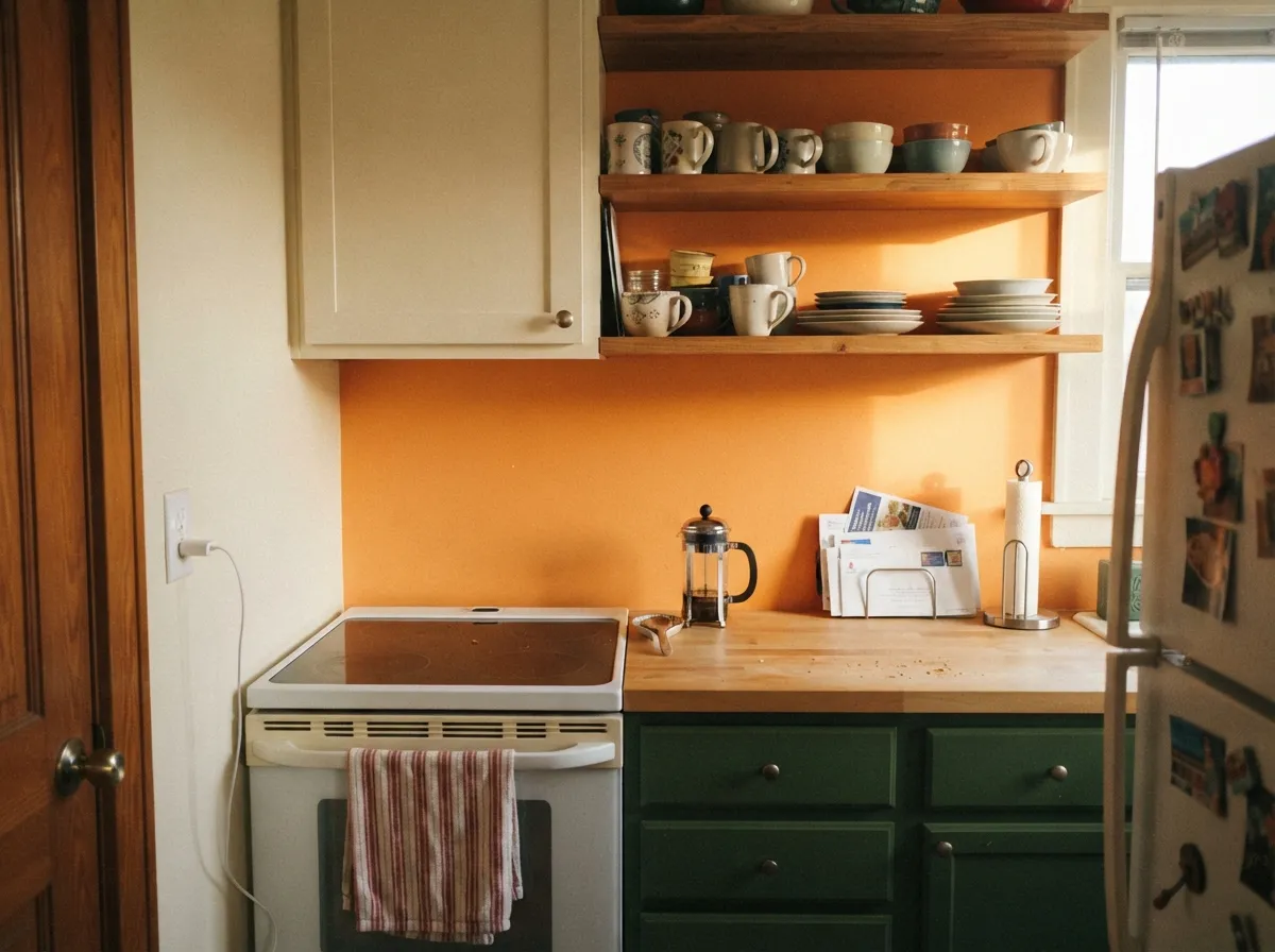
Navel does its best work as a surface, not a room. One wall of a playroom with white cubbies in front of it, the back panel of open kitchen shelving, an island, a pantry door, a front door on a plain white house — those are the jobs where a color this saturated reads deliberate and slightly witty instead of overwhelming. It also holds up better than pale colors where kids actually live: at LRV 35 a scuff or a fingerprint disappears into it. Give it a warm white, real daylight, pale oak or white shelving and one cool counterweight, and it looks like a designer made the call.
Where It Fails
The bad Navel stories are remarkably consistent, and none of them are about the paint being a bad paint. They are about scale, about the room already having an orange problem, and about how much saturated orange costs to install and to undo. If any of the three below describes your project, this is the wrong color and a bigger sample will only prove it faster.
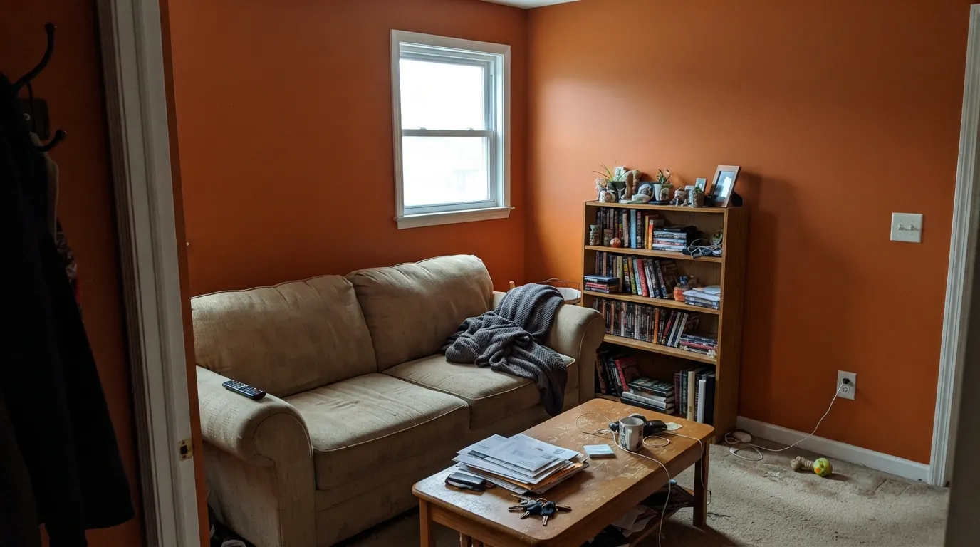
Saturation multiplies with area — a chip that reads cheerful becomes a wall that reads loud and a room that reads relentless. This is the single most common orange regret: homeowners describe rooms they cannot relax in and cannot decorate around, because every other color in the room now has to negotiate with the walls. The fix is the 60-30-10 split: one Navel wall, warm white on the rest, and a cool color carrying the furniture.
Honey oak floors, red oak trim, orange-toned brick, terracotta tile, pine paneling, golden builder beige — all of these are dilute versions of this color. Put Navel next to them and neither side wins: the floor looks like a failed match rather than a contrast, and the wall looks like the room caught fire twice. Navel needs pale white oak, walnut, painted white cabinetry or a big neutral rug between it and anything already warm-orange.
Saturated orange is a pigment-heavy color mixed in a deep base with almost no white in it, so it hides poorly: expect a tinted primer plus two to three finish coats to look even, and expect lap marks anywhere you let an edge dry. Undoing it is worse — orange bleeds through white, so the standard fix is a shellac or stain-blocking primer and two more coats on top. That is a real cost, and it is the reason to keep it to a wall, a door or a shelf back rather than a whole room.
Room by Room
This is where a color this loud is actually appropriate: kids read it as fun, not as a design statement, and at LRV 35 it survives crayon, tape and sticky hands better than the pale colors playrooms usually get. Keep it to one wall or the back of the storage cubbies and let white take the rest — designers and child-development writers agree that a fully orange room tips from energizing to agitating. Scrubbable satin, not matte.
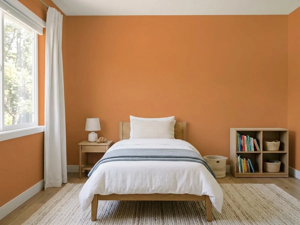
A Navel headboard wall gives a kid the bold color they asked for without giving them a room that will not let them sleep. Pair it with a calm blue on the bedding or built-ins rather than with more warm colors. In a bedroom that gets strong afternoon sun, sample on the wall the bed faces, not the one behind it.
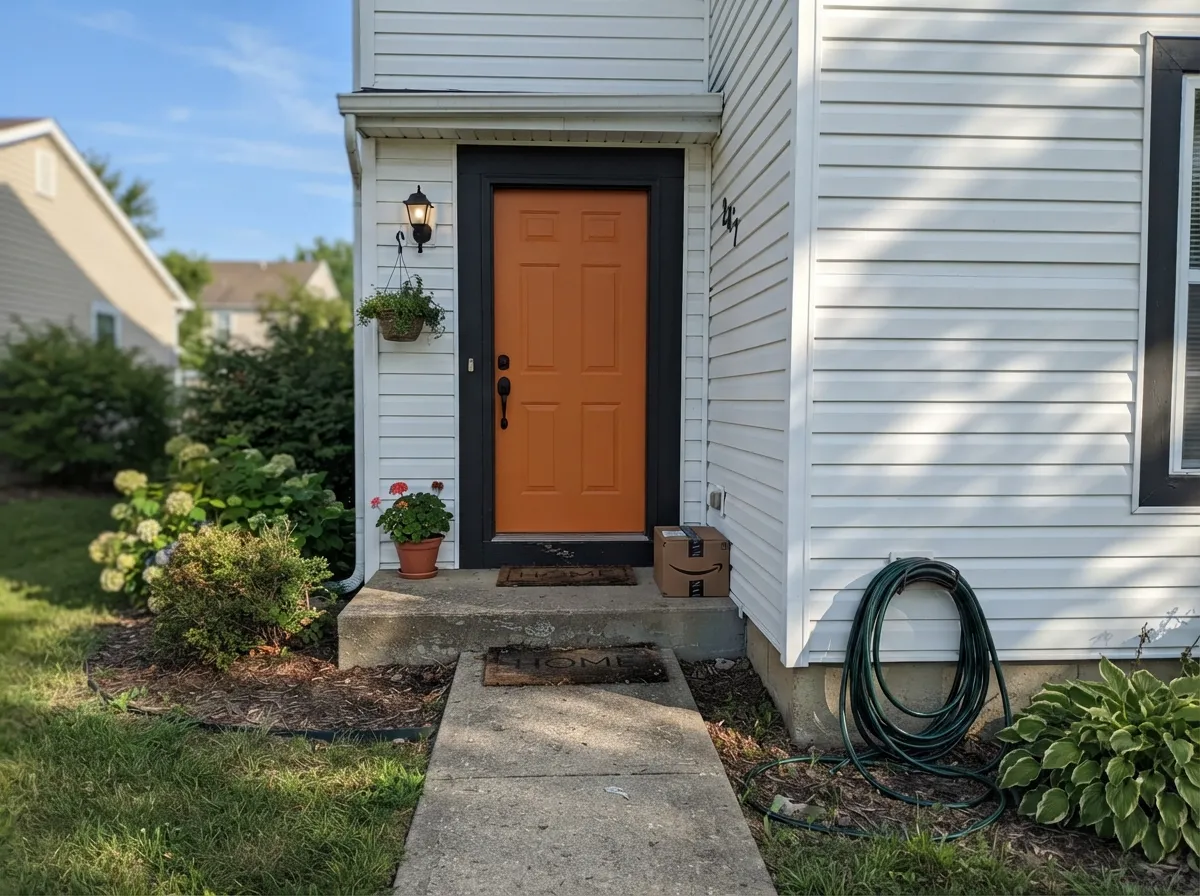
On a white, pale gray or greige house with dark trim, a Navel door is the single best use of this color: small enough to be a joke you meant to tell, saturated enough to be visible from the street. Satin or semi-gloss exterior enamel. See the front-door section below for the fade caveat, which is real for any orange.
In doses it is genuinely good here: the back panel behind open shelving, a pantry or laundry door, an island under creamy white uppers. A full kitchen of orange cabinets is a different and much braver purchase, and a losing one over honey-oak floors. Satin cabinet enamel either way, and give it a deep green or navy somewhere in the room so it does not read as the only decision anyone made.
One wall, an alcove, the inside of a built-in bookcase, a dining-room niche behind open shelving: all fine, all reversible-ish. Four walls of a living room is where the classic orange regret story starts, and open-plan layouts make it worse, because the color follows you into the kitchen whether you invited it or not.
Adult bedrooms and nurseries want light to fall out of the room, and this color throws it back at you all evening. Home offices are the quieter no: it looks great on the first video call and starts competing for attention by week three. If you want warmth in these rooms, Caramelized delivers the same family at the same LRV 35 with the volume down.
Your Light Is the Risk
Full daylight is the only light that keeps it in citrus territory — clean, sunlit, unmuddied. If a room has this, Navel looks like the photo.
Cool, weak light plus LRV 35 leaves a heavy pumpkin that closes the room in. Cold daylight also strips the cheer and leaves the intensity — the worst trade.
Morning east light reads it a touch yellower and flatter; late west sun and golden hour push it distinctly red, almost tangerine, for about an hour.
Warm 2700K lamps deepen it toward amber and burnt orange — usually the flattering version. Cool 4000K and up neutralizes the warmth and leaves a flatter, more plastic orange; keep the bulbs warm in any room wearing this.
Most complaints about Navel are a light mismatch. Upload a photo of your actual room and see it on your walls — then ask for the same wall in north light or evening lamps before you buy a single sample.
Need It From Another Brand?
Any paint counter can custom-tint Sherwin-Williams SW 6887 directly. If you would rather stay in one brand's own deck, these are the closest stock matches, measured as ΔE2000. Under 2 is a difference you will not see on the wall.
| Brand | Closest color | ΔE | LRV | |
|---|---|---|---|---|
| Behr | Construction ZoneP220-7 · Behr | 3.5 | 35 | Color page → |
| Benjamin Moore | Startling Orange2016-10 · Benjamin Moore | 2.6 | 32 | Color page → |
| Valspar | Carrot Cake2007-3A · Valspar | 3.3 | 35.1 | Color page → |
| Dutch Boy | Outback Orange110-7DB · Dutch Boy | 2.5 | 32 | Color page → |
| Dunn-Edwards | Bright MangoDE5195 · Dunn-Edwards | 3.5 | 39 | Color page → |
| Diamond Vogel | Cheddar Cheese0977 · Diamond Vogel | 3.0 | 37 | Color page → |
Similar Sherwin-Williams Colors
The nearest shades to Navel within Sherwin-Williams's own range, ranked by perceptual color distance — useful when you want the same look a touch lighter, darker, or warmer.
WCAG 2.1: AA is 4.5 : 1 for normal text, 3 : 1 for large text, AAA is 7 : 1.
Navel vs the Colors You're Also Considering
Every Navel sample board has the same rivals on it. The numbers show the real lightness gap — then it comes down to which risk you would rather live with.
Pick this when you actually want people to notice the color, not just feel warmer.
Sherwin-Williams SW 9186 · LRV 35CaramelizedPick this for the same LRV 35 warmth with the saturation turned down — a caramel that can carry a whole well-lit room instead of one wall.
Pick this when clay reads too muted and you want the fruit, not the pot.
Sherwin-Williams SW 7701 · LRV 24Cavern ClayPick this for the earthy, dusty terracotta version — deeper at LRV 24 and grayed enough to behave like a neutral in a whole room.
Navel Coordinating Colors
The rule for coordinating with Navel: one warm white to hold the room, one cool color to argue with it, and one dark to frame the edges. What it will not tolerate is company — another warm color of similar strength in the same room turns the whole thing into a fruit bowl. These are the partners that keep showing up in rooms that actually work:
Navel With Wood Tones, Brick and Floors
This decision gets made at the floor and the fireplace, not at the paint counter. Navel's best company is wood that has no orange left in it: pale unstained white oak, gray-washed plank, walnut, or painted white cabinetry. Against those, the orange is clearly the only orange in the room, which is exactly the job you hired it for.
The honest no is anything already in the family. Honey oak floors, orange-stained oak trim, pine paneling, red-oak stair treads, terracotta floor tile, and 1970s orange-toned brick all sit within a few degrees of this hue. That is not contrast, it is a near-miss, and near-misses look like mistakes in a way that opposites never do. If the honey oak is staying, either put a large neutral rug between it and the wall, or pick Cavern Clay and let the earthy version make peace with the floor instead of fighting it.
Metals and materials are the easy part: aged brass, matte black and raw natural linen all ground it; white marble and pale quartz keep it from feeling heavy. Polished chrome and cool blue-gray stone are the two that read cold and slightly cheap beside it.
Navel on a Front Door: Fade, Sheen and the Curb Test
Outside is where this color is easiest to love, because a door is small and a whole facade of orange is nobody's plan. On a white or pale-gray house with dark trim, a Navel door reads warm, confident and unmistakably intentional — the friendly cousin of the traditional red door, and a better fit on a bungalow, a mid-century ranch or anything too casual to carry formal red.
Two practical notes before you buy the quart. First, fade: bright oranges and reds rely on organic pigments, which are the least UV-stable pigments in the tinting system, and south- and west-facing surfaces take the most sun. A Navel door on the shady north side of a house will hold for years; the same door facing full southwest sun will visibly soften and need a refresh coat long before the siding does. Use a real exterior door enamel and accept the maintenance as part of the color. Second, sheen: satin or semi-gloss, never flat. A saturated orange in a flat exterior sheen looks chalky within a season and shows every hand mark around the handle.
The curb test is worth thirty seconds: paint a poster board, tape it over the door, and walk to the sidewalk. From ten feet a bright door is a personality; from the street it is either a welcome or the loudest thing on the block, and only your particular house and your particular neighbors settle which.
Three Ready Palettes Built on Navel
A color is never alone on the wall. These are complete combinations in the 60-30-10 pattern, with the reason each one holds together. Every one opens in the visualizer.
This is 60-30-10 doing real work. Blue is orange's opposite on the wheel, so the sky blue cools the room down instead of piling more energy on it, and Alabaster keeps the white side warm — a stark bright white would make the orange look neon by comparison. One orange wall is stimulating; four is the complaint every designer writes about.
Try this palette in your roomA near-black frame is what makes a bright door read as a decision rather than an accident — at LRV 6 Iron Ore is dark enough to hold the edge and soft enough not to go stark. Keep the dark to trim-width lines: large fields of black plus large fields of orange is how a house accidentally becomes a Halloween decoration.
Try this palette in your roomDeep leafy green is the pairing that gives bright orange a crisp, slightly vintage edge instead of a tropical one — and because the green does the heavy lifting on the cabinets, the orange only has to show up behind the dishes. The creamy white keeps the whole thing from tipping into holiday colors, which a hard white plus orange will do.
Try this palette in your roomNavel FAQ
Is Navel too bright for a whole room?
For most rooms, yes. It is a fully saturated orange, and saturation grows with area — the chip is cheerful, four walls are relentless. The honest exception is a small playroom or a laundry room where you actively want the energy and you spend limited time. Everywhere else, use it on one wall, a door, an island or shelf backs and let warm white carry the room.
What white goes with Navel?
A warm, softened white. Alabaster is the natural SW partner and Dover White if you want more cream. Avoid the brightest, coolest whites next to it — a hard bright white makes the orange look neon and pushes the pair toward a construction-sign contrast. Semi-gloss trim, eggshell or satin walls.
How many coats does Navel take, and what primer?
Plan on a gray or orange-tinted primer plus two to three finish coats. It is mixed in a deep base with very little white pigment, so it hides poorly and shows lap marks if an edge dries before you get back to it — keep a wet edge and roll a full wall in one go. Undoing it later needs a shellac or stain-blocking primer before any white goes on, or the orange telegraphs through.
Is Navel a good front door color?
It is one of its best uses. On a white, greige or pale gray house with dark trim it reads friendly and visible from the street without the formality of a red door. Use a satin or semi-gloss exterior door enamel, and know that bright orange and red pigments are the fastest-fading colors outdoors — a south- or west-facing door will need a refresh coat years before your siding does.
Does Navel work with honey oak floors or orange brick?
This is its worst pairing. Honey oak, red oak, pine paneling, orange-toned brick and terracotta tile are all dilute versions of the same hue, so instead of contrast you get a near-miss — the floor reads like a failed color match and the wall reads twice as loud. Navel wants pale white oak, walnut, painted white cabinetry, or a large neutral rug in between.
Is bright orange dated?
Bright orange has never been a safe neutral and never will be, so the fair question is not whether it dates but how much it costs you when it does. On one wall, a shelf back or a door it is a weekend and a quart. On four walls it is a shellac primer and three coats of white. Buy it at the scale you would be willing to redo in five years, and it stops being a risk.
Have you painted with Navel?
Rate it — one tap helps the next reader decide.
Ask a Question