Saffron Strands
The spice-market gold Behr once crowned Color of the Month, reviewed honestly: the one wall it was built for, the light that turns it mustard, and what to pick instead.

Jessica has spec'd whites and neutrals for more than 300 rooms and keeps a sample wall of painted drawdowns in her studio. Every color review is checked against real reader rooms in the comments and re-tested when a formula changes. About the testing process →
- 1Determined Orange22
- 2Tart Orange31
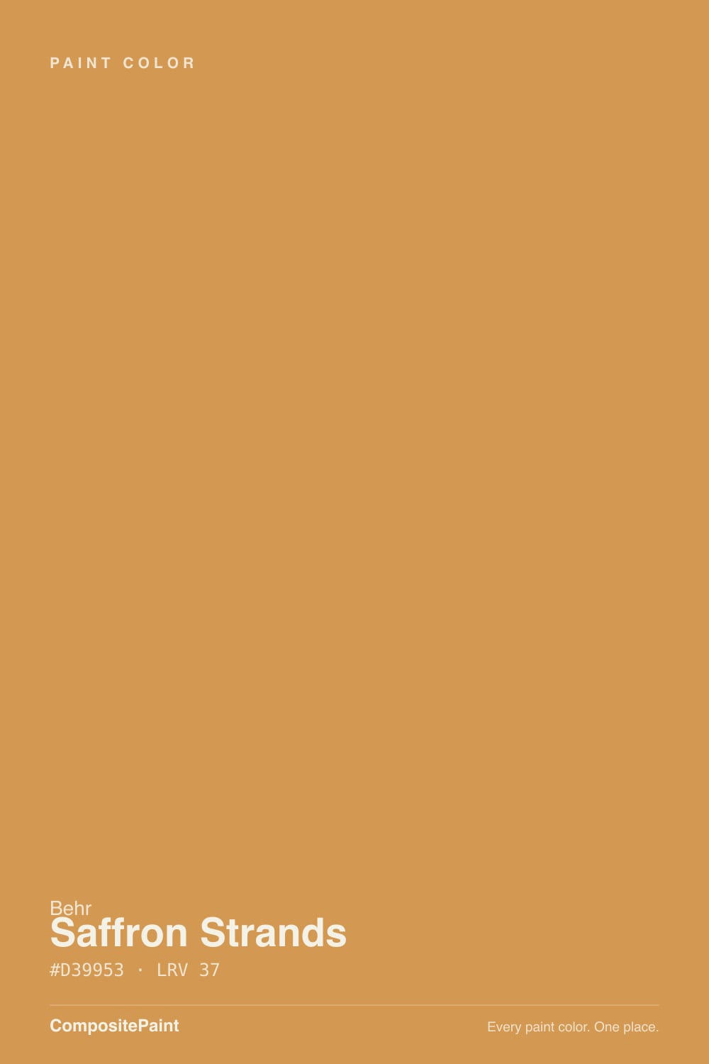
- 3Saffron Strands37
- 4Venetian Plaster42
- 5Colonial Yellow59
The Fast Verdict
Saffron Strands is Behr's honest gold — not a buttery pastel, not a safe wheat neutral, but an actual saturated saffron-and-turmeric spice color with a real orange undertone underneath. Behr put it in its 2021 Color Trends Palette and gave it a Color of the Month feature for a reason: in a doorway, on an island, or across one accent wall next to a plain white, it reads rich and confident. Try to live with it on four walls and the same intensity that makes it work in doses turns into a room you can't sit in for long.
One accent wall in a kitchen or dining room · a kitchen island or hutch under white cabinets · a front door with real curb presence · anyone who wants a true gold, not beige pretending to be gold
You want it on all four walls of a small room · your room only gets flat, cool north light · your kitchen is already busy with warm wood, brass, and terracotta tile · you're not ready to repaint if the trend cools
- A genuine saturated gold with real orange depth — not a pastel pretending to be bold
- Behr's own 2021 Color Trends Palette pick, so it was styled and tested, not an afterthought
- Outstanding with brass, copper, and plain warm whites
- Reads rich and confident on a front door or a single accent wall
- LRV 37 keeps it legible without washing out in normal daylight
- Overwhelming across four walls of anything but a large, bright room
- Goes flat and mustard-brown in dim or north-facing rooms
- Fights other warm, busy colors instead of complementing them
- A trend-adjacent color with more repaint risk than a true neutral gold
What Color Is Saffron Strands, Really?
A saturated golden-yellow with a genuine orange undertone underneath — that undertone is the whole story. Pale trend yellows like Butter Yellow or Sunflower Seed stay in the cream family even at full strength; Saffron Strands does not. Behr's own copy calls it "an exotic gold" and describes the orange as what keeps the yellow from reading candy-sweet — instead it lands closer to turmeric, curry powder, or the actual saffron threads it's named for. It was chosen for Behr's 2021 Color Trends Palette and later featured as a Color of the Month, which tells you this was a deliberate, styled color, not a background neutral that happened to lean gold.
At LRV 37 it sits at a genuine medium depth — noticeably darker and richer than the pastel yellows most decks lean on for "safe" gold, and that depth is exactly why it reads as spice rather than sunshine. It reflects enough light to stay legible in a normal room, but not so much that it washes out; put it next to a paler gold like Jackfruit (LRV 62, from the same PPU6 Behr strip) and Saffron Strands suddenly looks like a completely different, more grown-up color.
Undertone in one line: gold first, orange close behind — never green, never a flat mustard-brown on a good sample. If your swatch reads brownish and dull, that is cool or dim light stripping the gold out, not a defect in the paint.
Where It Shines
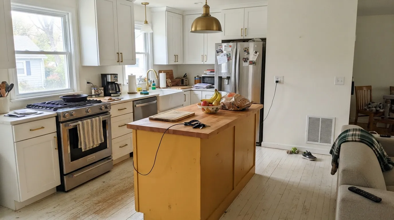
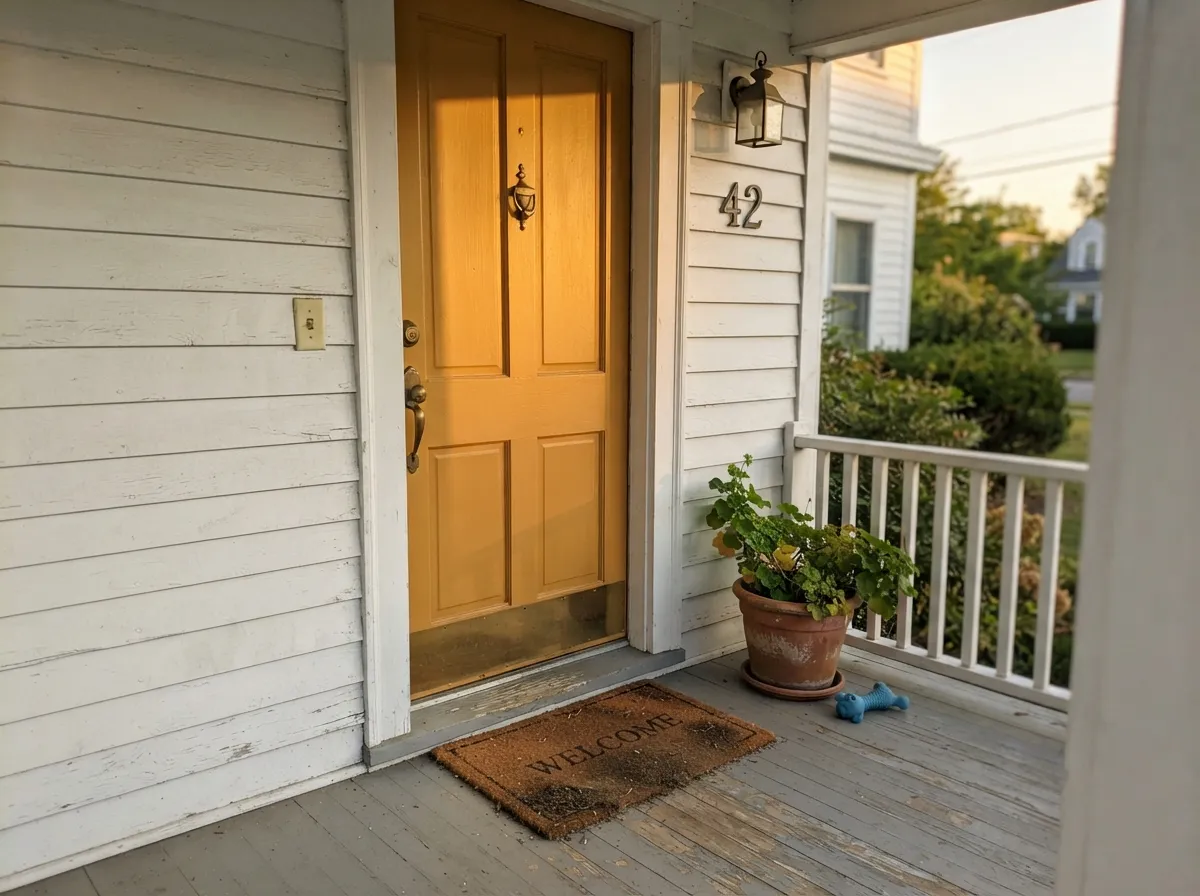
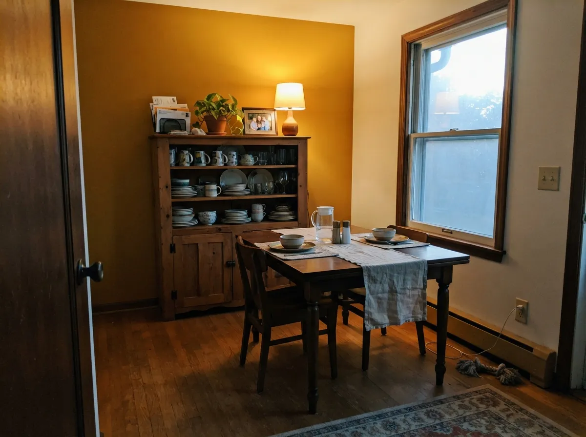
Give it one surface and real daylight and it is genuinely striking. A single kitchen accent wall behind open shelving, an island under white perimeter cabinets, or a front door on a white or light-gray house all let the color do its job without asking the whole room to live inside it. It is at its best with brass or unlacquered copper hardware — Behr's own pairing suggestion — and with a plain warm white like Swiss Coffee or a crisp white like Ultra Pure White doing the heavy lifting around it.
Where It Fails
Almost every disappointed review of a bold single-note color like this follows the same handful of scripts, and Saffron Strands is no exception. None of these are the paint failing — they are the color being asked to do a job it was never built for.
This is a doorway-and-accent color, not a whole-room color. At LRV 37 and full saturation, four walls of Saffron Strands in anything but a large, bright room reads loud fast — readers who buy the gallon expecting a "warm neutral" are the ones who end up repainting. Use it on one wall, an island, or a door and let white or a quiet neutral carry the rest of the room.
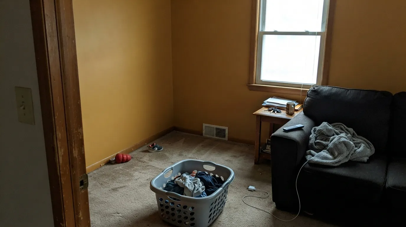
Without real daylight the orange undertone loses its lift and the color settles into a flatter, more mustard-brown version of itself — less spice-market, more baby-food jar. If the room only gets cool north light, either add warm lamps or pick a paler gold like Jackfruit that has more room to lose brightness before it goes dull.
Saffron Strands next to terracotta tile, honey-oak cabinetry, and a red-brown backsplash all at once is too many warm notes competing for attention — the eye can't find the color's edge. It needs at least one calm, pale neutral (Swiss Coffee, Ultra Pure White) in the room to read as intentional rather than chaotic.
Room by Room
Its best room. An island, a hutch, or the wall behind open shelving all let it shine next to white cabinets and brass pulls. A full kitchen of Saffron Strands cabinetry is a bold, high-commitment bet, not a safe one — satin or semi-gloss cabinet enamel either way.
One accent wall behind a buffet or hutch, paired with a warm white on the other three, gives a dining room genuine personality at dinner-hour lamplight without becoming the only thing anyone remembers about the meal.
On a white, light-gray, or greige house it is a confident, unusual door color that still reads welcoming rather than jarring. Semi-gloss exterior enamel; expect it to look brighter and more saturated in direct sun than the chip suggests.
Works as a single accent wall or on a piece of furniture, not as the wall color for an entire open-plan living space. In an open floor plan it has to negotiate with every adjoining room's color, and gold this saturated rarely wins that negotiation gracefully.
This is an energizing, wake-you-up color, the opposite of what most bedrooms want at night. It can work as a headboard-wall accent for someone who genuinely wants a bold bedroom, but it is not a rest color.
Beyond the front door, it works on shutters or trim accents against a pale body color. It is not built to be the main siding color across a whole exterior — that much saturated gold facing the street, all day, in full sun, is a different and much riskier commitment.
Your Light Is the Risk
Strong warm sun is where the gold and the orange underneath both come forward at full strength — the true saffron read.
Cool, flat daylight drains the gold and leaves a duller, more mustard-brown color behind. Test a big sample before committing a whole wall.
Bright and citrus-gold in direct morning or afternoon sun, noticeably quieter and more amber once the sun moves off the wall.
2700K warm bulbs push it toward a cozy amber glow. Cool white LEDs flatten the gold and can push it toward a greenish-mustard cast — worth testing before you commit to LED can lights in the same room.
Most complaints about Saffron Strands are a light mismatch. Upload a photo of your actual room and see it on your walls — then ask for the same wall in north light or evening lamps before you buy a single sample.
Need It From Another Brand?
Any paint counter can custom-tint Behr PPU6-02 directly. If you would rather stay in one brand's own deck, these are the closest stock matches, measured as ΔE2000. Under 2 is a difference you will not see on the wall.
| Brand | Closest color | ΔE | LRV | |
|---|---|---|---|---|
| Sherwin-Williams | HoneycombSW 6375 · Sherwin-Williams | 1.8 | 37 | Color page → |
| Benjamin Moore | Delightful Golden2158-30 · Benjamin Moore | 0.6 | 36 | Color page → |
| Valspar | Sassy Sassafras8002-17E · Valspar | 2.9 | 38 | Color page → |
| PPG / Glidden | Bran MuffinPPG16-14 · PPG / Glidden | 2.1 | 36 | Color page → |
| Glidden | Bran MuffinPPG16-14 · Glidden | 1.8 | 36 | Color page → |
| Dutch Boy | Golden Meadow213-5DB · Dutch Boy | 1.8 | 38 | Color page → |
Similar Behr Colors
The nearest shades to Saffron Strands within Behr's own range, ranked by perceptual color distance — useful when you want the same look a touch lighter, darker, or warmer.
WCAG 2.1: AA is 4.5 : 1 for normal text, 3 : 1 for large text, AAA is 7 : 1.
Saffron Strands vs the Colors You're Also Considering
Every Saffron Strands sample board has the same rivals on it. The numbers show the real lightness gap — then it comes down to which risk you would rather live with.
Pick this for the spice-rack gold instead of a citrus orange — Saffron Strands is warmer and deeper.
Sherwin-Williams SW 6890 · LRV 45Osage OrangePick this if you want the color pushed further toward true orange and away from gold — brilliant in doses, brutal by the gallon either way.
Pick this when you want gold to read first and orange to sit quietly underneath it.
Behr P220-6 · LRV 40Bergamot OrangePick this for a straight, punchy orange with no gold in it at all — a different, brighter kind of bold from the same brand.
Saffron Strands Coordinating Colors
The rule for coordinating with Saffron Strands: give it one calm, pale partner to play against, and keep the rest of the room from stacking up other warm, saturated colors on top of it. It pairs cleanly with plain warm and true whites, near-black accents, and its own paler sibling from the same Behr strip. These are the partners that keep showing up in rooms that work:
A Behr Trends Pick, Not an Accident
Saffron Strands was not a quiet strip-and-chip color that happened to get noticed — Behr selected it for its 2021 Color Trends Palette and later gave it its own Color of the Month feature on the brand's design blog, both of which describe it as an "exotic gold" meant to bring bold warmth and charisma into a space. That styling pedigree is worth knowing: it was chosen to be used deliberately, in doses, in rooms built around it — not as a default wall color someone picks because they wanted "a warm yellow."
That also explains why it doesn't show up much in owner complaint threads the way a mainstream neutral does: it is a color people choose on purpose, in small amounts, after already deciding they want something bold. The buyer's remorse stories that do exist follow the same pattern as any saturated accent color pushed too far — the paint over-delivering on a promise the buyer under-planned for.
Saffron Strands With Wood Tones and Metal
Metal is where this color does its best work. Brass and unlacquered copper hardware, light fixtures, or faucets pick up the gold's warmth directly and look intentional rather than mismatched — Behr's own styling leans on exactly this pairing for kitchens and dining rooms. Matte black and dark bronze hardware also work, giving the wall a sharper, more graphic contrast instead of a tonal one.
For wood, pale surfaces do the most for it: white oak, butcher block, and unstained maple let the gold read clearly without competing. Honey-oak or heavily orange-toned wood is the one combination to test carefully first — two warm, saturated tones in the same small room can crowd each other rather than complementing, especially in a kitchen where the floor, cabinets, and an accent wall are all vying for attention at once.
Three Ready Palettes Built on Saffron Strands
A color is never alone on the wall. These are complete combinations in the 60-30-10 pattern, with the reason each one holds together. Every one opens in the visualizer.
Swiss Coffee gives the gold island room to be the loudest thing in the kitchen without a bright white fighting it, and the near-black hardware pins the scheme down so it reads designed instead of accidental.
Try this palette in your roomA crisp white body keeps the gold door from competing with anything else on the facade, and near-black shutters give the eye a resting point so the door reads confident, not random.
Try this palette in your roomEven Better Beige stays out of the yellow family entirely, so it never competes with the gold; Jackfruit is Saffron Strands' own paler sibling from the same Behr strip, giving the room two related warm notes instead of one loud one.
Try this palette in your roomSaffron Strands FAQ
Is Saffron Strands warm or cool?
Warm, and unmistakably so — it is a saturated gold with a real orange undertone underneath, not a pastel or a neutral. It does not have a cool reading in any normal light; the only shift is between vivid (warm daylight) and dull (cool, dim light).
Can I paint a whole room in Saffron Strands?
You can, in a large room with strong daylight, but most people are happier using it on one wall, an island, or a door and letting a white or quiet neutral carry the rest. At full saturation on four walls it reads far more intense than the paint chip suggests.
What white goes with Saffron Strands?
Behr's own pairing suggestions are Swiss Coffee for a softer, warmer backdrop or Ultra Pure White for a crisper, higher-contrast look. Both keep the gold as the clear focal point instead of competing with it.
Does it work on a front door?
Yes, and it's one of its strongest jobs — a saturated, unusual color that still reads welcoming rather than aggressive, especially against a white or light-gray house. Use exterior semi-gloss enamel.
Is it good for kitchen cabinets?
In doses — an island or a hutch works beautifully under white perimeter cabinets. A full kitchen of Saffron Strands cabinetry is a genuine style commitment, not a safe one; test a large sample under your actual kitchen lighting first.
How does it look in a room with little natural light?
Duller and more mustard-brown than the chip promises — the orange undertone needs real daylight or warm lamps to read as gold rather than flat brown. If your room is dim and north-facing, either commit to warm 2700K lighting or choose a paler gold like Jackfruit instead.
Have you painted with Saffron Strands?
Rate it — one tap helps the next reader decide.
Ask a Question