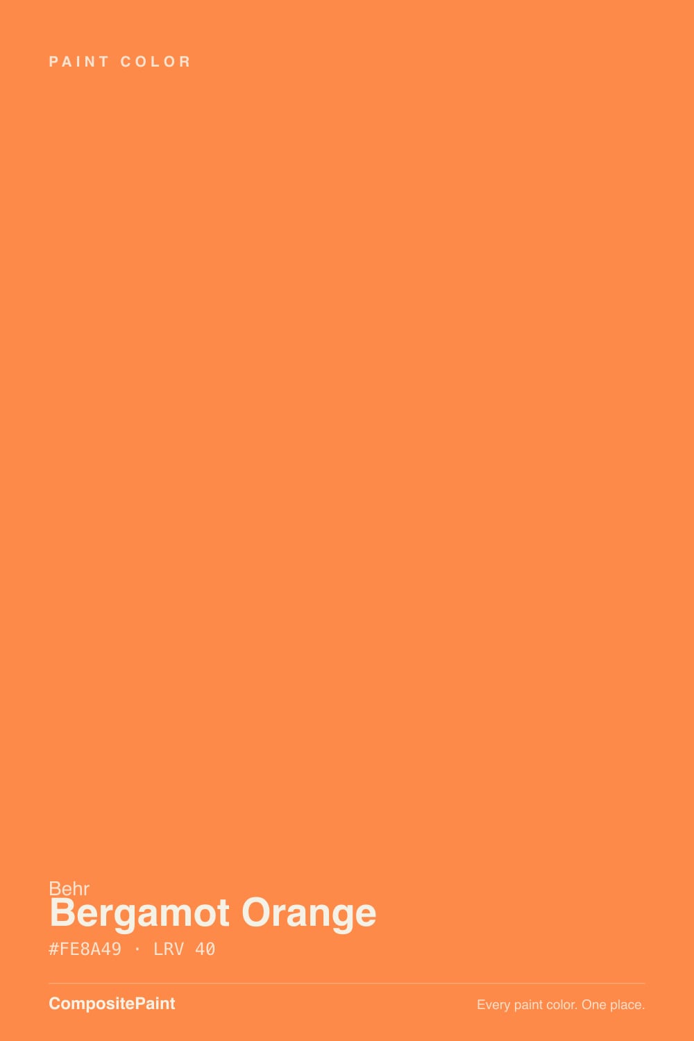
Bergamot Orange
The Behr orange kids' rooms keep asking for, reviewed honestly: the dose that works, the light that turns it hot, and the coats nobody warns you about.

Jessica has spec'd whites and neutrals for more than 300 rooms and keeps a sample wall of painted drawdowns in her studio. Every color review is checked against real reader rooms in the comments and re-tested when a formula changes. About the testing process →
- 1Determined Orange22
- 2Caramelized35
- 3Bergamot Orange44
- 4Beehive51
- 5Colonial Yellow59
The Fast Verdict
Bergamot Orange is a clean, cheerful mid orange with a golden lean — closer to a citrus peel than to terracotta, and nothing at all like the muted clay tones designers have been selling for years. Used the way it wants to be used — one wall, a bank of storage cubbies, a mudroom, a front door — it is one of the happiest colors Behr sells for the price of a quart. Rolled onto all four walls of a small sunny room, it stops being cheerful and starts running the room: white trim goes peachy, the ceiling picks up a cast, and nobody can sit still in there. Buy it for a dose, not for a house.
Kids' rooms and playrooms in measured doses · storage cubbies, built-ins and lockers · mudrooms and laundry rooms · a front door on a neutral house · anyone who wants real color for one weekend of work
You want a muted, earthy terracotta · the room is small with big south or west windows · it's a room meant for sleeping or for calming down · you are hoping one coat will cover · your trim is a warm cream rather than a clean white
- A clean, honest orange — no muddy brown, no pink
- Transforms a mudroom, laundry or playroom for one quart
- Kids' spaces: the sociable, energizing end of the spectrum
- Excellent front-door color on a gray or white house
- Behaves better than expected in cool north light
- Two coats rarely cover — plan for a tinted primer
- Casts orange onto trim, ceiling and faces at full-room scale
- Direct afternoon sun turns it hot and glary
- Fades faster than muted colors on a sunny exterior
What Color Is Bergamot Orange, Really?
A clear, saturated mid orange with a golden lean — the color of a citrus peel rather than a clay pot. That distinction matters more than anything else on this page, because most of the orange people have been buying for the last decade has been muted: terracotta, rust, clay, all of them grayed and browned until they behave like neutrals. Bergamot Orange is not grayed. It is a true, bright orange that stays bright on the wall, and every rule below follows from that one fact. The name comes from a citrus too — bergamot is the fruit whose peel flavors Earl Grey tea, though the actual fruit ripens green-to-yellow, so the paint is quite a bit more orange than its namesake.
At LRV 44 it sits right in the middle of the deck: not a pastel, not a deep tone. Two practical things come out of that. First, a wall of it absorbs a real share of the room's light while bouncing what it returns back as orange, so a small room painted all the way around will tint its own ceiling, its own trim, and the faces of the people in it. Second, saturated oranges are made with organic pigments that hide poorly — expect two solid coats over an existing light wall, three if you go straight over white with no help, and plan on a gray-tinted primer if you want to stop at two. Behr's one-coat promises apply to a specific collection of colors; this is not one of them.
Undertone in one line: warm orange with a yellow-gold pull — never red-brick, never pink. If your sample looks peachy, that is a thin coat over white letting the wall show through; a second coat brings the real color forward every time.
Where It Shines
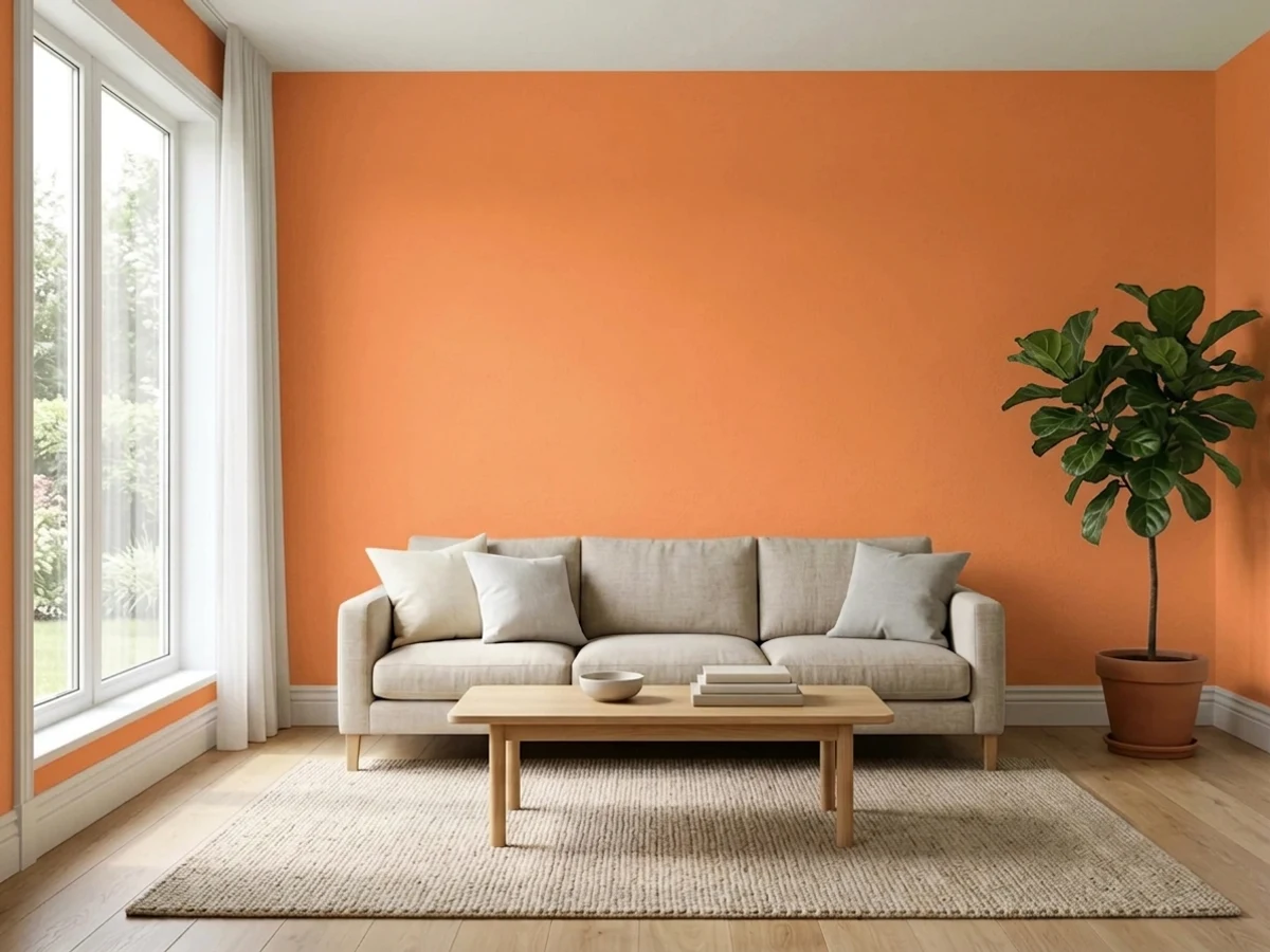
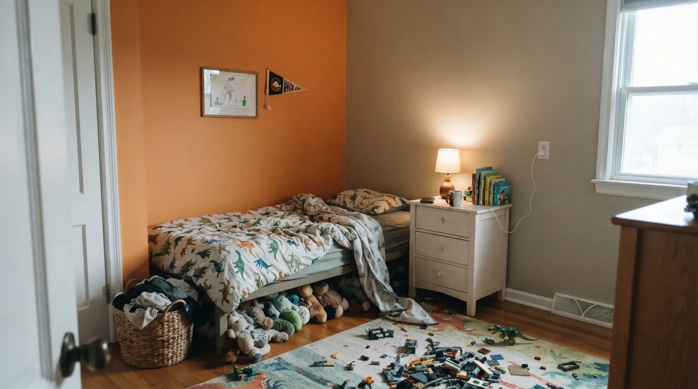
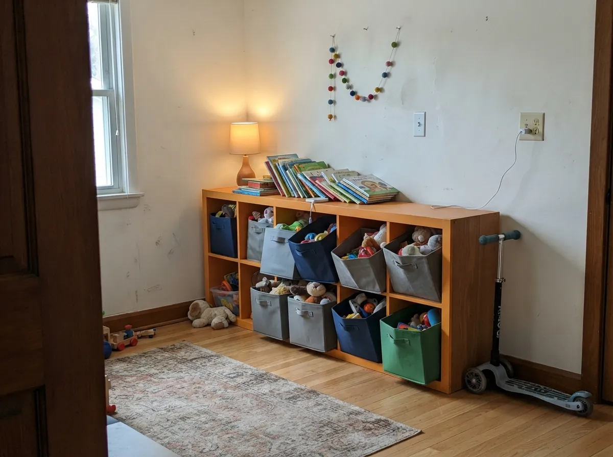
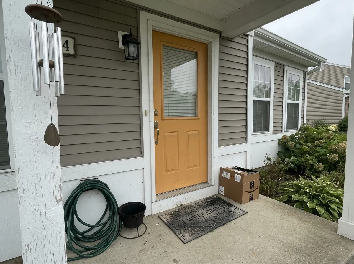
This color has one gift and it is a big one: it makes a small, boring, functional space feel like somebody cared. Kids' rooms and playrooms are its home turf — orange is the sociable, talkative end of the spectrum, and children respond to it exactly that way — but the same logic works on a mudroom wall of hooks, a laundry cabinet run, a set of playroom cubbies, or a front door on an otherwise quiet gray house. Give it clean white trim, plenty of plain wall around it, and something blue or green in the room, and it reads deliberate and modern rather than loud.
Where It Fails
Every bad Bergamot Orange story is really one of three stories, and all three are visible from the paint aisle. None of them mean it is a bad color — they mean it was given a job it was never going to do.
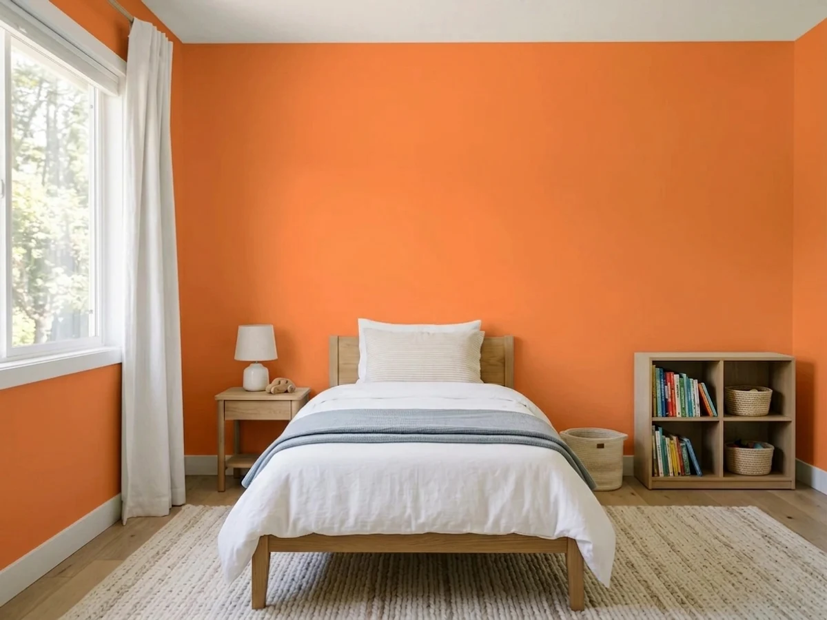
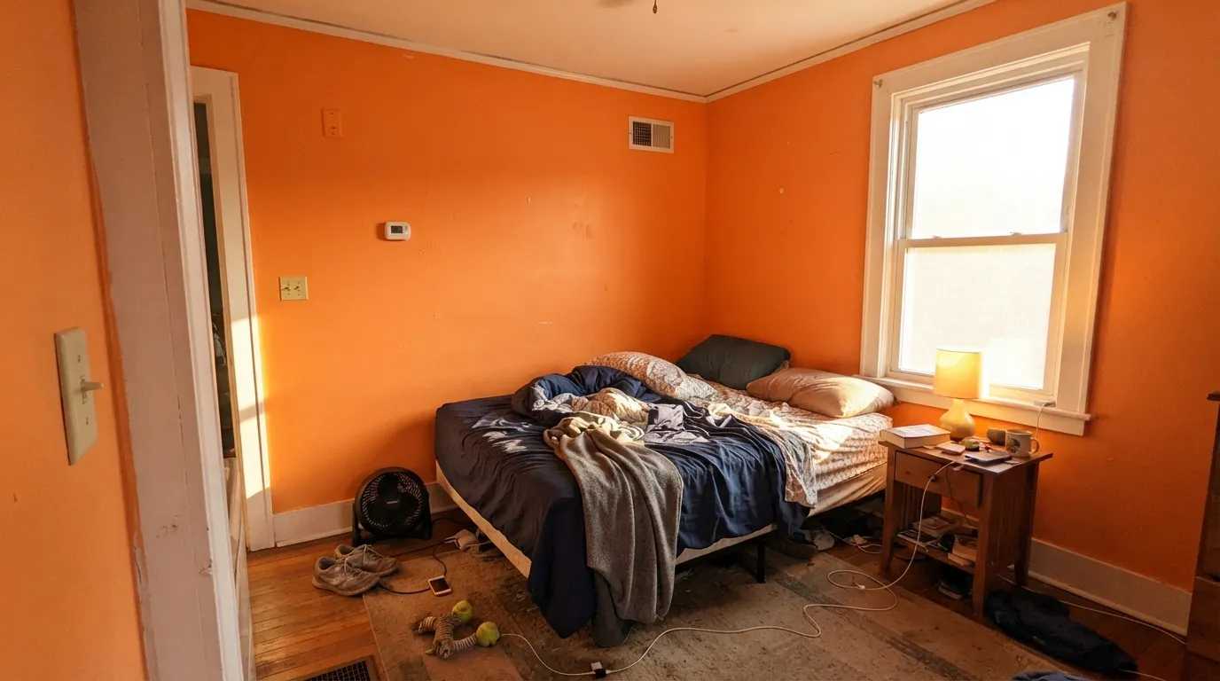
This is the regret that gets posted. Saturated orange on every wall of a normal-sized bedroom stops being a wall color and becomes the light in the room: white trim goes peachy, the ceiling takes a cast, and the space feels hot even when it isn't. Designers who like orange in children's spaces almost all say the same thing — accent wall, lower half, or built-ins, not a full wrap around a bed. If you want orange everywhere, buy it lighter and grayer.
Bright oranges are among the worst-hiding colors on the shelf, and the paint-and-primer label on the can does not change the pigment chemistry. Straight over white you will see roller striping and a washed patch above the outlet after coat two, and you will be back on the ladder for a third. The fix is boring and cheap: one coat of primer tinted about halfway to the color, then two finish coats. Buy the extra quart before you start, not after.
Direct west or south sun landing on this wall pushes it from cheerful to hot — it glows, it glares slightly in satin, and it throws orange onto everything nearby. In a large, bright room that is fun for an hour a day. In a small one it is the reason the color came back off. Put it on the wall the sun does not hit, or keep it for rooms with cooler, indirect daylight.
Room by Room
One wall behind the bed or the desk, or the lower two-thirds under a chair rail, with the rest of the room in a quiet white or greige. That is the version that people keep and photograph. Eggshell wipes down and hides handprints better than flat; save the drama for the wall and let the trim stay clean white.
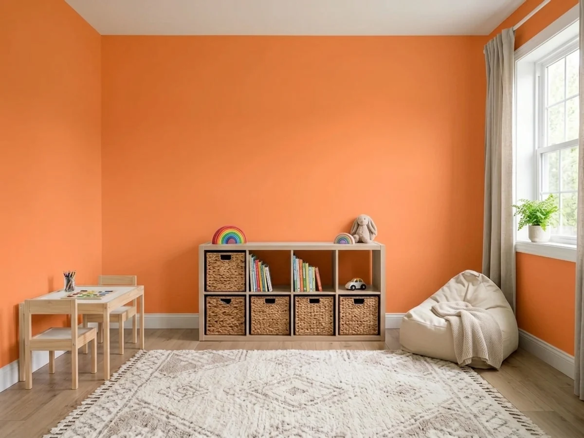
A playroom is the one interior where full walls of it are genuinely defensible: nobody sleeps there, the energy is the point, and toy clutter reads as part of the scheme instead of against it. Satin is the right call for scrubbing crayon off. If full walls feel like too much, paint the storage instead — orange cubbies against a white wall get you the same lift for a quarter of the paint.
These are rooms nobody expects to enjoy, and a saturated color costs almost nothing here because the square footage is tiny. Hooks and bench wall in Bergamot Orange, everything else plain, satin so the wet coats and detergent drips wipe off. If the room has no window at all, the color still holds up under warm bulbs — it just goes deeper and more amber.
On a gray, greige or white house this is a genuinely good door color, and Behr sells the shade in exterior lines including a sprayable pro-grade acrylic. The honest caveat is fade: bright orange, red and yellow pigments are the first things UV goes after, so a south- or west-facing door will look tired years before the siding does. A door takes an hour to repaint, which is why it is a fair bet and a full orange facade is not.
A pantry door, an island end, or a single dining wall works and looks intentional next to wood and white. What does not work is orange as the general kitchen wall color: it fights every warm wood tone in the room for the same job, and against cream or almond cabinets it turns the cabinets dingy. If your whites are creamy rather than clean, skip it entirely here.
Adult bedrooms are the wrong assignment: this is a color that raises the temperature of a room, and sleep wants the opposite. Living rooms are borderline — one wall in a big, well-lit, modern space with plenty of white around it can be excellent, but in a normal-sized room with warm floors it takes over. If you want warmth in these rooms, a muted clay tone will give you the feeling without the volume.
Your Light Is the Risk
Cool, even daylight is the perfect brake on a saturated warm color — the orange stays clear and cheerful without going hot. North rooms are where this color is easiest to live with.
West or south sun striking the wall pushes it toward glowing tangerine and throws orange light across the room. Fine on a wall the sun misses; rough in a small bright room.
Morning east light reads it cleanest and most apricot; it settles mid-day; then golden hour flares it a full step hotter for about an hour before it drops back.
Warm 2700K bulbs deepen it toward amber and make it cozier than daylight ever does. Cooler 3500-4000K LEDs flatten it slightly — which, unusually, is the helpful direction for this color in a bright room.
Most complaints about Bergamot Orange are a light mismatch. Upload a photo of your actual room and see it on your walls — then ask for the same wall in north light or evening lamps before you buy a single sample.
Need It From Another Brand?
Any paint counter can custom-tint Behr P220-6 directly. If you would rather stay in one brand's own deck, these are the closest stock matches, measured as ΔE2000. Under 2 is a difference you will not see on the wall.
| Brand | Closest color | ΔE | LRV | |
|---|---|---|---|---|
| Sherwin-Williams | Osage OrangeSW 6890 · Sherwin-Williams | 5.0 | 45 | Color page → |
| Benjamin Moore | Antelope Canyon125 · Benjamin Moore | 2.6 | 45 | Color page → |
| Valspar | Brushed Orange2007-3B · Valspar | 1.8 | 42.4 | Color page → |
| PPG / Glidden | Fall LeafPPG1197-6 · PPG / Glidden | 0.9 | 43 | Color page → |
| Glidden | Orange Slice83YR 44/540 · Glidden | 0.7 | 44 | Color page → |
| Dutch Boy | Marigold Glow111-6DB · Dutch Boy | 2.8 | 44 | Color page → |
Similar Behr Colors
The nearest shades to Bergamot Orange within Behr's own range, ranked by perceptual color distance — useful when you want the same look a touch lighter, darker, or warmer.
WCAG 2.1: AA is 4.5 : 1 for normal text, 3 : 1 for large text, AAA is 7 : 1.
Bergamot Orange vs the Colors You're Also Considering
Every Bergamot Orange sample board has the same rivals on it. The numbers show the real lightness gap — then it comes down to which risk you would rather live with.
Pick this when you want the cleaner, more citrus orange with real punch behind it.
Sherwin-Williams SW 6890 · LRV 45Osage OrangePick this for a softer, more golden orange that sits closer to apricot and takes a whole wall more gracefully.
Pick this for the lighter, brighter version that keeps a kids' room feeling open rather than closed in.
Behr HDC-MD-27 · LRV 31Tart OrangePick this for a deeper, redder orange with more weight — better on a front door, tougher indoors.
Bergamot Orange Coordinating Colors
The rule with a saturated orange is that its partners should all be quieter than it is. Clean whites keep the edges sharp, warm grays give the eye a rest, and one cool note — blue, green or near-black — is what turns the room from loud into designed. Avoid piling on other warm brights, and avoid creamy or peachy whites, which go dingy the moment real orange is next to them. These are the partners that keep working:
How Much Orange a Kids' Room Can Take
Color advice for children's rooms is usually vague, so here is the specific version. Orange is the sociable color — the research-backed reputation is for talking, playing and cooperating, which is why it turns up in playrooms, classrooms and daycare plans far more often than in nurseries. The flip side is stated just as consistently: too much of it tips into restlessness, and the room a child has to fall asleep in is the wrong place to find that out.
The practical dose, in order of how safe they are: storage and furniture first (cubbies, a bookcase, a closet door), then the lower two-thirds of the walls under a rail, then a single feature wall — ideally the one behind the bed, where the child is not staring at it. Full walls belong in a playroom, not a bedroom. A north-facing room can carry more of it than a sunny south-facing one, because the cooler light keeps it from glowing.
Two details that decide whether it looks finished or chaotic: keep the trim a clean white so the orange has a crisp edge, and put one cool color in the room — a blue rug, green bedding, a slate-blue door — so the eye has somewhere to go. And use eggshell or satin rather than flat; kids' walls get touched, and orange touch-ups over flat paint flash badly.
The Name, the Fruit, and Where This Orange Sits in the Trend
Bergamot is a real citrus — the fruit whose peel gives Earl Grey tea its perfume — and it is a small joke on the paint chip, because the actual bergamot ripens from green to yellow and never looks like this. What the name does get right is the register: this is a clean, fresh, edible sort of orange rather than a dusty architectural one, which is exactly why it does well in rooms meant to feel cheerful and badly in rooms meant to feel calm.
In trend terms, orange has been sitting out the last several years. The muted clay family — terracotta, rust, adobe — took over the warm side of the spectrum, and the 2026 color-of-the-year announcements went to greens and earthy browns rather than anything this saturated. That leaves Bergamot Orange in a useful position: it is not fashionable, so it will not date the way a trend color does, and it is not rare either — Behr keeps it stocked across interior and exterior lines. It is simply the color you buy when you have decided a specific surface should be orange.
One last practical note that follows from the pigment rather than the fashion: bright organic orange is the least stable end of the exterior palette. Indoors it will look the same in ten years. Outdoors, on a wall that gets afternoon sun, it will not — which is the real reason this belongs on a door or a shutter and not on a whole house.
Three Ready Palettes Built on Bergamot Orange
A color is never alone on the wall. These are complete combinations in the 60-30-10 pattern, with the reason each one holds together. Every one opens in the visualizer.
Orange and blue sit opposite each other, so a slate blue on the door or the bunk frame makes the orange wall look chosen instead of leftover. Silver Drop on the other three walls does the real work — it gives the eye somewhere quiet to land — and a clean white trim keeps the orange looking crisp; a creamy trim would drag it toward peach.
Try this palette in your roomThe cheapest way to get this color right: paint the furniture, not the room. Orange cubbies against plain white walls give you all of the energy and none of the cast, the near-black frame keeps it graphic rather than sugary, and when the kids outgrow it you are repainting six doors instead of four walls.
Try this palette in your roomA warm gray body and clean white trim give the door the plainest possible stage, which is exactly what a saturated orange needs. Use the exterior line, not leftover interior paint, and accept that a south-facing door will need a refresh sooner than the rest of the house — that is the trade for a color this bright outdoors.
Try this palette in your roomBergamot Orange FAQ
Is Bergamot Orange too bright for a kids' room?
On one wall, no — it is one of the better choices out there, and orange is the color most associated with sociability and energy in children's spaces. On all four walls of a small bedroom, usually yes: it raises the temperature of the room and works against sleep. The reliable formula is one feature wall, or the lower two-thirds under a rail, with clean white trim and calm color everywhere else.
How many coats does it take?
Plan for three unless you prime. Bright orange pigments hide badly, so straight over a white wall the second coat still shows striping and thin patches around outlets. One coat of primer tinted roughly halfway to the color, then two finish coats, is faster, cheaper and flatter than fighting it with topcoats.
What white goes with Bergamot Orange?
A clean one. Ultra Pure White (LRV 92) or Polar Bear (LRV 86) keep the edges crisp and let the orange stay a color rather than a glow. Avoid a warm cream trim beside it — Behr's own Blank Canvas has a peach tell that goes muddy next to a real orange, and any yellowed white next to this reads dirty.
What color goes with orange on the opposite wall?
Something blue, green or gray, and quieter than the orange. Slate blue is the classic complement and the safest bet in a child's room; a soft sage cools the room down without fighting; a warm greige like Silver Drop (LRV 60) simply gets out of the way. What does not work is a second warm brightness — orange plus a strong yellow or red is a fast-food sign.
Will it work on a front door?
Yes, and it is one of the best uses for it. Behr sells the color in exterior products, including a sprayable pro line. The one thing to know is that bright orange fades faster under UV than muted colors do, so a sun-facing door will lose some punch in a few years. Doors are an hour of work to redo, which is why this is a fair risk on a door and a poor one on siding.
Is orange dated?
Honestly, it has never been the safe answer, and the 2026 color-of-the-year lineups went to greens and earthy browns rather than anything this bright. But that cuts both ways: this is not a trend color that will suddenly timestamp your house, it is a permanent accent color that a few people love and most people use in small amounts. Treat it as a dose you can repaint in a weekend and the trend question mostly stops mattering.
Have you painted with Bergamot Orange?
Rate it — one tap helps the next reader decide.
Ask a Question