Jungle Camouflage
The Behr sage with the tough-guy name, reviewed honestly: where its warm olive-green glows, the light that turns it muddy, and what the name gets wrong about it.

Jessica has spec'd whites and neutrals for more than 300 rooms and keeps a sample wall of painted drawdowns in her studio. Every color review is checked against real reader rooms in the comments and re-tested when a formula changes. About the testing process →
- 1Anonymous20
- 2Felted Wool28
- 3Jungle Camouflage38
- 4Agreeable Gray60
- 5Balboa Mist66
The Fast Verdict
Jungle Camouflage is not what its name promises. This is not tactical drab or army-surplus green — it is a soft, warm sage with a yellow-green base and an earthy, olive-brown undertone, the kind of quiet green you paint a kitchen island without anyone accusing you of "going bold." At LRV 38 it sits square in the middle of the scale: light enough to feel like a neutral, dark enough to actually read as color. Behr has given it a modest "Color of the Month" nod and nothing bigger — no Color of the Year campaign, no viral before-and-afters. That is an honest description of what it is: a dependable, under-the-radar green that does its best work when nobody is arguing about it.
Kitchen cabinets with brass or bronze hardware · farmhouse and ranch exteriors · dens and home offices with warm wood · anyone who wants a green that reads as a neutral from across the room
Your room stays cool, dim and lamp-free all day · you actually want a true gray or a true neutral · your trim is a stark cool white · you picked it expecting something drab and tactical because of the name
- A genuinely livable, warm sage — not the drab tactical green the name suggests
- Mid-tone LRV 38 holds its color without reading dark or heavy
- Flatters brass, bronze hardware and warm wood tones
- One can does both kitchen cabinets and full exterior siding
- Quiet enough to skip most of the "will this date me" anxiety that trend greens carry
- Cool light and cool LEDs pull the warmth out and leave it flat and muddy
- The name oversells drama the paint does not deliver — expect buyer confusion
- Needs a warm-leaning trim white; a stark cool white makes it look dingy
- Still unmistakably green on four walls — not a fit for true neutral-seekers
What Color Is Jungle Camouflage, Really?
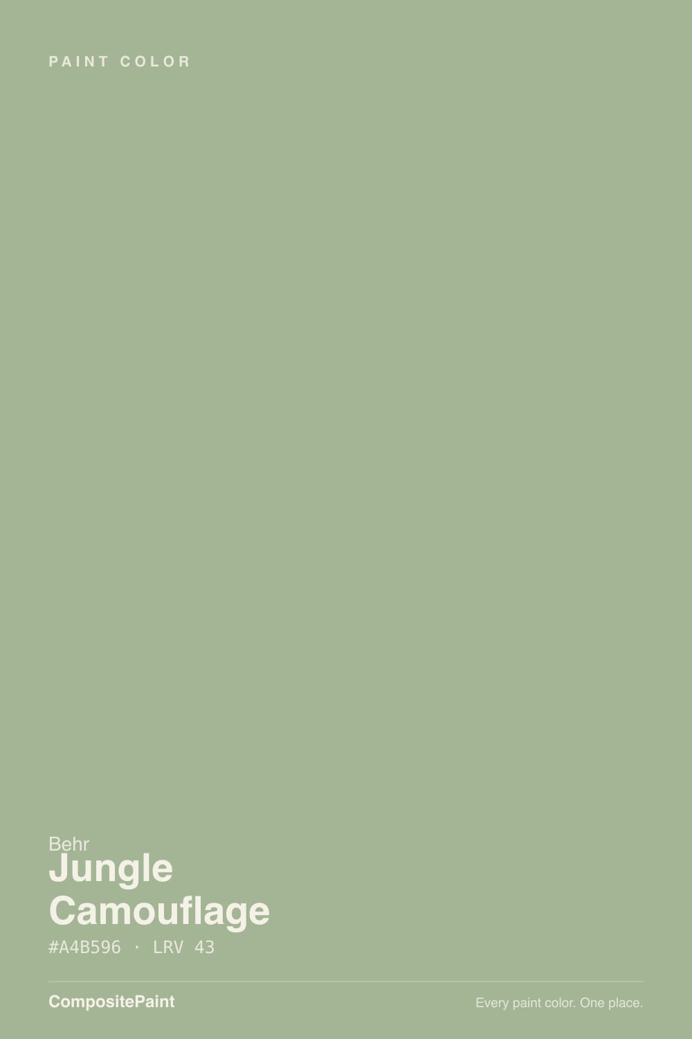
Start with the name, because it is the first thing every buyer has to get past. "Jungle Camouflage" sounds like a drab, murky olive built to disappear into foliage — and the paint is nothing like that. Behr's own material describes it as a relaxed gray-green, and in person it reads as a clear, warm sage: yellow-green at its base, with a soft brown-olive undertone that keeps it earthy rather than minty. It is one of the more misleadingly named colors in the Behr deck, and that mismatch is worth knowing before you buy a sample, not after.
At LRV 38 it is a genuine mid-tone — noticeably deeper than the pale, whisper-sages that barely register as green (October Mist, LRV 39, sits close by but reads lighter and cooler), and noticeably lighter than a designer cabinet green like Evergreen Fog (LRV 30). That middle position is the practical payoff: it holds its color in a bright room without going dark and heavy, and it does not wash out to nothing the way pale sages can in strong sun.
Undertone in one line: warm, yellow-green first, earthy olive-brown second — never blue, never a true cool gray. If your sample reads flat and grayish, the light in the room is cool or dim, not the paint's actual undertone.
Where It Shines
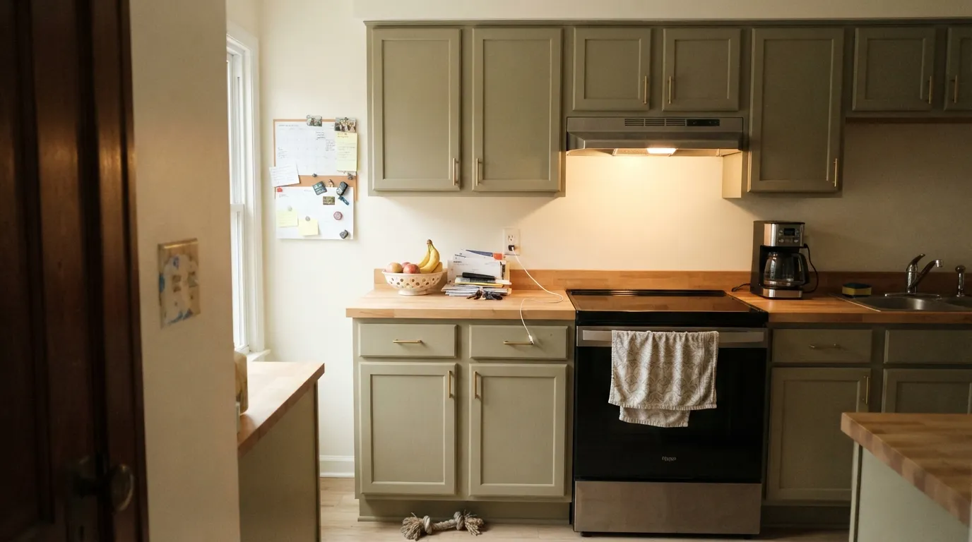
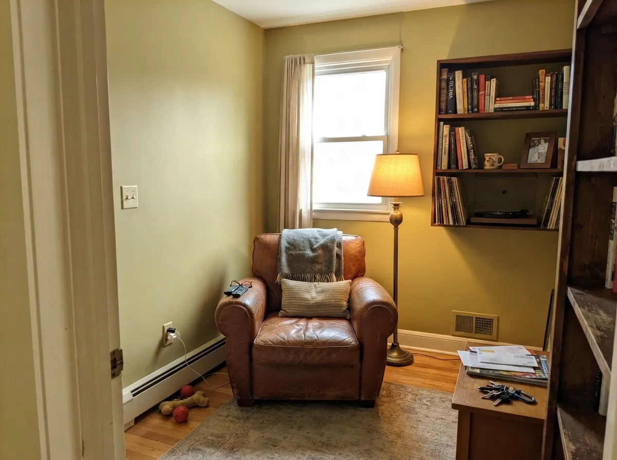
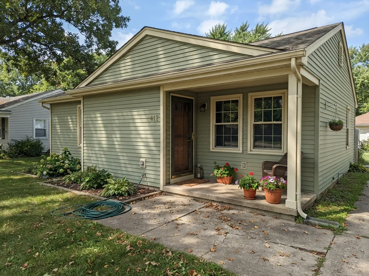
Give it real daylight and warm materials and it stops being "the weird camo one" and starts being one of the easier greens to live with. It is a genuine dual-duty color — the same can does kitchen cabinets under brass hardware and full exterior siding on a farmhouse or split-level ranch, which is rarer than it sounds. Indoors, walnut shelving, leather, and butcher block bring out the warm side; outdoors, full sun reads it as a settled, natural green rather than anything trendy.
Where It Fails
The complaints this color earns are less about drama and more about mismatched expectations — starting with the name itself. None of the three below are the paint's fault, but each one predicts a disappointed buyer before the first coat goes on.
Buyers who pick this off the name alone, expecting a murky tactical green, are consistently surprised by how soft and livable it actually is. That surprise cuts both ways: some people love the mismatch, but if you specifically wanted a heavy, military-drab green for a themed room, this is the wrong can — look at something with lower LRV and more black in the mix instead.
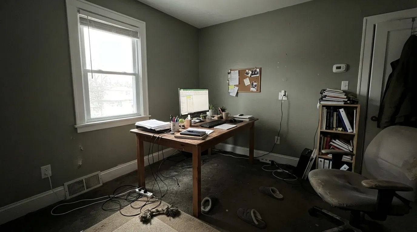
It is a warm-based color, so a north-facing room or cool 5000K LEDs pull the yellow out and leave a flatter, muddier gray-green behind. It does not go ugly, exactly — it just goes quiet and a little drab. Warm 2700K bulbs and any real daylight bring the sage back.
Pair it with a bright, blue-leaning white (extra-white trim territory) and the contrast makes the wall look dingy by comparison, the same trick that trips up almost every mid-tone color. A warm off-white trim — cream, not blue-white — keeps the wall reading intentional instead of dirty.
Room by Room
With brass or bronze pulls and a butcher-block or warm-stone counter, this is genuinely one of the easier sage cabinet colors to commit to. Satin or semi-gloss cabinet enamel; it hides scuffs around handles better than a lighter color would.
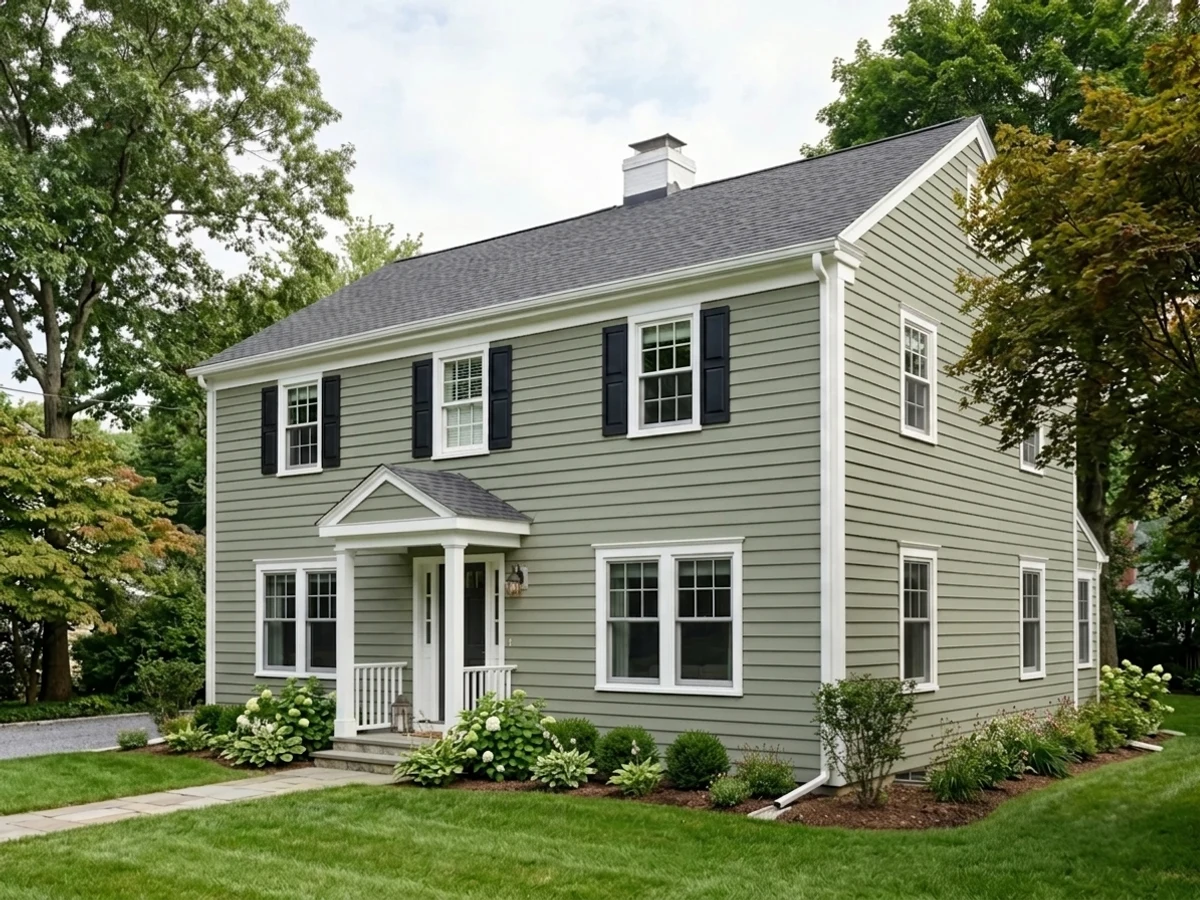
In full sun it reads as a settled, natural green rather than anything trend-chasing, which is exactly why Behr features it for split-level ranch and farmhouse exteriors. Pair it with a warm trim white and a near-black door, not a cool blue-white.
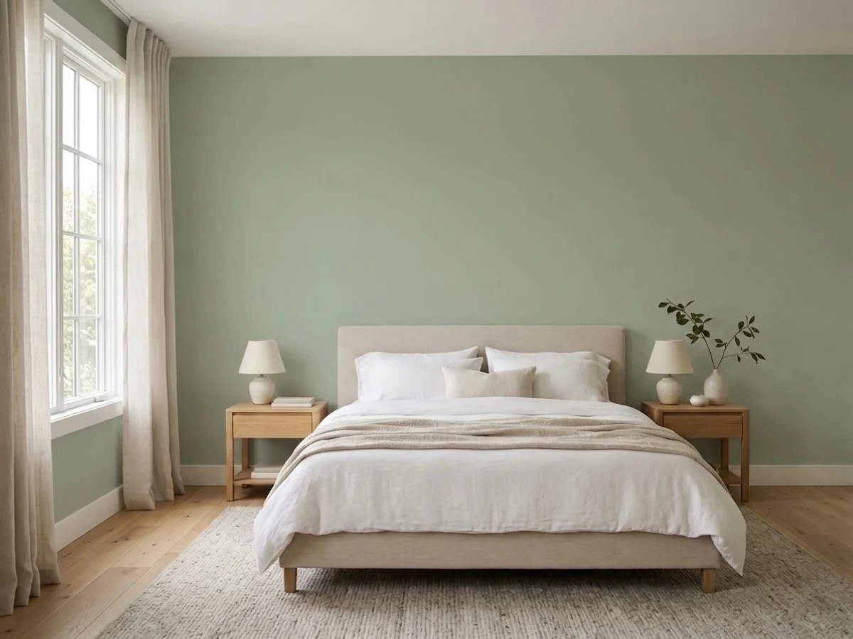
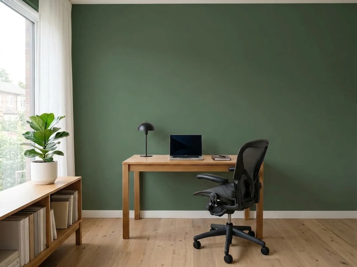
Walnut shelving, leather chairs and brass lamp light are its best company; the mid-depth color keeps a small room from feeling either stark or cave-like. Eggshell for durability where a desk chair scuffs the wall.
Works best as a deliberate choice, not a safe-default one — pair with warm neutrals (sand, taupe, ivory) rather than cool grays, and expect guests to notice it is green, not read it as a texture.
Calm and grounding at night under 2700K light. Skip it for a north-facing bedroom that never gets warm lamps turned on before dark — it will read duller than the chip promised.
Warm-toned tile, wood vanities and brass fixtures let it shine. Cool gray or blue-veined marble fights it the same way it fights any warm color; sample big before committing next to cold stone.
Your Light Is the Risk
The yellow-green base glows and the earthy olive undertone comes forward. This is the light that matches the chip.
Cool daylight drains the warmth and leaves a flatter, muddier gray-green. Test a big sample here before committing.
Warmer and more olive at the sun hours, quieter and more neutral the rest of the day — a gentle shift, not a new color.
2700K lamps: warmer, more olive, closer to its best self. Cool white LEDs: flat and gray-leaning — swap the bulb before you blame the paint.
Most complaints about Jungle Camouflage are a light mismatch. Upload a photo of your actual room and see it on your walls — then ask for the same wall in north light or evening lamps before you buy a single sample.
Need It From Another Brand?
Any paint counter can custom-tint Behr N350-4 directly. If you would rather stay in one brand's own deck, these are the closest stock matches, measured as ΔE2000. Under 2 is a difference you will not see on the wall.
| Brand | Closest color | ΔE | LRV | |
|---|---|---|---|---|
| Sherwin-Williams | Frosted FernSW 9648 · Sherwin-Williams | 1.5 | 38 | Color page → |
| Benjamin Moore | Jockey Hollow GrayHC-108 · Benjamin Moore | 2.0 | 39 | Color page → |
| Valspar | Afternoon NapT679 · Valspar | 0.6 | 39.5 | Color page → |
| PPG / Glidden | AldabraPPG14-28 · PPG / Glidden | 1.3 | 38 | Color page → |
| Glidden | Whispering Willow60YY 38/120 · Glidden | 1.4 | 38 | Color page → |
| Dutch Boy | Greywood423-3DB · Dutch Boy | 0.6 | 38 | Color page → |
Similar Behr Colors
The nearest shades to Jungle Camouflage within Behr's own range, ranked by perceptual color distance — useful when you want the same look a touch lighter, darker, or warmer.
WCAG 2.1: AA is 4.5 : 1 for normal text, 3 : 1 for large text, AAA is 7 : 1.
Jungle Camouflage vs the Colors You're Also Considering
Every Jungle Camouflage sample board has the same rivals on it. The numbers show the real lightness gap — then it comes down to which risk you would rather live with.
Pick this for more visible green and more warmth — Jungle Camouflage holds its color better in direct sun.
Sherwin-Williams SW 6178 · LRV 41Clary SagePick this if you want the quieter, more gray-leaning member of the sage family — it can read almost taupe in low light.
Pick this for a lighter, easier wall or exterior green that is not chasing a moment.
Sherwin-Williams SW 9130 · LRV 30Evergreen FogPick this for the deeper, more famous designer sage that owns the cabinet-green trend right now.
Within Behr, Willow Grove PPU11-06 at LRV 42 and hex #A6B291 is the closest neighbor, marginally darker and a shade more yellow. Confederate N370-4 at LRV 43 and hex #A1B49E is the same lightness but cooler and bluer, so it reads more sage and less khaki. Field Khaki BXC-22 at LRV 44 and hex #ACB494 goes the other way, clearly warmer.
Across brands, Diamond Vogel Hidden Glade 0744 at LRV 41 has a deltaE of 1.62 and Benjamin Moore Palisades Park 439 at LRV 43 is at 1.74, so both are visually identical to Jungle Camouflage in normal room light. Valspar Rolling Glen 5007-5C at LRV 43 is at 2.02 and Sherwin-Williams Haven SW 6437 at LRV 42 is at 2.68, very close but worth sampling, with Haven reading a bit more yellow. PPG Gargoyle PPG1127-4 at LRV 43 is at 4.66, close but visibly grayer side by side.
Jungle Camouflage Coordinating Colors
The rule for coordinating with Jungle Camouflage is the same rule that governs any warm mid-tone: stay warm, and give it warm metals. It pairs best with creams and warm off-whites, warm wood, brass and bronze, and a near-black for contrast — and it argues with cool blue-whites and cool gray stone. These are the partners that keep showing up in rooms and exteriors that work:
The Name Doesn't Match the Paint
"Jungle Camouflage" is an unusually misleading name for what this color actually is. It sits in Behr's larger deck of evocative, atmospheric names, and it reads more like a marketing flourish than a description — the paint underneath is a relaxed, livable sage, not a drab tactical green. Behr's own material calls it a subtle, gray-forward green suited to both interior and exterior work, and the company has given it a modest "Color of the Month" nod rather than any Color of the Year campaign or viral moment.
That honest, under-the-radar positioning is worth knowing going in. This is not a famous color with a designer origin story or a trend cycle attached to it — it is a dependable, warm sage that has quietly done kitchen cabinets and farmhouse exteriors without much fanfare. If you came here chasing hype, there is not much; if you came here for a genuinely usable green that will not date itself, that quietness is the point.
Jungle Camouflage With Wood Tones and Floors
Because its own undertone is yellow-green rather than blue-green, this color gets along with warm wood better than most sages do. Walnut, white oak, and cedar all sit comfortably next to it — the shared warmth means neither the wall nor the floor has to fight the other for temperature.
Very orange, high-gloss honey oak is the one pairing to sample first. It will not clash the way a true cool sage would against warm wood, but two warm-leaning surfaces stacked together can occasionally read a little flat rather than tense — less a fight, more a lack of contrast. A darker rug or a warmer trim white usually solves it. Brass, bronze, and matte black hardware are all safe; polished chrome is the only metal that leans noticeably cold against it.
Three Ready Palettes Built on Jungle Camouflage
A color is never alone on the wall. These are complete combinations in the 60-30-10 pattern, with the reason each one holds together. Every one opens in the visualizer.
The pairing Behr itself pushes for split-level and farmhouse exteriors: a warm, settled green siding, a warm cream trim (never a cool blue-white, which fights the green), and a near-black door for the one sharp accent the scheme needs.
Try this palette in your roomA soft warm-white wall keeps the room bright while the cabinets carry the color; the near-black hood gives the eye one dark anchor. Add brass or bronze pulls — this pairing is built for warm metals, not chrome.
Try this palette in your roomWhite Dove's warmth keeps the trim from turning the sage muddy by contrast — a stark cool white would. Wrought Iron on shelving gives the room one deep, grounding note without repainting the walls.
Try this palette in your roomJungle Camouflage FAQ
Is jungle camouflage actually a camouflage color?
No — and that mismatch trips up a lot of buyers. Despite the name, it is a soft, warm sage green, not a drab tactical or military color. If you want an actual camo-drab green, look for something with a lower LRV and more black mixed in; this is a livable neutral-adjacent green, not costume paint.
Is Jungle Camouflage warm or cool?
Warm. It has a yellow-green base with an earthy, olive-brown undertone, and it never turns blue or truly cool. In dim or north light it can look flatter and grayer, but that is the light draining the warmth out, not a cool undertone showing through.
Does it work on kitchen cabinets?
Yes — it is arguably its best use. Pair it with brass or bronze hardware and a warm counter (butcher block, warm-toned stone) and it reads custom without being loud. Use a satin or semi-gloss cabinet enamel, not a wall flat.
What white goes with Jungle Camouflage trim?
A warm off-white or cream — Behr Blank Canvas or Swiss Coffee, not a stark, blue-leaning white. A cool bright white makes the green read dingy by contrast, the same problem that trips up most mid-tone colors next to the wrong trim.
Does it work on exteriors?
Yes. Behr specifically positions it for farmhouse and split-level ranch exteriors, and full outdoor sun reads it as a settled, natural green rather than anything trend-chasing. Pair with a warm trim and a near-black door for contrast; avoid cool blue-white trim.
Does it clash with honey oak floors?
It is more forgiving than most greens because its own base is yellow-green rather than blue-green, so it does not fight golden wood the way a cool sage would. Walnut and white oak are the easiest partners; with very orange honey oak, sample first — warm-on-warm can occasionally read a little flat rather than clashing outright.
Have you painted with Jungle Camouflage?
Rate it — one tap helps the next reader decide.
Ask a Question