Frosted Fern
A quiet gray-green sage reviewed honestly: where it reads as real green, where it flattens to plain gray, and the near-identical colors already sitting in our deck.

Jessica has spec'd whites and neutrals for more than 300 rooms and keeps a sample wall of painted drawdowns in her studio. Every color review is checked against real reader rooms in the comments and re-tested when a formula changes. About the testing process →
- 1Anonymous20
- 2Felted Wool28
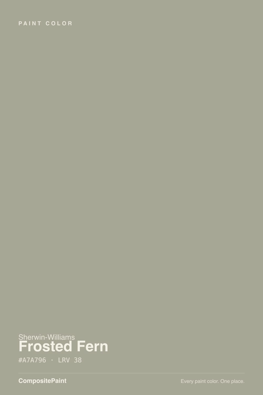
- 3Frosted Fern38
- 4Agreeable Gray60
- 5Balboa Mist66
The Fast Verdict
Frosted Fern is a muted gray-green that Sherwin-Williams itself files under Neutral — and on paper, so do we. On the wall it is more honest than that filing: give it real daylight and the fern comes forward, unmistakably green. Take the light away and the green retreats, leaving a soft, slightly cool gray. Neither read is wrong; both are the same paint being accurate about the room it's in. What it is not is rare — several colors already in this deck sit within a hair of the same hex and LRV.
Bright kitchens and bedrooms · calm home offices with real daylight · spa-leaning bathrooms · anyone who wants a sage without committing to a loud green
You want a true, flat gray with zero color · your room runs on cool LEDs or stays dim all day · you already own October Mist, Sage Wisdom, or Clary Sage · you need an exterior color with a long track record
- A genuine, calm sage-gray — not a full-commitment green
- Reads warmer and greener in real daylight, cooler and quieter in shade
- Flatters both white cabinetry and darker accents
- Works in kitchens, bedrooms, and bathrooms without feeling themed
- Mid-depth LRV hides everyday scuffs better than a pale neutral
- Filed as Neutral / Gray, but the green is unmistakable in good light — a surprise for gray-seekers
- Goes flat and cold under cool LEDs or in a dim north room
- Nearly indistinguishable from several already-popular sages in this deck
- Little verified exterior track record despite being marketed for siding
What Color Is Frosted Fern, Really?
A grayed sage with equal parts red and green in its formula and noticeably less blue — a textbook gray-green undertone. Sherwin-Williams lists it in its Neutral family, and our own site's automated color-family sort puts it under Gray, not Green. Both filings are defensible on the chip. Neither one survives contact with a sunlit wall: in real daylight the fern in Frosted Fern is plainly visible, and buyers who picked it expecting a flat, safe gray are the ones who write it up as surprising.
At LRV 38 it sits in the workhorse mid-tone band — not light enough to brighten a dark room, not deep enough to read as a committed statement color. That mid-depth is exactly why the color leans so hard on its light: Sherwin-Williams' own color notes describe it going cooler and grayer in north rooms and under artificial light, then warmer and more clearly green in south and east daylight. This is not a defect specific to Frosted Fern — it is how every muted mid-tone sage behaves — but it means the swatch on the fan deck and the wall in your actual room can look like two different colors.
The part worth knowing before you buy: Frosted Fern is not a distinctive formula. Benjamin Moore's October Mist and Sage Wisdom sit within a single hex step and two LRV points of it, and Sherwin-Williams' own Clary Sage is close enough that almost nobody could pick the right can out of a lineup. If you're choosing Frosted Fern specifically because it looked different from the sage-gray everyone already has, sample it next to those first — there's a real chance it isn't.
Where It Shines
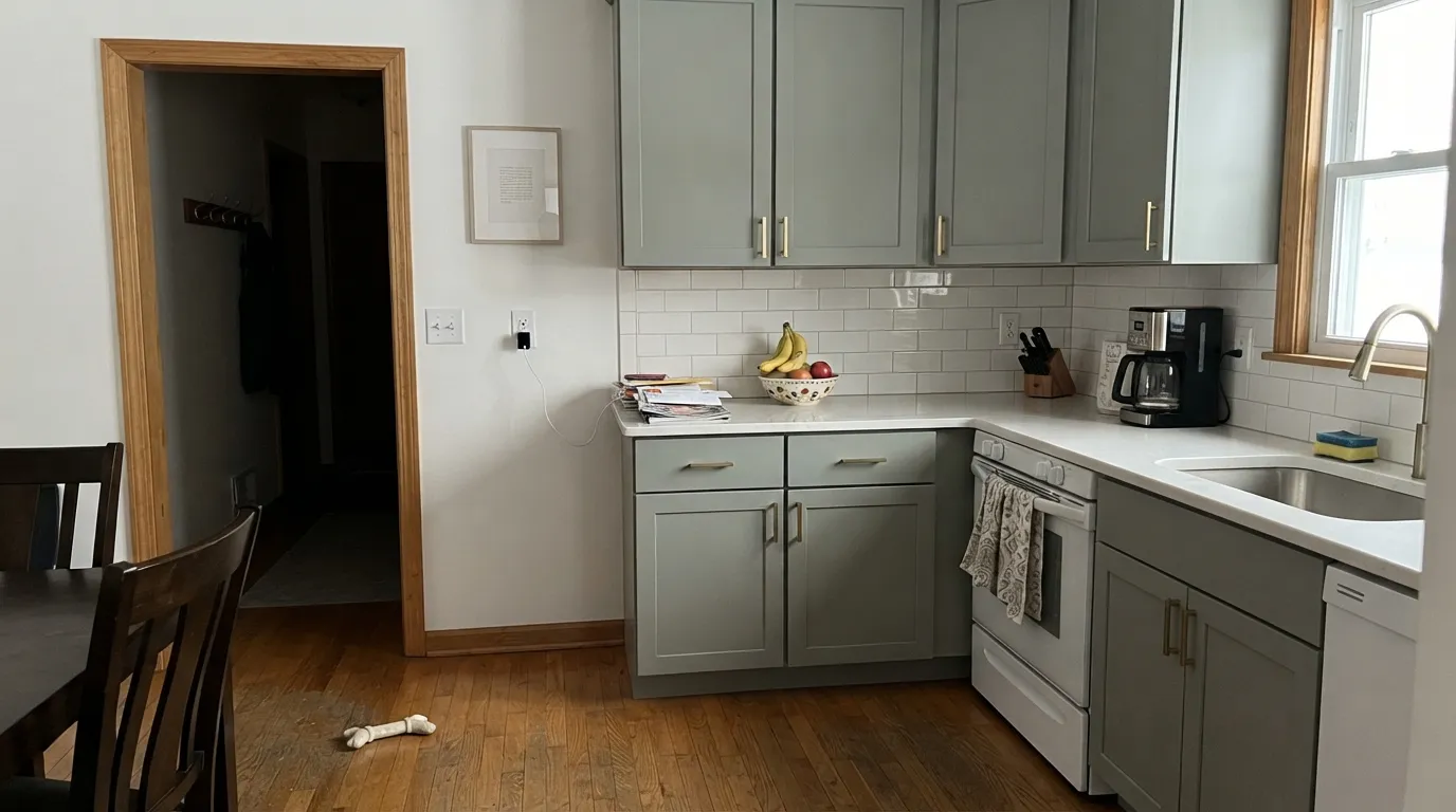
Put it somewhere with genuine daylight — a south- or east-facing kitchen, a bedroom that gets real morning sun — and it does exactly what a good muted sage should: reads as a calm, grounded green without ever tipping into a loud or trendy color. It plays well against both white cabinetry and darker accents, which is why it keeps showing up on homeowner shortlists for kitchen islands and cabinet refreshes. It does not ask a room to commit to "green" the way a saturated forest color would; it asks for good light and gives back a quiet, grown-up sage in return.

Where It Fails
Almost every disappointment with Frosted Fern traces back to one of three mismatches between what the color promises on the chip and what it does on an actual wall. None of them are unique to this paint — they are the standard failure modes of every mid-depth gray-green sage — but they are worth knowing before the gallon is mixed.
Sherwin-Williams catalogs Frosted Fern as Neutral; plenty of shoppers browsing a "safe gray" wall of chips land on it by category. In real daylight the green is not subtle — it is a sage, not a gray with a green whisper. If a flat, colorless gray is the actual goal, this is the wrong can even though the label agrees with you.
The opposite problem: north light and cool-white LEDs pull the warmth and green out and leave a flat, slightly cold gray with none of the sage character that sold the sample. If the room you're painting doesn't get direct daylight for at least part of the day, swap in warm 2700K bulbs before you decide the color failed — the light usually did.
Frosted Fern sits almost on top of Benjamin Moore's October Mist and Sage Wisdom and Sherwin-Williams' own Clary Sage — same undertone, same depth, within a couple of LRV points. If the appeal was picking something distinctive, sample all four side by side first; there's a real chance you can't tell them apart on the wall.
Room by Room
Works well on shaker cabinets or an island against white walls, especially with brass or unlacquered hardware. Homeowners researching kitchen refreshes bring it up specifically as an alternative to the now-ubiquitous forest-green island. Satin or semi-gloss for durability.
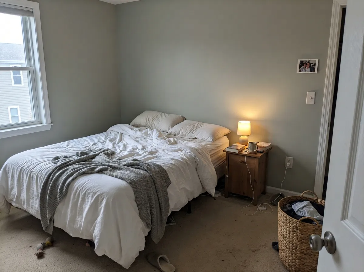
In real daylight it reads like a quiet forest glade without asking for a bold commitment. Eggshell on the walls, a warm white on trim, and 2700K bedside lamps keep the green alive after dark instead of letting it go flat.
On a vanity or in a small powder room it leans calm and green-toned rather than sterile gray, which is the whole appeal of a spa palette. Diffused daylight (a frosted window, a skylight) flatters it more than a windowless bath lit only by cool vanity bulbs.
Genuinely good in a bright, south- or east-facing room with warm wood furniture. In a dim or north-facing living room it tends toward flat and slightly dull — this is the room where the light-dependence shows up most, since living rooms get used at every hour.
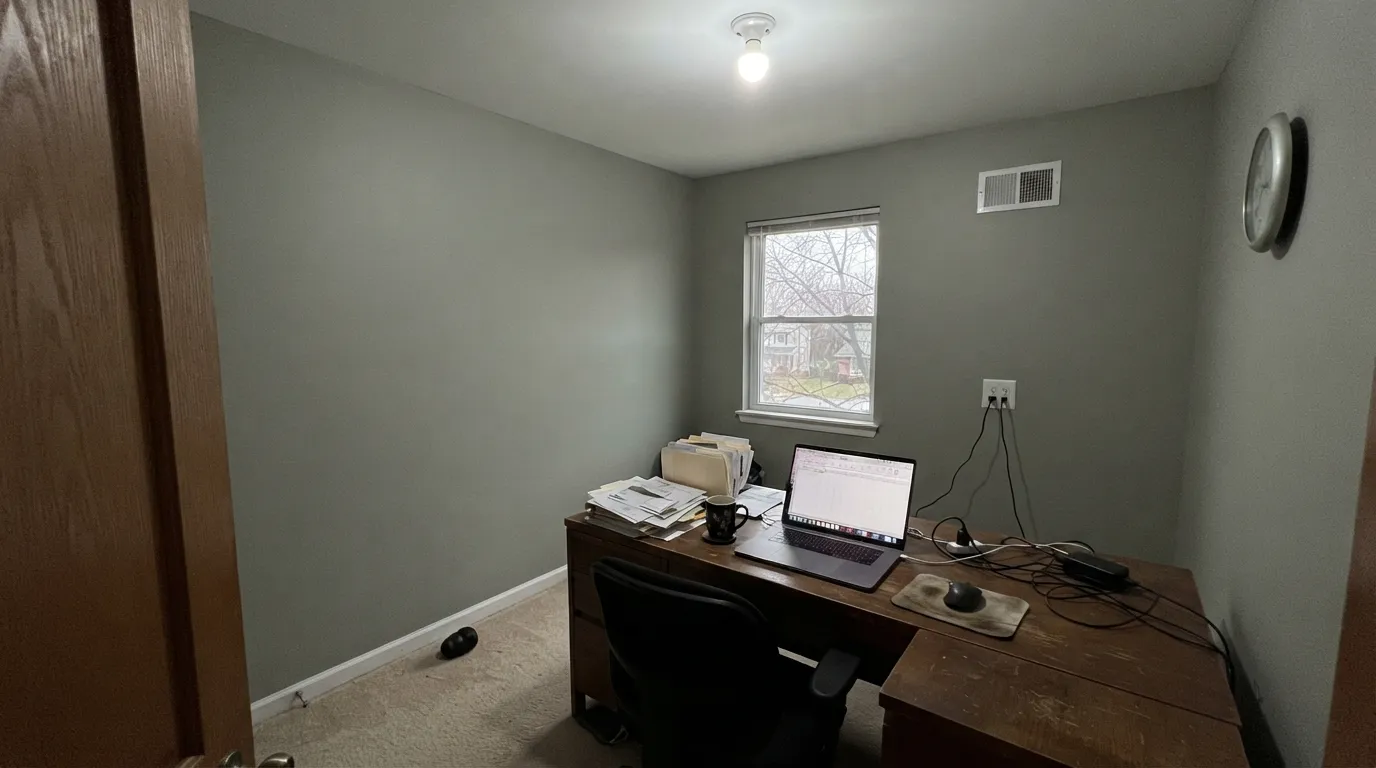
A calm, low-key color for a room meant for focus rather than drama, as long as the desk sits near a real window. Under all-day fluorescent or cool-LED office lighting it loses most of its personality.
Sherwin-Williams' own marketing suggests it for siding and trim, but there is little independent track record to confirm how it weathers or reads in full sun versus shade. Sample a large board outdoors before committing a whole house to it.
Your Light Is the Risk
The green comes forward and the color reads warmer and livelier — the clearest, most honest version of Frosted Fern.
Cool artificial and north daylight strip the green out and leave a flat, slightly cold gray. Test with warm bulbs before judging it.
Fresh and clearly green in soft east morning light; noticeably more muted and subdued by west afternoon light.
Warm 2700K lamps keep the sage character alive after dark. Cool white bulbs push it toward a flat gray-taupe with the green mostly gone.
Most complaints about Frosted Fern are a light mismatch. Upload a photo of your actual room and see it on your walls — then ask for the same wall in north light or evening lamps before you buy a single sample.
Need It From Another Brand?
Any paint counter can custom-tint Sherwin-Williams SW 9648 directly. If you would rather stay in one brand's own deck, these are the closest stock matches, measured as ΔE2000. Under 2 is a difference you will not see on the wall.
| Brand | Closest color | ΔE | LRV | |
|---|---|---|---|---|
| Behr | Simply SagePPU10-16 · Behr | 0.5 | 38 | Color page → |
| Benjamin Moore | ChateauCSP-140 · Benjamin Moore | 3.8 | 37 | Color page → |
| Valspar | Afternoon NapT679 · Valspar | 1.7 | 39.5 | Color page → |
| PPG / Glidden | Wandering WillowPPG1031-3 · PPG / Glidden | 1.0 | 38 | Color page → |
| Glidden | Wandering WillowPPG1031-3 · Glidden | 1.0 | 38 | Color page → |
| Dutch Boy | Greywood423-3DB · Dutch Boy | 2.1 | 38 | Color page → |
Similar Sherwin-Williams Colors
The nearest shades to Frosted Fern within Sherwin-Williams's own range, ranked by perceptual color distance — useful when you want the same look a touch lighter, darker, or warmer.
WCAG 2.1: AA is 4.5 : 1 for normal text, 3 : 1 for large text, AAA is 7 : 1.
Frosted Fern vs the Colors You're Also Considering
Every Frosted Fern sample board has the same rivals on it. The numbers show the real lightness gap — then it comes down to which risk you would rather live with.
Pick this if you're already committed to the Sherwin-Williams deck; the two are near-identical twins either way.
Benjamin Moore 1495 · LRV 39October MistPick this if your painter works in Benjamin Moore — the hex and LRV are close enough that almost nobody could tell them apart on a wall.
Pick this for a touch more depth and a slightly grayer cast.
Sherwin-Williams SW 6178 · LRV 41Clary SagePick this for a hair lighter, slightly warmer version of the same idea, still in the SW deck.
Within the Sherwin-Williams deck, Rare Gray (SW 6199), hex #A6A69B, shares the LRV of 38 but carries less yellow, so it reads more like a straight gray. Coastal Plain (SW 6192), hex #9FA694 at LRV 37, is greener and reads as a proper sage. Ethereal Mood (SW 7639), hex #AEA594, and Gray Area (SW 7052), hex #AFA696 at LRV 39, both tip toward beige and lose most of the green.
Across brands, Behr Simply Sage (PPU10-16) at a color difference of 0.53 and Glidden Wandering Willow (PPG1031-3) at 0.97 are effectively the same color, both at LRV 38. Rodda Buried Fossil (R057) at 1.17, C2 Bramble (C2-957) at 1.24, Dunn-Edwards Whale Watching (DET512) at 1.29, and Valspar Afternoon Nap (T679) at 1.69 all look identical in normal room light.
Dutch Boy Greywood (423-3DB) at 2.09 is very close but worth sampling. Benjamin Moore Chateau (CSP-140) at 3.78 and Farrow and Ball Light Gray (No. 17) at 4.94 are close but visibly different side by side, both leaning warmer.
Frosted Fern Coordinating Colors
Keep the room bright enough to let the green show, and give it one deep, green-leaning dark for contrast rather than a stark black — that's the whole coordinating strategy. These are the partners that keep showing up in the rooms that work:
A Fern With Several Twins
Frosted Fern is not a distinctive formula, and it's worth saying plainly rather than dressing it up. Benjamin Moore's October Mist sits within a single hex step and 1 LRV of it; Benjamin Moore's Sage Wisdom is closer still; Sherwin-Williams' own Clary Sage is close enough that most painters couldn't match the right can to the right wall from memory. This is not a knock on the color's quality — it's a genuinely fine, workable gray-green — it's a note about how crowded the mid-depth sage category has gotten across every major deck.
The practical upshot: if you're drawn to Frosted Fern specifically because you haven't seen it everywhere, sample it next to October Mist or Clary Sage before you commit to a brand or a can. There's a real chance the color you actually want is whichever one is easiest for your painter to source, because on the wall they will likely behave the same way.
Frosted Fern With Wood Tones and Floors
White oak, walnut, and painted millwork all sit comfortably with Frosted Fern — the wood provides the warmth the paint itself only offers in good light, and the pairing feels calm rather than staged. Brass and unlacquered hardware read well against it for the same reason they work with most muted sages.
Very orange or heavily honey-toned oak floors are the one combination to sample carefully. Because Frosted Fern's green only fully commits in strong daylight, in a room with dominant warm-orange flooring the wall can read a little muddy rather than complementary if the light is anything less than ideal. A large sample board next to the actual floor, viewed at different times of day, settles it faster than guessing.
Three Ready Palettes Built on Frosted Fern
A color is never alone on the wall. These are complete combinations in the 60-30-10 pattern, with the reason each one holds together. Every one opens in the visualizer.
Pure White keeps the room bright enough for Frosted Fern's green to actually show up, and Rock Bottom on the island — itself a near-black with a green undertone — ties back to the cabinets instead of fighting them.
Try this palette in your roomWhite Dove's warmth keeps the sage from reading cold, and Wrought Iron gives the room one deep, green-leaning near-black note so the palette feels deliberate rather than accidental.
Try this palette in your roomSea Salt and Frosted Fern are both gray-greens a good distance apart on the LRV scale, so the vanity reads as a deliberate deeper note rather than a mismatch. Alabaster trim keeps the small room from feeling closed in.
Try this palette in your roomFrosted Fern FAQ
Is Frosted Fern gray or green?
Both, depending on the light — and that's not a dodge, it's the honest answer. Sherwin-Williams files it as Neutral, and our own site's color sort puts it under Gray, but in real daylight the green is plainly visible. In a dim or north-facing room, or under cool LEDs, it reads much closer to plain gray. Sample it in your actual room before deciding which one you're getting.
What's the difference between Frosted Fern and October Mist?
On paper, almost nothing — the hex values and LRVs are a hair apart. The real difference is which brand's deck and sheen lineup you're already buying into. If you like one, sample the other before assuming you need both.
Does Frosted Fern work in a north-facing room?
It can, but plan for it to read flatter and grayer than the chip promises, with less of the green that makes the color interesting. Warm 2700K bulbs help; if the room stays dim all day and you refuse to add warm lamps, pick a color that isn't relying on daylight to show its color.
What trim white goes with Frosted Fern?
Pure White or Alabaster, both in the Sherwin-Williams deck, keep the room bright and let the sage do the work. A warmer white like White Dove softens the contrast further if you want a cozier, less graphic look.
Is Frosted Fern good for kitchen cabinets?
Yes — it's one of the more common uses homeowners bring it up for, especially as an alternative to a full dark forest-green island. Use a satin or semi-gloss cabinet-rated enamel and pair it with white walls so the room has enough light to show the green.
Will Frosted Fern look dated in a few years?
Muted sage-grays as a category have staying power — they behave more like a neutral than a trend color. The bigger practical risk isn't dating, it's redundancy: it's so close to colors like October Mist and Clary Sage that picking it specifically for its own identity may not get you one.
Have you painted with Frosted Fern?
Rate it — one tap helps the next reader decide.
Ask a Question