Softened Green
The green-gray that shows up on more moodboards than living rooms, reviewed honestly: where it earns the name, the light that flattens it, and what to pick instead.

Jessica has spec'd whites and neutrals for more than 300 rooms and keeps a sample wall of painted drawdowns in her studio. Every color review is checked against real reader rooms in the comments and re-tested when a formula changes. About the testing process →
- 1Sage Green22
- 2Evergreen Fog30
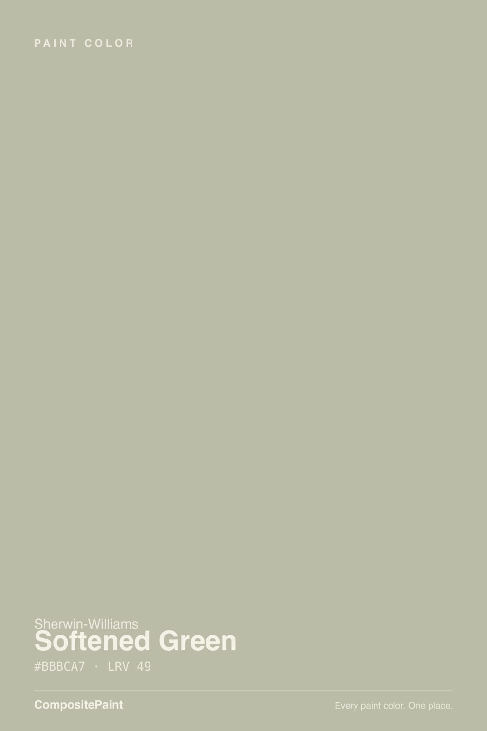
- 3Softened Green49
- 4Soft Fern57
- 5Hancock Green66
The Fast Verdict
Softened Green is Sherwin-Williams filing a genuinely gray-leaning color under "green" and being right about it either way. It is a muted, mid-depth gray-sage — enough green to read as a color, enough gray to behave like a neutral, and it moves between the two depending on the light in the room. Give it real daylight and warm wood and it is a calm, grown-up green for people who insist they don't like green. Shut it in a windowless room and it goes flat, olive-drab gray. It is a workhorse, not a headline color — no Color of the Year run, no viral room — and that quiet consistency is exactly the case for it.
Living rooms and dens with real daylight · home offices and reading rooms · kitchen islands and cabinets · anyone who wants green but keeps flinching at green paint chips
The room has no window · you want an unmistakably green wall, not a maybe-gray one · your fixed finishes are cool blue-white or icy chrome · you're judging it off the tiny fan-deck chip alone
- Green for people who say they don't like green — reads as a sophisticated neutral first
- Holds real color at LRV 49 without darkening a room
- Genuinely versatile across traditional, farmhouse and contemporary styles
- One of the better mid-tone choices for kitchen islands and lower cabinets
- Coordinates cleanly with warm whites, white oak, brass and rattan
- Goes flat, muddy olive-gray in windowless or dim north rooms
- The small fan-deck chip badly undersells how much green shows on a full wall
- Reads murky next to cool blue-white trim or chrome
- Easy to mistake for "just gray" if you never see it in strong light
What Color Is Softened Green, Really?
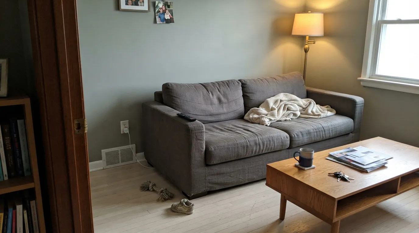
A gray base carrying a muted, grayed-down green — sage more than moss, and never bright. Sherwin-Williams shelves it in the green family; cross-reference it against the site's own neutral-family data and it also qualifies as a warm neutral. Both filings are correct, and that dual citizenship is the entire personality: in strong, warm light the green steps forward and it reads sage; in flat or cool light the gray takes over and it reads as a soft warm-neutral greige. It is not an indecisive color so much as an honest one — it is telling you what your light actually is.
At LRV 49 it sits dead in the middle of the reflectance scale — deep enough to read as a real color choice, light enough that a normal room does not go dark. That middle position is also why the fan-deck chip is famous for undermining it: a 3-inch chip under fluorescent store light flattens the green and shows almost pure gray, which is not what a full wall in real daylight does. Sample it big, on an actual wall, before deciding it is boring.
Undertone in one line: green first, gray doing the grounding — never blue, never yellow-chartreuse. If your sample looks like plain warm gray, that is a dim or north-facing room talking, not the paint; give it a sunnier wall or a lamp before you rule it out.
Where It Shines
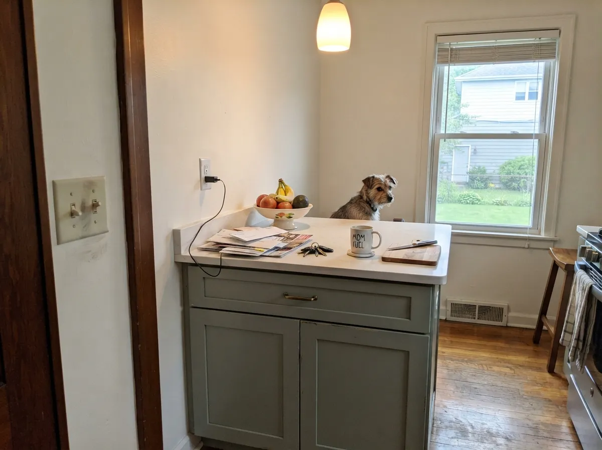
It earns its keep in rooms with a real window and some warm material to bounce off of. South and west light pull the green forward into a genuine, confident sage; pair that with white oak, rattan, jute or brass and the color reads considered rather than trendy. Its other strong lane is the kitchen island or a bank of lower cabinets under a lighter wall — deep enough to look intentional against white or cream, without committing an entire kitchen to green the way a full-saturation forest tone would.
Where It Fails
Nearly every disappointed review of Softened Green traces back to one of three predictable mistakes, and none of them are the paint's fault.
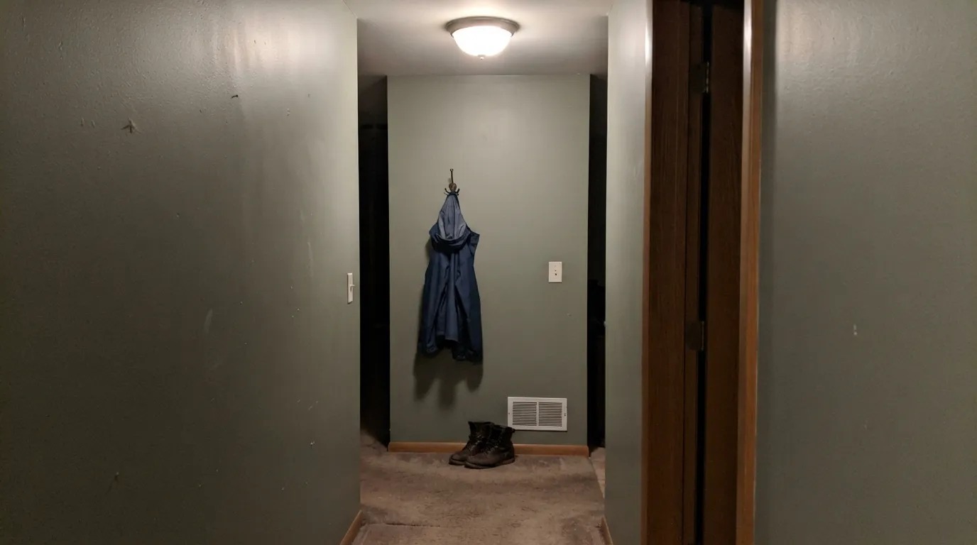
Without daylight to pull the green forward, the gray base wins completely and the wall settles into a flat, slightly muddy olive-gray — the one look nobody actually wanted. This color needs a light source, natural or a warm lamp, to show its green side at all. Skip it in interior powder rooms and dim back hallways.
The 3-inch fan-deck sample undersells this color badly — store lighting and the small surface area flatten it toward plain gray. Readers who buy a quart and roll a real 4-by-4-foot sample on the actual wall consistently report more green and more personality than the chip promised. Never make the final call from the deck alone.
This is a warm-leaning neutral-green, and stark blue-white trim or icy chrome fixtures fight its temperature — the wall starts to look murky and dingy instead of calm. Warm whites (Alabaster, Greek Villa) and warm metals (brass, aged bronze) are the correct company; save the crisp cool-white trim for a true gray.
Room by Room
With any real daylight it is a calm, grown-up backdrop that flatters wood furniture without going full-forest. Eggshell on the walls; keep the trim warm, not stark.
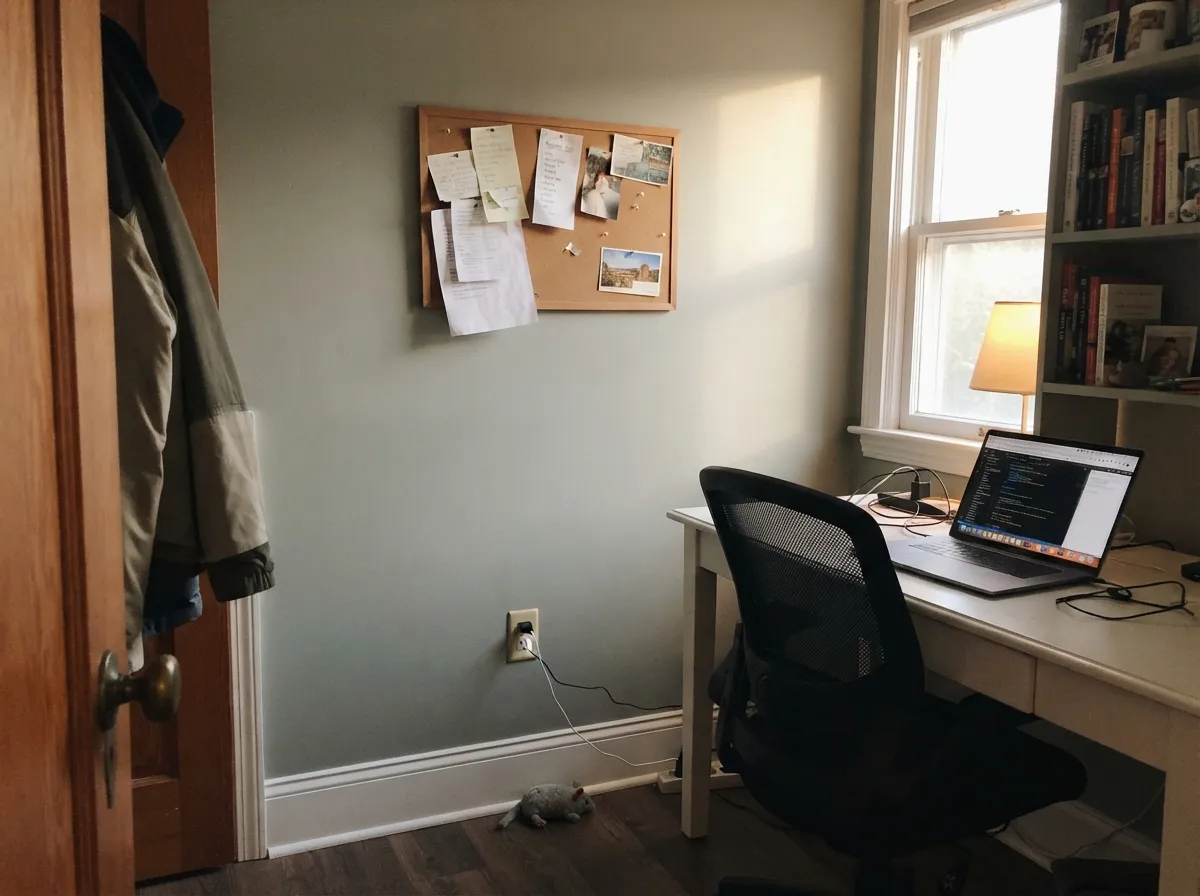
Muted enough not to fight a screen all day, colored enough not to be sterile. One of the more requested "calming but not boring" office colors in this LRV range.
On an island or lower cabinets under a lighter wall it reads intentional and current without betting the whole kitchen on green. Satin cabinet enamel; brass or aged-bronze hardware over chrome.
Restful rather than dramatic, and it settles further toward gray-quiet after dark under warm bulbs. Skip it in a bedroom with only one small north window and no lamps.
In a bathroom with a real window it is a soft, spa-like neutral-green. In a windowless powder room it is the single worst fit on this list — go with a true gray or a warm white instead.
At LRV 49 it holds its own on a facade without reading dark, and it sits comfortably beside white trim and stone. It shows up far less often outdoors than as an interior pick, mostly because homeowners default to it as a living-room color first.
Your Light Is the Risk
Strong warm daylight pulls the green fully forward into a confident, genuine sage. This is the light to sample it in.
Without daylight the gray base takes over completely and the wall reads flat, muddy olive-gray. Needs a light source to show its color at all.
Sage in the morning or late-day sun hours, quieter gray-green in between. The shift is gentle, not a different color.
2700K lamps keep it warm and settle it toward a quiet gray-green at night. Cool white LEDs flatten it back toward plain gray — swap the bulb before you blame the paint.
Most complaints about Softened Green are a light mismatch. Upload a photo of your actual room and see it on your walls — then ask for the same wall in north light or evening lamps before you buy a single sample.
Need It From Another Brand?
Any paint counter can custom-tint Sherwin-Williams SW 6177 directly. If you would rather stay in one brand's own deck, these are the closest stock matches, measured as ΔE2000. Under 2 is a difference you will not see on the wall.
| Brand | Closest color | ΔE | LRV | |
|---|---|---|---|---|
| Behr | Pebble Stone750D-4 · Behr | 2.0 | 49 | Color page → |
| Benjamin Moore | Senora Gray1530 · Benjamin Moore | 3.3 | 48 | Color page → |
| Valspar | Sweet Clover8003-30C · Valspar | 1.1 | 49 | Color page → |
| PPG / Glidden | Heavy HammockPPG1027-3 · PPG / Glidden | 2.8 | 48 | Color page → |
| Glidden | Sacred Olive Green70YY 49/106 · Glidden | 2.0 | 49 | Color page → |
| Dutch Boy | Cathedral Spire423-2DB · Dutch Boy | 2.9 | 50 | Color page → |
Similar Sherwin-Williams Colors
The nearest shades to Softened Green within Sherwin-Williams's own range, ranked by perceptual color distance — useful when you want the same look a touch lighter, darker, or warmer.
WCAG 2.1: AA is 4.5 : 1 for normal text, 3 : 1 for large text, AAA is 7 : 1.
Softened Green vs the Colors You're Also Considering
Every Softened Green sample board has the same rivals on it. The numbers show the real lightness gap — then it comes down to which risk you would rather live with.
Pick this when you want the option to read gray on a dim day — Clary Sage commits to green more fully.
Sherwin-Williams SW 6178 · LRV 41Clary SagePick this for a color one shade deeper and unmistakably green from the first look — the sibling SKU right next door in the deck.
Pick this when you actually want the green to be visible — Soft Sage is the more gray-first of the two.
Sherwin-Williams SW 9647 · LRV 50Soft SagePick this for a near-twin that leans a touch more neutral and warm despite the sage name.
Within Sherwin-Williams the neighbors are separated by very little. Grassland SW 6163 at LRV 50, hex #C1BCA7, is slightly warmer and more beige. Soft Sage SW 9647 at LRV 50, hex #BCBCAE, is a touch grayer and less yellow. Techno Gray SW 6170 at LRV 49 pulls further toward greige, and Hazel Gaze SW 9652 at LRV 51 is the greenest of the group.
Across brands, HGTV Home by Sherwin-Williams Softened Green HGSW 3246 shares the identical hex #BBBCA7 and LRV 49, so it is the same color. Valspar Sweet Clover 8003-30C at deltaE 1.07, Farrow and Ball Vert De Terre No. 234 at 1.2, Rodda Sea Foam CA175 at 1.54, Dunn-Edwards Tickled Crow DEC780 at 1.59, and Clare Money Moves PNT100-MD-48 at 1.72 are all visually identical in normal room light. Behr Pebble Stone 750D-4 at 2.05 and Benjamin Moore Senora Gray 1530 at 3.31 are very close, so sample first.
Softened Green Coordinating Colors
The rule for coordinating with Softened Green is temperature, not hue: stay warm and it behaves; go stark and cool and it starts to look murky. It wants warm whites for trim, deeper members of its own green family for accents, and warm metals over chrome. These are the partners that keep showing up in rooms that work:
A Workhorse, Not a Headline
Softened Green has no Color of the Year run and no viral before-and-after attached to it, and that is worth saying plainly rather than inventing a story to fill the space. It sits in the Sherwin-Williams deck as a genuinely useful mid-depth gray-green — the kind of color a painter or designer reaches for when a client wants "a little bit of green, nothing bold," not the color anyone builds a whole brand campaign around.
That quiet positioning is also its real strength. Because it reads as much neutral as green, it slots into rooms that would reject a truer sage — a formal dining room, a resale-minded living room, a home office that needs to stay calm rather than make a statement. Judge it on that job, not on fame, and it does the job well.
Softened Green With Wood Tones and Floors
White oak, rattan, jute and unlacquered brass are its best company — all warm, all low-contrast, all happy to let the wall's green-gray shift stay subtle rather than fighting it for attention. Walnut and other deep warm woods work too, grounding the color and pushing it a touch more toward its green side.
The pairing to watch is cool, gray-washed flooring or icy white oak with a blue-grey cast. Two cool-leaning neutrals in the same room can cancel each other out, and the wall ends up reading as plain, flat gray instead of the intended green-gray. If your floor is on the cool side, lean on warm brass and wood furniture to pull the green back into the room.
Three Ready Palettes Built on Softened Green
A color is never alone on the wall. These are complete combinations in the 60-30-10 pattern, with the reason each one holds together. Every one opens in the visualizer.
Alabaster keeps the trim warm instead of stark, which is exactly what this color needs to avoid looking murky. Pewter Green as a single dark note — built-ins, a door — deepens the same family without adding a second, competing color.
Try this palette in your roomA warm white keeps the kitchen bright while two depths of the same gray-green family — a mid-tone island, a deeper cabinet base — read as one deliberate color story instead of two different greens competing.
Try this palette in your roomMindful Gray sits almost exactly at the same LRV with none of the green, so the shelving reads as a shade change rather than a clash — a near-monochrome room that still has one wall doing something interesting.
Try this palette in your roomSoftened Green FAQ
Is Softened Green actually green, or is it gray?
Both, honestly — that is the whole point of the color. Sherwin-Williams files it under green; by LRV and behavior it also qualifies as a warm neutral. In strong daylight the green is clearly visible; in a dim or windowless room the gray base takes over almost completely. Sample it on your actual wall before deciding which one you're getting.
Will it look too gray on the paint chip?
Very likely, and that is a known issue with this specific color. The small fan-deck chip under store lighting flattens the green badly. Buy a quart, roll a real sample on the wall, and look at it across a full day before ruling it out — the chip consistently undersells it.
Is it good for kitchen cabinets or an island?
Yes — it is one of its strongest uses. On an island or lower cabinets under a lighter wall it reads current and intentional without committing the whole kitchen to green. Use a satin cabinet enamel and warm hardware (brass, aged bronze) rather than chrome.
What trim color goes with Softened Green?
A warm white — Alabaster or Greek Villa, both semi-gloss. Cool, stark blue-white trim fights this color's warm-neutral-green temperature and can make the wall read murky instead of calm.
Does it work in a room with no windows?
Not well. Without daylight to pull the green forward, the color settles into a flat, muddy olive-gray — the single most common regret with this paint. Save it for rooms with a real window, or at minimum strong warm lamp light.
How is it different from a plain sage green?
It is grayer and quieter than a true sage like Clary Sage or Evergreen Fog — closer to a warm neutral that happens to lean green. If you want a wall that unmistakably reads as green from across the room, size up to one of those instead.
Have you painted with Softened Green?
Rate it — one tap helps the next reader decide.
Ask a Question