Coastal Plain
The sage-green cottage color reviewed honestly: the daylight kitchen it was built for, the cool LED that turns it blue on an island, and the three deck cousins buyers keep confusing it with.

Jessica has spec'd whites and neutrals for more than 300 rooms and keeps a sample wall of painted drawdowns in her studio. Every color review is checked against real reader rooms in the comments and re-tested when a formula changes. About the testing process →
- 1Sage Green22
- 2Evergreen Fog30
- 3Coastal Plain37
- 4Saybrook Sage45
- 5Soft Fern57
The Fast Verdict
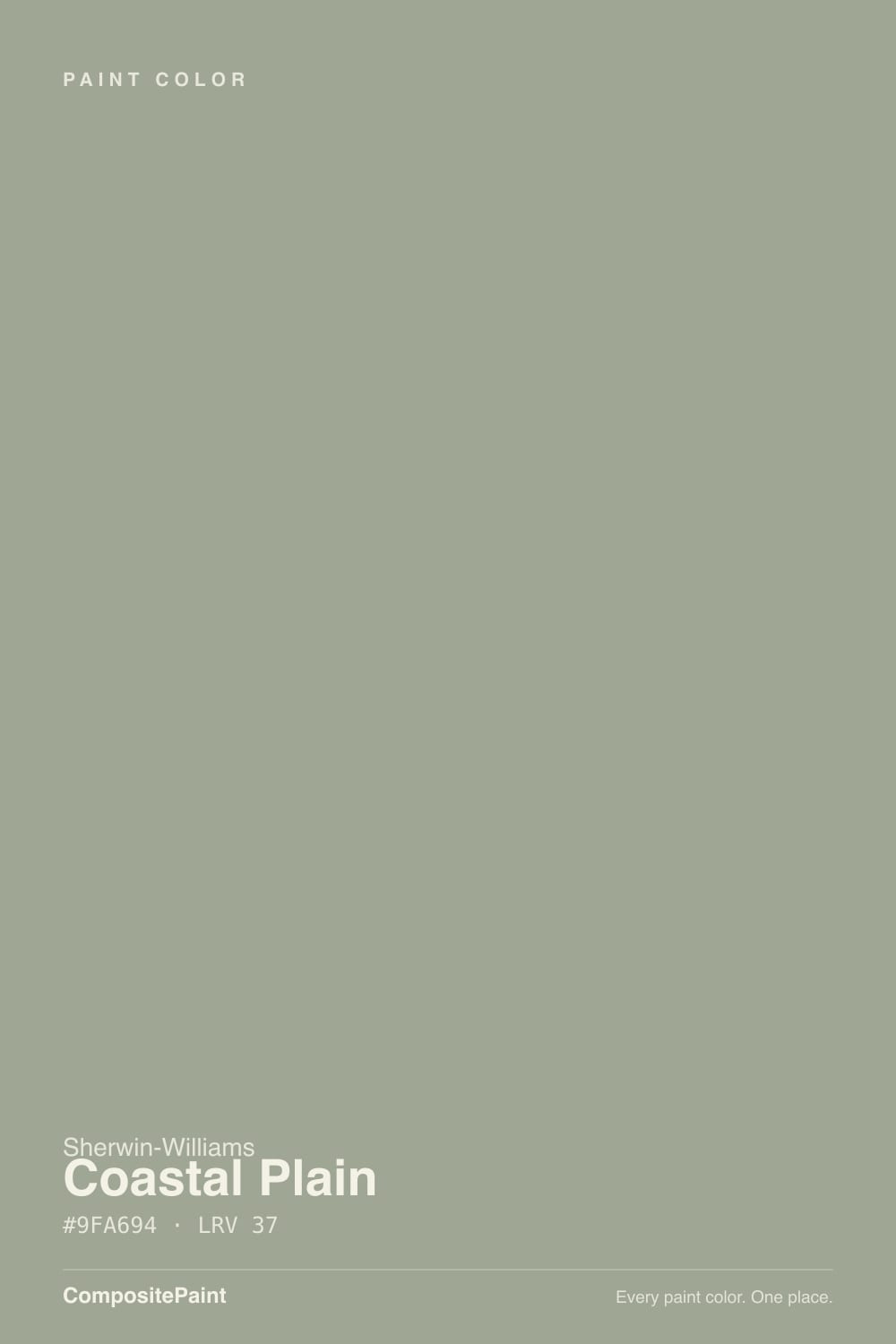
Coastal Plain is Sherwin-Williams's quiet cottage green — a gray-green with a mossy, yellow-olive base that never fully commits to being a gray or a green. In real daylight, especially a south-facing window, it reads exactly like the name promises: sandy, sea-grass green with a little warmth. Put the same paint under a cool white LED puck light over a kitchen island, though, and it can read distinctly baby blue — a real, repeated complaint, not a fluke. It also sits in a crowded family: Oyster Bay, Sage and Evergreen Fog are all within a few LRV points of it in the SW deck, so half the "this isn't the color I ordered" stories start with the wrong chip, not a bad gallon.
Kitchens and islands with real daylight · coastal and cottage-style exteriors, shutters and front doors · laundry rooms, pantries and powder baths · anyone who wants green without a loud commitment
Your cabinet or island lighting is all cool LED · you want a true grass green, not a gray-green · the room is dim or north-facing with little daylight · you're comparing chips on a phone screen instead of ordering the real SW 6192 sample
- A genuine gray-green that reads mossy and organic, never minty or artificially saturated
- Fresh, warm sea-grass green in real daylight — one of the better daylight-kitchen greens in the SW deck
- Exterior-rated: works on siding, shutters and front doors without looking like a bold statement color
- Versatile enough to sit comfortably in both cooler and warmer whole-house schemes
- A believable small-commitment color — laundry, pantry, powder bath or a single island
- Cool LED lighting can flip the undertone toward baby blue, especially on cabinets and islands
- Sits in a crowded SW cluster with Oyster Bay, Sage and Evergreen Fog — easy to accidentally order the wrong one
- Mid-tone LRV 37 goes flat and muddy in dim, north-facing or low-daylight rooms
- Not a famous or Color-of-the-Year name — no guaranteed resale story, just a solid quiet workhorse
What Color Is Coastal Plain, Really?
Coastal Plain lives in Sherwin-Williams's green family, but it spends most of its time pretending to be a neutral. The base is a soft, mossy olive with a gray cast folded in — enough gray to keep it restrained, enough yellow-green to keep it from reading cold or minty. Sherwin-Williams markets it for exactly the look the name suggests: siding, shutters, front doors and cabinets in a relaxed, nature-adjacent cottage register, not a saturated statement green.
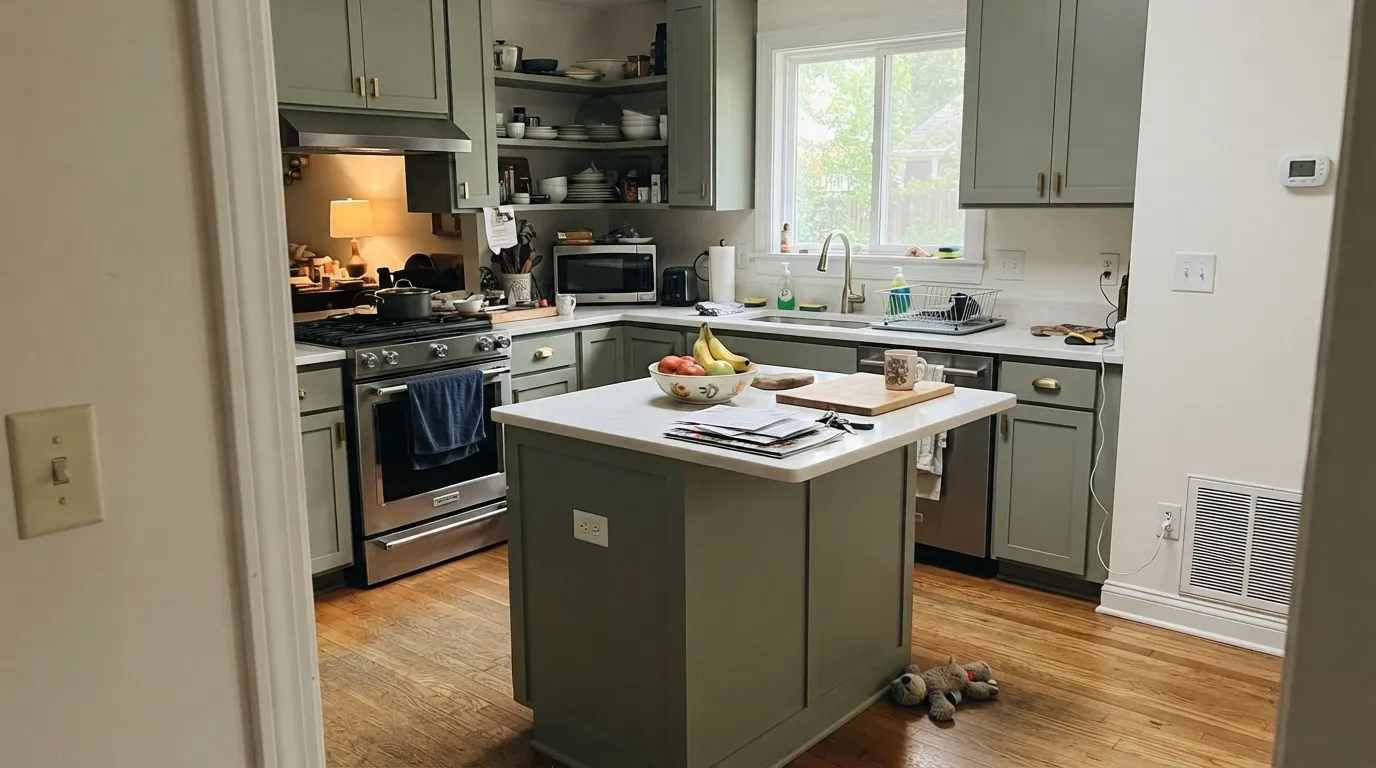
At LRV 37 it sits in the true mid-tone range — it absorbs more light than it reflects, which is why the room it's in matters more than usual. In strong daylight, especially from the south, it reads fresh and clearly green with a little warmth. Under soft white or incandescent light the yellow-beige undertone comes forward and it goes richer and earthier. Take away the daylight and swap in a cool white LED, and the undertone can flip: real reports describe Coastal Plain cabinets and islands reading distinctly baby blue under cool task lighting, which is the single most-repeated surprise about this color.
It is not alone in the deck. Oyster Bay, Sage (SW 7732) and Evergreen Fog all sit within a handful of LRV points and a close family of hues — Evergreen Fog is the deeper, grayer, design-magazine-famous one; Oyster Bay and Sage are near-siblings with their own light sensitivity. Coastal Plain is the lightest and greenest of that cluster, and the honest headline is that it's a solid, useful workhorse — not a Color of the Year, not a famous room, just a dependable quiet green that a lot of coastal and cottage kitchens have quietly used for years.
Where It Shines
This is a daylight color first. Give it a bright kitchen window, a covered porch under open sky, or exterior siding with normal sun exposure, and it reads exactly as advertised: a soft, sandy, sea-grass green that feels collected rather than trendy. It is also a confident small-room color — one reviewer's honest take was that it "goes perfect alone in a laundry, pantry or bathroom," and that's the right instinct: enough personality to feel intentional, mild enough that nobody has to live with a big green room if they change their mind.
Where It Fails
Every real regret story about Coastal Plain traces back to one of three things, and none of them are mysterious once you know to look for them.
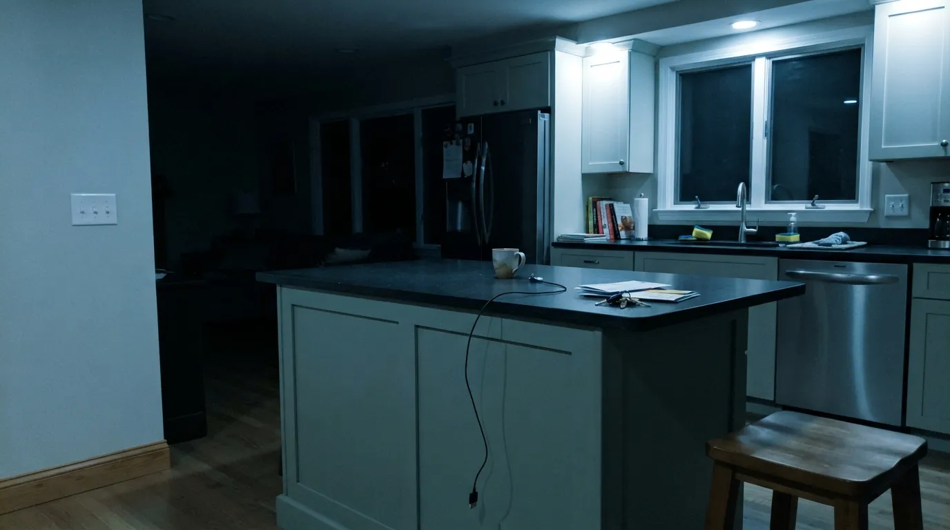
This is the color's single most-documented surprise: under cool white LED puck lights with little daylight backing it up, the gray-green undertone tips toward blue instead of green. It's not a bad batch — it's the undertone doing exactly what cool light does to a muted gray-green. Fix it by sampling the actual chip under your actual cabinet lighting at night before you commit, and swap in warm 2700K bulbs if you want the green to stay green after dark.
Coastal Plain sits in a tight cluster with Oyster Bay (SW 6206), Sage (SW 7732) and Evergreen Fog (SW 9130) — all close in hue and within a few points of LRV. On a phone screen or a cheap swatch card they look nearly identical. Painters and homeowners regularly discover only after the gallon dries that they got a chip greener or grayer than they meant to. There's no shortcut here: order the real SW 6192 peel-and-stick or fan deck chip, not a lookalike from a search result.
LRV 37 is a genuine mid-tone — it soaks up more light than it bounces back. In a north-facing or low-light room, the fresh, airy "coastal" read the chip promises settles into a flatter, muddier gray-green. That's fine if subdued is what you wanted; it's a letdown if you sampled it in a bright showroom and expected the same brightness in a dim hallway.
Room by Room
In a kitchen with a real window, Coastal Plain on cabinets or a single island reads clean, fresh and a little coastal without going full farmhouse-green. White or light stone counters and either brass or matte black hardware both work. The one condition: check your under-cabinet and pendant lighting before you commit — this is the exact surface where the cool-LED-to-blue shift shows up most.
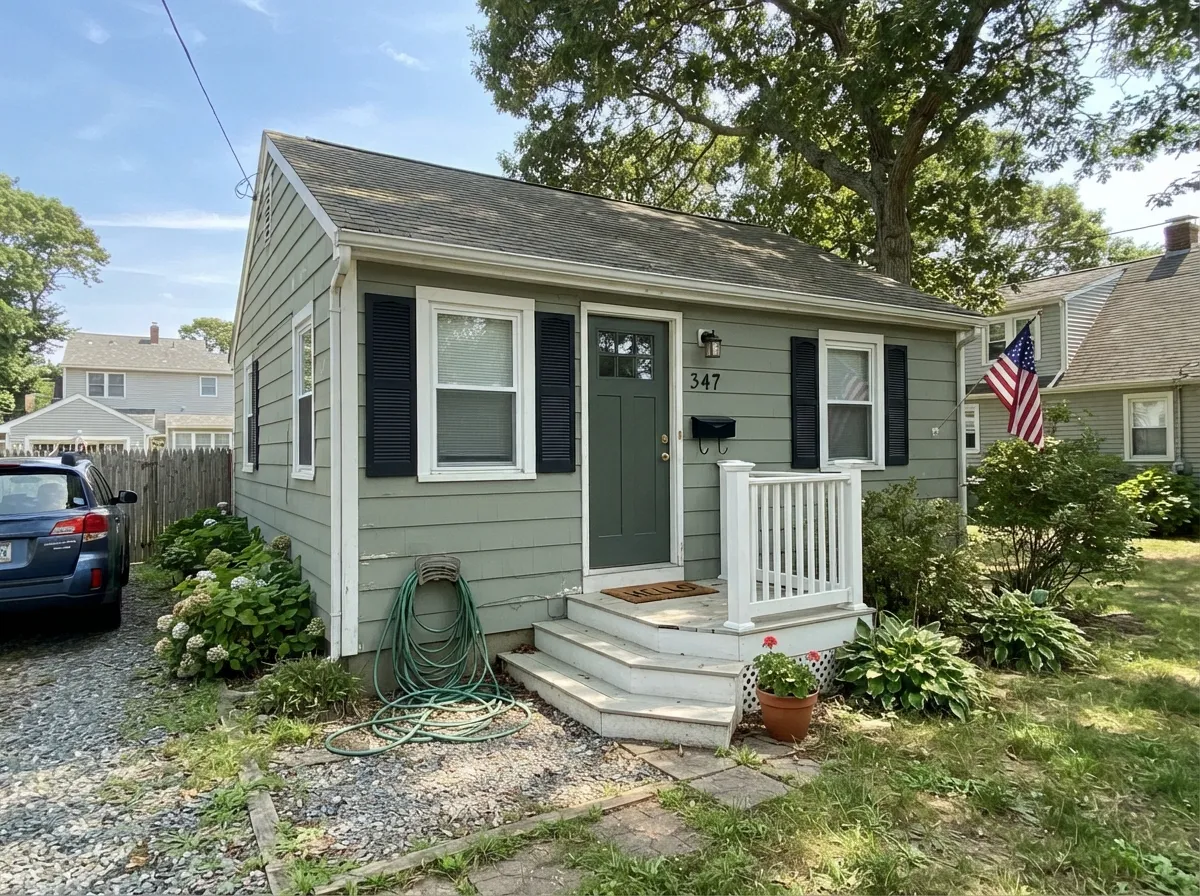
Sherwin-Williams rates it for exterior use, and it earns the rating: on siding it adds a friendly, nature-adjacent color without reading neon or trendy, and it pairs cleanly with white trim, stone paths and natural landscaping. On a single front door against a white or light-gray house, it's an easy, low-risk way to add color.
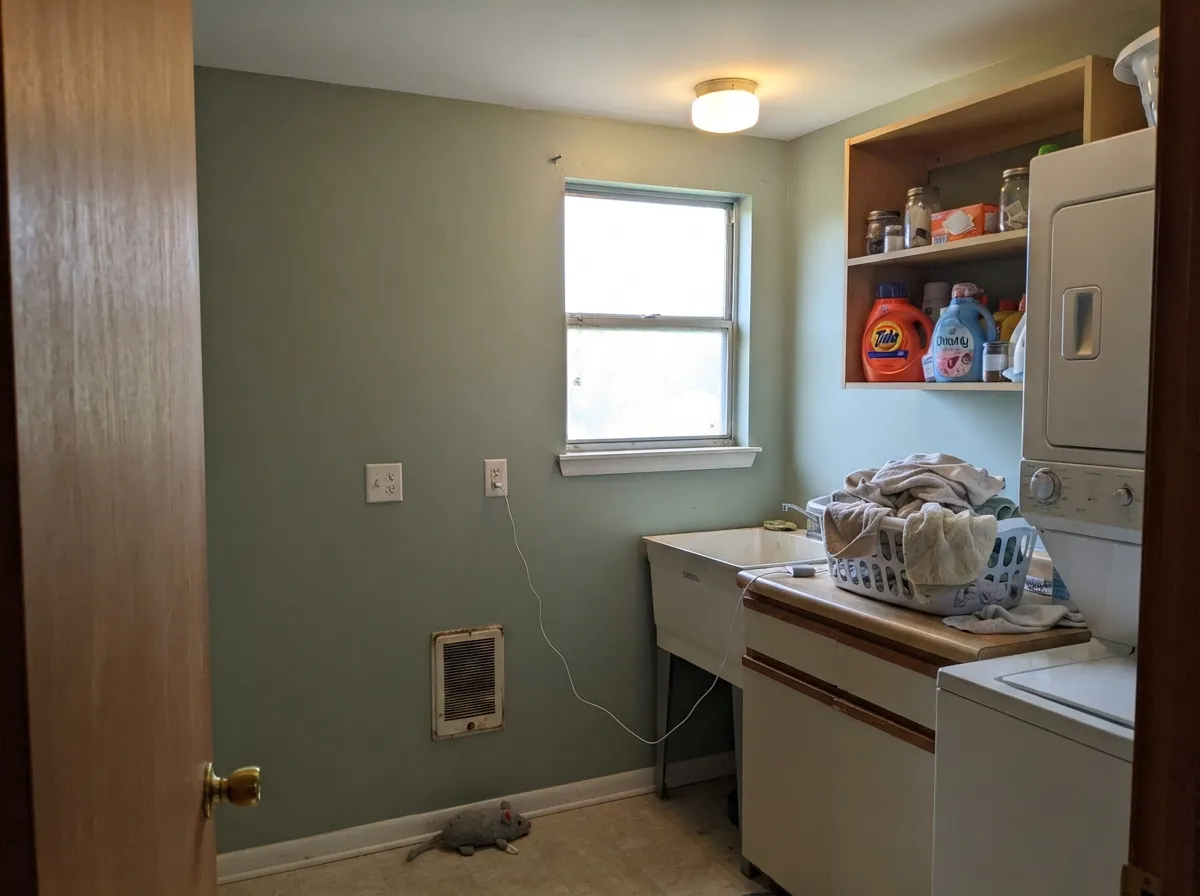
This is where the color earns its quiet reputation. A laundry room, pantry or powder bath is small enough that the light stays consistent and the room reads finished with one confident decision, without the risk of a whole-house green commitment.
Workable on a full wall in a bright, open-plan space, especially paired with warm wood tones and a neutral sofa. In a room that only gets afternoon or indirect light, sample first — the mid-tone LRV means it reads noticeably different at 9am than at 6pm.
A soft, restful option for a bedroom that gets decent daylight. Keep the same rule that applies everywhere else: warm 2700K bulbs at night keep it mossy and green; cool white bulbs can pull it toward gray or blue.
A bookcase, window seat or single accent wall in a sunlit room is a low-risk way to use this color without repainting an entire floor plan. Skip it for built-ins in a windowless hallway or a room lit only by overhead cool LEDs — that's exactly the combination behind the baby-blue complaints.
Your Light Is the Risk
Strong, direct daylight is where Coastal Plain looks exactly like its name: a fresh, sandy sea-grass green with a little warmth. This is the light to sample it in first.
Cool white puck lights or overhead LEDs with little daylight backing them up are behind the documented "my island turned baby blue" complaints. Test under your actual fixtures, not the showroom's.
Brighter and greener in cool morning east light; by afternoon west sun the yellow-beige undertone comes forward and it reads richer and earthier. The swing is gentle, not dramatic — but it is real.
Warm bulbs pull the yellow-olive base forward for a cozy, mossy look after dark. Cool white or daylight LEDs desaturate it toward gray, and under punchy cool task lighting specifically, toward blue.
Most complaints about Coastal Plain are a light mismatch. Upload a photo of your actual room and see it on your walls — then ask for the same wall in north light or evening lamps before you buy a single sample.
Need It From Another Brand?
Any paint counter can custom-tint Sherwin-Williams SW 6192 directly. If you would rather stay in one brand's own deck, these are the closest stock matches, measured as ΔE2000. Under 2 is a difference you will not see on the wall.
| Brand | Closest color | ΔE | LRV | |
|---|---|---|---|---|
| Behr | Ashwood720D-4 · Behr | 2.0 | 37 | Color page → |
| Benjamin Moore | Herb Bouquet460 · Benjamin Moore | 2.6 | 35 | Color page → |
| Valspar | Sprig of Sage8004-28D · Valspar | 3.0 | 36 | Color page → |
| PPG / Glidden | Smoky SlatePPG1028-4 · PPG / Glidden | 3.3 | 36 | Color page → |
| Glidden | Monsoon Green10GY 36/096 · Glidden | 1.3 | 36 | Color page → |
| Dutch Boy | Mossed Thicket424-3DB · Dutch Boy | 1.3 | 35 | Color page → |
Similar Sherwin-Williams Colors
The nearest shades to Coastal Plain within Sherwin-Williams's own range, ranked by perceptual color distance — useful when you want the same look a touch lighter, darker, or warmer.
WCAG 2.1: AA is 4.5 : 1 for normal text, 3 : 1 for large text, AAA is 7 : 1.
Coastal Plain vs the Colors You're Also Considering
Every Coastal Plain sample board has the same rivals on it. The numbers show the real lightness gap — then it comes down to which risk you would rather live with.
Pick this for the lighter, greener, easier-going version when Evergreen Fog feels like too much commitment.
Sherwin-Williams SW 9130 · LRV 30Evergreen FogPick this if you want it grayer, deeper and more of a design-magazine statement — Evergreen Fog is the famous, moodier cousin built for cabinets.
Pick this for the steadier, more reliably green option between these two near-twins.
Sherwin-Williams SW 6206 · LRV 35Oyster BayPick this if you want the closest chip in the whole deck, with a touch more gray and less green — just know it shifts with light even more than Coastal Plain does.
Pick this for the lighter, gentler version of the same story, with a softer landing if the light goes cool.
Sherwin-Williams SW 7732 · LRV 32SagePick this for a slightly deeper, more assertive green with the same cool-light caution — Sage commits harder to actually being a green.
Pick this when you're committed to Sherwin-Williams and don't want to mix brands on one job.
Benjamin Moore 1495 · LRV 39October MistPick this if you're already building a Benjamin Moore palette and want the cross-brand match — nearly the same LRV, the same daylight-dependent story.
Frosted Fern SW 9648 (#A7A796, LRV 38) is warmer and a touch yellower at the same lightness. Rare Gray SW 6199 (#A6A69B, LRV 38) drops most of the green and behaves as a straight neutral. Western Reserve SW 9597 (#A8A294, LRV 36) leans browner, Unusual Gray SW 7059 (#A3A7A0, LRV 38) leans cooler, and Marine SW 9659 (#94A69D, LRV 36) is the openly green-blue one of the set.
Across brands, HGTV Home by Sherwin-Williams Coastal Plain HGSW 3255 shares the exact hex and LRV 37, and Dunn-Edwards Lichen Green DET516 (deltaE 0.95) is a match for practical purposes. Glidden Monsoon Green 10GY 36/096 (deltaE 1.29), Dutch Boy Mossed Thicket 424-3DB (deltaE 1.3), and Behr Ashwood 720D-4 (deltaE 1.99) are visually identical in normal room light. Benjamin Moore Herb Bouquet 460 (deltaE 2.61) and Valspar Sprig of Sage 8004-28D (deltaE 3.0) are very close, so sample first. Farrow and Ball Pigeon No. 25 (deltaE 3.61, LRV 34) is close but visibly different, reading darker and grayer.
Coastal Plain Coordinating Colors
The rule for coordinating with Coastal Plain: soft warm whites for trim, black or deep charcoal for a single sharp accent, and a safe greige if you're pairing it with the rest of the house. It stays easy next to both cool and warm neutrals, which is part of why it works so well as a one-room or one-surface commitment.
The SW Sage Cluster: Coastal Plain and Its Deck Cousins
Coastal Plain isn't a famous color — no Color of the Year run, no viral room, no headline designer moment. What it is instead is one of four close gray-green siblings sitting almost on top of each other in the Sherwin-Williams deck: Coastal Plain (SW 6192, LRV 37), Oyster Bay (SW 6206, LRV 35), Sage (SW 7732, LRV 32) and Evergreen Fog (SW 9130, LRV 30). Evergreen Fog got the fame — it's the deepest, grayest and most design-magazine-photographed of the four. Coastal Plain sat quietly next to it the whole time, doing the lighter, greener, less demanding version of the same job.
That closeness is genuinely useful once you know it's there: if a room needs a hair more gray, step to Oyster Bay; a hair more assertive green, step to Sage; full commitment and drama, go to Evergreen Fog. But it's also the source of most "this isn't the color I ordered" stories — on a phone screen or a cheap fan deck, these four are nearly indistinguishable. The fix is always the same: order the real SW 6192 sample, not a search-result lookalike.
Coastal Plain With Wood Tones and Stone
This is one of the more forgiving greens with wood. White oak and lighter, weathered or gray-washed floors give the whole room a Scandinavian-cottage lean that matches the color's restraint. Walnut and darker woods work too — the mossy undertone doesn't fight brown the way a true blue-green would.
Even honey oak, which is a genuine problem for the site's true violets and true blues, is only a mild caution here rather than a hard no: Coastal Plain's yellow-olive base is close enough in temperature to golden wood that the two coexist instead of fighting. It's not the boldest pairing, but it's a safe one.
For exteriors, it sits comfortably with natural stone, weathered wood shingle and stucco in warm-gray or sandy tones. Metals are easy: unlacquered brass, matte black and aged bronze all read well against it; only a very polished chrome leans noticeably cold in comparison.
Three Ready Palettes Built on Coastal Plain
A color is never alone on the wall. These are complete combinations in the 60-30-10 pattern, with the reason each one holds together. Every one opens in the visualizer.
A soft warm white keeps the green from feeling heavy, and one near-black door or shelf gives the room a single sharp edge so the scheme reads deliberate instead of pastel. Brass or matte black hardware finishes it either way.
Try this palette in your roomClassic coastal-cottage exterior logic: a friendly, muted green body, crisp white trim to keep the roofline sharp, and black shutters and door for contrast that reads current without being trendy.
Try this palette in your roomThe safe way to try a green you're not sure about: keep the greige workhorse everywhere buyers and family actually vote on, and let Coastal Plain carry one room you get to enjoy without repainting the whole house if you change your mind.
Try this palette in your roomCoastal Plain FAQ
is Coastal Plain more green or more gray?
Both, depending on the light — that's the honest answer. It's a genuine gray-green with a mossy, yellow-olive base. In strong daylight it reads clearly green; in dim or north light it settles toward gray; under cool LED lighting it can even edge toward blue. If you need a color that holds one identity in every light, this isn't it.
why did my Coastal Plain cabinets turn blue?
Cool white LED task or puck lighting with little daylight nearby is the specific trigger — this is a real, repeated complaint, not a defect. The fix is to sample the actual chip under your actual cabinet lighting at night before committing, and to use warm 2700K bulbs if you want the color to read green after dark.
what's the difference between Coastal Plain, Oyster Bay, Sage and Evergreen Fog?
All four sit within a few LRV points of each other in the SW deck. Coastal Plain is the lightest and greenest. Oyster Bay is close but grayer and shifts more with light. Sage (SW 7732) is a touch deeper and more assertively green. Evergreen Fog is the deepest, grayest and most famous of the four. Order the actual SW 6192 chip — on a screen or a cheap swatch card, these four are hard to tell apart.
is Coastal Plain good for exteriors?
Yes — Sherwin-Williams rates it for exterior use and it's a natural fit for cottage and coastal-style homes: siding, shutters or a front door, paired with white trim and natural landscaping. It reads as color without reading as bold.
what trim white goes with Coastal Plain?
A clean, slightly warm white — Alabaster indoors, Extra White or Pure White for crisper contrast, especially outdoors. Avoid a stark blue-white trim, which can push the green toward cool and amplify the same undertone that causes the blue-cabinet complaints.
does Coastal Plain work with wood floors and cabinetry?
Yes, and it's forgiving. White oak and lighter, weathered woods keep the coastal-cottage feel intentional. Warmer woods like walnut or honey oak still work because the color's yellow-olive base doesn't fight orange the way a true cool green would — it's one of the easier greens to place next to warm wood.
Have you painted with Coastal Plain?
Rate it — one tap helps the next reader decide.
Ask a Question