Tart Orange
The vivid true orange Behr keeps recommending for kids' rooms, reviewed honestly: the one wall where it works, the coverage nobody warns you about, and what to pick instead.

Jessica has spec'd whites and neutrals for more than 300 rooms and keeps a sample wall of painted drawdowns in her studio. Every color review is checked against real reader rooms in the comments and re-tested when a formula changes. About the testing process →
- 1Rookwood Terra Cotta14
- 2Determined Orange22
- 3Tart Orange31
- 4Canyon Dusk36
- 5Venetian Plaster42
The Fast Verdict
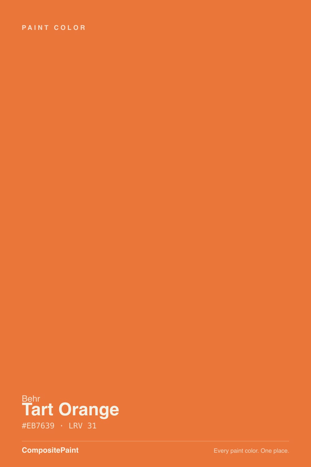
Tart Orange is a real orange — not a terracotta, not a rust, not a clay neutral hiding behind an orange name. It is a clean mid-depth tangerine with red-gold weight behind it, and at LRV 31 it has enough body to stay orange in a bright room instead of fading to peach. That honesty is the appeal and the problem in one sentence: on one playroom wall, a front door, or a run of mudroom lockers it is fantastic, and on all four walls of a room somebody sleeps in it is exhausting by week three. Buy it as an accent, budget three coats, and it will not let you down.
Playroom and kids'-room accent walls · front doors on white, gray or sea-glass houses · mudroom lockers, cubbies and built-ins · anyone who wants actual orange, not another terracotta
You are painting all four walls of a room anyone sleeps in · your floors or trim are honey oak · you wanted a warm earthy neutral and assumed orange meant clay · you need the job finished in two coats over a dark wall
- An actual orange — clean and confident, not another browned-out terracotta
- LRV 31 keeps it reading orange in bright rooms and in lamplight alike
- One of the best front-door colors on white, gray and sea-glass houses
- Playrooms and kids' rooms get real personality from a single wall
- Sold in enamel and floor formulas, so lockers, doors and built-ins are fair game
- Overwhelming on four walls — especially in a room anyone sleeps in
- Poor hide: plan on a gray primer plus two coats, not one-coat magic
- Clashes hard with honey oak trim, floors and orange-stained wood
- Throws a visible orange cast onto ceilings, white trim and skin in strong sun
What Color Is Tart Orange, Really?
A saturated mid-tone orange with a red-gold core — warmer and heavier than a pure citrus orange, but nowhere near the browned-down terracottas that dominate the current warm-color shelf. Behr files it in the Home Decorators Collection, which is the deck Home Depot builds its own room displays around, and the brand's own guidance points it at kids' rooms, playrooms and front doors rather than at living-room walls. That is an unusually honest bit of positioning: this is a color sold as an accent, and it performs like one.
At LRV 31 it sits right in the middle — not a pastel, not a deep burnt tone. That number matters more than it does for a neutral. A lighter orange (LRV 40 and up) washes toward peach or apricot in a bright room and stops reading as a real color; a deeper one (LRV 20 and below) slides into rust and brick. Tart Orange holds the middle, which is why it still reads unmistakably orange in a sunny playroom and still reads orange, rather than brown, under evening lamps. The trade is intensity: mid-depth plus high chroma is a lot of color per square foot, and four walls of it is roughly twice the room you think you are getting.
Undertone in one line: red-gold, leaning warm — never pink, never neon-yellow. If your sample looks like a highlighter, that is direct afternoon sun; if it looks like rust, the room is under-lit. Both are the same paint telling the truth about the room.
Where It Shines
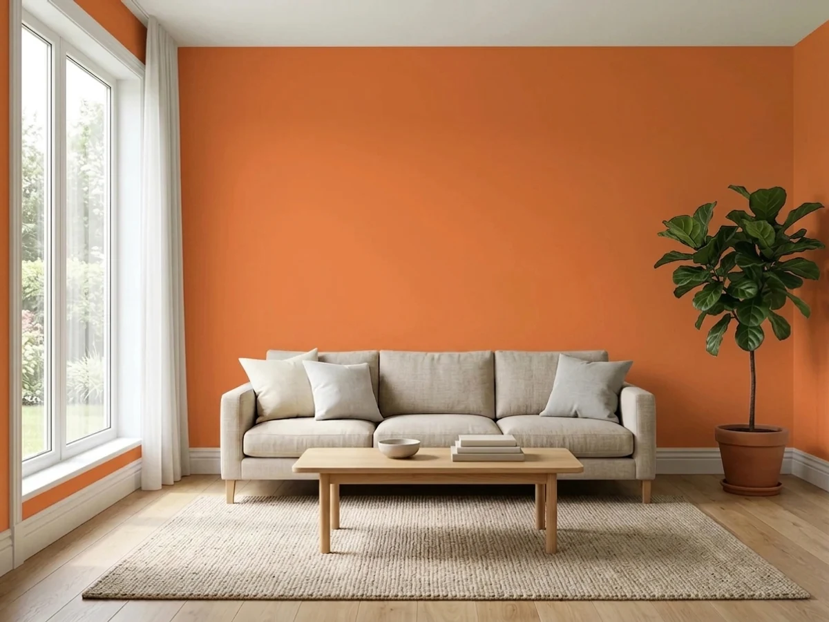
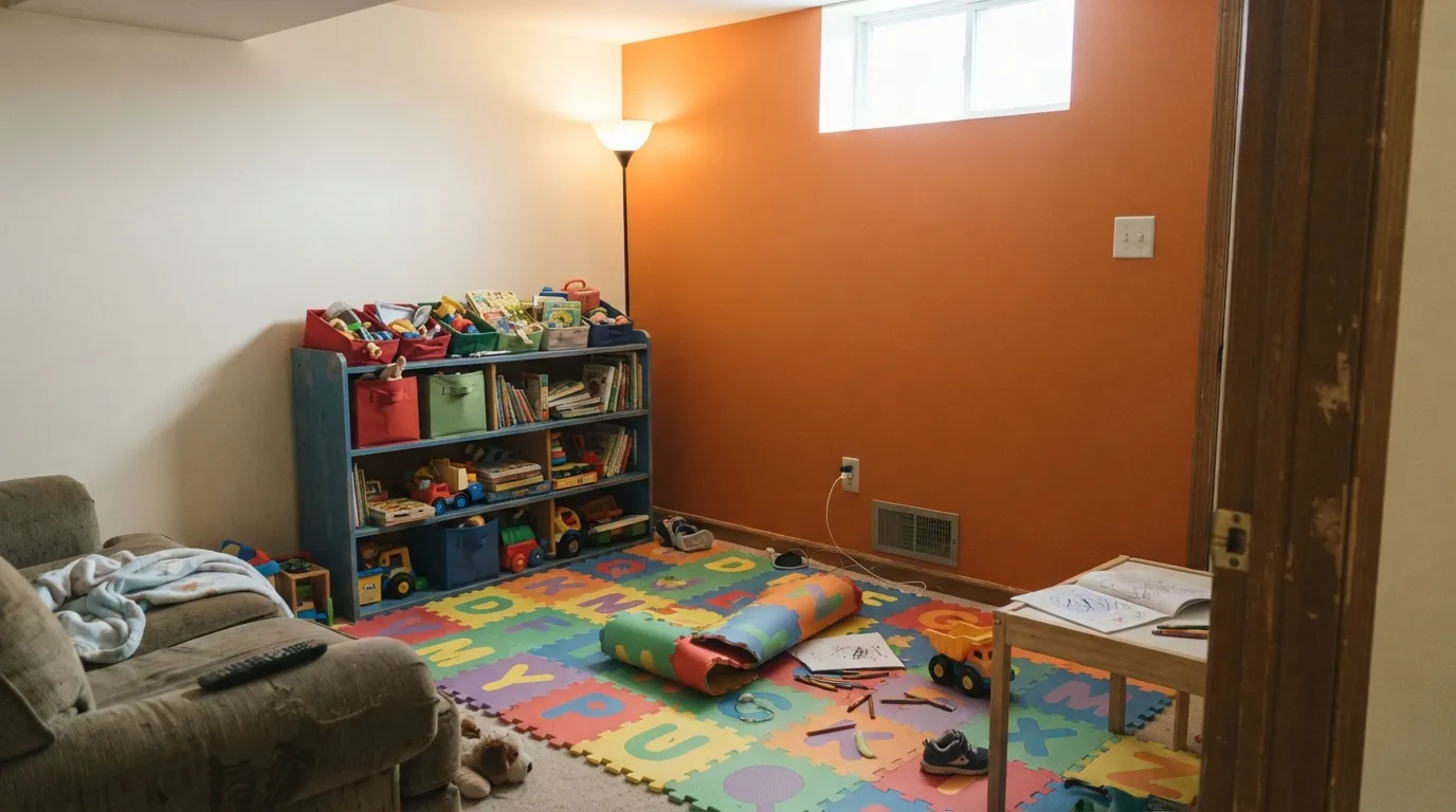
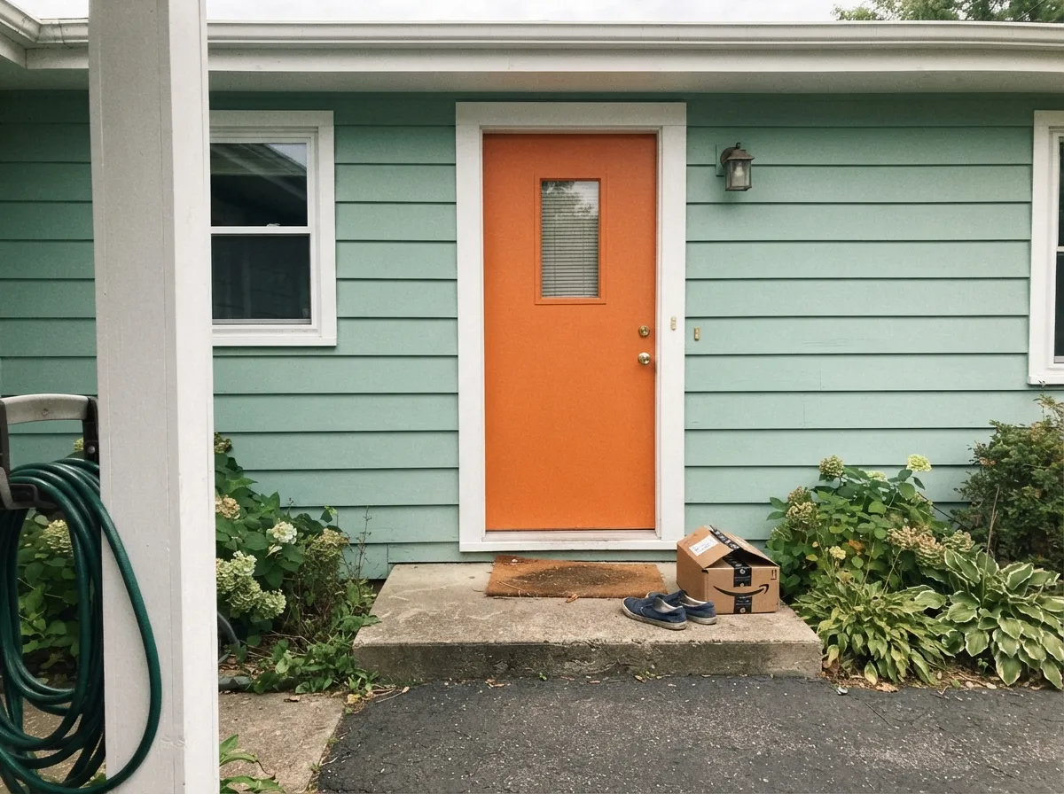
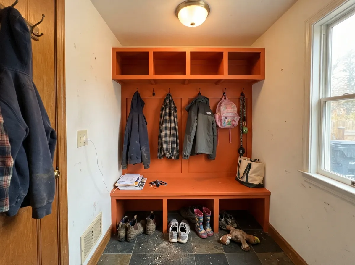
This color earns its keep on one surface at a time. A single playroom wall in Tart Orange, with the other three in a warm white, gives a kid's room all the energy people want from orange and none of the fatigue — and because it is a mid-tone, it still photographs well and still looks deliberate at eye level rather than washed out. Its second job is the front door: against white, gray, or a sea-glass green body it reads modern and welcoming from the curb, and it flatters mid-century and ranch architecture in a way that a burgundy or forest green never quite does. Its third job is the least glamorous and maybe the best — mudroom lockers, cubbies, laundry cabinets, a garage bench. Behr sells this color in urethane alkyd and porch-and-patio floor enamel as well as wall paint, which tells you where it actually gets used.
Where It Fails
Nearly every regret story about a saturated orange follows one of three scripts, and all three are visible before you open the can. None of them are the paint's fault — but if your project matches one, sampling bigger will only confirm it faster.
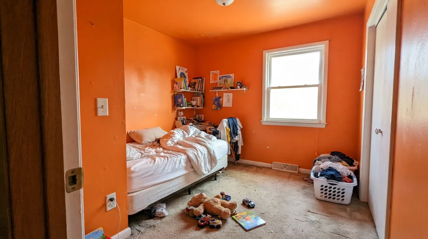
This is the number-one complaint about every high-chroma orange, and Tart Orange is not an exception. Color psychology writeups and designers land in the same place: orange in quantity reads as energy at first and as agitation by the second week, which is exactly wrong for a room a child sleeps in. Paint one wall — usually the one behind the bed or behind the toy storage — and keep the other three in a warm white. If you already committed to all four and it feels like too much, you are not imagining it and it is not the paint.
Bright oranges, reds and yellows are built on organic pigments that are more transparent than the earth oxides in a beige, so they hide badly no matter which brand you buy. Real-world reports on saturated Behr oranges run two to four coats, and Behr's own one-coat language applies only to specific one-coat-hide collections under specific conditions — do not plan your weekend around it. The fix is cheap and boring: prime first with a gray-tinted primer, then two coats of color. That is nearly always faster than four coats of paint over white.
Orange next to orange-toned wood is not contrast, it is a smear — the wall and the floor read as one muddled warm zone and neither looks intentional. Golden oak trim is worse than golden oak floors because it sits directly against the paint line. Tart Orange wants white oak, walnut, gray-washed floors, or a hard white trim break; if the honey oak is staying and cannot be broken up, pick a muted clay tone instead and stop fighting the wood.
Room by Room
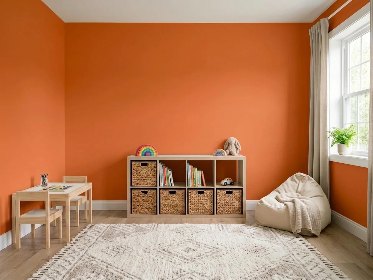
One wall of Tart Orange in a playroom is close to ideal: enough energy to make the room feel like a kids' zone, contained enough that the adults in the house can stand it. Put it behind the toy shelving or the craft table, keep the rest warm white, and use satin so crayon, sticky hands and scooter scuffs wipe off. It also pairs naturally with primary blues on bins and rugs — blue is orange's complement, so the room reads coordinated rather than random.
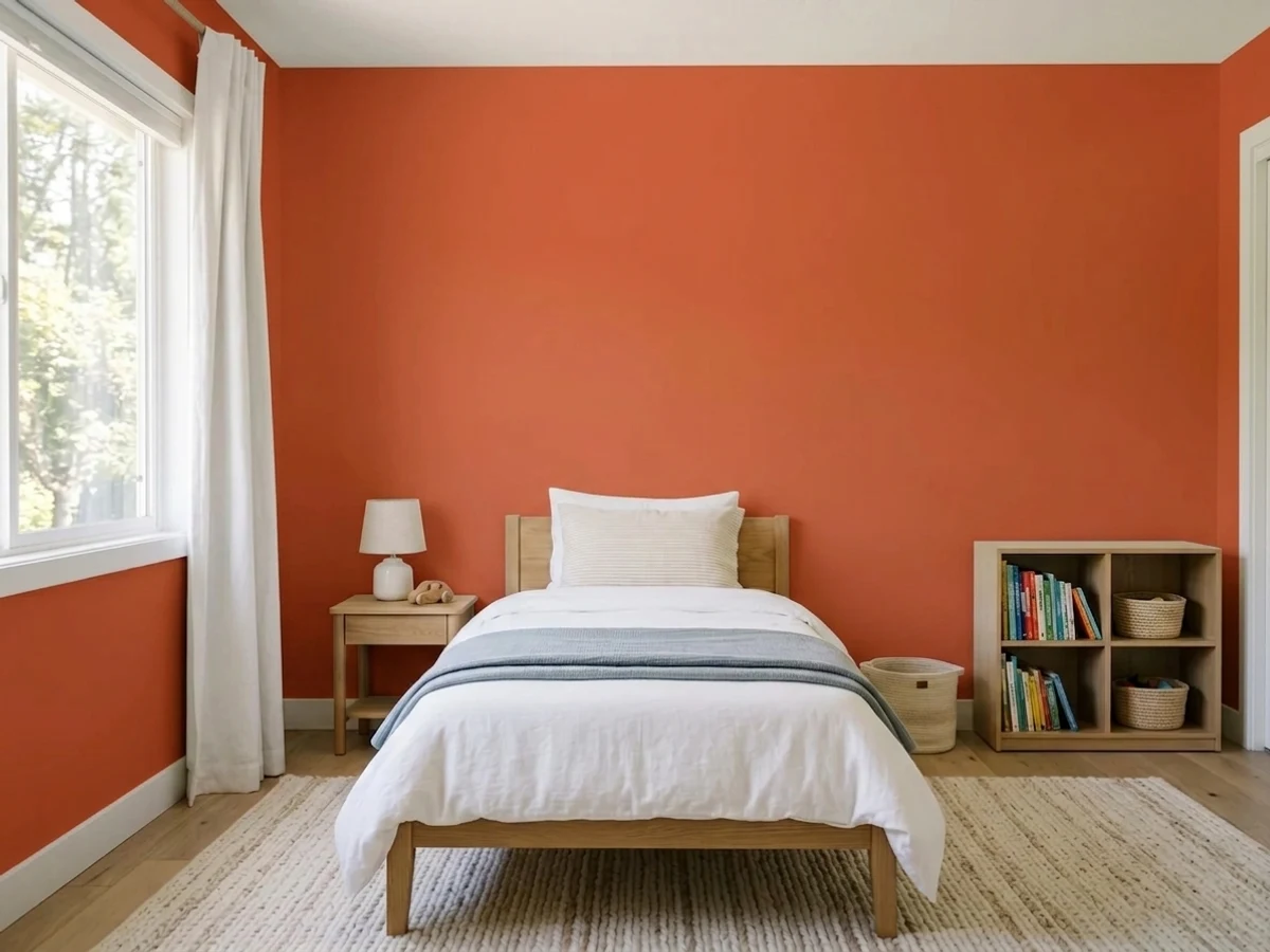
Behr points this color at kids' rooms and it deserves the recommendation, with the obvious limit: a sleeping room should not be wall-to-wall stimulation. One accent wall behind the headboard, white or pale blue elsewhere, and warm 2700K bulbs in the lamps. If you want the color everywhere, put it on the closet doors, a bookcase and a desk chair instead of on the drywall — same effect, one-tenth the commitment.
This is where Tart Orange asks the least and gives the most. On a white, light-gray or soft sea-glass green house it reads modern, friendly and slightly mid-century, and it holds up from across the street where a muted terracotta would go invisible. Use an exterior semi-gloss or urethane alkyd enamel, and prime the door — an orange over a dark old door is the exact scenario that eats four coats.
Small, busy, unglamorous rooms take strong color better than big ones, because you pass through instead of sitting in them. Tart Orange on mudroom lockers, cubby backs, a bench, or laundry-room cabinets makes a utility space feel deliberate, and the enamel finishes it comes in are built for the abuse. Keep the walls neutral and let the millwork carry the color.
In a room where adults sit for hours, this much orange stops being cheerful and starts being loud, and it bounces a visible warm cast onto ceilings, white cabinets and faces. It can be terrific as a single object — a bar cabinet, an interior door, the inside of a bookcase, a kitchen desk nook — where it works like a piece of art. Full walls in a living room or a whole kitchen of orange cabinets is a bet almost nobody wins.
Two honest nos. Orange is a stimulating color and a primary bedroom is the one room where that is a liability; every color-psychology roundup that mentions orange says the same thing. And as a whole-house exterior body color it is relentless in full sun and hard to sell later — orange belongs on the door, the shutters can stay dark, and the siding can stay quiet.
Your Light Is the Risk
A big east or north window without direct sun on the wall is where this color is happiest — clean, tangerine, cheerful, with no glare and no color bouncing off it. This is the read most people picture when they pick it.
Full west or south sun landing on the wall pushes it fluorescent, and the reflected light stains the ceiling, the white trim and everyone's face warm orange. If the sun hits that wall, hang a sheer or move the color to a shaded wall.
Cool morning light calms it and it reads its most balanced before noon. Through the afternoon the red side comes forward and by golden hour it deepens toward rust — a much moodier color than the chip. Sample on the actual wall and look at it at 8am and again at 6pm.
Warm 2700K bulbs deepen it toward terracotta and make it feel cozier and more grown-up. Cool 4000K and up LEDs do the opposite — they sharpen the chroma and it starts to look like safety orange. In a kids' room, warm bulbs are part of the paint decision.
Most complaints about Tart Orange are a light mismatch. Upload a photo of your actual room and see it on your walls — then ask for the same wall in north light or evening lamps before you buy a single sample.
Need It From Another Brand?
Any paint counter can custom-tint Behr HDC-MD-27 directly. If you would rather stay in one brand's own deck, these are the closest stock matches, measured as ΔE2000. Under 2 is a difference you will not see on the wall.
| Brand | Closest color | ΔE | LRV | |
|---|---|---|---|---|
| Sherwin-Williams | InvigorateSW 6886 · Sherwin-Williams | 1.6 | 29 | Color page → |
| Benjamin Moore | Electric Orange2015-10 · Benjamin Moore | 3.6 | 29 | Color page → |
| Valspar | Autumn Glimmer2003-1A · Valspar | 0.8 | 31.8 | Color page → |
| Diamond Vogel | Lava Lamp1033 · Diamond Vogel | 1.3 | 31 | Color page → |
| Hirshfield's | Lava Lamp1033 · Hirshfield's | 1.3 | 29 | Color page → |
| C2 Paint | Summer SquashBD55 · C2 Paint | 4.0 | 28 | Color page → |
Similar Behr Colors
The nearest shades to Tart Orange within Behr's own range, ranked by perceptual color distance — useful when you want the same look a touch lighter, darker, or warmer.
WCAG 2.1: AA is 4.5 : 1 for normal text, 3 : 1 for large text, AAA is 7 : 1.
Tart Orange vs the Colors You're Also Considering
Every Tart Orange sample board has the same rivals on it. The numbers show the real lightness gap — then it comes down to which risk you would rather live with.
Pick this for the Home Depot version and a hair more brightness at the same depth.
Sherwin-Williams SW 6886 · LRV 29InvigoratePick this if you are already shopping Sherwin-Williams — it is close enough to be a stand-in, a touch deeper and slightly less golden.
Pick this when you want the same energy with more weight; at LRV 31 it stays a color instead of glowing.
Behr P220-6 · LRV 40Bergamot OrangePick this for a lighter, brighter, more citrus orange — better on a small accent, louder in full sun.
Tart Orange Coordinating Colors
The rule for coordinating with an orange this saturated: give it one quiet partner and one hard edge, and keep everything else out of the way. Warm whites for the walls it shares a room with, a cool blue or green-gray for contrast, a near-black to stop the scheme from reading nostalgic, and a plain greige for whatever room comes next. These are the partners that keep showing up in rooms that work:
Where Orange Actually Lives Now
Orange spent two decades in exile. The 1970s used it up — harvest gold, burnt orange, shag — and then the gray decade would not let any warm color back in the door. What brought it back was not a nostalgia wave for wall-to-wall orange; it was the mid-century modern revival, which puts orange exactly where mid-century architecture always put it: on a door, on a chair, on a length of built-in cabinetry, against otherwise calm surfaces.
You can read Behr's own read on this color from the products it sells it in. Tart Orange is stocked in exterior flat, in urethane alkyd satin enamel, and in porch-and-patio floor paint alongside the standard interior lines — those are door, trim, millwork and floor formulas. A color a brand expects you to roll across a living room does not get pushed in door enamel. Take the hint: the paint aisle already knows this is an accent color, and the people who are happiest with it treated it as one.
Tart Orange With Wood Tones, Floors and Metals
Walnut is the best wood next to this color by a clear margin — the dark red-brown gives the orange something to push against, and the two share enough warmth that the room reads intentional. Pale white oak and gray-washed floors are the safe modern choice and let the orange be the only loud thing in the room. Cream and low-pile gray carpet are both fine, which is useful in playrooms where the floor was chosen for spills, not for looks.
The one genuine no is golden: honey oak floors, orange-stained trim, and yellow-beige carpet all sit in the same neighborhood as the paint, so instead of contrast you get a wash of undifferentiated warm. Honey oak trim is the worst version because it meets the color at the edge with nothing between them. If the oak is staying and you cannot break it up with white trim or a big rug, choose a muted clay tone and stop fighting it.
Metals are easy. Matte black is the cleanest partner and the one that makes it look current rather than retro; brushed nickel and chrome both work and keep the scheme cool where it needs relief. Unlacquered brass is the risky one — gold plus orange reads distinctly 1974, which is charming on purpose and a mistake by accident.
Three Ready Palettes Built on Tart Orange
A color is never alone on the wall. These are complete combinations in the 60-30-10 pattern, with the reason each one holds together. Every one opens in the visualizer.
Blue sits directly opposite orange on the wheel, so the room reads coordinated instead of chaotic — and Adirondack Blue is a slate-toned blue rather than a primary one, which keeps the whole thing from looking like a toy box. Whisper White is warm enough that the orange wall does not look like it was dropped in from another house, and it comes from the same Behr collection, so the two are easy to buy in one trip.
Try this palette in your roomThis is the pairing Behr's own exterior guidance points to, and it works for a simple reason: a soft green-gray sea-glass body is cool and quiet, so a warm door reads as the one intentional decision on the facade. Ultra Pure White trim gives the door a hard bright edge to sit against — a creamy trim white would blur into the orange from the curb.
Try this palette in your roomBlank Canvas has a faint peach lean that most people have to work around — next to Tart Orange it becomes an asset, because the walls and the accent share a family instead of arguing. One near-black note keeps the scheme from reading nostalgic, and walnut furniture plus a jute rug does the rest. Use it on millwork, never on the walls.
Try this palette in your roomTart Orange FAQ
Is Tart Orange too bright for a kid's room?
On one wall, no. On four walls, usually yes. It is a genuinely high-chroma orange, and designers and color-psychology writeups agree that a lot of orange reads as energy at first and as agitation after a couple of weeks — which is the wrong trade in a room where a child sleeps. Do one accent wall, keep the rest warm white, and put warm 2700K bulbs in the lamps.
How many coats does Tart Orange need?
Budget three, or a gray-tinted primer plus two. Bright oranges use more transparent organic pigments than beiges and grays do, so poor hide is a property of the color, not a fault of the brand. Behr's one-coat language only applies to specific one-coat-hide collections under specific conditions — do not plan the weekend around it, especially over a dark or strongly colored wall.
What white goes with Tart Orange?
A warm white, not a stark one, for interior walls — Whisper White is the natural in-house partner and comes from the same Behr collection. On an exterior, flip it: a bright, clean trim white like Ultra Pure White gives the door a crisp edge from the street, where a creamy white would smudge into the orange.
Does it work with oak floors?
White oak, gray-washed and walnut floors are fine, and walnut is the best of them. Honey oak and orange-stained wood is the one real clash: the wall and the floor become a single muddled warm zone and neither looks chosen. Honey oak trim is worse than honey oak floors, because it touches the paint line directly.
Is Tart Orange a good front door color?
It is one of its two best uses. It reads modern and welcoming on white, gray and soft green-gray houses and stays visible from the curb where a muted terracotta disappears. Use an exterior semi-gloss or a urethane alkyd enamel, prime the door first, and expect the same three-coat reality if you are going over a dark existing color.
Will orange date my house?
Honestly, more than a greige and less than you fear — because of where you put it. A front door repaints in an afternoon and lockers repaint in a morning, so the trend risk is a few hours of work. Full walls are the version that gets expensive to change your mind about, which is another argument for keeping this color on accents.
Have you painted with Tart Orange?
Rate it — one tap helps the next reader decide.
Ask a Question