Breezeway
Behr's 2022 Color of the Year, reviewed honestly: the sea-glass green-blue-gray that glows with brass and light, and the overcast weather that flattens it out.

Jessica has spec'd whites and neutrals for more than 300 rooms and keeps a sample wall of painted drawdowns in her studio. Every color review is checked against real reader rooms in the comments and re-tested when a formula changes. About the testing process →
- 1Stardew43
- 2Palladian Blue60
- 3Breezeway65
- 4Glass Slipper70
- 5Spring Thaw83
The Fast Verdict
Breezeway is Behr's most decorated color of the last decade for a reason: it is genuinely three colors in one — green, blue, and a whisper of gray — balanced so none of them wins outright. Bright daylight pulls it toward a delicate sea-glass mint; overcast light pulls it toward silvery blue. That range is exactly why designers reached for it, and exactly why it needs real light to work. In a dim room it just goes flat.
Kitchens with brass or nickel hardware · bathrooms and powder rooms · home offices · coastal-style exteriors in bright, sunny climates
You actually want a true, unmoving gray · your climate stays overcast most of the year · your floors and trim are honey oak or gold-toned · you want one color that reads identical morning to night
- A genuine sea-glass green-blue-gray — reads sophisticated, not novelty
- Real 2022 Behr Color of the Year pedigree, not a fad-of-the-month pick
- Brass, nickel, chrome and stainless all glow against it
- LRV 65 keeps rooms bright without going stark or clinical
- Shifts gently through the day — mint at noon, blue-silver at dusk — instead of sitting flat
- Chameleon behavior means it rarely reads the same color twice, which unsettles buyers who want predictability
- Fades toward washed-out and colorless on overcast exteriors without dark trim
- Fights honey oak, gold trim and warm beige — wants cool or neutral wood instead
- Not a true gray, whatever the paint chip suggests in the store
What Color Is Breezeway, Really?
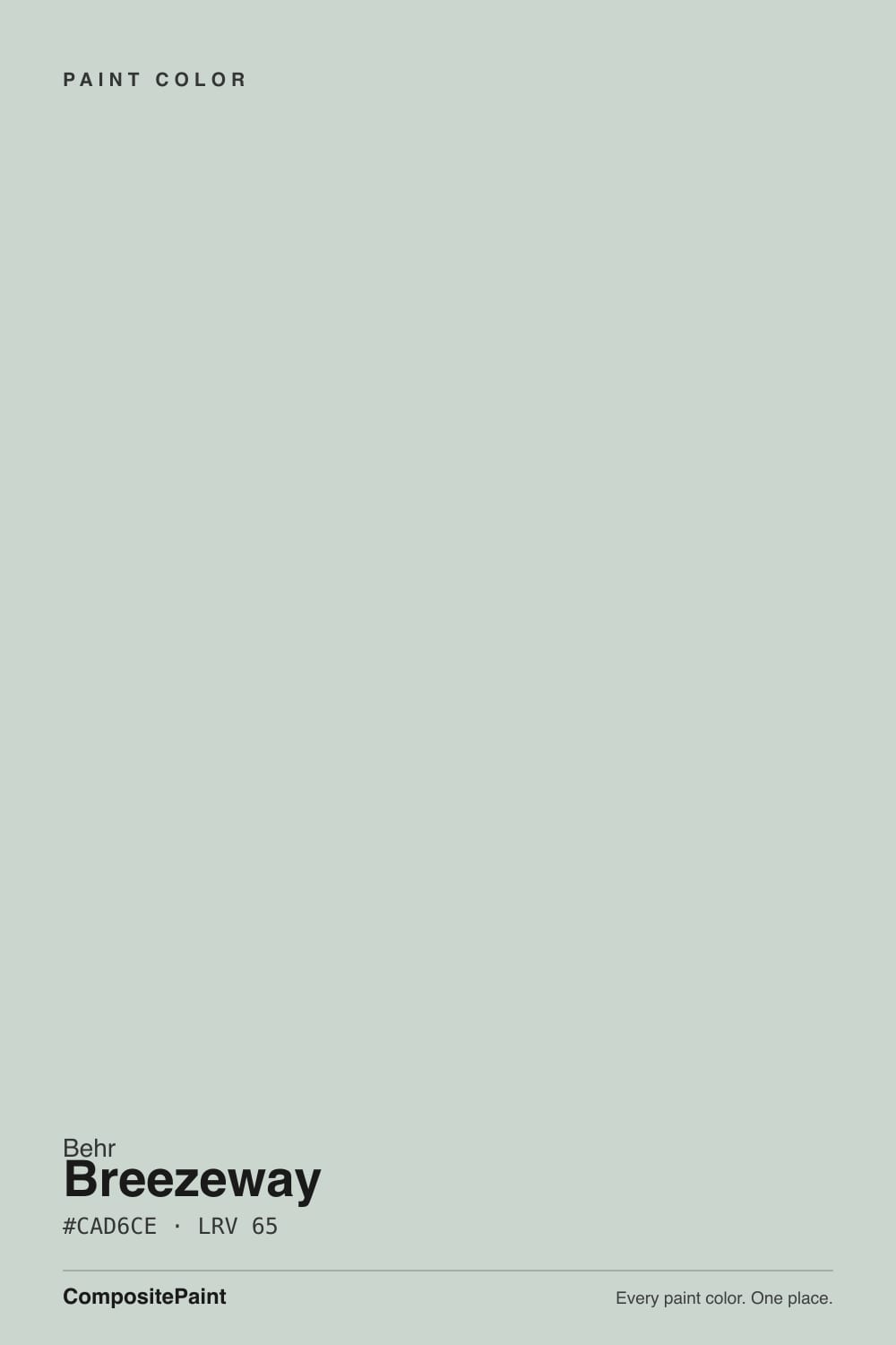
A soft sea-glass green-blue with a gray base — Behr named it its Color of the Year in 2022, and the name is literal: it is styled after glass worn smooth and pale by ocean water. Most single-family greens or blues pick one temperature and stay there. Breezeway does not. It carries genuine green, genuine blue, and enough gray to keep both in check, which is the whole reason it reads as calm and coastal instead of as a decorating decision.
At LRV 65 it sits in the same light-reflectance range as Sherwin-Williams Sea Salt (LRV 63), its closest and most obvious cousin, and that number tells you it is a bright, livable mid-light color, not a saturated statement wall. What it does not tell you is how much the color itself shifts: in strong, bright daylight it thins out toward a pale mint that nearly disappears next to a white wall; in normal daylight the green and blue trade off evenly; in dim or overcast light, blue and silver take over and the green mostly drops out.
Undertone in one line: green first, blue close behind, gray underneath — never warm, never yellow. If your sample reads washed-out and colorless, that is overcast light doing exactly what overcast light does to this color; it is not a bad can of paint.
Where It Shines
Give it real light and any polished metal and it earns its Color of the Year reputation. Brass, nickel, chrome and stainless all catch a gleam against it that plain gray or plain white cannot produce — which is why kitchens and bathrooms are its natural home. It is also a genuinely restful color for a home office: cool enough to feel calm, bright enough at LRV 65 not to feel closed-in. On a sunlit coastal-style exterior, paired with dark trim, it is the color the whole cottage-and-shiplap moment was chasing.
Where It Fails
Almost every disappointed review of Breezeway comes from one of three predictable mismatches. None of them are the paint failing — they are the color doing what a genuine chameleon color always does when the conditions are wrong for it.
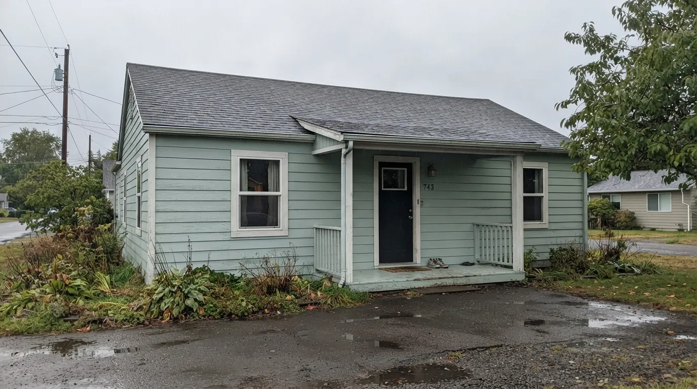
This is the color's one well-documented weak spot: on an exterior in a mostly gray-sky region, without a dark roofline, door or window frame to anchor it, Breezeway can read washed-out and faded rather than fresh. The fix is contrast, not a different color — add a near-black trim (Wrought Iron, Kendall Charcoal) and it holds its shape even under flat sky.
Breezeway is a cool green-blue; honey-toned wood and gold undertones sit almost opposite it on the wheel. Put them together and the wood looks more orange while the wall looks more washed and blue. It wants walnut, white oak, gray-washed floors, or matte black — not builder-grade golden oak.
On a small chip in a bright store it can look like a quiet gray. On four walls in normal daylight the green and blue are unmistakable. If "gray with almost no color" was the goal, this reads as more personality than that — look at a true neutral gray instead and let this one stay a green-blue.
Room by Room
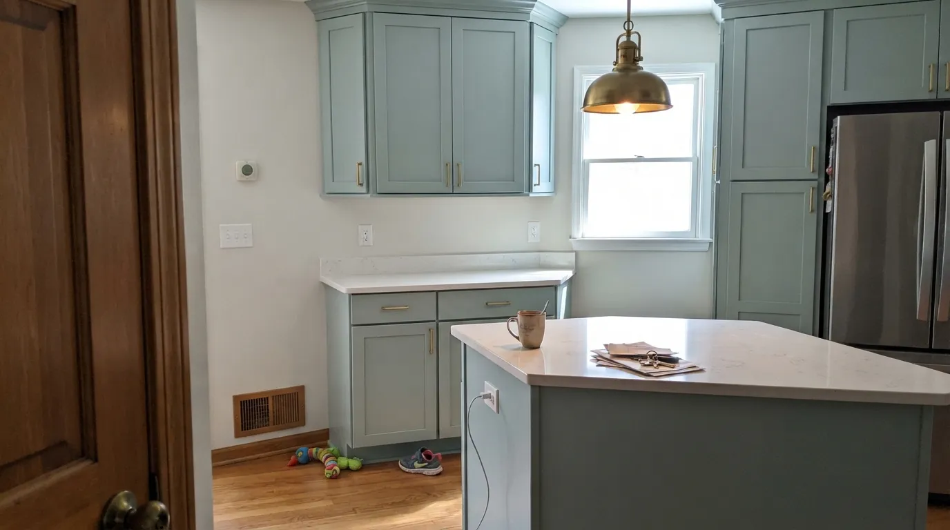
On cabinets or a full kitchen, brass and nickel hardware glow against it and it reads sophisticated rather than trendy. Satin cabinet enamel; pair with a warm white counterpart on the walls so the whole room does not go cool at once.
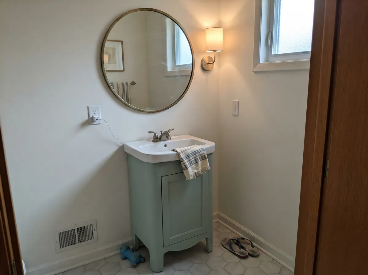
Small rooms with real daylight and metal fixtures are exactly where the sea-glass effect shows off. Eggshell or satin for the moisture and the wipe-down.
Cool enough to feel calm for focus work, bright enough at LRV 65 to avoid feeling closed-in, especially with a north or east window.
In a bright, open room with real daylight it is genuinely lovely and easy to live with. In a dim or heavily shaded room it goes flat and colorless — sample it on the actual wall, at the actual time of day, before committing a whole room.
The same shift that makes it interesting during the day (mint at noon, blue-silver at dusk) can feel unsettled at night without help. Keep the bulbs at 2700K to hold some warmth against the cool base, or it can read a little cold once the sun goes down.
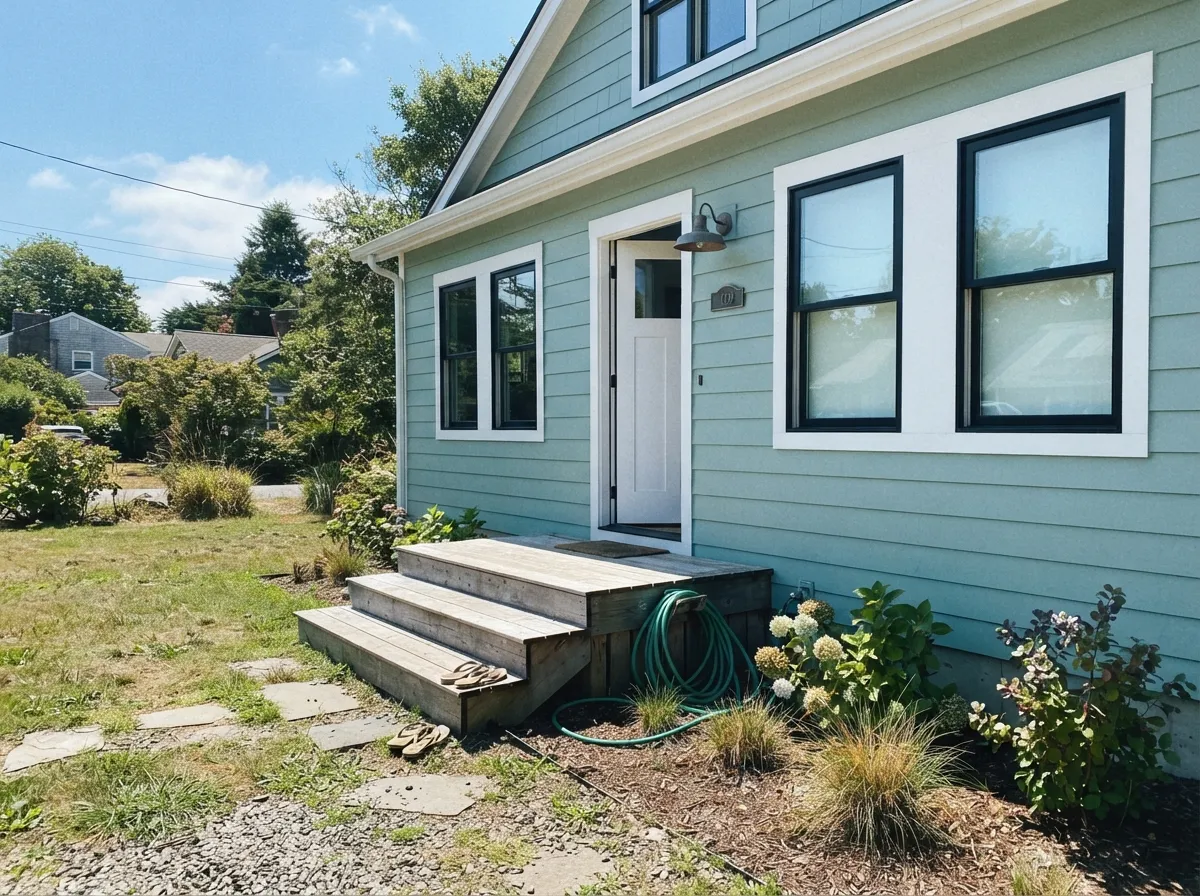
A genuine coastal-cottage color in bright, sunny climates, especially with black or charcoal trim and a white door. In a mostly overcast region, it needs that dark trim to keep from washing out — see the fails section above.
Your Light Is the Risk
The color thins toward a delicate sea-glass mint and the metal in the room starts to gleam. This is the light the Color of the Year reputation was built on.
Blue and silver take over, green mostly drops out, and on an exterior without dark trim it can read faded. Test on an actual gray-sky day before committing a whole house.
Balanced green-blue at midday, paler and mintier in strong sun, cooler and more silvery-blue as the light fades toward dusk.
2700K warm bulbs pull it toward a soft sage-gray and keep it from feeling cold at night. Cool white LEDs push it further blue — swap the bulbs before you blame the paint.
Most complaints about Breezeway are a light mismatch. Upload a photo of your actual room and see it on your walls — then ask for the same wall in north light or evening lamps before you buy a single sample.
Need It From Another Brand?
Any paint counter can custom-tint Behr MQ3-21 directly. If you would rather stay in one brand's own deck, these are the closest stock matches, measured as ΔE2000. Under 2 is a difference you will not see on the wall.
| Brand | Closest color | ΔE | LRV | |
|---|---|---|---|---|
| Sherwin-Williams | Pine FrostSW 9656 · Sherwin-Williams | 2.9 | 65 | Color page → |
| Benjamin Moore | Swept Away701 · Benjamin Moore | 1.3 | 63 | Color page → |
| Valspar | Opal Fire8003-34B · Valspar | 0.9 | 65 | Color page → |
| PPG / Glidden | Blue LullabyPPG1143-2 · PPG / Glidden | 1.4 | 65 | Color page → |
| Glidden | Blue LullabyPPG1143-2 · Glidden | 1.7 | 66 | Color page → |
| Dutch Boy | Muted Opal331-2DB · Dutch Boy | 1.9 | 65 | Color page → |
Similar Behr Colors
The nearest shades to Breezeway within Behr's own range, ranked by perceptual color distance — useful when you want the same look a touch lighter, darker, or warmer.
WCAG 2.1: AA is 4.5 : 1 for normal text, 3 : 1 for large text, AAA is 7 : 1.
Breezeway vs the Colors You're Also Considering
Every Breezeway sample board has the same rivals on it. The numbers show the real lightness gap — then it comes down to which risk you would rather live with.
Pick this for the confirmed Color of the Year pedigree and a slightly stronger green lean over Sea Salt's blue-gray.
Sherwin-Williams SW 6204 · LRV 63Sea SaltPick this if your painter works in Sherwin-Williams — it is nearly the same light-reflectance twin, cooler on the chip and just as light-dependent.
Pick this for the pale, sea-glass lightness — Evergreen Fog sits at less than half the LRV.
Sherwin-Williams SW 9130 · LRV 30Evergreen FogPick this for a deeper, more saturated sage with real weight — a cabinet and accent-wall color, not a pale whole-room green.
Pick this for the fresher, more clearly green-forward sea-glass — Woodlawn Blue leans moodier and more traditional.
Benjamin Moore HC-147 · LRV 61Woodlawn BluePick this for the more historic, slightly deeper blue-green take on the same cool calm.
Pick this for the cooler, more watery green-blue — October Mist never turns silvery-blue the way Breezeway does at dusk.
Benjamin Moore 1495 · LRV 39October MistPick this for a warmer, olive-leaning sage that skips the blue entirely — the safest sage in the BM deck when your room has real daylight.
Silver Marlin N360-2 at LRV 64 is nearly the same color, a hair darker and no real difference in cast. Dolphin Fin 790C-3 at LRV 65 pushes slightly more yellow-green, so it feels a touch warmer. Frosted Silver BNC-07 at LRV 65 goes the other way, with hex #C6D7D1 reading cooler and more blue-green. Salt Glaze PPU12-11 at LRV 65 is the most neutral of the group and the safest if the green worries you.
Across brands, Valspar Opal Fire 8003-34B at LRV 65 is a deltaE of 0.87 and is the same color in practice. Kompozit and Hirshfield's Calm Breeze 0461 at 1.21 and Benjamin Moore Swept Away 701 at LRV 63 and 1.28 will look identical in normal room light.
Sherwin-Williams Pine Frost SW 9656 at LRV 65 is 2.94, very close but sample it first, since its hex #D0D5CB reads a little yellower. Farrow and Ball Blanc de Chine No. 9814 at LRV 63 is 3.46 and Dunn-Edwards Mount Sterling DE6317 at LRV 59 is 4.85, both close but visibly different side by side.
Breezeway Coordinating Colors
The rule for coordinating with Breezeway: stay cool or neutral, keep the metal polished, and give it one dark anchor so it doesn't drift toward faded. It pairs with warm whites better than stark ones, loves brass and nickel, and sits comfortably next to its own deeper cousins. These are the partners that keep showing up in rooms that work:
Breezeway's Color of the Year Story
Behr named Breezeway its Color of the Year for 2022, built around a sea-glass concept: pale green-blue glass worn soft and smooth by ocean water. The messaging leaned on renewal and calm, which is standard Color of the Year copy — but the color itself has outlasted the campaign. It still shows up regularly in kitchen and bathroom design coverage years later, which most annual color picks do not manage.
It also is not really a solo act. Sherwin-Williams' Sea Salt and Rainwashed occupy almost the identical light-gray-green-blue territory, and Benjamin Moore has Woodlawn Blue and Quiet Moments in the same family. That is worth knowing before you paint: this is less a single trendy pick than one entry in an entire pale-coastal-neutral category that has proven durable across every major paint brand, which lowers the repaint risk considerably.
Breezeway With Wood Tones and Metal Finishes
Metal is the easy, reliable part: brass, unlacquered brass, nickel, chrome and stainless steel all catch a genuine gleam against Breezeway, which is the real reason it became a kitchen and bathroom favorite rather than just a wall color. Matte black hardware works too, just with less of the shimmer effect.
Wood needs more thought. Walnut, white oak, and gray-washed or weathered wood all sit comfortably next to the cool green-blue-gray. Honey oak, red-toned cherry, and anything gold-varnished are the mismatch: yellow-orange sits close to opposite this color on the wheel, so the wood looks more orange and the wall looks more washed-out blue at the same time. If the honey floor is staying, keep it away from a full-room Breezeway and use it in smaller doses — a vanity, an island, a powder room — instead.
Three Ready Palettes Built on Breezeway
A color is never alone on the wall. These are complete combinations in the 60-30-10 pattern, with the reason each one holds together. Every one opens in the visualizer.
Polar Bear keeps the room bright and neutral so Breezeway's sea-glass color carries the cabinets without a fight, and Wrought Iron on the pantry door supplies one grounding dark note that lets brass hardware do the glowing Behr's own color story promises.
Try this palette in your roomA warm trim white keeps the cool sea-glass walls from feeling clinical, and one charcoal accent on built-ins adds depth without competing with the green-blue — a calm, focused room that still has real contrast.
Try this palette in your roomDark shutters and a dark door are exactly the anchor that keeps Breezeway from washing out under gray sky, and Behr's own bright trim white sharpens the edges so the whole facade reads crisp coastal cottage instead of faded pastel.
Try this palette in your roomBreezeway FAQ
Is Breezeway blue or green?
Both, plus gray — that three-way blend is the whole point of the color. Bright light tips it toward green-mint, dim or overcast light tips it toward blue-silver. Nobody's sample is wrong; they are just looking at it in different light.
Was Breezeway really Behr's Color of the Year?
Yes — 2022. It is one of the more decorated colors in Behr's current lineup, styled after sea glass, and it still shows up in kitchen and bathroom design coverage years later, which is more staying power than most Color of the Year picks get.
Does Breezeway work on a house exterior?
Yes, especially in a bright, sunny climate with dark trim — black or charcoal shutters and doors keep it looking crisp rather than faded. In a mostly overcast region, skip it without that dark anchor; it can wash out under flat gray sky.
What white goes with Breezeway walls?
A warm white keeps the room from feeling entirely cold — Benjamin Moore White Dove or Behr Polar Bear both work as trim. A stark, blue-white trim doubles down on the cool side and can feel clinical.
Does Breezeway work with honey oak floors?
Not well. Honey oak and gold-toned trim sit almost opposite this color on the wheel, so the floor reads more orange and the wall reads more washed-out blue. Walnut, white oak, or gray-washed floors are the better match.
Is it good for kitchen cabinets?
One of its best uses. The subtle gray in Breezeway picks up the gleam of brass or nickel hardware and stainless appliances, which is exactly why designers reach for it on islands and cabinet runs. Use a satin cabinet enamel.
Have you painted with Breezeway?
Rate it — one tap helps the next reader decide.
Ask a Question