Butterscotch
The golden caramel-orange everyone half-remembers from Sherwin-Williams' yellow wall, reviewed honestly: the one job it's built for, the light that turns it muddy, and where it does not belong.

Jessica has spec'd whites and neutrals for more than 300 rooms and keeps a sample wall of painted drawdowns in her studio. Every color review is checked against real reader rooms in the comments and re-tested when a formula changes. About the testing process →
- 1Rookwood Terra Cotta14
- 2Rusty Gate19
- 3Butterscotch25
- 4Caramelized35
- 5Venetian Plaster42
The Fast Verdict
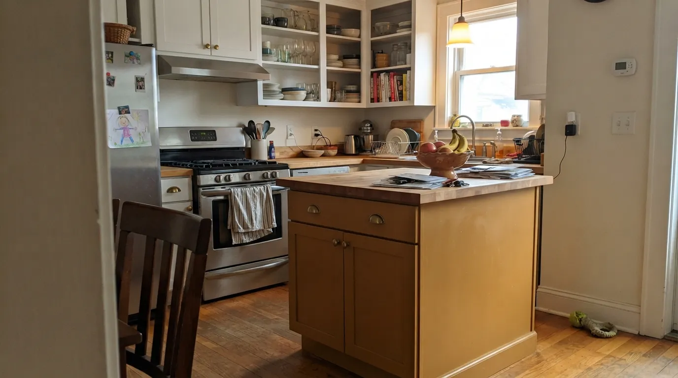
Butterscotch sits right on the border between amber-yellow and true orange — Sherwin-Williams itself can't decide which family page to file it under, and neither will your eye. On a kitchen island, a front door, or a set of built-ins it reads rich and gilded, the color equivalent of brown sugar. Roll it across four walls of a small room and it stops being caramel and starts being pumpkin. This is an accent color wearing a wall-paint SKU.
Kitchen islands and lower cabinets · a front door with real personality · dining room millwork and built-ins · anyone who wants an orange that reads warm gold, not traffic-cone
You want it on all four walls of a small room · your kitchen already has warm wood and brass everywhere · your room runs on cool north light or fluorescent bulbs · you're not ready to commit to a genuine accent color
- Genuine amber-caramel warmth — richer and more interesting than a flat orange
- LRV 25 gives it real depth without going near-black
- Outstanding with brass, walnut, and butcher block
- Strong enough to be a real accent statement, not another beige
- Reads gilded and expensive on cabinets, doors, and built-ins
- Too saturated for whole-room walls in most homes
- Fights cool gray quartz, chrome, and blue-white marble
- Goes flat and muddy under cool light or in a north-facing room
- Not a safe, resell-friendly color — it's a personality color, not a neutral
What Color Is Butterscotch, Really?
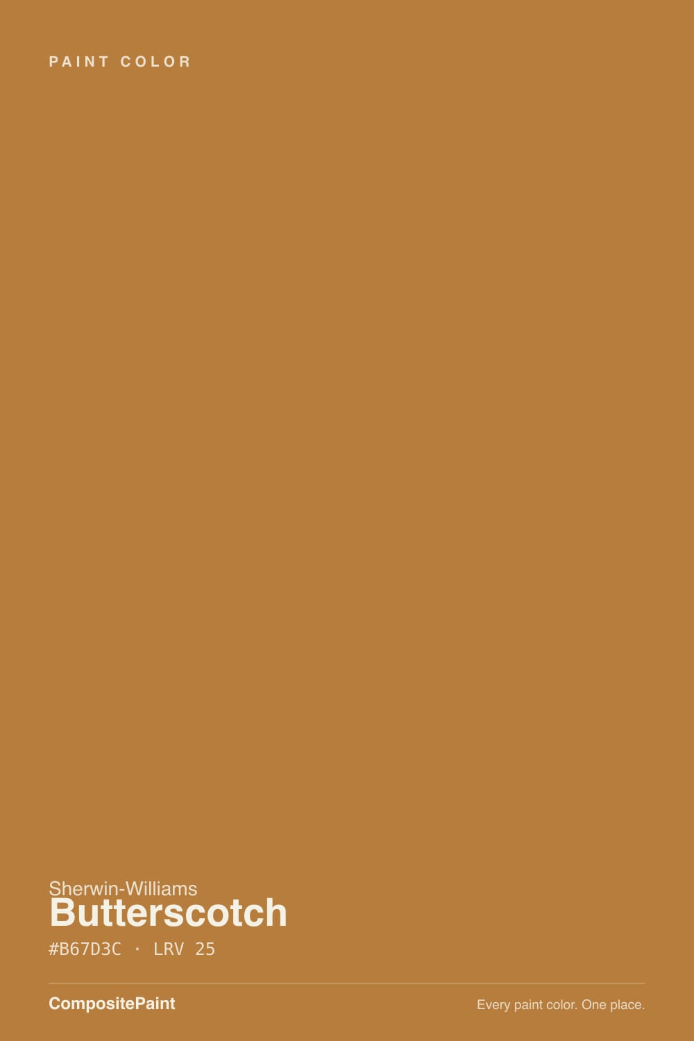
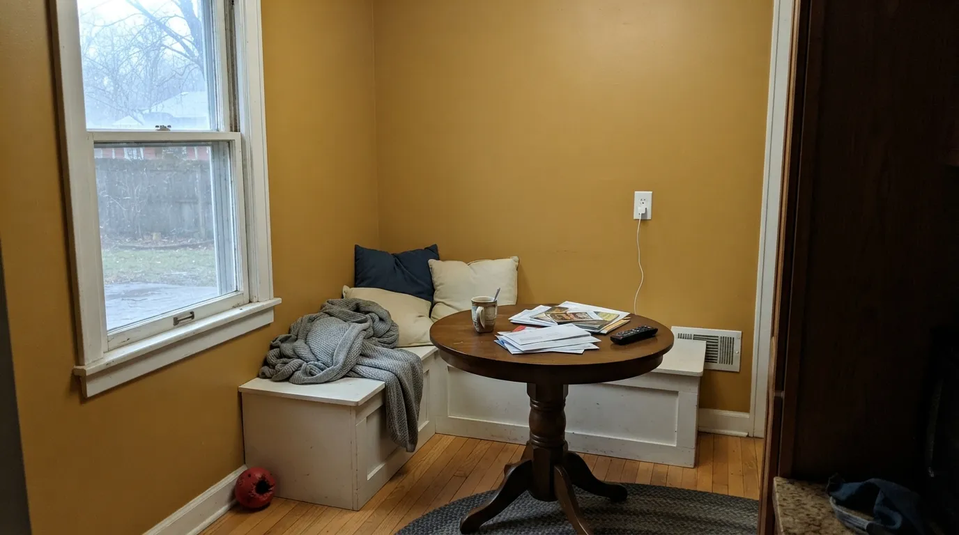
SW 6377 is a medium-deep golden brown with a genuine amber-caramel character — sweeter than a straight orange, heavier than a butter yellow. Sherwin-Williams' own site can't settle on a family for it: one product page files it under Yellow Paint Colors, another labels it simply an Orange Paint Color. That confusion is the color in a nutshell — it sits exactly at the border, and which side you see depends on the light and what's next to it.
At LRV 25 it is a genuinely deep, saturated color — not a pastel, not a wash. That depth is what makes it read like caramel instead of a cartoon crayon: there's enough brown mixed in to keep it grounded, and enough gold to keep it from turning muddy. It behaves less like a neutral and more like a spice — a little goes a long way, and full rooms of it get overwhelming fast.
Undertone in one line: amber-red, never true yellow. Push it into cool light or next to blue-grays and the red comes forward and it edges toward rust; give it warm daylight and wood and the gold wins. If your sample looks flatter and browner than you expected, that's usually a north-facing room or a cool white LED bulb doing the work — not a bad batch of paint.
Where It Shines
Give it a single surface to own — an island, a front door, built-in shelving — and warm afternoon light, and it glows like actual butterscotch candy: rich, a little sticky-looking in the best way, genuinely photogenic next to brass and walnut. It is a color that wants a job, not a whole room.
Where It Fails
The regret stories about Butterscotch follow a short, predictable list — and every one of them comes from asking a spice to behave like a neutral.
At LRV 25 with real chroma, a full room of Butterscotch reads less "golden retreat" and more "pumpkin patch," especially in a small or enclosed space with no relief color. Use it as an island, a door, one wall, or built-ins — not the whole box.
Cool gray quartz, white marble with blue veining, and polished chrome all sit at the opposite temperature and make the orange in Butterscotch louder and less caramel. Warm stone, brass, and matte black are the metals and surfaces that keep it reading gold instead of traffic-cone.
North-facing rooms and cool-white LEDs strip the amber out and leave a flatter, muddier brown-orange — the "it looked so different on the chip" complaint. This color earns its name under warm 2700K light and real daylight; skip it if you're not willing to swap bulbs.
Room by Room
Lower cabinets or an island under white or pale upper cabinets is the classic move — it grounds the room without eating the whole thing, and it flatters brass hardware and butcher block hard. Satin or semi-gloss cabinet enamel, never flat.
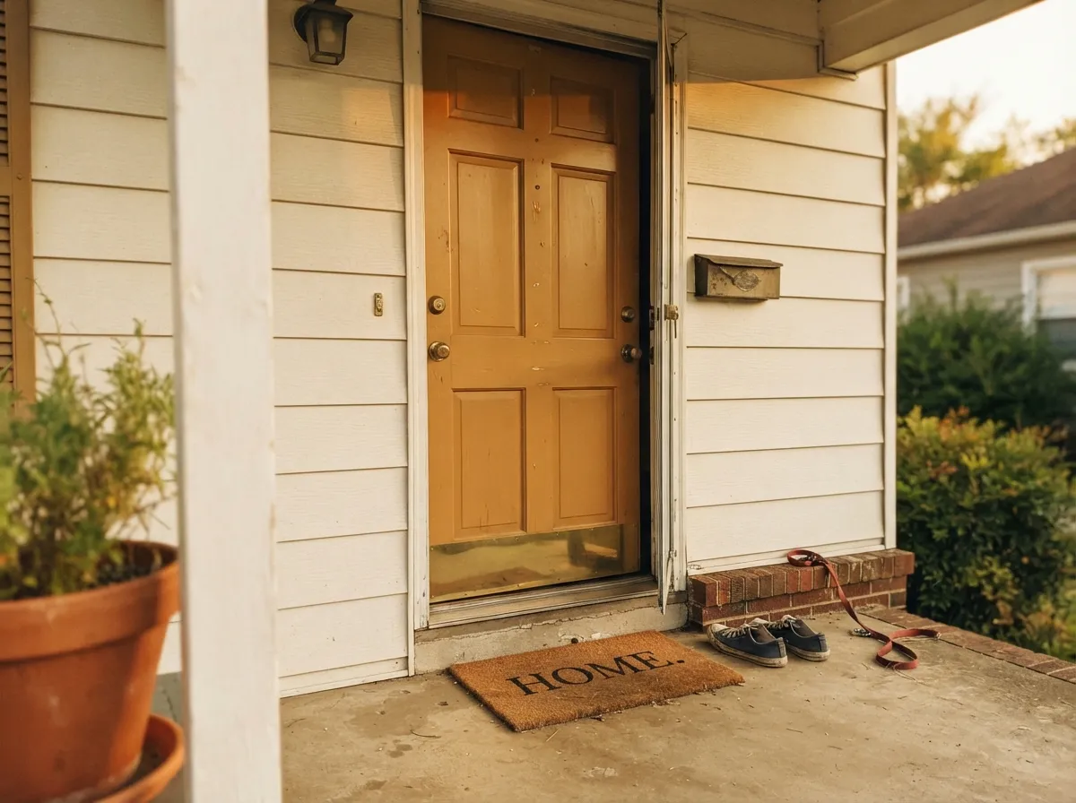
A saturated, welcoming color that reads as intentional rather than trendy, especially against a warm white or greige house. Semi-gloss, and keep the surrounding trim a calmer neighbor — white or a warm greige, not another loud color.
On a hutch, wainscoting, or one accent wall under a warm white it reads like an expensive, considered choice. On all four walls it competes with the food on the table for attention — literally.
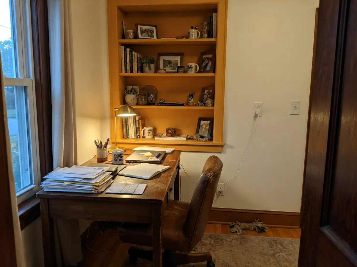
Built-in shelving or a single wall behind a walnut desk, paired with leather and brass task lighting, is exactly the kind of confident, grown-up use this color wants. Eggshell or satin for durability.
One wall, a media cabinet, or a piece of millwork works; four walls in an open-plan space fights every other color in the room, including whatever's in the adjoining kitchen.
It is an energizing, appetite-triggering color, the opposite of what a bedroom wants. If you love the tone, borrow it for a headboard wall in a guest room you don't sleep in every night — not your own.
Your Light Is the Risk
Direct warm sun brings the gold forward and the color reads exactly like its name — rich, glowing, a little sweet.
Cool light strips the amber out and leaves a flatter, duller brown-orange. Test with your actual bulbs before committing a whole cabinet run to it.
Golden and bright at the sun hours, quieter and browner the rest of the day — expect it to visibly change, not stay static.
2700K bulbs push it toward true caramel at night. Cool white LEDs make it look closer to a dull terracotta — swap the bulb before you swap the paint.
Most complaints about Butterscotch are a light mismatch. Upload a photo of your actual room and see it on your walls — then ask for the same wall in north light or evening lamps before you buy a single sample.
Need It From Another Brand?
Any paint counter can custom-tint Sherwin-Williams SW 6377 directly. If you would rather stay in one brand's own deck, these are the closest stock matches, measured as ΔE2000. Under 2 is a difference you will not see on the wall.
| Brand | Closest color | ΔE | LRV | |
|---|---|---|---|---|
| Behr | Roasted CashewS250-5 · Behr | 1.8 | 24 | Color page → |
| Benjamin Moore | Caramel Corn2160-10 · Benjamin Moore | 2.3 | 25 | Color page → |
| Valspar | Garden Ochre3005-5A · Valspar | 1.2 | 26.1 | Color page → |
| PPG / Glidden | Cider ToddyPPG1207-7 · PPG / Glidden | 2.9 | 26 | Color page → |
| Glidden | Cider ToddyPPG1207-7 · Glidden | 2.5 | 26 | Color page → |
| Dutch Boy | Sparrow's Beak213-7DB · Dutch Boy | 3.0 | 24 | Color page → |
Similar Sherwin-Williams Colors
The nearest shades to Butterscotch within Sherwin-Williams's own range, ranked by perceptual color distance — useful when you want the same look a touch lighter, darker, or warmer.
WCAG 2.1: AA is 4.5 : 1 for normal text, 3 : 1 for large text, AAA is 7 : 1.
Butterscotch vs the Colors You're Also Considering
Every Butterscotch sample board has the same rivals on it. The numbers show the real lightness gap — then it comes down to which risk you would rather live with.
Pick this for the brighter, more golden caramel — Cavern Clay is flatter and cooler by comparison.
Sherwin-Williams SW 7701 · LRV 24Cavern ClayPick this for a more muted, dusty terracotta that reads more brown than gold — better for whole exterior walls.
Pick this when beige has started to feel safe and boring and you want a color with actual pigment.
Sherwin-Williams SW 7037 · LRV 47Balanced BeigePick this if you want the warmth without committing to orange — a real beige, not a caramel.
Butterscotch Coordinating Colors
The rule for coordinating with Butterscotch: warm whites and warm neutrals to give it room to breathe, deep warm browns and near-blacks to frame it, and nothing cool or blue nearby. These are the partners that keep it reading gold instead of orange:
Yellow or Orange? Sherwin-Williams Can't Quite Decide Either
This is not a rhetorical question. Sherwin-Williams' own website files SW 6377 Butterscotch under its "Yellow Paint Colors" collection page, while a separate homeowner product listing titles it simply an "Orange Paint Color." Both are defensible — the color sits close enough to the border that the brand's own taxonomy splits on it.
In practice, that ambiguity is the most useful thing to know before you buy a sample. Anyone expecting a cheerful butter-yellow will find Butterscotch noticeably deeper and more orange on the wall than the name suggests; anyone expecting a full orange will find it more amber and less saturated than a paint called "Pumpkin" or "Marigold." It reads as caramel precisely because it refuses to fully commit to either family — which is also why it works best as an accent rather than a wall color you have to live inside.
Butterscotch With Wood Tones and Floors
Dark, cool-toned wood — walnut, espresso, ebonized oak — is the best partner: the contrast in value and temperature lets the caramel read as a deliberate warm accent against a calm, grounded floor. Painted white or pale-gray floors do the same job from the other direction, giving the color a quiet, neutral stage.
The one match that fights itself is honey oak or another already-orange, mid-tone wood floor. Two warm oranges in the same room compete rather than cooperate, and the wall can end up looking like an extension of the floor instead of a deliberate color choice. If the floor is staying golden, keep Butterscotch to a single contained surface — a door, an island, a shelf — rather than a wall the floor runs right up to.
Three Ready Palettes Built on Butterscotch
A color is never alone on the wall. These are complete combinations in the 60-30-10 pattern, with the reason each one holds together. Every one opens in the visualizer.
Alabaster keeps the room bright enough for a saturated island to feel intentional instead of overwhelming; Urbane Bronze on the hood repeats the color's warm-dark side so the kitchen reads coordinated, not accidental.
Try this palette in your roomGreek Villa's warm white keeps the composition calm enough for the door to be the one loud note; Iron Ore's near-black shutters frame it without competing for the same warm-gold territory.
Try this palette in your roomNatural Linen already leans warm, so the built-ins escalate the same temperature instead of fighting it; Sable's deep brown grounds the palette so the gold doesn't read like the only decision in the room.
Try this palette in your roomButterscotch FAQ
Is Butterscotch too orange for a kitchen?
Not as an island or lower cabinets — that's the job it's genuinely good at. It gets "too orange" fast if you try to use it as a wall color across a large, bright kitchen; keep it to one surface and let white or pale cabinets do the rest of the room.
Is Butterscotch warm or cool?
Warm, with an amber-red undertone — never a true cool yellow. Cool light and blue-toned surfaces push it toward rust; warm light and wood push it toward gold. It never reads cold, only sometimes duller.
What trim white goes with Butterscotch?
A warm off-white like Alabaster or Natural Linen, not a stark cool white. A blue-white trim makes the orange look harsher by contrast; a warm white lets the caramel read as intentional.
Does it work on a front door?
Yes — it's one of its strongest jobs. Semi-gloss, a warm-toned house body, and dark or black shutters give it the contrast it wants without a second loud color competing for attention.
Can I use it on kitchen cabinets?
Yes, especially lower cabinets or an island under lighter upper cabinets. Use a satin or semi-gloss cabinet-grade enamel — flat sheen will look chalky and won't hold up to daily use.
Does it clash with gray quartz countertops?
Cool gray quartz and Butterscotch are genuine opposites in temperature, and the contrast can look harsh rather than intentional. Warm-toned quartz, butcher block, or a warm-veined stone are safer partners; if your counters are already cool gray, sample big before committing cabinets to this color.
Have you painted with Butterscotch?
Rate it — one tap helps the next reader decide.
Ask a Question