Dolphin Fin
One of Behr's best-selling grays ever, reviewed honestly: the light where it turns warm greige, the light where it flashes blue, and what to pick instead.

Jessica has spec'd whites and neutrals for more than 300 rooms and keeps a sample wall of painted drawdowns in her studio. Every color review is checked against real reader rooms in the comments and re-tested when a formula changes. About the testing process →

- 1Mindful Gray48
- 2Light French Gray53
- 3Dolphin Fin59
- 4Pale Oak69
- 5Shoji White74
The Fast Verdict
Dolphin Fin is the gray Behr sells more of than almost anything else in the deck, and it earns that spot honestly: at LRV 59 it holds real body without going dark, and it carries both a warm beige base and a cool blue undertone at once. That dual nature is the whole story — in bright, warm light it reads like a soft greige; in flat or north light it slides toward a stormy blue-gray. Most buyers love the range. Some just wanted one gray and got two.
Rooms with real daylight from more than one direction · kitchens that want cabinets and walls in the same family · exteriors next to brick or stone · anyone who likes a gray with a little movement in it
You need the exact same color in every room of an open floor plan · your only window faces north · you're already using Agreeable Gray next door and expect a seamless match · you want a gray that reads identical morning to night
- One of Behr's genuine best-sellers — proven across thousands of real houses, not a hyped launch color
- LRV 59 holds real color without going dark or washing out
- Warm beige and cool blue undertones both present — flexible with brass or black, wood or stone
- A strong cabinet color that reads expensive under real daylight
- Pairs naturally with brick and stone on exteriors
- The same undertone flexibility means it isn't consistent room to room in mixed exposures
- Goes flat, stormy blue-gray in north light and under cool LEDs
- Close enough to Agreeable Gray and Repose Gray on paper that people assume they'll match — they don't, exactly
- Not the color to pick if you want one predictable gray everywhere
What Color Is Dolphin Fin, Really?
Dolphin Fin is a light-to-mid greige that Behr classifies in its gray family, and it has quietly become one of the brand's all-time best-selling colors — sitting alongside Silver Drop, Ultra Pure White and Whisper White on Behr's own top-seller lists, with none of the Color-of-the-Year fanfare those launches usually get. It built that following the slow way: painters and homeowners kept reaching for it because it works in more rooms than a single-note gray or beige can.
At LRV 59 it sits in the same middle band as Sherwin-Williams Agreeable Gray (LRV 60) and Repose Gray (LRV 58) — light enough to open up a room, dark enough to hold real color on the wall instead of washing out. Next to Behr's own Silver Drop (LRV 70), Dolphin Fin reads noticeably deeper and more pigmented; it is not one of the airy, near-white greiges.
Undertone in one line: warm beige base, cool blue undertone, and the room decides which one you see. South-facing daylight and yellow-toned bulbs pull it toward a soft, creamy greige. North-facing daylight and cool LEDs pull the same paint toward a stormy blue-gray. East rooms tend to run warm in the morning and cooler by afternoon; west rooms do the reverse. This is not a defect — it is the color's whole personality — but it means the swatch in the store and the wall in your specific room can look like two different colors.
Where It Shines
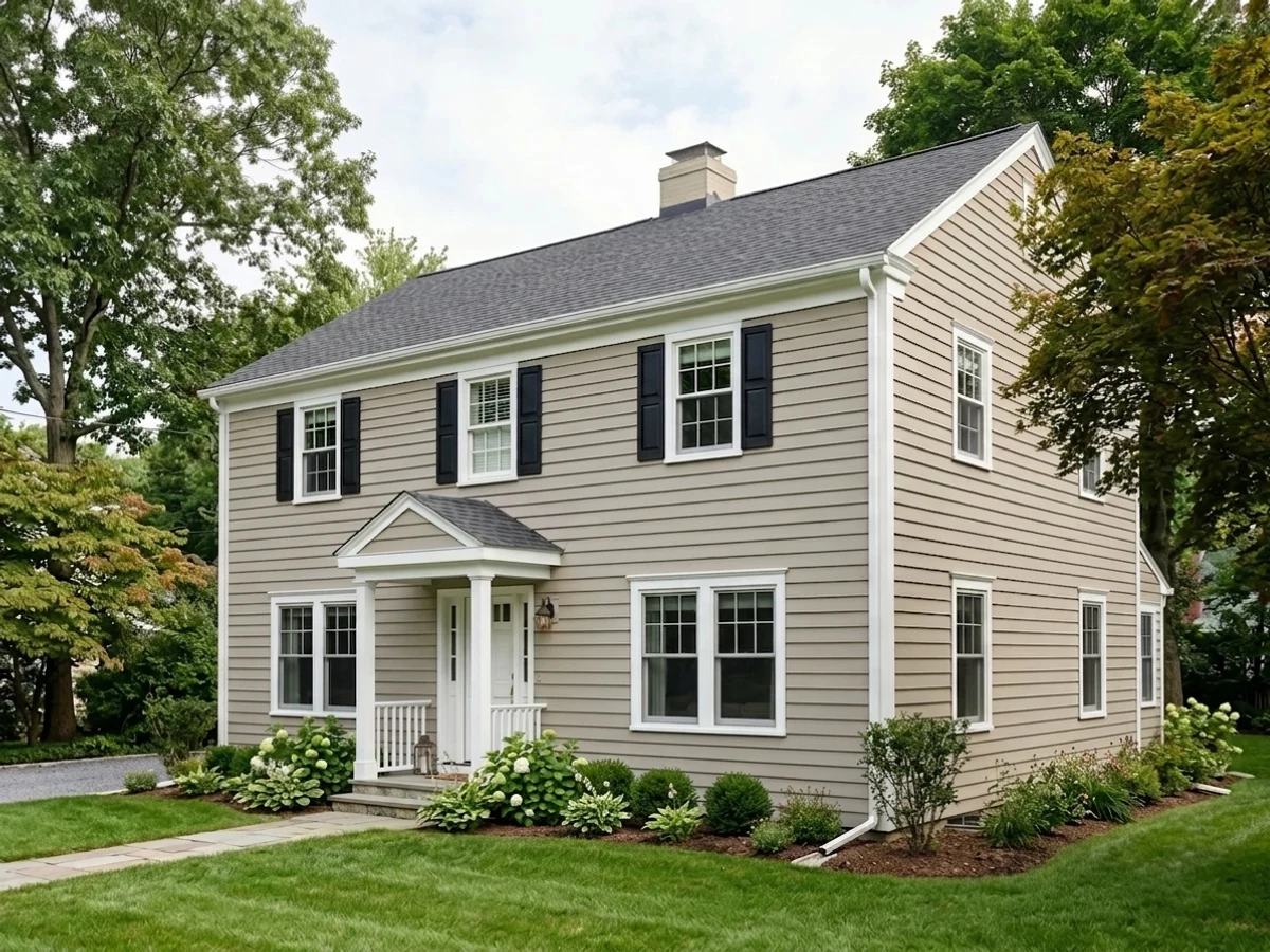
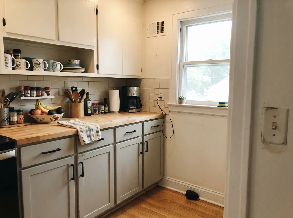
It is at its best in rooms that get consistent, real daylight — south light especially, but any room with more than one window handles it well. That's also why it has become a favorite for kitchens: cabinets in Dolphin Fin under a bright window read as a warm, expensive greige, and the same undertone that flatters brass also gets along with black hardware and stainless. Outside, it pairs naturally with brick and stone, which is why it shows up so often on exteriors that never had a gray phase before.

Where It Fails
The complaints about Dolphin Fin almost never say the color is bad — they say it isn't what they expected, and that's a predictable result of buying a chameleon undertone without testing it in your own light first.
Dolphin Fin genuinely shifts by exposure: warmer and greige-leaning in south and west afternoon light, cooler and distinctly blue in north light and morning east light. Paint an open floor plan with mixed exposures and the same can of paint can look like two slightly different colors room to room. If you need one unwavering read, pick a less directional color and test it in every room first — this one won't give you that.
Cold light cancels the warm beige side and leaves the blue undertone standing alone. Owners who bought it after seeing it glow in a bright showroom often describe the north room version as flat, stormy, or "a little muddy." The fix is warm 2700K bulbs and a lamp doing real work in that room — or choosing Agreeable Gray instead, which stays more decisively beige regardless of light.
The three colors sit close enough on paper (LRV 58–60, same greige family) that people assume they're interchangeable across an addition or a room-to-room repaint. They aren't: Dolphin Fin runs cooler and bluer than Agreeable Gray's confident beige, and side by side under the same light the seam shows. If you're extending an existing Agreeable Gray or Repose Gray scheme, use that same color — don't swap in Dolphin Fin expecting a blend.
Room by Room
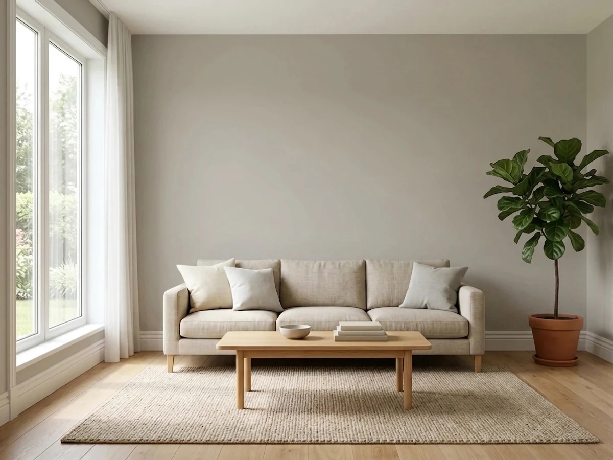
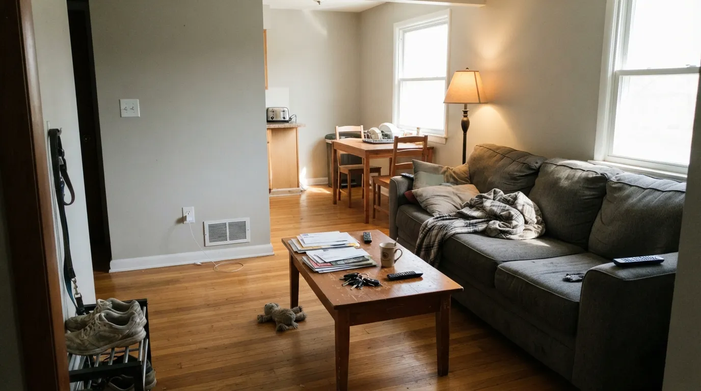
A living room with two or more exposures is exactly where the chameleon effect works for you instead of against you — warmer in the afternoon sun, cooler and calmer in the morning. Eggshell finish; keep the trim in a warm white, not a stark cool one.
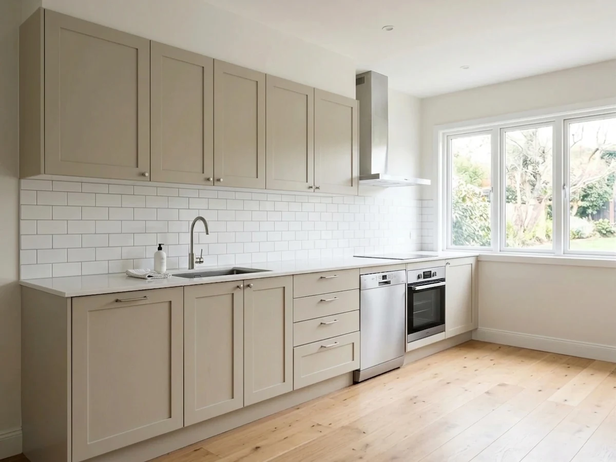
Dolphin Fin cabinets under a bright window are a genuine designer look, and the undertone is forgiving with both brass and black hardware. Satin or a cabinet-grade enamel; pair with a warm white wall, not a cool white, to keep the whole room reading the same temperature.
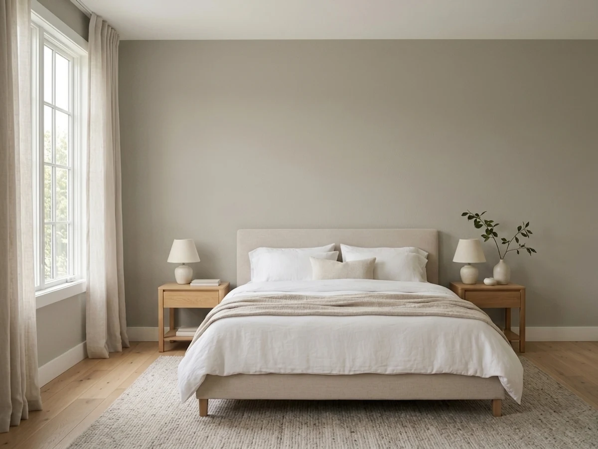
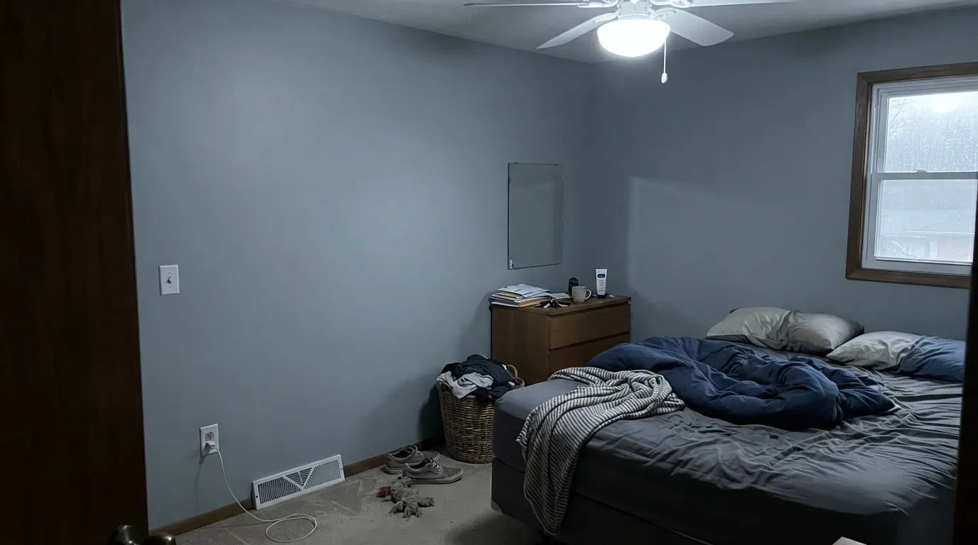
Calming in daylight, and it turns soft and neutral under a warm bedside lamp at night. A north-facing bedroom with no lamps is the one setup that disappoints — it goes cool and flat exactly when you want cozy.
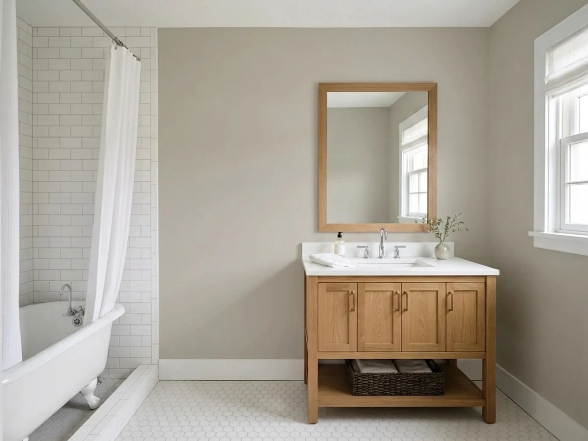
With warm-toned tile, wood vanities or brass fixtures it leans into its beige side and looks expensive. With cool white subway tile and chrome, the blue undertone comes forward instead — neither is wrong, but know which bathroom you have before you commit.
A good hand-off color between rooms of different temperature because it can meet a warm room on one side and a cooler one on the other without looking out of place either way.
Full sun reads it as a clean, contemporary gray, and it sits comfortably next to brick and natural stone in a way that some cooler grays fight. White or black trim both work; this is one of the more dependable places to use this color precisely because exterior light doesn't swing as wildly as a single indoor room's exposure does.
Your Light Is the Risk
Direct, warm daylight pulls the beige side forward and the color settles into a soft, confident greige all day.
Cool, flat daylight strips the warmth and exposes the blue undertone — the color most owners describe as "stormier" than they expected.
East rooms run warm and creamy in the morning, cooler by afternoon. West rooms do the reverse — gray in the morning, warmer by evening.
2700K warm bulbs keep it in its beige lane after dark. Cool white LEDs bring the blue undertone back out — swap the bulb before you swap the paint.
Most complaints about Dolphin Fin are a light mismatch. Upload a photo of your actual room and see it on your walls — then ask for the same wall in north light or evening lamps before you buy a single sample.
Need It From Another Brand?
Any paint counter can custom-tint Behr 790C-3 directly. If you would rather stay in one brand's own deck, these are the closest stock matches, measured as ΔE2000. Under 2 is a difference you will not see on the wall.
| Brand | Closest color | ΔE | LRV | |
|---|---|---|---|---|
| Sherwin-Williams | Repose GraySW 7015 · Sherwin-Williams | 0.6 | 58 | Color page → |
| Benjamin Moore | WishAF-680 · Benjamin Moore | 1.8 | 59 | Color page → |
| Valspar | Filtered Shade4003-1B · Valspar | 1.9 | 58.4 | Color page → |
| PPG / Glidden | Swirling SmokePPG1007-2 · PPG / Glidden | 1.8 | 59 | Color page → |
| Glidden | Swirling SmokePPG1007-2 · Glidden | 1.0 | 59 | Color page → |
| Dutch Boy | Doves Wings443-1DB · Dutch Boy | 2.0 | 60 | Color page → |
Similar Behr Colors
The nearest shades to Dolphin Fin within Behr's own range, ranked by perceptual color distance — useful when you want the same look a touch lighter, darker, or warmer.
WCAG 2.1: AA is 4.5 : 1 for normal text, 3 : 1 for large text, AAA is 7 : 1.
Dolphin Fin vs the Colors You're Also Considering
Every Dolphin Fin sample board has the same rivals on it. The numbers show the real lightness gap — then it comes down to which risk you would rather live with.
Pick this when you want a little cool movement in the color instead of one flat read.
Sherwin-Williams SW 7029 · LRV 60Agreeable GrayPick this if you want a greige that stays decisively warm and beige no matter what the light does.
Pick this for the slightly cooler, more blue-leaning version of the same idea.
Sherwin-Williams SW 7015 · LRV 58Repose GrayPick this if your painter only stocks Sherwin-Williams — the undertones are close enough to be the same color in most light.
Side-by-side comparison →The most-searched matchup is Dolphin Fin versus Sherwin-Williams Repose Gray (SW 7015). Repose Gray is noticeably lighter at LRV 58 versus 47, and it leans cooler and grayer. On the wall, Repose Gray keeps a room airier and safer in dim spaces, while Dolphin Fin gives more visible color and warmth. Pick Repose Gray for small or north-facing rooms; pick Dolphin Fin when off-whites and pale grays have been disappearing on your walls.
Inside Behr's own deck, Rushmore Gray (HDC-CL-27G) at LRV 45 is nearly identical in depth and hue; most people could not tell the two apart across a room, so availability and the rest of your palette can decide. Behr Greige (PPU24-11) at LRV 46 sits a touch grayer and slightly less warm, which makes it the better choice if Dolphin Fin's khaki lean shows too strongly in your afternoon light.
Dolphin Fin Coordinating Colors
Because it carries two undertones at once, Dolphin Fin coordinates comfortably with both warm and cool company — the trick is picking a lane for your trim and accents so the whole room doesn't feel like it's arguing with itself. These are the partners that keep showing up in rooms that work:
Behr's Quiet Bestseller
Dolphin Fin never had a Color-of-the-Year campaign or a viral TikTok moment. It built its following the slow way, through painters and homeowners who kept reaching for it, and it now ranks among Behr's all-time best-selling colors alongside Silver Drop, Ultra Pure White and Whisper White. That list is telling: none of them are attention-grabbing colors. They are the ones that keep working, order after order, without needing a marketing push.
The chameleon undertone is very likely why. A single-note beige or a single-note cool gray only fits one kind of room; a color that can lean either way fits more houses, which is a quieter but more durable path to a bestseller than any trend cycle.
Dolphin Fin With Wood Tones and Floors
Because the undertone itself sits between warm and cool, Dolphin Fin is unusually easygoing about wood. Oak, walnut and butcher block all read comfortably against it, and it doesn't fight brass the way a colder, more decisively blue gray can. On the exterior it's a genuine match for brick and natural stone — one of the more dependable pairings for this color, since outdoor light is steadier than a single indoor room's exposure.
The one situation worth testing first is a very cool-toned floor — gray-washed LVP or dark-stained cool wood — paired with a north-facing room. Two cool elements in one space can push the wall further toward its blue side than most buyers expect; a large sample on the actual wall, viewed at different times of day, is the cheap way to find out before the whole room is painted.
Three Ready Palettes Built on Dolphin Fin
A color is never alone on the wall. These are complete combinations in the 60-30-10 pattern, with the reason each one holds together. Every one opens in the visualizer.
A crisp white trim keeps Dolphin Fin's undertone honest instead of muddying it, and the near-black accent gives the room one anchor that reads the same regardless of which way the walls are leaning that hour.
Try this palette in your roomA warm cabinet white keeps the whole kitchen in the same temperature family as Dolphin Fin's beige side, so the cabinets read intentional rather than mismatched; the near-black gives brass or black hardware something to answer to.
Try this palette in your roomFull outdoor light behaves more consistently than a single indoor room, which is exactly where Dolphin Fin's chameleon nature stops being a liability. It sits comfortably next to brick or stone, and a black door supplies the one crisp contrast the palette needs.
Try this palette in your roomDolphin Fin FAQ
Is Dolphin Fin warm or cool?
Both, depending on the room — that's the defining trait of this color. It carries a warm beige base and a cool blue undertone at the same time, and your light decides which one wins. South light and warm bulbs bring out the beige; north light and cool LEDs bring out the blue.
What's the real difference between Dolphin Fin and Agreeable Gray?
On paper they're close (LRV 59 vs 60, same greige family), but Agreeable Gray commits harder to warm beige in almost any light, while Dolphin Fin has that cooler blue side that shows up in north rooms and cloudy days. If you want one dependable read everywhere, Agreeable Gray is the safer bet.
Is Dolphin Fin good for kitchen cabinets?
Yes — it's one of the more popular uses for this color. It flatters both brass and black hardware, and under real daylight it reads as a warm, expensive greige. Pair it with a warm white wall rather than a stark cool white to keep the kitchen's temperature consistent.
Does Dolphin Fin work on a house exterior?
Yes, and this is one of its more reliable applications — full outdoor daylight doesn't swing as dramatically as one indoor room's exposure. It pairs naturally with brick and stone, and works with either white or black trim.
What trim white goes with Dolphin Fin?
A warm white on interior trim keeps the wall's beige side supported; a stark cool white can pull the blue undertone forward by contrast. On exteriors, a bright white like Ultra Pure White works because outdoor light is more consistent.
Will Dolphin Fin look too blue in my room?
It can, specifically in north-facing rooms and under cool LED bulbs — that's the color's one predictable weak spot. Test a sample in your actual room at different times of day before committing; if you already know your room is dim and north-facing, warm bulbs are non-negotiable, or consider Agreeable Gray instead.
Have you painted with Dolphin Fin?
Rate it — one tap helps the next reader decide.
Ask a Question