Sherwin-Williams Repose GrayvsBehr Dolphin Fin
Why this comparison: Dolphin Fin is Behr’s closest answer to Repose Gray. Repose Gray and Dolphin Fin are visually nearly identical (ΔE 0.55). Most eyes can't tell them apart on a wall — pick whichever is easier to source.

Built from our full reviews of both colors — same measured data, same real-room photos. About the testing process →
The Numbers
LRV is essentially equal (58 vs 59) — both reflect light the same.
What Each Color Really Is
A light greige built on a violet base. That last part is the whole story. Most warm grays get their softness from yellow or brown pigment; Repose Gray gets a good share of its from a whisper of purple, with a faint green thread underneath it. In warm light the purple reads as "soft" and "not cold," which is exactly the effect people are after. Take the warm light away and the same pigment reads as what it is. Nothing about the mix changes room to room — only what the light lets you see.
At LRV 58 it sits almost exactly where Agreeable Gray does at 60, so the two are not a light-versus-dark decision — they are a temperature decision. Repose leans slightly cool and clean; Agreeable leans slightly tan. That two-point gap also tells you something people miss: 58 is mid-light, not pale. It is a real, visible color on the wall, roughly halfway between a white ceiling and a mid-tone gray sofa, and it will read as gray from across the room rather than disappearing like an off-white.
Dolphin Fin is a light-to-mid greige that Behr classifies in its gray family, and it has quietly become one of the brand's all-time best-selling colors — sitting alongside Silver Drop, Ultra Pure White and Whisper White on Behr's own top-seller lists, with none of the Color-of-the-Year fanfare those launches usually get. It built that following the slow way: painters and homeowners kept reaching for it because it works in more rooms than a single-note gray or beige can.
At LRV 59 it sits in the same middle band as Sherwin-Williams Agreeable Gray (LRV 60) and Repose Gray (LRV 58) — light enough to open up a room, dark enough to hold real color on the wall instead of washing out. Next to Behr's own Silver Drop (LRV 70), Dolphin Fin reads noticeably deeper and more pigmented; it is not one of the airy, near-white greiges.
Specs Side by Side
| Spec | Repose Gray | Dolphin Fin |
|---|---|---|
| Brand | Sherwin-Williams | Behr |
| SKU | SW 7015 | 790C-3 |
| Hex | #CCC9C0 | #CCCAC1 |
| RGB | 204, 201, 192 | 204, 202, 193 |
| LRV | 58 | 59 |
| Undertone | red-orange / warm | yellow / warm |
| Family | Neutral | Neutral |
How Light Changes Them
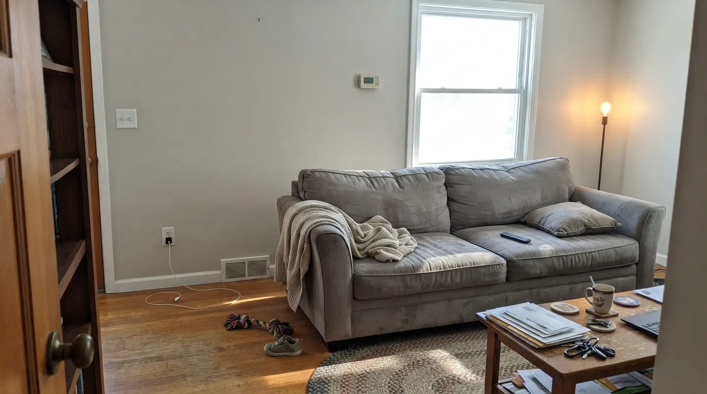
Warm daylight all day keeps the greige balanced and soft. This is the room it was made for.
Cool light kills the warmth and the violet base surfaces. Expect lavender or baby blue. Sample large, or go warmer.
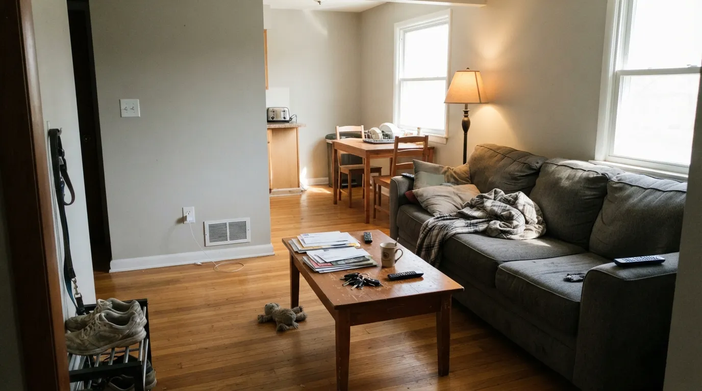
4000K LEDs push it blue-gray and lifeless after dark. Swap to 2700K bulbs before you blame the paint — it usually fixes it outright.
West windows at 4pm bleach it close to an off-white. Fine on a big wall, disappointing if you wanted visible gray.
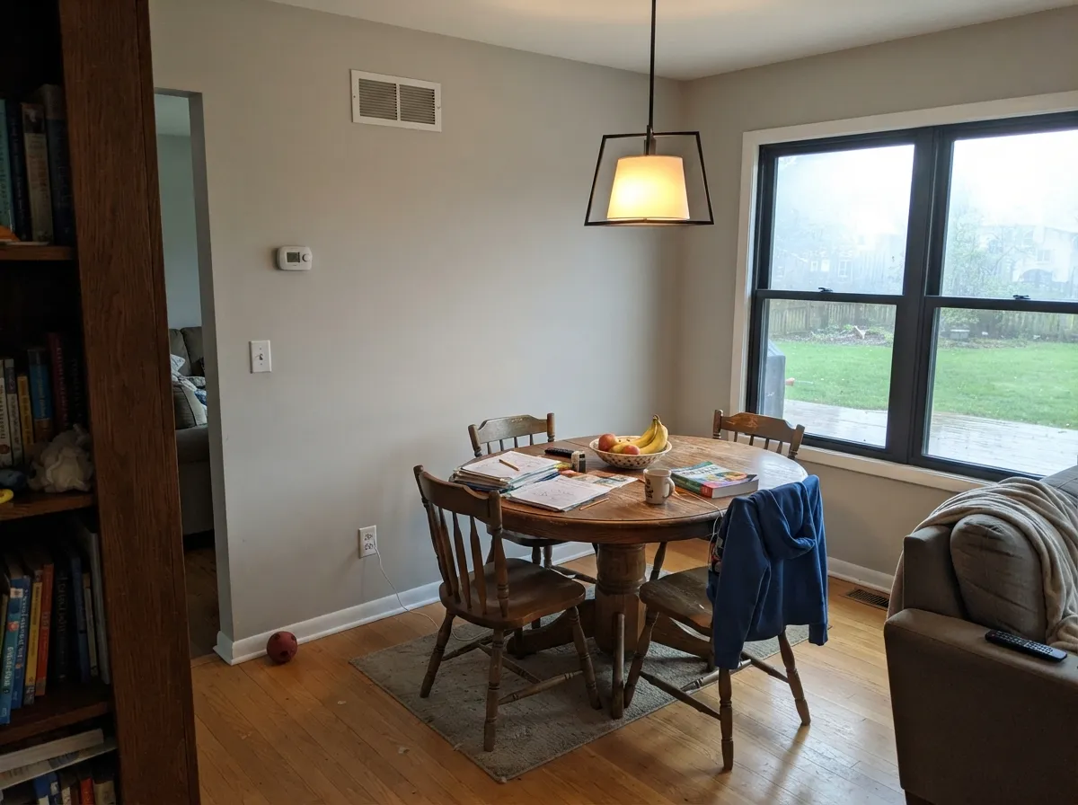
Direct, warm daylight pulls the beige side forward and the color settles into a soft, confident greige all day.
Cool, flat daylight strips the warmth and exposes the blue undertone — the color most owners describe as "stormier" than they expected.
East rooms run warm and creamy in the morning, cooler by afternoon. West rooms do the reverse — gray in the morning, warmer by evening.
2700K warm bulbs keep it in its beige lane after dark. Cool white LEDs bring the blue undertone back out — swap the bulb before you swap the paint.
Both Colors in Real Rooms
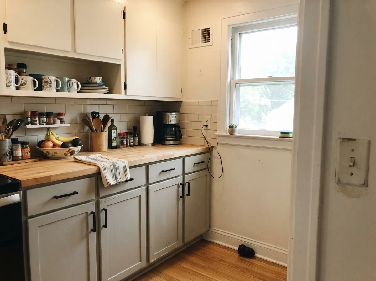
Photos from our full reviews — the same rooms and captions, so you can judge each color where it actually lives, not on a chip.
When to Pick Which
South- and west-facing living rooms · open-plan main floors that need one calm neutral · walls beside warm wood, brass, or matte black · anyone who found Agreeable Gray too beige
Your room faces north and stays dim · your cabinets or counters are cream, ivory, or champagne · your bulbs are 4000K daylight LEDs · you want a gray that reads clearly gray, not greige
Rooms with real daylight from more than one direction · kitchens that want cabinets and walls in the same family · exteriors next to brick or stone · anyone who likes a gray with a little movement in it
You need the exact same color in every room of an open floor plan · your only window faces north · you're already using Agreeable Gray next door and expect a seamless match · you want a gray that reads identical morning to night
No comparison page can see your light. Upload one photo of your room and try both colors on the same walls, seconds apart.
Repose Gray vs Dolphin Fin FAQ
Which is lighter, Repose Gray or Dolphin Fin?
They are practically the same lightness — LRV 58 vs 59. Neither will make the room brighter than the other.
Which is warmer, Repose Gray or Dolphin Fin?
They sit in the same temperature family: Repose Gray reads red-orange / warm, Dolphin Fin reads yellow / warm. Side by side, undertone is not the deciding factor here.
How similar are Repose Gray and Dolphin Fin?
Repose Gray and Dolphin Fin are visually nearly identical (ΔE 0.55). Most eyes can't tell them apart on a wall — pick whichever is easier to source. The only reliable test is seeing both in your own room and light — a side-by-side on a screen or chip flattens the difference.
Can I use Repose Gray and Dolphin Fin together in one house?
Not in the same room, and be careful in the same house. At ΔE 0.55 they are so close that two walls in each will read as a tinting mistake, not a design choice. Pick one, or keep them on different floors where they are never seen together.
Ask a Question