Gratifying Gray
Behr's Designer Collection greige that lands almost exactly where Sherwin-Williams Repose Gray does, reviewed honestly: where it earns its keep, the light that turns it green, and what to pick instead.

Jessica has spec'd whites and neutrals for more than 300 rooms and keeps a sample wall of painted drawdowns in her studio. Every color review is checked against real reader rooms in the comments and re-tested when a formula changes. About the testing process →
- 1Mindful Gray48
- 2Light French Gray53
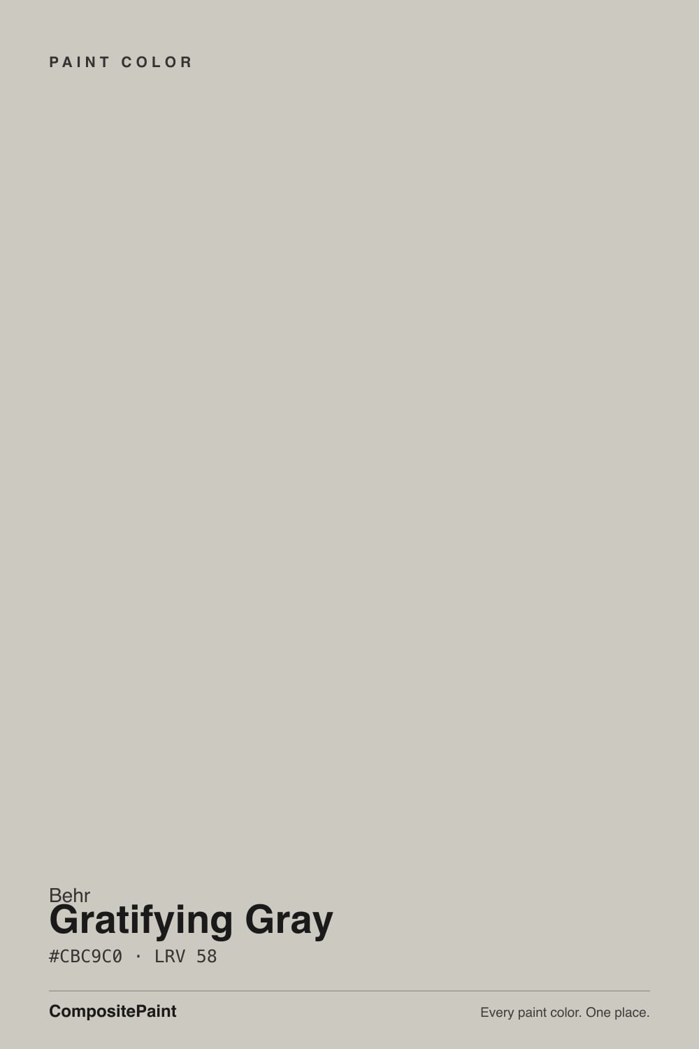
- 3Gratifying Gray58
- 4Pale Oak69
- 5Shoji White74
The Fast Verdict
Gratifying Gray is Behr's answer to a decade of Repose Gray requests. At LRV 58 it lands on almost the identical number Sherwin-Williams gives its most famous greige, and the two chips are close enough that paint-matching tools list them as each other's cross-brand equivalent. It's a warm, dependable neutral gray with a trace of green-yellow underneath, sold with Behr's One-Coat Hide guarantee at every Home Depot in the country. It isn't trying to be a design event — it's trying to be the greige you don't have to think about, and mostly it delivers.
Whole-house walls in daylight-filled rooms · anyone who wants the Repose Gray look without a specialty paint store · honey oak floors and warm wood trim · living rooms, bedrooms, and offices that need a calm backdrop
Your room is dim and north-facing · you want a true cool gray with zero warmth · you're pairing it with cool blue-gray stone or tile · you want a color with its own name recognition, not a stand-in for a more famous one
- A warm, dependable neutral gray with wide Home Depot availability and a One-Coat Hide guarantee
- Near-identical to SW Repose Gray — the popular look without a specialty paint store trip
- LRV 58 holds real color in daylight without going stark
- Flatters honey oak, warm wood trim, and brass hardware
- Whole-house safe in rooms that get real daylight
- Overcast or north light can pull the green-yellow trace forward into "olive" or muddy
- Sold and matched as a stand-in for a more famous Sherwin-Williams color — no separate identity of its own
- Can look slightly dingy against true cool-gray stone or tile
- As a cabinet color it needs strong lighting or it can read murky up close
What Color Is Gratifying Gray, Really?
A warm neutral gray from Behr's Designer Collection, sold with the brand's One-Coat Hide guarantee — Behr's own copy calls it a "neutral maestro" for how easily it sits next to other neutrals. Independent color-matching sites describe the base as beige-washed with a trace of green and yellow. Both descriptions agree on the important part: this is a warm-leaning gray, not a clean cool one, in the same crowded category of greige workhorses that turned Repose Gray, Agreeable Gray, and Revere Pewter into three of the best-selling wall colors in the country.
The comparison that won't go away: hex #CBC9C0, one digit off Sherwin-Williams Repose Gray's #CCC9C0, and the same LRV 58 either brand's own data will hand you. Paint-matching databases list the two as each other's closest cross-brand match, and Behr sells Gratifying Gray at every Home Depot for the price of a can of Premium Plus, no specialty store trip required. That's the honest story here — not a knockoff, just the same room-tested greige recipe delivered through Behr's supply chain instead of Sherwin-Williams's.
Undertone in one line: warm gray with a trace of green-yellow underneath — never a clean blue-gray. In bright daylight that trace stays quiet and reads as a soft neutral; pull it into cooler or overcast light and the green can step forward enough that some owners describe it as "a little olive" rather than plain gray.
Where It Shines
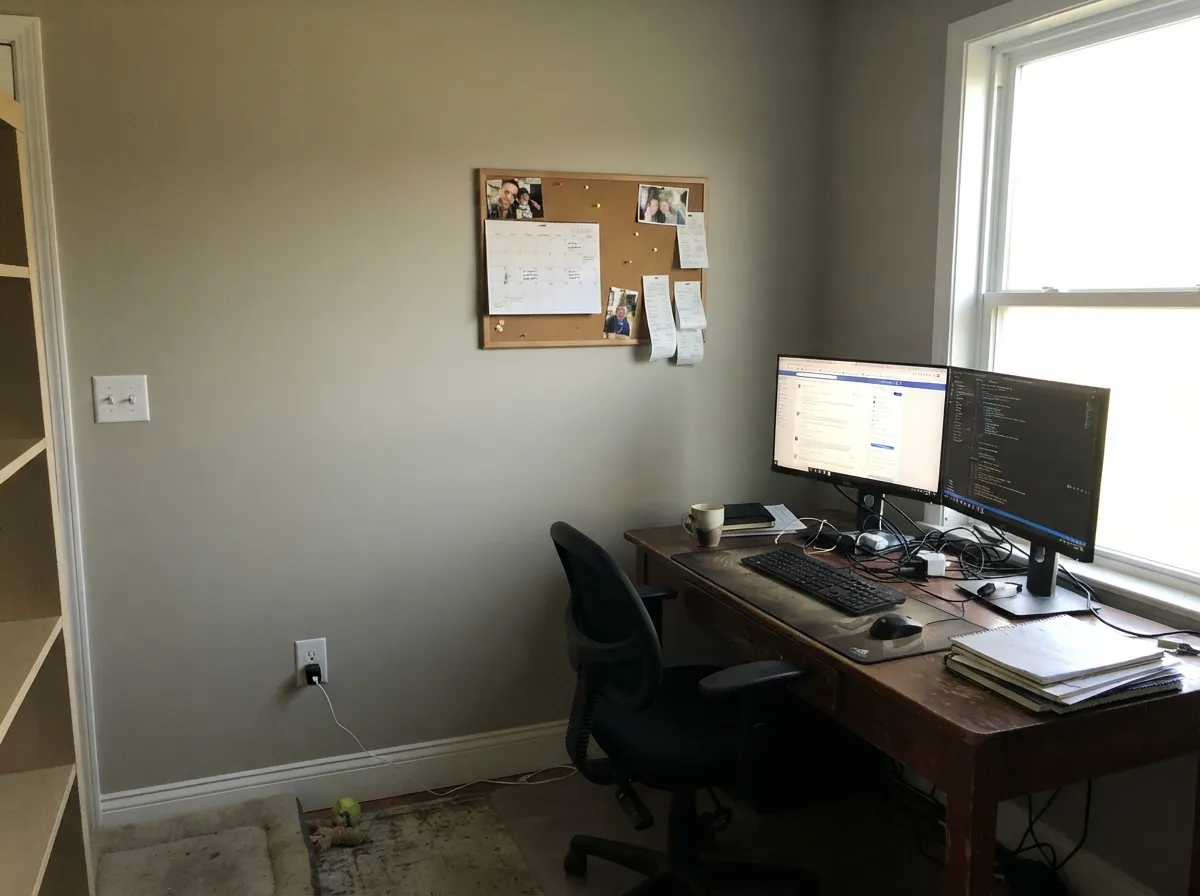
Give it real daylight — south or bright east — and honey-toned wood, and Gratifying Gray does what Repose Gray does: it disappears into a calm, expensive-feeling neutral that doesn't argue with anything else in the room. That makes it an easy whole-house color, and the One-Coat Hide formula means fewer coats than most Designer Collection colors need over a similar mid-tone wall.
Where It Fails
The complaints split into two separate stories: the light-dependency every LRV 58 warm gray inherits, and the identity question that comes from being sold, accurately, as a match for a more famous color.
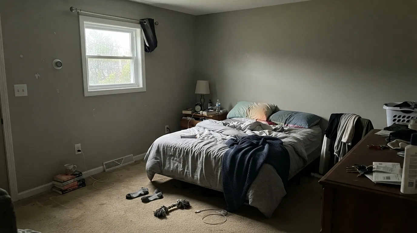
Take the daylight warmth away and the trace of green-yellow in the base can step forward — readers describe it going "a little olive" or muddy on a gray day, the same trap most warm greiges in this LRV range fall into. Test a large sample directly on the wall, not just propped near a window.
Paint-matching tools list Gratifying Gray and SW Repose Gray as each other's closest cross-brand match, and that's accurate. If you're chasing a color with its own separate reputation in showrooms and design blogs, this isn't it — that's a real reason to pick something else, not a flaw in the paint itself.
Because the undertone leans warm even when the color reads plain gray at a glance, it can look slightly dingy set against true cool-gray quartz or blue-gray tile. Pair it with warm-white or cream stone instead, or sample directly against the actual countertop before buying gallons.
Room by Room
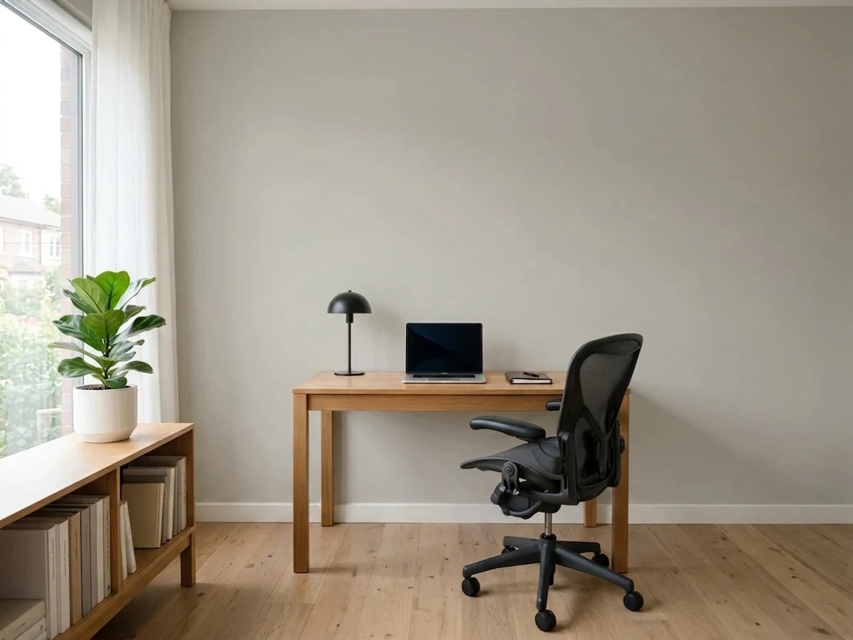
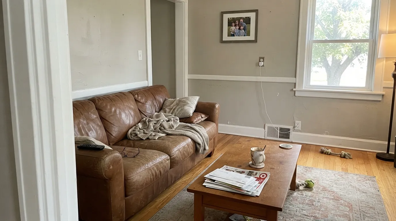
In a bright room it's the calm, does-everything backdrop; oak floors and a leather sofa read warmer next to it. Eggshell finish holds up to daily traffic and wipes clean.
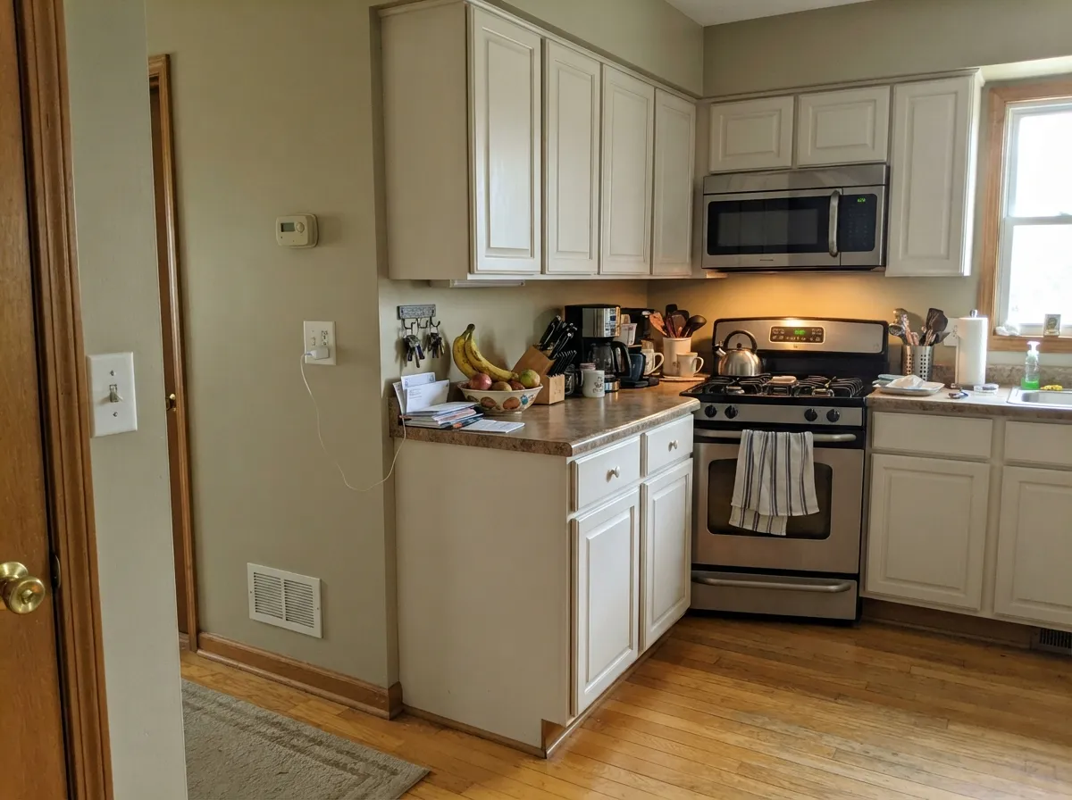
Behind warm wood cabinetry it's an easy win on walls. As a cabinet color itself it needs strong task lighting, or the green-yellow trace can read slightly murky up close; Behr Swiss Coffee is the safer cabinet choice if you want guaranteed warmth instead.
Warm 2700K lamps keep it soft after dark. In a north-facing bedroom that only sees overcast daylight, expect the color to sit closer to flat gray than the cozy warm gray on the fan deck.
Neutral enough behind you on a video call without reading as stark white or beige once the webcam compresses it. Test under your actual desk lighting first — fluorescent and cool LED task lamps push it the wrong direction.
With warm-white or cream tile and brass fixtures it's a clean match. With cool gray-blue tile or chrome-heavy fixtures, the green-yellow trace can look slightly off, the same warning as the stone pairing above.
Behr backs it for exterior use with the same one-coat-hide claim. In full sun it reads a notch lighter and warmer than the interior chip, and pairs cleanly with white trim or a darker charcoal door for contrast.
Your Light Is the Risk
The warm base stays quiet and the color reads as a calm, true-feeling neutral gray — the light it was built for.
The trace green-yellow undertone steps forward; expect "a little olive" or flat gray instead of the warm neutral on the chip.
Warmer and gray-brown at the sun hours, quieter neutral gray the rest of the day — normal movement for an LRV 58 warm gray.
2700K lamps keep it soft and warm at night; cool white LEDs can flatten it back toward the overcast-day look — swap the bulb before you second-guess the paint.
Most complaints about Gratifying Gray are a light mismatch. Upload a photo of your actual room and see it on your walls — then ask for the same wall in north light or evening lamps before you buy a single sample.
Need It From Another Brand?
Any paint counter can custom-tint Behr DC-008 directly. If you would rather stay in one brand's own deck, these are the closest stock matches, measured as ΔE2000. Under 2 is a difference you will not see on the wall.
| Brand | Closest color | ΔE | LRV | |
|---|---|---|---|---|
| Sherwin-Williams | Repose GraySW 7015 · Sherwin-Williams | 0.5 | 58 | Color page → |
| Benjamin Moore | Apparition860 · Benjamin Moore | 1.0 | 58 | Color page → |
| Valspar | Filtered Shade4003-1B · Valspar | 1.9 | 58.4 | Color page → |
| PPG / Glidden | Swirling SmokePPG1007-2 · PPG / Glidden | 1.8 | 59 | Color page → |
| Glidden | Swirling SmokePPG1007-2 · Glidden | 1.1 | 59 | Color page → |
| Dutch Boy | Misted Silver445-1DB · Dutch Boy | 2.5 | 58 | Color page → |
Similar Behr Colors
The nearest shades to Gratifying Gray within Behr's own range, ranked by perceptual color distance — useful when you want the same look a touch lighter, darker, or warmer.
WCAG 2.1: AA is 4.5 : 1 for normal text, 3 : 1 for large text, AAA is 7 : 1.
Gratifying Gray vs the Colors You're Also Considering
Every Gratifying Gray sample board has the same rivals on it. The numbers show the real lightness gap — then it comes down to which risk you would rather live with.
Pick this if you're shopping at Home Depot or want Behr's One-Coat Hide guarantee on the can.
Sherwin-Williams SW 7015 · LRV 58Repose GrayPick this if your painter or store only stocks Sherwin-Williams — the two colors are near-identical matches for each other.
Pick this when you want the wall to read gray, not beige, in daylight.
Sherwin-Williams SW 7029 · LRV 60Agreeable GrayPick this for a slightly warmer, more beige-leaning greige with the same cool-light catch.
Inside Behr, Whitewash Oak PPU24-12 (#CAC9C0, LRV 58) is essentially the same wall color. Dolphin Fin 790C-3 (#CCCAC4, LRV 59) and Graycloth PPU26-09 (#CCC9C5, LRV 59) are a shade cooler and less yellow. French Castle 770A-3 (#CCC7C2, LRV 58) leans very slightly purple-gray, and Paving Stones PPF-16 (#CBCCC4, LRV 60) is the greenest of the group and the lightest.
Across brands the field is crowded because this exact tone is popular everywhere. Repose Gray SW 7015 (LRV 58, deltaE 0.52) and Cloud Cover DEGR44 (LRV 59, deltaE 0.63) are the same color for practical purposes. Apparition 860 by Benjamin Moore (deltaE 1.01), Swirling Smoke PPG1007-2 by Glidden (LRV 59, deltaE 1.09) and Shadow Gray No. 9904 by Farrow and Ball (LRV 58, deltaE 1.72) are visually identical in normal room light. Paris Grey by Annie Sloan (LRV 52, deltaE 3.9) is close but visibly different, reading darker and greener.
Gratifying Gray Coordinating Colors
The rule for coordinating with Gratifying Gray is the same one that works for any warm greige: stay warm, keep true cool grays and blue-grays at a distance. It flatters clean whites, warm woods, and near-blacks that borrow their undertone from the room around them. These are the partners that keep showing up in rooms that work:
Why Everyone Compares It to Repose Gray
Behr's own marketing calls Gratifying Gray a "neutral maestro," and the brand has spotlighted it as a Color of the Month pick on its Colorfully Behr blog — but the detail that actually drives search traffic is simpler: the hex code and LRV sit within a rounding error of Sherwin-Williams's most popular greige. Paint-matching sites treat the two as each other's closest cross-brand equivalent, and homeowners who can't get to a Sherwin-Williams store, or who already shop Behr through Home Depot, use Gratifying Gray as the practical substitute.
That is not a knock on the color. Repose Gray earned its reputation the hard way, over a decade of real rooms, and a warm LRV 58 greige with a trace of green-yellow is a genuinely useful recipe — useful enough that more than one brand landed on close to the same number. Gratifying Gray's honest pitch is availability and price, not novelty: the same look, sold through a different supply chain, backed by Behr's One-Coat Hide guarantee.
Gratifying Gray With Wood Tones and Floors
Warm wood is this color's best partner. Honey oak, golden pine, and reclaimed barnwood all sit comfortably against it because the wall's warmth meets the floor's warmth instead of fighting it — the exact reason greiges in this LRV range became the default answer to "my oak floors are staying, what do I paint the walls."
Cool-toned flooring is the one pairing that needs a sample first: gray-washed engineered wood or cool LVP can pull the green-yellow trace into relief, and the wall can start to look faintly olive against it. It usually isn't a dealbreaker — a warm rug and brass fixtures pull it back — but test a large sample above the actual floor before committing to gallons.
Three Ready Palettes Built on Gratifying Gray
A color is never alone on the wall. These are complete combinations in the 60-30-10 pattern, with the reason each one holds together. Every one opens in the visualizer.
Ultra Pure White keeps the trim crisp against a warm gray that could otherwise look soft-edged next to a duller white, and Hale Navy on the door supplies the one dark note a whole-house scheme needs without fighting the wall color's warmth.
Try this palette in your roomSwiss Coffee cabinets share the same warm base as the walls, so the room reads as one calm palette instead of two competing whites, and an Iron Ore island gives honey oak floors the single deep anchor they usually need.
Try this palette in your roomBehr White keeps the trim soft instead of stark, and Peppercorn on a dresser or accent piece borrows its undertone from the room the same way Gratifying Gray does, so the two never fight each other.
Try this palette in your roomGratifying Gray FAQ
Is Gratifying Gray the same as Sherwin-Williams Repose Gray?
Not literally — different manufacturers, different color bases — but the two are listed as each other's closest cross-brand match, with hex codes one digit apart and the same LRV 58. On the wall, most people can't tell them apart.
Is Gratifying Gray warm or cool?
Warm. It carries a trace of green and yellow under a gray surface, which reads as a soft neutral in daylight and can drift toward "a little olive" in overcast or north light.
Does it work with honey oak floors?
Yes — the warmth in the base meets the warmth in the wood, which is exactly the pairing that made Repose Gray and its lookalikes so popular over builder-grade oak.
What trim white goes with Gratifying Gray?
A clean white like Behr Ultra Pure White or Behr White in semi-gloss. Both are crisp enough to define the trim line without fighting the wall's warmth.
How many coats does it need?
Behr backs it with a One-Coat Hide guarantee over a similar mid-tone color, but two coats is still the standard for even sheen and full coverage. Prime first if you're going over a dark or saturated wall.
Does it work on exteriors?
Yes, Behr sells and backs it for exterior use. Expect it to read a notch lighter and warmer in full sun than it does indoors; white trim or a darker charcoal door both work for contrast.
Have you painted with Gratifying Gray?
Rate it — one tap helps the next reader decide.
Ask a Question