Filtered Shade
Valspar's Popular-collection greige, reviewed honestly: the rooms where it stays a quiet true gray, the cream trim that pulls violet, and why it is not Agreeable Gray.

Jessica has spec'd whites and neutrals for more than 300 rooms and keeps a sample wall of painted drawdowns in her studio. Every color review is checked against real reader rooms in the comments and re-tested when a formula changes. About the testing process →
- 1Mindful Gray48
- 2Light French Gray53
- 3Filtered Shade58.4
- 4Pale Oak69
- 5Shoji White74
The Fast Verdict
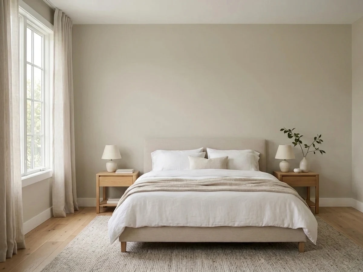
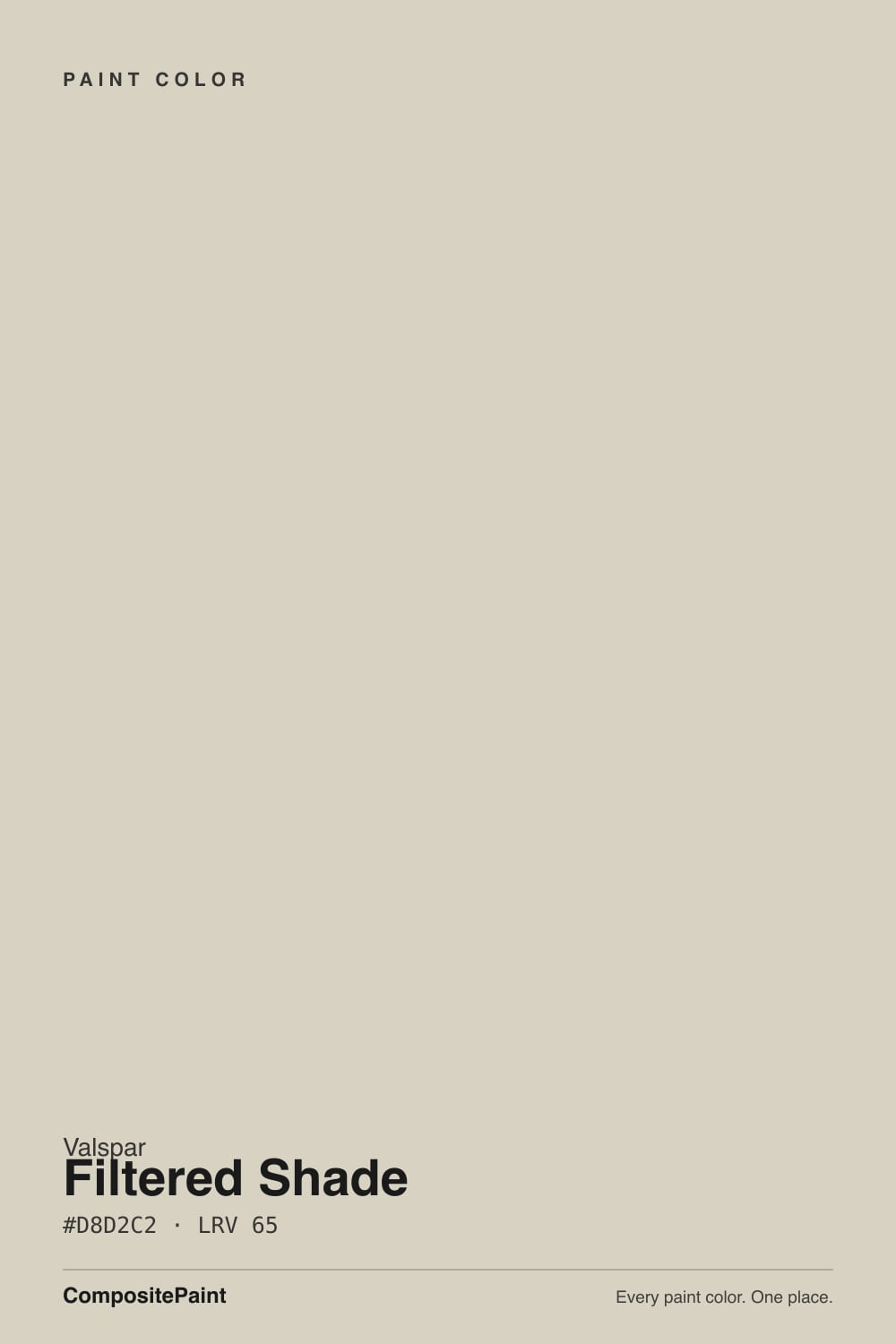
Filtered Shade is the greige you pick at Lowe's when Agreeable Gray feels too beige. At LRV 58.4 it is a low-chroma warm gray — Valspar files it as warm, Lowe's calls out a slight red undertone — that reads almost like a true gray on the wall and almost like an off-white until you put it next to white trim. It is one of Valspar's all-time bestsellers for a reason: it stays out of gold, green, and blue, and it lets oak, leather, and brick be the warm thing in the room. It will not do anything interesting. That is the point.
Open main floors with oak, leather, or brick · hallways connecting gray rooms · bedrooms that need a supporting-role gray · rentals and flips where you cannot sample for weeks · anyone who found Agreeable Gray too tan
Your room faces north and stays dim · your trim or cabinets are cream or Antique White · the floors and sofa are already gray · you wanted a cozy beige greige · you want a wall color with an actual opinion
- Almost a true gray — no gold, no green, no blue
- Same whole-house depth as Repose Gray, with less violet
- Lets oak, leather, and brick be the warm thing in the room
- Low-risk rental and flip neutral when you cannot sample for weeks
- Lowe's-shelf and one of Valspar's all-time bestsellers
- Goes flat and institutional in a dim north room, especially gray-on-gray
- Cream and Antique White trim pull a faint lavender
- Not Agreeable Gray — shoppers wanting beige find it drab
- Will not do anything interesting in a room that already has good light and millwork
What Color Is Filtered Shade, Really?
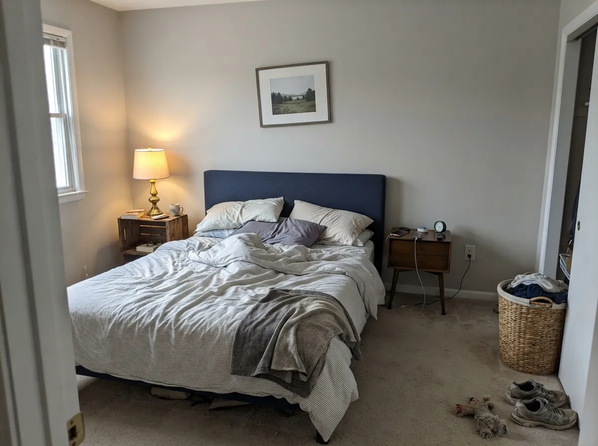
A low-chroma warm gray that American paint stores keep trying to sell as the reasonable alternative to Sherwin-Williams Agreeable Gray. Valspar files Filtered Shade in the Popular collection as a warm gray; the Lowe's can copy is more precise: a soft gray with a slight red undertone. That red is so faint it almost never reads beige. Put a chip of Agreeable Gray (LRV 60) next to it and Filtered Shade looks cleaner, cooler, and more like gray; put it next to a true cool gray and the warmth shows up as a whisper of greige. Designers who actually live with it call it one of the better nearly-true grays in the big-box decks — the color that plays supporting role so the navy headboard, the gold lamp, and the oak floor can take the lead.
At LRV 58.4 it sits in the whole-house band, a hair above Repose Gray's LRV 58 and a step below Agreeable Gray. That is the useful depth: light enough to keep an open main floor from going cave-like, deep enough that white trim has a job. On a chip it can pass for off-white. On four walls, only the trim reveals the gray — which is why people who sample it against builder white are startled by how much color is actually there, and why people who sample it against a beige wall think they bought a white. Plan for the wall to read a half-step deeper and cleaner than the card.
Undertone in one line: warm gray with a faint red-violet — never beige, never green, never blue. If your sample looks purple, that is cream trim, ivory cabinets, or a golden floor bouncing into it. If it looks beige, that is west sun. If it looks dead institutional gray, the room is dim and already gray. All three are the same paint being honest about where you put it.
Where It Shines
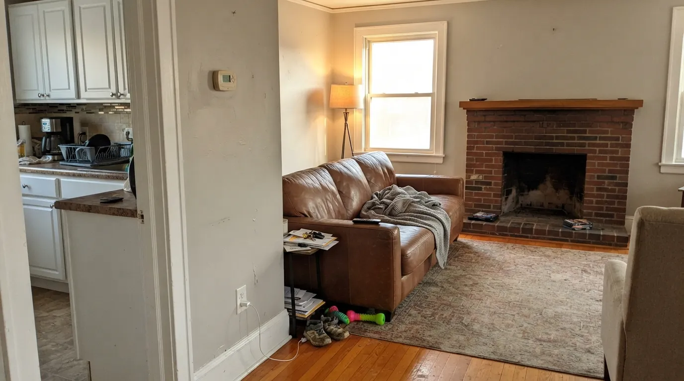
Give it real daylight and something warm in the room — oak floors, a leather sofa, a brick fireplace — and Filtered Shade is almost boring in the way a good greige is supposed to be. The wall recedes, the wood reads as the warm object, and nothing fights. Hallways and whole-house runs are its other job: it is gray enough to hand off to cool rooms and warm enough not to go blue in a dark corridor, which is the thing most cool grays cannot manage.
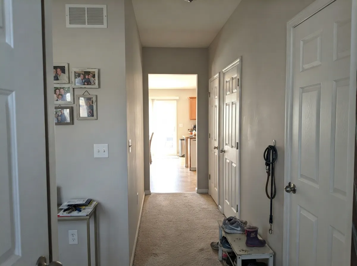
Where It Fails
Almost every disappointed Filtered Shade story is a shopping-or-pairing mistake, not a bad can. Three situations produce nearly all of them, and you can spot all three before the first coat.
North light is cool and thin, and it strips the little warmth this color has. What is left is a flat, slightly institutional gray — the exact look homeowners describe when they painted a north den with gray carpet, a gray sofa, and no lamps. The paint did not go cold on purpose; the room cancelled the red. If the room is dim, go warmer: Agreeable Gray (SW 7029) at LRV 60, or Accessible Beige (SW 7036) at LRV 58, and turn the lamps on.
Valspar itself suggests Antique White (7002-20) as a coordinating white. Do not. Cream sits opposite that faint red-violet, so the yellow in the trim pushes the walls toward purple and the walls push the trim toward yellow. The same fight shows up next to ivory or champagne cabinets — the two feet of wall beside the run look lavender even when the rest of the room looks gray. Pair it with a clean white: Valspar Du Jour (7002-6) or Dove White (7002-7). Save the cream for a warmer greige.
This is the comparison Valspar is selling, and it is the wrong comparison if beige is what you actually like. Agreeable Gray is a warm greige that reads tan in good light. Filtered Shade is a quiet gray that happens to have a warm base. Shoppers who grab it as the Lowe's dupe end up with cleaner, cooler walls than the Pinterest photo, then call it drab. If you wanted the cozy beige version, buy Agreeable Gray. If you wanted gray that does not go blue, you are in the right can.
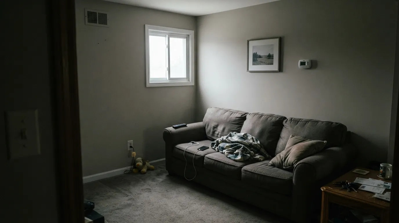
Room by Room
The counterweight greige: orange-toned oak, leather, brick, and brass all sit comfortably against it because the wall stays almost perfectly neutral and lets the warm objects be warm. Eggshell, Du Jour or Dove White on the trim. Skip it if the sofa, rug, and floor are already gray — the room will go cold and a little municipal.
This is where Filtered Shade earns a whole-house can. It is the cooler end of the connector group: gray enough to hand off to cool rooms, with just enough warm base to stay out of blue in a dark hall. Against white six-panel doors it reads clean and current. If the rooms off the hall are cream or beige, skip it — it will make the cream look yellow. Use Edgecomb Gray (HC-173) instead.
Homeowners who have lived with it give it the Grade A for this exact reason: it does not steal the show. Navy headboards, gold lamps, black frames, and a white ceiling all pop; the wall just sits there. Soft morning light keeps it a clean gray. Warm 2700K bulbs at night keep the red from dropping out. Matte or eggshell.
On the walls beside warm wood, butcher block, or brass it is a calm backdrop that will not add more beige on top of oak. Satin on any cabinet you do paint, but this is not a cabinet color — too gray, not enough personality to justify the sanding. Ultra White or Du Jour on the trim and uppers. Cool gray quartz is fine; cream or champagne cabinets are the fight described above.
Rentals, flips, and houses that have to work with whatever furniture arrives next are the reason this color stays in the Popular collection. It is the low-risk greige when you cannot sample for two weeks: almost no gold, no green, only that faint red-violet if you pair it wrong. Do not run it through a cream-on-cream house. Do run it through a house with mixed woods, white trim, and a couple of gray rooms.
At LRV 58.4 the body sits into the landscape instead of shouting, which is why it turns up as a greige farmhouse siding. Pair it with Ultra White trim and a Dark Kettle Black door. It needs sun. On a permanently shaded lot the warmth drops out and the house reads flat, slightly cold gray from the street — walk the shady side with a sample before you commit.
Your Light Is the Risk
Warm daylight all day keeps the red in and the gray balanced. This is the light where it reads as a finished greige, not a builder gray.
Cool, thin daylight strips the warmth and leaves a flat institutional gray. Sample the darkest wall, or pick a warmer greige.
Cooler and more gray in east morning light; a hint of beige through west afternoon and golden hour. The shift is gentler than Agreeable Gray — most people never notice it.
2700K lamps hold the warm-gray and keep it from going dead after dark. Cool 4000K LEDs push it toward flat gray with a faint violet edge — swap the bulbs before you blame the can.
Most complaints about Filtered Shade are a light mismatch. Upload a photo of your actual room and see it on your walls — then ask for the same wall in north light or evening lamps before you buy a single sample.
Need It From Another Brand?
Any paint counter can custom-tint Valspar 4003-1B directly. If you would rather stay in one brand's own deck, these are the closest stock matches, measured as ΔE2000. Under 2 is a difference you will not see on the wall.
| Brand | Closest color | ΔE | LRV | |
|---|---|---|---|---|
| Sherwin-Williams | ZirconSW 7667 · Sherwin-Williams | 1.0 | 59 | Color page → |
| Behr | GrayclothPPU26-09 · Behr | 0.8 | 59 | Color page → |
| Benjamin Moore | Stonington GrayHC-170 · Benjamin Moore | 1.8 | 59 | Color page → |
| PPG / Glidden | Swirling SmokePPG1007-2 · PPG / Glidden | 1.8 | 59 | Color page → |
| Glidden | Pittsburgh GrayPPG0994-2 · Glidden | 2.5 | 59 | Color page → |
| Dutch Boy | Misted Silver445-1DB · Dutch Boy | 1.1 | 58 | Color page → |
Similar Valspar Colors
The nearest shades to Filtered Shade within Valspar's own range, ranked by perceptual color distance — useful when you want the same look a touch lighter, darker, or warmer.
WCAG 2.1: AA is 4.5 : 1 for normal text, 3 : 1 for large text, AAA is 7 : 1.
Filtered Shade vs the Colors You're Also Considering
Every Filtered Shade sample board has the same rivals on it. The numbers show the real lightness gap — then it comes down to which risk you would rather live with.
Pick this when Agreeable Gray read too beige and you wanted gray that still is not cold.
Sherwin-Williams SW 7029 · LRV 60Agreeable GrayPick this if you want the warmer, tan-leaning greige — it is cozier in good light, and the extra warmth is what fails when the light goes cool.
Pick this for the same depth with less of that violet; Filtered Shade stays quieter when the light cools.
Sherwin-Williams SW 7015 · LRV 58Repose GrayPick this if you want the famous modern greige and your rooms have warm light — just know the weakness is violet in a north room.
Pick this when you want that same quiet greige a step deeper, and you are already at Lowe's.
Sherwin-Williams SW 7671 · LRV 62On the RocksPick this if your painter is already in Sherwin-Williams — it is the closest lookalike, a hair lighter and a hair warmer, still undecided about being gray.
Warm Putty (6006-1A), at LRV 64.8, is Filtered Shade's closest sibling in the Valspar line. The two are nearly the same lightness, but Warm Putty tends to read a hair heavier and more putty-brown, while Filtered Shade keeps a slightly cleaner gold-tan feel. Choose Warm Putty if you want a touch more traditional beige body.
Tea Stain (6001-1A), LRV 64.2, is another near match in brightness but leans a little more toward a soft, aged cream character. It is a good pick when you want warmth without the greige balance.
Barest Celadon (M244), LRV 64, edges cooler and greener than Filtered Shade despite the similar lightness. If a room already runs warm and you want to calm it slightly, Barest Celadon pulls back the gold, whereas Filtered Shade keeps things sunny and inviting.
Filtered Shade Coordinating Colors
The pairing rule is the opposite of a warm greige: keep the whites clean, keep the creams away, and let greens, navies, and true blacks do the personality work. Filtered Shade is so low-chroma that almost any saturated accent will sit on it; the failures are temperature fights, not hue fights. These are the partners that keep showing up in rooms that work:
Not Agreeable Gray: Why Valspar Pushes This One
Filtered Shade is not a Color of the Year and it does not have a TV-show origin story. What it has is a Lowe's aisle and a job: it is the greige Valspar keeps in the Popular collection for shoppers who walked in asking for Agreeable Gray. Sue Kim, Valspar's director of color marketing, put it on Better Homes & Gardens' 2025 list of the brand's ten best-selling colors of all time — a warm-toned gray sold as an open-space backdrop, not as a personality wall.
That positioning is honest about the depth (LRV 58.4, same band as Repose Gray) and slightly misleading about the mood. Agreeable Gray is the safest greige until the light goes cool; Filtered Shade is the quieter, grayer answer to the same brief. Designers who have used both treat Filtered Shade as a supporting-role gray — DIY Playbook graded it an A in a bedroom and reused it in a nursery for exactly that reason — and they warn that cream coordinating whites (Antique White especially) will emphasize the faint violet. If you came from a Sherwin-Williams deck, On the Rocks (SW 7671) at LRV 62 is the closest lookalike: a quiet greige that still cannot quite decide if it is gray, just lighter and a touch warmer.
Filtered Shade With Wood Tones and Floors
Warm wood is why this color exists. Orange-toned builder oak, red oak, walnut, butcher block, and a leather sofa are the company it keeps, because a greige with almost no beige of its own does not stack warmth on top of warmth and turn the room amber. The wall recedes; the floor and the furniture carry the temperature. That is the living-room brief in one sentence.
Gray floors are the honest no. Gray LVP, gray-washed oak, and a gray sectional in the same room cancel the red and leave the institutional gray from the fails section — especially under north light. Pale white oak and ash are safe and a little more modern. Honey oak is more forgiving here than it is against a violet-leaning gray like Repose, but still sample a big board over the actual floor; any leftover red-violet will make the oak look more orange.
Metals are easy: unlacquered brass, antique bronze, and matte black all work. Polished chrome is the one that leans a little cold against it. Keep the bulbs at 2700K and the floor decision does most of the rest.
Three Ready Palettes Built on Filtered Shade
A color is never alone on the wall. These are complete combinations in the 60-30-10 pattern, with the reason each one holds together. Every one opens in the visualizer.
One Lowe's trip: the clean white in Valspar's warm-white trio keeps Filtered Shade looking light instead of dingy, and Dark Kettle Black is a true black — no blue, no green — so the door is a single dark note, not a second undertone fight. Ultra White also works on the trim if you want the gray to show more.
Try this palette in your roomThis is the room the color was built for: a quiet gray wall, a White-Dove-like trim from the same Lowe's aisle, and the safest navy in the BM deck as the one dark object. Oak floors and a leather sofa do the rest. Hale Navy wants real light — do not put the navy wall in the dim corner.
Try this palette in your roomFiltered Shade will work with almost any green; Warm Eucalyptus is Valspar's 2026 Color of the Year that actually behaves like a neutral, so the island reads as depth rather than a trend. Ultra White on the uppers is the trim job it was made for — bright, empty white that leaves the gray and the sage alone.
Try this palette in your roomFiltered Shade FAQ
Is Filtered Shade gray or greige?
Both, barely. Valspar files it as a warm gray; on the wall it reads as a very quiet greige that most people will just call gray. It has a faint red-violet, not the tan of Agreeable Gray and not the stronger violet of Repose Gray. If you hold it next to a beige, it looks gray. If you hold it next to a cool gray, the warmth shows.
Is it a dupe for Agreeable Gray?
No, and that is the most useful thing to know before you buy it. Agreeable Gray (SW 7029) at LRV 60 is a warmer, tan-leaning greige. Filtered Shade is cleaner, a hair deeper, and more gray. Valspar promotes them as alternatives because they sit in the same whole-house band, not because they match. If you loved Agreeable on a sunny Pinterest wall, sample both — you may not love this one.
What trim white goes with Filtered Shade?
A clean white, not a cream. Valspar Du Jour (7002-6) or Dove White (7002-7) keep the wall looking light; Ultra White (7006-24) on the trim makes the gray show more, which is the right call on an exterior or if you want contrast. Skip Antique White and any ivory — cream pulls the faint violet forward. Semi-gloss on the trim, eggshell on the walls.
Does it work in a north-facing room?
Only if you add warm light. North daylight cancels the red and leaves a flat institutional gray, and the problem is worse if the carpet and sofa are already gray. Test a big sample on the darkest wall. If it goes drab, step to Agreeable Gray or Accessible Beige, and put 2700K bulbs in the lamps — they are part of this paint job.
Can I use it whole-house?
Yes — that is the job it was hired for, and it is why it sits in Valspar's Popular collection and on BHG's list of the brand's all-time bestsellers. It carries from a sunny living room into a hallway without changing personality much. The exception is a cream-on-cream house: Filtered Shade will make the cream rooms look yellow. For those, pick Edgecomb Gray.
Does Filtered Shade work with oak floors?
Warm oak is its best company. Orange-toned builder oak, red oak, walnut, and leather all sit well against it because the wall does not add more beige on top of the wood. Gray LVP and gray-washed floors are the risk — they pull the warmth out and the room goes cold. Honey oak is safer here than with a more violet gray, but sample over the actual floor anyway.
Have you painted with Filtered Shade?
Rate it — one tap helps the next reader decide.
Ask a Question