On the Rocks
The gray-or-greige color that professional color blogs can't agree on, reviewed honestly: where it reads clean and neutral, the light that turns it cold, and what to pick instead.

Jessica has spec'd whites and neutrals for more than 300 rooms and keeps a sample wall of painted drawdowns in her studio. Every color review is checked against real reader rooms in the comments and re-tested when a formula changes. About the testing process →
- 1Mindful Gray48
- 2Revere Pewter55
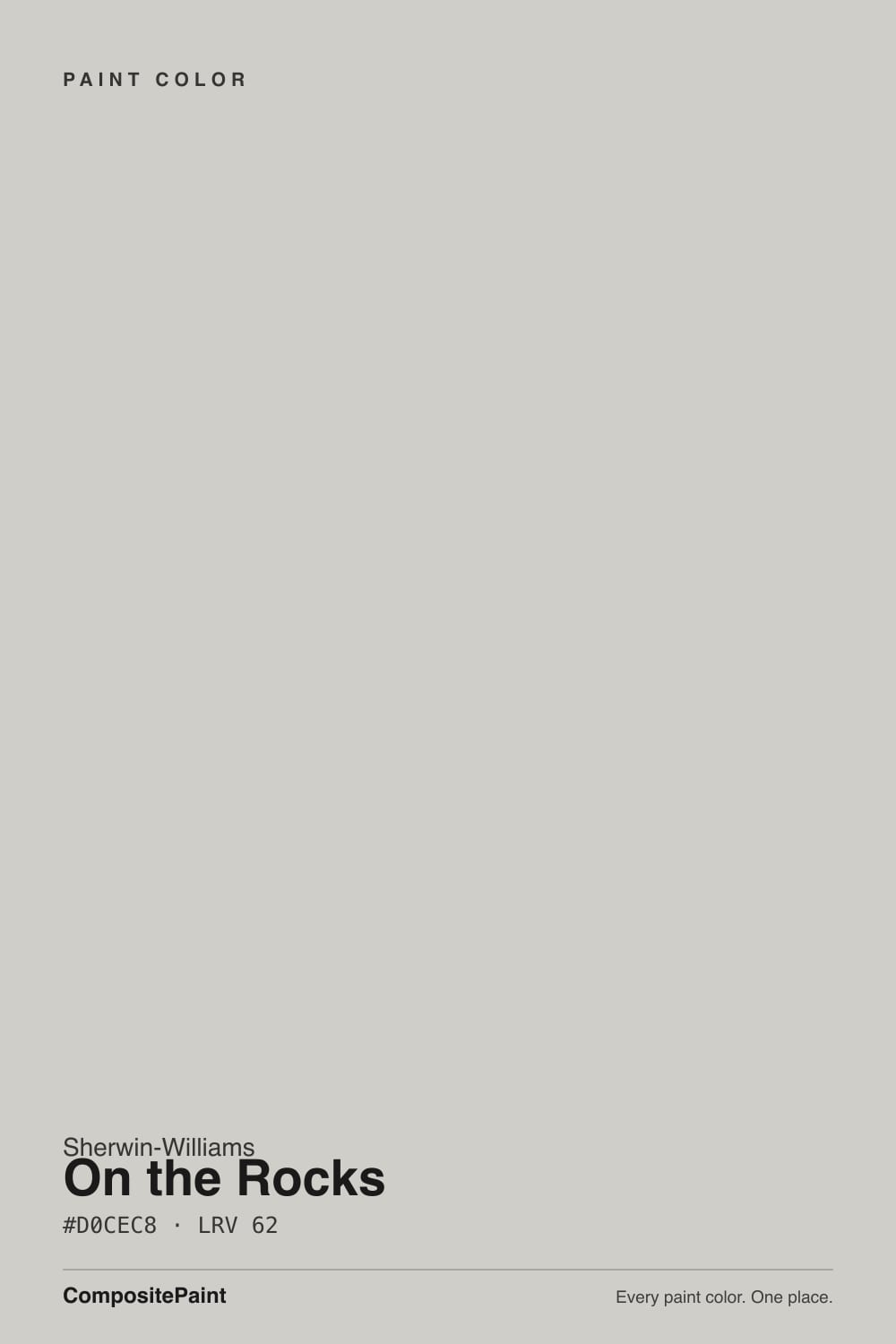
- 3On the Rocks62
- 4Pale Oak69
- 5Shoji White74
The Fast Verdict
On the Rocks is Sherwin-Williams' most quietly argued-about neutral: a light gray-greige at LRV 62 with a violet-blue undertone so faint that different rooms, and even different color experts, describe it differently. In good daylight with a crisp white trim it reads as a clean, dependable neutral that goes with almost anything. In flat, cool light it drifts distinctly blue-gray. Nobody is fighting over this color online — it has no Color of the Year moment and no viral bathroom photo — and that quiet, unglamorous reliability is exactly the case for it.
Whole-house neutral walls in rooms with real daylight · anyone who wants "gray" without a strong personality · hallways and open floor plans that need one color to flow room to room · pairing with Pure White or Extra White trim
You want a committed, unmistakable gray with zero drift · your room is north-facing and stays dim most of the day · you're chasing a specific famous or trending color · you want strong warmth to greet honey-oak floors head-on
- Genuinely flexible — reads clean in most rooms with decent light
- Bright enough (LRV 62) to keep rooms feeling open, not stark-white bright
- Undertone stays quiet enough to avoid clashing with most fixed finishes
- Pairs cleanly with both cool trim whites (Extra White) and warm ones (Greek Villa)
- No trend timestamp — an unglamorous color that won't look dated in five years
- Never fully commits to gray or greige — buyers wanting a decided color may find it wishy-washy
- Goes flat and cool-blue in dim, north-facing rooms with no warm light
- Online descriptions genuinely conflict, so any single write-up (including this one) undersells the sampling step
- Unremarkable enough that it rarely becomes anyone's favorite room
What Color Is On the Rocks, Really?
On the Rocks is a light gray-greige built around a passive violet-blue undertone that mostly stays hidden — Sherwin-Williams itself files the color under its white-paint listings online, which is a tell: this was never meant to be a bold gray statement. It sits in the quiet middle of the deck, the kind of color a painter reaches for when a client says "just a gray, nothing weird" and means it.
At LRV 62 it reflects a solid majority of the light that hits it — bright enough to keep a room from feeling closed in, without the near-white starkness of something like Extra White. That mid-range brightness is also why it reads so differently room to room: it has enough body to pick up a cast from whatever light it's given, but not so much pigment that the cast overwhelms it.
Undertone in one line: a passive violet with a whisper of blue, present almost all the time but rarely loud enough to name. Warm 2700K light coaxes it toward a soft taupe-violet; cool, overcast daylight nudges the same wall toward blue-gray. Independent color-consultant sites describe this paint as everything from "a cool light gray" to "a warm greige with a beige cast" — and both are honest readings of the same undertone in different light. If your sample looks gray in the showroom and faintly warm at home, that is the paint, not a bad batch.
Where It Shines
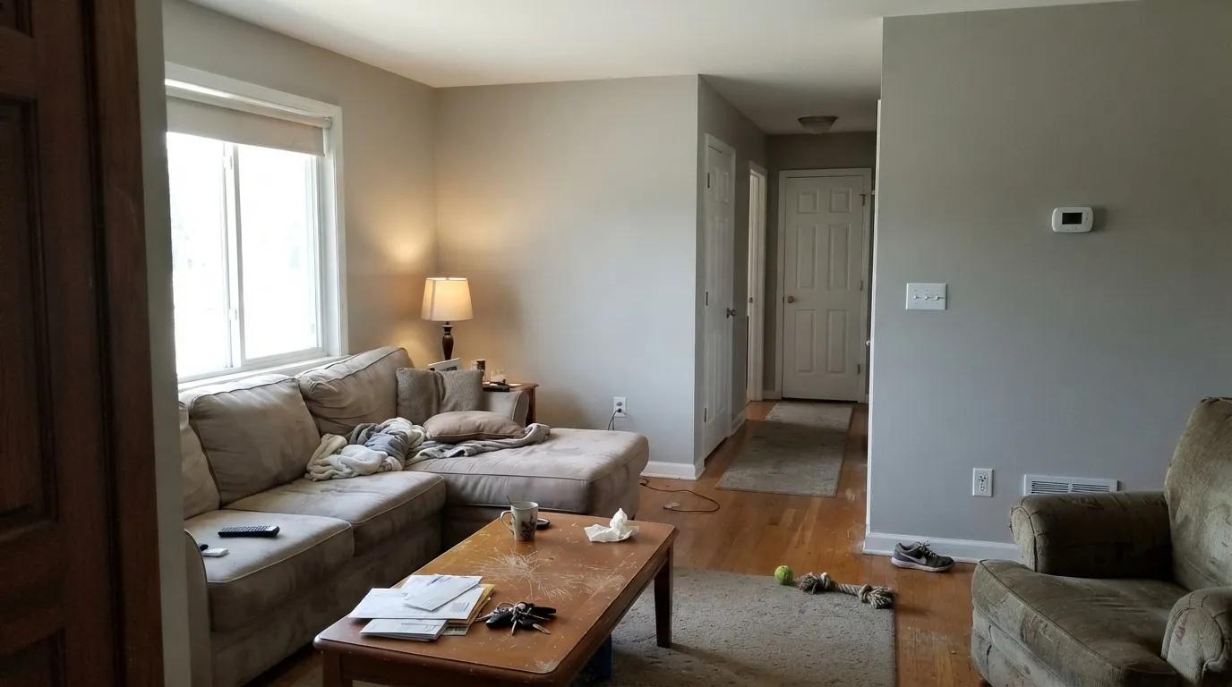
Give it real daylight — east or west light through midday, or bright bounced light in an open floor plan — and it settles into a genuinely clean, quiet neutral that doesn't fight anything around it. It is a strong whole-house pick for exactly that reason: it doesn't demand a themed room to work in, it just needs enough light to stay honest. Pair it with a crisp white trim (Pure White is the default, Extra White for more contrast) and it reads finished without reading cold.
Where It Fails
On the Rocks doesn't have a famous, dramatic failure mode — no viral "my walls turned purple" story. Its regret pattern is quieter and comes from three predictable mismatches between what buyers expect and what a chameleon color actually does.
The violet-blue undertone never fully disappears, which means On the Rocks never reads as flatly neutral as a color built with zero warm bias. If you want a gray that stays gray in every light with no argument, Stonington Gray or Repose Gray commit harder — this one is deliberately softer and less decided.
Cool overcast daylight is the one light that consistently exposes the blue side of the undertone, and without a lamp to counter it the wall can read flat and a little cold. It is not damaged paint — it is the same chameleon behavior that makes it flexible everywhere else, showing its coolest face.
This is the honest, verifiable pattern behind most buyer confusion with this color: reputable color-consultant sites describe On the Rocks as a cool violet-gray, a warm beige-greige, and a neutral "goes with everything" gray — sometimes on the same page. None of them are wrong; the undertone really is that quiet and that light-dependent. Sample it on your actual wall before trusting any single description, including this one.
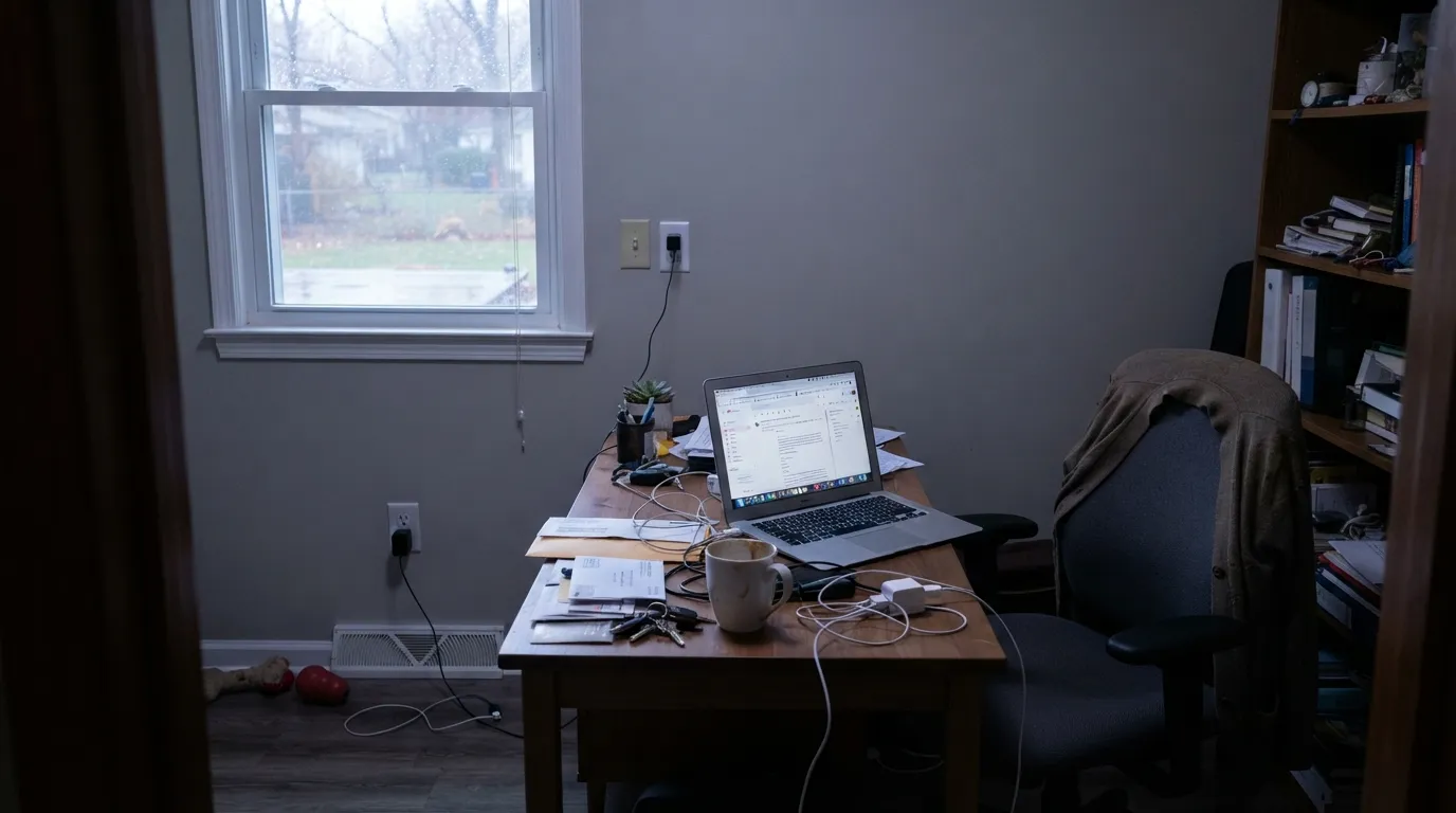
Room by Room
In a room that gets real light through the day it is a calm, adaptable backdrop for almost any furniture style. Eggshell finish; keep the trim a true white so the wall doesn't read dingy by comparison.
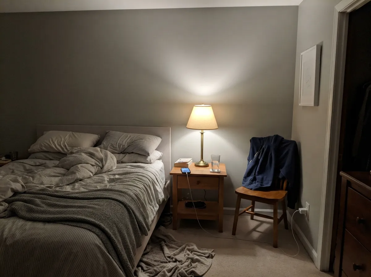
At night under 2700K bulbs the violet comes forward just enough to feel soft and restful rather than clinical. If the room is north-facing and lamp-light-poor during the day, expect a cooler, quieter read than the swatch promised.
Works cleanly with white or light-gray cabinets and most countertop tones. It doesn't fight warm wood or cool quartz the way a stronger greige or a truer gray would — the tradeoff is that it also won't be the color that makes the kitchen memorable.
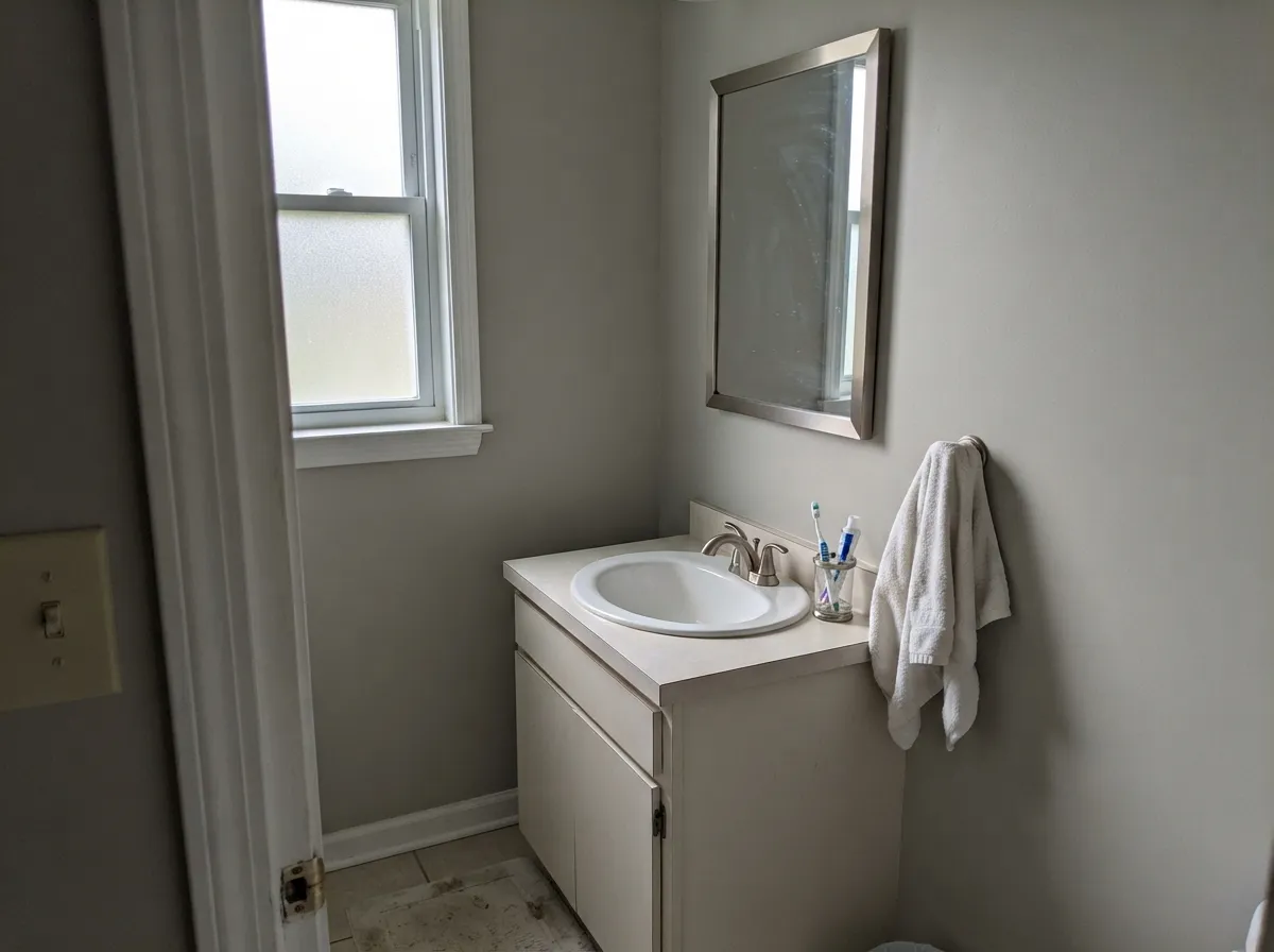
On a vanity or full bath walls it reads clean and a little spa-like in daylight. Pair with Pure White trim and warm-toned fixtures; cold chrome and blue-white tile will pull it toward its coolest, flattest self.
This is where the chameleon trait pays off: a neutral quiet enough to carry from a sunlit living room into a dimmer hallway without ever feeling like a different color was used. The single most common reason people pick it over a bolder gray.
Reads as a clean, pale modern gray in full sun with white or charcoal trim. It will not give a house a signature look the way a deeper, more committed color would — it is a safe choice, not a statement one.
Your Light Is the Risk
East or west rooms at midday, or any room with generous bounced light: the undertone stays quiet and it reads as a genuinely clean, calm neutral.
Cool, flat daylight pulls the blue side of the undertone forward and the wall can read a step colder and flatter than the sample chip.
Strong, direct sun can wash the LRV 62 surface toward near-white at the brightest part of the day, then settle back to gray-greige as the light softens.
2700K lamps pull the violet forward into a soft taupe-gray. Cool white LEDs flatten it back toward blue-gray — swap the bulb before you second-guess the paint.
Most complaints about On the Rocks are a light mismatch. Upload a photo of your actual room and see it on your walls — then ask for the same wall in north light or evening lamps before you buy a single sample.
Need It From Another Brand?
Any paint counter can custom-tint Sherwin-Williams SW 7671 directly. If you would rather stay in one brand's own deck, these are the closest stock matches, measured as ΔE2000. Under 2 is a difference you will not see on the wall.
| Brand | Closest color | ΔE | LRV | |
|---|---|---|---|---|
| Behr | Pewter VasePPL-64 · Behr | 1.6 | 62 | Color page → |
| Benjamin Moore | Abalone2108-60 · Benjamin Moore | 1.2 | 62 | Color page → |
| Valspar | Gravel DriveT561 · Valspar | 0.8 | 61.2 | Color page → |
| PPG / Glidden | Allegheny RiverPPG0997-1 · PPG / Glidden | 1.5 | 62 | Color page → |
| Glidden | Allegheny RiverPPG0997-1 · Glidden | 1.0 | 62 | Color page → |
| Dutch Boy | Silvered Fog439-1DB · Dutch Boy | 1.0 | 62 | Color page → |
Similar Sherwin-Williams Colors
The nearest shades to On the Rocks within Sherwin-Williams's own range, ranked by perceptual color distance — useful when you want the same look a touch lighter, darker, or warmer.
WCAG 2.1: AA is 4.5 : 1 for normal text, 3 : 1 for large text, AAA is 7 : 1.
On the Rocks vs the Colors You're Also Considering
Every On the Rocks sample board has the same rivals on it. The numbers show the real lightness gap — then it comes down to which risk you would rather live with.
Pick this if you want the cooler, quieter sibling that won't read yellow-warm under any bulb.
Sherwin-Williams SW 7029 · LRV 60Agreeable GrayPick this if you want a warmer, more decided greige that commits to warmth even in so-so light.
Pick this for a touch more brightness and an even quieter, less-committed undertone.
Sherwin-Williams SW 7015 · LRV 58Repose GrayPick this for a slightly deeper, more classic warm-gray with a well-documented light behavior.
Gossamer Veil SW 9165 shares the same LRV of 62 but its hex #D3CEC4 carries more yellow, so side by side Gossamer Veil looks warmer and On the Rocks looks cooler and cleaner. Mercurial SW 9550 at LRV 61 and hex #D1CCC6 sits between the two. Big Chill SW 7648 at LRV 62 and hex #D0CEC9 is close enough that swapping them on a wall would not be noticeable.
Across brands, Valspar Gravel Drive T561 at deltaE 0.84 is effectively the same color. Glidden Allegheny River PPG0997-1 at deltaE 1.02, Dutch Boy Silvered Fog 439-1DB at deltaE 1.04, Farrow and Ball Cornforth White No. 228 at deltaE 1.19, Benjamin Moore Abalone 2108-60 at deltaE 1.22, Dunn-Edwards So Chic DET614 at deltaE 1.25, and Behr Pewter Vase PPL-64 at deltaE 1.6 are all visually identical in normal room light.
HGTV Home Turning Pointe HGSW 3267 at deltaE 2.11 is very close, so sample first. Magnolia Home Dark Moon JG-74 at deltaE 3.19 is close but visibly different side by side, reading cooler and bluer.
On the Rocks Coordinating Colors
Because the undertone is so quiet, On the Rocks pairs with a wider range of partners than most grays — the rule is simply to decide whether you want to lean into its cool side or its warm side, and pick trim and accents accordingly. These are the partners that show up most reliably in rooms that work:
The Color Nobody Can Quite Agree On
Every well-known Sherwin-Williams neutral has a settled reputation — Agreeable Gray is the warm greige everyone knows, Repose Gray is the safe modern gray, Light French Gray is the true gray with the famous blue flash. On the Rocks has never gotten that treatment. It has no Color of the Year run, no viral before-and-after room, and no strong camp of fans or critics online.
What it has instead is a genuine identity crisis in the reviews that do exist: professional color-consultant sites describe it as a cool violet-gray in one breath and a warm beige-greige in the next, often within the same write-up. That is not sloppy research — it is an accurate description of a color whose undertone is quiet enough to be read either way depending on the light in the room the reviewer happened to be looking at. The honest takeaway is not that On the Rocks is a bad or confusing paint; it is that this particular shade rewards sampling on your own wall more than most, because no single online description — including this one — will settle the question for your specific room.
On the Rocks With Wood Tones and Floors
Its neutrality makes it genuinely flexible with wood, but not effortless. Mid-tone and dark wood — walnut, espresso, weathered oak — sit comfortably against it because they supply the warmth the paint's cool side can lack on its own. Honey-toned builder oak works too, though it will nudge the wall a step warmer and more taupe than a cooler wood would.
Gray or cool-toned LVP flooring is the one pairing to sample first: two cool-leaning neutrals in the same room can read a little flat and colorless together without a warm rug, warm lighting, or wood furniture to break it up. Metals are easy — brushed nickel and matte black both read clean against it; warm brass softens the cool side nicely if the room needs it.
Three Ready Palettes Built on On the Rocks
A color is never alone on the wall. These are complete combinations in the 60-30-10 pattern, with the reason each one holds together. Every one opens in the visualizer.
Pure White keeps the trim crisp enough that the wall's whisper of violet never reads dingy by comparison, and Peppercorn supplies one dark, genuinely neutral note that doesn't fight the wall's cool-leaning undertone the way a warm black would.
Try this palette in your roomGreek Villa's warmth on the trim gives On the Rocks a nudge toward its taupe-violet side instead of its blue one, which matters most at night; Urbane Bronze grounds the room with one deep, warm-dark note without going full black.
Try this palette in your roomIn a bright, cool-lit bath or kitchen, matching On the Rocks with Extra White's crisper trim and Light French Gray's true-gray cabinetry keeps the whole room reading as one honest cool-neutral family instead of arguing with itself.
Try this palette in your roomOn the Rocks FAQ
Is On the Rocks gray or greige?
Technically both, depending on the light — that is the actual character of the color, not an inconsistency in the description. It carries a passive violet-blue undertone that reads coolly gray in overcast daylight and warms toward a soft taupe-greige under lamplight. If you need a color that reads the same in every room, this is not it; if you want a neutral that quietly adapts, it is.
What is the undertone?
A passive violet with a whisper of blue, present most of the time but rarely strong enough to name outright. It is not a green or a pink undertone — those would be a genuinely different sample.
What trim color goes with On the Rocks?
Pure White is the reliable default. Extra White gives a crisper, cooler edge if the room already leans cool. Warm the whole room up instead by using Greek Villa on the trim, which nudges On the Rocks toward its warmer taupe-violet side.
Will it look too cold in a north-facing room?
It can. North light is the one condition that consistently pulls the blue side of the undertone forward, and without a warm lamp to counter it, the wall reads flatter and cooler than most sample chips show. Test a large sample in the actual room before committing a whole house to it.
How is it different from Agreeable Gray or Repose Gray?
Agreeable Gray is a more decided warm greige — it holds its warmth even in mediocre light. Repose Gray sits close in spirit but reads a touch deeper and more classically gray. On the Rocks is the quietest and least committed of the three: brighter, and more willing to shift with whatever light it's given.
Is On the Rocks a popular or trending color?
No — and that is part of its honest appeal. There is no Color of the Year moment or viral room behind this one; it is a workhorse neutral that shows up in real houses without fanfare. If you want a color the internet has already agonized over on your behalf, look at Agreeable Gray or Repose Gray instead, which have far larger public track records.
Have you painted with On the Rocks?
Rate it — one tap helps the next reader decide.
Ask a Question