Thai Curry
Behr's saturated spice-gold, reviewed honestly: the one surface where it earns its name, the light that turns it muddy, and what to pick instead.

Jessica has spec'd whites and neutrals for more than 300 rooms and keeps a sample wall of painted drawdowns in her studio. Every color review is checked against real reader rooms in the comments and re-tested when a formula changes. About the testing process →
- 1Cabin Fever14
- 2Thai Curry21
- 3Peristyle Brass30
- 4Chilled Wine41
The Fast Verdict
Thai Curry is a genuine gold at heart, then dragged down by a brown base until it reads more like a spiced mustard than a clean yellow. At LRV 21 it holds its color instead of washing out, which is exactly what makes it work as a kitchen island, a front door, or one accent wall — and exactly what makes a full room of it feel heavy fast. This is a color with one job, and it does that job well.
Kitchen islands and cabinets in good light · a dining-room or den accent wall · front doors and shutters · anyone who wants one bold spice-gold surface, not a whole room
You want it across all four walls of a small room · your room runs dim or north-facing without lamps · you're pairing it with cool gray or icy blue without a plan · you want a color that recedes into the background
- A genuine spice-gold — deep and warm without tipping into neon-yellow
- Confirmed as a real exterior color too, sold as both a paint and a matching wood stain
- LRV 21 gives it enough depth to hold its color in bright light, where pale golds wash out
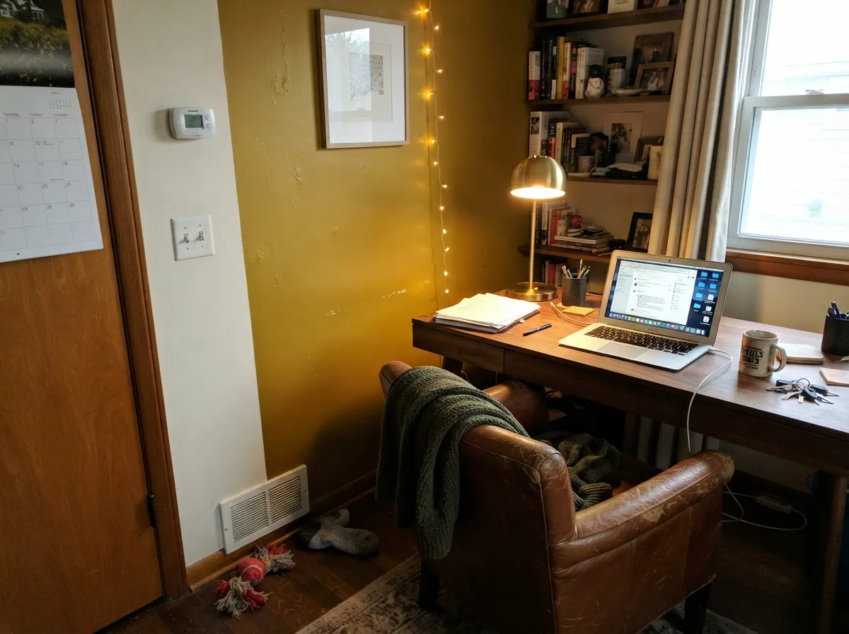
- Reads expensive against walnut, black hardware and leather — a natural bohemian pairing
- One bold surface (island, door, accent wall) delivers real personality without a whole-room bet
- Too saturated for four walls in most rooms — it reads as a brown box fast
- Dim or north light drains the gold and leaves a muddy, olive-brown cast
- Fights cool gray and icy blue neighbors without a warm-toned buffer between them
- A genuinely bold color — a room painted in it is a harder resale sell than a neutral
What Color Is Thai Curry, Really?
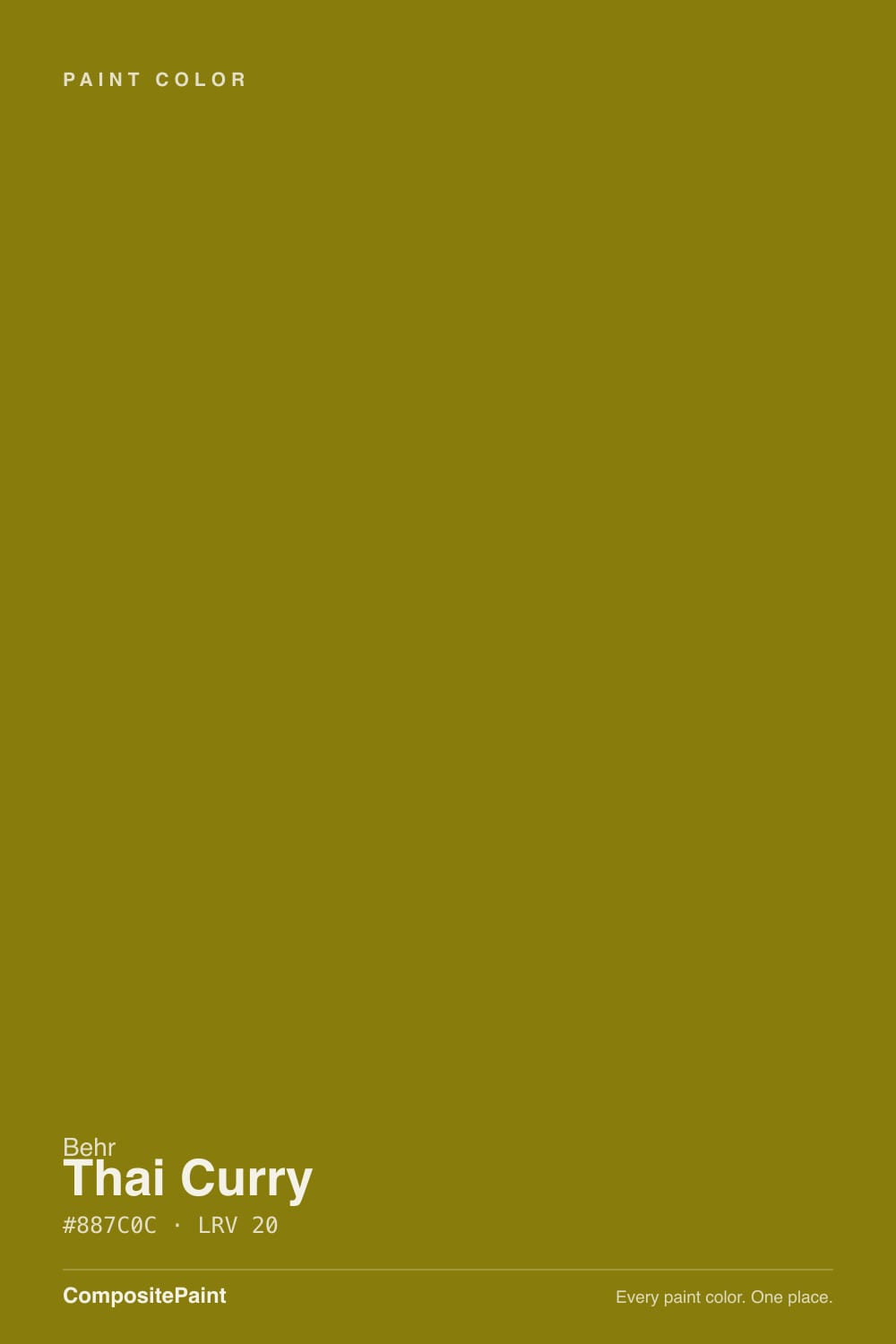
A deep, spiced gold with a genuine brown base — "curry" is not just a marketing name here. Most warm golds this saturated eventually tip either sunny-yellow or muddy-brown depending on the light; Thai Curry sits deliberately in between, which is why it reads as "spice" rather than "paint" in the right room. Its true complementary color is a deep blue, confirming it as a genuinely saturated, color-wheel-legitimate gold and not just a beige with ambition.
At LRV 21 it is a medium-dark color — roughly as deep as a mid-tone brown, not a pastel wearing a bold name. That depth is the whole trade: it holds its spice-gold color in bright daylight where paler golds wash out, but it also means the color carries real visual weight on a wall. Treat it like you would a deep accent color, not a background neutral — one surface, not four walls, is the difference between "statement" and "the whole room went brown."
Undertone in one line: warm gold-brown, with no green in the official color. If a sample looks murky, flat, or olive-ish on your wall, that's dim or cool light draining a deep gold of its warmth — not the paint shifting family. Every saturated gold does this in the wrong light; the fix is more light or a smaller dose, not a different can.
Where It Shines
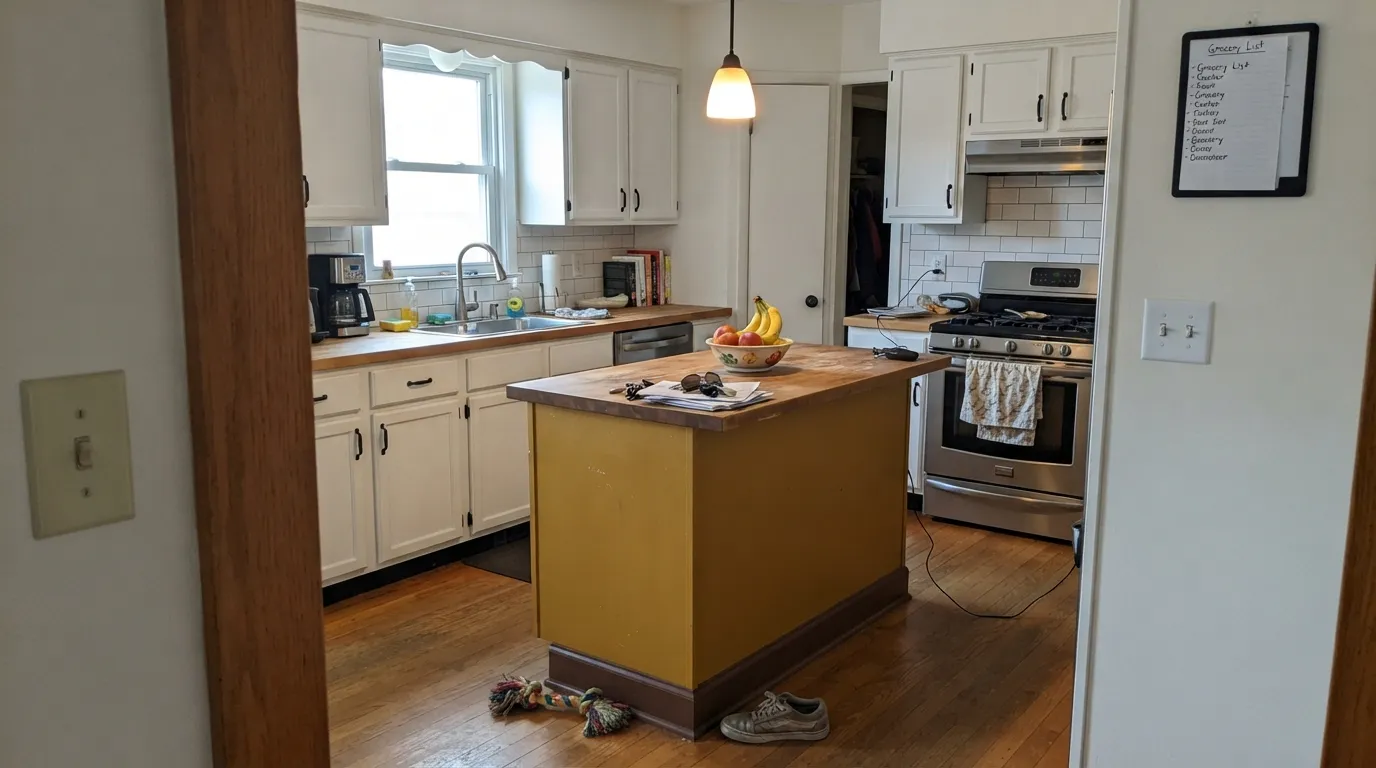
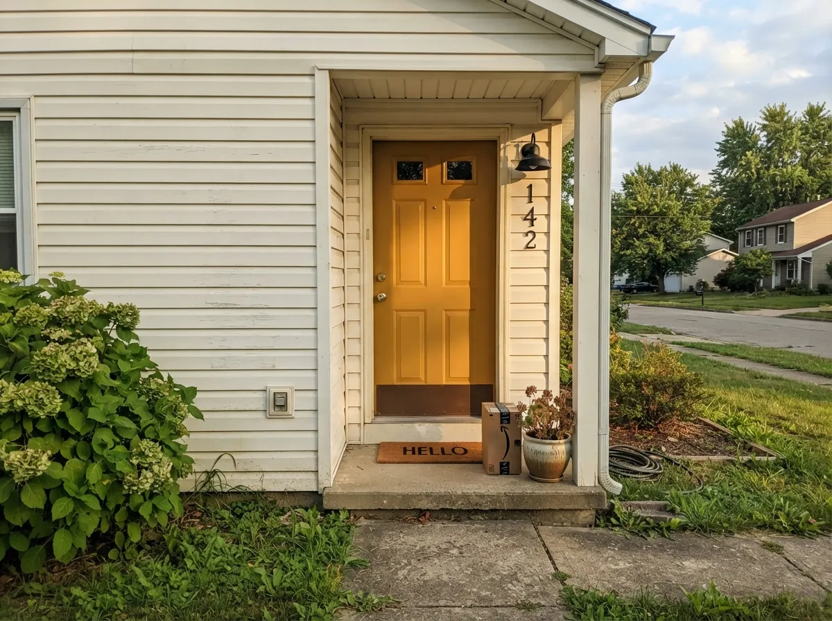
Give it one job and it delivers. A kitchen island under white perimeter cabinets, a front door on a neutral-body house, a single dining-room or den wall with walnut furniture nearby — in each case the color gets to be the loudest thing in the room without a fight, and daylight or a warm lamp brings the actual spice-gold forward instead of the brown underneath it. It is also a genuinely tested exterior color: Behr sells this exact formula as a solid-color house-and-fence wood stain as well as a paint, so a door or a gate in this gold has real weathering behind it, not just a hopeful interior sample carried outside.
Where It Fails
Almost every regret story with a color this saturated follows one of three scripts, and all three are predictable before the first coat. None of them are the paint's fault — but if your room matches one, this is not your wall color, and a bigger sample will only confirm it.
At LRV 21, a full room of this gold reads less like "spice" and more like a brown box by the third wall — the depth that makes it glow on one surface adds up fast at whole-room scale. Keep it to an island, a door, or one wall, and let a lighter neutral carry the rest of the room.
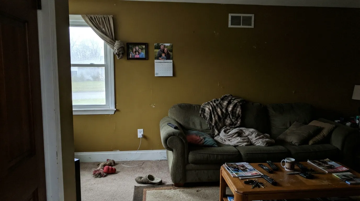
Cool, low daylight strips the warmth out of any deep gold, and what's left reads muddy, flat, and closer to olive-brown than spice-gold. The color did not change families — the light took the warmth away. Add a warm 2700K lamp or reserve this color for a room with real daylight.
This gold's true complement is a deep, warm-leaning blue used in small doses — a door, an island, a bit of trim. A wall of cool builder-gray next to it, or a bright icy blue, reads like a clash rather than a pairing. Warm whites, near-blacks and a deliberate deep blue accent are the safe company.
Room by Room
An island under white perimeter cabinets is the classic move, and it works: the gold gets to be the one bold decision in an otherwise calm kitchen. A full run of cabinets in this color is a bigger commitment — sample it on the actual doors under your kitchen's real light before ordering more than a quart.
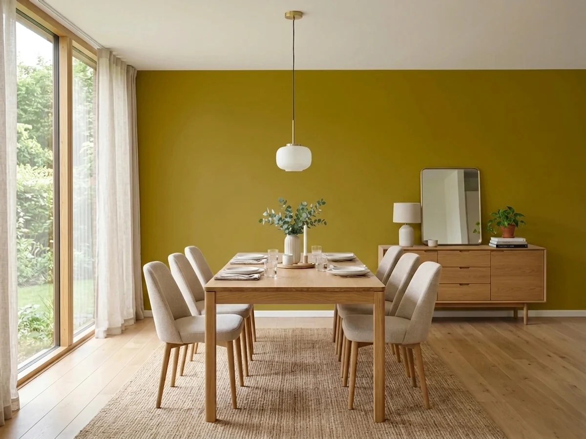
A single accent wall behind a walnut table or a sideboard reads warm and confident, especially with a brass or black chandelier. All four walls turns dinner-party lighting into a genuinely orange room — pick one wall and mean it.
Behr sells this exact color as an exterior paint and a solid house-and-fence stain, so a door or a gate in Thai Curry is a tested pairing, not a stretch. Full sun brings the gold forward; a shaded north-facing door will read a step darker and browner, so sample it on the actual door first.
One accent wall with a walnut desk, leather chair and a warm lamp is where this color feels genuinely expensive and cozy. Skip it if the room only gets cool overhead light and no lamps — that's the combination that reads muddy.
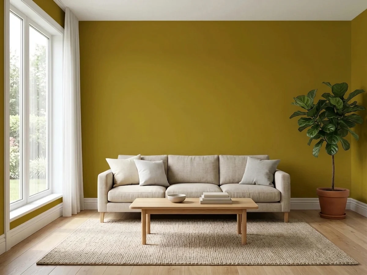
Works as a layered, bohemian accent — a bookshelf back, a niche, one wall — next to a cream or warm-white main color. A full living room in this gold fights every sofa and rug color you own; keep it to a dose.
This is a color for spaces you're active and awake in, not for rest. A whole bedroom in a saturated spice-gold reads stimulating rather than calm; if you love it, save it for a headboard nook or a single accent wall and keep the rest of the room quiet.
Your Light Is the Risk
The gold comes all the way forward and reads confidently spiced, not brown. This is the light the color was built for.
Cool, low daylight drains the warmth and leaves a flat, muddy, olive-leaning brown. Test a sample in your actual room before committing.
Warmest and most golden at sunrise and sunset hours; more brown and quiet through the middle of the day.
2700K lamps deepen it into a rich, cozy spice-gold at night. Cool LEDs flatten it toward khaki-brown — swap bulbs, not paint.
Most complaints about Thai Curry are a light mismatch. Upload a photo of your actual room and see it on your walls — then ask for the same wall in north light or evening lamps before you buy a single sample.
Need It From Another Brand?
Any paint counter can custom-tint Behr M320-7 directly. If you would rather stay in one brand's own deck, these are the closest stock matches, measured as ΔE2000. Under 2 is a difference you will not see on the wall.
| Brand | Closest color | ΔE | LRV | |
|---|---|---|---|---|
| Sherwin-Williams | Fervent BrassSW 6405 · Sherwin-Williams | 2.7 | 20 | Color page → |
| Benjamin Moore | DragonwellCSP-930 · Benjamin Moore | 0.9 | 22 | Color page → |
| Valspar | Marsh Grass8003-24G · Valspar | 0.4 | 21 | Color page → |
| PPG / Glidden | Peas PleasePPG1110-7 · PPG / Glidden | 4.1 | 21 | Color page → |
| Glidden | Peas PleasePPG1110-7 · Glidden | 4.1 | 21 | Color page → |
| Dutch Boy | Curly Willow319-7DB · Dutch Boy | 4.7 | 21 | Color page → |
Similar Behr Colors
The nearest shades to Thai Curry within Behr's own range, ranked by perceptual color distance — useful when you want the same look a touch lighter, darker, or warmer.
WCAG 2.1: AA is 4.5 : 1 for normal text, 3 : 1 for large text, AAA is 7 : 1.
Thai Curry vs the Colors You're Also Considering
Every Thai Curry sample board has the same rivals on it. The numbers show the real lightness gap — then it comes down to which risk you would rather live with.
Pick this when you want the color to actually read gold, not just warm — Honey Tea drifts toward beige in anything but ideal light.
Behr MQ2-18 · LRV 52Honey TeaPick this for the same honey-gold warmth spread across four walls — lighter and far safer at whole-room scale.
Pick this for real depth and drama — Charismatic reads closer to a warm yellow than a spiced curry.
Behr PPU6-14 · LRV 57CharismaticPick this for a brighter, sunnier cabinet or island gold — the lighter, less brown version of the same idea.
Persian Gold M300-7 (#8F7516, LRV 19) is the closest alternative if you want less green: it is redder and more orange, so it reads as gold rather than curry. Burnished Bronze S-H-380 (#8E7B1D, LRV 20) sits at the same lightness with a slightly warmer, bronzier cast. Gold Ink S310-6 (#937D30, LRV 21) is a step lighter and noticeably less saturated, which makes it the softer, more antique choice for anyone who finds Thai Curry too bright.
Raked Leaves 360F-6 (#887B27, LRV 20) matches the LRV but has less punch, landing closer to olive. Green Tea Leaf M330-7 (#77792F, LRV 18) is clearly greener and a little darker, and Valley Vineyards M310-7 (#7A731B, LRV 16) is the darkest of the group, deeper and heavier on a wall.
Across brands, Valspar Fickle Pickle V057-6 (LRV 19.6) is very close to Thai Curry, near enough that most people would not name the difference, but sample it first before matching a wall.
Thai Curry Coordinating Colors
The rule for coordinating with Thai Curry: keep the neighbors warm and let the gold be the loudest color in the room. Warm whites and creams give it room to breathe, near-blacks give it the edge it needs to read deliberate, and its true complementary color is a deep, warm-leaning blue — used sparingly, that blue makes the gold read richer instead of clashing with it. These are the partners that keep showing up in rooms that work:
Thai Curry on Exteriors
Outside, Thai Curry is a genuinely tested color, not just an interior shade pressed into exterior service — Behr sells this exact M320-7 formula as both an exterior paint and a solid-color house-and-fence wood stain, so a door, a gate, or a run of trim in this gold has real weathering data behind it, not just a hopeful sample carried outdoors.
Full sun brings the gold forward and lets it read confidently spiced rather than brown; a shaded, north-facing door will read a step darker and browner, so sample it on the actual door before ordering a gallon. Pair it with a warm neutral body and near-black or bronze hardware for the cleanest result — icy white siding pushes the gold toward muddy by comparison.
Thai Curry With Wood Tones and Metals
Walnut, aged leather and rattan are this color's natural company — the same warm-spice register at a different depth, which is exactly why it shows up so often in bohemian and eclectic rooms. Honey-oak floors are fine but not a highlight; the two golds don't clash, they just don't add much to each other either.
Metals need a little more care than usual. Brushed or matte black and bronze hardware ground the color and read as a deliberate choice. Polished brass can work in small doses, but a lot of brass next to a lot of gold paint starts to compete rather than complement — pick one to be the star. Bright chrome is the one hard no; it reads cold and clinical against this much warmth.
Three Ready Palettes Built on Thai Curry
A color is never alone on the wall. These are complete combinations in the 60-30-10 pattern, with the reason each one holds together. Every one opens in the visualizer.
A soft warm-white body lets the gold door do all the talking; near-black shutters give the modern-farmhouse edge without competing with the spice color. Behr sells this exact gold as an exterior stain too, so the door and any wood trim nearby can match precisely.
Try this palette in your roomWhite perimeter cabinets keep the kitchen from tipping into an all-brown room; the gold island gets to be the one bold decision. A near-black pantry door adds the contrast the gold needs to read as a choice, not an accident.
Try this palette in your roomA warm cream keeps the room from reading like a mustard box; the muted green tucked into a niche or bookshelf back adds a second jewel-tone note without a turf war. This is the layered, bohemian look the color was built for.
Try this palette in your roomThai Curry FAQ
is Thai Curry a yellow or a brown?
Both, in a sense — it's a genuine gold at heart, but the low LRV (21) and brown base mean it reads more like a spiced mustard-brown on the wall than a clean, bright yellow. Direct light brings the gold forward; dim or cool light lets the brown take over.
will it look muddy or olive on my wall?
Only in dim or north-facing light. The official color is a warm gold-brown with no green in it, but low light drains any deep gold of its warmth, and what's left can read murky or olive-ish. Test a sample where your actual light hits before committing to a gallon.
can I use it on all four walls?
You can, but most people regret it. At this depth and saturation a full room reads heavy fast — it's built to be the one bold surface, like an island, a door, or a single accent wall, not the whole box.
does it work outside?
Yes — Behr sells this exact color as both an exterior paint and a solid-color house-and-fence wood stain, so a front door, shutters, or a gate in this gold is a genuinely tested combination, not a stretch.
what colors go with Thai Curry?
Warm whites and creams keep it from feeling heavy, near-black trim gives it the edge it needs to read intentional, and its true complementary color is a deep blue — used sparingly, on a door or a bit of trim, a blue accent makes the gold read noticeably richer.
is it good for kitchen cabinets or just an island?
Both are used in real kitchens, but an island or a lower bank of cabinets under white uppers is the safer bet. A full kitchen of cabinets in this color is a serious commitment — sample it on the actual cabinet doors, under your kitchen's real light, before committing to the whole run.
Have you painted with Thai Curry?
Rate it — one tap helps the next reader decide.
Ask a Question