Red Tomato
The cheerful Sherwin-Williams red that keeps landing on accent walls, reviewed honestly: where a clear tomato red pays off, why the first coat looks pink, and what to buy instead.

Jessica has spec'd whites and neutrals for more than 300 rooms and keeps a sample wall of painted drawdowns in her studio. Every color review is checked against real reader rooms in the comments and re-tested when a formula changes. About the testing process →
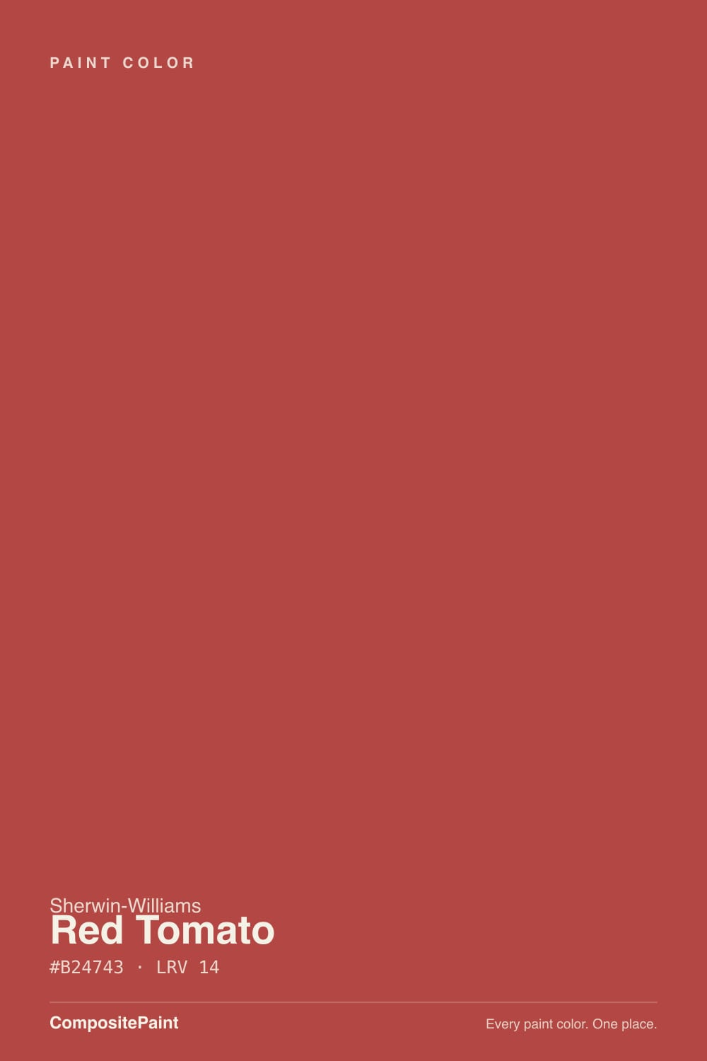
- 1Rookwood Dark Red3
- 2Rumors8
- 3Red Tomato14
- 4Cinnamon Slate19
- 5Rejuvenate30
The Fast Verdict
Red Tomato is a red that still reads red — not a brick, not a wine, not a rust. It sits almost dead center on the red axis with just enough gray to keep it out of fire-truck territory, which is what makes it survivable on a wall. At LRV 14 it is a genuinely dark color, so it works best where you meant it to be loud: one wall, a dining room, a powder room, a front door. Four walls of it in a dim room is the mistake people write about afterward.
One accent wall in a room with real light · dining rooms you mostly use after dark · powder rooms drenched top to bottom · front doors and shutters on a white or gray house · anyone who wants a clear red, not a merlot
You actually want a moody wine or oxblood · the room is dim, north-facing and lamp-free · you are painting over white and won't prime gray first · your brick, tile or floors already run orange-red · it's a bedroom you need to fall asleep in
- A red that still reads red — no brick, no rust, no wine
- Softened just enough to survive as a wall color, not just an accent object
- Deep enough (LRV 14) to look intentional instead of pastel
- Dining rooms and powder rooms feel finished with one decision
- One of the better front-door reds: visible from the street without shouting
- Poor hide — plan on gray primer plus two coats, never a one-coat job
- Wrong color for anyone chasing the moody merlot and oxblood look
- Goes flat brick-brown in dim north rooms with no lamps
- Fades faster than any other color family in full exterior sun
What Color Is Red Tomato, Really?
Red Tomato is a mid-depth red that stays red. Take the color apart and the green and blue sides of it land within a few points of each other, which means it leans neither cherry-blue nor rust-orange — it is about as centered as a red gets. What softens it is saturation, not hue: there is enough gray folded in that it reads like a ripe tomato instead of a fire engine, and that single degree of restraint is the reason it works on a wall when a primary red would not. Sherwin-Williams itself positions it as an accent color rather than a whole-house one, which is an honest place to start.
At LRV 14 this is officially a dark color, and that number matters more than the hue does. A wall this deep absorbs light instead of returning it, so a room with one small window will feel noticeably smaller and dimmer with Red Tomato on all four sides — and the color itself pays for it, sagging toward heavy brick in the corners. In a bright room, or on one wall out of four, the same paint stays clear and lively. Nearly every good Red Tomato room and every bad one comes down to that arithmetic, not to taste.
Undertone in one line: red first, a hair of orange second — never wine, never pink. If your sample card looks orange, that is west sun or a warm bulb doing it. If it looks brown and heavy, your room is not giving the color enough light to work with. Both readings are the same paint being honest about the room it is in.
Where It Shines
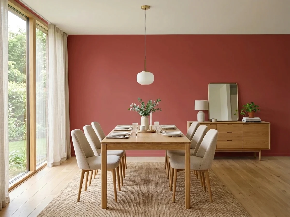
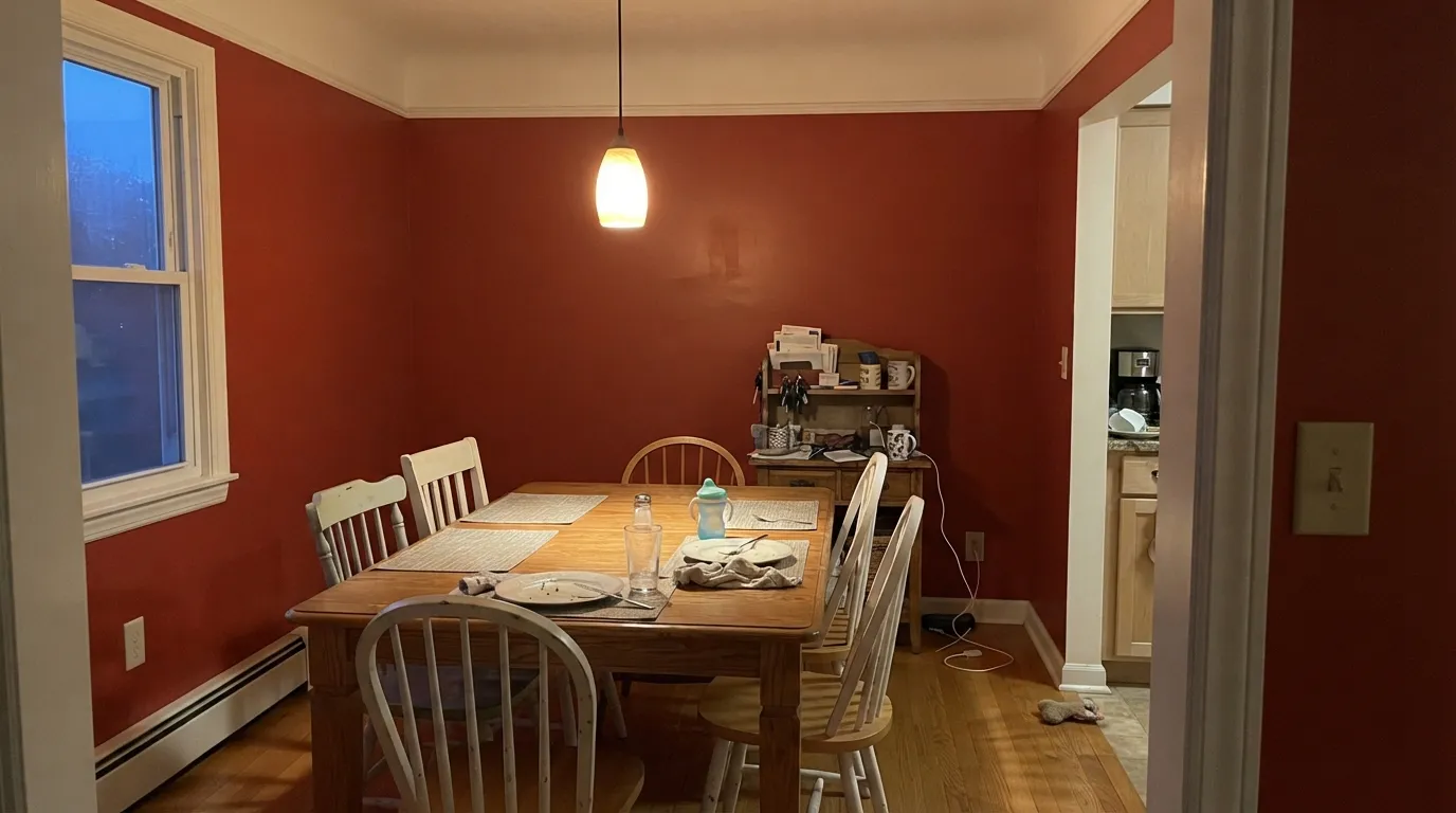
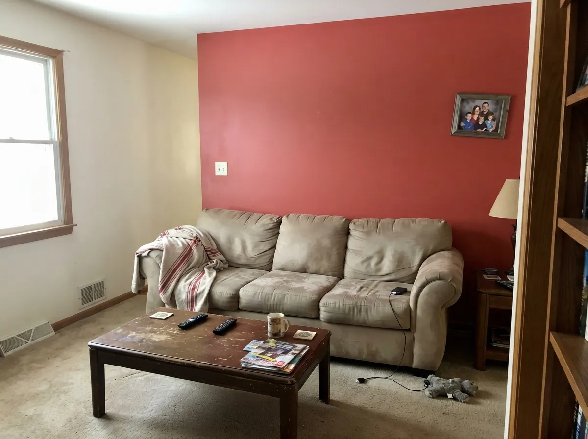
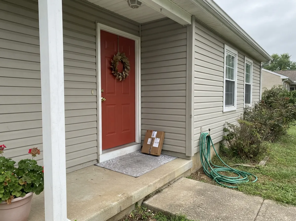
This color is at its best when it is the point. A dining room you use at night, one wall behind a sofa, a powder room painted top to bottom, a front door on a plain gray house — those are the jobs where a clear red earns the risk. Give it a warm white next to it, warm wood in the room and 2700K bulbs overhead, and Red Tomato reads confident and slightly old-school in the good way: the color a room chose, not a color that happened to it.
Where It Fails
The complaints about Red Tomato are unusually predictable, and none of them are really about the shade. Two are about how red paint physically behaves, one is about buying the wrong red on purpose. If your project matches any of the three, more sampling will not save it.
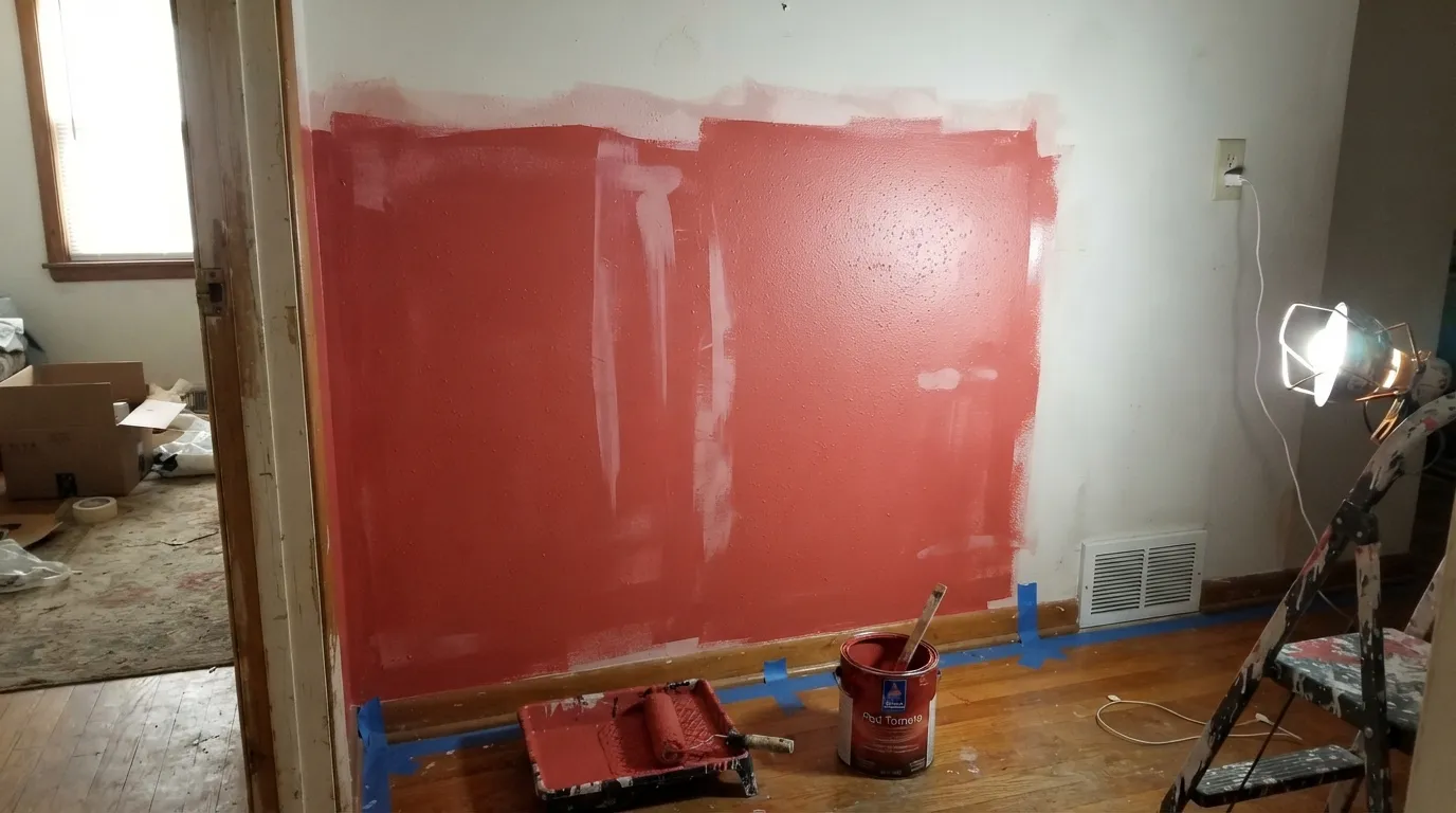
Red pigment is the least opaque pigment in the store. Rolled straight over white drywall, coat one goes on translucent and blotchy, coat two is still uneven, and people end up at four coats and a bad mood. The fix is boring and cheap: a gray-tinted primer, then two coats. Skip it and you are buying a third gallon to solve a problem primer solves for twenty dollars.
Half the people shopping for red right now actually want the current dark-red look — merlot, oxblood, plum-brown, the kind of red that reads almost as a neutral at night. Red Tomato is not that color. It is bright, clear and cheerful, and on four walls it announces itself the way a 2005 accent wall did. If depth is what you're after, Behr Rumors is the oxblood version of this decision.
LRV 14 has no reserves. In a north-facing room, on an overcast day, with no lamps on, the clarity drains out and Red Tomato goes flat, brownish and heavy — closer to old barn siding than to a tomato. Owners describe it as looking dirty, which is really just a dark color starved of light. Warm bulbs and a lamp or two are part of the paint job, not an upgrade.
Room by Room
Red dining rooms are a cliche because they work: you are in the room after dark, under warm light, for two hours at a time, and a deep red makes the table feel like an occasion. Eggshell on the walls, a soft warm white on the trim and ceiling, and candles or 2700K bulbs. This is the one room where painting all four walls Red Tomato is a good idea rather than a brave one.
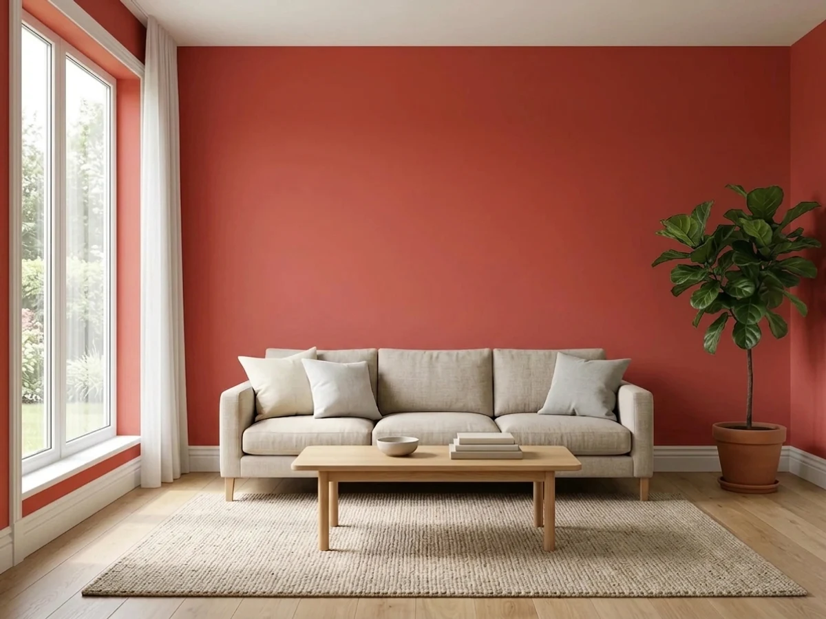
A single wall behind a sofa, a bed frame or a fireplace gives you the whole personality of the color for a quarter of the risk and a quarter of the paint. Put it on the wall that is not fighting a window — a red wall backlit by daylight goes to a dark silhouette all afternoon. Keep the other three walls warm white or greige and let the red do one job.
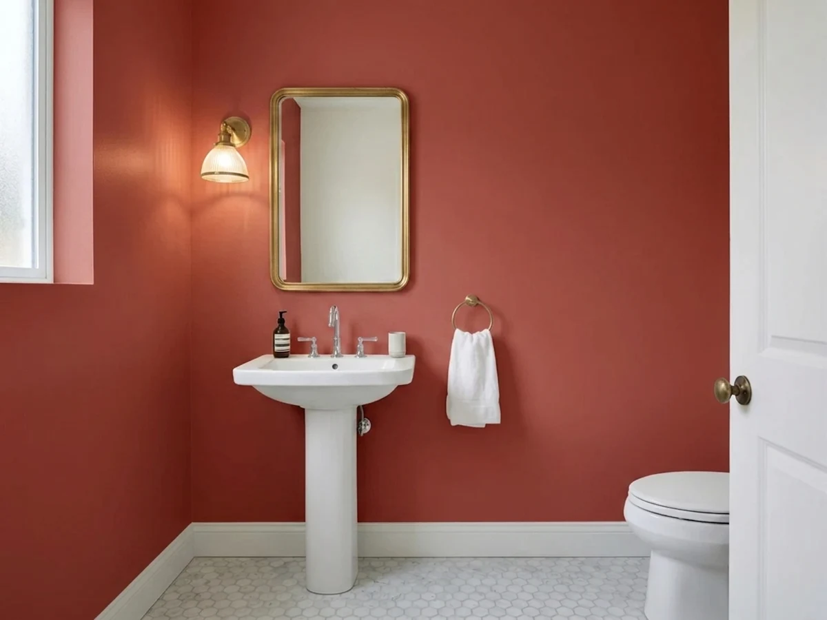
Tiny rooms take deep color better than big ones, and nobody is in a powder room long enough to get tired of it. Walls, ceiling and even the inside of the door in Red Tomato, with brass or matte black hardware and a white sink, reads deliberate and expensive. The one honest caveat: red walls bounce red light, so faces in the mirror pick up a flush. In a powder room that's flattering; in a bathroom where people do makeup, it isn't.
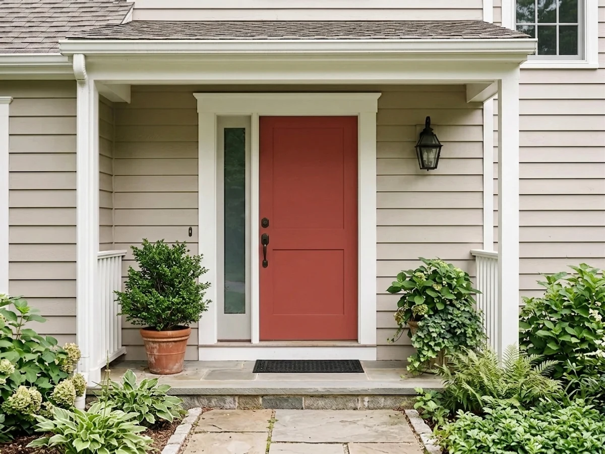
A red door on a white, gray or greige house is the oldest reliable move in exterior color, and Red Tomato is a good version of it — clear enough to be seen from the street, softened enough not to look like a stop sign. Same for colonial shutters. Use satin or gloss rather than flat: the sheen slows UV fade, and reds fade faster than any other family outdoors.
A run of red kitchen cabinets is a big, permanent, resale-narrowing commitment, and red is the family most likely to look dated first. In a dose it's charming: a single island, a pantry door, a mudroom door off the kitchen, or open shelving backing. Satin cabinet enamel, and keep it away from red-brown cabinetry that already leans the same direction.
Red is the highest-energy color you can put on a wall, and a bedroom is the one room asking for the opposite. Even people who love the color report that four red walls make the room feel warm and restless at night. If you want red in a bedroom, put it on one wall behind the headboard where you can't see it from the pillow, or keep it in textiles.
Your Light Is the Risk
Full, even light keeps the red clear and lively instead of heavy. This is the light that proves the color is a tomato, not a brick.
Cool, weak daylight strips the clarity out and leaves a flat brownish red. LRV 14 has nothing in reserve — this is where the bad photos come from.
Late sun pushes it visibly orange for an hour, then drops it into deep brick as the light goes. Sample at 6pm, not only at noon.
2700K lamps deepen it toward a rich wine-red and flatter it — this is the dining-room look. Cool 4000K LEDs do the opposite, making it look raw and slightly plastic.
Most complaints about Red Tomato are a light mismatch. Upload a photo of your actual room and see it on your walls — then ask for the same wall in north light or evening lamps before you buy a single sample.
Need It From Another Brand?
Any paint counter can custom-tint Sherwin-Williams SW 6607 directly. If you would rather stay in one brand's own deck, these are the closest stock matches, measured as ΔE2000. Under 2 is a difference you will not see on the wall.
| Brand | Closest color | ΔE | LRV | |
|---|---|---|---|---|
| Behr | Stiletto LoveP160-7 · Behr | 1.6 | 15 | Color page → |
| Benjamin Moore | Rosy Apple2006-30 · Benjamin Moore | 1.3 | 15 | Color page → |
| Valspar | Deep Rose2001-3A · Valspar | 2.6 | 14.6 | Color page → |
| PPG / Glidden | Teaberry BlossomPPG1189-7 · PPG / Glidden | 1.6 | 15 | Color page → |
| Glidden | Teaberry BlossomPPG1189-7 · Glidden | 1.7 | 15 | Color page → |
| Dutch Boy | Lantern Red206-7DB · Dutch Boy | 4.1 | 14 | Color page → |
Similar Sherwin-Williams Colors
The nearest shades to Red Tomato within Sherwin-Williams's own range, ranked by perceptual color distance — useful when you want the same look a touch lighter, darker, or warmer.
WCAG 2.1: AA is 4.5 : 1 for normal text, 3 : 1 for large text, AAA is 7 : 1.
Red Tomato vs the Colors You're Also Considering
Every Red Tomato sample board has the same rivals on it. The numbers show the real lightness gap — then it comes down to which risk you would rather live with.
Pick this for the lighter, friendlier version that a whole dining room can actually live with.
Benjamin Moore AF-290 · LRV 8CalientePick this if you want the deeper, more saturated benchmark red — it commits harder and reads richer on a door.
Pick this if you shop Sherwin-Williams; the difference between the two is smaller than the difference between two rooms.
Benjamin Moore 2006-30 · LRV 15Rosy ApplePick this if you shop Benjamin Moore — at LRV 15 it is the closest cross-brand twin to this color, just a shade warmer in daylight.
Red Tomato Coordinating Colors
The rule for building around Red Tomato: one loud color per room, and everything else quiet and warm. It wants soft warm whites rather than bright ones, warm near-blacks rather than cool charcoals, and neutrals that lean beige rather than gray-blue. Navy is the one other saturated color it genuinely likes — red, navy and white is a combination that has been working for two hundred years. These are the partners that keep showing up in rooms that work:
Red Tomato Outside: Doors, Shutters, and the Fade Question
Outside is where this color has the least competition. A red front door on a pale house is one of the few exterior moves that reads as taste rather than trend, and Red Tomato is a well-judged version — clear enough to carry from the sidewalk, gray enough not to look like signage. It works on colonial shutters for the same reason, and it is a decent barn or shed color if you like the traditional look and accept that it will be brighter than true barn red.
The honest caveat is fade. Red pigments are the least UV-stable family in the exterior world, and a door in unshaded south or west sun can lose noticeable depth within a couple of years while the greens and earth tones on the same house look untouched. Two choices buy you years: use a quality exterior door and trim enamel rather than a leftover interior gallon, and go satin or gloss rather than flat — the smoother the surface, the more UV bounces off instead of soaking in. A covered porch or a north-facing entry holds the color far longer than an exposed one.
Whole-house red is a different conversation and mostly a no. At LRV 14 an entire facade in this color is a huge amount of saturation to look at every day, it dates fast, and it narrows your buyers. Keep it to the door, the shutters, or an outbuilding.
Red Tomato With Wood Tones and Floors
Warm wood is the natural company here. Walnut, oak with a natural or brown stain, leather and rattan all sit comfortably next to a centered red, and brass hardware makes the whole thing look older and more considered than it is. Cream and unbleached linen are better textile partners than pure white; a stark white sofa against a red wall exaggerates how saturated the wall is.
The clash to watch is same-family competition. Red-brown or orange-stained floors, exposed red brick, terracotta tile, mahogany cabinets and cedar shingles are all doing a version of what Red Tomato is doing, and two nearly-matching reds in a room look like a mistake in a way that two clearly different colors never do. Either put real distance between them — a big neutral rug, a full wall of white — or pick a color from a different family and let the brick be the red in the room.
Cool floors are easier than people expect. Gray-washed oak, concrete and slate all give the red something neutral to push against, and the slight warm lean in this color keeps the pairing from going cold. The one combination to test carefully is blue-gray floors with cool LEDs — that light strips the warmth out of the red and the room starts to read like a flag.
Three Ready Palettes Built on Red Tomato
A color is never alone on the wall. These are complete combinations in the 60-30-10 pattern, with the reason each one holds together. Every one opens in the visualizer.
A warm white rather than a bright one is the whole trick here — Alabaster keeps the ceiling soft so the red reads warm instead of hot. Van Dyke Brown is a near-black brown, which grounds the scheme without the cold edge a true black would bring against a warm red. Brass, candlelight and walnut finish it.
Try this palette in your roomThe accent-wall version of this color needs a quiet room around it. White Dove is warm enough that the red never looks like it was dropped in from another house, and Black Fox is a near-black that leans warm in good light — a colder charcoal next to a warm red reads slightly cheap. Three colors, one loud one.
Try this palette in your roomThe most-copied exterior formula in America, and it holds up: a warm greige body, crisp white trim, one saturated door. Pure White is cleaner than the body color, so the trim frames the door instead of blending into it. Keep the door at satin or gloss — flat red outdoors gives up its color fastest.
Try this palette in your roomRed Tomato FAQ
Is Red Tomato too bright for a whole room?
For most rooms, yes — and that is not an insult to the color. At LRV 14 it absorbs a lot of light, and red is the most stimulating hue on a wall, so four walls of it in a living room or bedroom tends to feel hot rather than cozy. The two exceptions are a dining room, where you want the room to feel like an event and you mostly use it at night, and a powder room, where you are in and out in two minutes. Everywhere else, one wall.
Why does red paint need a gray primer?
Red pigment is the least opaque pigment on the shelf. Over a white wall, the first coat goes on translucent and patchy and reads pink, and the second coat often still shows lap marks. A gray-tinted primer kills the white underneath so the red reaches full color in two coats instead of four. Any paint store will tint primer gray for you; ask for it before you buy the third gallon.
What white trim goes with Red Tomato?
A soft warm white. Alabaster is the easy default in the Sherwin-Williams deck, White Dove if you shop Benjamin Moore. A very bright, cool white makes the red look hotter and slightly cheap by contrast — the same effect a stark white mat has on a warm photograph. Semi-gloss on the trim, eggshell on the walls.
Is Red Tomato orange-red or blue-red?
Neither, really — it sits close to the center of the red family, with a slight warm lean that only shows up under west sun or 2700K bulbs. That centered position is why it plays well with both warm wood and cool grays, where a clearly orange red would fight the grays and a clearly blue red would fight the wood.
Will a red front door fade?
Faster than any other color, yes. Red pigments break down under UV more readily than blues, greens or earth tones, and a south- or west-facing door in full sun can show visible fade in a couple of years. Two things help: a higher sheen, because gloss reflects more UV than flat does, and a quality exterior enamel rather than a leftover interior gallon. A shaded or porch-covered door will hold its color far longer.
Red Tomato or Caliente for a front door?
Caliente is deeper and more saturated at LRV 8 — it looks richer up close and holds up better against a dark or busy facade. Red Tomato is lighter and clearer at LRV 14, which reads friendlier and shows up better on a pale gray or white house from the curb. If the house is dark, go Caliente; if it's light, Red Tomato is the more cheerful choice.
Have you painted with Red Tomato?
Rate it — one tap helps the next reader decide.
Ask a Question