Rosy Apple
The warm, faintly orange red Benjamin Moore keeps putting in dining rooms, reviewed honestly: where it glows, where it turns tomato, and what to pick instead.

Jessica has spec'd whites and neutrals for more than 300 rooms and keeps a sample wall of painted drawdowns in her studio. Every color review is checked against real reader rooms in the comments and re-tested when a formula changes. About the testing process →
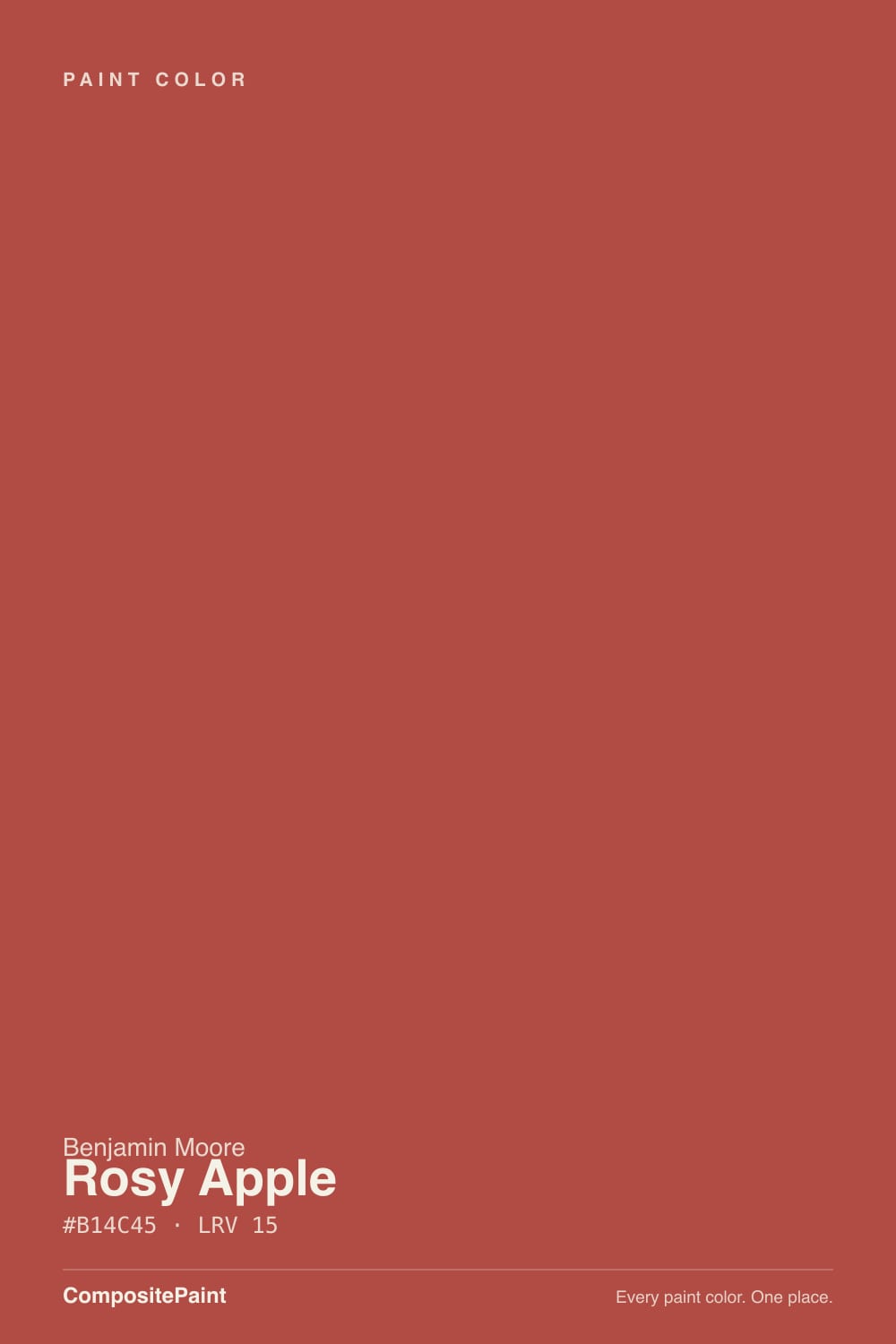
- 1Rookwood Dark Red3
- 2Rumors8
- 3Rosy Apple15
- 4Inferno22
- 5Rejuvenate30
The Fast Verdict
Rosy Apple is a mid-depth red with a pink-orange lean — warmer and friendlier than a wine red, louder and more coral than a barn red. At night, under a chandelier and candles, it does exactly what Benjamin Moore built the dining-room pitch around: the room goes warm, close and expensive. In flat midday sun it shows its orange side and gets much louder than the chip promised. Buy it for rooms you use after dark, not for the ones you sit in at noon.
Dining rooms used at night · powder rooms and entries · drenched walls-plus-ceiling treatments · front doors on warm white or cream houses
You actually want oxblood, merlot or a dusty barn red · your floors are honey oak or orange-toned red oak · the room is a bright all-day family space · you hate repainting and want zero color commitment
- Warm, appetizing red that makes food, faces and candlelight look better
- Deep at LRV 15, so it envelops instead of just decorating
- Drenches beautifully — walls plus ceiling is its best format
- Small rooms and front doors get big character for one gallon
- Loves walnut, brass, cream and black; no styling gymnastics needed
- Reads brighter and more orange in daylight than the chip suggests
- Clashes hard with honey oak, orange brick and red-oak floors
- Poor hide — tinted primer plus two to three coats, and touch-ups flash
- Too stimulating for four walls of a room you relax in all day
What Color Is Rosy Apple, Really?
A saturated warm red sitting somewhere between tomato and clay — not a blue-based crimson, not a brown-based brick. The tell is a pink-orange cast that shows up whenever real light hits it, and that cast is the whole personality: it is what makes the color flatter candlelight, brass, walnut and skin tones, and it is also what makes the color run hot in a sunny room. Benjamin Moore files it in Color Preview, the deck's bolder half, and features it in its own dining-room ideas — including the suggestion to carry it over the ceiling for a fully enveloped room.
At LRV 15 it is a genuinely deep color, and deep plus saturated is a different animal from deep plus grayed. A muted color at this depth recedes; a red at this depth advances. On a chip it looks controlled and appetizing. On four walls it doubles in volume, and the pink-orange lean that was invisible on the fan deck becomes the first thing your eye names. Sample two coats on a large board and look at it at 1pm and again at 8pm before you commit — those are two different colors.
Undertone in one line: red with a pink-orange lean — never blue-red, never burgundy. If your sample reads coral, that is direct sun. If it reads brick-brown, the room is not giving it enough light. Both are the same paint telling the truth about the room.
Where It Shines
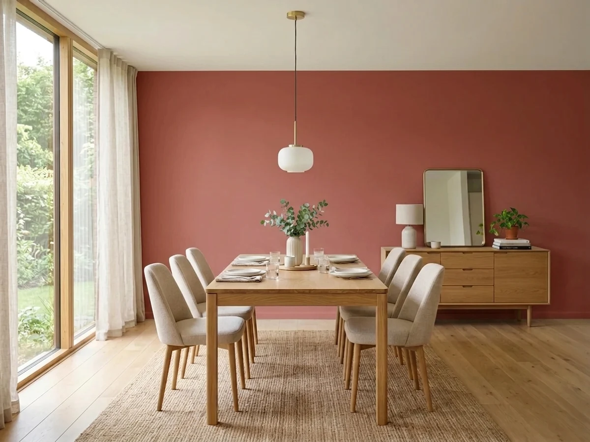
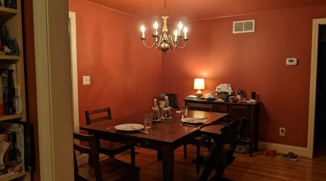
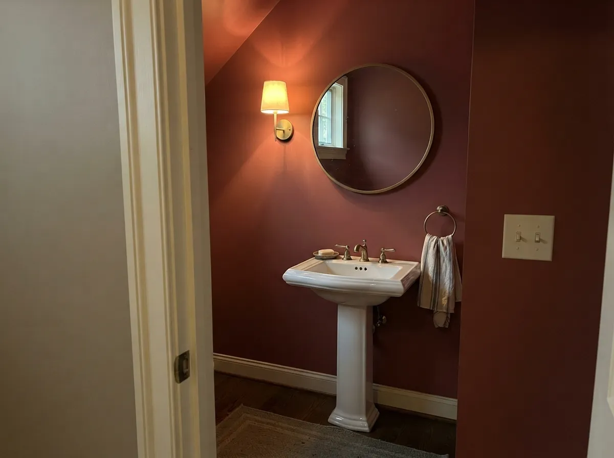
This is a night color. Under a chandelier, warm 2700K bulbs and a couple of candles, the walls go deep and glowing, faces look better than they do under any neutral, and the room feels like a restaurant that knows what it is doing — which is exactly why warm reds have been dining-room stock for two centuries. Its second strength is the small, brief room: a powder room or an entry, where guests spend four minutes and a saturated red reads as confidence instead of commitment. Give it cream trim, walnut, unlacquered brass and a dark grounding note, and it looks deliberate rather than dated.
Where It Fails
The complaints about a red like this are remarkably consistent, and every one of them is predictable before you open the can. Two are about light and expectation, one is about labor. If your room matches the first two, sampling bigger will only confirm it.
People shop for red imagining a deep, dusty, library red and then buy a chip that is actually a warm mid-red. In strong daylight Rosy Apple leans coral-tomato, and four walls of it in a bright room reads loud, not lush. If the color in your head is merlot or oxblood, go to Bewitched instead — that is a genuinely dark, dusty red, and you will not be surprised by it.
This red already carries orange, so anything else orange in the room stops reading as wood or masonry and starts reading as more of the same color at a different value. Honey-oak floors, orange-stained trim and a 1990s orange-brick fireplace are the three classic offenders — the room flattens into one hot mass and immediately looks dated. Walnut, espresso, black-stained oak or a large rug between the floor and the wall are the fix; a cool gray floor is fine too.
Deep reds are built on organic pigments with very little white in the base, so they hide badly. Over builder beige, expect a gray-tinted primer plus two to three finish coats before the color stops looking blotchy, and expect touch-ups to flash unless you keep a roller-loaded corner of the wall to feather into. It also cuts both ways: whenever you repaint over it, that is another primer plus two coats. Budget the extra gallon and the extra day now.
Room by Room
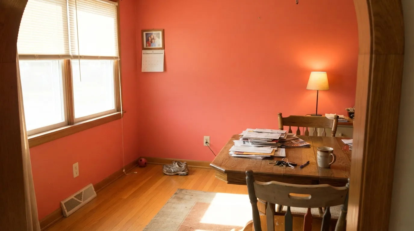
This is the room the color was made for and the one Benjamin Moore itself pushes it toward. Dining rooms are used at night, which is when a warm red is at its best, and they are rooms you pass through rather than sit in for eight hours, which forgives the intensity. Eggshell on the walls, White Dove trim, warm bulbs on a dimmer, and let candles do the rest.
Carrying it up over the ceiling is Benjamin Moore's own suggestion, and it is the single best thing you can do with this color. A red ceiling removes the bright white lid that otherwise makes red walls look like a stripe of loud color, and the whole room reads as one enveloping surface — the effect color-drenching became a trend for. Flat on the ceiling, eggshell on the walls; the sheen change is all the separation you need.
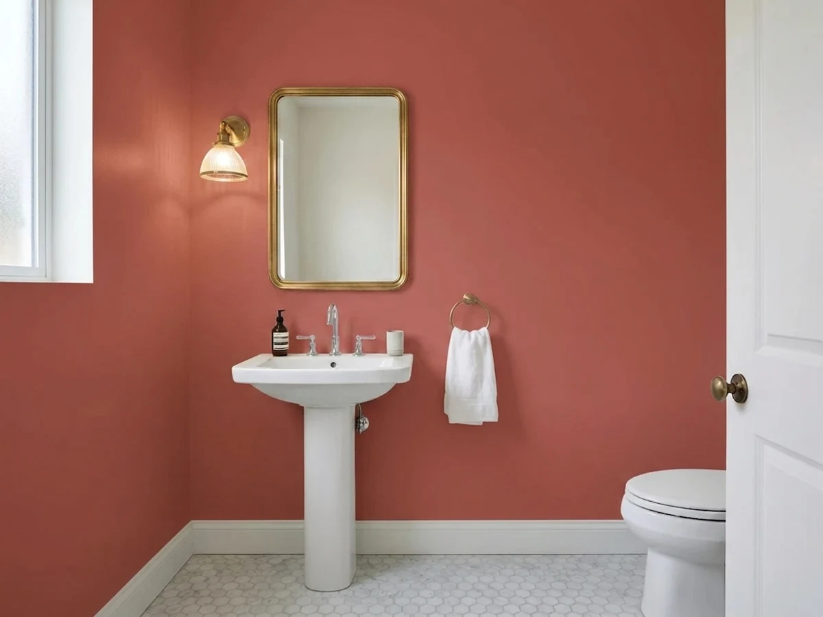
A powder room is a four-minute room, so saturated color is nearly risk-free there, and an entry that opens onto quieter neutrals gives the house a real first note. Both are small enough that the coverage tax stays cheap. Add a mirror, one warm sconce and brass or aged bronze fittings, and it looks like a design decision rather than a leftover gallon.
A red island or a red butler's-pantry hutch under cream cabinets is genuinely good, and satin cabinet enamel keeps it wipeable. Whole kitchens of this red are a different bet: kitchens are daytime rooms with hard bright task lighting, which is the worst light for it, and it fights stainless and warm-toned wood counters at the same time.
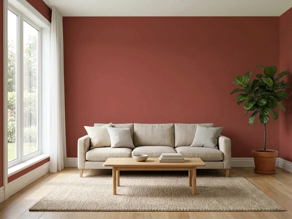
Benjamin Moore shows it on a bedroom accent wall, and that is about the right dose. A headboard wall in this red behind cream bedding is warm and grown-up; four walls of it in a room you actually relax in is a lot of stimulation, and it is the most common source of red regret stories. Same logic in a living room: an alcove, a chimney breast or built-ins, with the rest of the room in a warm neutral.
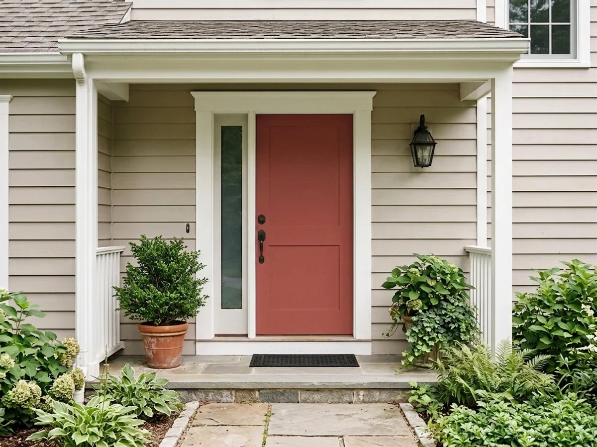
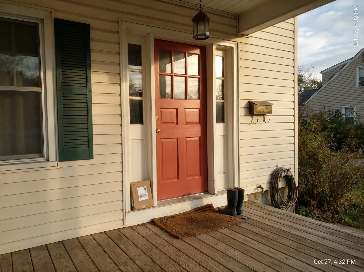
A warm red door on a cream or warm-white house is a classic for good reason, and this red has the earthy side that keeps it from looking like fire-engine paint. Do know that reds fade faster than any other family outdoors — the pigments that make them bright are the ones UV breaks down first — so a south-facing door will want a refresh years before the siding does. That same fade math is why a whole red house body is a hard sell.
Your Light Is the Risk
Low warm light deepens the red and mutes the orange — the walls turn velvety and the room feels close. This is the light that sells the color.
Cool gray daylight drains the glow and leaves a heavy brick-brown that reads dark and a little muddy. Add lamps or pick a color that does not need warmth.
Midday sun pulls the pink-orange forward and the walls go a full step brighter, close to tomato. Golden hour is spectacular; noon is the honest test.
2700K bulbs on a dimmer are part of this paint job. Cool 4000K LEDs flatten the warmth and give the red a chilly pink edge that also bounces onto faces.
Most complaints about Rosy Apple are a light mismatch. Upload a photo of your actual room and see it on your walls — then ask for the same wall in north light or evening lamps before you buy a single sample.
Need It From Another Brand?
Any paint counter can custom-tint Benjamin Moore 2006-30 directly. If you would rather stay in one brand's own deck, these are the closest stock matches, measured as ΔE2000. Under 2 is a difference you will not see on the wall.
| Brand | Closest color | ΔE | LRV | |
|---|---|---|---|---|
| Sherwin-Williams | Red TomatoSW 6607 · Sherwin-Williams | 1.3 | 14 | Color page → |
| Behr | Carmine RedUL110-8 · Behr | 1.5 | 15 | Color page → |
| Valspar | Deep Rose2001-3A · Valspar | 2.6 | 14.6 | Color page → |
| PPG / Glidden | Teaberry BlossomPPG1189-7 · PPG / Glidden | 1.3 | 15 | Color page → |
| Glidden | Teaberry BlossomPPG1189-7 · Glidden | 1.3 | 15 | Color page → |
| Dutch Boy | Red Rainboot205-6DB · Dutch Boy | 2.4 | 15 | Color page → |
Similar Benjamin Moore Colors
The nearest shades to Rosy Apple within Benjamin Moore's own range, ranked by perceptual color distance — useful when you want the same look a touch lighter, darker, or warmer.
WCAG 2.1: AA is 4.5 : 1 for normal text, 3 : 1 for large text, AAA is 7 : 1.
Rosy Apple vs the Colors You're Also Considering
Every Rosy Apple sample board has the same rivals on it. The numbers show the real lightness gap — then it comes down to which risk you would rather live with.
Pick this when you want warmth and glow rather than drama; Rosy Apple is the lighter, friendlier, more coral-leaning of the two.
Benjamin Moore AF-290 · LRV 8CalientePick this for the deeper, cleaner, more classic red — Benjamin Moore's 2018 Color of the Year is darker at LRV 8 and carries far less orange.
Pick this when Cottage Red looks too muted and you want the color to actually read red at night.
Benjamin Moore HC-184 · LRV 11Cottage RedPick this for the dusty, historic barn red — quieter, browner and easier to live with on four walls.
Rosy Apple Coordinating Colors
The rule with a warm red is simple: give it cream, not stark white; give it dark, not medium; and keep other oranges out of the room. Warm off-whites soften the edges, near-blacks give the red something to push against, and a deep grayed green or a navy in an adjacent room reads as a proper color scheme rather than a theme. These are the partners that keep working:
On wood tones and floors, walnut and espresso are the easy wins — the dark red-brown depth sits under the wall color instead of competing with it. Black-stained oak, cool gray LVP and cream carpet are all safe. Honey oak is the one honest no, for the same reason twice: the floor makes the wall look more orange, and the wall makes the floor look more orange. Metals are easy — unlacquered brass, antique bronze and matte black all belong here; polished chrome is the only one that reads cold against it.
Why Red Dining Rooms Came Back
Red dining rooms went away for about fifteen years. The gray decade wanted every room to flow into the next, and a saturated red is the opposite of flow — it announces a doorway. What brought it back is color-drenching: once designers started painting walls, ceiling and trim in one color, the old objection stopped applying, because a drenched red room reads as a single deliberate volume rather than a loud stripe under a white ceiling. Real-estate listings and design press have both been full of the technique, and dining rooms and powder rooms are where it lands most often.
The other half of the revival is older than any trend. Warm reds were dining-room stock in the 18th and 19th centuries because they flatter candlelight, portraits and skin, and because they are believed to make people talk and eat more — which is also why restaurant designers keep reaching for a warm red that stops short of Christmas. Rosy Apple sits in the friendly half of that tradition: it is warmer and more open than a National-Trust oxblood, so it gets you the historic dinner-party effect without the room feeling like a museum period set.
Getting Rosy Apple on the Wall: Primer, Coats and Touch-Ups
This is the section people wish they had read first. Saturated reds are built on organic pigments in a clear or deep base with almost no white in it, which is exactly why the color is brilliant and exactly why it hides badly. Rolling it straight over builder beige, most people are still seeing streaks after two coats. The fix is not more finish coats — it is a gray-tinted primer first, which gives the red a uniform mid-value ground to sit on and usually saves a whole gallon of expensive finish paint.
Application matters more than it does with a neutral. Cut and roll the entire wall in one session so you never lap onto dried paint, work in a decent light so you can see holidays while they are still fixable, and use a good half-inch nap that carries enough paint to keep the film even. Later touch-ups will flash at almost any sheen above flat, so keep a labeled quart and be prepared to repaint corner to corner rather than dabbing a patch.
One last piece of planning: this is a two-way commitment. Whenever you or the next owner decides to go back to a neutral, that is another gray primer plus two coats of white, and covering red is the single most-complained-about repaint job there is. That is not a reason to skip it — it is a reason to use it in the rooms that deserve it and not on every wall in the house.
Three Ready Palettes Built on Rosy Apple
A color is never alone on the wall. These are complete combinations in the 60-30-10 pattern, with the reason each one holds together. Every one opens in the visualizer.
Drenching the ceiling is what turns loud red walls into an enveloping room. White Dove is Benjamin Moore's own coordinating pick here and it matters: a soft warm white keeps the trim from cutting a hard bright line around all that color. Wenge on a sideboard or built-ins gives the scheme one near-black note so the red has something to lean against.
Try this palette in your roomCream siding is what keeps a warm red door looking traditional rather than novelty-bright — against a cool stark white the same door reads like a stop sign. Iron Mountain shutters supply the dark frame that stops the facade from being just two warm tones. Plan on refreshing the door before anything else on the house; reds are the first color outdoors to lose their punch.
Try this palette in your roomThis is how most people should actually use the color: one saturated room inside a warm neutral house. Muslin carries a faint pink warmth of its own, so the handoff at the dining-room doorway feels related rather than abrupt, and White Dove trim runs through both so the house still reads as one house.
Try this palette in your roomRosy Apple FAQ
Is Rosy Apple too bright for a dining room?
In a dining room used at night, no — lamplight and candles pull it deeper and warmer, and that is the room Benjamin Moore itself recommends it for. In a bright south-facing room you eat breakfast in every morning, it can be too much: midday sun brings the pink-orange forward and the walls get loud. Judge your sample at noon, not at dinner.
What undertone does Rosy Apple have?
Warm — a pink-orange lean under the red. It is not a blue-based crimson and not a brown-based brick. Practically, that means it glows next to brass, walnut and cream, and it argues with anything else orange in the room, especially honey-oak floors and orange brick.
How many coats does Rosy Apple need?
Plan on a gray-tinted primer plus two to three finish coats over a light wall. Deep reds carry almost no white pigment, so they hide poorly and look blotchy until the last coat. Keep a wet edge, roll full walls in one session, and accept that spot touch-ups later will flash a little.
What trim white goes with Rosy Apple?
A soft warm white. White Dove is Benjamin Moore's own coordinating pick and the safe answer; Swiss Coffee goes creamier and more traditional. A stark cool white like Chantilly Lace makes the red look raw where the two meet — the crisp edge fights the warmth instead of framing it.
Can I paint the ceiling Rosy Apple too?
Yes, and it is the best version of this color. Benjamin Moore suggests exactly that for dining rooms, and it works because a bright white ceiling above red walls reads as an interruption. Use flat on the ceiling and eggshell on the walls; the sheen difference gives you all the definition you need.
Rosy Apple or Caliente?
Caliente is deeper, cleaner and more formally red at LRV 8; Rosy Apple is lighter at LRV 15 with visible warmth and a coral side. Pick Caliente for a dramatic, classic red room — a library, a dark dining room, a front door that should read as a statement. Pick Rosy Apple when you want the room to feel warm and glowing rather than dramatic.
Have you painted with Rosy Apple?
Rate it — one tap helps the next reader decide.
Ask a Question