Iron Mountain
A warm, brown-black near-black nobody has crowned Color of the Year — reviewed honestly: the doors and islands where it shines, the dim rooms where it goes flat black, and what to pick instead.

Jessica has spec'd whites and neutrals for more than 300 rooms and keeps a sample wall of painted drawdowns in her studio. Every color review is checked against real reader rooms in the comments and re-tested when a formula changes. About the testing process →
- 1Iron Mountain9
- 2Kendall Charcoal15
- 3Retreat21
The Fast Verdict
Iron Mountain is a warm, brown-black near-black — not a green-black, not a blue-black. In direct light the bronze undertone comes forward and it reads as a rich charcoal-brown; in flat or dim light it collapses into plain black and the personality disappears. It has never been a Color of the Year and no famous room is built around it — Benjamin Moore ships it quietly as a general-purpose dark, and it earns that role in small, well-lit doses: a door, an island, a shutter, a lamplit study — not by starring in a magazine spread.
Front doors, shutters and garage doors · a kitchen island against white perimeter cabinets · a lamplit den or home office · small, well-lit accent walls
You're painting a whole dim room or house in it · you want true black or a cool blue-black · your trim and doors are staying bright cool white · you need a color with a big online track record to point to
- A real brown-black, not a flat industrial charcoal
- Small doses — door, island, shutters — look expensive and deliberate
- Neutral enough to sit next to warm or cool schemes without a fight
- No trend baggage — never a Color of the Year, so it won't date like one
- Reads consistently warm next to brass and walnut
- At LRV 11, dim rooms flatten it to plain black fast
- Almost no owner track record online to check your plan against
- Cool LEDs cancel the brown and leave it looking muddy-flat
- Whole-room or whole-house use is a bigger commitment than the chip implies
What Color Is Iron Mountain, Really?
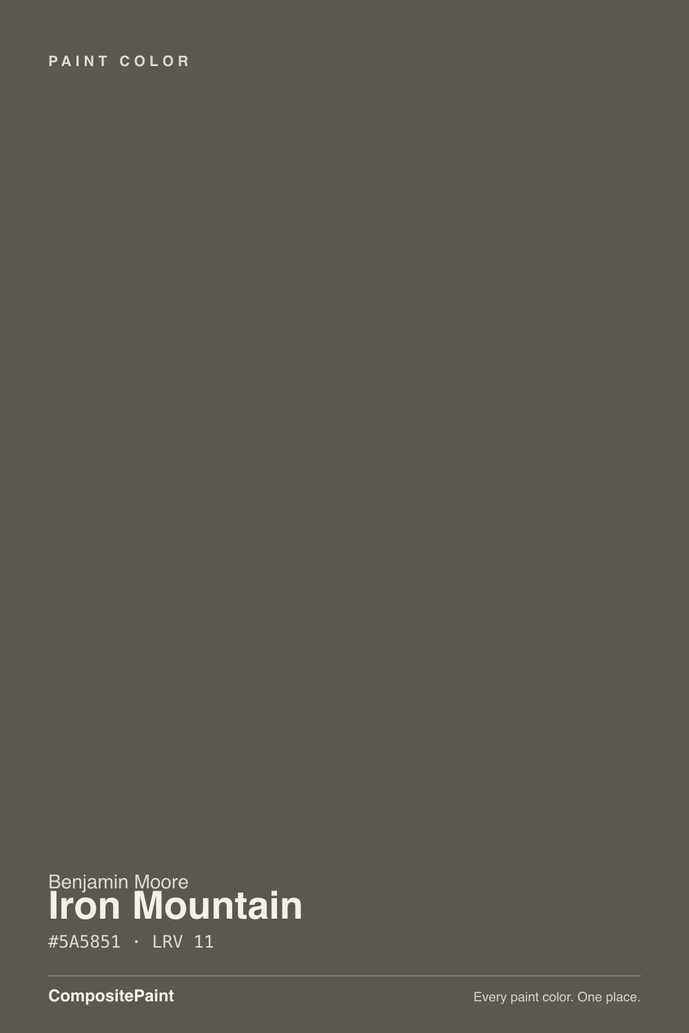
Benjamin Moore calls Iron Mountain a "soft black," and that is the right way to think about it: not a true black, not a cool charcoal, but a warm brown-black built to sit between the two. The warmth comes from a bronze undertone running underneath the gray — enough to keep the color from reading flat or industrial, not enough to tip it toward a true brown like Taupe. BM files it in the Neutral family for exactly that reason: it is meant to be the dark note that agrees with almost anything, not a color with a loud personality of its own.
At LRV 11 it sits in the same near-black band as Wrought Iron and Sherwin-Williams's Urbane Bronze — deep enough that a wall stops behaving like a color and starts behaving like a shadow the moment the light drops. The red-leaning RGB reading (90, 88, 81) confirms the brown lean is real, not just marketing copy, but it is a small lean on a small scale: in flat or overcast light the three channels compress toward each other and the brown all but disappears, leaving plain near-black behind.
What Iron Mountain has never been is famous. It has not been a Color of the Year, no design blog credits it with a viral room, and it does not come up in the same breath as Kendall Charcoal or Wrought Iron — siblings that get named in far more listicles. That is not a defect; it is an accurate description of a color built to be used, not admired from across a room. Its whole reputation is doors, shutters, and cabinets that quietly do their job.
Where It Shines
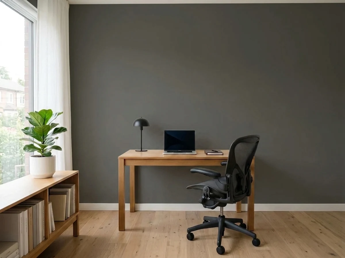
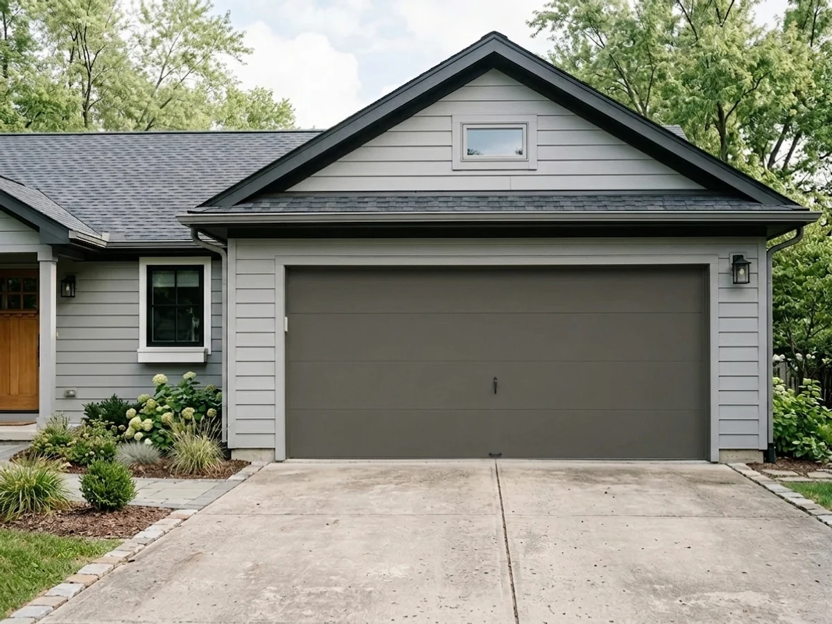
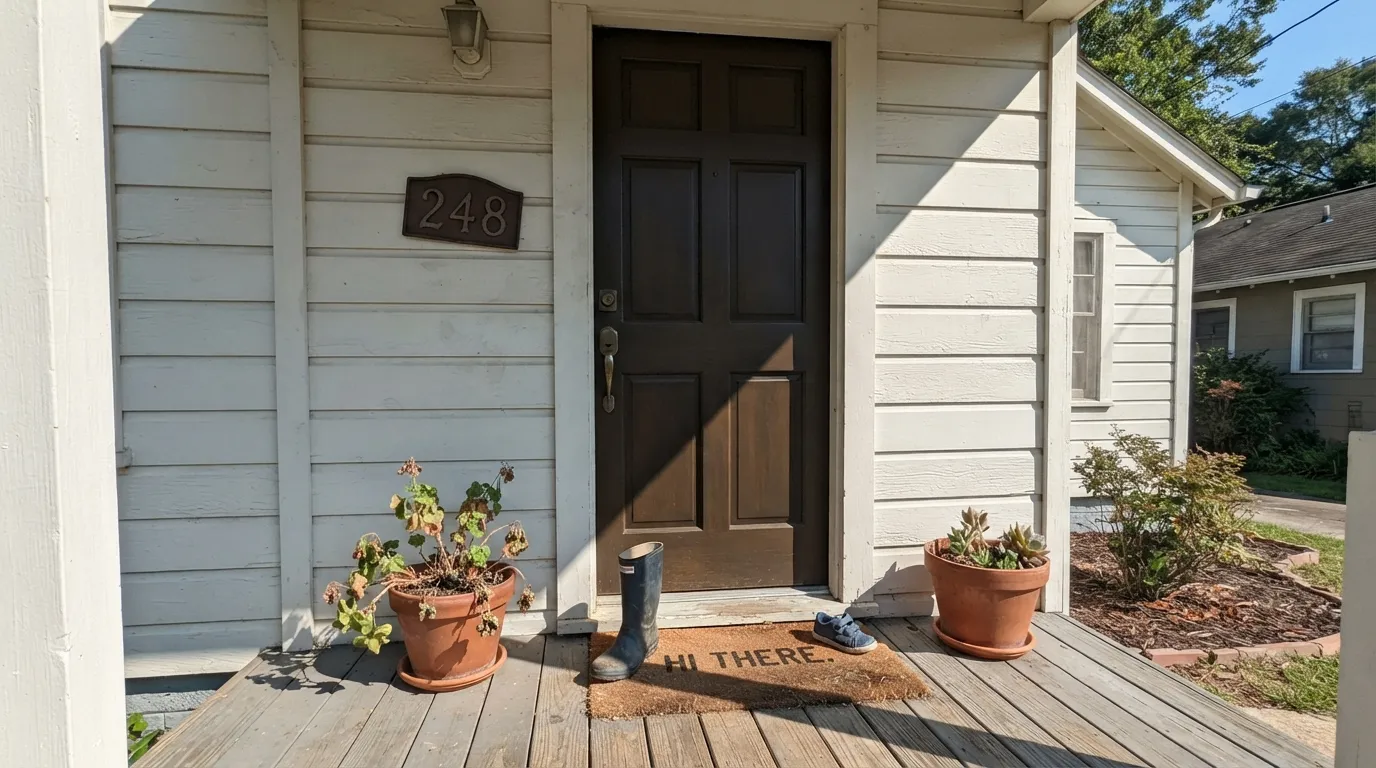
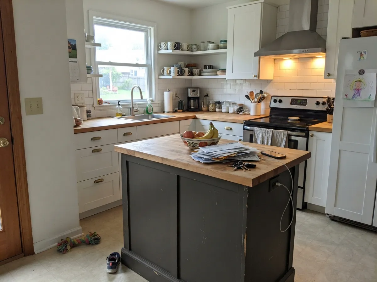
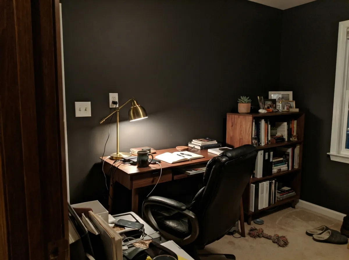
Iron Mountain earns its keep in small, well-lit doses — the places Benjamin Moore's own materials point to: a front door, shutters, a garage door, a kitchen island. Full daylight or a bright entry light is what pulls the brown forward instead of letting it collapse into flat black, and in those settings it reads as a genuinely warm, expensive-looking dark rather than an off-the-shelf black. Its other strong home is a lamplit den or office after dark, where warm bulbs do the same job daylight does outside.
Where It Fails
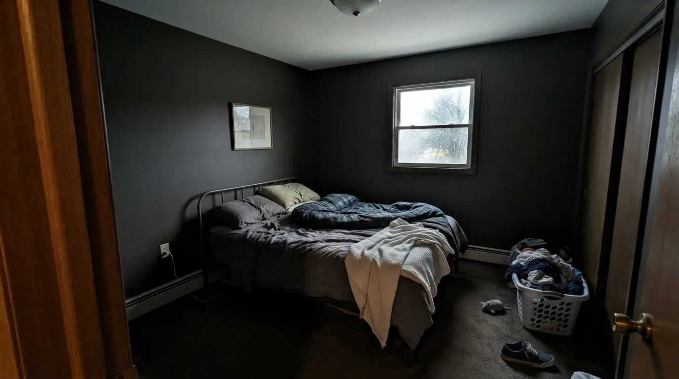
Almost every way this color disappoints traces back to one cause: not enough light reaching it, and that is predictable before the first coat. Iron Mountain was built as an accent dark, not a room-filling one — ask it to do a whole dim room's work and it stops being a warm black and starts being a hole in the wall.
At LRV 11 the color needs real light to hold its brown; without it, a whole room in Iron Mountain reads as plain black with the trim swallowed into the shadows. Keep it to a door, an island, or one well-lit wall — not a dim bedroom's four walls.
The bronze undertone is subtle but real, and next to a cool blue-black or a true neutral black it looks warmer and slightly muddier, not crisper. If you want a genuinely cool near-black, Sherwin-Williams Iron Ore is the better pick.
Cold light compresses the RGB channels toward each other and cancels the brown, leaving a flat charcoal-black with none of the warmth the daylight photos promise. Warm 2700K bulbs are part of the paint job with any color this dark.
Room by Room
This is the use Benjamin Moore itself leads with, and it holds up: daylight on an exterior door pulls the brown forward, and the classic white-siding, dark-door combination looks deliberate and current. Semi-gloss holds up to weather and wipes clean.
Iron Mountain on an island with White Dove or Swiss Coffee perimeter cabinets is a confident, warm-black contrast that doesn't fight brass hardware or butcher block. A whole kitchen of it is a much bigger commitment — most kitchens don't have the light for it.
Under warm evening light it goes cozy and enveloping rather than gloomy, especially with leather, walnut and brass in the room. Eggshell holds up to a rolling office chair better than matte.
A full living room in Iron Mountain works when the room gets strong, direct sun for most of the day. In an average or north-facing room it reads closer to plain black than the chip suggests — sample a large board and watch it through a full day first.
One wall behind the headboard, lit by bedside lamps, gets the cozy dusk effect without turning the whole room into a cave. Whole-room use needs a genuinely bright bedroom to pull off.
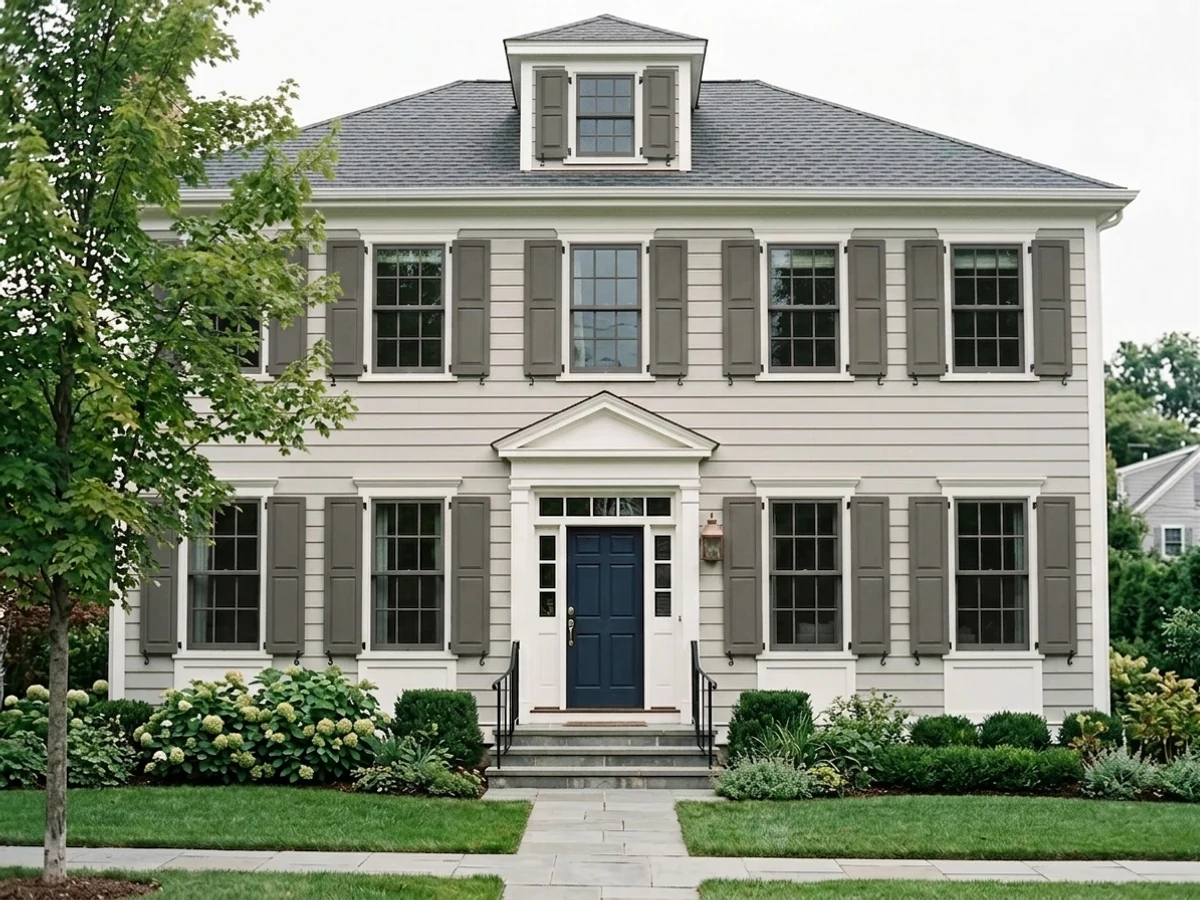
As a whole-house color it is a heavier, riskier commitment than the door-and-shutter version: full sun reads it closer to true black than warm brown-black, and an entire dark facade shows dirt and fading unevenly. Keep the drama to the door and trim.
Your Light Is the Risk
The bronze undertone comes forward and the color reads as a genuine warm black, not a flat one. The light this color needs to look like its photos.
Without direct light the brown compresses out and it reads as plain, flat near-black. The single biggest source of disappointment with this color.
Warmer and browner at the sun hours, closer to true black once the direct light passes. Expect real movement through the day.
2700K lamps keep the brown alive after dark; cool LEDs flatten it toward blue-black. Bulb choice matters as much as wall color here.
Most complaints about Iron Mountain are a light mismatch. Upload a photo of your actual room and see it on your walls — then ask for the same wall in north light or evening lamps before you buy a single sample.
Need It From Another Brand?
Any paint counter can custom-tint Benjamin Moore 2134-30 directly. If you would rather stay in one brand's own deck, these are the closest stock matches, measured as ΔE2000. Under 2 is a difference you will not see on the wall.
| Brand | Closest color | ΔE | LRV | |
|---|---|---|---|---|
| Sherwin-Williams | Stony CreekSW 9610 · Sherwin-Williams | 2.0 | 9 | Color page → |
| Behr | Carbon CopyPPU25-01 · Behr | 1.8 | 9 | Color page → |
| Valspar | Semi-Sweet4003-2C · Valspar | 2.0 | 8.6 | Color page → |
| PPG / Glidden | UndercoverPPG0998-7 · PPG / Glidden | 2.4 | 10 | Color page → |
| Glidden | Forest Black30YY 10/038 · Glidden | 2.0 | 10 | Color page → |
| Dutch Boy | Dark and Stormy436-7DB · Dutch Boy | 2.7 | 9 | Color page → |
Similar Benjamin Moore Colors
The nearest shades to Iron Mountain within Benjamin Moore's own range, ranked by perceptual color distance — useful when you want the same look a touch lighter, darker, or warmer.
WCAG 2.1: AA is 4.5 : 1 for normal text, 3 : 1 for large text, AAA is 7 : 1.
Iron Mountain vs the Colors You're Also Considering
Every Iron Mountain sample board has the same rivals on it. The numbers show the real lightness gap — then it comes down to which risk you would rather live with.
Pick this if you're already color-matched to Benjamin Moore, or you'd rather a fixed bronze lean than a color that borrows its undertone from the room.
Sherwin-Williams SW 7674 · LRV 11PeppercornPick this if your painter works in Sherwin-Williams — the hex and LRV are nearly identical, so it's effectively the same dark neutral in their deck.
Pick this for more drama and a warmer, browner black than Kendall Charcoal's truer gray reads.
Benjamin Moore HC-166 · LRV 13Kendall CharcoalPick this for a proven, slightly lighter dark gray with a bigger track record — the deck's most dependable dark neutral.
Randolph Gray (CW-85, LRV 10) is nearly the same depth but leans a touch greener and cooler, so it feels slightly more muted where Iron Mountain holds a bit more warmth. If you want a dark gray that reads calmer and less warm, Randolph Gray is the pick.
Aegean Olive (1491, LRV 12) is a hair lighter and pushes its warm side toward a clear olive-brown, making it a good choice when you actually want green-brown character rather than a straight charcoal.
Gray (2121-10, LRV 12) is the most truly neutral of the group, with almost no warm or cool lean, so it is the safest true-gray option. Choose Iron Mountain when you want a deep charcoal with a faint warm softness; choose Gray when you want that same darkness to stay strictly neutral.
Iron Mountain Coordinating Colors
The rule for coordinating with Iron Mountain is simple: warm whites and warm mid-tones let the bronze undertone show; cool, stark whites and blue-grey stone fight it. It reads best in small doses next to a lot of light neutral, with brass or aged bronze hardware nearby. These are the partners that keep showing up in rooms that work:
The Quiet Workhorse: Why Iron Mountain Has No Story
Every deck has colors like this one: technically excellent, genuinely useful, and almost never mentioned. Iron Mountain has not been a Color of the Year, has not driven a viral room on social media, and does not have the pile of Reddit threads and Houzz debates that surround Kendall Charcoal or Wrought Iron. Searching for real owner reviews of it turns up almost nothing — professional color-consultant write-ups, yes; a track record of people arguing about it online, no.
That is worth saying plainly rather than dressing it up. It does not mean the color is weak — the underlying case for it (a warm, bronze-black near-black that behaves in small doses) is solid — it means you are one of the first to build a public track record with it rather than following one. Sample it generously, live with the board for a few days, and treat the honest obscurity as a reason to test more, not less.
Iron Mountain With Wood Tones and Floors
Walnut, espresso and white oak all sit easily against Iron Mountain — a dark floor plus a dark accent needs a light wall nearby to keep the room from going cave-like, while a lighter oak floor gives a door or island real contrast to stand out against. Brass, aged bronze and matte black hardware all read warm next to it; only polished chrome looks slightly cold in the mix.
The one combination that undercuts it is a cool grey-washed or LVP floor: the color's warmth reads oddly against a cool grey plane, and the pairing can look like two different decades stacked on top of each other. A warm rug or a run of butcher block nearby usually bridges the gap.
Three Ready Palettes Built on Iron Mountain
A color is never alone on the wall. These are complete combinations in the 60-30-10 pattern, with the reason each one holds together. Every one opens in the visualizer.
Swiss Coffee keeps the body soft and warm, White Dove trim matches it without competing, and the Iron Mountain door supplies the one dark note full sun needs to look deliberate rather than heavy.
Try this palette in your roomWhite Dove perimeter cabinets keep the kitchen bright enough to feed the island real light; Revere Pewter walls share the same warm base so nothing argues, and the island gets to be the one confident dark note in the room.
Try this palette in your roomContained to one small, well-lit room, Iron Mountain gets to be genuinely warm instead of flat. White Dove trim keeps the edges soft rather than stark, and a Pale Oak ceiling or adjoining hallway eases the handoff back to the rest of a lighter house.
Try this palette in your roomIron Mountain FAQ
Is Iron Mountain black or gray?
Neither, exactly — it's a warm, brown-leaning near-black at LRV 11. In good direct light the bronze undertone is visible and it reads as a deep charcoal-brown; in dim or overcast light it compresses toward plain black. If you want a true cool black, look at Sherwin-Williams Iron Ore instead.
Is it good for a front door?
Yes — this is the job Benjamin Moore itself recommends it for, and it delivers. Against a white or light-neutral house, an Iron Mountain door in semi-gloss reads warm and deliberate rather than heavy, and full exterior daylight is exactly the light this color needs.
Can I use it on kitchen cabinets?
Yes, best in doses — an island against a white or warm-neutral perimeter, not the whole kitchen. A full kitchen of it is a bigger light-dependent commitment than an island, and most kitchens don't get the direct sun the color wants.
Will it look different than the paint chip?
Expect it to read darker and flatter than the chip the moment it's out of direct light — every color this deep does. Sample a large board and watch it morning, midday, and evening before committing to a full room.
Why haven't I heard of this color before?
Because it genuinely is a quiet one — it has never been a Color of the Year and no famous room is built around it. Benjamin Moore markets it as a general-purpose dark, and its actual reputation is doors, shutters and islands doing their job without drawing attention to themselves.
What trim color goes with Iron Mountain?
A warm white — White Dove or Swiss Coffee — keeps the pairing soft; a cooler white like Chantilly Lace gives it more contrast and a slightly more modern edge. Avoid a stark cool white if the rest of the house leans warm, or the door will look like it belongs to a different building.
Have you painted with Iron Mountain?
Rate it — one tap helps the next reader decide.
Ask a Question