Carbon Copy
Behr's near-black cabinet-and-door charcoal, reviewed honestly: why it reads true black next to white, when it drifts blue or green, and why a whole wall asks more of it than it can give.

Jessica has spec'd whites and neutrals for more than 300 rooms and keeps a sample wall of painted drawdowns in her studio. Every color review is checked against real reader rooms in the comments and re-tested when a formula changes. About the testing process →
- 1Carbon Copy9
- 2Kendall Charcoal15
- 3Retreat21
The Fast Verdict
Carbon Copy is Behr's answer to "I want black, but not quite" — a deep charcoal-gray so close to neutral that it reads as true black beside a white cabinet and settles into a quieter dark gray everywhere else. At LRV 9 it is genuinely dark, and it ships as more than a wall paint: Behr sells it as a cabinet, door and trim enamel and as an exterior direct-to-metal paint, which tells you exactly where it earns its keep.
Kitchen islands and lower cabinets · front doors, shutters and exterior trim · bathroom and powder-room vanities · one accent wall in a room with real daylight
You want a true, no-argument black · the room has no natural light and runs on overhead LEDs · you're painting four walls, not a surface · you want warmth instead of a color that drifts cool
- Reads genuinely black next to white cabinetry, without buying an actual black paint
- Sold as a real cabinet-door-trim enamel and an exterior direct-to-metal paint — one color, several real jobs
- Near-neutral base (RGB 84/85/84) means it won't clash with either warm or cool schemes
- Small rooms — vanities, powder rooms, front doors — take the depth beautifully
- Same-brand white (Polar Bear) makes it easy to build a simple two-color kitchen around it
- Not a true black — visibly grays out next to Behr Carbon or an actual black paint
- Goes flat and murky in a room with no real daylight
- Too dark and too name-confusable with Behr's own Carbon to trust as a whole-room wall color
- The subtle blue-vs-green drift means you genuinely can't predict the undertone without testing your own light
What Color Is Carbon Copy, Really?
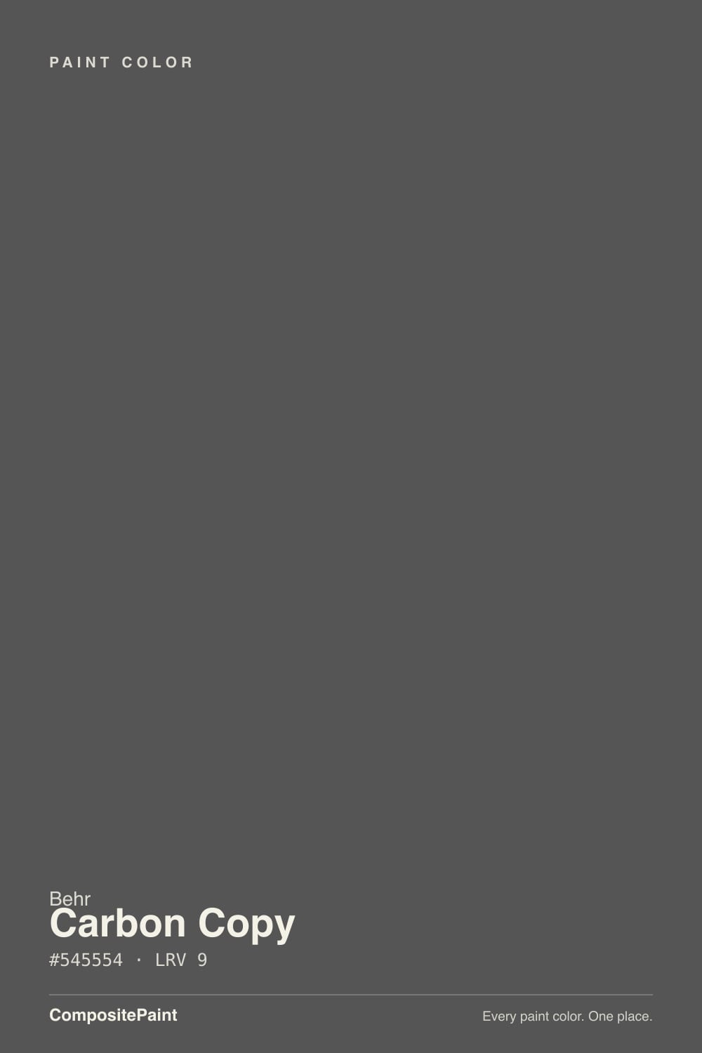
Carbon Copy's numbers tell a plain story: the deck RGB is 84, 85, 84 — three channels within a point of each other, about as close to neutral as a dark color gets. Behr files it under its Black color family, and it is one of the rare single colors sold across the catalog's cabinet-door-trim enamel line, a satin interior/exterior formula, and a direct-to-metal exterior paint — three different products built around one chip, which says more about how people actually use it than any marketing line would.
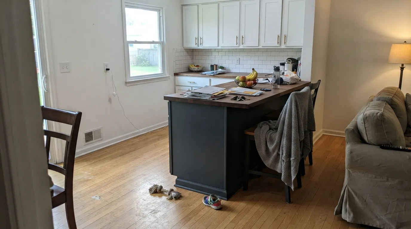
At LRV 9 it sits in the same dark band as Behr's own Graphic Charcoal and Shasta Lake, a step lighter than true blacks like Behr's own Carbon (LRV 5) or Sherwin-Williams Tricorn Black (LRV 3). On paper that gap sounds small. In a real kitchen it isn't: a DIY blogger who painted her island Carbon Copy against white upper cabinets described it plainly reading as a black paint color once it was up, even though it is, on the can, a dark charcoal-gray. Against white, the eye rounds it down to black. Next to an actual black, it won't fool anyone.
Undertone in one line: essentially neutral, with a whisper that goes either way depending on the room. Some retailers list a faint gray-green cast; the same island blogger described it shifting toward blue in one light and green in another as she tested swatches around her house before committing. Both are consistent with a color this close to true neutral — it doesn't carry a fixed lean strong enough to fight the room, so the room's own light decides which way it drifts.
Where It Shines
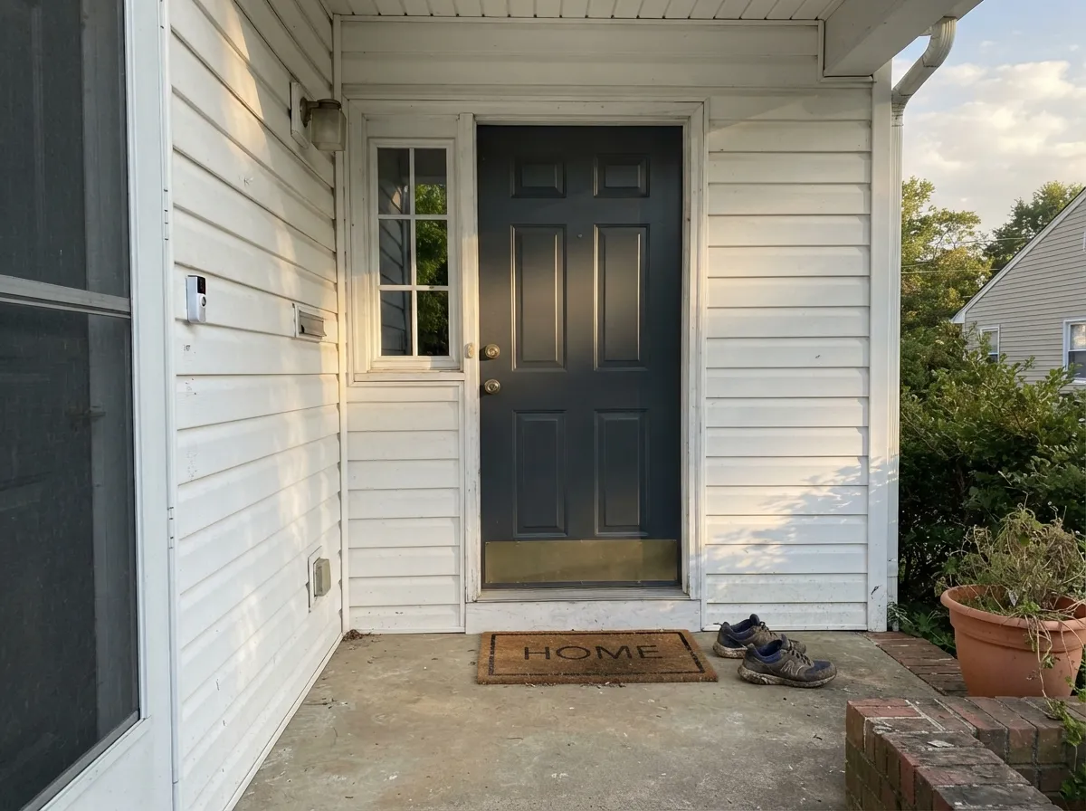
Give it a white or light partner and real daylight, and Carbon Copy does exactly what its name promises — an imprint of black without the commitment of an actual black can. Kitchen islands under white uppers are its best-documented job: painted low, against white cabinetry and warm floors, it reads crisp and grounding rather than heavy. Front doors and exterior trim are its second home, helped by the fact that Behr genuinely engineers a metal-paint version for exactly that use — steel doors, railings, exterior hardware all get the same finish.
Where It Fails
Almost every disappointed Carbon Copy story traces back to one of three mix-ups, and all three are avoidable before you open the can.
Line Carbon Copy up against an actual black — Behr's own Carbon, Sherwin-Williams Tricorn Black — and it visibly grays out. It is a dark charcoal that reads black in isolation, not a substitute for black paint next to black paint. If the room needs to match a true-black light fixture or door hardware, sample both side by side first.
Behr sells Carbon Copy (PPU25-01, LRV 9) and Carbon (N520-7, LRV 5) at the same time, in the same aisle, and even lists them together in its own coordinated-palette tool. They are noticeably different depths — Carbon is the truer black — but the names are close enough that shoppers grab the wrong swatch. Check the code, not just the name, before you order the gallon.
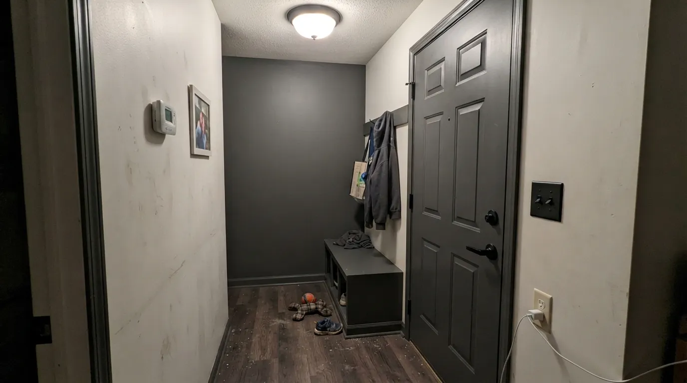
A color this close to neutral needs light to show any character at all. In a windowless powder room or under flat overhead LEDs it doesn't turn interesting — it just goes flat and murky, the same undefined dark every near-black falls into without daylight. It photographs better than it lives in a light-starved room.
Room by Room
As an island or lower-cabinet color under white uppers, it grounds an open floor plan without going heavy. Satin cabinet enamel; expect roughly two coats over primer, about 20 minutes of working time per coat on a small island.
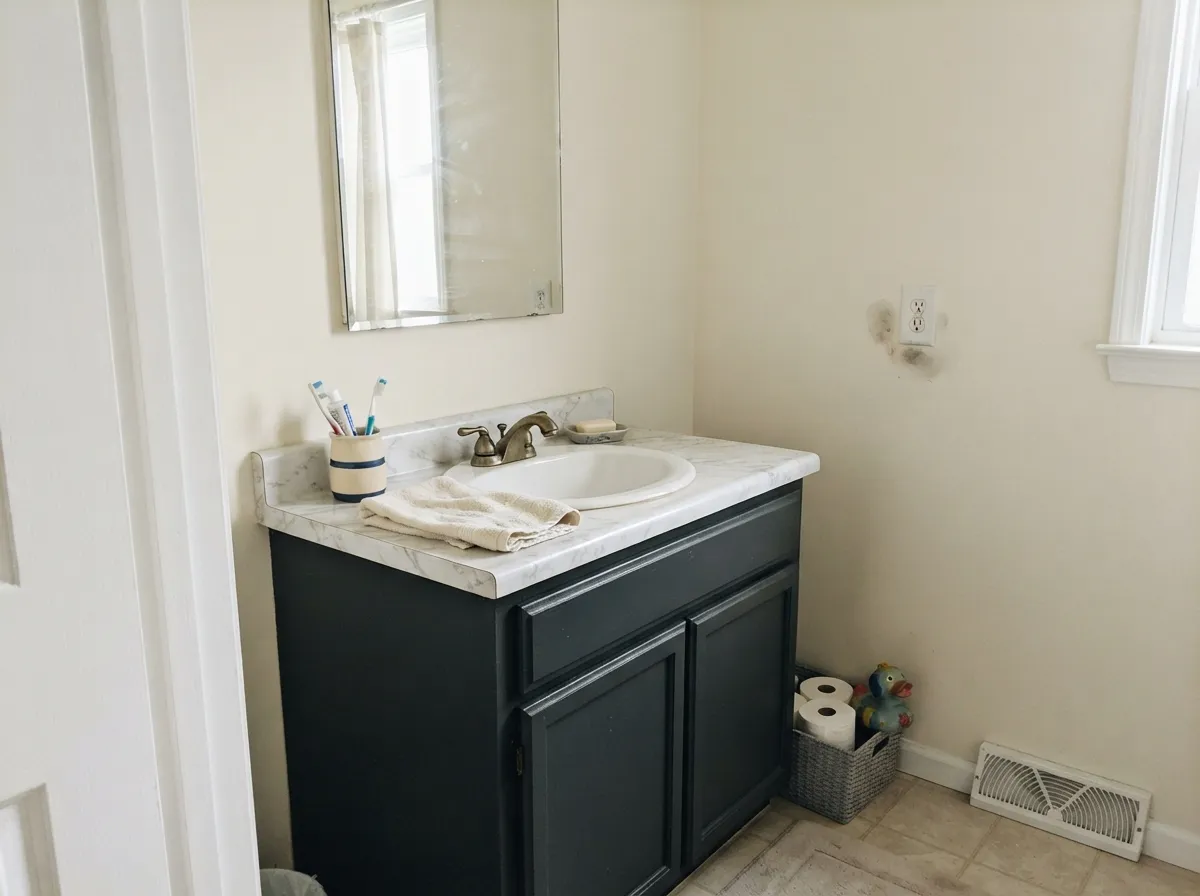
A vanity is exactly the small, contained dose this color wants. Keep the surrounding walls light — Alabaster, Polar Bear — so the vanity carries the depth instead of the whole room fighting for attention.
Behr sells this exact color as a direct-to-metal exterior enamel, not just a wall paint recolored. Semi-gloss on a steel or fiberglass door, or on railings and shutters, holds up to weather and reads confidently dark against light siding.
Small rooms take near-black well, and a powder room is the classic place to commit. The one condition: it needs a real light source. A fully interior, windowless powder room is the failure case above.
One wall in a room that gets genuine daylight can carry it. Skip a north-facing room with weak light — the color won't develop the character that makes it worth choosing over a flat black.
This is a surface color, not a room color. Behr didn't build it, sell it, or market it as a four-wall paint, and nothing in its real-world use suggests it should be one — the depth that reads great on one island or one door gets exhausting across four walls.
Your Light Is the Risk
Reads as a clean, balanced charcoal-black — neither warm nor cool, exactly the neutral the RGB numbers promise.
Under flat overhead LEDs with no window, it just goes murky and undefined. The near-neutral character needs daylight to show up at all.
Cooler, slightly blue in morning light; a touch greener as the light warms toward evening. The drift is real and mild — most owners barely notice it.
Warm 2700K lamps nudge it toward the green side; cool LEDs push it toward blue-black. Neither is wrong — just different rooms, different bulbs.
Most complaints about Carbon Copy are a light mismatch. Upload a photo of your actual room and see it on your walls — then ask for the same wall in north light or evening lamps before you buy a single sample.
Need It From Another Brand?
Any paint counter can custom-tint Behr PPU25-01 directly. If you would rather stay in one brand's own deck, these are the closest stock matches, measured as ΔE2000. Under 2 is a difference you will not see on the wall.
| Brand | Closest color | ΔE | LRV | |
|---|---|---|---|---|
| Sherwin-Williams | Stony CreekSW 9610 · Sherwin-Williams | 3.4 | 9 | Color page → |
| Benjamin Moore | Iron Mountain2134-30 · Benjamin Moore | 1.8 | 9 | Color page → |
| Valspar | To the TarmacV116-3 · Valspar | 2.8 | 8.8 | Color page → |
| PPG / Glidden | Black WidowPPG0997-7 · PPG / Glidden | 1.7 | 10 | Color page → |
| Glidden | Black WidowPPG0997-7 · Glidden | 1.5 | 10 | Color page → |
| Dutch Boy | Dark and Stormy436-7DB · Dutch Boy | 1.3 | 9 | Color page → |
Similar Behr Colors
The nearest shades to Carbon Copy within Behr's own range, ranked by perceptual color distance — useful when you want the same look a touch lighter, darker, or warmer.
WCAG 2.1: AA is 4.5 : 1 for normal text, 3 : 1 for large text, AAA is 7 : 1.
Carbon Copy vs the Colors You're Also Considering
Every Carbon Copy sample board has the same rivals on it. The numbers show the real lightness gap — then it comes down to which risk you would rather live with.
Pick this if you want black's presence without black's flatness — Carbon Copy holds just enough neutral gray to keep cabinets and doors from reading like a chalkboard.
Behr N520-7 · LRV 5CarbonPick this if you want a true, no-argument black — Carbon is darker and doesn't drift toward blue or green the way Carbon Copy does.
Pick this when you're painting a surface, not a room — Carbon Copy is sold and formulated as a cabinet-and-door enamel first.
Sherwin-Williams SW 7069 · LRV 6Iron OrePick this for a near-black that's proven itself on whole rooms, not just cabinets, doors and trim.
Pick this when you want the deeper, closer-to-black end of the charcoal range — Kendall Charcoal is a full step lighter.
Benjamin Moore HC-166 · LRV 13Kendall CharcoalPick this for a lighter, more forgiving charcoal that's a better bet on four walls — it still wants real light, just less of it than a near-black does.
Pick this for the more genuinely neutral option at the same LRV — Graphic Charcoal commits to blue, Carbon Copy doesn't commit to anything.
Behr N500-6 · LRV 9Graphic CharcoalPick this for the exact same depth and the same cabinet-and-door job, but with a cooler blue-teal lean instead of Carbon Copy's neutral drift.
Within Behr, Maximum Gray QE-62 at #555657 and LRV 9 is the closest neighbor, with a very slightly cooler cast. Shadow Mountain PPU24-22 at #585858 and LRV 10 is marginally lighter and perfectly neutral, since its red, green, and blue values are identical. Cracked Pepper PPU18-01 at #4F5152 and LRV 8 is deeper and reads a touch bluer, while Equestrian Leather HDC-CL-24G at #5B5652 and LRV 9 is the warm, brown-leaning option in the group.
Across brands, Rodda Midnight Wanderer R017 shares the exact hex #545554 with a deltaE of 0, so it is the same color. Dutch Boy Dark and Stormy 436-7DB at LRV 9 is a deltaE of 1.28, visually identical in normal room light, and the same applies to Glidden Black Widow PPG0997-7 at LRV 10 with a deltaE of 1.46. Sherwin-Williams Stony Creek SW 9610 at LRV 9 is a deltaE of 3.37, close but visibly different side by side, reading warmer and browner than Carbon Copy.
Carbon Copy Coordinating Colors
Because Carbon Copy reads closer to neutral than most near-blacks — RGB values within a point of each other on every channel — it doesn't fight warm or cool schemes the way a blue-black or green-black would. It mostly wants a light partner to actually show up against, and a same-family accent when you want to repeat the depth without repeating the exact color:
Carbon Copy vs. Behr Carbon: The Mix-Up Behr's Own Site Sets Up
Behr currently sells two colors that share a name and a color family: Carbon (N520-7, LRV 5), a genuinely neutral true black, and Carbon Copy (PPU25-01, LRV 9), the softer charcoal reviewed here. Behr's own coordinated-palette pages list them side by side, which is convenient for browsing and a trap for anyone comparing chips in a dim aisle — a four-point LRV gap is easy to miss on a small paint swatch and impossible to miss on a wall.
The practical fix is simple: write down the code, not just the name, before you order. If the goal is a flat, no-argument black — cabinetry, a piece of furniture, a front door with zero ambiguity — Carbon is the one to buy. If the goal is a near-black that still reads as a color and not a void, Carbon Copy is the better pick.
Carbon Copy With Wood Tones and Hardware
As a cabinet or island color, its neutral base is genuinely easy to pair: butcher block, oak, walnut and LVP flooring in warm or gray-washed tones all sit comfortably next to it, since there's no strong undertone pulling the wood one direction or the other. The one thing to watch is very orange, unfinished-looking pine or builder oak — a color this dark and neutral can make an aggressively warm wood look even more orange by contrast.
Hardware is flexible for the same reason: brass and matte black both read well against it, and unlacquered brass in particular gets a lift from sitting next to a near-black rather than a true one. Polished chrome is the least flattering pairing — it's the coolest metal against a color that's already ambiguous about temperature, and the combination can look slightly mismatched rather than intentional.
Three Ready Palettes Built on Carbon Copy
A color is never alone on the wall. These are complete combinations in the 60-30-10 pattern, with the reason each one holds together. Every one opens in the visualizer.
This is the real-world combination the color gets documented in most: light greige walls and white uppers keep an open floor plan from feeling boxed in, while the island in Carbon Copy supplies one grounding dark note that reads black against the white cabinetry without the commitment of an actual black paint.
Try this palette in your roomWhite siding keeps the house bright, and matching the door to the shutters in two close near-blacks — Carbon Copy's softer charcoal, Iron Ore's cooler black — reads as one confident dark instead of two competing colors squinting at each other across the facade.
Try this palette in your roomA small room takes the near-black well. Alabaster keeps the walls light so the vanity carries the color, and Wrought Iron on the mirror frame ties the metal finishes together without adding a second, competing dark to a tight space.
Try this palette in your roomCarbon Copy FAQ
Is Carbon Copy a true black?
No — it's a dark charcoal-gray at LRV 9, with an RGB reading (84, 85, 84) that's about as close to neutral as a dark color gets. Against white cabinetry the eye reads it as black. Set next to an actual black paint, it visibly grays out.
Is Carbon Copy the same as Behr Carbon?
No, and the names trip people up because Behr sells both at once and even pairs them in its own coordinated-palette tool. Carbon (N520-7) is LRV 5, a genuinely truer black. Carbon Copy (PPU25-01) is LRV 9, softer and closer to neutral gray. Check the color code, not just the name, before ordering.
What's the undertone — warm or cool?
Essentially neutral. The RGB channels sit within a point of each other, and real-world reports are split: some describe a faint gray-green cast, others a cooler blue lean depending on the light. Treat it as a color that takes its cue from the room rather than one with a fixed undertone.
Can I use it on kitchen cabinets?
Yes — it's sold specifically as an interior/exterior cabinet, door and trim enamel in satin and semi-gloss. It's best documented on islands and lower cabinets under white uppers, not as an all-cabinet color.
Does it work on a front door?
Yes, and it's engineered for it: Behr also sells this exact color as a direct-to-metal exterior paint, so it covers steel and fiberglass doors, railings and exterior hardware in the same finish. Semi-gloss holds up best outdoors.
Will it look black or gray on my walls?
Depends on the light and what's next to it. Beside a white cabinet or white trim, it reads black. In a windowless room or under flat LEDs, it can go flat and murky instead. It's a more reliable surface color — cabinets, doors, a vanity — than a whole-room wall color.
Have you painted with Carbon Copy?
Rate it — one tap helps the next reader decide.
Ask a Question