Graphic Charcoal
Behr's coolest dark neutral, reviewed honestly: the light where the blue-green shows, the rooms where it just goes black, and what to pick instead.

Jessica has spec'd whites and neutrals for more than 300 rooms and keeps a sample wall of painted drawdowns in her studio. Every color review is checked against real reader rooms in the comments and re-tested when a formula changes. About the testing process →
- 1Cyberspace6
- 2Graphic Charcoal11
- 3Retreat21
- 4Dovetail26
The Fast Verdict
Graphic Charcoal is Behr's answer to "I want black, but not boring." It is a deep, cool charcoal that Behr sells specifically as a cabinet, door, and trim enamel — not a wall paint — and that positioning tells you almost everything. Give it strong daylight raking across a door or an island and a quiet blue-green undertone shows through. Take the daylight away and it reads as a very good black. Both versions work; the trouble starts when you expect one and get the other.
Front doors and exterior trim · kitchen islands and cabinets · one accent wall with real daylight · anyone who wants black's drama without committing to flat black
Your room has no real daylight · you are painting all four walls, not one surface · you need the blue-green to show under evening lamps too · you actually wanted a warm black
- Reads as a sophisticated cool charcoal, not flat black, in real daylight
- Purpose-built by Behr for doors, cabinets and trim — durable enamel formulas exist for exactly this use
- Available in a matching exterior (Marquee) formula, so a door and its trim can be the same can
- Small doses — a door, an island, one wall — get the drama with none of the cave risk
- Plays cleanly with warm wood and brass rather than fighting them
- LRV 11 reads almost black in any room without strong daylight
- Whole-room, four-wall use in a dim space turns cave-like fast
- Under warm 2700K lamps at night the blue-green undertone disappears — it is just black
- Thin real-room inspiration online, since Behr markets it as a specialty trim color, not a wall paint
What Color Is Graphic Charcoal, Really?
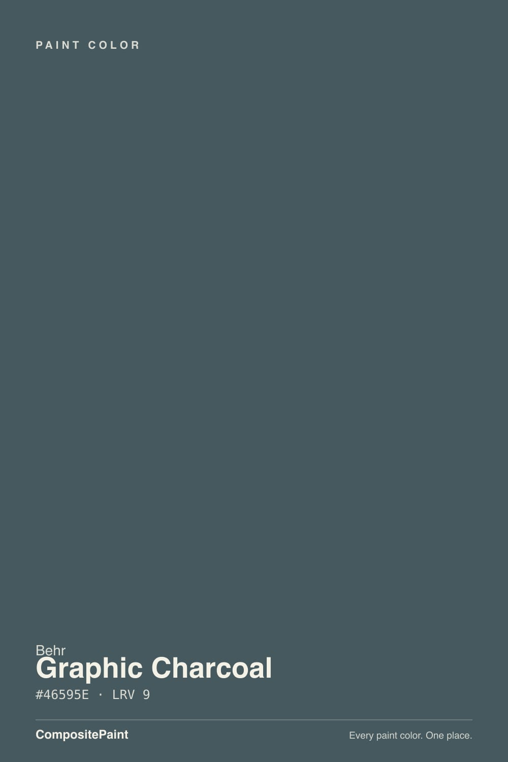
A very dark, low-chroma charcoal with a cool undertone that sits between blue and teal rather than true violet — despite what a few color-chip sites claim. Behr does not sell it as a general wall color: it is formulated in the Premium Cabinet, Door & Trim enamel line and in the Marquee exterior line, which tells you what job it was actually built for. That is the honest story here — this is not a famous, trend-chasing color with a Color of the Year moment behind it. It is a dependable, slightly obscure specialty dark that painters reach for on doors and islands, and it earns that job well.
At LRV 11 it is deep enough to sit one notch above true black — closer in depth to Benjamin Moore Wrought Iron or Sherwin-Williams Iron Ore than to a mid-tone charcoal like Kendall Charcoal. That depth is exactly why it needs real daylight to prove it is not just black: hit it with strong, raking sun and the cool blue-green comes forward; put it in a windowless room or under a single lamp and it reads as plain black with none of the color story left. Plan for both outcomes, because your room decides which one you get.
Undertone in one line: cool, blue-green — a slate-teal charcoal, never warm, never truly violet. If your sample looks flatly black with no hint of color, that is not a bad can; it is a room without enough daylight to unlock the undertone.
Where It Shines
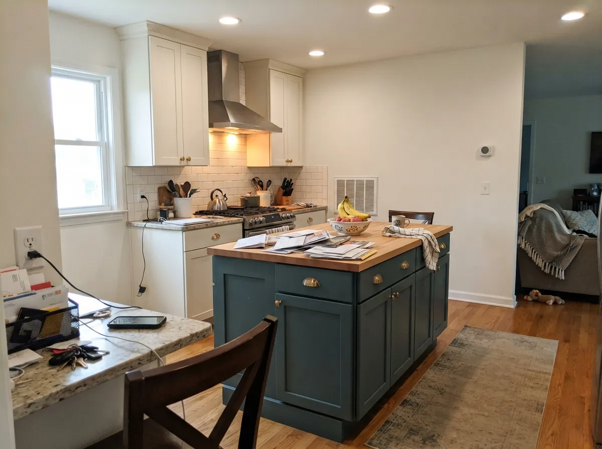
This color is built for edges and surfaces, not fields of wall. A front door, a kitchen island, cabinet doors, interior trim — small, well-lit surfaces are where Graphic Charcoal earns its reputation, because a little daylight goes a long way on a door-sized surface and the payoff is a color that reads far more interesting than store-bought black. Its second home is the confident single accent wall in a room with a real window, where it gives a space the drama of black with a cooler, more current undertone underneath.
Where It Fails
Almost every letdown with Graphic Charcoal traces back to one of three scripts, and all three are avoidable before the first coat. None of them are the paint failing — they are the paint being asked to do a job Behr did not build it for.
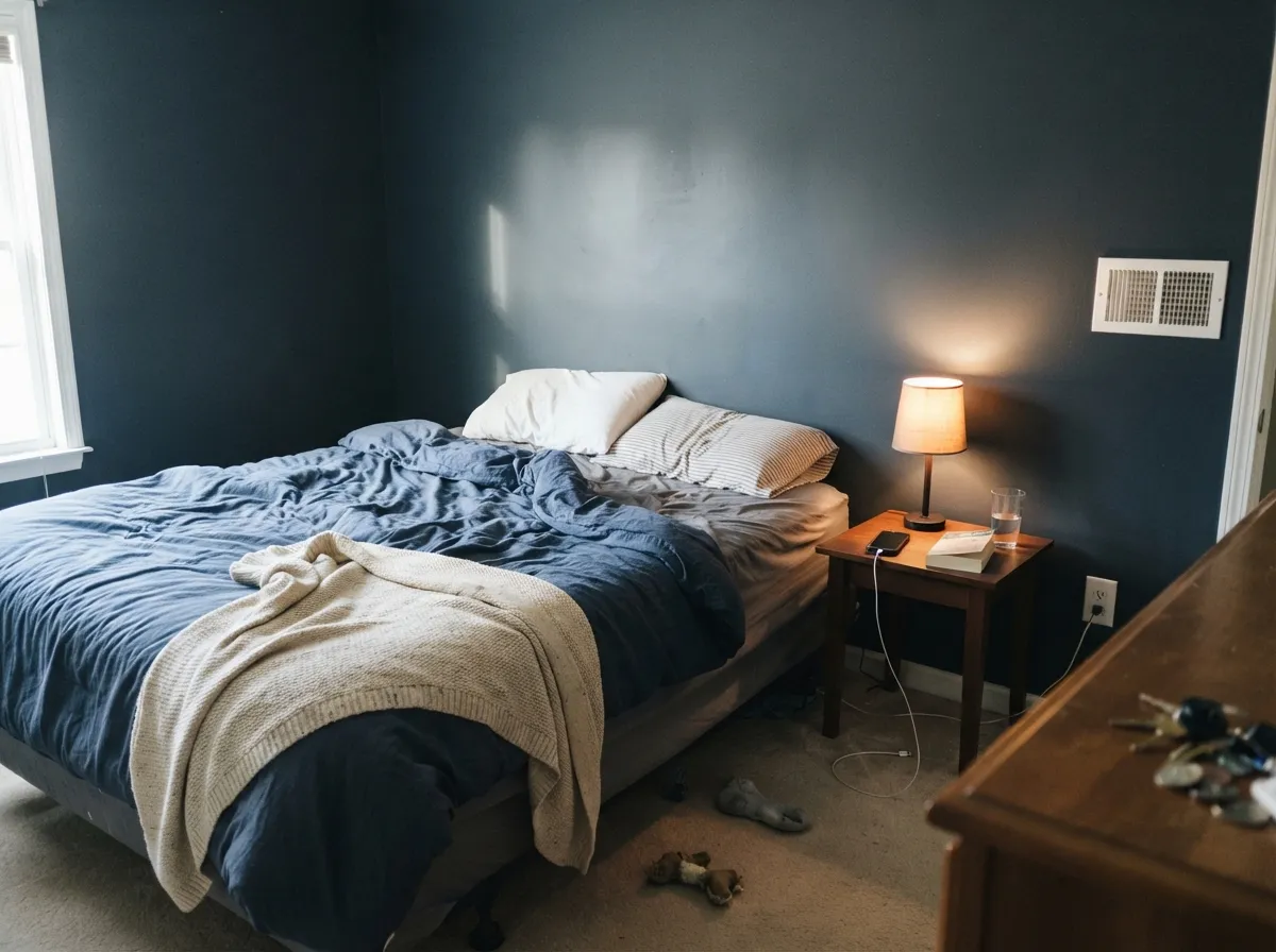
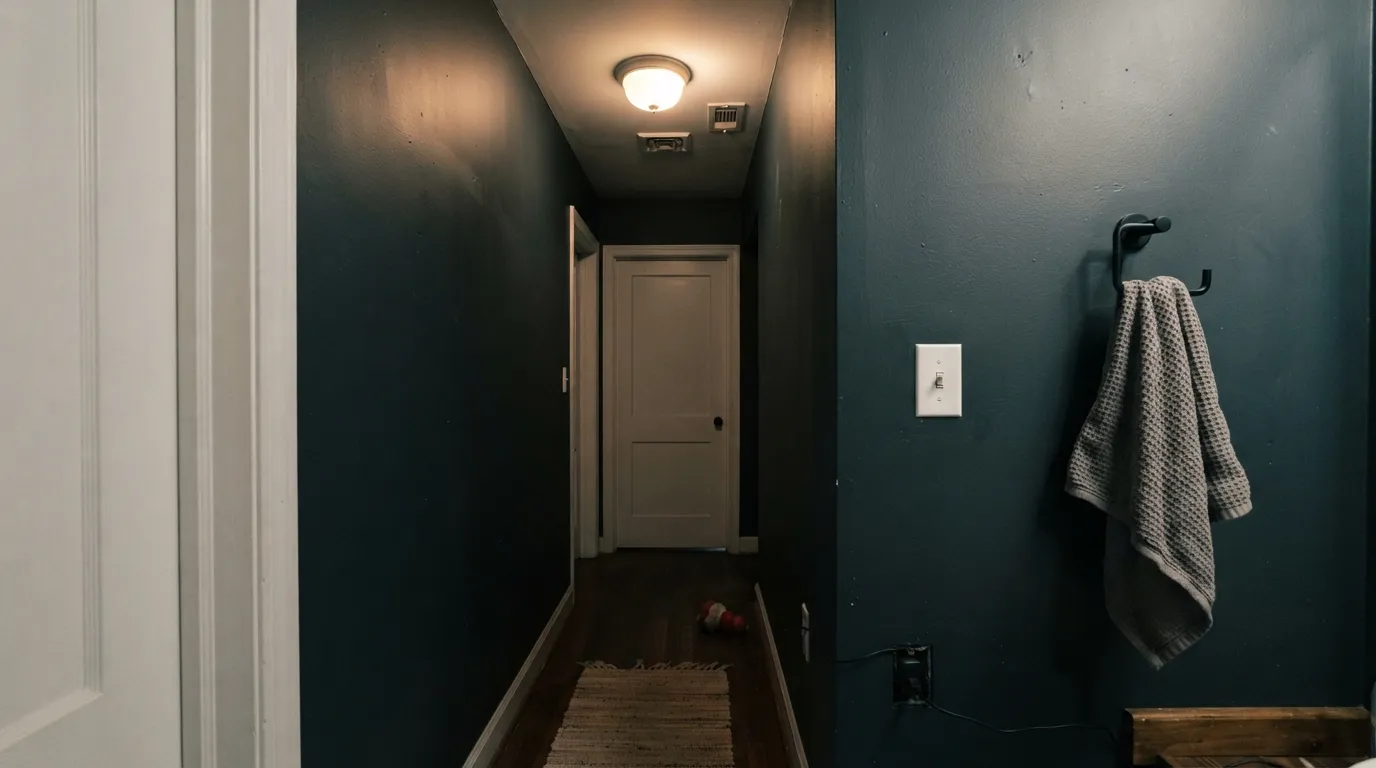
At LRV 11 this is one step above true black. Without real daylight hitting it, the blue-green undertone never shows and you get a cave, not a color. Behr sells this as a cabinet, door and trim enamel for exactly this reason — save the whole-wall commitment for a room with a real window, or step up to a lighter cousin like Hidden Gem (LRV 14).
This is unmistakably cool — a blue-green charcoal, not a warm near-black like a chocolate brown or a soft warm gray. In bright daylight it can look almost neutral next to brass, but under warm 2700K lamps at night it drops all its color and reads as plain black, which disappoints anyone chasing the moody-blue photos.
Whole-room inspiration photos and forum threads are thin for this one, because Behr markets it as a specialty enamel for doors, cabinets and trim, not a wall paint — the volume of real-room reviews that colors like Iron Ore or Peppercorn have just does not exist here yet. Sample it yourself in your own light before trusting a stock photo.
Room by Room
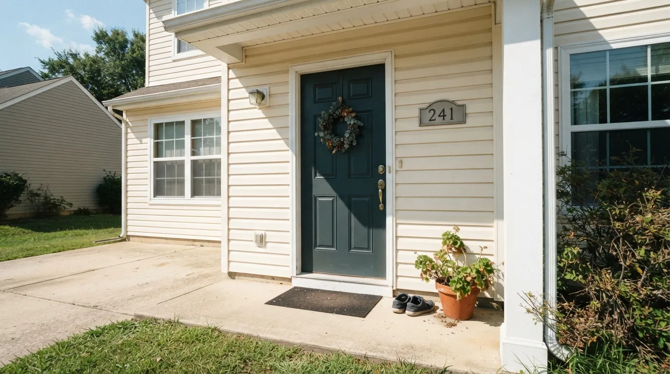
Exactly what Behr built it for. It is sold in a Marquee exterior satin formula specifically for this, and full outdoor daylight is the strongest, most consistent light this color ever gets. Pairs cleanly with light siding and white or black hardware.
Use the Premium Cabinet, Door & Trim enamel in satin. Keep the perimeter cabinets in a warm white so the kitchen stays light overall while the island carries the depth. Wipes clean well; a durable enamel matters more here than sheen choice.
A single vanity under a real window looks custom and expensive. In a windowless powder room it goes flat and cave-like fast — add a sconce or skip it there.
With a real window it reads as a confident, cool-toned dark that photographs well by day and turns essentially black-and-cozy at night. Keep it to one wall; four walls in a typical bedroom's dim evening light lose the color entirely.
Unless the room has serious daylight from multiple exposures, this reads cave-dark by evening. An accent wall or the trim carries the mood better than a full commitment here.
Full sun is the most forgiving light this color gets, and against a light-colored body it reads crisp and modern rather than flat black. A safe, dependable exterior dark.
Your Light Is the Risk
Direct sun across a door or island surface pulls the blue-green undertone forward — the one light that proves this is not just black.
No daylight at all and it reads as pure black, losing the charcoal identity entirely. Pick a lighter color if you wanted visible color, not black.
On a gray day or a shaded exterior wall it goes flatter and cooler — less blue-green, more soot. Still handsome, just quieter.
Warm 2700K bulbs wash the cool undertone out almost completely at night — expect plain black. Cool LEDs keep a faint blue edge but read colder overall.
Most complaints about Graphic Charcoal are a light mismatch. Upload a photo of your actual room and see it on your walls — then ask for the same wall in north light or evening lamps before you buy a single sample.
Need It From Another Brand?
Any paint counter can custom-tint Behr N500-6 directly. If you would rather stay in one brand's own deck, these are the closest stock matches, measured as ΔE2000. Under 2 is a difference you will not see on the wall.
| Brand | Closest color | ΔE | LRV | |
|---|---|---|---|---|
| Sherwin-Williams | Cloak GraySW 6278 · Sherwin-Williams | 3.8 | 11 | Color page → |
| Benjamin Moore | FlintAF-560 · Benjamin Moore | 2.3 | 12 | Color page → |
| Valspar | Carriage WheelM330 · Valspar | 2.1 | 11.5 | Color page → |
| PPG / Glidden | Knight's ArmorPPG1001-6 · PPG / Glidden | 0.6 | 11 | Color page → |
| Glidden | Glazed GranitePPG1011-6 · Glidden | 1.2 | 11 | Color page → |
| Dutch Boy | Thunderous Gray444-6DB · Dutch Boy | 3.8 | 11 | Color page → |
Similar Behr Colors
The nearest shades to Graphic Charcoal within Behr's own range, ranked by perceptual color distance — useful when you want the same look a touch lighter, darker, or warmer.
WCAG 2.1: AA is 4.5 : 1 for normal text, 3 : 1 for large text, AAA is 7 : 1.
Graphic Charcoal vs the Colors You're Also Considering
Every Graphic Charcoal sample board has the same rivals on it. The numbers show the real lightness gap — then it comes down to which risk you would rather live with.
Pick this when you want a touch more depth of teal-green rather than straight blue, and one step lighter.
Sherwin-Williams SW 7964 · LRV 7CyberspacePick this for an even darker, more clearly blue near-black with the same daylight-dependent personality.
Pick this when you want the color to commit to a cool blue-green identity, not shrug and match the room.
Sherwin-Williams SW 7674 · LRV 11PeppercornPick this if you want a dark gray that stays neutral and borrows whatever undertone your room gives it — the safer, more chameleon pick.
Pick this for the darker, more neutral-reading version that leans black most of the time and saves its color for daylight.
Behr N430-6A · LRV 14Hidden GemPick this for the same Behr family one step lighter, where the green-blue reads clearly even indoors without full sun.
Asphalt Gray N520-6, #49575B at LRV 9, is the closest neighbor and the more neutral of the two, with less blue-green in it. Otter Creek ECC-14-3, #3F5A5D at LRV 9, is deeper and clearly greener, closer to a dark forest slate. Flapper Dance T13-13, #495762 at LRV 9, drops the green and reads as an obvious blue-gray. Hostaleaf MQ6-9, #475B5A at LRV 10, sits furthest into green territory of the group.
Across brands, Diamond Vogel Iron Forge H062 at LRV 10 has a difference of 0.67, close enough to treat as the same color. Dunn-Edwards Blue Tapestry DET545 at LRV 10 and 1.19, and Benjamin Moore Vanderberg Blue 721 at LRV 11 and 1.37, are both visually identical in normal room light, with Vanderberg Blue a touch lighter. Sherwin-Williams Still Water SW 6223 at LRV 10 and 2.19 is very close, worth sampling first. Farrow and Ball Grove Green No. G17 at 4.5 is close but visibly different, reading greener and warmer.
Graphic Charcoal Coordinating Colors
The rule for coordinating with Graphic Charcoal is simple: keep the surrounding colors warm and let this one supply the only cool note in the room. It pairs easily with warm creams and beiges, layers well with other dark neutrals in small doses, and needs a genuinely warm white nearby if it is going to feel inviting rather than stark. These are the partners that keep showing up in rooms that work:
Why Behr Sells This as a Door-and-Cabinet Color, Not a Wall Paint
This is the honest part of Graphic Charcoal's story: it is not a Color of the Year, and there is no famous celebrity kitchen or viral Reddit thread attached to it. Behr formulates it in the Premium Cabinet, Door & Trim enamel line and in the Marquee exterior line — durable, high-sheen formulas built for surfaces that get touched, wiped and weathered, not for rolling across an open living room. That positioning is deliberate, and it is the reason inspiration photos for whole rooms are thin online while door and cabinet projects are easy to find.
That narrow lane is a feature, not a limitation. A color this dark needs strong, consistent light to prove it is more than black, and doors, islands and trim are exactly the surfaces that get it — direct sun on an exterior door, task lighting over an island. Treat it as the specialty dark it is built to be, and it is a genuinely dependable, if quietly obscure, workhorse rather than a color that overpromises and disappoints on four dim walls.
Graphic Charcoal With Wood Tones and Metals
Warm wood is this color's best friend, the same way it is for most cool darks: walnut, warm oak and butcher block all sit comfortably against Graphic Charcoal because the wood supplies the warmth the paint deliberately withholds. A charcoal island next to a warm wood dining table, or a charcoal front door flanked by a natural wood porch ceiling, both read as intentional contrast rather than a fight.
Metals are equally forgiving. Brass and unlacquered gold hardware read as a warm accent against the cool charcoal rather than clashing with it, and matte black or brushed nickel hardware simply recede into the same dark family. The one pairing to sample first is very pale, cool-toned gray flooring or countertops right next to it — two cool near-neutrals side by side can read a little flat and lifeless without a warm material somewhere in the room to break it up.
Three Ready Palettes Built on Graphic Charcoal
A color is never alone on the wall. These are complete combinations in the 60-30-10 pattern, with the reason each one holds together. Every one opens in the visualizer.
A warm cream body keeps the house from feeling severe, crisp white trim frames the door cleanly, and full outdoor sun is the one light where Graphic Charcoal always shows its blue-green rather than reading as flat black.
Try this palette in your roomWarm perimeter cabinets and walls keep the kitchen bright overall so the island can carry all the drama, in the exact cabinet-grade enamel Behr built this color for. The warm beige keeps the cool island reading intentional rather than cold.
Try this palette in your roomOne wall carries the depth so the room stays livable after dark; Creamy Mushroom's warmth keeps the taupe walls from feeling cold next to the charcoal, and Whisper White trim gives the eye a bright edge to land on.
Try this palette in your roomGraphic Charcoal FAQ
Is graphic charcoal black or blue-gray?
Both, depending on the light. At LRV 11 it is dark enough to read as plain black in any room without strong daylight. Hit it with real sun — on a door, an island, an exterior wall — and a cool blue-green undertone comes forward. Neither read is wrong; it is genuinely both colors depending on what light it gets.
Can I paint a whole room in graphic charcoal?
You can, but it needs serious daylight from more than one window to stay a color instead of becoming a black box by evening. Most rooms do better with it on one accent wall, a door, or cabinetry than on all four walls.
What trim white goes with graphic charcoal?
A warm off-white like Swiss Coffee for a cozier, traditional look, or a cleaner white like Behr White when you want more contrast and a modern edge. Either works because the charcoal is dark enough that trim brightness matters more than trim undertone.
Is it a good front door color?
Yes — this is arguably the job Behr built it for. It comes in a Marquee exterior satin formula made for doors and trim, and full outdoor daylight is the most consistent light this color ever gets, so the blue-green undertone reliably shows.
Does it work with brass or gold hardware?
Yes. The cool undertone does not fight warm metals the way it can fight warm wood tones — brass and unlacquered gold hardware read as an intentional contrast against the charcoal rather than a clash.
How is it different from a true black paint?
In dim or artificial light, barely — it will look close to plain black either way. The difference shows up only in strong daylight, where Graphic Charcoal reveals a cool blue-green cast that a true black, like Tricorn Black or Cracked Pepper, never does.
Have you painted with Graphic Charcoal?
Rate it — one tap helps the next reader decide.
Ask a Question