Knight's Armor
PPG's true-black charcoal, reviewed honestly: why it holds cool instead of drifting brown, the surfaces it was actually built for, and the one wall mistake that turns a room into a cave.

Jessica has spec'd whites and neutrals for more than 300 rooms and keeps a sample wall of painted drawdowns in her studio. Every color review is checked against real reader rooms in the comments and re-tested when a formula changes. About the testing process →
- 1Cyberspace6
- 2Knight's Armor11
- 3Retreat21
- 4Dovetail26
The Fast Verdict
Knight's Armor is a cool, true-black charcoal at LRV 11 — dark enough to read as black in most rooms, without the warm brown drift that trips up a lot of near-blacks. PPG doesn't just sell it as a wall color: it comes in a dedicated Break-Through door/trim/cabinet enamel and a Floor and Porch formulation, which tells you what this color is actually for. On a front door, an island, or interior trim it is confident and low-drama. Wrap all four walls of a dim room in it and the same steadiness turns into a cave.
Front doors and exterior shutters or trim · kitchen and bath cabinets or islands · interior doors and trim as a softer stand-in for flat black · floors and porches, where PPG sells a dedicated formulation · accent walls in rooms with real daylight
You actually want a warm, brown-leaning black · your room is dim with little natural light · you're planning all four walls in a windowless space · you want a true jet black rather than a cool dark charcoal
- A true cool black undertone that doesn't drift brown or green in mixed light
- Sold in dedicated cabinet/door/trim and floor-and-porch enamels, not just wall paint
- A softer, less severe alternative to flat black on a front door
- Plays cleanly with marble, quartz, and white trim without a warm cast fighting them
- Available under both PPG Paints and Glidden, so it's easy to find at more than one counter
- LRV 11 goes cave-like fast on four walls with no real daylight
- Not the color if you actually want a warm, cozy-leaning black
- Sits close in depth to several other deck near-blacks — easy to grab the wrong chip
- A hard-surface specialist first; treat it as a whole-room wall neutral at your own risk
What Color Is Knight's Armor, Really?
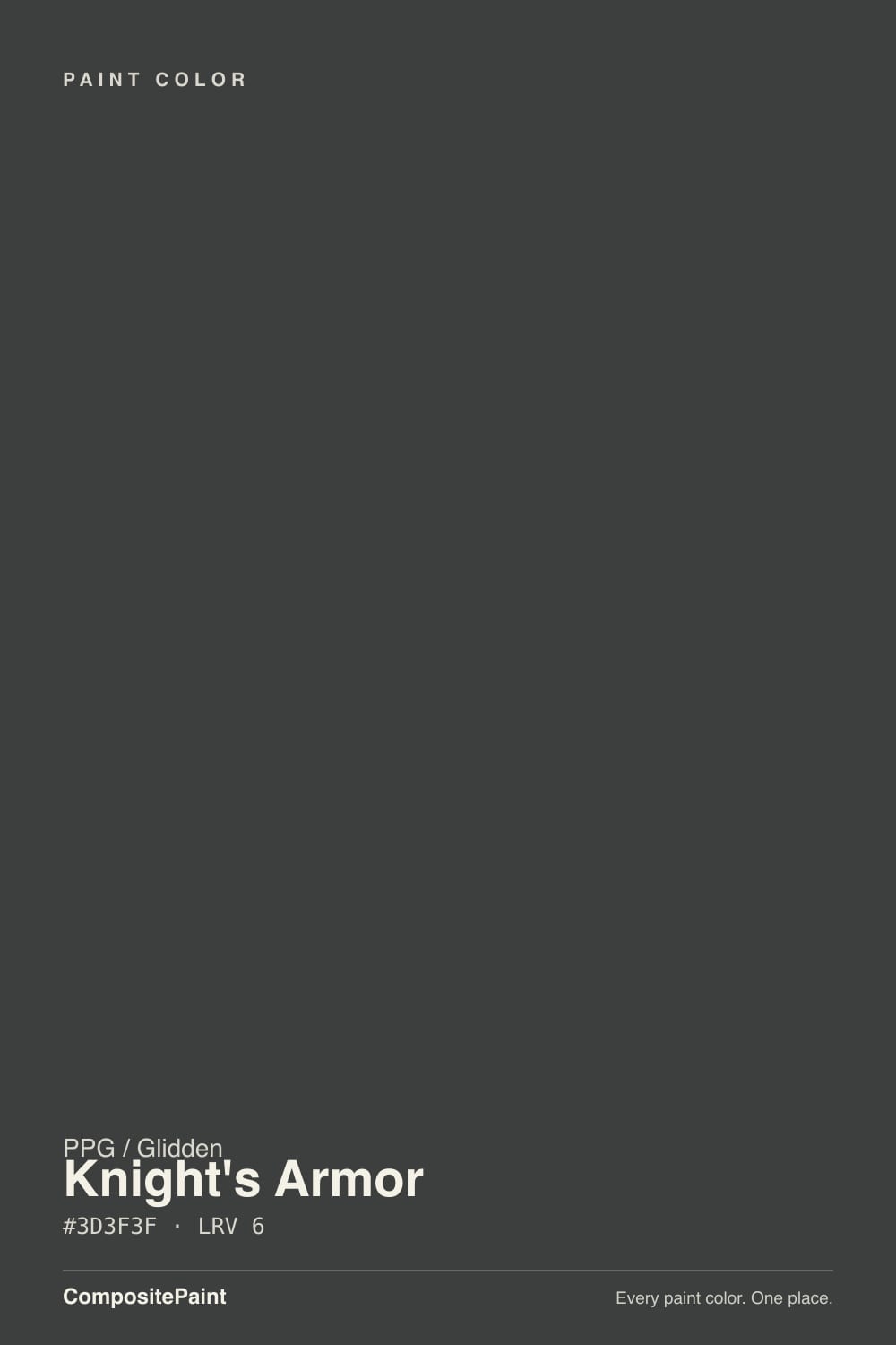
Knight's Armor is a cool charcoal gray with what PPG and the retailers who carry it consistently describe as a true black undertone — no green, no brown, no violet hiding underneath. That matters more than it sounds: a lot of near-blacks in this price range are built on a warm base and swing brown the second the light goes soft, which is exactly the complaint attached to several other dark neutrals in this deck. Knight's Armor holds its cool, neutral character across more lighting conditions than most of its competition.
It's sold under two labels off the same PPG1001-6 formula — PPG Paints and Glidden — which is why you'll find it in both a premium interior line and Glidden's budget exterior tins. At LRV 11 it reflects only about a tenth of the light that hits it: genuinely dark, on the same shelf as Sherwin-Williams Peppercorn and a full step darker than a color like Kendall Charcoal. The tell that PPG treats it as a workhorse rather than a wall trend is the product lineup around it — a Break-Through door/trim/cabinet enamel and a dedicated interior/exterior Floor and Porch paint exist specifically in this color, alongside the ordinary wall and exterior siding formulas.
Undertone in one line: cool, neutral, true black — never brown, never green, never violet. If a swatch of it looks brownish in your house, that's warm bulbs or a warm floor talking, not the paint.
Where It Shines
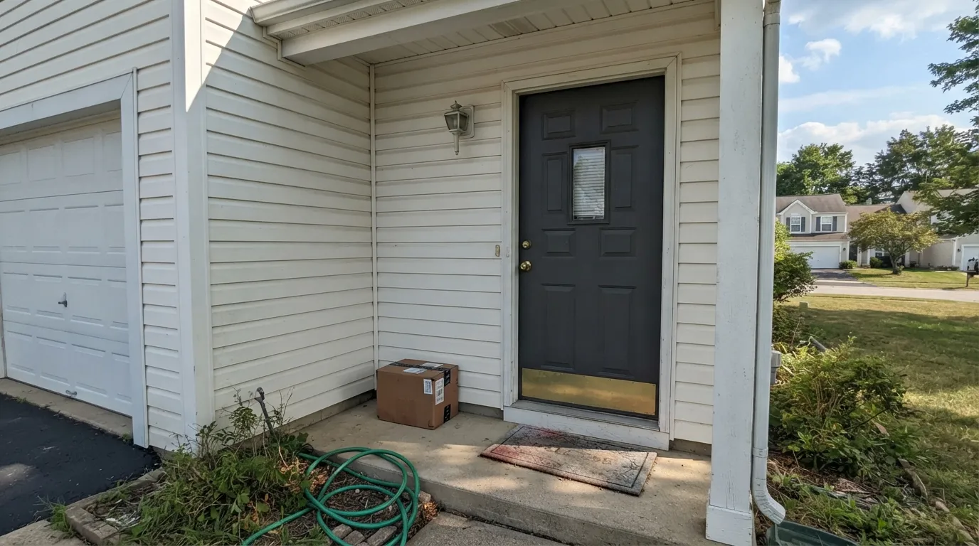
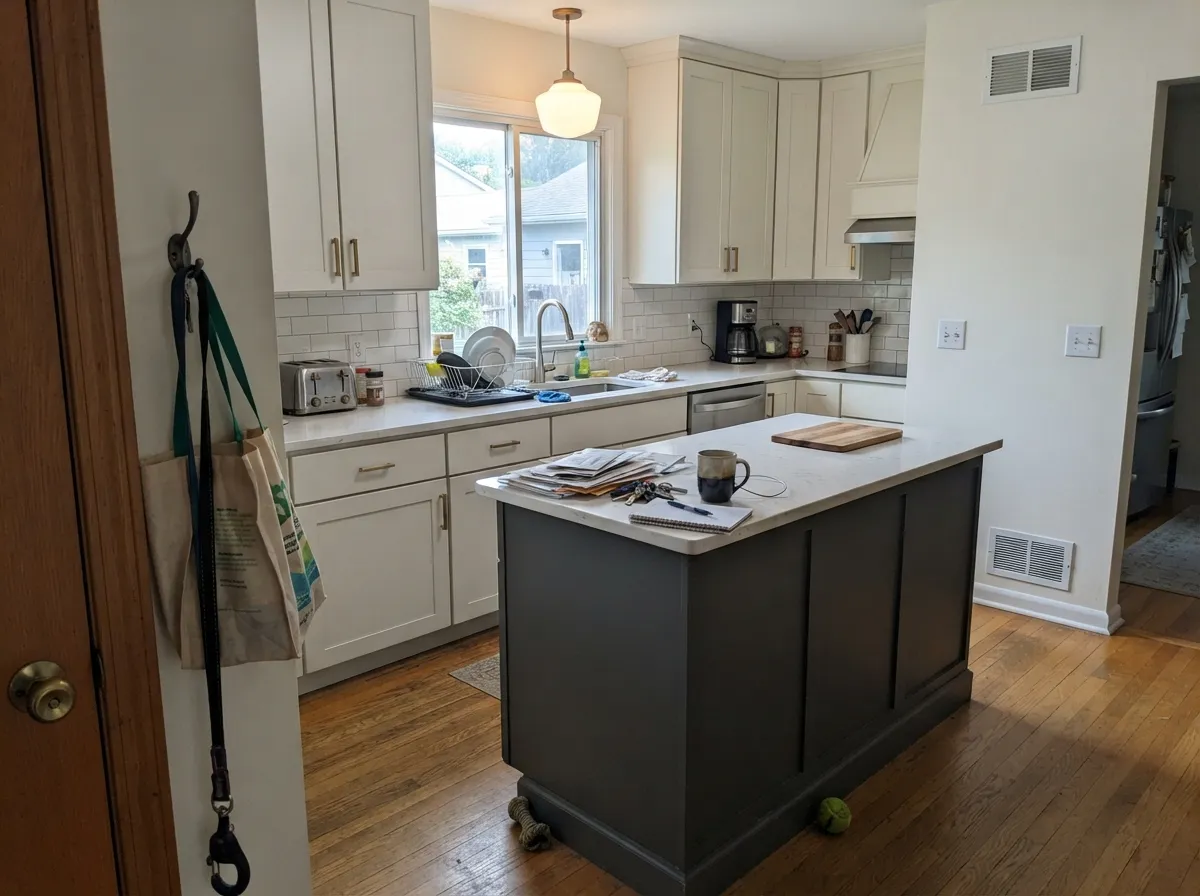
This is a hard-surface color first and a wall color second. On a front door it's the alternative to flat black that homeowners reach for when true black feels too severe — it still reads dramatic against white trim or stone, just with a hair more depth and none of the stark edge. On a kitchen island or bath vanity, the same cool undertone keeps it from arguing with marble or quartz the way a warm-black paint sometimes does. And because PPG built dedicated cabinet, trim, and floor-and-porch enamels in this exact color, it holds up to the traffic those surfaces get better than most "just paint it a wall color" darks.
Where It Fails
The complaints about Knight's Armor sort into three predictable buckets, and none of them are really about the paint — they're about asking a hard-surface color to do a wall color's job, or expecting a different kind of black than the one it is.
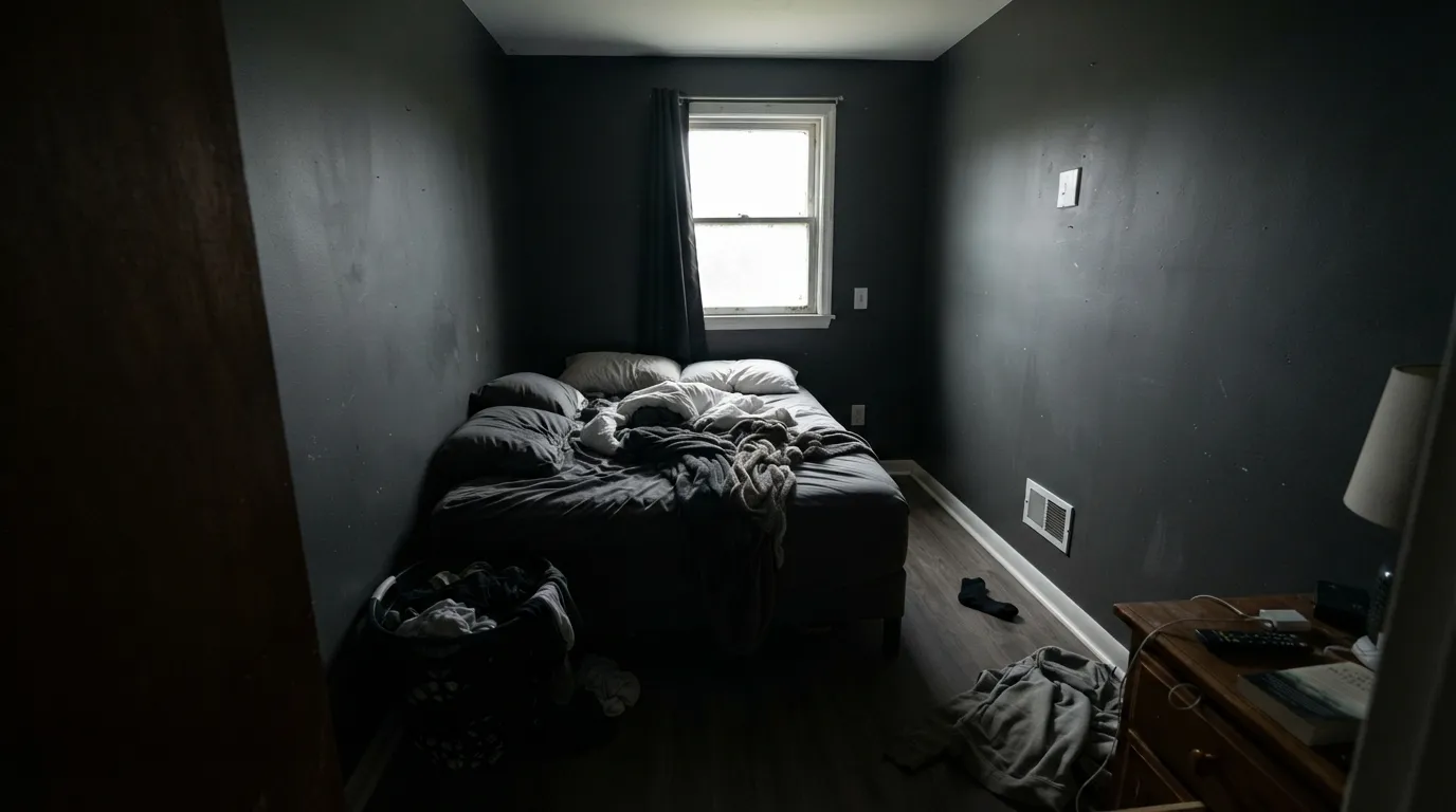
At LRV 11 this color already gives back very little light. Wrap a windowless or north-facing room in it with no lamps and the effect isn't moody, it's a cave — the exact reason PPG sells it in cabinet, trim, and porch enamels rather than pushing it as a whole-room neutral. If you love the color, take it to the door, the island, or one accent wall that gets real daylight first.
Knight's Armor is built cool and stays cool — that's its whole selling point over warmer near-blacks. If you actually want a black that leans brown and cozy in lamplight, this will read too flat and gray-blue by comparison; look at a warm charcoal like BM Iron Mountain or SW Black Fox instead.
LRV 11 is genuinely dark, but it isn't the deepest black in the deck — Tricorn Black sits at LRV 3 and Iron Ore at LRV 6. Next to a true reference black, or in bright daylight on a large surface, Knight's Armor can read as a dark charcoal gray rather than pure black. That's usually the point on a front door; it's a letdown if you specifically wanted ink black.
Room by Room
The color's best-known use. It reads dramatic against white or light siding without the flatness of true black, and the cool undertone won't clash with either warm or cool trim. Satin or semi-gloss exterior enamel; PPG's Break-Through line is built for exactly this.
The true-black undertone is the reason it works so well against marble and quartz — no brown or green cast fighting the veining. Pair with a lighter perimeter and warm hardware so the island reads as the intentional anchor, not a hole in the room.
As door and casing paint it gives the crisp definition of black without the starkness, especially against a warm white wall. PPG's cabinet/door/trim enamel is formulated in this color for a reason — it's meant to be touched and cleaned, not just looked at.
Excellent with marble, quartz, or any cool-veined stone; brass or matte black hardware both work since the undertone doesn't tip warm. Satin or semi-gloss for wipeability.
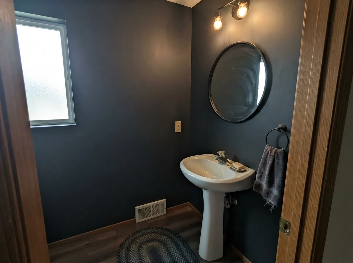
A single wall or a small daylit powder room lets the color show its cool depth without the cave effect. Skip it in a windowless powder room with only a vanity bulb — that's the one place this color needs help it won't get.
PPG sells this exact color in a Floor and Porch formulation, which is unusual for a review-deck color and worth knowing about if you're looking at a concrete porch, steps, or garage floor rather than a wall at all.
Your Light Is the Risk
Direct sun on an exterior door or a daylit kitchen shows the color at its clearest — a crisp, cool charcoal-black that holds its undertone instead of going muddy.
With no daylight and no bulbs doing the work, LRV 11 gives you almost nothing back. This is the light behind every "it swallowed the room" complaint.
Because the undertone is genuinely neutral, it moves less than most near-blacks as the light changes — no strong morning-to-evening color swing, just darker or lighter depending on how much light is actually hitting it.
2700K lamps soften the edge slightly without pushing it brown the way they would a warmer near-black. Cool LEDs keep it reading crisp and close to true black — either way it stays recognizably itself.
Most complaints about Knight's Armor are a light mismatch. Upload a photo of your actual room and see it on your walls — then ask for the same wall in north light or evening lamps before you buy a single sample.
Need It From Another Brand?
Any paint counter can custom-tint PPG / Glidden PPG1001-6 directly. If you would rather stay in one brand's own deck, these are the closest stock matches, measured as ΔE2000. Under 2 is a difference you will not see on the wall.
| Brand | Closest color | ΔE | LRV | |
|---|---|---|---|---|
| Sherwin-Williams | Forged SteelSW 9565 · Sherwin-Williams | 1.8 | 10 | Color page → |
| Behr | Graphic CharcoalN500-6 · Behr | 0.6 | 11 | Color page → |
| Benjamin Moore | FlintAF-560 · Benjamin Moore | 2.4 | 12 | Color page → |
| Valspar | Carriage WheelM330 · Valspar | 2.6 | 11.5 | Color page → |
| Glidden | Summer ShadowPPG0996-7 · Glidden | 1.2 | 11 | Color page → |
| Dutch Boy | Thunderous Gray444-6DB · Dutch Boy | 4.3 | 11 | Color page → |
Similar PPG / Glidden Colors
The nearest shades to Knight's Armor within PPG / Glidden's own range, ranked by perceptual color distance — useful when you want the same look a touch lighter, darker, or warmer.
WCAG 2.1: AA is 4.5 : 1 for normal text, 3 : 1 for large text, AAA is 7 : 1.
Knight's Armor vs the Colors You're Also Considering
Every Knight's Armor sample board has the same rivals on it. The numbers show the real lightness gap — then it comes down to which risk you would rather live with.
Pick this when you want that exact depth to stay cool and true-black no matter the room.
Sherwin-Williams SW 7674 · LRV 11PeppercornPick this if you want the same depth but a color that takes on whatever undertone your room's light gives it.
Pick this when you want a shade lighter that still reads black on a door or cabinet without the full commitment.
Sherwin-Williams SW 7069 · LRV 6Iron OrePick this if you actually want a wall-safe black at real black depth — Iron Ore is the deck's benchmark for that job.
Within PPG's deck, Knight's Armor sits among a tight cluster of near-blacks, and the differences are small but real. Black Magic (PPG1001-7) at LRV 5 is a touch darker and denser, so it reads as an even more absolute black with slightly less of the gray-green whisper; choose it when you want the darkest possible surface.
Starless Sky (PPG0995-7) at LRV 5 is also fractionally deeper and very close in tone, making it a good alternative if Knight's Armor looks a hair soft to you in bright light.
Phantom Mist (PPG1002-7) at LRV 6 shares the same lightness but leans warmer, with a slight brown cast in its hex, so it feels a little softer and cozier where Knight's Armor stays neutral. If you want your black to be truly undertone-quiet, Knight's Armor is the safer pick; if you want a hint of warmth, Phantom Mist is the move.
Knight's Armor Coordinating Colors
The rule for coordinating with Knight's Armor: stay cool or neutral, and let it carry the depth. It pairs cleanly with warm whites for farmhouse contrast, cooler cabinet whites for a consistent cool scheme, and lighter charcoals when you want a tonal, layered look instead of one flat block of near-black. These are the partners that keep showing up in rooms that work:
Built for Doors, Cabinets, and Floors — Not Just Walls
Most colors in this deck exist as a single wall-paint formula. Knight's Armor doesn't: PPG sells it in a Break-Through door/trim/cabinet enamel built for constant handling, and in an interior/exterior Floor and Porch paint for concrete steps, garage floors, and porches — on top of the ordinary interior wall and Glidden exterior siding formulas. That product spread is the clearest signal PPG gives about how this color is actually used in the field: as the dark, durable accent on the things you touch, not the default backdrop behind them.
That's useful information before you buy a gallon of wall paint in this color expecting a soft, roll-on-easy neutral. If your project is a door, an island, a trim package, or a floor, you're using the color the way it was built to be used. If it's four walls in a room without much daylight, you're asking a hard-surface specialist to do a wall color's job.
The Cool, True-Black Undertone, Explained
A lot of dark neutrals marketed as "near-black" are actually built on a warm base and swing brown once the light softens — that's the whole story behind colors like Benjamin Moore Iron Mountain or Sherwin-Williams Black Fox, which read distinctly warm in some rooms and flatter in others. Knight's Armor is built the other way: a genuinely neutral, cool black base that doesn't have a hidden warm or green cast waiting to show up.
The payoff is consistency. Next to cool stone, chrome or brushed nickel hardware, and white trim, it stays exactly the color you picked — no surprise brown or olive cast turning up under a different bulb. The tradeoff is that if you actually wanted that cozier, warm-black feeling, this isn't it; a warm charcoal will get you there faster than trying to make this one behave warm.
Three Ready Palettes Built on Knight's Armor
A color is never alone on the wall. These are complete combinations in the 60-30-10 pattern, with the reason each one holds together. Every one opens in the visualizer.
A warm white siding keeps the house from feeling severe, and the cool undertone in Knight's Armor means the door won't fight either the warm siding or the slightly deeper, true-black shutters. Two near-blacks in different roles is the classic farmhouse move — the depth match is intentional, not a mistake.
Try this palette in your roomA soft cabinet white overhead keeps the kitchen bright while the island carries all the drama. Extra White on the trim adds a crisp edge without competing with the island — this is the two-tone kitchen most owners are picturing when they search for a dark island color.
Try this palette in your roomSmall daylit rooms take deep color well, and a powder room is where the cave risk turns into an asset. Cloud White trim keeps the ceiling from disappearing, and a slightly lighter charcoal on the vanity gives the room two depths of the same cool family instead of one flat block of color.
Try this palette in your roomKnight's Armor FAQ
Is Knight's Armor black or dark gray?
Technically a dark gray — LRV 11 with a true black undertone, so it reads as black in most rooms without being an actual reference black. Next to a genuine black like Tricorn Black (LRV 3) it visibly softens toward charcoal; on its own, most people will call it black.
Can I paint all four walls of a bedroom in it?
You can, but only with real daylight or a lot of lamps — LRV 11 gives back very little light on its own. PPG itself sells this color primarily as a cabinet, trim, and floor enamel, which is a fair hint that it was built for surfaces, not for surrounding you in a dim room.
Is it a good front door color?
One of its best jobs. It gives the drama of black without the starkness, and the cool undertone means it won't clash with warm or cool siding and trim the way a warm-based black can.
What white pairs best with Knight's Armor?
A warm white like White Dove for farmhouse contrast, or a cooler cabinet white like Alabaster or Extra White if you want the whole scheme to stay consistently cool. Avoid a very yellow-warm white — it will fight the color's cool undertone.
Does it work on kitchen cabinets?
Yes — PPG sells a dedicated Break-Through door/trim/cabinet enamel in this exact color, and the true black undertone keeps it from arguing with marble or quartz counters the way a warm-based charcoal sometimes does.
How does it compare to a true black paint?
It's noticeably lighter — LRV 11 against LRV 3 for Tricorn Black or LRV 6 for Iron Ore — so it reads a step softer and more like charcoal, especially in bright light or on a large surface. On a door or cabinet most people won't notice the difference; on four sunlit walls they will.
Have you painted with Knight's Armor?
Rate it — one tap helps the next reader decide.
Ask a Question