Oriole
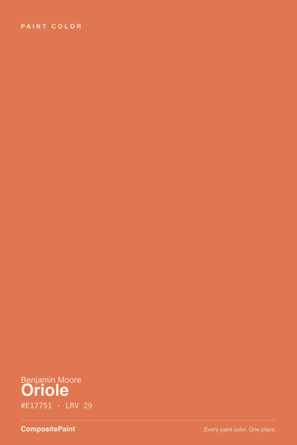
2169-30 · #E17751 · LRV 29 — warm red tone, mid-tone — versatile but shifts visibly with light.
- 1Rookwood Terra Cotta14
- 2Determined Orange22
- 3Oriole29
- 4Caramelized35
- 5Venetian Plaster42
What Color Is Oriole, Really?
Oriole reads as a warm red tone — mid-tone — versatile but shifts visibly with light. The notes below cover how Benjamin Moore 2169-30 behaves in different light and the closest matches at competing US brands.
Best Rooms and Uses for Oriole
Oriole is versatile enough for full rooms but has enough depth to anchor a space, so it suits living rooms, bedrooms and cabinetry alike. Earthy oranges and terracottas warm up dining rooms and entries.
How Lighting Changes Oriole
Oriole sits in the mid-range at LRV 29, so it shifts visibly through the day — lighter and more open in morning light, deeper and moodier after dark. Its red undertone is the part to watch: it gets picked up by whatever sits next to it, so test it against your trim, floor and the room's main light before committing. South-facing rooms will pull it lighter and warmer, while north light cools it down.
Most complaints about Oriole are a light mismatch. Upload a photo of your actual room and see it on your walls — then ask for the same wall in north light or evening lamps before you buy a single sample.
Need It From Another Brand?
Any paint counter can custom-tint Benjamin Moore 2169-30 directly. If you would rather stay in one brand's own deck, these are the closest stock matches, measured as ΔE2000. Under 2 is a difference you will not see on the wall.
| Brand | Closest color | ΔE | LRV | |
|---|---|---|---|---|
| Sherwin-Williams | RejuvenateSW 6620 · Sherwin-Williams | 4.4 | 30 | Color page → |
| Behr | Mai TaiHDC-SM16-03 · Behr | 1.3 | 29 | Color page → |
| Valspar | Flamenco Pink2004-3B · Valspar | 5.0 | 27.7 | Color page → |
| PPG / Glidden | Clay PotPPG1194-6 · PPG / Glidden | 1.4 | 30 | Color page → |
| Glidden | Clay Pot50YR 21/318 · Glidden | 1.7 | 21 | Color page → |
| HGTV Home by Sherwin-Williams | Pink RanunculusHGSW 1094 · HGTV Home by Sherwin-Williams | 4.4 | 30 | Color page → |
Similar Benjamin Moore Colors
The nearest shades to Oriole within Benjamin Moore's own range, ranked by perceptual color distance — useful when you want the same look a touch lighter, darker, or warmer.
WCAG 2.1: AA is 4.5 : 1 for normal text, 3 : 1 for large text, AAA is 7 : 1.
Coordinated palette
Generated by hue-rotating #E17751 in HSL space. Pair Oriole with one accent and one neutral — the swatches below are starting points, not final picks.
Have you painted with Oriole?
Rate it — one tap helps the next reader decide.
Ask a Question