Sage
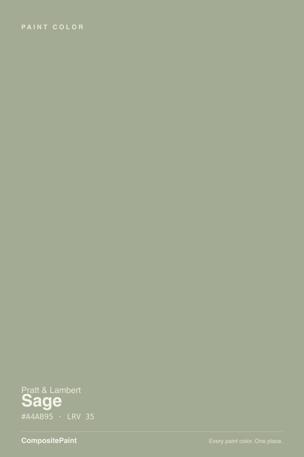
Pratt & Lambert's perennial sage, reviewed honestly: where it reads as a colored gray-green, the light that turns it drab olive, and why the same hex is also Magnolia Home Sage.

Jessica has spec'd whites and neutrals for more than 300 rooms and keeps a sample wall of painted drawdowns in her studio. Every color review is checked against real reader rooms in the comments and re-tested when a formula changes. About the testing process →
- 1Sage Green22
- 2Evergreen Fog30
- 3Sage35
- 4Clary Sage41
- 5October Mist47
The Fast Verdict
Sage 26-5 is the gray-green Pratt & Lambert dealers have mixed for decades: muted, mid-depth, more colored-neutral than statement green. At LRV 35 it has enough body for cabinets and four walls, and just enough yellow in the mix to keep it from going minty.
The catch is the same one every quiet sage has — cold north light and cool LEDs strip the green and leave a drab olive-gray. Give it daylight, oak, and 2700K lamps and it behaves. Do not confuse it with Magnolia Home Sage: same hex, different store, different paint.
Daylit living rooms and bedrooms · kitchen cabinets and vanities with brass and oak · a sage that behaves like a colored gray · anyone whose painter already buys Pratt & Lambert
Your room faces north and stays dim · your bulbs are 4000K or fluorescent · you wanted a clearly green green · your counters are cool gray marble
- A gray-green that behaves like a colored neutral — sage without the mint
- Mid-tone at LRV 35: cabinets and four walls both work in daylight
- Flatters oak, walnut, brass, and aged bronze
- Same color as Magnolia Home Sage if you prefer Pratt & Lambert paint
- Quiet enough to outlast the current sage boom
- Goes drab olive-gray in dim north rooms
- Cool LEDs and fluorescents kill the green on cabinets
- Too muted if you actually wanted a green room
- A half-step deeper than Clary Sage — can close in a small dark room
What Color Is Sage, Really?
A gray-green with the volume turned almost all the way down. The hue is yellow-green — dried sage leaf, not grass — but so little of it is actual color that the wall reads as a colored neutral until you put it next to a true white. That is why independent dealers have kept mixing 26-5 through every gray decade and every sage boom: it gives you the feeling of a green room without a green room's commitment, and it never goes mint, spa-blue, or lime. Pratt & Lambert's Accolade line is the vehicle most painters use for it, which is a paint conversation, not a color one.
At LRV 35 it sits in the useful middle of the sage shelf. Clary Sage (SW 6178) at LRV 41 is a full step lighter and a touch warmer — the easy four-wall version. Evergreen Fog (SW 9130) at LRV 30 is a half-step deeper and the one that made sage cabinets a default. Sage 26-5 lands between them: dark enough that a run of cabinet doors looks like painted furniture, light enough that a bedroom still breathes — as long as the room has daylight to give back. Next to Sea Salt (SW 6204) at LRV 63 it suddenly looks like a real color rather than a hint.
Undertone in one line: grayed yellow-green — cooler and grayer than Clary Sage, never mint, never blue. Against a crisp white the green jumps and looks unmistakably sage; against a warm beige it quiets toward gray. If your sample reads olive, that is west sun or 2700K bulbs pushing the yellow; if it reads plain gray, the room is short on light, not the paint.
Where It Shines
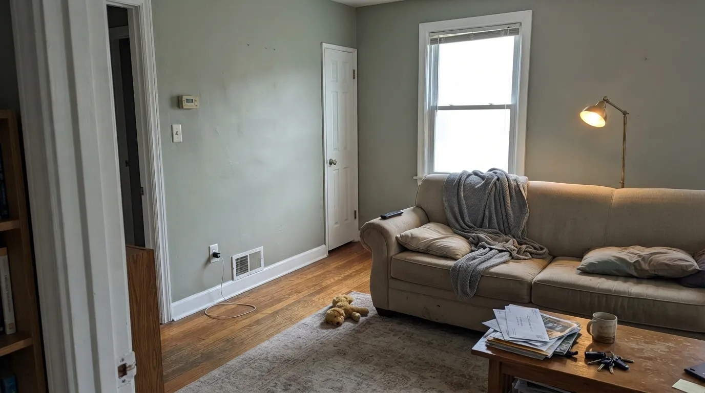
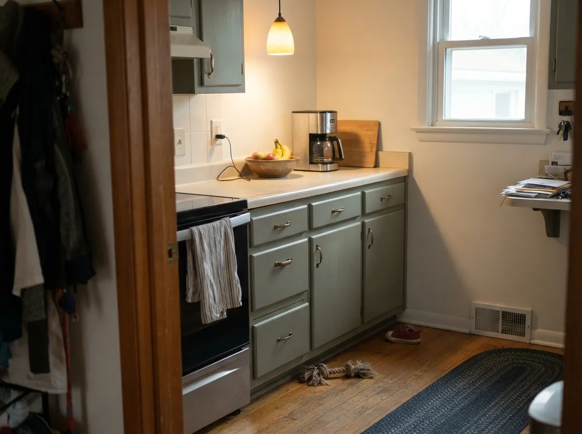
Give it real daylight, warm wood, and brass, and it does the quiet thing people actually want from sage: a room that feels settled and a little outdoorsy without anyone naming the color. Kitchen cabinets and vanities are its best surface — at LRV 35 the doors read as furniture, not a trend — and a south-facing living room or bedroom is the four-wall version of the same idea. It is the sage you pick when your painter already buys Pratt & Lambert and you do not need the Sherwin-Williams name on the can.
Where It Fails
Almost every regret story about a muted sage follows one of three scripts, and Sage 26-5 is no exception. None of them are the paint's fault — but at LRV 35 it has less light in reserve than a paler sage, so the misses show up faster. If your room matches one, this is not your green.
North light is cool and flat, and it strips the small amount of yellow that keeps this color alive. At LRV 35 there is not enough bounce to compensate, so four walls settle into a drab olive-gray that readers of similar sages call dirty or just gray. You did not get a green room; you got a darker version of the gray you were trying to leave. In that light go lighter and warmer with Clary Sage (SW 6178), or pick a green with more pigment to lose.
This is the cabinet-job killer. Under 4000K LEDs or leftover fluorescent tubes the yellow-green drops out and the doors read olive, tired, and slightly dirty. Swap every bulb to 2700K–3000K before you blame the paint — that is the cheapest fix in this family. If you cannot change the bulbs, Evergreen Fog (SW 9130) holds more green in cold light; Sage 26-5 does not.
Carrara-type stone and blue-gray porcelain sit on the opposite side of the temperature line and push this already-cool sage toward institutional green-gray. The wall looks sour; the stone looks colder. Warm white quartz, cream stone, oak vanities, and unlacquered brass are the company it wants. If the cool stone is staying, pick a warm greige like Accessible Beige (SW 7036) and let the stone be the cool thing.
Room by Room
South or west windows keep the green honest and the gray in check, so wood furniture and art look deliberate instead of staged. Eggshell, with Swiss Coffee (OC-45) trim in semi-gloss. Skip it if this is a closed north room with one lamp.
At LRV 35 the doors have enough depth to read as painted furniture, which is the whole point of a cabinet sage. Satin, brass or aged bronze pulls, warm-white counters, oak or walnut floors. 2700K under-cabinet and pendant bulbs are part of the spec. Cool gray quartz is the pairing to refuse.
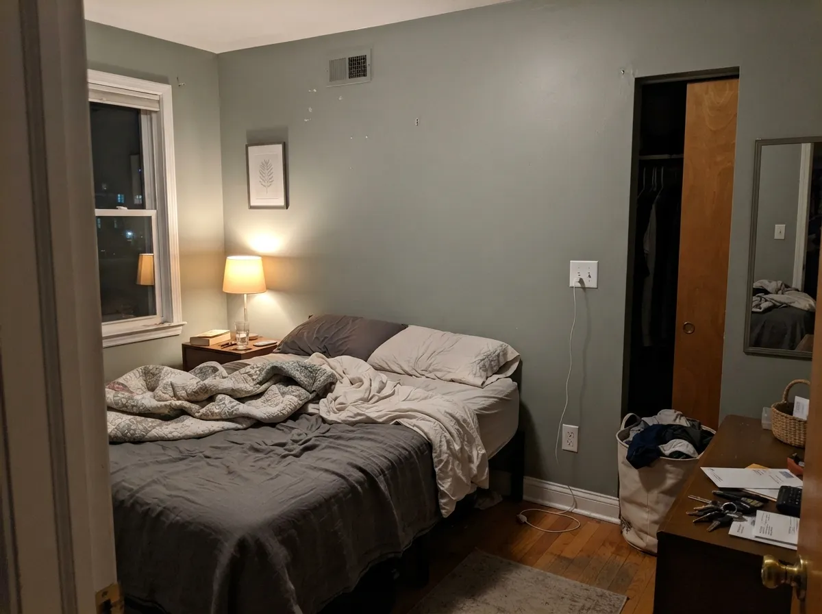
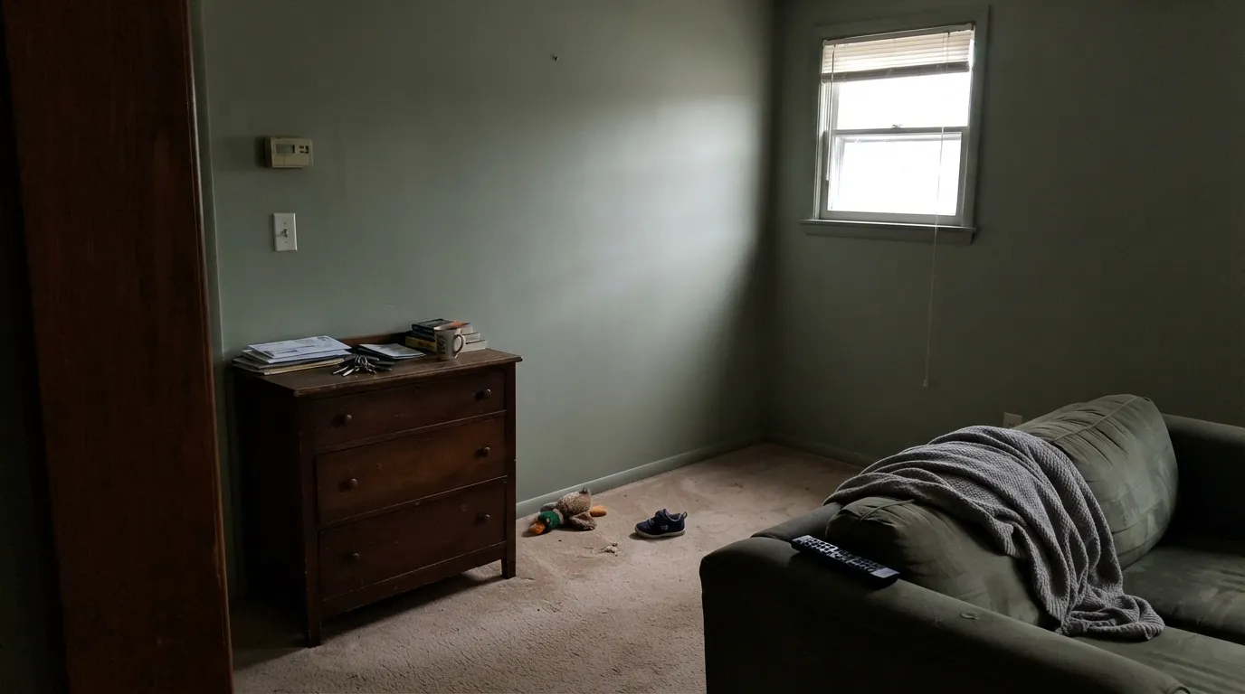
Restful without going spa, and deep enough to feel like a color after dark. Matte or eggshell; keep the bulbs at 2700K. A south-facing bedroom is easy. A north-facing one with the blinds down is the drab-olive version of this paint — test a big board before you commit four walls.
Small rooms take mid-depth sage well. Satin on a vanity under a warm stone top, or all four powder-room walls in eggshell with a cream towel and brass faucet. It looks custom without betting the house. Cool gray tile is still a no.
Enough color to make a desk or a dinner table look intentional, quiet enough to sit with all day. Pair with white oak and one dark note — Hale Navy (HC-154) on a door or Pewter Green (SW 6208) on a hutch. An interior dining room with no daylight will go flat after dark; plan lamps first.
As a body color it settles a farmhouse or older house into its trees rather than announcing a paint job, and warm white trim keeps the green clean. Full sun can olive it; the shaded north elevation will read a step grayer and heavier. Walk the sample around the house at 4pm before you commit a facade. It is a better body or shutter color than a punchy front door.
Your Light Is the Risk
Warm sun lifts the yellow just enough that the sage is obvious and soft, never minty. This is the light the color was mixed for.
Cool gray daylight strips the yellow and leaves drab olive-gray. At LRV 35 the room also reads a step heavier. Sample a dark wall first.
East mornings mute it toward gray-green; west afternoon and golden hour push the yellow and it can flash olive for an hour. It settles back after the sun drops.
2700K lamps bring the sage back and keep it from going stone. 4000K LEDs and fluorescents flatten it to dirty olive — swap bulbs before you repaint.
Most complaints about Sage are a light mismatch. Upload a photo of your actual room and see it on your walls — then ask for the same wall in north light or evening lamps before you buy a single sample.
Need It From Another Brand?
Any paint counter can custom-tint Pratt & Lambert 26-5 directly. If you would rather stay in one brand's own deck, these are the closest stock matches, measured as ΔE2000. Under 2 is a difference you will not see on the wall.
| Brand | Closest color | ΔE | LRV | |
|---|---|---|---|---|
| Sherwin-Williams | Frosted FernSW 9648 · Sherwin-Williams | 3.9 | 38 | Color page → |
| Behr | Simply SagePPU10-16 · Behr | 3.4 | 38 | Color page → |
| Benjamin Moore | Weekend Getaway473 · Benjamin Moore | 1.1 | 39 | Color page → |
| Valspar | Cool Pine8003-30D · Valspar | 2.2 | 40 | Color page → |
| PPG / Glidden | Wandering WillowPPG1031-3 · PPG / Glidden | 3.0 | 38 | Color page → |
| Glidden | Frosted Pine10GY 39/136 · Glidden | 0.7 | 39 | Color page → |
Contrast and Legibility
WCAG 2.1: AA is 4.5 : 1 for normal text, 3 : 1 for large text, AAA is 7 : 1.
Sage vs the Colors You're Also Considering
Every Sage sample board has the same rivals on it. The numbers show the real lightness gap — then it comes down to which risk you would rather live with.
Pick this if your painter buys Pratt & Lambert Accolade — the hex and LRV match; the can and the dealer do not.
Magnolia Home JG-022 · LRV 35SagePick this if you already shop Magnolia Home / KILZ and want the Joanna-Gaines farmhouse label on the same color.
Pick this when you want more depth and a cooler, grayer read, or your painter is already in the P&L booth.
Sherwin-Williams SW 6178 · LRV 41Clary SagePick this for a lighter, slightly warmer sage that is easier on four walls of a dimmer room — America's default easy sage, with the same lighting weakness.
The colors people most often weigh against Sage are its Pratt & Lambert neighbors. Sterling (32-13), at LRV 38, sits at nearly the same depth but is a true greige with no green in it. If you want the wall to read clearly green, choose Sage; if you want a quiet, colorless neutral at a similar lightness, Sterling is the safer pick.
Williamsburg Stone (CW-25), LRV 33, is close in depth again but reads warm and browner, a greige that leans tan rather than green. It suits a warmer, more traditional room, while Sage stays cooler and fresher.
Bracken (27-7), LRV 22, is the same green family taken deeper and more olive. Use it where you want a moody, saturated green; use Sage where you want that character softened and lightened for full walls. Behr's Simply Sage is a close cross-brand match if you shop elsewhere.
Sage Coordinating Colors
The rule for coordinating with Sage 26-5: warm whites, deeper green-grays, and one near-black or brown — and keep cool gray stone at arm's length. It loves oak, walnut, unlacquered brass, and aged bronze. Chrome and blue-gray tile make it look institutional. These are the partners that keep the green honest:
Two Brands, One Hex: Do Not Confuse the Sages
Magnolia Home Sage (JG-022) and Pratt & Lambert Sage (26-5) share hex #A4AB95 and LRV 35. That is not an approximation — it is the same color on a spectrophotometer. If you held both chips in daylight they would be interchangeable. The internet treats them as different paints because they live in different stores: Magnolia Home is the Joanna Gaines line (KILZ), the farmhouse-sage people screenshot; Pratt & Lambert is the independent-dealer brand painters have used since before that line existed.
What actually changes is the can. Accolade hides and levels differently than a big-box formula; sheen names and cabinet enamels are not the same SKU. None of that rewrites the undertone. If you fell in love with a Magnolia Sage room and your painter buys P&L, 26-5 is the match. If you fell in love with a P&L Sage kitchen and you only shop Magnolia, JG-022 is the match. Do not sample both expecting a different green.
Sage With Wood Tones and Floors
White oak and walnut are the easy yes — the gray in 26-5 meets their warmth halfway and the wall stays sage instead of going khaki. Gray-washed oak is safe and pushes the wall quieter. Orange honey oak is the sample-first floor: yellow-orange can shove this grayed green toward olive, and both sides look muddier. Red-toned cherry is the one honest clash — the green makes the red look brick-y. Test a big board over the actual floor before you commit four walls.
Cool gray LVP and blue-gray tile are the honest no, same as cool marble — they pull the yellow out and leave institutional green-gray. A large rug between a gray floor and this wall is a patch, not a fix. Metals are easy: unlacquered brass, antique bronze, and matte black all work; polished chrome is the one that leans cold against it.
Three Ready Palettes Built on Sage
A color is never alone on the wall. These are complete combinations in the 60-30-10 pattern, with the reason each one holds together. Every one opens in the visualizer.
Alabaster is warm enough to keep the sage from going cold without tipping cream, so the cabinets stay the star. Pewter Green on the island is the dark green-gray this scheme needs — outstanding on cabinets, which is exactly the job — and brass hardware ties both greens back to the oak.
Try this palette in your roomSwiss Coffee is the soft white this sage wants on the woodwork — warm enough that the walls stay green, not so creamy that they fight. Hale Navy is the single deep note; it is the safest navy as long as the room has light, which this palette already assumes.
Try this palette in your roomOne dealer, three cans: Antique White is the in-deck warm trim that keeps Sage from looking dusty, and Cocoa is a genuine brown at LRV 7 that grounds the scheme the way a navy would, without introducing a second brand. Stay on 2700K bulbs so the white does not flash yellow against the green.
Try this palette in your roomSage FAQ
Is Pratt & Lambert Sage warm or cool?
Grayed yellow-green, cooler and quieter than Clary Sage, not icy. South sun and 2700K lamps pull a little yellow forward; north light and cool LEDs push it toward drab gray. It never reads mint or blue.
Is this the same color as Magnolia Home Sage?
On paper, yes: both are Sage, both are hex #A4AB95, both sit at LRV 35. Magnolia Home Sage is JG-022, sold in the Joanna Gaines / KILZ line; Pratt & Lambert Sage is 26-5, mixed at independent P&L dealers, usually in Accolade. The chip matches. The paint, the sheen range, and the store do not. Pick the dealer your painter already uses.
What trim white goes with Sage?
A soft warm white — Swiss Coffee (OC-45) or Alabaster (SW 7008) — so the walls stay green instead of going dusty. Pratt & Lambert Antique White (1-1) is the in-deck version. A stark cool white like Chantilly Lace (OC-65) makes the green jump, which some people want; a heavy cream makes both sides look tired. Semi-gloss on the trim, eggshell on the walls.
Is it good for kitchen cabinets?
Yes — that is its best job. LRV 35 is the cabinet-sage band: deep enough to look like furniture, light enough that a galley still feels open. Use satin, brass or aged bronze pulls, and 2700K bulbs. Cool gray quartz and leftover fluorescent tubes are the two ways to ruin it.
Does Sage work in a north-facing room?
Poorly, unless you add a lot of warm lamp light. North daylight strips the yellow and, at LRV 35, the walls go drab olive-gray and a step heavier than the chip. If the point is to actually see green, Clary Sage (SW 6178) at LRV 41 keeps more of it in weak light. If the north room stays dim on purpose, pick a different family.
How is it different from Clary Sage?
Clary Sage (SW 6178) is lighter (LRV 41 vs 35), a touch warmer, and the sage most people already know. Pratt & Lambert Sage is cooler, grayer, and a half-step deeper — closer to a colored gray than to a yellow-green. Same idea, different temperature and weight. If your room is already short on light, Clary Sage is the safer four-wall pick.
Have you painted with Sage?
Rate it — one tap helps the next reader decide.
Ask a Question