Tundra
Pratt & Lambert's long-running greige, reviewed honestly: the rooms where it sits quietly, the light that turns it drab, and why the name Tundra is a trap.

Jessica has spec'd whites and neutrals for more than 300 rooms and keeps a sample wall of painted drawdowns in her studio. Every color review is checked against real reader rooms in the comments and re-tested when a formula changes. About the testing process →
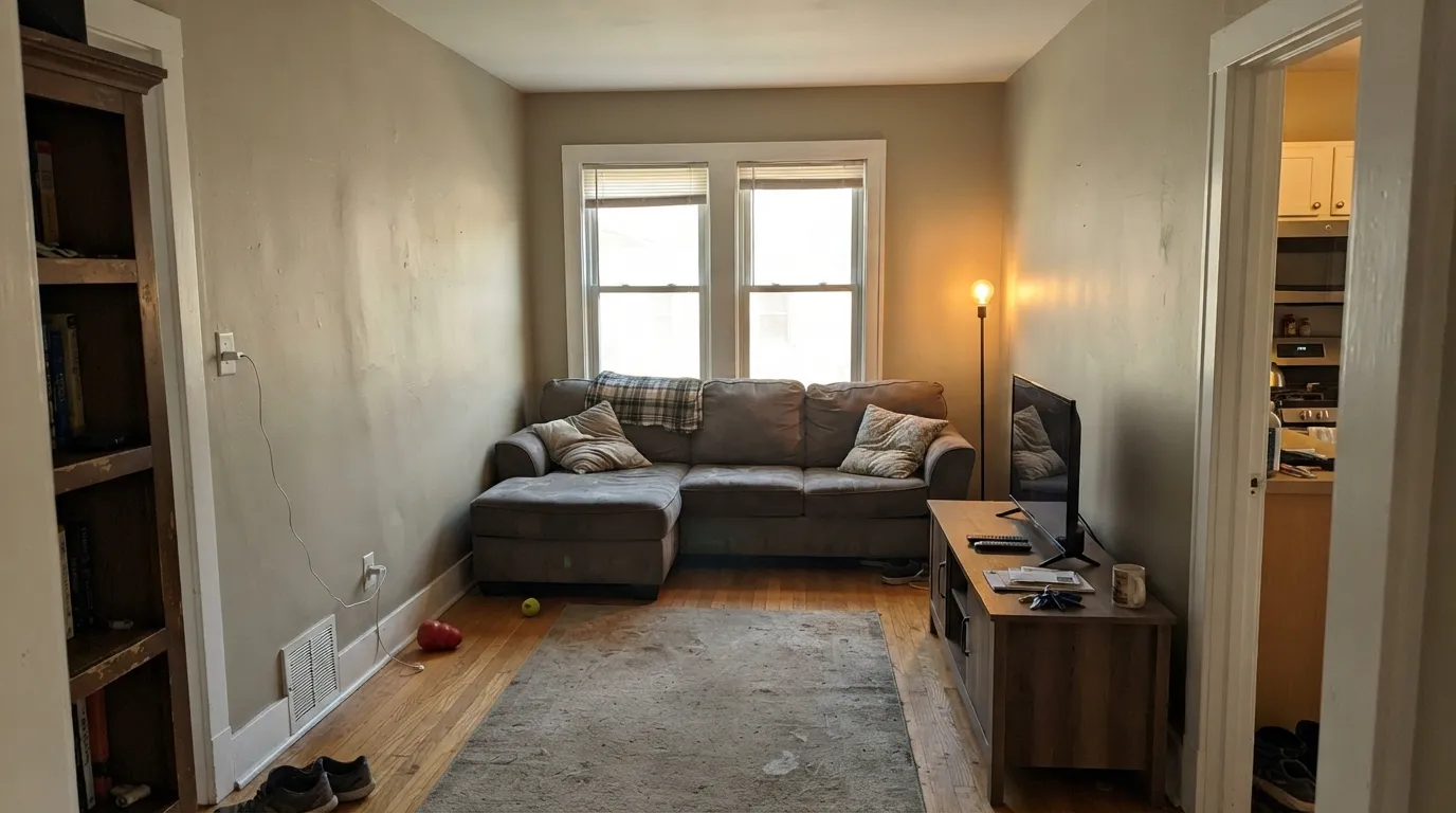
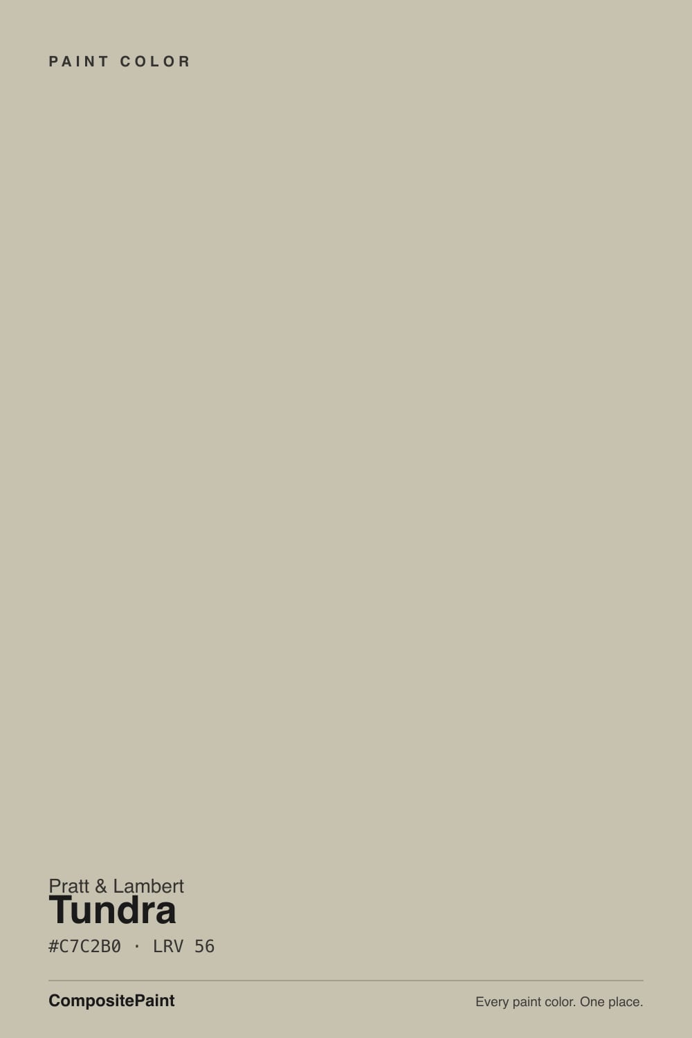
- 1Dorian Gray39
- 2Mindful Gray48
- 3Tundra56
- 4Pale Oak69
- 5Shoji White74
The Fast Verdict
Tundra is not ice. Pratt & Lambert 32-6 is a muted khaki greige at LRV 56 — the same depth as Revere Pewter — that reads gray and beige in the same glance. In real daylight it is a finished, low-chroma wall that does not shout. In a dim north room the gold drops out and you are left with a dirty gray. If you already paint in Accolade and you want a whole-house greige, this is the one in the 32-range. If you wanted Arctic gray, keep walking.
Living rooms, hallways, and bedrooms with real daylight · whole-house walls when greige is the point · anyone already painting in Pratt & Lambert Accolade
The room faces north and stays dim · you actually wanted gray · a cooler, crisper trim white is staying · you will sample at Sherwin-Williams anyway
- Same useful depth as Revere Pewter (LRV 56) without the internet noise
- Low chroma: gray and beige at once, neither winning
- Carries hallways and open plans without a color announcement
- Accolade lays out evenly on a color that shows flashing
- Not a trend color — it has been the 32-range workhorse for years
- The name promises ice; the wall delivers khaki greige
- Cool, dim north light turns it drab and slightly dirty
- A crisp bright trim white makes the walls look tired
- Harder to sample and buy than the Sherwin and BM greiges it competes with
What Color Is Tundra, Really?
A light greige with the beige and the gray occupying the same stretch of wall. Pratt & Lambert files it as 32-6 in a long run of 32-range neutrals, and Tundra is the workhorse in the middle: not as pale as Silver Lining, a half-step deeper and more khaki than Light Grey. It is not a trend color and it has no Color of the Year story. It is the shade a P&L dealer has been pulling for clients who said they wanted something not-white and not-beige.
At LRV 56 it sits at the same reflectance as Benjamin Moore Revere Pewter, which is the useful comparison: enough body to look like a decided color, not so much that a living room goes cave. On the chip it can pass for a warm gray. On four walls the yellow-gold in the mix comes forward, so the finished room reads khaki-greige rather than pewter. Plan for it to look a half-step warmer and slightly more beige than the strip suggested.
Undertone in one line: muted yellow-gold — khaki, not pink, not blue. The name Tundra does real damage here. Nothing about 32-6 is icy. If your sample goes green, that is lawn or tree bounce, not a green base. If it goes gray and tired, the light is cool and the gold has nowhere to sit.
Where It Shines
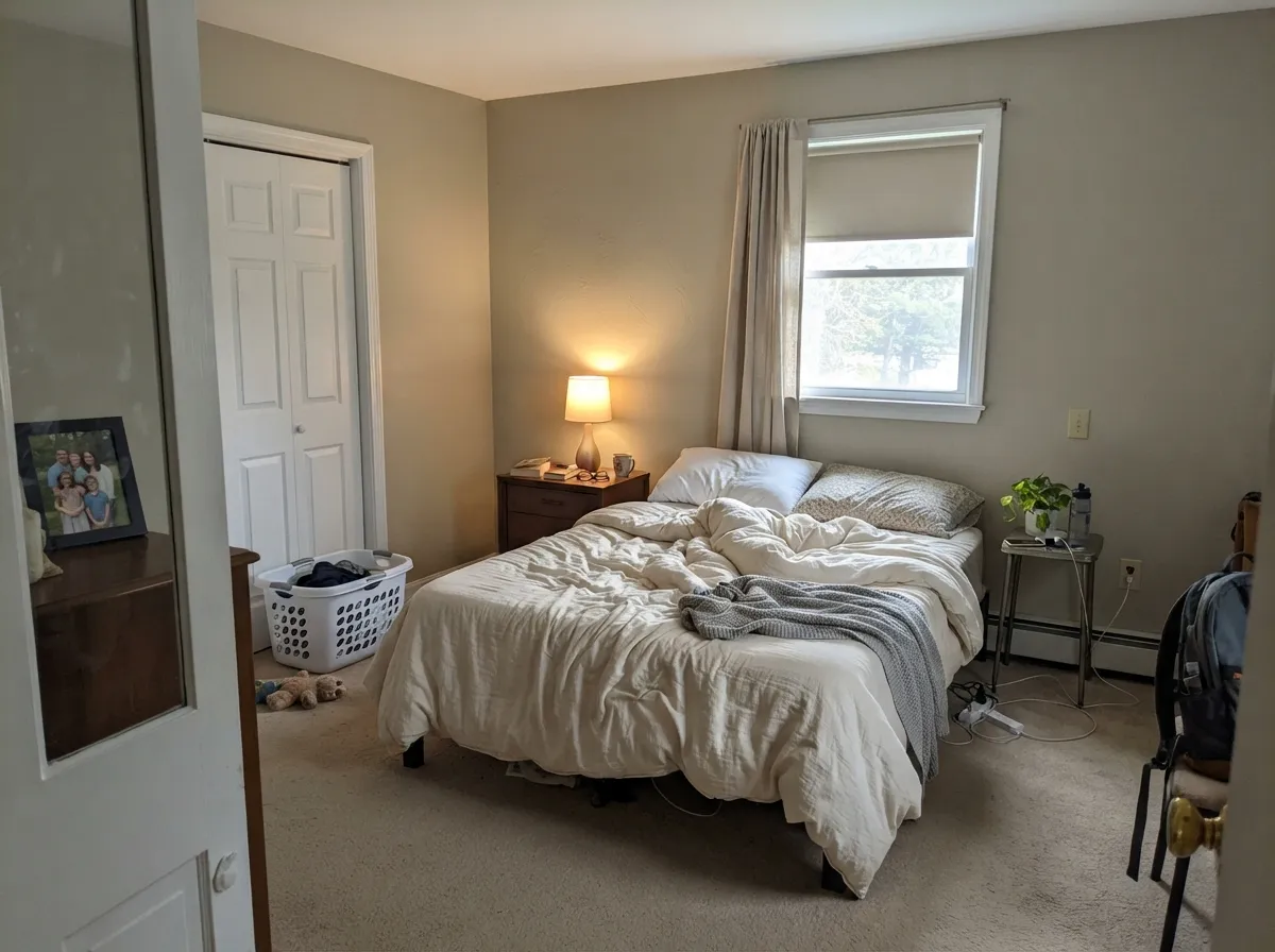
Give it south or west daylight, warm wood, and a soft white on the trim, and Tundra behaves like the greiges people actually live with — Revere Pewter, Agreeable Gray, Edgecomb Gray — without the internet volume. Hallways and open main floors are its job: it carries from room to room without announcing a color decision. Bedrooms with a window, and 2700K lamps after dark, stay calm instead of chalky. The Accolade film is the other quiet win if your painter can get it: it lays out full and even, which a low-chroma greige needs, because flashing shows every lap.
Where It Fails
Almost every bad Tundra wall comes from a mismatch the chip cannot show: the name, the light, or the trim. None of those are the pigment's fault — but if your room matches one, this is not your greige, and a bigger sample will only confirm it.
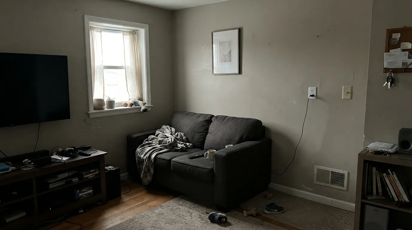
North light is cool and gray — it strips the yellow-gold out and leaves a flat, slightly dirty gray that readers of every greige at this depth describe as drab. Tundra at LRV 56 does not generate its own light. If the room is dim and you will not add warm lamps, pick a lighter, creamier neutral or live with the mud.
Tundra sounds like ice and stone. The paint is khaki greige. On four walls nobody will call it gray, and people who bought it hoping for a cool, modern gray are the ones who repaint. If gray is the goal, Repose Gray or Light French Gray will tell the truth; if beige-warm is the goal, Accessible Beige is the more honest warm neutral.
The most common pairing mistake with mid-greiges: Tundra walls, a crisp gallery white on the trim. The brighter white wins and 32-6 looks unwashed, even dingy. Use a soft warm white — White Dove or Alabaster — or run Tundra and the trim as one color at two sheens. Extra White and Chantilly Lace are the wrong edge for this wall.
Room by Room
Open main floors with real windows are where Tundra earns its keep: warm enough to feel finished, gray enough to stay clean against White Dove or Alabaster trim. Eggshell; same-color or soft-white trim in semi-gloss. Oak, walnut, and a worn sofa all sit comfortably against it.
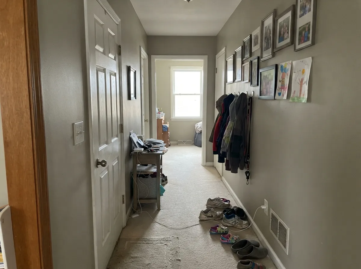
Low-chroma greige at LRV 56 is built to run room to room without clashing. Hallways, stair landings, and the rooms you walk through are the test, and Tundra passes if the light is decent. This is not a feature-wall color; it is a house color.
Soft in morning light, calmer at night under 2700K bulbs. Matte or eggshell; cream or white bedding rather than a yellow beige, which can push the walls khaki. If the bedroom is a cave with one north window, this is the wrong depth.
As a wall color under Alabaster or White Dove cabinets it is a steady greige backdrop for brass, butcher block, and warm stone. A full kitchen of LRV-56 greige cabinets tends to read dirty, especially with cool quartz. Satin on any cabinet color; keep Tundra on the walls.
Warm tile, cream stone, and brass: fine. Cool gray marble or blue-gray tile will push Tundra toward yellow-khaki and make the stone look colder. Sample a big card against the actual vanity top before you commit four walls.
Full sun washes a mid-greige toward dusty khaki, and from the street it can read as faded rather than chosen. A shaded body color on a traditional house is the only maybe; for siding in the open, go lighter or commit to a true gray. Do not use it as a front door.
Your Light Is the Risk
The yellow-gold sits quietly and the wall reads as a finished greige all day — warm enough, gray enough, never icy. This is the light to sample in first.
Cool gray daylight kills the gold and leaves a flat, slightly dirty gray. Fine if you half-wanted gray; disappointing if you wanted a soft, lived-in greige.
Cooler and more gray in morning east light; khaki-gold by west afternoon and golden hour. The shift is real but gentle — most people like it once they expect it.
2700K bulbs bring the beige forward and the room goes cozy. Cool white LEDs (4000K and up) flatten it to gray-khaki. Swap the bulbs before you repaint.
Most complaints about Tundra are a light mismatch. Upload a photo of your actual room and see it on your walls — then ask for the same wall in north light or evening lamps before you buy a single sample.
Need It From Another Brand?
Any paint counter can custom-tint Pratt & Lambert 32-6 directly. If you would rather stay in one brand's own deck, these are the closest stock matches, measured as ΔE2000. Under 2 is a difference you will not see on the wall.
| Brand | Closest color | ΔE | LRV | |
|---|---|---|---|---|
| Sherwin-Williams | NaturelSW 7542 · Sherwin-Williams | 2.9 | 54 | Color page → |
| Behr | Washed KhakiUL170-8 · Behr | 2.2 | 54 | Color page → |
| Benjamin Moore | Paris Rain1501 · Benjamin Moore | 1.5 | 53 | Color page → |
| Valspar | Snake Charmer8004-23B · Valspar | 1.6 | 54 | Color page → |
| PPG / Glidden | Great GrayPPG15-28 · PPG / Glidden | 3.5 | 54 | Color page → |
| Glidden | HideawayPPG14-26 · Glidden | 1.8 | 53 | Color page → |
Contrast and Legibility
WCAG 2.1: AA is 4.5 : 1 for normal text, 3 : 1 for large text, AAA is 7 : 1.
Tundra vs the Colors You're Also Considering
Every Tundra sample board has the same rivals on it. The numbers show the real lightness gap — then it comes down to which risk you would rather live with.
Pick this if your painter is already in Pratt & Lambert and you want the same depth without the Revere Pewter baggage.
Benjamin Moore HC-172 · LRV 56Revere PewterPick this if you want the famous greige at the same LRV, with a decade of real-room photos to borrow from.
Pick this when you want a half-step more body and a quieter, less-searched wall.
Sherwin-Williams SW 7029 · LRV 60Agreeable GrayPick this if you want the safer, slightly lighter whole-house greige — the one every painter already knows.
The closest Pratt & Lambert neutrals to Tundra sit just a little lighter. Light Grey (32-12), at LRV 58, is nearly the same value but reads as a cooler, more balanced greige with less of Tundra's yellow warmth. If Tundra ever looks too tan in your light, Light Grey is the cooler alternative at almost the same brightness.
Statuary (32-14), at LRV 65, is noticeably lighter and softer. It works when you want the same warm-neutral character but a brighter, more open feel, for example on a ceiling or in a room that stays dim. Tundra will feel more grounded and hold more color on the wall.
Silver Lining (32-1), at LRV 80, is closer to an off-white. Use it when Tundra is too much color for trim or a small space, and use Tundra when you want the walls to actually read as a warm greige rather than a near-white.
Tundra Coordinating Colors
The rule for coordinating with Tundra: stay on the warm-soft side of white, and let one darker note do the contrast. It likes White Dove and Alabaster on trim, Pale Oak in the next room, and a navy or charcoal on the door. Cool gallery whites and blue-gray stone argue with the khaki. These are the partners that keep the wall from looking dirty or unfinished:
The Name Is a Trap — And It Is Not Dunn-Edwards Tundra
Tundra is a terrible name for this paint. It suggests glacier, stone, cool gray. Pratt & Lambert 32-6 is a muted yellow-gold greige that has lived in the 32-range as a workhorse, not a headline. Pratt & Lambert does not run a Color of the Year program, and there is no famous room, show house, or viral interior attached to 32-6 that we could verify. Honest obscurity is the story: if you know this color, you probably have a P&L dealer.
Do not confuse it with Dunn-Edwards Tundra (DET619). That is a different formula from a different company, even though both sit at LRV 56 and both get searched as Tundra. Order by SKU — 32-6 — and ignore the poetry on the chip.
Tundra With Wood Tones and Floors
Warm wood is the easy pairing. White oak, walnut, and most medium stained oak sit naturally against a khaki greige because the yellow-gold in Tundra meets the floor halfway instead of fighting it. Red oak is usually fine; orange builder oak can push the walls more khaki, which some people like and some people call dingy — sample a board against a big card before you roll.
The floor that needs a test is cool gray LVP or gray-washed wood. Gray floors pull Tundra's warmth into relief, and the wall can read beige-yellow against them. A large warm rug and brass lamps often fix it; a whole-house gray plank floor may not. Cream carpet is safe. True gray carpet is the same gamble as gray LVP.
Metals: unlacquered brass, bronze, and matte black all work. Polished chrome is the one that leans cold against the khaki and makes the greige look a little dirty. If the plumbing is staying chrome, warm the bulbs up and keep the trim soft.
Three Ready Palettes Built on Tundra
A color is never alone on the wall. These are complete combinations in the 60-30-10 pattern, with the reason each one holds together. Every one opens in the visualizer.
White Dove is the soft warm white this greige needs — a brighter trim white would make Tundra look tired. Hale Navy is the single dark note so the scheme does not float. Same idea as a Revere Pewter house, quieter on the wall.
Try this palette in your roomAlabaster cabinets keep the greige from doing too much work; Evergreen Fog on the island adds one muted sage note that reads restful, not decorated. Brass hardware and a warm wood floor finish the argument. Do not put Tundra on the cabinets.
Try this palette in your roomThree depths of the same greige family, so the house gets quieter as you walk back rather than changing color. Pale Oak needs good light; Pashmina needs even more. White Dove trim (not in this chip set) ties all three back together.
Try this palette in your roomTundra FAQ
Is Tundra gray or beige?
Both, which is the point of a greige — and the name does not help. On the chip it can pass for a warm gray; on four walls the muted yellow-gold comes forward and it reads khaki-beige. If you need it to be one thing, it will disappoint. If you wanted a true gray, look at Repose Gray or Light French Gray instead.
What trim white goes with Tundra?
A soft warm white. White Dove is the default; Alabaster if the painter is in Sherwin-Williams. A crisp bright white — Extra White, Chantilly Lace — makes the walls look dingy. Semi-gloss on the trim, eggshell on the walls, or run Tundra at two sheens and skip the contrast.
Will Tundra work in a north-facing room?
Only if you add warm lamps and accept a grayer, flatter wall. Cool north daylight strips the gold and leaves a drab gray that is the number-one failure for greiges at LRV 56. Sample on the actual north wall, overcast day, before you buy gallons.
Is Pratt & Lambert Tundra the same as Dunn-Edwards Tundra?
No. Same name, different companies, different formulas. Pratt & Lambert 32-6 is hex #C7C2B0; Dunn-Edwards DET619 is a separate color. Do not send a painter to match one from the other, and do not assume a review of one applies to both.
How does it compare to Revere Pewter?
Same LRV (56), same job: a whole-house greige with a warm, slightly khaki lean. Revere Pewter is the one with a thousand real-room photos and a known green-flash risk. Tundra is the P&L version — quieter online, same sampling rules. Pick the brand your painter already buys.
Can I use Tundra on kitchen cabinets?
You can, but it is usually a miss. Mid-greige cabinets at LRV 56 pick up every fingerprint and read slightly dirty next to cool stone. Put Tundra on the walls and paint the cabinets Alabaster or White Dove in satin. Save the commitment for a darker island if you want contrast.
Have you painted with Tundra?
Rate it — one tap helps the next reader decide.
Ask a Question