Light Grey
The light gray spec writers look up in Pratt & Lambert, reviewed honestly: where it stays a quiet greige, the rooms that turn it beige, and why the name is cooler than the paint.

Jessica has spec'd whites and neutrals for more than 300 rooms and keeps a sample wall of painted drawdowns in her studio. Every color review is checked against real reader rooms in the comments and re-tested when a formula changes. About the testing process →
- 1Mindful Gray48
- 2Light French Gray53
- 3Light Grey58
- 4Pale Oak69
- 5Shoji White74
The Fast Verdict
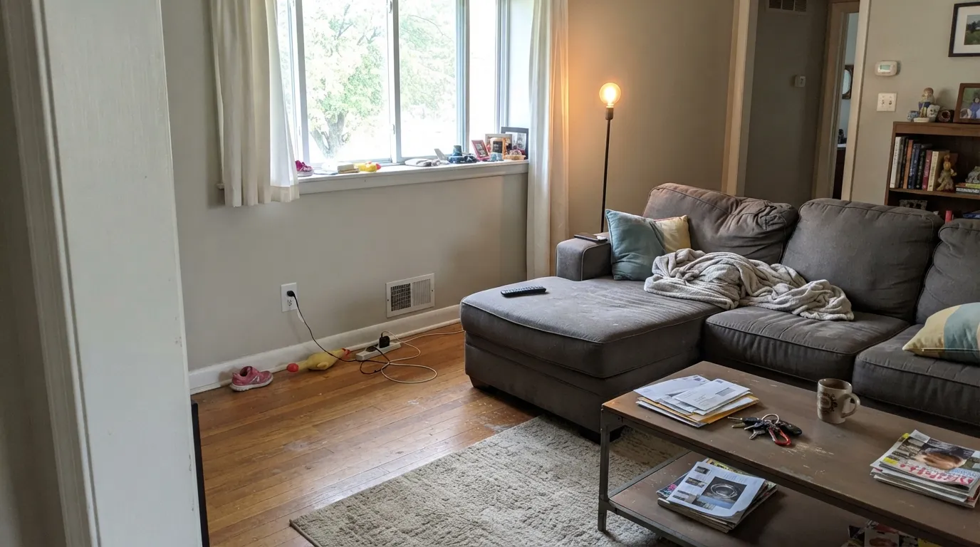
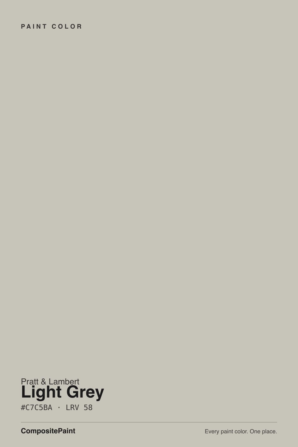
Light Grey 32-12 is the color contractors pull when a Pratt & Lambert spec says light gray and nobody wants a fight. At LRV 58 it sits in Repose Gray territory: light enough to keep a room open, deep enough to read as a wall. The name says grey. The chip is a warm-leaning greige — a yellow-tan whisper at very low saturation, never blue, never icy. Give it daylight, oak, and a soft white trim and it behaves. Buy it hoping for a cool gray, or hang it in a dim north room, and the beige is the whole story.
Daylit living rooms and hallways · bedrooms with 2700K lamps · kitchens that want a soft gray wall behind white cabinets · anyone whose painter already mixes Pratt & Lambert
You actually want a cool gray · the room faces north and stays dim · floors or counters are cool gray or blue-gray stone · you need a greige a resale buyer will recognize by name
- A quiet mid-light gray-greige that recedes instead of decorating
- Same depth as Repose Gray (LRV 58) without the violet flash
- Flatters oak, walnut, brass, and soft white trim
- The light gray P&L dealers already know how to mix
- Soft enough to run living room into hall into bedroom
- Not a cool gray — buyers who wanted gray see beige by the second wall
- Goes drab and slightly dirty in dim north rooms
- Fights cool gray floors, LVP, and Carrara-type stone
- No name recognition if you are painting for resale
What Color Is Light Grey, Really?
A light gray with the cool taken out of it. People look this one up because it is the light gray that shows up most often in Pratt & Lambert spec sheets, and the British spelling on the chip makes it sound crisper than it is. The measured hue sits in the yellow range at about ten percent saturation, so the wall is nearly neutral with a soft tan lean — greige, not gallery gray. Independent dealers have mixed 32-12 for years as a contractor default, not a blog color. You will not find it on a Color of the Year list or a designer roundup. What you will find is a fan deck where the word Grey is doing more work than the pigment.
At LRV 58 it is the same lightness as Repose Gray (SW 7015) and Accessible Beige (SW 7036): a true mid-light wall, not a pale wash. That number is the useful part. It reflects enough daylight to keep living rooms and hallways from closing in, and it holds enough body that four walls still look painted rather than leftover builder white. Put it next to Classic Gray (OC-23, LRV 74) and Light Grey suddenly shows its weight. Put it next to Light French Gray (SW 55, LRV 53) and the yellow-tan steps forward. On a chip it looks like a quiet gray. On a sunny wall it looks like a greige.
Undertone in one line: warm yellow-tan, very low chroma — never blue, never green, never violet. If your sample looks beige, that is south or west sun doing exactly what a yellow-based gray does. If it looks like a true gray, the light is north or the bulbs are cool and the tan is being held in check. Both versions are the same paint being honest about the room.
Where It Shines
Give it real daylight, warm wood, and a soft white trim and it does the quiet job spec writers hired it for: a wall that recedes, flatters oak and brass, and does not fight the next room. Open living rooms, hallways, and bedrooms with ordinary windows are its home turf. Kitchens are the second-best use — on the walls, behind white cabinets — because at LRV 58 it reads as a finished gray-greige instead of leftover beige. It is the color you pick when the painter already buys Pratt & Lambert and you do not need the Sherwin-Williams name on the can.
Where It Fails
Almost every regret about Light Grey is a naming problem or a light problem, and both are visible on a sample board if you look at the right hour. None of them are a bad batch — but if your room matches one, this is not your gray, and more coats will not add the cool the label promised.
The name is the trap. On the chip it passes as a light gray. On four walls the yellow-tan is the color — a soft greige, not the cool, modern gray a spec sheet or a Pinterest board implied. Set a Light French Gray (SW 55) sample next to it and Light Grey looks beige. If cool gray is the point, this is the wrong can; Light French Gray stays gray (with one violet flash in cold light) and Repose Gray is the cooler same-depth greige, knowing it can drift lavender in a north room.
North light is cool and flat, and it strips the small amount of yellow that keeps this color alive. At LRV 58 there is not enough bounce left, so four walls settle into a drab, slightly dirty gray that readers of similar greiges call muddy. You did not get a light gray room; you got a tired one. In that light commit to 2700K lamps in every corner before you blame the paint, or step up to a lighter gray like Classic Gray (OC-23, LRV 74) that still has bounce in medium light.
Cool gray LVP, blue-gray tile, and Carrara-type marble sit on the opposite side of the temperature line. They pull Light Grey's tan into relief, so the walls look beige and slightly dirty while the stone looks colder. Warm oak, walnut, cream stone, and brass are the company it wants. If the cool floor is staying, pick a true gray like Light French Gray and let the floor be the cool thing — or put a large warm rug between them and sample both.
Room by Room
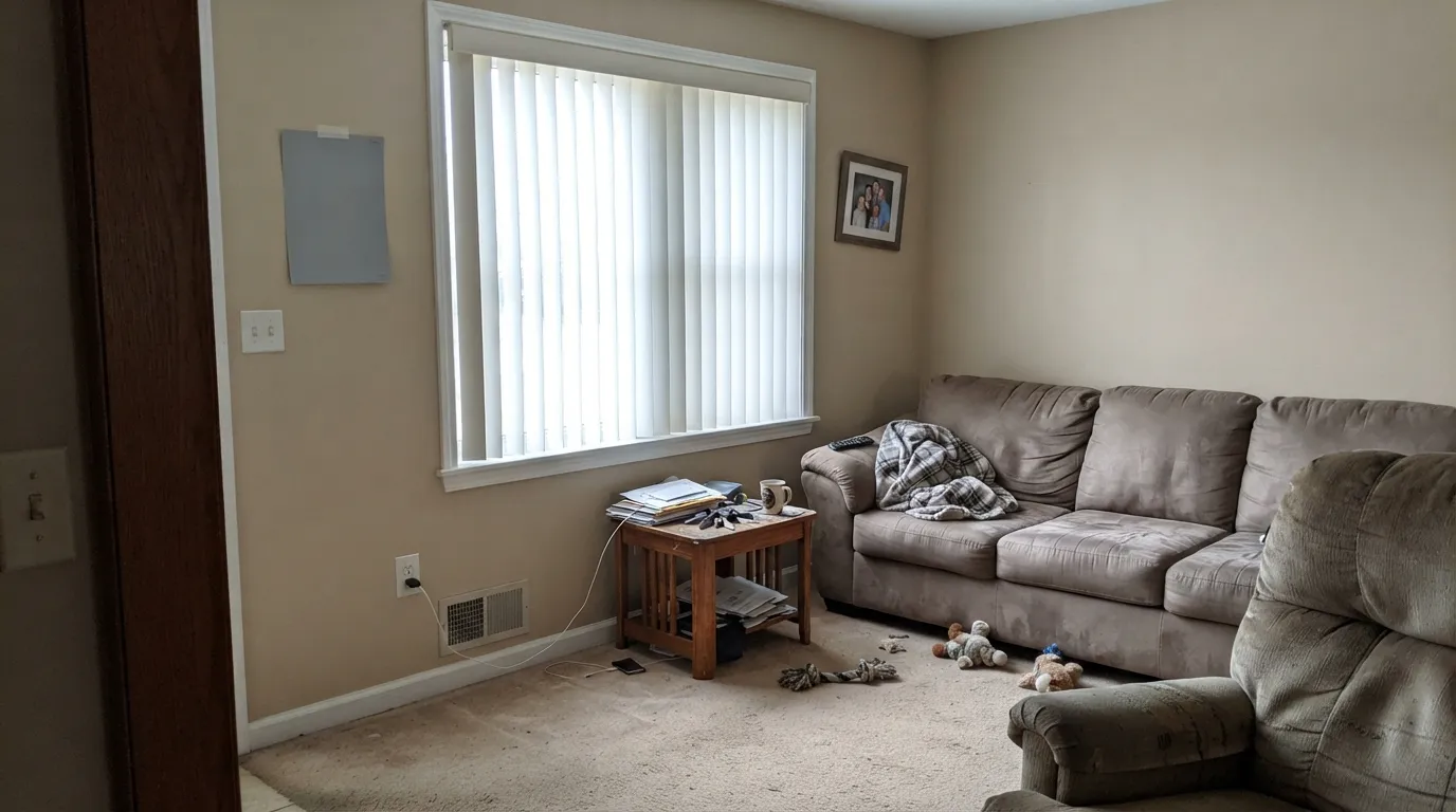
South or west windows keep the greige honest and the tan in check, so oak floors, a linen sofa, and art look chosen instead of leftover. Eggshell on the walls; White Dove (PM-19) trim in semi-gloss. A closed north living room with one lamp is the drab version of this paint — test a big board on the darkest wall before you commit.
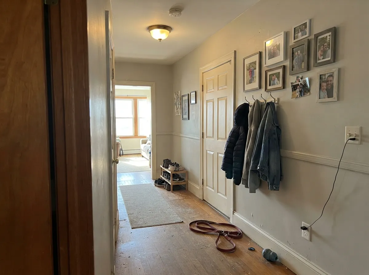
This is the use independent dealers actually mix it for. A windowed hall carries Light Grey from room to room without a temperature fight, and at LRV 58 it still reads as a color next to White Dove doors. Same color on the ceiling in flat sheen keeps the plane quiet. A windowless interior hall needs lamps; without them it goes muddy.
Soft and restful in mixed daylight, and under 2700K bulbs at night the tan comes forward just enough to feel finished. Matte or eggshell. A south-facing bedroom is easy. A north-facing one with the blinds down is the drab-gray version — keep the lamps on, or this is not your gray.
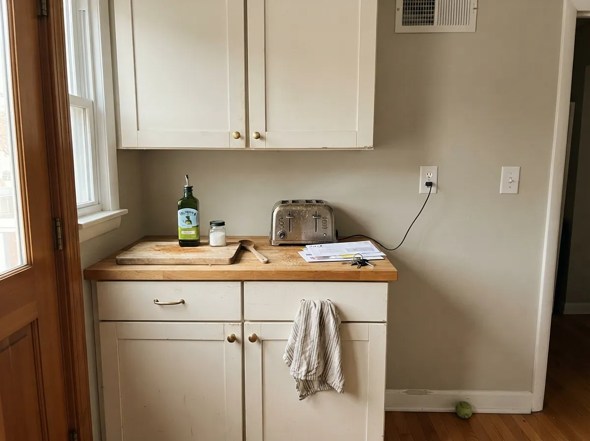
On the walls behind White Dove or Alabaster cabinets it is a warm, quiet field that loves oak, brass, and a navy or Iron Ore island. Satin Light Grey on the cabinets themselves is a bigger, more dated bet — greige doors at LRV 58 read like 2014. Keep the greige on the wall. Cool gray quartz is the pairing to refuse.
Enough color to make a desk or a dinner table look intentional, quiet enough to sit with all day. Pair with white oak and one dark note — Hale Navy (HC-154) on a door or Kendall Charcoal (HC-166) on a hutch. An interior dining room with no daylight will go flat after dark; plan 2700K lamps first.
Warm tile, wood vanities, and brass: easy. Cool gray marble or blue-gray subway tile pushes it beige and slightly dirty — that bath wants a true gray, not this one. Eggshell on walls; satin on a vanity only if the counters are warm.
Your Light Is the Risk
Warm sun keeps it a true soft gray-greige: the tan stays a whisper, the wall looks finished. This is the light the color was mixed for.
Cool gray daylight strips the yellow and leaves a drab, slightly muddy gray. Fine if you half-wanted gray; disappointing if you wanted a light, clean wall.
Cooler and grayer in the off-sun hours, sandier when the sun is in the room. Golden hour pulls the tan forward for an hour. Sample at 8am and 4pm on the same wall.
2700K lamps: greige and a little tan, which most people want at night. 4000K LEDs: flatter gray that can look slightly dirty. Swap bulbs before you repaint.
Most complaints about Light Grey are a light mismatch. Upload a photo of your actual room and see it on your walls — then ask for the same wall in north light or evening lamps before you buy a single sample.
Need It From Another Brand?
Any paint counter can custom-tint Pratt & Lambert 32-12 directly. If you would rather stay in one brand's own deck, these are the closest stock matches, measured as ΔE2000. Under 2 is a difference you will not see on the wall.
| Brand | Closest color | ΔE | LRV | |
|---|---|---|---|---|
| Sherwin-Williams | AlpacaSW 7022 · Sherwin-Williams | 3.4 | 57 | Color page → |
| Behr | Vintage PewterDC-009 · Behr | 2.4 | 56 | Color page → |
| Benjamin Moore | Seattle Mist1535 · Benjamin Moore | 1.1 | 55 | Color page → |
| Valspar | Zen PebbleV145-2 · Valspar | 0.9 | 55.1 | Color page → |
| PPG / Glidden | Silent StormPPG1033-3 · PPG / Glidden | 2.8 | 55 | Color page → |
| Glidden | Grey Nuance90YY 55/049 · Glidden | 1.2 | 55 | Color page → |
Contrast and Legibility
WCAG 2.1: AA is 4.5 : 1 for normal text, 3 : 1 for large text, AAA is 7 : 1.
Light Grey vs the Colors You're Also Considering
Every Light Grey sample board has the same rivals on it. The numbers show the real lightness gap — then it comes down to which risk you would rather live with.
Pick this when you want that same LRV 58 wall without the violet streak, and your painter already mixes Pratt & Lambert.
Sherwin-Williams SW 7015 · LRV 58Repose GrayPick this if you want the cooler, more gray-forward version of the same depth — knowing it can flash lavender in north light.
Pick this when you want it a step grayer and a hair deeper, and you do not need the Sherwin-Williams name.
Sherwin-Williams SW 7029 · LRV 60Agreeable GrayPick this if you want the famous whole-house greige a resale buyer already knows — a touch lighter and warmer.
Tundra (32-6, LRV 56) is the closest Pratt & Lambert neighbor. It sits at nearly the same lightness but leans a hair more toward a tan-green greige, so it feels a touch earthier. Choose Tundra when you want more visible warmth; choose Light Grey when you want the color to stay reading as gray.
Statuary (32-14, LRV 65) is the same warm-neutral idea taken lighter. With about seven more points of LRV it bounces more light and reads closer to an off-white on the wall. Use Statuary when a room is dim or you want an airier feel, and Light Grey when you want a bit more presence and depth.
Among well-known matches, Sherwin-Williams Alpaca (SW 7022, LRV 57) is very close in both lightness and warm greige character, so it is a useful reference point if you are cross-shopping brands.
Light Grey Coordinating Colors
The rule for coordinating with Light Grey is simple: stay on the warm side of the fence, and let a soft white do the trim. It flatters warm woods, cream, muted sage, and a single dark navy or charcoal — and it argues with icy blues, cool greys, and blue-gray stone. These are the partners that keep showing up in rooms that work:
A Spec-Sheet Gray, Not A Famous One
Light Grey 32-12 is the light gray people look up most often in Pratt & Lambert spec sheets, which is a search fact, not a designer-blog fame story. Pratt & Lambert is a dealer brand — Accolade on the can, mixed at independent stores, specified by painters who have been buying it for decades. This color earns its volume the unglamorous way: it is on the list, it is light, it is gray enough to satisfy a spec, and it does not fight oak.
That is also the limit. It is not a Color of the Year. It is not the greige a listing agent will name-drop. If you need the reassurance of Agreeable Gray or Repose Gray because the next buyer will recognize the chip, buy those. If your painter is already at the Pratt & Lambert counter and you want a quiet LRV 58 wall, 32-12 is the honest workhorse in that deck — just walk in knowing the name is cooler than the paint.
Light Grey With Wood Tones And Floors
Warm wood loves it, which is the whole reason this color survives in spec sheets. Oak — red, white, honey — walnut, butcher block, and cedar all sit comfortably against Light Grey because the yellow-tan in the wall meets theirs halfway. Honey oak, the floor that makes cool grays look dingy, is one of the few gray-family walls that does not immediately lose: the warmth on both sides agrees, even if neither is fashionable.
The flooring that needs a sample first is cool gray LVP, gray-washed oak, and blue-gray tile. Those pull the tan into the open, and the wall can read beige and slightly dirty against them. It is not always a dealbreaker — a large warm rug and brass hardware fix it in most rooms — but tape a big sample above the actual floor before you paint the whole run.
Metals are the easy part: unlacquered brass, antique bronze, and brushed nickel all work. Polished chrome is the one that leans cold against it and makes the greige look a little tired.
Three Ready Palettes Built on Light Grey
A color is never alone on the wall. These are complete combinations in the 60-30-10 pattern, with the reason each one holds together. Every one opens in the visualizer.
White Dove is the soft warm white that lets Light Grey read as a color instead of leftover beige; a brighter gallery white would make the walls look dirty. Hale Navy is the single dark note an open main floor needs, and it still wants a room with light — put it on the door, not four dim walls.
Try this palette in your roomAlabaster on the doors is the cabinet white that loves oak and brass; Light Grey on the walls stays a step grayer so the kitchen does not go beige-on-beige. Iron Ore on the island is the near-black that grounds the room — respect LRV 6 and keep it on the island, not the whole kitchen.
Try this palette in your roomSwiss Coffee keeps the edges creamier than White Dove, which is the right move in a bedroom that should feel finished at night — just know it can go too warm in strong sun, so sample the trim wall in the afternoon. Evergreen Fog is one muted sage note that reads restful against the greige, not decorated.
Try this palette in your roomLight Grey FAQ
Is Light Grey warm or cool?
Warm — quietly. The name and the spec-sheet searches imply a cool gray, but the chip is a yellow-tan greige at very low saturation. In north light or under cool LEDs it can pass for gray; in south sun or under 2700K lamps the tan is obvious. If cool is what you actually want, this is the wrong color.
What trim white goes with Light Grey?
A soft warm white — White Dove is the default, Swiss Coffee if you want the edges creamier. A stark bright white in Chantilly Lace territory (OC-65, LRV 90) makes the walls look beige and slightly dirty next to the crisp edge. Semi-gloss on the trim, eggshell on the walls.
Does Light Grey work on kitchen cabinets?
It can, in satin, but it is the dated move. Greige cabinets at LRV 58 read like a 2010s kitchen. Keep Light Grey on the walls and put Alabaster or White Dove on the doors, with one dark island if you need contrast. Cool gray quartz argues with it either way.
How is it different from Repose Gray?
Same depth — both LRV 58 — different temperature. Repose Gray is the cooler, more gray-forward greige, and its real weakness is a lavender flash in north light. Light Grey sits on the yellow-tan side and will not go violet; it will go beige. Pick Repose for the modern gray look, Light Grey when your oak wants warmth and your painter is already mixing Pratt & Lambert.
Will it look beige in a south-facing room?
It will look warmer, yes — sandier, a little tan, still a greige rather than a butter wall. That is the honest south-light read, not a defect. If even a whisper of beige is a dealbreaker, sample Light French Gray instead and accept that it is a cooler, truer gray.
Is it a whole-house color?
In a house with decent daylight, yes — living room into hall into bedroom is the job it was mixed for. Skip the dim north rooms, the basement, and any bath with cool gray stone. It is a whole-daylight-floor color, not a paint-every-wall-including-the-cave color.
Have you painted with Light Grey?
Rate it — one tap helps the next reader decide.
Ask a Question