Vintage Pewter
The Home Depot greige built to stand in for Benjamin Moore's most famous one, reviewed honestly: where it earns that comparison, where it goes flat, and what to pick instead.

Jessica has spec'd whites and neutrals for more than 300 rooms and keeps a sample wall of painted drawdowns in her studio. Every color review is checked against real reader rooms in the comments and re-tested when a formula changes. About the testing process →
- 1Dorian Gray39
- 2Mindful Gray48
- 3Vintage Pewter56
- 4Pale Oak69
- 5Shoji White74
The Fast Verdict
Vintage Pewter is Behr's version of the safe warm greige every paint deck seems to need — and it is close enough to Benjamin Moore's Revere Pewter, hex for hex and LRV for LRV, that the comparison is the whole story. It is one of 30 colors in Behr's Designer Collection, a "tried and true" capsule its own color team curated to be nearly foolproof. On the wall that shows: a warm tan-grey with a soft brown base, calm in real daylight, dependable with wood and brass, and quietly available in nearly every Behr product line from cheap sample pots to the exterior-grade Marquee line.
Living rooms and bedrooms with real daylight · kitchens with warm wood, brass, and butcher block · exterior siding under white trim · anyone who wants the Revere Pewter look from a Home Depot can
Your room is north-facing and dim · you actually want a true cool gray, not a greige · your trim stays a stark bright white with no warm framing · your counters or tile are cool blue-gray
- A close, budget-friendly stand-in for Benjamin Moore's Revere Pewter
- Warm, brown-based greige — resists the cold purple-blue flash common in cooler grays
- Stocked across nearly every Behr product line, interior and exterior
- Flatters oak, walnut, and brass without fighting them
- Part of a curated 30-color capsule, so it is a genuinely vetted, low-risk pick
- Goes flat and "mushroom" in dim, north-facing rooms
- Reads dingy next to a stark bright-white trim
- Tan enough in strong sun to disappoint anyone expecting a true cool gray
- Less name recognition than its BM twin, so fewer real-room photos to sample from
What Color Is Vintage Pewter, Really?
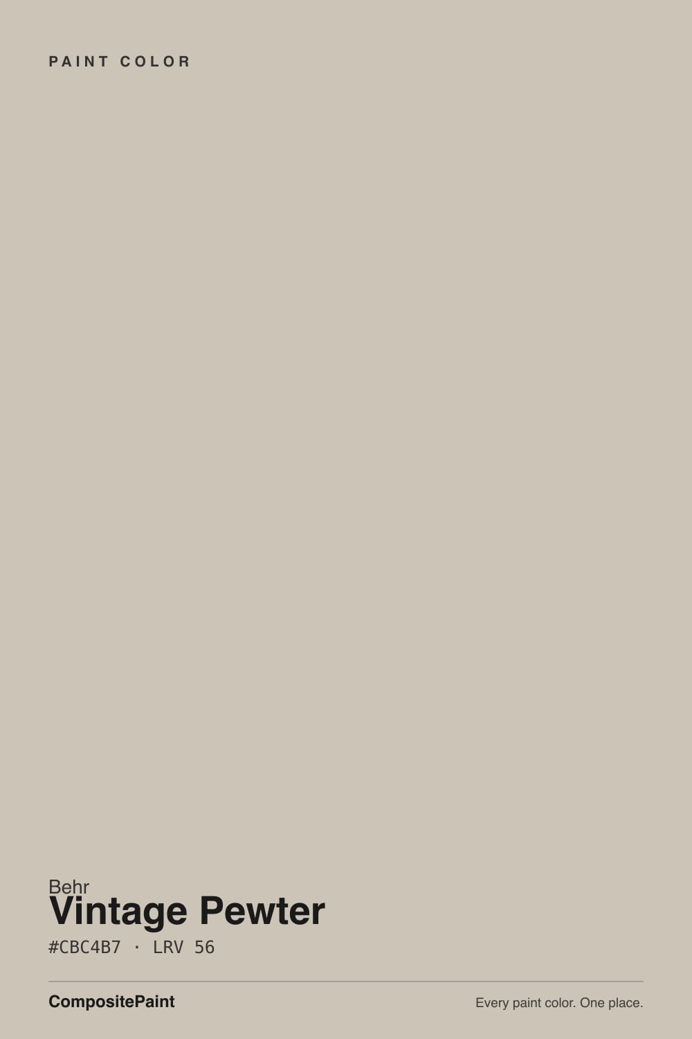
A warm greige built on a brown-tan base rather than a blue-gray one. In RGB terms it sits at 203, 196, 183 — red the highest channel, blue the lowest, by a wide enough margin that the warmth is unmistakable once it is on a wall. Behr's own materials describe it as resisting "the cold, purple-blue shifts common in cooler grays," which lines up with the numbers: this is a color that reads sandy and grounded, not icy.
It belongs to the Behr Designer Collection, a capsule of 30 colors Behr's design team picked and marketed as fool-proof, tried-and-true choices — the same collection that holds Even Better Beige (DC-010), reviewed elsewhere on this site. That curation matters more than any single feature of the paint: Vintage Pewter was not built to chase a trend or win a Color of the Year headline. It was built to be the safe answer when a homeowner says "just a nice warm gray, nothing weird."
At LRV 56 it sits mid-depth — dark enough to read as a real color instead of an off-white, light enough to keep a room from feeling closed in. That is the exact same LRV Benjamin Moore lists for Revere Pewter, and the hex codes (Behr's #CBC4B7 against BM's #CCC2B1) are close enough that multiple independent color-matching sites list them as direct equivalents. If you have seen Revere Pewter in a magazine and wanted it without a Benjamin Moore store nearby, this is the can to reach for at Home Depot.
Where It Shines
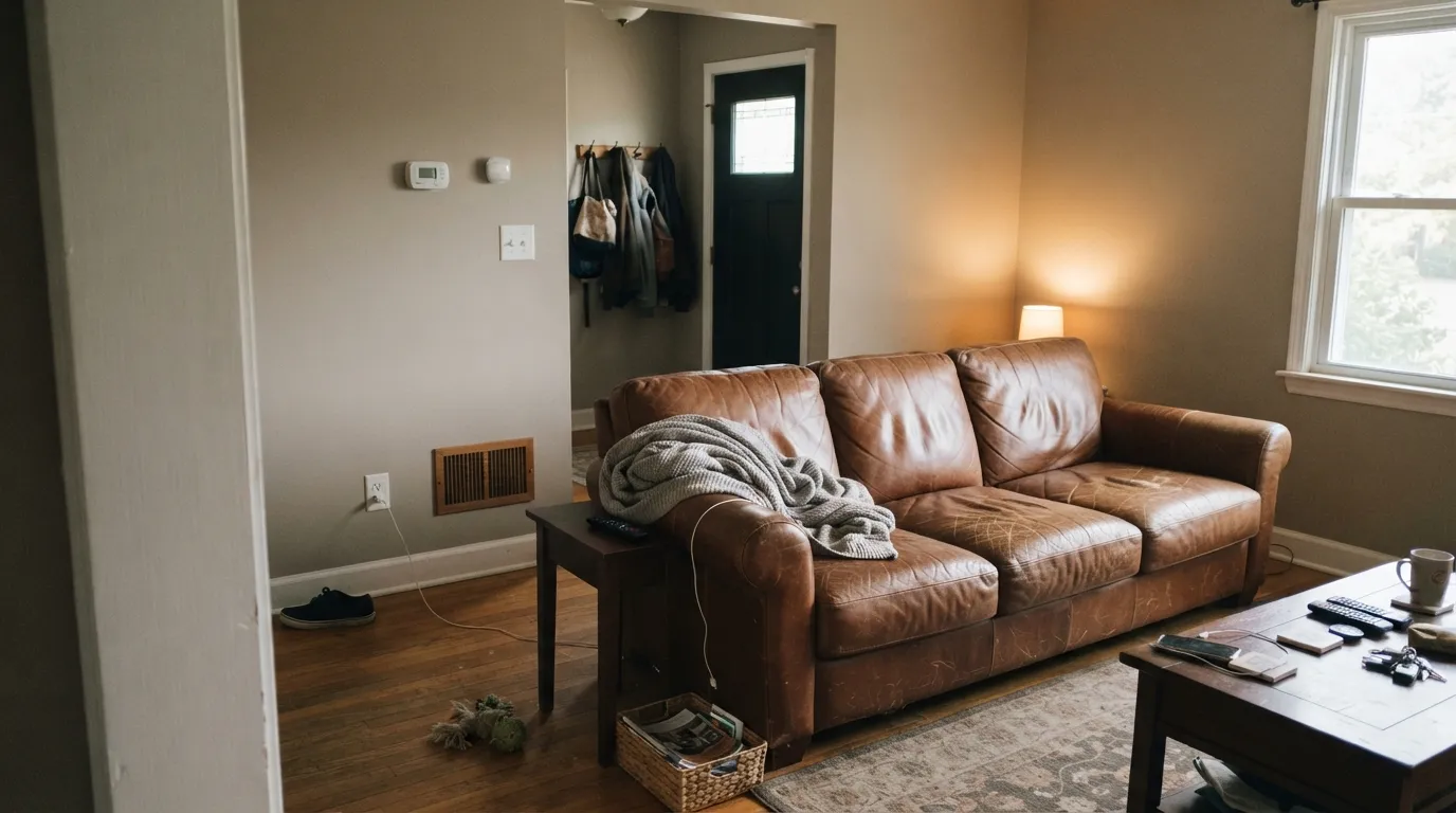
Give it a room with real daylight and warm materials and it does exactly what a designer-curated greige is supposed to do: recede into the background while making everything around it look more expensive. It carries whole-house schemes without picking fights, flatters oak and walnut instead of fighting them, and because it is stocked across Behr's full range — Premium Plus, Dynasty, Ultra, Marquee for exterior, even the Pro line — it is one of the easier warm greiges to actually buy in the sheen and formula a specific room needs.
Where It Fails
The complaints that follow this color trace back to three predictable mismatches, and none of them are a defect in the paint. If your room or your expectations match one of these, this is not your color — no extra coat fixes it.
Behr's own lighting notes say it plainly: in north light, Vintage Pewter "deepens into a flat, shadowy mushroom tone rather than flashing cool." That is the honest version of what a dim room does to every warm greige — the color does not brighten or cool off, it just goes muddy. Add warm lamps or pick a lighter color for a dark room.
The most common greige mistake: Vintage Pewter walls next to builder-grade bright-white trim. The trim wins the contrast and the wall reads dingy by comparison. Trim it in a soft warm white — Behr Blank Canvas or Behr Ultra Pure White — or lean into the greige-on-greige look with a slightly deeper trim instead.
This is a warm color with a brown base, not a neutral gray with cool undertones. Buyers who sample it expecting Sherwin-Williams Repose Gray or Agreeable Gray's cooler cousins are often surprised how tan it reads in strong afternoon sun. If gray is the actual goal, look at Sherwin-Williams Light French Gray instead.
Room by Room
In a room with real windows it is a calm, expensive-looking backdrop for wood furniture, leather, and brass fixtures. Eggshell finish; keep the trim warm, not stark white.
A safe warm-neutral bedroom color that will not date itself the way a trend color would. Pairs well with cream or white bedding; add a warm lamp for evenings, since the greige goes quiet under cool LEDs.
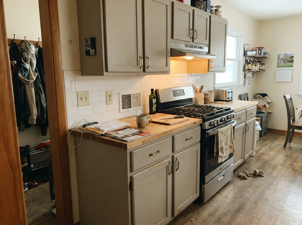
On cabinets it does the same job Revere Pewter does for Benjamin Moore shoppers: warms up a kitchen without committing to a loud color. Satin enamel wipes clean and hides fingerprints around handles better than a bright white would.
With warm-veined stone and brass fixtures it stays calm and pulled-together. Against cool gray-blue marble or chrome fixtures, the warmth in the paint starts to look slightly off; sample first.
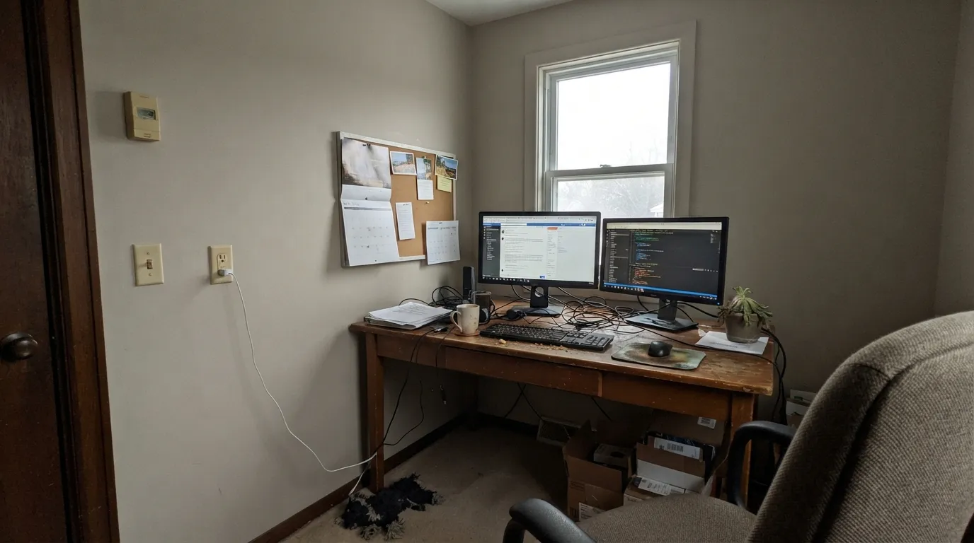
Good backdrop for bookshelves and dark wood furniture, especially with a desk lamp running most of the day. In a north-facing office with only overhead LEDs, it will read flatter and grayer than the chip promised.
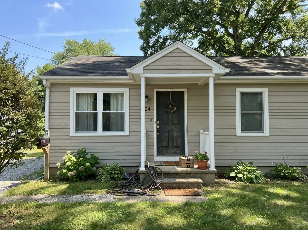
Available in Behr's Marquee exterior formula, it holds its warmth in full sun and pairs cleanly with white trim and black or charcoal shutters. Full details and pairings are in the exterior section below.
Your Light Is the Risk
Side or south light lets the brown base show through cleanly — grounded and warm without tipping tan or dingy.
Behr's own notes call it out: north exposure pushes it into a flat, shadowy "mushroom" tone. Test before committing a dim room.
Warmer and more visibly tan at the sun hours, quieter and more neutral once the direct light passes.
2700K lamps bring out the warm brown base and make it feel cozy. Cool white LEDs flatten it toward a dull, mushroom gray — swap the bulb before you consider repainting.
Most complaints about Vintage Pewter are a light mismatch. Upload a photo of your actual room and see it on your walls — then ask for the same wall in north light or evening lamps before you buy a single sample.
Need It From Another Brand?
Any paint counter can custom-tint Behr DC-009 directly. If you would rather stay in one brand's own deck, these are the closest stock matches, measured as ΔE2000. Under 2 is a difference you will not see on the wall.
| Brand | Closest color | ΔE | LRV | |
|---|---|---|---|---|
| Sherwin-Williams | Slumber SlothSW 9606 · Sherwin-Williams | 1.1 | 56 | Color page → |
| Benjamin Moore | Seattle Mist1535 · Benjamin Moore | 1.5 | 55 | Color page → |
| Valspar | Swiss LiveryM204 · Valspar | 2.2 | 55.4 | Color page → |
| PPG / Glidden | SynchronicityPPG1021-2 · PPG / Glidden | 1.1 | 56 | Color page → |
| Glidden | SynchronicityPPG1021-2 · Glidden | 1.5 | 57 | Color page → |
| Dutch Boy | Centuryed Gray442-2DB · Dutch Boy | 2.4 | 57 | Color page → |
Similar Behr Colors
The nearest shades to Vintage Pewter within Behr's own range, ranked by perceptual color distance — useful when you want the same look a touch lighter, darker, or warmer.
WCAG 2.1: AA is 4.5 : 1 for normal text, 3 : 1 for large text, AAA is 7 : 1.
Vintage Pewter vs the Colors You're Also Considering
Every Vintage Pewter sample board has the same rivals on it. The numbers show the real lightness gap — then it comes down to which risk you would rather live with.
Pick this if you are already shopping Behr or Home Depot and want the same look without a special trip.
Benjamin Moore HC-172 · LRV 56Revere PewterPick this if you want the original in Benjamin Moore's own can — nearly the same hex, the same LRV, and the same real-world reputation as a dependable warm greige.
Pick this if you specifically want the Behr can and the Behr Designer Collection's curated confidence behind the pick.
Sherwin-Williams SW 7043 · LRV 57Worldly GrayPick this for a slightly warmer, softer Sherwin-Williams take on the same greige family.
C2 Paint Shaker C2-817 is #CAC5B9 at LRV 56, with a deltaE of 0.98 against Vintage Pewter. That is effectively the same color. Sherwin-Williams Slumber Sloth SW 9606 and PPG Synchronicity PPG1021-2 are both #CEC5B6 at LRV 56 with a deltaE of 1.1, and Benjamin Moore Seattle Mist 1535 is #C9C5B8 at LRV 55 at 1.54. All three are visually identical in normal room light.
Valspar Swiss Livery M204 at LRV 55.4 sits at 2.22 and Farrow and Ball Shadow Gray No. 9904 at #CCC9BC and LRV 58 at 2.29. Both are very close but worth sampling first, and Shadow Gray in particular reads a touch lighter and greener.
The clearest departure is Annie Sloan Paris Grey at #BEC0B3 and LRV 52, with a deltaE of 4.76. It is close but visibly different side by side, noticeably darker and cooler, with the green-gray character the name Vintage Pewter suggests but this color does not actually have.
Vintage Pewter Coordinating Colors
The pairing rule is the same one that governs every warm greige: stay warm, avoid stark. Vintage Pewter flatters soft whites, warm woods, and near-black accents, and it starts to look tired next to icy bright whites or cool blue-gray materials. These are the partners that keep showing up in rooms and exteriors that work:
Why a Home Depot Greige Copies a Benjamin Moore One
Vintage Pewter is one of 30 colors in the Behr Designer Collection, a capsule Behr's own design team assembled and marketed as "tried and true" — colors chosen specifically to be low-risk, not trend-chasing. Even Better Beige, reviewed elsewhere on this site, is its sibling in the same collection. Neither color was built to win a Color of the Year headline; both were built to be the safe answer when someone wants a warm neutral and does not want to gamble.
That is also why the Revere Pewter comparison is worth taking seriously rather than dismissing as marketing. Warm mid-tone greiges near LRV 56 have become a genuine category — Benjamin Moore has one, Sherwin-Williams has several (Worldly Gray, Anew Gray), and Behr's Designer Collection needed its own. Vintage Pewter is that entry: a color built to do the same job as the most famous greige in the category, at Home Depot prices and in Home Depot's product lines.
Vintage Pewter With Wood Tones and Floors
Warm wood is this color's best company. Oak, walnut, and butcher block all sit comfortably against it because the paint's own brown base meets the wood halfway — there is no fighting undertone the way a true cool gray would have with orange-leaning oak.
Cool gray or gray-washed LVP flooring is the one pairing that needs a sample first. Against a cool floor, Vintage Pewter's warmth becomes more obvious by contrast, and some rooms will read slightly tan where the floor reads cold. It is rarely a dealbreaker — a warm rug and brass fixtures usually settle the argument — but test a large sample above the actual floor before committing a whole room.
Three Ready Palettes Built on Vintage Pewter
A color is never alone on the wall. These are complete combinations in the 60-30-10 pattern, with the reason each one holds together. Every one opens in the visualizer.
A warm greige and a crisp white trim is the classic modern-farmhouse handoff; the near-black door supplies the single dark note the scheme needs, and all three come from the same Behr deck.
Try this palette in your roomBlank Canvas keeps the room bright while the cabinets carry the color; a near-black island or hardware grounds the warmth instead of letting it drift toward beige. Brass pulls finish the look.
Try this palette in your roomFull sun keeps the greige warm rather than washing it cold; white trim and near-black shutters give the classic farmhouse contrast without needing a second brand's siding color.
Try this palette in your roomVintage Pewter FAQ
Is Vintage Pewter warm or cool?
Warm. It is built on a brown-tan base, not a blue-gray one, which is exactly what keeps it from flashing cold the way many "greige" colors do. In a dim north room it goes flat and muddy rather than blue — still warm in tone, just less bright.
Is Vintage Pewter basically the same as Benjamin Moore's Revere Pewter?
Close enough that they are commonly listed as equivalents: both sit at LRV 56 with nearly identical hex values, and both read as a dependable warm greige. They are not a guaranteed formula match — always confirm with a physical sample if you are matching an existing Revere Pewter room — but as a starting point, Vintage Pewter is Behr's answer to the same look.
Does it work on kitchen cabinets?
Yes — it is one of its stronger uses. Satin enamel on cabinets flatters brass hardware and butcher block, and the LRV 56 depth hides scuffs better than a white would. Keep the surrounding walls a warm white, not a stark bright one.
What trim color goes with Vintage Pewter walls?
A soft warm white — Behr Blank Canvas or Behr Ultra Pure White both work. A stark bright white makes the greige look dingy by comparison, the most common complaint about this color.
Does it work on exteriors?
Yes — it is available in Behr's Marquee exterior line specifically for this. Full sun keeps the warmth intact, and it pairs cleanly with white trim and black or charcoal shutters for a modern-farmhouse look.
Will it look good in a north-facing room?
Only with help. Behr's own lighting guidance says north exposure turns it into a flat, shadowy "mushroom" tone. Warm 2700K lamps largely fix this at night; in daytime, a north room may just show less of this color's warmth than the sample promised.
Have you painted with Vintage Pewter?
Rate it — one tap helps the next reader decide.
Ask a Question