Sculptor Clay
Behr's mid-tone warm neutral, reviewed honestly: the light where it reads khaki, the light where it reads gray, and what to pick instead.

Jessica has spec'd whites and neutrals for more than 300 rooms and keeps a sample wall of painted drawdowns in her studio. Every color review is checked against real reader rooms in the comments and re-tested when a formula changes. About the testing process →
- 1Dorian Gray39
- 2Mindful Gray48
- 3Sculptor Clay55
- 4Agreeable Gray60
- 5Pale Oak69
The Fast Verdict
Sculptor Clay is Behr's answer to the same brief Agreeable Gray and Revere Pewter chase — a warm mid-tone neutral safe enough for a whole house — except it never fully commits to gray or beige. Give it real daylight and it settles into a soft khaki-taupe; take the light away and it drifts toward a quiet warm gray. That swing is the whole story: pick it because you want a color that moves with your rooms, not because you want certainty off the chip.
Open floor plans and hallways carrying one color through shifting light · rooms with warm wood floors or natural materials · farmhouse, industrial, and boho schemes that want an earthy backdrop · anyone comparing every Behr mid-tone greige and wanting the warmer khaki option
You want the paint to read the exact same color in every room · your main light source is cool LED with no warm lamps at night · you've already fallen for one specific look on the chip and won't sample first · you want certainty over character
- A genuine khaki-to-gray swing that keeps whole-house color from feeling flat or one-note
- Sits at the same LRV as Agreeable Gray, so it slots into the same trim-and-whites playbook people already trust
- Real owners report it working across farmhouse, industrial, and boho styles without a fight
- Mid-depth hides everyday scuffs and traffic marks better than a pale greige
- Handles a cool accent color — blue, green-blue — better than most warm khakis, because its own undertone already leans that way in the right light
- The same swing that's a pro for some readers is a con for buyers who want one fixed, predictable color
- Cool LED lighting and dim rooms consistently push it toward flat and grayish
- Almost no design-press or Color-of-the-Year attention — you're sampling on faith, not a wall of inspiration photos
- Easy to confuse with its own close Behr siblings (Wheat Bread, Silver Drop) at the paint counter — bring swatches of all three
What Color Is Sculptor Clay, Really?
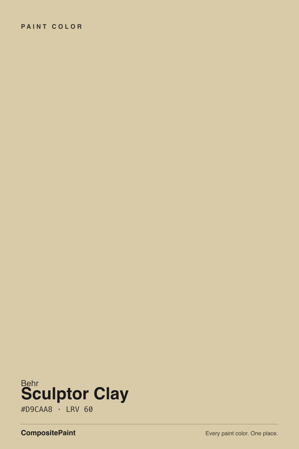
Sculptor Clay is Behr's mid-tone warm neutral in the PPU3 strip — a soft khaki-taupe built on the same warm-neutral logic as Agreeable Gray or Revere Pewter, but with enough yellow-olive pull in the base to earn "clay" in its name instead of "gray." Independent reviewers who've actually lived with it describe it the same way from unrelated rooms: a color that reads gray-brown one week and warm beige the next, depending on what's next to it and which bulb is on. That is not indecisiveness in the formula — undertone shifts like this happen wherever a pigment sits near the gray-tan cusp, and Sculptor Clay sits closer to that cusp than most of its neighbors in the deck.
At LRV 55 it reflects a solid majority of incoming light — put it beside Behr's own Swiss Coffee (LRV 80) and the gap is obvious, Sculptor Clay reading as a genuine color rather than an off-white. That depth is exactly why it hides everyday wear — fingerprints, pet noses, hallway traffic — better than a pale greige, while staying light enough that a room never feels closed in. It sits at almost the identical LRV as Sherwin-Williams Agreeable Gray and Behr's own Wheat Bread and Silver Drop: three colors answering the same brief with three different undertone bets.
Undertone in one line: warm khaki-olive first, grayed by a genuine warm-cool swing second — never truly pink, never truly blue. In warm daylight and incandescent bulbs it leans tan; under cool LEDs and flat north sky it drifts toward a soft green-gray. Both readings are honest; neither is a defect.
Where It Shines
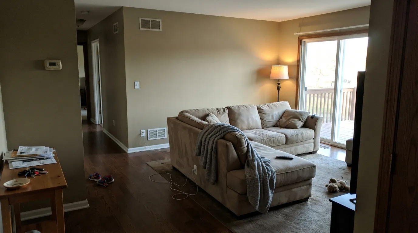
Give it real daylight — south or west exposure, or a room that gets warm bulbs at night — and it earns the "goes with everything" reputation real owners give it online: farmhouse, industrial, boho, all claim it works. Its best rooms are exactly the ones real reviews keep pointing to: open floor plans and hallways, where one wall color has to carry through shifting light without ever reading wrong, and this one does.
Where It Fails
Almost every disappointed story about Sculptor Clay follows one of three scripts, and all three are predictable before the first coat. None of them are the paint's fault — but if your room matches one, this is not your color, and a bigger sample will only confirm it.
This color's whole personality is that it doesn't pick a lane — warm khaki in good light, quiet gray in flat light. Buyers who need certainty on the chip end up unhappy either direction. If you want one predictable read every day, choose a color built further from the gray-tan cusp, like Behr's own Wheat Bread.
Flat artificial light is the one condition where the swing consistently lands on the wrong side: grayish, muted, a little muddy. The fix costs less than repainting — warm 2700K bulbs are part of this paint job, especially at night and under cabinets.
Sculptor Clay, Wheat Bread and Silver Drop all sit at LRV 55 in Behr's own deck, and a lot of buyers grab whichever one is in stock without noticing the differences. Sculptor Clay carries the most khaki-olive pull of the three — if you wanted a plainer beige-greige, you likely wanted Wheat Bread instead.
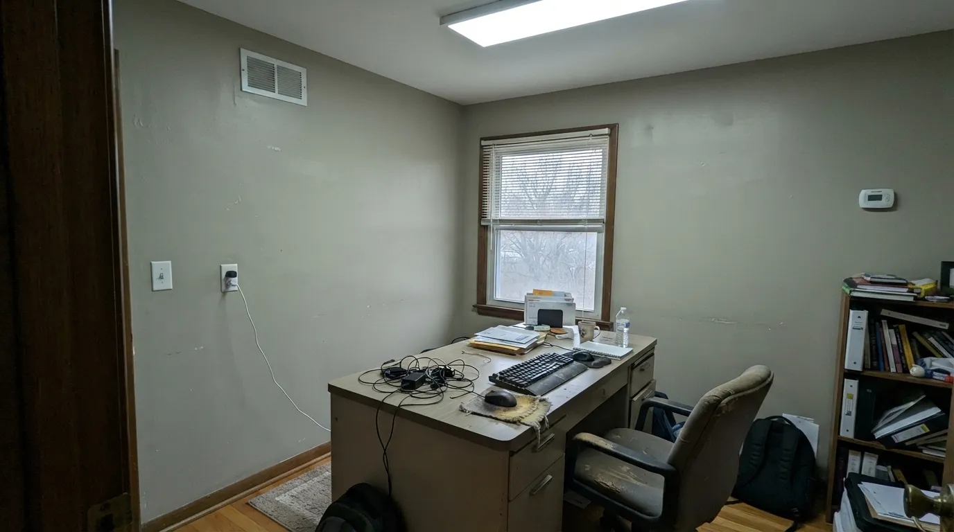
Room by Room
Real owners keep landing here for the same reason: one wall color has to survive a kitchen window, a windowless hallway, and a west-facing sliding door, and the khaki-to-gray swing means it never reads flatly wrong in any of those spots. Eggshell finish; sample it on the wall that gets the least light before committing the whole floor.
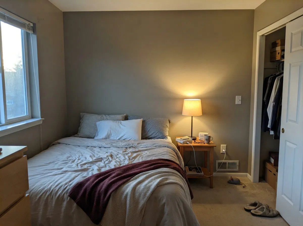
Owners using it in guest and rental bedrooms report it reading calm and comforting rather than moody. Keep the bulbs at 2700K — cool LEDs are the one thing that consistently pushes it toward flat and grayish at night.
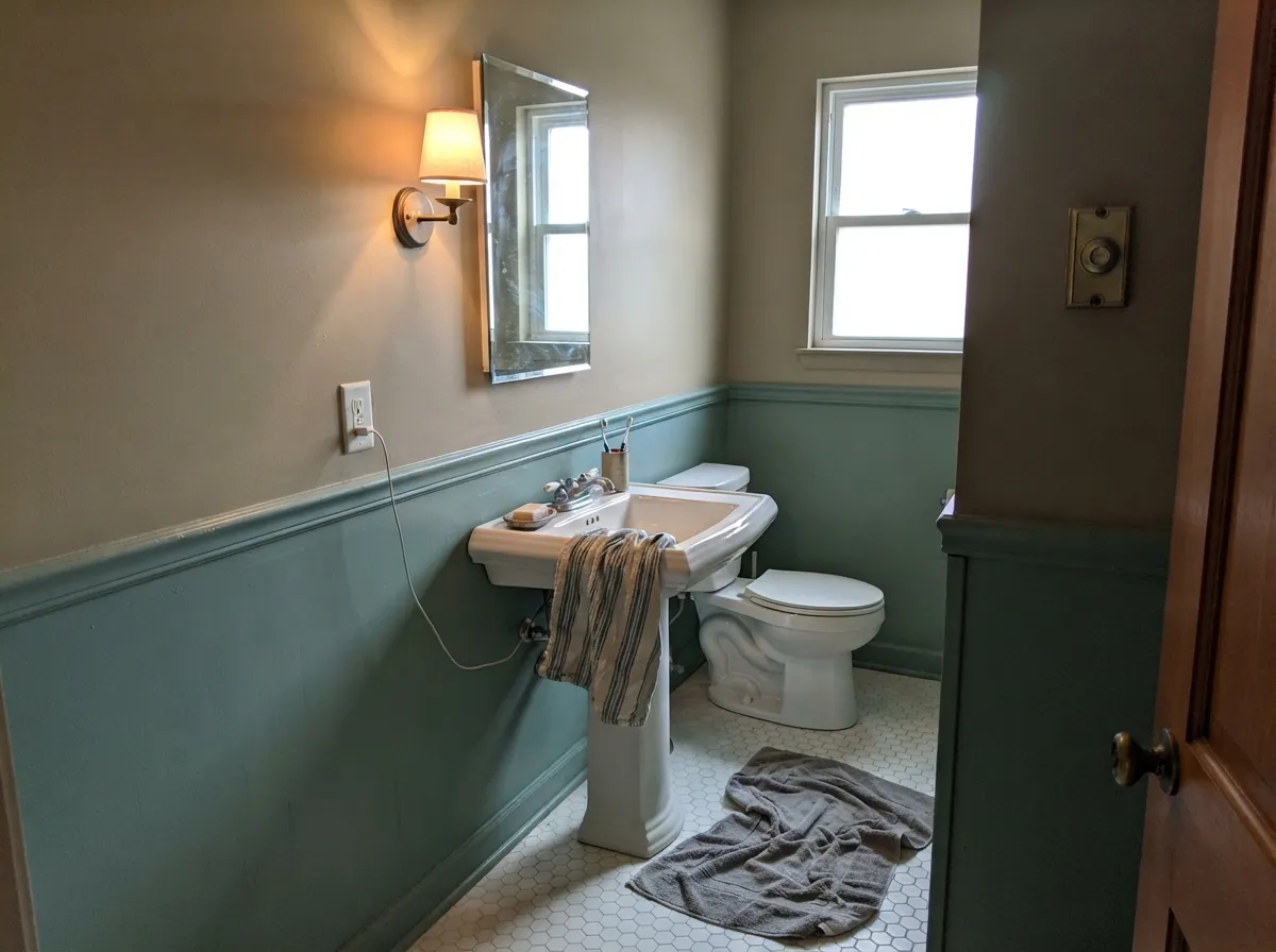
One documented real-world pairing: Sculptor Clay walls against green-blue wainscoting in a guest bath, praised for how well the warm neutral played against the cooler accent. Satin or semi-gloss for moisture; it takes a cool accent better than most warm khakis because its own undertone already swings that direction under the right light.
On an island or a bank of lower cabinets under a lighter perimeter it reads as an intentional warm neutral, not indecision. A full kitchen of Sculptor Clay cabinets is a bigger bet — sample a door front under your actual under-cabinet lighting, since that is usually cool LED and the one place the color goes flattest.
No fixed furniture, no single correct light source, rooms handing off to each other on either side — hallways are the stress test every whole-house neutral has to pass, and real reviews single this color out for exactly that job.
At LRV 55 it's light enough to avoid heavy heat absorption and reads as a grounded, HOA-friendly earth tone rather than a trend color. Pair with a true white trim and a near-black door for contrast; there is no large body of exterior-specific reviews yet, so sample a full poster-size swatch outdoors before committing to siding.
Your Light Is the Risk
Real daylight is what makes the khaki-taupe read forward and settles the swing on the warm side. This is the light to sample it in first.
Flat artificial light is the one condition where it consistently reads grayish and muted. Test a large sample here before committing to a whole room.
Morning and evening sun push it warmer; midday and shade pull it back toward a soft gray-green. Most owners who keep it call this a feature, not a flaw.
2700K lamps keep the tan forward and cozy. Cool white LEDs are the fastest way to make it look wrong — swap the bulb before you blame the paint.
Most complaints about Sculptor Clay are a light mismatch. Upload a photo of your actual room and see it on your walls — then ask for the same wall in north light or evening lamps before you buy a single sample.
Need It From Another Brand?
Any paint counter can custom-tint Behr PPU5-08 directly. If you would rather stay in one brand's own deck, these are the closest stock matches, measured as ΔE2000. Under 2 is a difference you will not see on the wall.
| Brand | Closest color | ΔE | LRV | |
|---|---|---|---|---|
| Sherwin-Williams | Slumber SlothSW 9606 · Sherwin-Williams | 1.0 | 56 | Color page → |
| Benjamin Moore | Smokey Taupe983 · Benjamin Moore | 0.9 | 55 | Color page → |
| Valspar | Mushroom RisottoM243 · Valspar | 1.4 | 55.1 | Color page → |
| PPG / Glidden | Gotta Have ItPPG1076-3 · PPG / Glidden | 1.8 | 55 | Color page → |
| Glidden | WhippetPPG1020-3 · Glidden | 2.2 | 55 | Color page → |
| Dutch Boy | Centuryed Gray442-2DB · Dutch Boy | 2.3 | 57 | Color page → |
Similar Behr Colors
The nearest shades to Sculptor Clay within Behr's own range, ranked by perceptual color distance — useful when you want the same look a touch lighter, darker, or warmer.
WCAG 2.1: AA is 4.5 : 1 for normal text, 3 : 1 for large text, AAA is 7 : 1.
Sculptor Clay vs the Colors You're Also Considering
Every Sculptor Clay sample board has the same rivals on it. The numbers show the real lightness gap — then it comes down to which risk you would rather live with.
Pick this for the extra khaki warmth and the daylight-to-gray movement Wheat Bread doesn't have.
Behr PPU7-19 · LRV 60Wheat BreadPick this if you want the plainer, less olive beige-greige version of the exact same LRV — no chameleon swing to manage.
Pick this for more consistent warmth — Silver Drop leans cooler across more lighting conditions.
Behr PPU18-19 · LRV 60Silver DropPick this if you want the same room-to-room unpredictability tipped further toward gray than tan.
Inside Behr, the neighbors mostly shift the hue by a few degrees. Khaki Shade YL-W11 at LRV 61 has hex #D5CDAF, which pulls slightly green and reads more olive. Crepe PPU7-19 at LRV 60 goes the other way at #E0C9A2, warmer and more golden. New Khaki ECC-54-1 at LRV 59 is the closest to Sculptor Clay itself.
Across brands, Glidden and PPG Baked Bread PPG1100-3 at LRV 60 measures a deltaE of just 0.24, and Benjamin Moore Monroe Bisque HC-26 at LRV 58 measures 0.9, so both are the same color for practical purposes. Farrow and Ball String No. 8 at LRV 60 is deltaE 1.57 and Sherwin-Williams Straw Harvest SW 7698 at LRV 59 is deltaE 1.71, both visually identical in normal room light.
Dunn-Edwards Light Aspiration DE6185 is worth a note: deltaE 0.65 in hue but LRV 56, so it will look a shade deeper on the wall despite the near-identical color.
Sculptor Clay Coordinating Colors
The rule for coordinating with Sculptor Clay is simple: give it a genuinely warm white to sit next to, and it can handle a cooler accent color better than most khaki-taupes — its own undertone already swings that direction under the right light. These are the partners real usage and its own Behr family point to:
The Quiet Chameleon: Why Sculptor Clay Isn't a Famous Color
Search for Sculptor Clay and you won't find a Color-of-the-Year press release or a viral before-and-after — this color has no famous moment. What you will find is a handful of homeowners who actually painted with it: a guest bathroom paired with green-blue wainscoting, rental bedrooms picked because the color "played well" with whatever furniture showed up next. That's a different kind of endorsement than a marketing campaign, and arguably a more honest one.
The swing between warm and gray isn't a flaw in the formula — it's physics. Sculptor Clay's pigment load sits close to the cusp between a yellow-olive tan and a neutral gray, so small changes in the color temperature of the light hitting the wall are enough to tip the read one way or the other. Colors built further from that cusp — a true beige, a true gray — don't do this; colors built on the cusp, like this one, always will. Knowing that going in turns a confusing sample into a predictable one.
Sculptor Clay With Wood Tones and Floors
Warm wood is this color's best friend, and real reviews say so directly — oak, natural-finish trim and butcher block all sit comfortably against the khaki base because the warmth on both sides meets in the middle. It's one of the few neutrals that genuinely works across farmhouse, industrial and boho furniture, which explains why owners keep reaching for it in rental properties that need to read well no matter what furniture shows up.
The one floor worth sampling first is a very orange, high-gloss builder oak — strong warmth from below can push the wall further toward tan than the chip suggests, a pleasant surprise in some rooms and too much in others. Gray-washed or pale white oak gives the safest, most neutral result if you want the color to stay closer to its gray side.
Three Ready Palettes Built on Sculptor Clay
A color is never alone on the wall. These are complete combinations in the 60-30-10 pattern, with the reason each one holds together. Every one opens in the visualizer.
Open-plan rooms and hallways are where Sculptor Clay does its best work, and a genuinely warm trim white keeps the khaki-to-gray swing from feeling uncertain — Swiss Coffee never fights it in either direction. The near-black built-ins give the room one fixed, unmoving anchor.
Try this palette in your roomA crisp warm-white perimeter keeps the kitchen bright while the island carries the color; the slate-blue door echoes the one real pairing owners have already tried — Sculptor Clay against a cool green-blue — and confirms it works.
Try this palette in your roomThe mid-LRV khaki body reads warm and grounded next to a true white trim, and a near-black door supplies the contrast note a farmhouse exterior wants. Mid-depth walls also hide dust and streaking better than a pale beige body would.
Try this palette in your roomSculptor Clay FAQ
Is Sculptor Clay warm or gray?
Both, honestly — and that's the whole personality. In real daylight and under warm bulbs it reads as a soft khaki-tan; under cool LEDs or flat north sky it drifts toward a quiet warm gray. Reviewers who've lived with it describe it as a genuine chameleon, not an inconsistency to worry about.
What's the difference between Sculptor Clay, Wheat Bread, and Silver Drop?
All three sit at LRV 55 in Behr's own deck, which is exactly why they get confused at the counter. Sculptor Clay carries the most khaki-olive pull of the three; Wheat Bread reads as a plainer, more classic beige-greige; Silver Drop leans furthest toward gray. Bring swatches of all three side by side — the differences are real but subtle.
What trim white goes with Sculptor Clay?
A genuinely warm white keeps the pairing calm — Behr Swiss Coffee or Whipped Cream, both warm enough not to fight the khaki. A stark, cool white will make the walls look muddier than they actually are. Semi-gloss on the trim, eggshell on the walls.
Does it work on exteriors?
Cautiously yes. At LRV 55 it's light enough to avoid heavy heat absorption and reads as an earthy, HOA-friendly neutral rather than a trend color, but there isn't yet a large body of real exterior reviews to lean on. Sample a full-size swatch outdoors, in your actual light, before painting siding.
Is it good for a bathroom?
Yes, and there's a real example to point to: one owner painted a guest bathroom in Sculptor Clay against green-blue wainscoting and was happy with how the warm neutral balanced the cooler accent. Use a moisture-tolerant satin or semi-gloss.
Does Sculptor Clay work with oak floors?
Yes — its own warm-khaki base sits close enough to oak's warmth that the two don't fight, and reviewers specifically list rooms with warm wood floors among its best settings. Very orange, high-gloss builder oak is the one case worth sampling first, since a strongly warm floor can push the paint further toward tan than the chip suggests.
Have you painted with Sculptor Clay?
Rate it — one tap helps the next reader decide.
Ask a Question