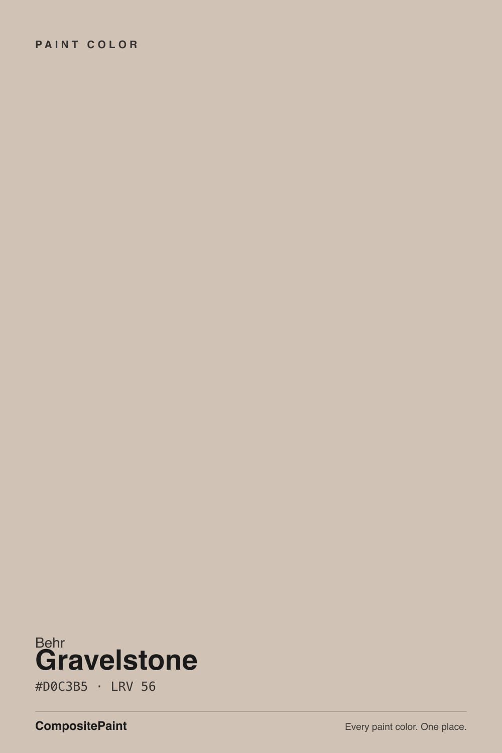
Gravelstone
Behr's light warm greige, reviewed honestly: the rooms where sand and gray stay balanced, the north light that leaves it drab, and why the name oversells the stone.

Jessica has spec'd whites and neutrals for more than 300 rooms and keeps a sample wall of painted drawdowns in her studio. Every color review is checked against real reader rooms in the comments and re-tested when a formula changes. About the testing process →
- 1Dorian Gray39
- 2Mindful Gray48
- 3Gravelstone56
- 4Pale Oak69
- 5Shoji White74
The Fast Verdict
Gravelstone is the greige you pick when you want Accessible Beige and you are already at Home Depot. Light, warm, sandy — beige enough to feel finished, gray enough not to look like builder beige. At LRV 56 it runs a whole floor without going dark. The trap is in the name and the light: it is not gray stone, and a north room will prove it.
Whole-house walls in decent daylight · open living rooms and bedrooms · halls that connect warm rooms · Home Depot shoppers who wanted Accessible Beige
Your room faces north and stays dim · your floors are cool gray LVP · your trim is staying a creamy white like Alabaster · you actually want gray
- Light whole-house greige at LRV 56 — sand and gray in one gallon
- Near-twin of Accessible Beige, from the Home Depot aisle
- Hides scuffs better than an off-white without going mid-tone-dark
- South light and 2700K lamps pull a sandy warmth that never goes cream
- Flatters oak, walnut, brass, and linen without a second personality
- Not gray — the name oversells stone; afternoon sun shows yellow-sand
- Cool north light strips the warmth and leaves it drab gray-beige
- Creamy whites (Alabaster, Swiss Coffee) push the walls gray by comparison
- Cool gray LVP and 4000K LEDs make it look dirty instead of finished
What Color Is Gravelstone, Really?
A light warm greige sitting right between beige and gray — taupe on Behr's chip, sandy stone on a daylit wall. The name does too much work. Gravelstone sounds like a cool gray rock; the paint is a muted beige-gray with a soft yellow-sand cast, low chroma, and just enough gray to keep it from reading cream. Behr files MQ2-50 in its white family and sells it in the Marquee one-coat line, which tells you how they see it: a light whole-house neutral, not a mid-tone, not a gray. It is not a Color of the Year and it is not a viral Pinterest color. It is the gallon Home Depot shoppers keep pulling because it looks like Accessible Beige and they are already in the aisle.
At LRV 56 it sits in the sweet spot the greige decade trained everyone to want. That is the same depth as Revere Pewter, two points under Accessible Beige (LRV 58), four under Agreeable Gray (LRV 60). On four walls the chip's polite taupe becomes a real light-mid: enough color to hide scuffs better than an off-white, enough bounce to carry a hallway, not so deep that a south room goes cave. Plan for it to read a half-step deeper and sandier than the card — every low-chroma greige does this — but it will not surprise you the way Behr Greige (LRV 46) does.
Undertone in one line: warm sand-beige first, gray second — a quiet yellow, not Revere Pewter's green. In bright daylight it goes pale sand; in cooler light and after dark the gray comes forward and it reads as a weathered stone beige. Sample boards on Reddit keep getting the same note: Gravelstone leans yellow next to a true taupe like Creamy Mushroom. If your sample looks pink, that is a neighboring surface or a warm bulb, not a reliable pink in the can. If it looks gray, your light is cool. Both versions are the same gallon being honest about the room.
Where It Shines
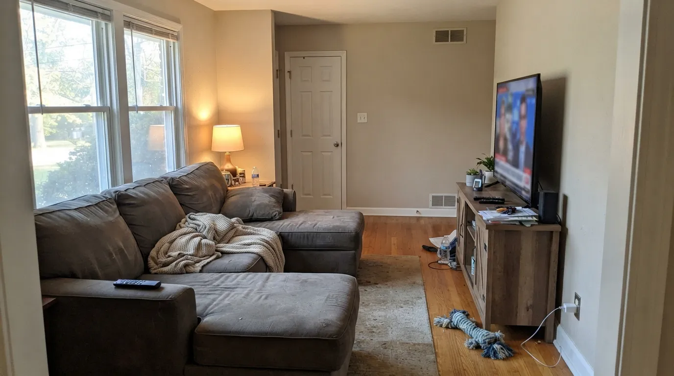
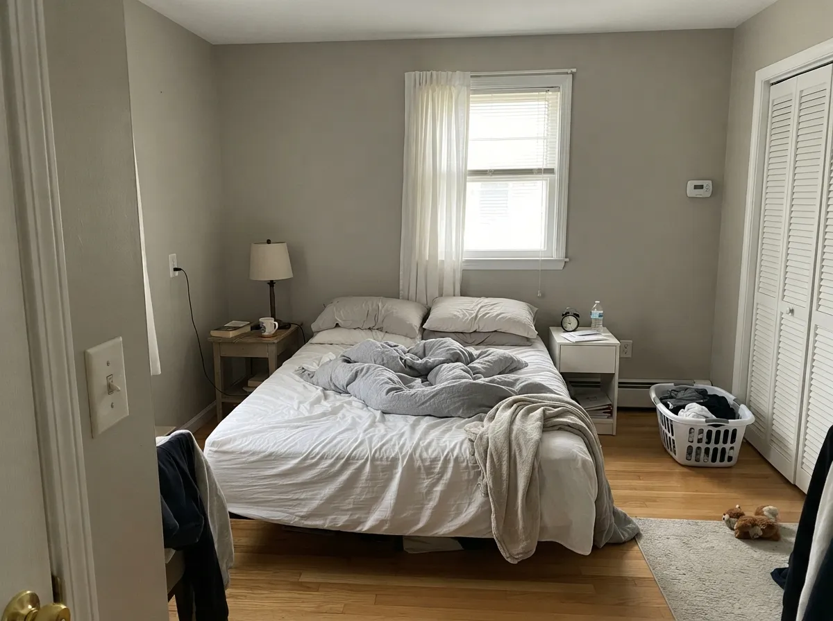
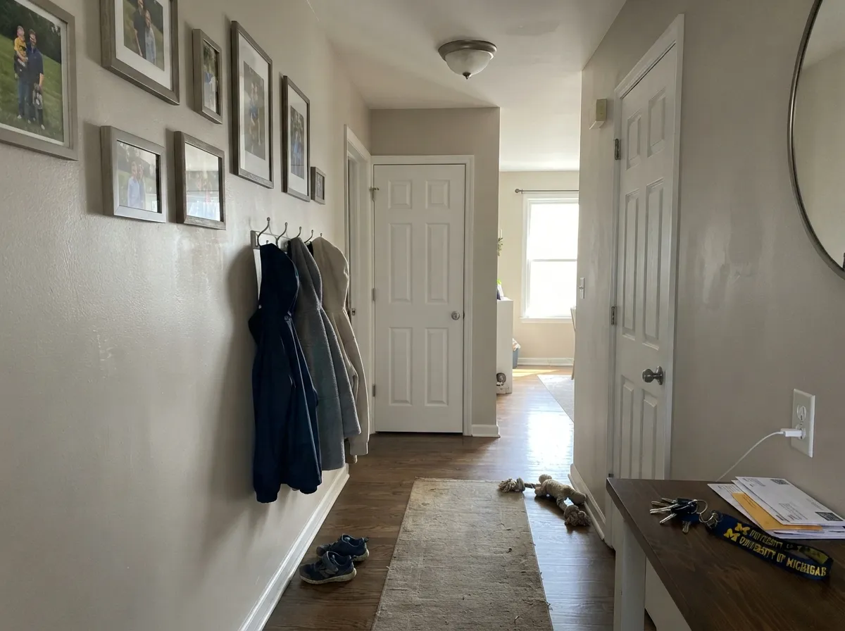
Give it real daylight, oak or walnut, and a clean (not creamy) white trim and Gravelstone does the job light greiges are supposed to do: the walls have color, the house looks finished, and nobody has to name the paint. Open living rooms, bedrooms with two windows, and the halls between them are its home turf. Brass, linen, and medium oak all sit comfortably against it. Outside, full sun lifts the sand and it reads like pale stone rather than a washed beige.
Where It Fails
Almost every regret about Gravelstone follows one of three scripts, and all three are visible before the first coat. None of them are a bad batch — but if your room matches one, this is not your color, and a bigger sample will only confirm it.
This is the one-star room, and it is the same room that wrecks Accessible Beige. Cool, flat daylight kills the sand and leaves a drab gray-beige — not airy gray, just dull. The paint did not fail; the light did. Step up to Agreeable Gray (LRV 60) or Even Better Beige (LRV 60), or commit to 2700K lamps before you commit to the gallon.
The name says gravel. The wall says warm sand. On four walls the yellow-beige is unmistakable, especially in afternoon sun — depth multiplies undertone. If your goal is gray with a little warmth, this is too much beige. Look at Agreeable Gray for the gray-first greige, or Revere Pewter if you want the same LRV with more gray (and its green risk).
Alabaster, Swiss Coffee, and other creamy whites sit on the warm side of this color and push the wall gray — the exact pairing that made Accessible Beige walls look 'too gray' next to Alabaster cabinets. Cool gray LVP does the opposite: it strips the sand and the walls go dirty. Use a cleaner white (Pure White or Polar Bear) and keep gray flooring at arm's length, or pick a cooler gray that matches the floor.
Room by Room
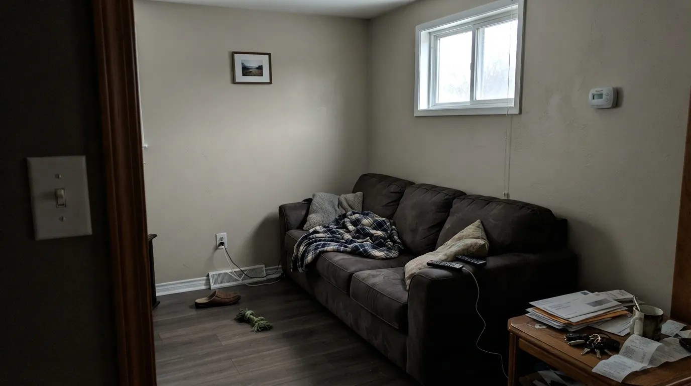
With south or west light it is the calm sandy greige that makes a worn sectional and oak floors look decided. Eggshell on the walls; Polar Bear or Pure White on the trim in semi-gloss. One small north window and no lamps? This is not the living-room color — go warmer or lighter.
At LRV 56 it wraps the room without bouncing around like an off-white. Under 2700K bulbs the sand comes forward and it feels restful rather than gray. Matte or eggshell; keep a lamp on each side of the bed so the corners do not drain to drab.
This is the test light greiges are built for. An open hall that sees daylight from both ends carries well, hides fingerprints, and hands off to living rooms without a color change. Windowless interior halls still want a lamp. If the whole house includes a north bedroom and a basement, run Gravelstone in the daylit rooms and step lighter in the dark connectors.
Warm quartz, butcher block, oak, brass: it behaves. Cool gray marble or blue-gray tile will argue and push the walls yellow. Satin on cabinets if you go that far; a full kitchen of Gravelstone walls under Polar Bear or Pure White uppers is the safe Home Depot version of the Accessible Beige kitchen. Test it at night under the actual under-cabinet lights.
An open dining room that borrows living-room light is a natural fit, and the light-mid hides chair-rail scuffs better than a pale greige. A closed, lamp-only dining room needs the bulbs at 2700K or it goes drab at dinner. A home office with a real window is fine; a windowless den is where the gray reviews come from.
Marquee sells it inside and out, and at LRV 56 full sun lifts it toward pale warm stone rather than glare. Pair the body with Polar Bear trim and a dark door — Hale Navy or Iron Ore. Walk a large sample around every elevation: the shaded north side will read a step grayer than the sunny south side. That shift is the color, not a bad batch.
Your Light Is the Risk
Warm, steady sun holds the sand and the gray in the same frame. Pale stone, not yellow, not office gray. This is the light the color was mixed for.
Cool, flat daylight kills the sand and leaves a drab gray-beige. Fine if you half-wanted gray; disappointing if you wanted warmth.
Quieter and grayer in cool morning light; sandier, slightly yellower through west afternoon. Sample it at 8am and at 5pm before you buy.
2700K lamps pull the sandy beige and it goes cozy. 4000K LEDs sharpen the gray and can look dingy — swap bulbs before you repaint.
Most complaints about Gravelstone are a light mismatch. Upload a photo of your actual room and see it on your walls — then ask for the same wall in north light or evening lamps before you buy a single sample.
Need It From Another Brand?
Any paint counter can custom-tint Behr MQ2-50 directly. If you would rather stay in one brand's own deck, these are the closest stock matches, measured as ΔE2000. Under 2 is a difference you will not see on the wall.
| Brand | Closest color | ΔE | LRV | |
|---|---|---|---|---|
| Sherwin-Williams | Slumber SlothSW 9606 · Sherwin-Williams | 2.2 | 56 | Color page → |
| Benjamin Moore | Alphano Beige989 · Benjamin Moore | 0.9 | 55 | Color page → |
| Valspar | Perfect Backdrop8005-8B · Valspar | 0.3 | 56 | Color page → |
| PPG / Glidden | Gotta Have ItPPG1076-3 · PPG / Glidden | 0.5 | 55 | Color page → |
| Glidden | Gotta Have ItPPG1076-3 · Glidden | 0.5 | 55 | Color page → |
| Dutch Boy | Centuryed Gray442-2DB · Dutch Boy | 3.2 | 57 | Color page → |
Similar Behr Colors
The nearest shades to Gravelstone within Behr's own range, ranked by perceptual color distance — useful when you want the same look a touch lighter, darker, or warmer.
WCAG 2.1: AA is 4.5 : 1 for normal text, 3 : 1 for large text, AAA is 7 : 1.
Gravelstone vs the Colors You're Also Considering
Every Gravelstone sample board has the same rivals on it. The numbers show the real lightness gap — then it comes down to which risk you would rather live with.
Pick this when you are already at Home Depot and want the slightly deeper, sandier version of the same idea.
Sherwin-Williams SW 7036 · LRV 58Accessible BeigePick this if you want the famous Sherwin-Williams twin — two LRV points lighter, the safest warm neutral until the light goes cool.
Pick this when Agreeable Gray looked washed and you wanted more sand, less gray, at a similar whole-house depth.
Sherwin-Williams SW 7029 · LRV 60Agreeable GrayPick this if you want gray first and beige second — lighter, more famous, the safest greige until the light goes cool.
Within Behr the differences are small but real. Avenue Tan HDC-AC-04 at LRV 56 has hex #D3C2B3, slightly warmer and more yellow. Merino Wool HDC-NT-13 at LRV 55 reads a step further toward tan. Gallery Taupe ICC-89 at LRV 57 and Indulgent Mocha PWN-70 at LRV 57 are both a shade lighter and quieter, while Sculptor Clay PPU5-08 at LRV 55 is grayer and cooler.
Across brands, Valspar Perfect Backdrop 8005-8B at LRV 56 comes in at a deltaE of 0.25 and Glidden Gotta Have It PPG1076-3 at LRV 55 at 0.52, both the same color for practical purposes. Benjamin Moore Alphano Beige 989 at LRV 55 is 0.89 and Rodda Ecru CA040 at LRV 56 is 0.91.
Sherwin-Williams Slumber Sloth SW 9606 at LRV 56 is 2.22 and Farrow and Ball Oxford Stone No. 264 at LRV 54 is 2.51, both very close but worth sampling first. Dunn-Edwards New Wool DE6073 at LRV 53 is 3.95, close but visibly different side by side and a step darker.
Gravelstone Coordinating Colors
The rule for coordinating with Gravelstone: a clean or everyday white, one dark, one muted green if you want a color, and stay off creamy whites and cool blue-gray stone. It wants contrast more than taupe-on-taupe. These are the partners that keep showing up in rooms that work:
Not Famous, Just Useful: The Home Depot Twin
Gravelstone has no Color of the Year plaque and no viral living-room hashtag. That is not a slight. It sits in Behr's Marquee deck as MQ2-50, filed with the whites, doing the same job Accessible Beige does two aisles over: a light warm greige that will run an open floor, hide a scuff, and not scare a buyer. Sample boards on Reddit put it next to Creamy Mushroom; the consistent read is yellow-sand, not cool stone. A stray sample photo has looked pink, which is worth a large board in your actual light and not worth a whole-house panic.
If you came here because you loved Accessible Beige on a blog and you shop at Home Depot, this is the honest shortcut — two LRV points deeper, a touch more yellow, same north-light failure, same creamy-trim trap. If you came here because the name sounded like gray, sample it at 5pm before you buy. The name is the marketing. The wall is beige.
Gravelstone With Wood Tones and Floors
This decision gets made at the floor, not the paint store. Medium oak, walnut, espresso, and pale unstained white oak are the easy yes — the gray in Gravelstone cools orange oak instead of turning up the honey, and the sand meets walnut halfway. Brass and matte black both work; chrome is the only metal that leans a little cold against it.
The honest no is cool gray LVP or gray-washed wood. Gray floors pull the sand out and the walls go dirty, which is the opposite of what a whole-house greige is for. Red-toned cherry and reddish stains deserve a big sample in morning light: any greige can flash an off cast when red light bounces back at the wall. If the gray floor is staying, pick a cooler gray that matches it. If the oak is staying, this color is on your short list.
Three Ready Palettes Built on Gravelstone
A color is never alone on the wall. These are complete combinations in the 60-30-10 pattern, with the reason each one holds together. Every one opens in the visualizer.
Polar Bear is Behr's dependable everyday white, not a creamy stand-in, so the beige on the wall stays warm instead of going gray. Hale Navy is the safest navy as long as the entry has light — one dark note so the scheme reads finished. If Polar Bear's LRV 94 makes the walls look dingy, step to Pure White.
Try this palette in your roomPure White is the default white that only fails when you pair it wrong — here the pairing is right: a clean cabinet white keeps Gravelstone reading sand, not gray. Evergreen Fog is the best cabinet sage in the SW deck and gives one muted green note that sits next to a sandy greige without going forest-theme.
Try this palette in your roomA cleaner white keeps the greige warm at the edges; Kendall Charcoal is the best-behaved dark gray in the BM deck and supplies one grounded note without going black. Keep the bulbs at 2700K so neither color goes cold after dark — Kendall Charcoal has a dim-room trap, and this bedroom should not find it.
Try this palette in your roomGravelstone FAQ
Is Gravelstone gray or beige?
Beige first, gray second — a light warm greige, not gray stone. In south sun it reads sandy taupe; in cool north light or under 4000K LEDs it reads gray-beige. The name oversells the gravel. If you actually want gray, pick Agreeable Gray (LRV 60). If you actually want beige — a real beige that skipped the yellow — pick Even Better Beige (LRV 60).
What trim white goes with Gravelstone?
A cleaner white, not a creamy one. Polar Bear is the Behr everyday white and keeps the walls looking sandy. Pure White is the Sherwin-Williams equivalent and is the pairing that saves Accessible Beige from looking gray. Creamy whites — Alabaster, Swiss Coffee — sit on the warm side and push Gravelstone drab. Ultra Pure White (LRV 97) is too bright and makes the walls look unwashed. Semi-gloss on the trim, eggshell on the walls.
Is Gravelstone the same as Accessible Beige?
Nearly. Accessible Beige (SW 7036, LRV 58) is the famous Sherwin-Williams twin — a warm tan with just enough gray, the safest warm neutral until the light goes cool. Gravelstone is two LRV points deeper and a touch sandier/yellower. Same jobs, same north-light failure, same creamy-trim trap. If your painter is already at Home Depot, this is the chip. If you want the documented bestseller, cross the aisle.
Does Gravelstone work with oak floors?
Usually, yes — the gray in it cools orange oak instead of amplifying it the way a yellow beige would. Walnut, espresso, and pale white oak are even easier. The miss is cool gray LVP: the floor pulls the sand out and the walls go dirty. Red-toned cherry is a sample-first floor for any greige. Put a big board over the actual floor in afternoon light before you roll.
Is it too dark for a whole house?
For daylit open rooms, no — LRV 56 is the whole-house number, the same depth as Revere Pewter. For a house that includes windowless halls, a north bedroom, and a basement, run it in the rooms with windows and step up to Agreeable Gray or Even Better Beige in the dark connectors. It is not Behr Greige (LRV 46); that one is the depth surprise.
Can I use it on cabinets or the exterior?
Yes on both, in the right company. Satin Gravelstone on an island or lower cabinets under Pure White or Polar Bear walls is a custom look without a saturated color. Outside, sun lifts it toward pale warm stone — Polar Bear trim and a Hale Navy or Iron Ore door. Always test against existing brick; pink or orange masonry can make the sand look muddy.
Have you painted with Gravelstone?
Rate it — one tap helps the next reader decide.
Ask a Question