Ripe Berry
The gray-plum everyone half-notices, reviewed honestly: where it turns velvety, the light that flattens it to plain charcoal, and what to pick instead.

Jessica has spec'd whites and neutrals for more than 300 rooms and keeps a sample wall of painted drawdowns in her studio. Every color review is checked against real reader rooms in the comments and re-tested when a formula changes. About the testing process →
- 1Nocturne Shade5
- 2Ripe Berry10
- 3Blue Nova17
- 4Gothic Purple24
The Fast Verdict
Ripe Berry is what happens when you gray a plum down until it almost stops admitting it's purple. At LRV 10 it reads first as a deep, smoky near-black, and only on a second look does the berry come forward — mostly under warm light. It never goes candy-mauve and never goes true violet; it sits in between, which is exactly why it works on cabinets, doors and small rooms and struggles the moment you ask it to light up a big, cool-lit space.
Powder rooms and vanities · bedrooms with warm lamps · cabinets, islands and interior doors · anyone who wants a purple no one will confidently call purple
You want a true, saturated violet · your only light is cool and overhead, no lamps · you're painting a whole open-plan main floor · your trim and floors already run icy cool
- A genuinely different near-black — gray-plum instead of another charcoal or navy
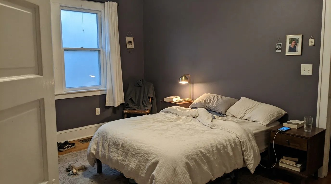
- Turns rich and velvety under warm lamplight
- Excellent on cabinets, vanities, islands and doors — small commitment, real payoff
- Deep enough (LRV 10) to behave like a neutral from across the room
- Reads different across sheens — flat and moody in matte, jewel-box in satin/semi-gloss
- Not a true violet — buyers wanting saturated purple will be disappointed
- Cool overhead light flattens it to plain charcoal-gray, and the berry disappears
- At LRV 10 it swallows light — wrong for a whole open-plan floor
- A small chip undersells how dark and gray it actually reads; needs a big sample
What Color Is Ripe Berry, Really?
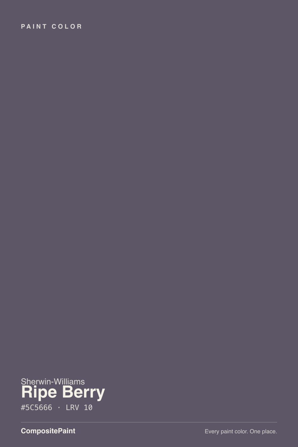
A deep, gray-based plum with the saturation turned way down. Sherwin-Williams files it under its purple family, but the color behaves more like a smoky near-black than a violet — the gray is doing most of the talking, and the plum is the undertone you notice once your eyes adjust. That restraint is the whole appeal: it gives you a genuinely different, more interesting near-black than another charcoal or navy, without ever reading as a themed "purple room."
At LRV 10 it is a true dark, on the same shelf as the deck's near-black neutrals rather than its lighter mauves. Put it next to Mature Grape (LRV 7) and Ripe Berry actually reads a step lighter and cooler — Mature Grape leans warmer and redder at a similar depth, while Ripe Berry stays gray and a little cooler-blooded. Both are dark enough that they behave like a neutral from across the room and only show their color up close or under a lamp.
Undertone in one line: cool, gray-leaning plum — never warm red, never true blue. If a sample reads flat charcoal-gray, that's cool daylight doing it; if it reads distinctly berry-purple, that's a warm bulb or direct light catching the undertone. Both are the same paint being honest about the light it's in.
Where It Shines
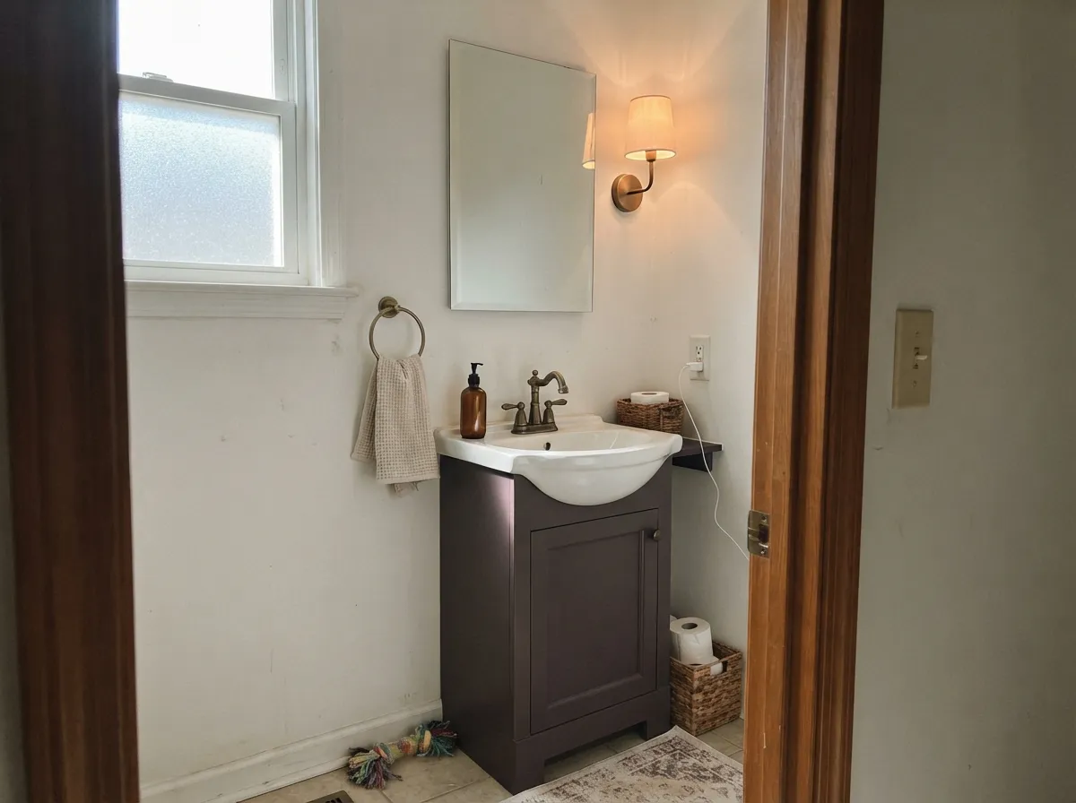
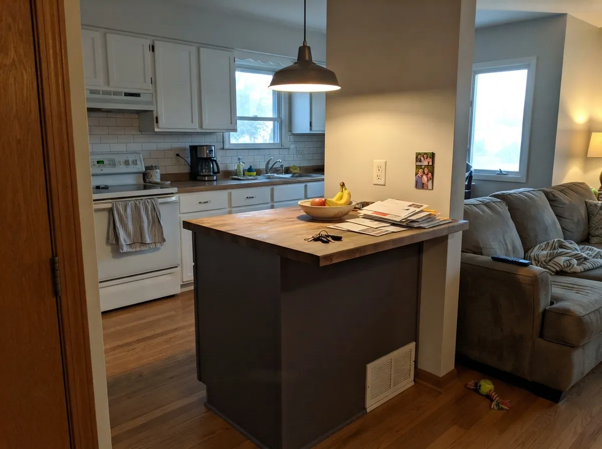
This is a lamp color first. Under warm 2700K light the gray recedes and the plum comes forward, turning the wall genuinely rich instead of merely dark — the effect owners describe as looking better in person, in a big sample, than the online chip suggests. Its best jobs are small commitments: a vanity, an island, a run of interior doors, a single accent wall in a room that's mostly lit by lamps at night. Give it brass or black hardware, walnut or dark oak, and it reads custom and deliberate rather than moody for its own sake.
Where It Fails
Almost every disappointment with Ripe Berry comes from one of three mismatches, and all three are predictable before the first coat. None of them are the paint's fault — but if your room matches one, this is not your color, and a bigger sample will only confirm the problem, not fix it.
Ripe Berry is muted almost to the point of hiding — the gray dominates and the purple is a whisper. If you want color that reads unmistakably violet on the wall, this will read as "dark gray" to most guests. Look at Mystical Grape instead, which commits to the saturation Ripe Berry deliberately avoids.
Take away warm light and the berry drops out almost entirely, leaving a flat, slightly cold charcoal-gray. That's fine if you half-wanted a near-black neutral; it's a letdown if you paid for purple and got plain dark gray. Warm 2700K bulbs are part of the paint job here, not an accessory.
At LRV 10 it swallows most of the light that hits it. On four walls of a big, sunlit space that's manageable; across an open floor plan with limited natural light it reads cave-like fast, and the color has to fight every adjoining room's undertone at once. Keep it to one room, one wall, or cabinetry — not the whole footprint.
Room by Room
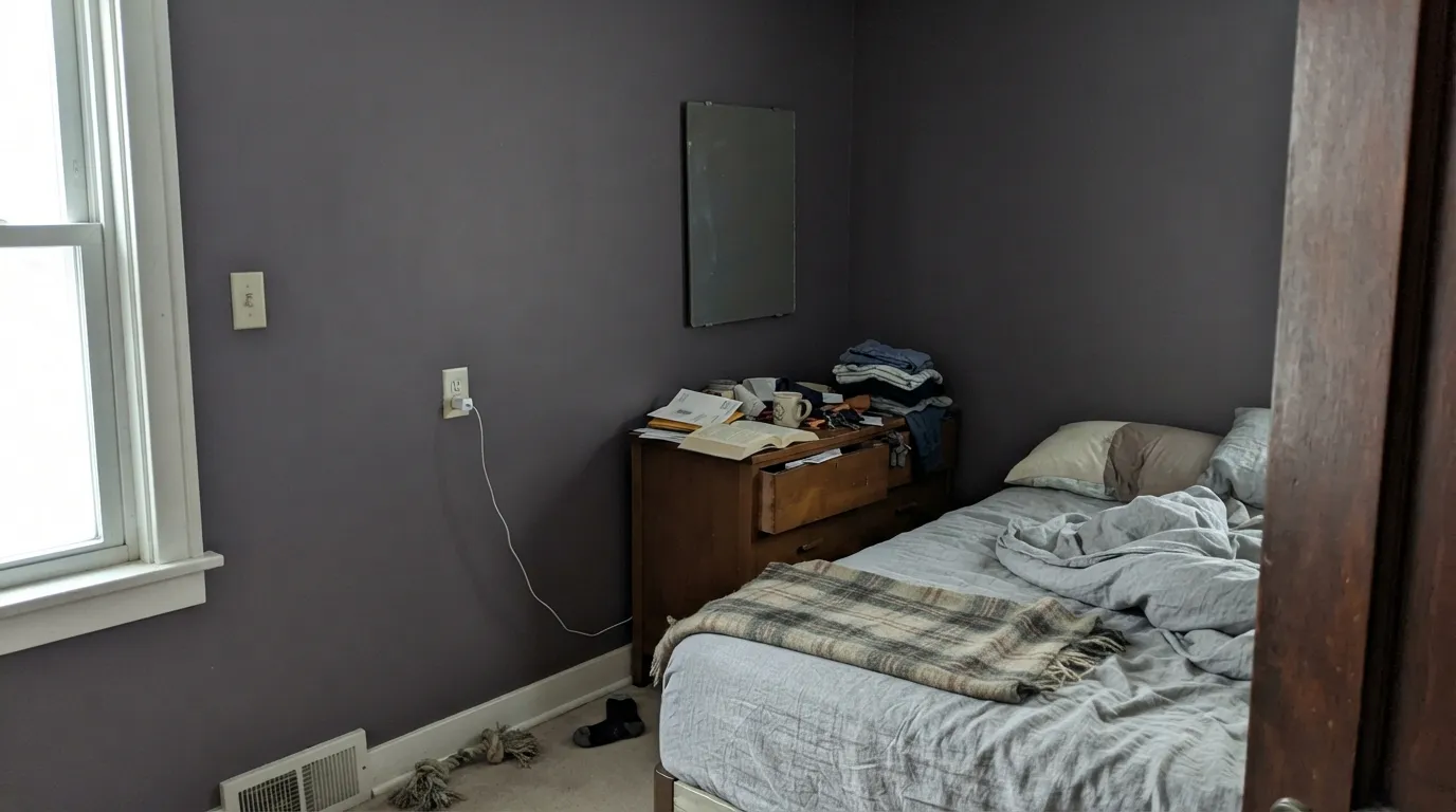
A single accent wall or a fully painted bedroom with warm lamps turns genuinely velvety at night. Matte or eggshell hides texture and deepens the color; keep the other walls in a warm white so the room doesn't go dark on all sides.
This is where Ripe Berry earns its keep: a small room or a single vanity in satin, under a warm-white surround, reads like a real design decision rather than a risk. Small rooms take deep, gray-based color well.
Low ambient light and reading lamps flatter it the same way a bedroom does. Leather, walnut shelving and brass task lighting are natural company; eggshell holds up to chairs and elbows better than matte.
One wall behind a sofa or a fireplace surround works. A full open-plan living-dining-kitchen space in Ripe Berry has too much cool daylight and too many neighboring undertones to negotiate with; keep the rest of the plan in a warm white or greige and let this be the single dark note.
On an island or a full run of cabinets under a warm-white perimeter, it looks expensive and current. A full kitchen of Ripe Berry cabinetry is a bigger, riskier commitment — do the island first and live with it before going further. Satin cabinet enamel either way.
On a shaded or north-facing door it reads as a deliberate, quietly unusual near-black rather than plain black. In full, unshaded sun it flattens the same way an interior wall does in cool light — expect it to read more charcoal than plum most of the day.
Your Light Is the Risk
2700K bulbs pull the plum forward and the near-black turns rich and velvety. This is the light the color is built for.
Without warmth to react against, the gray takes over and the wall reads flat charcoal — fine if you wanted dark neutral, disappointing if you wanted purple.
Direct sun brightens it just enough to show the plum honestly; the color settles back into smoky near-black as the light fades.
Warm bulbs at night make it read distinctly berry. Cool white LEDs push it toward plain slate-black — swap the bulb before you second-guess the paint.
Most complaints about Ripe Berry are a light mismatch. Upload a photo of your actual room and see it on your walls — then ask for the same wall in north light or evening lamps before you buy a single sample.
Need It From Another Brand?
Any paint counter can custom-tint Sherwin-Williams SW 9689 directly. If you would rather stay in one brand's own deck, these are the closest stock matches, measured as ΔE2000. Under 2 is a difference you will not see on the wall.
| Brand | Closest color | ΔE | LRV | |
|---|---|---|---|---|
| Behr | LegacyUL250-22 · Behr | 2.0 | 10 | Color page → |
| Benjamin Moore | MythicCSP-510 · Benjamin Moore | 4.5 | 10 | Color page → |
| Valspar | Forge8004-48F · Valspar | 3.6 | 11 | Color page → |
| PPG / Glidden | Purple ParlorPPG13-17 · PPG / Glidden | 1.7 | 9 | Color page → |
| Glidden | Night Vineyard30RB 10/100 · Glidden | 1.5 | 10 | Color page → |
| Dutch Boy | Smoky Purple343-7DB · Dutch Boy | 3.7 | 10 | Color page → |
Similar Sherwin-Williams Colors
The nearest shades to Ripe Berry within Sherwin-Williams's own range, ranked by perceptual color distance — useful when you want the same look a touch lighter, darker, or warmer.
WCAG 2.1: AA is 4.5 : 1 for normal text, 3 : 1 for large text, AAA is 7 : 1.
Ripe Berry vs the Colors You're Also Considering
Every Ripe Berry sample board has the same rivals on it. The numbers show the real lightness gap — then it comes down to which risk you would rather live with.
Pick this for the cooler, grayer read — Ripe Berry stays gray-cool where Mature Grape leans warm and red.
Sherwin-Williams SW 6286 · LRV 7Mature GrapePick this if you want the warmer, redder plum at a similar depth — same SW deck, more wine than smoke.
Pick this for the more neutral, near-black read that reads less obviously purple across a room.
Benjamin Moore 1379 · LRV 11EggplantPick this for true aubergine warmth — Eggplant leans red-brown where Ripe Berry stays gray and cool.
Ripe Berry Coordinating Colors
The rule for coordinating with Ripe Berry: bright, clean whites to keep the room from going dark on every side, one warm-metal note, and — if you want more color, not less — other gray-based members of its own family rather than a bright, saturated partner that will fight it. These are the pairings that keep showing up in rooms that work:
A Purple That Doesn't Act Like One
Sherwin-Williams sells plenty of confident, saturated violets, and Ripe Berry is deliberately not one of them. It sits in the deck's purple family but reads closer to the near-black neutrals — Iron Ore, Peppercorn, Urbane Bronze — than to anything you'd call a color statement from across the room. That's the whole design idea: a near-black with more personality than plain charcoal, for anyone who wants depth without committing to an obviously themed purple room.
That restraint is also why it rewards a real sample over a small chip. Ripe Berry looks close to flat gray on a paper swatch and considerably more like itself on a wall, under a lamp, in the evening — the gap between chip and room is bigger for this color than for most of the deck's true neutrals.
Ripe Berry With Wood Tones and Floors
Dark, warm woods are the safest match: walnut, espresso and aged leather all sit comfortably with the gray-plum and let it read as intentional rather than accidental. Black and unlacquered brass hardware both work — brass adds warmth against the cool undertone, black keeps the whole scheme quietly monochrome.
Golden or honey oak is the one pairing to test first. Yellow-orange sits opposite purple on the color wheel, so a warm honey floor can pull the wall's undertone forward in a way that reads more purple and less neutral than you may want — not a dealbreaker, but worth a large sample above the actual floor before committing a whole room.
Three Ready Palettes Built on Ripe Berry
A color is never alone on the wall. These are complete combinations in the 60-30-10 pattern, with the reason each one holds together. Every one opens in the visualizer.
Alabaster keeps the small room bright enough for the vanity to go all the way dark without the room feeling closed in. Wrought Iron gives one more near-black note so the pairing reads deliberate, not accidental; brass hardware finishes the look.
Try this palette in your roomPure White on three walls keeps the room from going dark all around, so the accent wall can carry the color safely. Iron Ore window trim ties the near-black families together without adding a second competing hue.
Try this palette in your roomAlabaster keeps the perimeter bright enough that the island can go all the way to near-black without the kitchen feeling small. Mindful Gray bridges the gap between the two extremes on open shelving instead of competing with either.
Try this palette in your roomRipe Berry FAQ
Is Ripe Berry purple or gray?
Both, in that order of visibility. On the wall it reads first as a deep gray near-black; the plum shows up once your eyes adjust or a lamp is on. It's officially filed as purple, but most guests will call it "dark gray" until the light says otherwise.
Is it warm or cool?
Cool. The gray-plum leans cool rather than red, which is why it never turns candy-pink and stays composed even under daylight. Warm 2700K lamps are what bring out the berry at night — the color doesn't do it on its own in cool light.
What trim white goes with Ripe Berry?
A clean, fairly bright warm-to-neutral white — Alabaster or Pure White both work well. Avoid a stark cool white, which pushes the wall color toward flat and grayer than intended.
Is it good for kitchen cabinets or an island?
Yes, and it's one of the better jobs for this color. An island or a full run of cabinets under a light perimeter reads current and expensive. Use a satin urethane-fortified cabinet enamel; test the island before committing a whole kitchen to it.
Can I use it on a whole room, or just an accent wall?
Small rooms — a bedroom, a powder room — can take it on every wall, especially with warm lamps at night. In a large or open-plan space, keep it to one wall or cabinetry; at LRV 10 a full room with mostly cool daylight goes dark fast.
Does it work on a front door?
On a shaded or north-facing entry, yes — it reads as a quietly unusual near-black instead of plain black. In full, unshaded sun expect it to read more charcoal than berry most of the day, the same flattening effect it shows indoors under cool light.
Have you painted with Ripe Berry?
Rate it — one tap helps the next reader decide.
Ask a Question