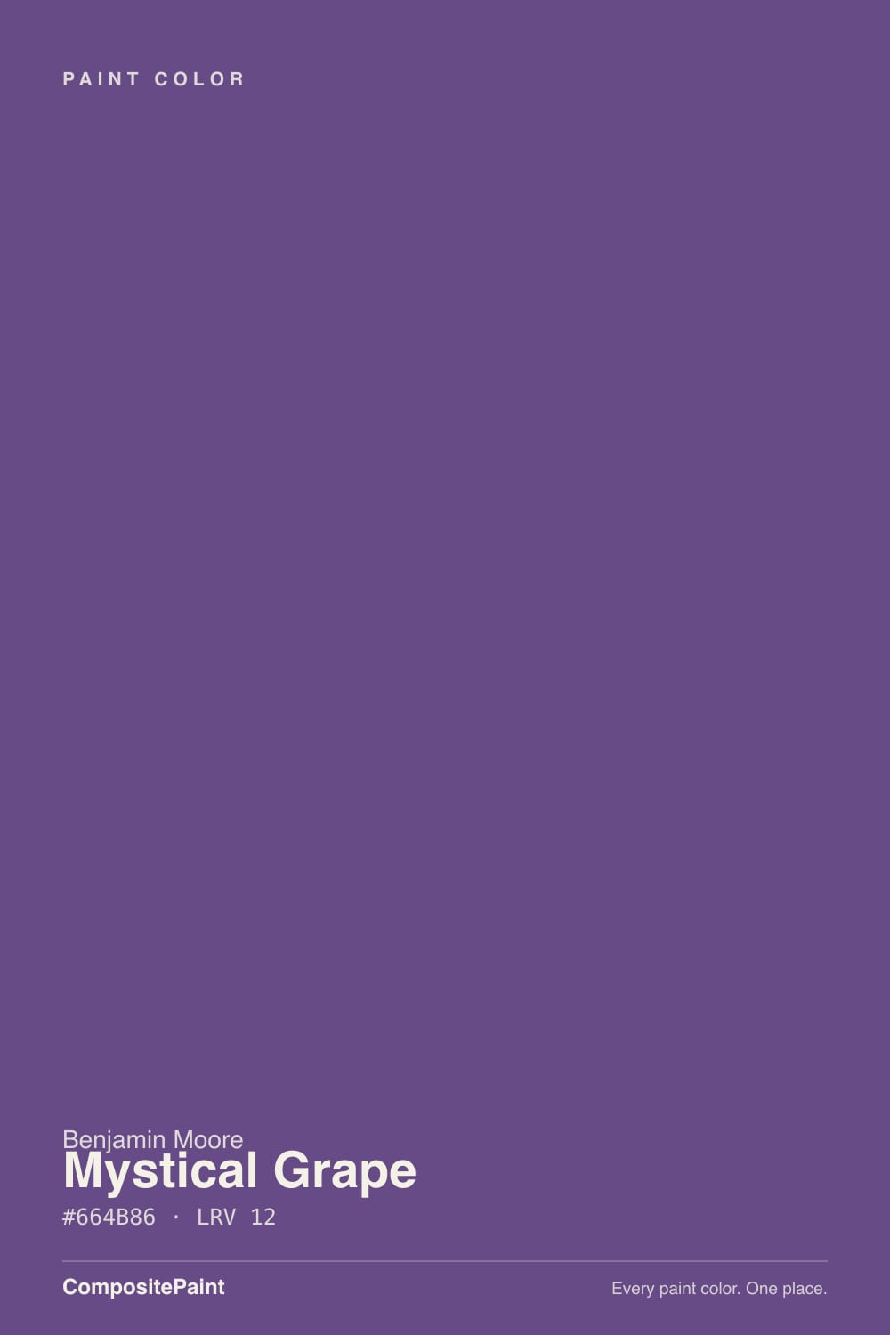
Mystical Grape
Benjamin Moore's saturated true violet, reviewed honestly: the dining rooms where it looks like a wine cellar, the light that turns it stony, and why the label says interior only.

Jessica has spec'd whites and neutrals for more than 300 rooms and keeps a sample wall of painted drawdowns in her studio. Every color review is checked against real reader rooms in the comments and re-tested when a formula changes. About the testing process →
- 1Nocturne Shade5
- 2Mystical Grape12
- 3Blue Nova17
- 4Gothic Purple24
The Fast Verdict
Mystical Grape is an actual purple — not a gray with a violet secret, not a plum-brown that behaves like a neutral. It sits dead center in the violet range with a slight lean to the blue side, grayed just enough to read like wine in a glass instead of grape candy. At LRV 12 it swallows a dining room whole, which is exactly the point: with lamps, candles, brass and dark wood it looks expensive. In a bright, plain, north-facing room with white furniture, it looks like a color someone chose in a hurry.
Dining rooms you actually use at night · powder rooms drenched to the ceiling · lamplit offices, libraries and dens · one accent wall or a run of interior doors · anyone who wants a real purple, not a purple-ish gray
You wanted aubergine or plum-brown · the room is north-facing with no lamps · your floors and trim are honey oak or golden beige · you need the color to pass as a neutral · it is going anywhere outside
- A real, unapologetic violet — no waiting to see which undertone shows up
- Grayed just enough to read like wine rather than grape candy
- At LRV 12 it drenches a dining room or powder room into a lit box
- Brass, gold, walnut and linen all look more expensive against it
- Big effect for one gallon — doors, a vanity or a small room carry it
- Cool north light drains the red and leaves a stony blue-violet
- Not aubergine — it never settles into a plum-brown neutral
- Deep violet tint bases cover badly: expect gray-tinted primer and three coats
- Interior only per Benjamin Moore, so no exterior or front-door use
What Color Is Mystical Grape, Really?
A true violet, faintly on the blue side of purple, with about a quarter of the pigment's punch grayed out. That grayed quarter is the whole reason it works on a wall: pure violet at this depth goes electric and cheap, while Mystical Grape lands somewhere near the color of wine held up to a lamp. Benjamin Moore files it in the Color Preview collection — the deck of clear, saturated hues rather than the muted Classics — and that placement is honest. This is a color, not a sophisticated neutral pretending to be one.
At LRV 12 it is genuinely deep. Roughly nine-tenths of the light that hits it stays there, so the room's own light sources become part of the paint job. Drench a small dining room or a powder room and it turns into a lit box; put it on one wall of a big bright room and it reads as a rectangle of purple rather than as atmosphere. Deep saturated violets also lay down unevenly over a light wall — the base is a deep tint base with little white in it, so first coats look blotchy and streaky. That is normal, not a bad gallon.
Undertone in one line: violet first, a cool blue edge second, red a distant third. That ordering is the single most useful fact about it. Colors like Cinnamon Slate lead with red-brown and behave like moody neutrals; Mystical Grape leads with violet and behaves like a statement. If you sample it hoping the walls will settle into a smoky plum-gray, they will not.
Where It Shines
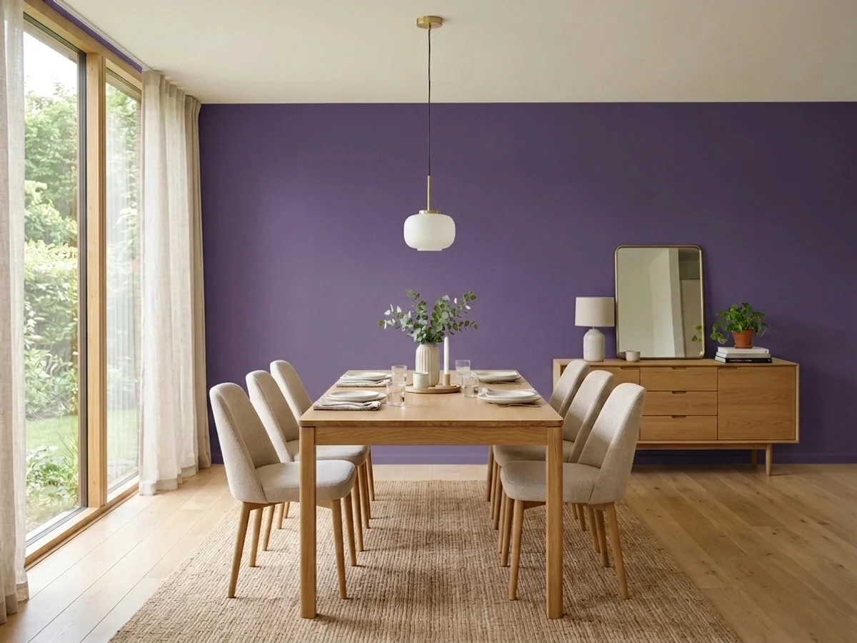
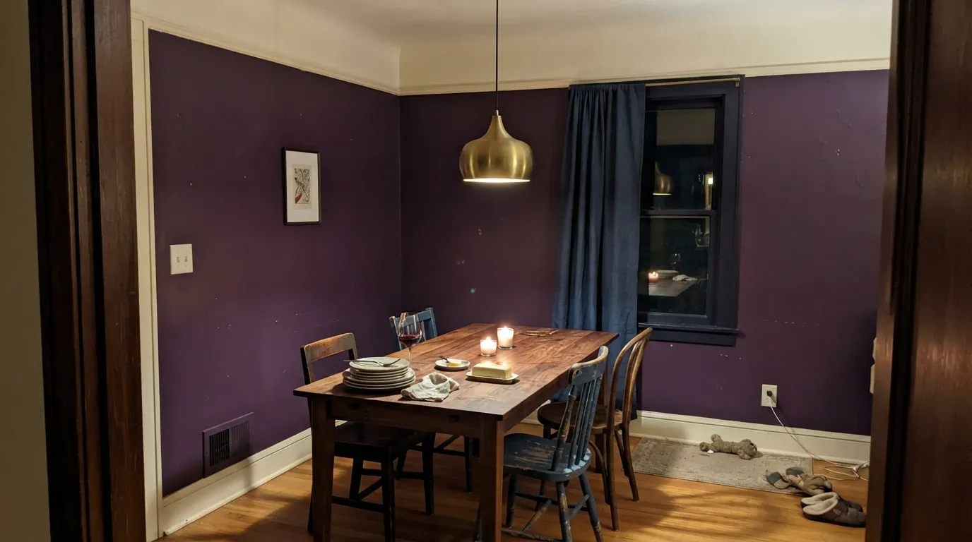
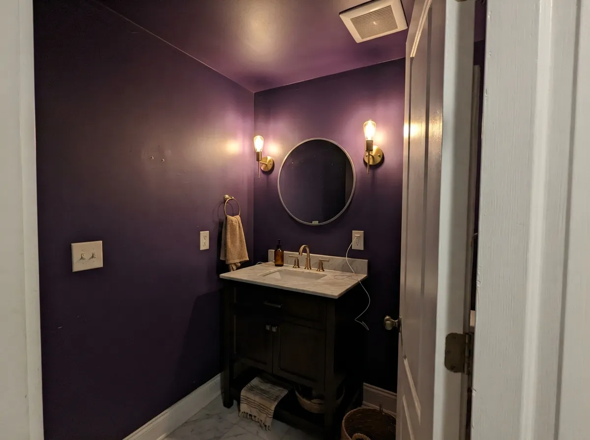
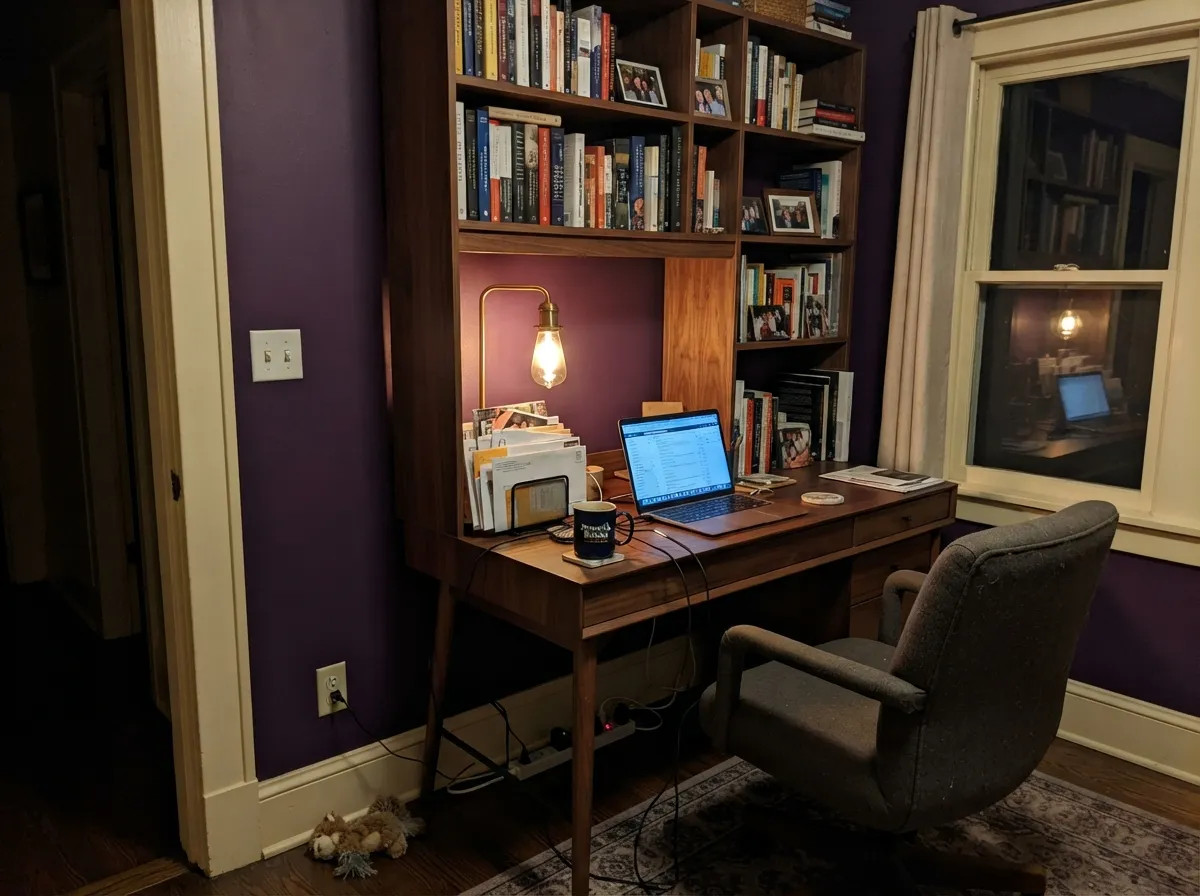
This color is built for the rooms that come alive after sunset. Under warm 2700K lamps and candlelight the small red content wakes up, the walls go wine-dark and velvety, and every brass, gold and walnut thing in the room looks better than it did the day before — which is why deep purple has come back around as a dining room color. Its second home is the one-gallon commitment: a powder room painted to the ceiling, a set of interior doors, a library wall behind shelves. In those doses it reads custom and confident, and if you tire of it you have repainted a closet-sized job, not a house.
Where It Fails
The bad reviews of Mystical Grape are remarkably consistent, and every one of them is predictable before you open the can. If your room matches one of these three, sampling a bigger square will only confirm the problem.
Most people searching for a deep purple room actually want the warm end: eggplant, plum-brown, that near-black wine color that reads like a moody neutral. Mystical Grape is not that. It is a clean violet with a cool edge, and going darker on the chip does not make it browner. If you want purple that behaves like a neutral, look at Cinnamon Slate (LRV 19) and accept a much softer color.
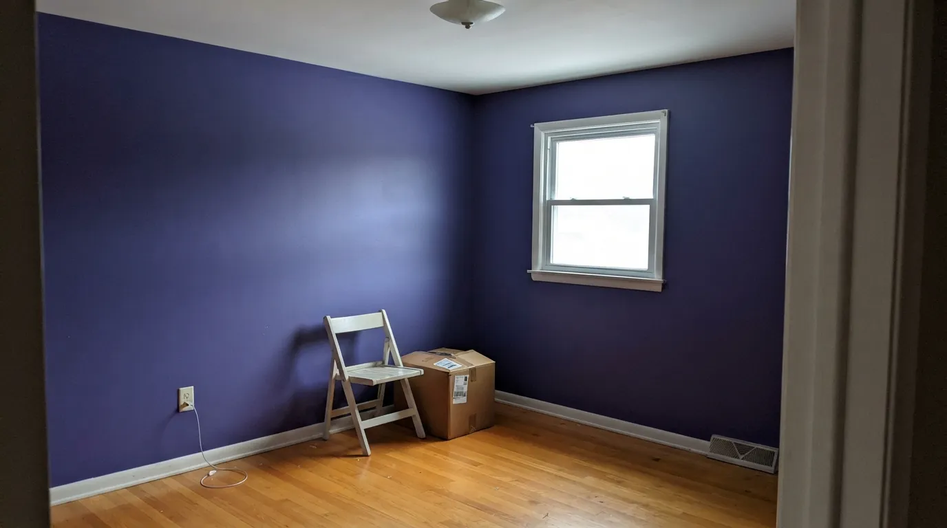
Cool daylight cancels the small amount of red and leaves the blue side of the violet exposed. Readers describe it as stony, chalky, faintly bruised — the color goes flat and slightly cold, and the room reads dim rather than moody. This paint needs warm light sources in the room, not just a window. If you refuse lamps, refuse this color.
Yellow-orange sits directly opposite violet on the wheel, so golden oak floors, orange-stained trim and beige carpet each push this color further purple while it pushes them further orange. Both sides look worse. Walnut, espresso, black-stained oak and pale unstained white oak are the company it wants; with wall-to-wall honey tones, no number of coats fixes the geometry.
Room by Room
The room that justifies the whole color. Dining rooms get used at night, under a fixture and candles, which is the exact light Mystical Grape needs, and they are usually closed off enough to take a saturated wall without negotiating with the kitchen. Drench the walls, keep the ceiling either the same color or a soft creamy white, and let brass, dark wood and linen carry the rest. Eggshell rather than flat where chair backs hit the wall.
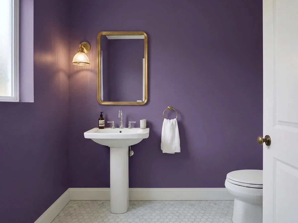
The cheapest way to own this color. A windowless powder room painted to the ceiling in a deep violet is jewel-box territory: no daylight means no risk of the stony north-light read, and the sconces do all the work. Pair with a crisp white trim and a near-black or brass-heavy vanity, and the whole thing costs a gallon and a Saturday.
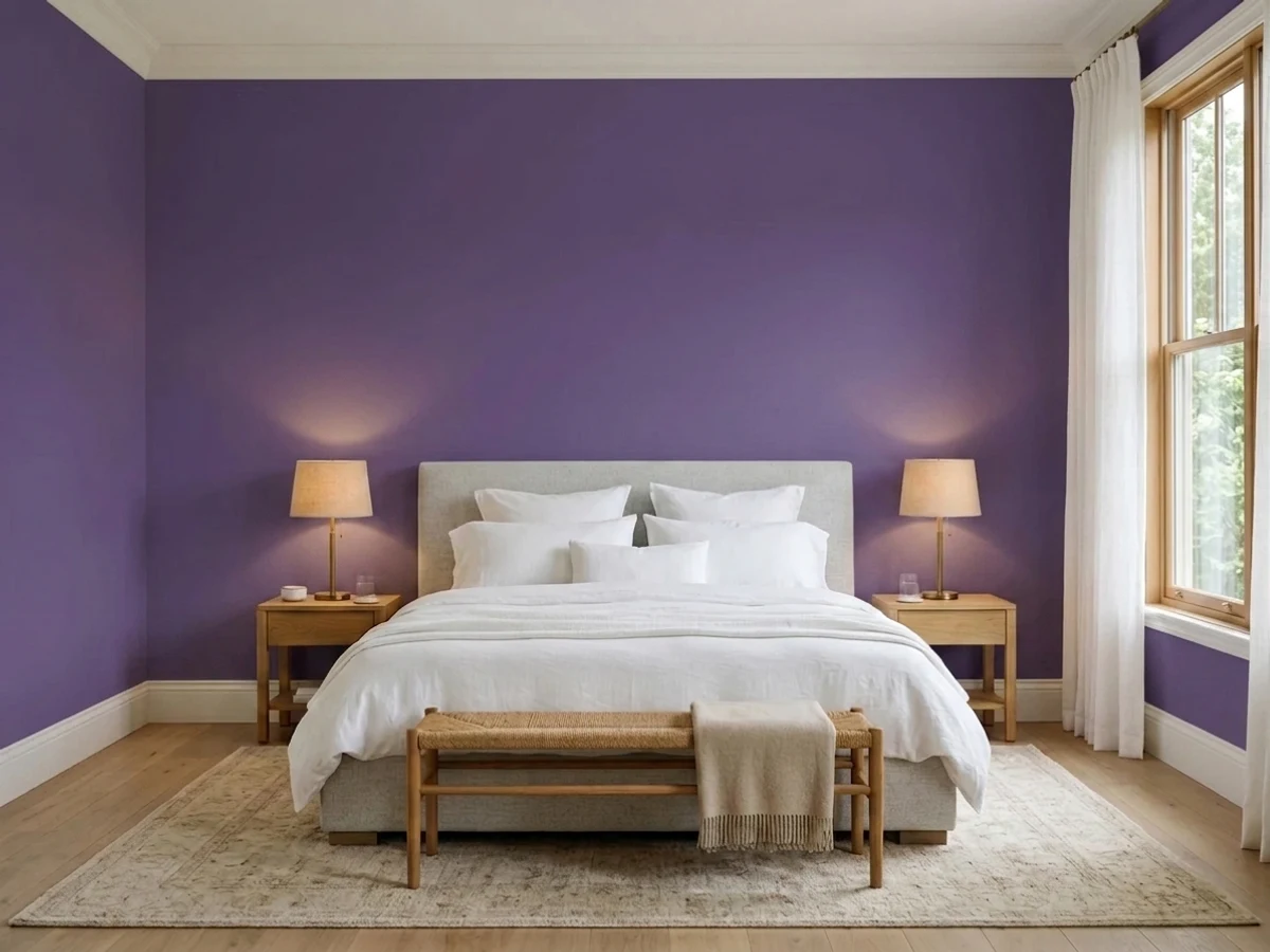
It works, with one condition: lamps, not overheads. Under warm bedside light it goes soft and wine-dark and genuinely restful. The regret stories come from bedrooms where the only light is a ceiling fixture with cool bulbs — then the walls close in and the room feels heavy by 9pm. Matte finish, warm bulbs, cream or white bedding rather than beige.
Rooms that never see noon flatter this color, and a wall of books breaks the purple into a background instead of a statement. Walnut shelving and a lamp on the desk are all it needs. Eggshell for wipeability around light switches and door casings.
If you like the color but not the commitment, put it on the doors. Satin Mystical Grape doors against a quiet near-white wall look deliberate and expensive, and you can undo the decision in an afternoon. A single accent wall works too, but only in a room that already has dark furniture or dark textiles somewhere else — otherwise the wall floats.
Benjamin Moore lists this one as interior only and does not recommend it as exterior paint, and the recommendation is worth taking. Saturated violets are the fastest fading family in full UV, and outdoor light strips the color toward a grayed blue that reads as weathering from the street. Even the front door is a bad bet here.
Your Light Is the Risk
2700K bulbs and candles pull the red content forward and the walls go wine-dark and velvety. This is the light the color was made for, and the reason to buy it.
Cool, shadowed light amplifies the blue edge and cancels the warmth. The violet flattens toward stone and the room reads cold rather than moody — the single most common complaint.
Morning east sun keeps it clean and clearly purple; midday is the most honest read; late west sun and golden hour warm it noticeably toward wine for about an hour. Sample on the wall you actually look at, and check it at 6pm.
2700K warm LEDs are non-negotiable — they are what makes it look rich. Anything at 4000K or above pushes it blue and slightly plasticky, and daylight-temperature bulbs are the fastest way to make a deep violet look cheap.
Most complaints about Mystical Grape are a light mismatch. Upload a photo of your actual room and see it on your walls — then ask for the same wall in north light or evening lamps before you buy a single sample.
Need It From Another Brand?
Any paint counter can custom-tint Benjamin Moore 2071-30 directly. If you would rather stay in one brand's own deck, these are the closest stock matches, measured as ΔE2000. Under 2 is a difference you will not see on the wall.
| Brand | Closest color | ΔE | LRV | |
|---|---|---|---|---|
| Sherwin-Williams | African VioletSW 6982 · Sherwin-Williams | 3.1 | 11 | Color page → |
| Behr | Kings CourtP560-7 · Behr | 3.6 | 10 | Color page → |
| Valspar | Rollick4003-10C · Valspar | 1.6 | 10.2 | Color page → |
| PPG / Glidden | EggplantPPG1247-7 · PPG / Glidden | 3.6 | 9 | Color page → |
| Glidden | EggplantPPG1247-7 · Glidden | 3.8 | 9 | Color page → |
| Dutch Boy | Purely Purple144-7DB · Dutch Boy | 3.1 | 11 | Color page → |
Similar Benjamin Moore Colors
The nearest shades to Mystical Grape within Benjamin Moore's own range, ranked by perceptual color distance — useful when you want the same look a touch lighter, darker, or warmer.
WCAG 2.1: AA is 4.5 : 1 for normal text, 3 : 1 for large text, AAA is 7 : 1.
Mystical Grape vs the Colors You're Also Considering
Every Mystical Grape sample board has the same rivals on it. The numbers show the real lightness gap — then it comes down to which risk you would rather live with.
Pick this when you want the color to be clearly purple and clearly deliberate, not almost-blue.
Sherwin-Williams SW 6824 · LRV 16Forget-Me-NotPick this for a softer, grayer, bluer violet that sits closer to a slate blue — easier in a room with less light.
Pick this when a muted mauve feels too safe and you want the room to be about the color.
Benjamin Moore 2113-40 · LRV 19Cinnamon SlatePick this if you want purple that behaves like a neutral — the 2025 Color of the Year leads with red-brown and needs real daylight to look its best.
Pick this for depth. French Lilac whispers; Mystical Grape sets the mood of the room.
Benjamin Moore 1403 · LRV 56French LilacPick this for the same violet family at LRV 56 — light enough for a whole bedroom without darkening the room.
Pick this when you have seen enough navy dining rooms and want one nobody else on the street has.
Benjamin Moore HC-154 · LRV 6Hale NavyPick this for the safe version of a dark, dramatic dining room — navy is the color most people end up choosing, and it also needs a room with light.
Mystical Grape Coordinating Colors
The rule for coordinating with a saturated violet: keep the whites either clearly creamy or clearly crisp, never a yellow-beige in between, and let the second color be either much lighter or much darker than the purple. Anything mid-toned next to it starts to look muddy. These are the partners that hold up in real rooms:
Why Purple Came Back As a Dining Room Color
Purple sat out the entire gray decade. It came back through the dining room specifically, because that is the one room where a color can be dramatic without having to live with you all day — designers writing about the 2026 palettes describe deep purple dining rooms almost identically: commit fully, take the color across the walls and often the ceiling, and let candlelight do the work. The reasoning is practical rather than mystical. A dining room is used at night, it usually has its own light fixture, and it is the room where guests expect a bit of theatre.
One honest caveat from the same conversation: most designers pushing this trend reach for the warm end of purple, the aubergines and plum-reds that behave like moody neutrals. Mystical Grape is the other kind — a clean violet, faintly cool. That makes it more of an actual color choice and less of a neutral in disguise. In a lamplit dining room that is a strength; anywhere you were hoping the purple would quietly recede, it is not.
Mystical Grape With Wood Tones, Floors and Metals
This decision is made at the floor. Walnut, espresso and black-stained oak are the color's best company — dark red-brown depth makes the violet read like wine rather than like a hue. Pale unstained white oak works too and gives the room a cooler, more modern cast. Cream carpet is fine, and so is true gray.
The clash is golden. Honey oak floors, orange-stained trim and yellow-beige carpet sit opposite violet on the color wheel, so each one exaggerates the other: the floor goes more orange, the walls go more purple, and the room never settles. If the golden floor is staying, either put a large dark rug between it and the walls, or paint the purple somewhere the floor is not — doors, a vanity, a powder room with tile.
Metals are easy and forgiving. Unlacquered brass and antique gold are the obvious winners, matte black is the modern answer, and oil-rubbed bronze disappears into the color in a good way. Polished chrome and nickel are the only ones that read cold and slightly clinical against it — fine in a bathroom, wrong in a dining room.
Three Ready Palettes Built on Mystical Grape
A color is never alone on the wall. These are complete combinations in the 60-30-10 pattern, with the reason each one holds together. Every one opens in the visualizer.
Benjamin Moore's own pairing for this color is a creamy white, and Atrium White is the reason why: a warm white keeps the violet from going cold at the edges, where a stark white would make it look blue. Cinnamon Slate in the next room hands the purple off to something browner and quieter, so the house reads intentional instead of themed. Brass fixtures and a walnut table finish it.
Try this palette in your roomA windowless powder room is the one place a crisp white belongs next to this violet — Chantilly Lace at LRV 92 draws a clean bright line around the color instead of blending into it, though it is a fussy white to roll evenly. Onyx on the vanity gives the scheme a near-black anchor so the purple reads as a decision. Unlacquered brass and a marble top do the rest.
Try this palette in your roomThe low-risk way to live with a saturated purple: keep the open areas in a quiet near-white and spend the color where the doors close. Silver Satin is calm enough that the violet never has to compete with a beige or a greige, and Decorator's White trim keeps every edge clean without the yellow that would fight the purple.
Try this palette in your roomMystical Grape FAQ
Is Mystical Grape blue or purple?
Purple, clearly — but it sits on the blue side of violet, and that is why some people photograph it and see blue. In warm lamplight it is unmistakably purple; in cool north daylight the blue edge takes over and it can pass for a very dark periwinkle. If you need it to stay warm and plum-like all day, this is the wrong purple.
Is Mystical Grape too dark for a dining room?
For a dining room it is the right kind of dark. LRV 12 means the room needs its own light, which a dining room already has: a fixture over the table, candles, sometimes sconces. Painted floor to ceiling it makes a small dining room feel deliberate and enclosed rather than cramped. The rooms where LRV 12 genuinely fails are the ones you use in daylight with nothing but a window.
How many coats does Mystical Grape need?
Plan on a gray-tinted primer plus two coats, or three coats of paint over a light wall. Deep violets are mixed into a tint base with very little white in it, so a single coat looks streaky and patchy no matter how well you roll it. Do not judge the color until coat two is dry, and roll the final coat in one session so the sheen stays even.
What trim white goes with Mystical Grape?
Two good answers. A soft creamy white such as Atrium White keeps the whole room warm and stops the violet from going cold at the edges — this is Benjamin Moore's own suggested partner. A crisp white such as Chantilly Lace does the opposite: maximum contrast, gallery-clean, best in a small drenched room like a powder bath. Avoid a yellow-leaning cream, which will drag the purple toward its complement and make both look muddy.
Can I paint my front door or shutters with it?
No. Benjamin Moore lists Mystical Grape as an interior color and specifically does not recommend it as exterior paint. Saturated violet pigments are the least UV-stable family there is, so the color would shift and fade unevenly, and in outdoor light it would read as a weathered gray-blue rather than as purple.
Will it look like a teenager's room?
Only if you furnish it like one. Saturated purple goes juvenile next to white laminate, bright pastels and plain builder trim; it goes adult next to walnut, brass, linen, black metal and warm lamplight. The color itself is not the variable here — the room around it is.
Have you painted with Mystical Grape?
Rate it — one tap helps the next reader decide.
Ask a Question