French Lilac
Benjamin Moore's classic pastel lilac, reviewed honestly: the light that keeps it clean, the light that turns it icy, and how to stop it reading like a 1990s girls' room.

Jessica has spec'd whites and neutrals for more than 300 rooms and keeps a sample wall of painted drawdowns in her studio. Every color review is checked against real reader rooms in the comments and re-tested when a formula changes. About the testing process →
- 1Blackberry Mocha26
- 2Wisteria48
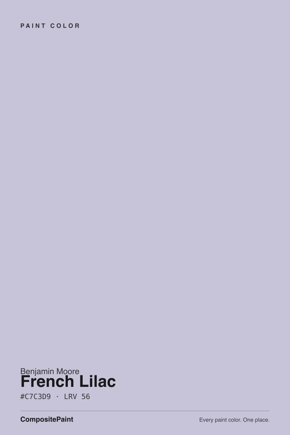
- 3French Lilac56
- 4Lavender Mist63
- 5Silver Peony68
The Fast Verdict
French Lilac is the pastel purple that skipped the candy aisle. It is a blue-violet, not a rosy mauve, grayed just enough to look tailored instead of sweet, and at LRV 56 it keeps a room light while still clearly being a color. Give it daylight, crisp white trim and one dark note — charcoal, navy, walnut — and it reads expensive. Give it a dim north room, warm cream furniture and no contrast, and it reads either icy or like a bedroom you had in 1996.
Bedrooms with real daylight · dining rooms with white trim and dark wood · bathrooms and powder rooms · nurseries and kids' rooms that should not look babyish · color-drenched rooms where the trim goes lilac too
Your room faces north and stays dim · you wanted a neutral with only a whisper of violet · your floors are honey oak or your tile is Tuscan gold · the room is already all cream, terracotta and warm wood
- A real lilac that never tips candy-sweet or Easter-egg
- LRV 56 keeps the room light while still committing to a color
- Cool violet stays crisp under daylight and modern LEDs
- Drenched — walls, trim and ceiling — it reads tailored, not themed
- A Classics-collection color, so it predates the purple trend and outlives it
- Turns cold and clinical in a dim north room
- Bright midday sun bleaches it toward pale gray-lavender
- Reads juvenile fast without charcoal, navy or dark wood in the room
- Fights honey oak, Tuscan gold and terracotta — no rug fixes it
What Color Is French Lilac, Really?
A true pastel lilac — and specifically a blue-violet one, which is the fact that decides everything else. The mix runs blue-highest with red barely ahead of green, so this is not the rosy, red-leaning mauve family that Sleepy Hollow and Cinnamon Slate belong to. It leans the other way, toward periwinkle. Benjamin Moore describes it as a pastel purple with a hint of blue, and files it in the Classics collection, which is the honest context for the current purple revival: French Lilac was sitting in the deck long before designers started predicting plum for 2026.
At LRV 56 it is a mid-light color, and that number is doing two jobs. It is light enough that four walls of it never feel closed in — this is not a moody color, whatever the word purple suggests. But it is also low-chroma, which means it flips easily: strong midday sun bleaches it toward a pale gray-lavender that can nearly disappear, and very warm light drains the violet out and leaves something dustier. Expect the wall to look a little grayer and a little more colorful than the chip at different hours of the same day.
Undertone in one line: blue-violet, never red-violet. If your sample reads faintly pink, that is a very warm bulb or low west sun doing it; if it reads periwinkle-blue, that is a cool LED or a north window. Both are the same paint telling you the truth about your room.
Where It Shines
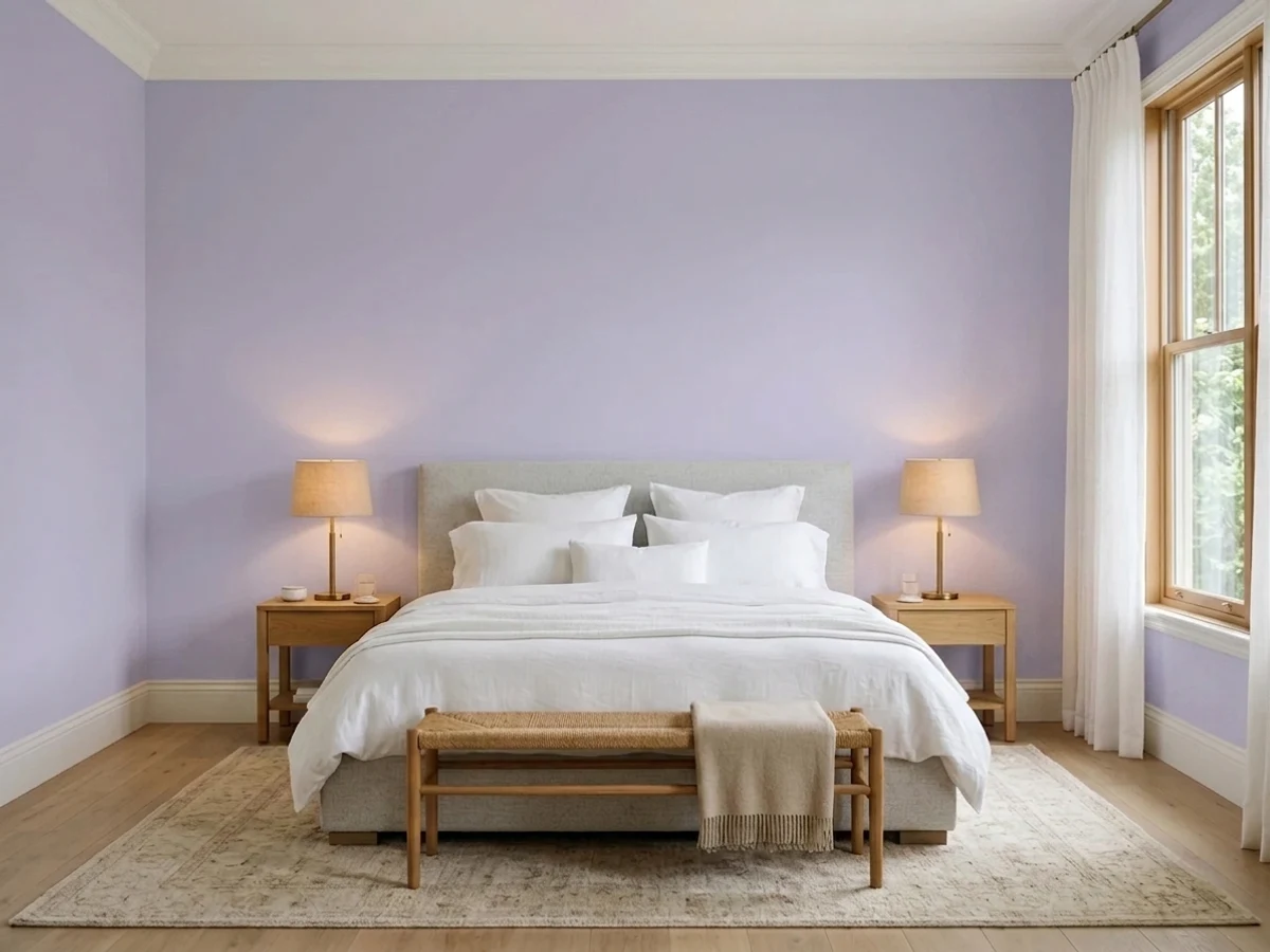
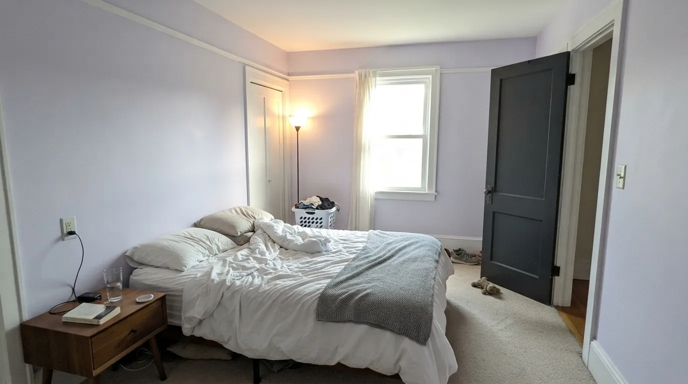
This color wants daylight and it wants contrast. Its best room is a bedroom with a real window: the lilac stays clean and soft all morning, and crisp white trim keeps it from going dusty. Its second best trick is drenching — walls, trim and ceiling all in French Lilac, which sounds bold and actually reads calmer than a lilac wall with a white stripe of baseboard, because the stripe is what makes a pastel look like a nursery. Add one dark note (a charcoal door, a navy built-in, a walnut table) and silver or nickel hardware, and the whole thing looks deliberate rather than sweet.
Where It Fails
The regret stories about pale lilacs are remarkably consistent, and all three are predictable before you open a can. None of them are the paint's fault — but if your room matches one, sampling a bigger square will only confirm it.
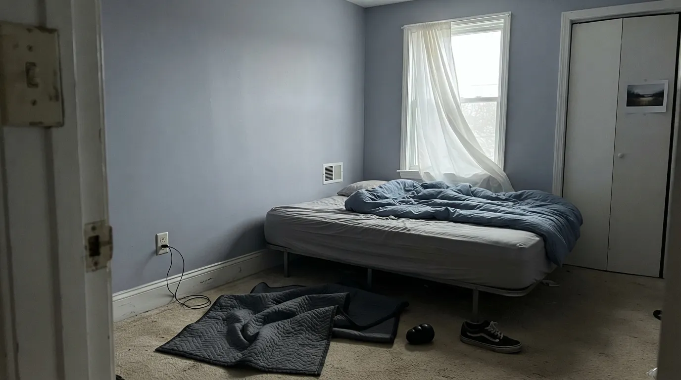
North light is cool and gray, and a cool violet has no warmth to fight back with. The violet actually survives — that part is real — but the room turns icy and faintly clinical, the read people describe as hospital lilac. If a north room is the plan, either commit to warm 3000K lamps and warm textiles, or pick something with red in it: Sleepy Hollow holds its color in poor light far better.
Pastel purple carries thirty years of baggage, and nothing triggers it faster than lilac walls plus white trim plus white furniture plus nothing else. The color is not the problem; the styling is. Charcoal, slate navy, black metal, dark wood and a real gray — Stonington Gray next door, Kendall Charcoal on a door — are what make it read 2026. Without at least one of them, guests will date the room instantly.
Yellow-orange sits directly opposite violet on the wheel, so golden oak floors, orange-stained trim, gold-flecked granite and terracotta tile all exaggerate the purple while the walls push them further orange. Both sides lose. French Lilac wants walnut, espresso, pale white oak, gray-washed floors or cool stone; if the golden floor is staying, this is the wrong color, not a rug problem.
Room by Room
Morning light suits it perfectly: soft, clean lilac with no sweetness. Matte finish, crisp white trim, and one dark anchor — a charcoal headboard wall or a slate-blue bench. Keep the bedding white or gray rather than cream, which reads yellow against a cool violet.
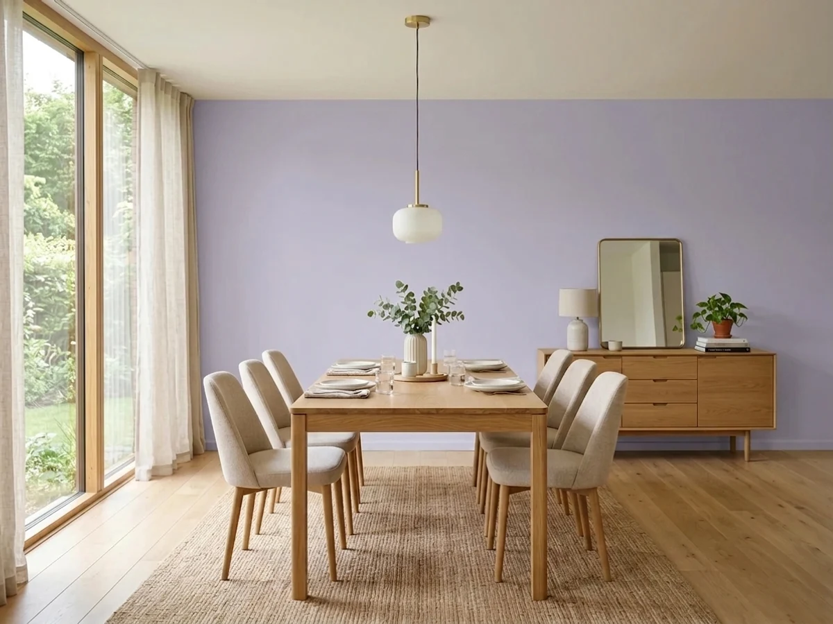
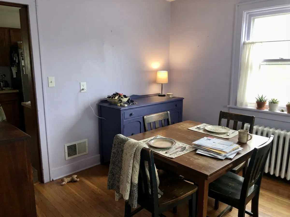
This is the lighter answer to the deep-aubergine dining room. Painted out top to bottom with a walnut table, white or nickel-toned lighting and a Blue Nova sideboard, it feels considered and unusual without going dark — a real advantage in a dining room that only has one window. In a dim, windowless dining room, a saturated purple does the job better.
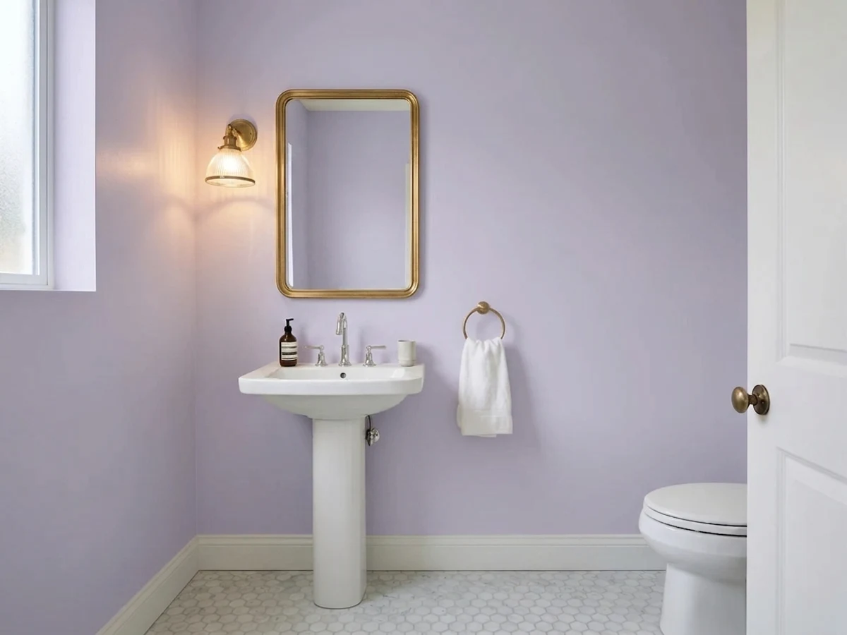
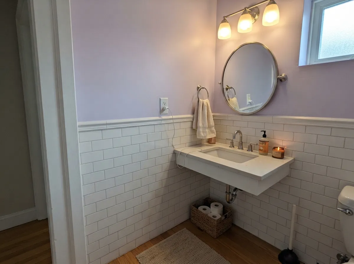
Small rooms with hard surfaces are where a cool color belongs. It sits beautifully against white subway tile, marble, chrome and polished nickel, and a powder room is a low-risk place to try purple. Satin or eggshell on the walls; keep the bulbs at 3000K so it does not go clinical.
Genuinely one of the better choices here: soft enough to be restful, grown-up enough that a nine-year-old will not hate it at fourteen. Add slate-blue or charcoal built-ins so it is not read as a gender label, and skip the matching lilac bedding — one lilac in the room is the whole point.
It can be lovely in a bright, closed living room with gray upholstery and dark wood. In an open plan it has to negotiate with kitchen wood tones and whatever the next room wears, and pale violet is not a good negotiator. If you want it on a main floor, put it in one defined room and let a true gray carry the hallway.
Full sun flattens low-chroma violets and the siding reads as faded rather than colored, which is the one thing exterior paint must never do. There is no good version of this on a facade; keep it inside.
Your Light Is the Risk
Bright morning light is where it is cleanest — an unmistakable soft lilac with no icy edge and no wash-out. Sample on the east wall first.
Cool gray daylight with nothing to warm it turns the room chilly and slightly clinical. The color survives; the comfort does not.
Strong midday sun washes it toward a pale gray-lavender that nearly disappears, then late-day warmth brings the color back a touch softer and rosier.
2700K warm bulbs mute the blue and leave a dustier, grayer violet; 3000K is the sweet spot; 4000K and up sharpen it toward periwinkle. Avoid fluorescent tubes entirely.
Most complaints about French Lilac are a light mismatch. Upload a photo of your actual room and see it on your walls — then ask for the same wall in north light or evening lamps before you buy a single sample.
Need It From Another Brand?
Any paint counter can custom-tint Benjamin Moore 1403 directly. If you would rather stay in one brand's own deck, these are the closest stock matches, measured as ΔE2000. Under 2 is a difference you will not see on the wall.
| Brand | Closest color | ΔE | LRV | |
|---|---|---|---|---|
| Behr | FoxgloveM550-3 · Behr | 2.4 | 55 | Color page → |
| Valspar | Playful Petal1001-4B · Valspar | 4.0 | 57.7 | Color page → |
| Glidden | Icy Spring Violet90BB 58/072 · Glidden | 2.4 | 58 | Color page → |
| Dutch Boy | Cooled Lavender244-2DB · Dutch Boy | 2.1 | 54 | Color page → |
| Diamond Vogel | Orchid Fragrance1287 · Diamond Vogel | 3.4 | 56 | Color page → |
| Hirshfield's | Purple Purity1246 · Hirshfield's | 1.3 | 59 | Color page → |
Similar Benjamin Moore Colors
The nearest shades to French Lilac within Benjamin Moore's own range, ranked by perceptual color distance — useful when you want the same look a touch lighter, darker, or warmer.
WCAG 2.1: AA is 4.5 : 1 for normal text, 3 : 1 for large text, AAA is 7 : 1.
French Lilac vs the Colors You're Also Considering
Every French Lilac sample board has the same rivals on it. The numbers show the real lightness gap — then it comes down to which risk you would rather live with.
Pick this when you want the color to actually register as lilac from the doorway, not just in the corners.
Benjamin Moore 2070-60 · LRV 63Lavender MistPick this if you want the same lilac turned down — lighter at LRV 63 and closer to a violet-tinted white.
Pick this when purple is the decision, not the side effect.
Sherwin-Williams SW 7022 · LRV 57AlpacaPick this if what you actually wanted was a neutral with a violet streak — nearly the same lightness, a fraction of the color.
French Lilac Coordinating Colors
The rule for coordinating with French Lilac: stay on the cool side, and make sure something in the room is dark. It pairs with clean whites, true grays and blue-violets; it argues with creams, golds and anything terracotta. These are the partners that keep showing up in rooms that actually work:
Lilac Is Back — and This One Never Left
Purple has been building for a few years now. Benjamin Moore named Blue Nova, a soft blue-violet, its Color of the Year for 2024, then followed with Cinnamon Slate for 2025 — a browner, deeper purple at LRV 19 — and color forecasters have spent the last year predicting plums and lilacs for 2026. Lilac in particular is being sold as the fresh partner for all the gray that houses already have.
French Lilac sits slightly outside that story, and that is the argument for it. It belongs to the Benjamin Moore Classics collection, which means it has been in the deck for decades, through the whole gray era, without a marketing campaign. You are not buying a 2026 color; you are buying a color 2026 happens to have caught up with.
The catch is the other decade it remembers. Pastel purple was everywhere in the 1990s, and enough people lived through lilac-and-white bedrooms that the association is instant. The fix is not a different lilac — it is different company. Drenched trim instead of a white baseboard stripe, charcoal or slate navy somewhere in the room, dark wood, matte black or nickel instead of white-and-brass, and gray textiles rather than cream. Same paint, thirty years apart.
French Lilac With Wood, Metal and Floors
The floor decides this one before the paint does. Walnut, espresso, pale unstained white oak and gray-washed wood are all excellent — the first two because their depth makes the lilac look intentional, the last two because they stay out of the way. Cool gray LVP, white marble, gray carpet and white quartz are all safe. Concrete and slate are better than safe.
The clear no is anything golden: honey oak floors, orange-stained trim, gold-flecked granite, Tuscan travertine, terracotta tile. Yellow-orange is violet's complement, so each side amplifies the other — the floor looks more orange, the walls look more purple, and no number of coats changes the geometry. This is a choose-one situation, not a rug situation.
Metals are simpler. Polished nickel, chrome and brushed silver are the natural friends of a cool violet, and matte black and pewter ground it. Brass is not banned — a little gold against violet makes the lilac pop, which is exactly why designers use unlacquered brass hardware in a lilac powder room — but a whole room of warm brass and cream will make the walls read purpler and slightly sour. Use it as jewelry, not as a theme.
Three Ready Palettes Built on French Lilac
A color is never alone on the wall. These are complete combinations in the 60-30-10 pattern, with the reason each one holds together. Every one opens in the visualizer.
A cool violet needs a clean white beside it, not a creamy one — Chantilly Lace keeps the lilac looking crisp instead of dusty. Kendall Charcoal is the adult in the room: one dark plane is what separates a designed bedroom from a pastel one. Nickel or polished chrome hardware, gray or white bedding, no cream.
Try this palette in your roomBlue Nova sits on the same blue-violet axis several steps deeper, so the sideboard reads as the same idea with weight rather than as a contrasting accent. Painting the trim out removes the white baseboard stripe that makes any pastel look like a kid's room, and a plain neutral ceiling at LRV 87 keeps the room from closing in. Walnut table, dark chairs, nickel or black lighting.
Try this palette in your roomThis is the softer route on purpose: White Dove is warm, so it reads a shade creamier next to a cool lilac, which takes the sharp edge off a small room — the opposite choice from the tailored bedroom above, and the right one here. Slate-blue built-ins stop the room reading as a gender label and give it somewhere to go at fourteen.
Try this palette in your roomFrench Lilac FAQ
Is French Lilac too purple for a whole room?
No — it is a pastel, and at LRV 56 four walls of it stay light and easy. What surprises people is that it is unmistakably purple, not a gray that happens to lean lilac. If you wanted the second thing, Alpaca at LRV 57 gives you the same lightness with only a violet streak.
What trim white goes with French Lilac?
A crisp, clean one. Chantilly Lace is the default — it keeps the lilac looking tailored rather than dusty. Oxford White is the quieter version of the same idea. A creamy white like Swiss Coffee will read distinctly yellow against a cool blue-violet, which is fine only if you want the room soft and old-fashioned on purpose. Or paint the trim French Lilac too and skip the argument.
Will French Lilac look blue?
It can. The blue is genuinely in there, so cool LEDs at 4000K and up, or a north window on a gray day, will push it toward periwinkle. Warm 2700K bulbs do the opposite and mute it toward a dusty gray-violet. Bulbs at 3000K keep it reading as lilac, and swapping bulbs is much cheaper than repainting.
Does it work in a dining room?
Yes, in a dining room with at least one real window. It is the light alternative to the classic deep-aubergine dining room — unusual and considered without making a small room dark. Paint the trim out with it, put a walnut or dark table in the middle, and add one deeper blue-violet piece such as a Blue Nova sideboard. In a windowless dining room, a saturated purple performs better than a pastel.
Is French Lilac good for a north-facing room?
It is the riskiest exposure for it. Cool north light keeps the violet but takes the comfort out, and the room can read icy and slightly clinical. It is workable with warm 3000K lamps, wood furniture and warm textiles — but if the room is both north-facing and dim, a red-leaning mauve like Sleepy Hollow is the safer purple.
Will lilac walls look dated?
The color is a Benjamin Moore Classic, so it did not arrive with a trend and will not leave with one. What dates is the 1990s styling around it: lilac walls, white trim, white furniture, nothing dark. Drench the trim, add charcoal or slate navy, use nickel or black metal instead of white-and-gold, and the same paint reads current.
Have you painted with French Lilac?
Rate it — one tap helps the next reader decide.
Ask a Question