Silver Peony
The whisper-lilac Sherwin-Williams files under purple, reviewed honestly: the light where it glows dusty-rose, the light where it just goes flat gray, and what to pick instead.

Jessica has spec'd whites and neutrals for more than 300 rooms and keeps a sample wall of painted drawdowns in her studio. Every color review is checked against real reader rooms in the comments and re-tested when a formula changes. About the testing process →
- 1French Lilac56
- 2Lavender Mist63
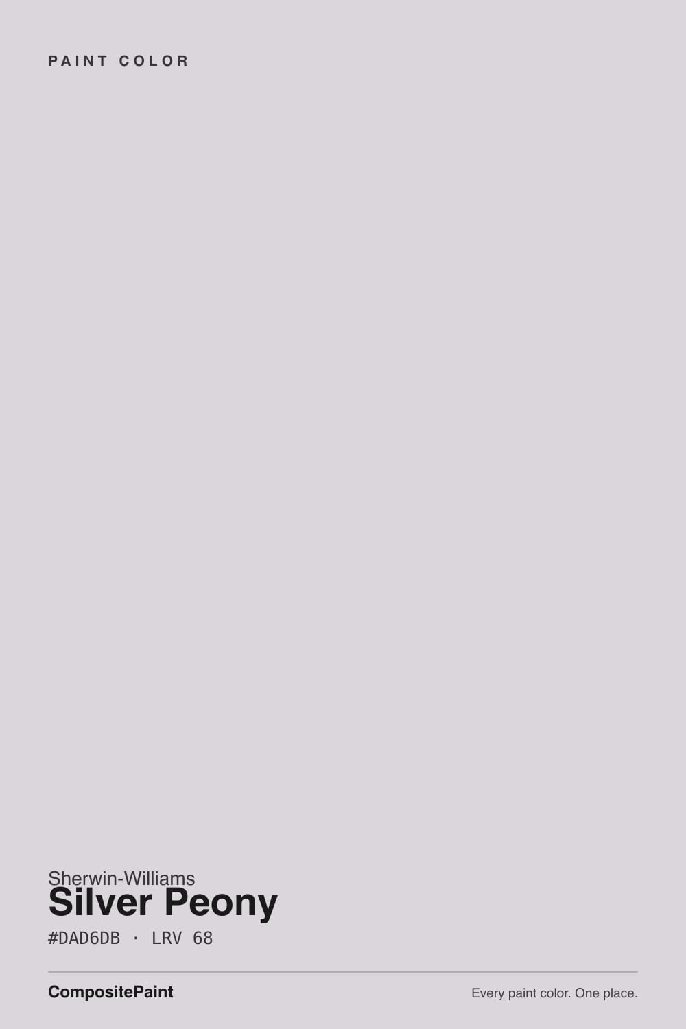
- 3Silver Peony68
- 4White Lavender76
- 5Barely Pink87
The Fast Verdict
Silver Peony is the color you pick when you want "a little color" and mean it literally. Sherwin-Williams files it under Purple, and the RGB numbers (218 / 214 / 219) back that up — but on most walls, in most daylight, it reads as a soft, quiet gray. The violet only fully shows up under warm lamp light or a direct side-by-side with a true white. If you want a color that announces itself, this is the wrong pick; if you want a neutral with one degree more personality than gray, it is nearly perfect.
Bedrooms and nurseries that want a hint of color, not a statement · powder rooms and vanities with brass · anyone who likes Agreeable Gray but wants a touch softer · rooms lit by warm lamps at night
You actually want visible lavender on the wall · your room is north-facing and dim · you're chasing the exact peony-pink the name implies · your trim runs warm cream instead of a cool-neutral white
- Genuinely soft, not saccharine — the palest whisper of lilac, never candy pink
- Turns a believable dusty rose-gray under warm lamp light at night
- A natural "one step past gray" pick for Agreeable Gray and Repose Gray fans
- High LRV (68) keeps small or dim rooms from feeling closed in
- Plays well with brass, warm wood, and cream linens without fighting them
- In bright or flat daylight the violet all but disappears — reads as plain gray
- Cool north light or cool LEDs strip the pink and leave a cold gray-blue
- Too pale a commitment for anyone who actually wants visible lavender
- Clashes with strong honey oak floors or brassy-gold trim
What Color Is Silver Peony, Really?
A near-white with just enough chroma to earn its own paint-family listing: Sherwin-Williams puts Silver Peony in its purple lineup, and the RGB values (218 red, 214 green, 219 blue) confirm there is a real, if tiny, violet lean — the blue channel edges just above the green and red. But "purple" on a swatch card and "purple" on four walls are two different claims. At this level of dilution, the color behaves far more like a quiet gray with a memory of pink than like a color anyone would call lavender from across the room.
At LRV 68 it reflects most of the light that hits it — bright enough to keep a small or dim room from feeling closed in, but clearly not a stark white. Put it next to Sherwin-Williams Pure White (LRV 84) and Silver Peony immediately shows its body: a faint dusty cast that reads as "soft" rather than "dirty." That depth is also why the pink-violet only fully commits under warm light — there isn't much saturation to work with in flat daylight.
Undertone in one line: cool violet-pink first, gray second — never warm gold, never true blue. If your sample looks completely flat and colorless, that's overcast or north light draining the little chroma it has. If it flushes visibly pink or mauve, that's a warm 2700K bulb or late-afternoon sun doing exactly what the paint was built to do.
Where It Shines
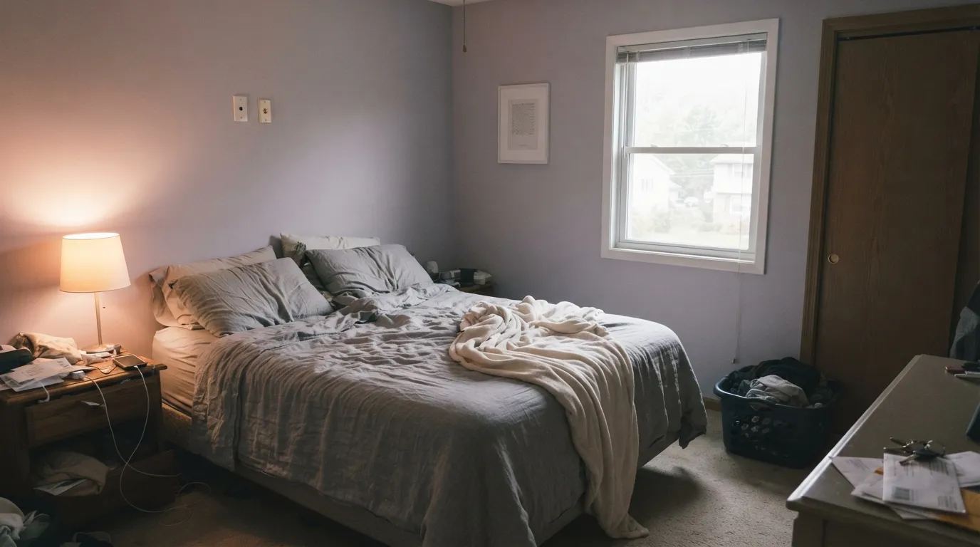
This is a color for rooms people actually use at night. Under warm lamp light the violet comes forward and the walls take on a dusty rose-gray that reads considered, not painted-by-numbers — which is exactly why designers reach for it in bedrooms and small powder rooms instead of a plain gray or a committed lilac. Its second home is anywhere someone loves the safe-neutral playbook (Agreeable Gray, Repose Gray) but wants one degree more warmth and personality without the risk of an actual color decision.
Where It Fails
Nearly every disappointed review of Silver Peony follows one of three scripts, and all three are predictable before the first coat goes on. None of them are the paint's fault — but if your room matches one, this is not your color, and a bigger sample will only confirm it.
At this diluted a depth, chroma nearly vanishes once it's spread across four walls in strong daylight. Readers who bought it hoping for a visible "pop of lavender" report walls that just look flat gray — the name oversells the color by a wide margin. If you want lavender you can actually see, look at a deeper cousin like Wisteria, not this one.
North-facing rooms and 4000K+ bulbs strip out what little pink-violet the color has and leave a cold, slightly blue-gray that reads dull rather than soft. This is the single most common complaint, and it's a lighting problem, not a paint defect — warm bulbs fix it in an evening.
Yellow-gold sits opposite violet on the color wheel, so strong honey oak floors or brassy-gold trim push each other the wrong way: the wood reads more orange, the wall reads more grayed-out and muddy. Pale oak, walnut, or painted trim are safer company.
Room by Room
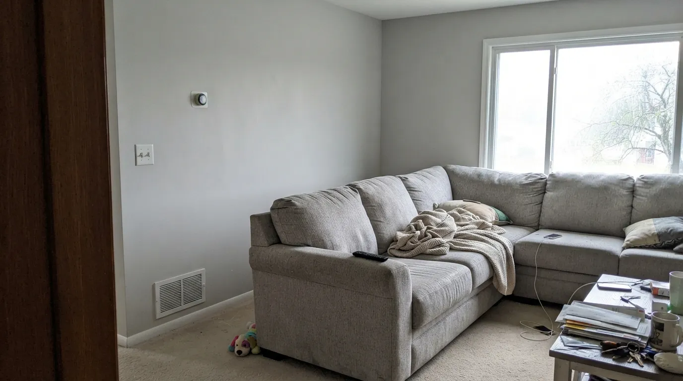
Warm lamp light at night pulls the dusty-rose forward; daylight keeps it a calm near-neutral. Eggshell on walls, cream or white bedding rather than stark white, which can make the wall look grayer by comparison.
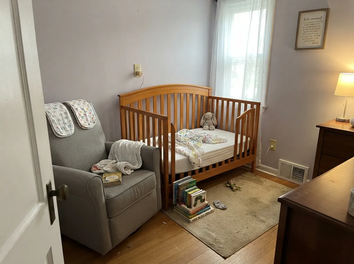
Gender-neutral enough to work either way, and soft enough not to overstimulate. Sample it in the room's actual daylight first — a north-facing nursery can look plainer gray than the chip promised.
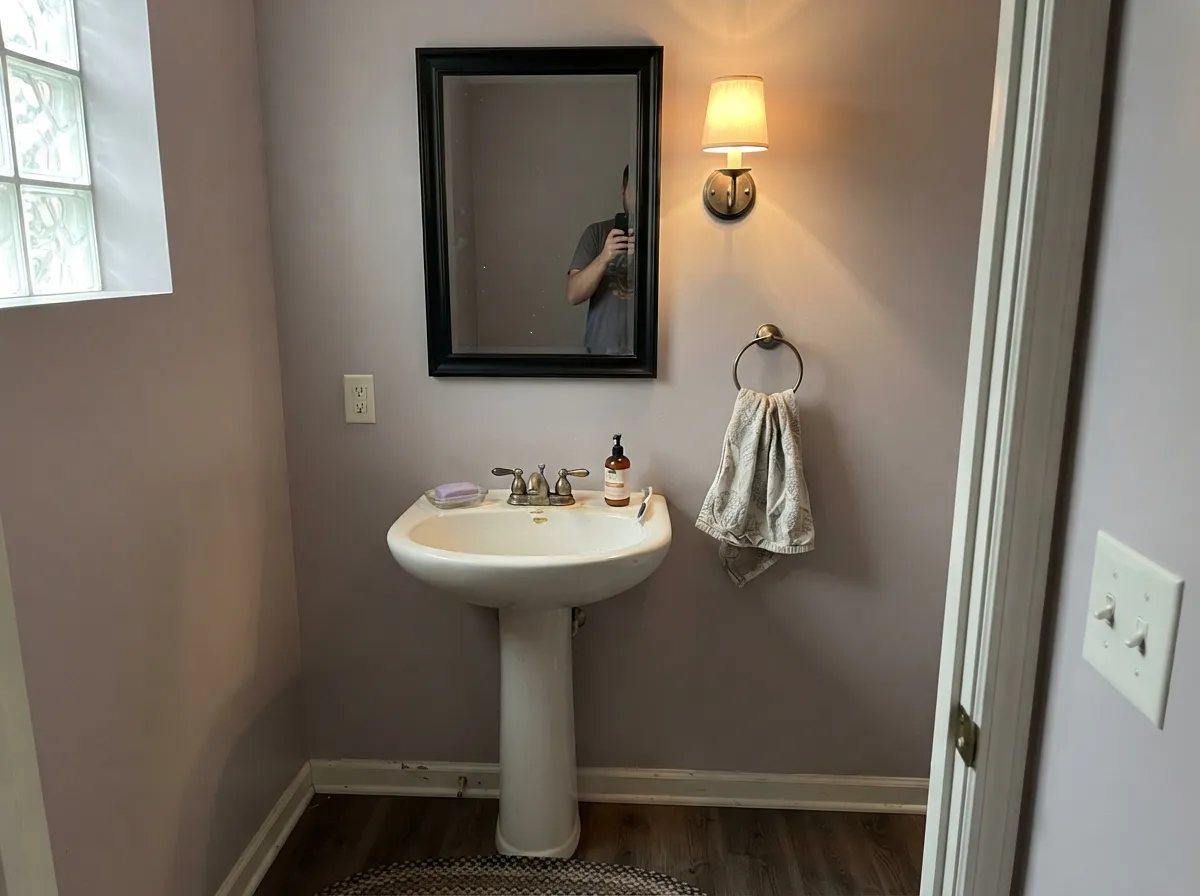
With brass hardware, a black-framed mirror, and one warm sconce it reads custom and quietly expensive. Under cool overhead LEDs and chrome it goes flat and forgettable — swap the bulbs before blaming the paint.
Works as a softer alternative to Agreeable Gray or Repose Gray in a bright room. In a dim or north-facing living room it is one of the least interesting choices you could make — pick a color with more LRV headroom or more built-in chroma instead.
Hallways rarely get consistent light all day, and this color changes the most of any near-neutral as the light shifts. What looks lilac at the window end can look flat gray at the dark end of the same hallway.
Full outdoor sun washes out what little violet it has and can read as a dull, slightly dirty off-white on siding. There are better whisper-neutrals built for exterior sun; this isn't one of them.
Your Light Is the Risk
2700K bulbs wake the violet and the walls settle into a soft dusty rose-gray — the closest this color gets to looking like its name.
Cool, flat daylight drains the little chroma it has, leaving a cold, slightly blue-gray with none of the promised lilac.
A faint cool-pink flush in the morning or evening sun hours, settling back to a quiet near-neutral the rest of the day.
2700K warm bulbs: visibly dusty-lilac. Cool 4000K+ LEDs: flat and gray. Same paint, different bulb — check yours before you decide the color "doesn't work."
Most complaints about Silver Peony are a light mismatch. Upload a photo of your actual room and see it on your walls — then ask for the same wall in north light or evening lamps before you buy a single sample.
Need It From Another Brand?
Any paint counter can custom-tint Sherwin-Williams SW 6547 directly. If you would rather stay in one brand's own deck, these are the closest stock matches, measured as ΔE2000. Under 2 is a difference you will not see on the wall.
| Brand | Closest color | ΔE | LRV | |
|---|---|---|---|---|
| Behr | Petal TipMQ3-30 · Behr | 1.9 | 68 | Color page → |
| Benjamin Moore | Touch of Gray2116-60 · Benjamin Moore | 1.4 | 69 | Color page → |
| Valspar | Nattie's CamiT552 · Valspar | 1.6 | 68.2 | Color page → |
| PPG / Glidden | Violet WhimseyPPG1174-2 · PPG / Glidden | 2.0 | 68 | Color page → |
| Glidden | Violet WhimseyPPG1174-2 · Glidden | 1.9 | 68 | Color page → |
| Dutch Boy | Frosted Silver435-1DB · Dutch Boy | 4.1 | 69 | Color page → |
Similar Sherwin-Williams Colors
The nearest shades to Silver Peony within Sherwin-Williams's own range, ranked by perceptual color distance — useful when you want the same look a touch lighter, darker, or warmer.
WCAG 2.1: AA is 4.5 : 1 for normal text, 3 : 1 for large text, AAA is 7 : 1.
Silver Peony vs the Colors You're Also Considering
Every Silver Peony sample board has the same rivals on it. The numbers show the real lightness gap — then it comes down to which risk you would rather live with.
Pick this for a touch more visible lilac without stepping into true lavender territory.
Sherwin-Williams SW 6827 · LRV 72ElationPick this if you want it a shade paler and quieter — Elation sits at LRV 72 and reads even closer to a plain soft white.
Pick this if you're already matching Sherwin-Williams paint elsewhere in the house.
Benjamin Moore 2071-70 · LRV 79Misty LilacPick this for Benjamin Moore's take on the same whisper-lilac idea — pinker and a step lighter at LRV 79.
Silver Peony Coordinating Colors
The rule for coordinating with Silver Peony is to stay cool-to-neutral and let the paint carry the only whisper of color in the room. It pairs cleanly with crisp trim whites, deeper violet-grays for tonal depth, and near-black accents for grounding — and it loses its subtlety fast next to anything strongly warm or gold. These are the partners that keep showing up in rooms that work:
Gray or Purple? The Question That Follows Silver Peony Everywhere
Almost every write-up of this color eventually asks the same thing: is this actually a purple, or is Sherwin-Williams stretching the definition? The RGB breakdown settles it on paper — 218 red, 214 green, 219 blue — the blue channel is genuinely the highest of the three, which is why the company's own color-family tool puts it in the purple lineup rather than gray or white. But chroma, not just hue, decides what a color looks like on a wall, and Silver Peony's chroma is extremely low.
That combination — a real but tiny violet lean at a very light, very low-saturation depth — is exactly why the color reads differently depending on who's looking and what light they're standing in. It is not an inconsistent paint; it is a paint sitting right at the edge of visibility, where the same wall can honestly be described as "gray" by one reader and "lilac" by another, often in the same house at different times of day.
Silver Peony With Wood Tones and Floors
This decision comes down to the floor more than the paint. Walnut, espresso, and pale white oak all sit comfortably with Silver Peony — the wood's warmth balances the wall's cool lean without a fight, and the effect stays quiet rather than themed. Gray-washed or driftwood-toned floors are safe as well, keeping the whole room in one cool, understated family.
The one floor that argues with it is strong honey or golden oak. Yellow-orange and violet sit opposite each other on the wheel, so a honey floor under Silver Peony walls tends to push the wood more orange and the wall more grayed-out and muddy — neither side wins. If the golden floor isn't going anywhere, a large rug between it and the wall helps, or consider a warmer neutral instead of this one.
Three Ready Palettes Built on Silver Peony
A color is never alone on the wall. These are complete combinations in the 60-30-10 pattern, with the reason each one holds together. Every one opens in the visualizer.
Sleepy Hollow is Silver Peony's deeper, more committed cousin, so a headboard wall in that color reads intentional rather than mismatched. Pure White trim keeps both from looking dingy in bright daylight.
Try this palette in your roomA warm trim white keeps the nursery from tipping cold, and one muted sage piece of furniture gives the room a second quiet color instead of leaning on the walls alone — gender-neutral and calm either way.
Try this palette in your roomA crisp trim white keeps the small room bright, and one near-black frame gives the scheme a grounding note so the whisper of lilac doesn't read accidental. Brass hardware finishes the look.
Try this palette in your roomSilver Peony FAQ
Is Silver Peony gray or purple?
Both answers are technically correct. Sherwin-Williams files it under its purple family, and the RGB numbers confirm a real, if very small, violet lean. But the chroma is so low that in flat or cool daylight it reads as a plain soft gray, and it only fully shows its pink-violet side under warm lamp light or next to a true white.
How light is Silver Peony — what's the LRV?
LRV 68, which is bright — closer to a soft white than a mid-tone color. It reflects most of the light that hits it, so it won't darken a small or dim room the way a true lavender or a mid-depth gray would.
What trim white goes with Silver Peony walls?
A crisp, cool-neutral white — Pure White or Extra White — keeps the pairing quiet and lets the wall's faint violet stay legible. A warm cream trim can nudge the whole room warmer and mute the lilac even further.
Is it good for a nursery?
Yes, with one caveat: sample it in the room's actual daylight first. It's gentle and gender-neutral, and it warms up nicely under a lamp at night, but a north-facing nursery can end up looking plainer gray than the paint chip suggested.
Does Silver Peony work with honey oak floors?
Not its best pairing. Honey oak and brassy-gold trim sit on the opposite side of the color wheel from violet, so the wood tends to read more orange and the wall reads more muddy-gray next to it. Pale oak, walnut, or painted trim are safer floors and trim to pair it with.
Silver Peony vs. Elation vs. Misty Lilac — which one?
All three are whisper-lilac near-whites and close enough that most people can't tell them apart on a chip. Silver Peony (SW 6547, LRV 68) is the deepest and grayest of the three; Elation (SW 6827, LRV 72) is a notch paler and quieter; Misty Lilac (BM 2071-70, LRV 79) is the lightest and pinkest. Pick by brand match first, then by how much whisper of color you actually want.
Have you painted with Silver Peony?
Rate it — one tap helps the next reader decide.
Ask a Question