Inspired Lilac
Sherwin-Williams' quietest purple, reviewed honestly: the light where it reads as lilac, the light where it disappears, and why it isn't the color you saw in the headlines.

Jessica has spec'd whites and neutrals for more than 300 rooms and keeps a sample wall of painted drawdowns in her studio. Every color review is checked against real reader rooms in the comments and re-tested when a formula changes. About the testing process →
- 1French Lilac56
- 2Lavender Mist63
- 3Inspired Lilac71
- 4White Lavender76
- 5Barely Pink87
The Fast Verdict
Inspired Lilac is Sherwin-Williams' answer to "I want a little purple, not a statement." At LRV 71 it sits close to a pale gray-lavender — enough blue-violet to read as color, not enough to fight anything else in the room. It is not the mauve SW crowned its 2025 "Loneliest Color" (that is a different paint, Radiant Lilac); Inspired Lilac has quietly sat in the Popular Purples collection instead, the paler, calmer one people actually buy. It rewards a room with real daylight and goes flat and forgettable the moment the light drops.
Nurseries and primary bedrooms with real daylight · powder rooms and bathroom vanities · home offices and craft rooms · closets and dressing areas · anyone who wants a hint of purple without committing to purple
Your room stays dim all day with no lamps · your floors are honey oak with brass everywhere · you want obvious, unmistakable purple on the wall · you were hoping for Radiant Lilac's deeper mauve
- Genuinely soft, cool lilac — reads as color without demanding a decision
- High LRV (71) keeps a room bright while still adding a hint of purple
- Small rooms — powder rooms, closets, nurseries — show it off at its best
- Plays well with crisp white trim and brass without looking sugary
- A quieter, cheaper way into the current lilac trend than the deeper, headline mauves
- In full bright sun it can bleach toward a barely-there off-white
- In a dim room it settles into a flat, sleepy gray-lavender
- Golden oak and heavy brass under daylight wash it out instead of complementing it
- Too subtle for anyone who wants an obviously purple wall
What Color Is Inspired Lilac, Really?
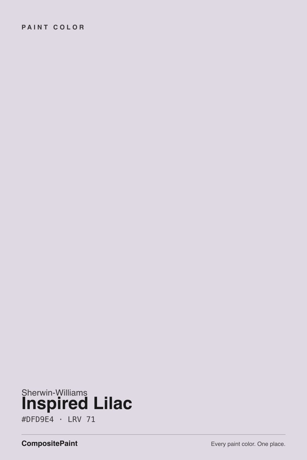
A very pale, cool-leaning lilac-gray — the undertone reads blue-violet, not the pink-mauve most lavenders lean on. The hex itself backs that up: in #DFD9E4, blue sits highest, red second, green lowest, which is exactly the recipe for a gray built with a whisper of blue-violet rather than a violet diluted with gray. Sherwin-Williams keeps it in its own Popular Purples collection, between paler cousin Elation and deeper cousin Wisteria — Inspired Lilac sits in the middle, light enough to use almost anywhere a soft neutral would go, colored enough that people notice.
At LRV 71 it reflects nearly as much light as a straight white. Put it next to SW Pure White (LRV 84) and the gap is real but not dramatic — more a difference of coolness than brightness. That high reflectance is the whole personality: on a bright wall it can read as a barely-there off-white, and only in even, moderate daylight or up close does the lilac properly register. This is a color for someone who wants some purple and none of the commitment, not for anyone chasing a wall that reads unmistakably purple from across the room.
Undertone in one line: cool blue-violet, never pink, never a warm mauve. If your sample looks flat gray, the room is probably too dim to carry any pale tint — that happens to colors this light regardless of hue. If it looks faintly blue in the evening, that is cool light doing its job, not a bad can.
Where It Shines
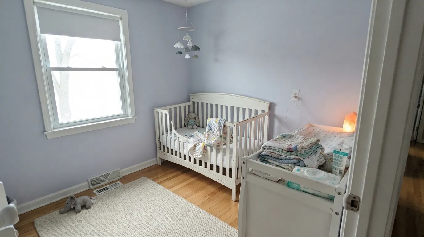
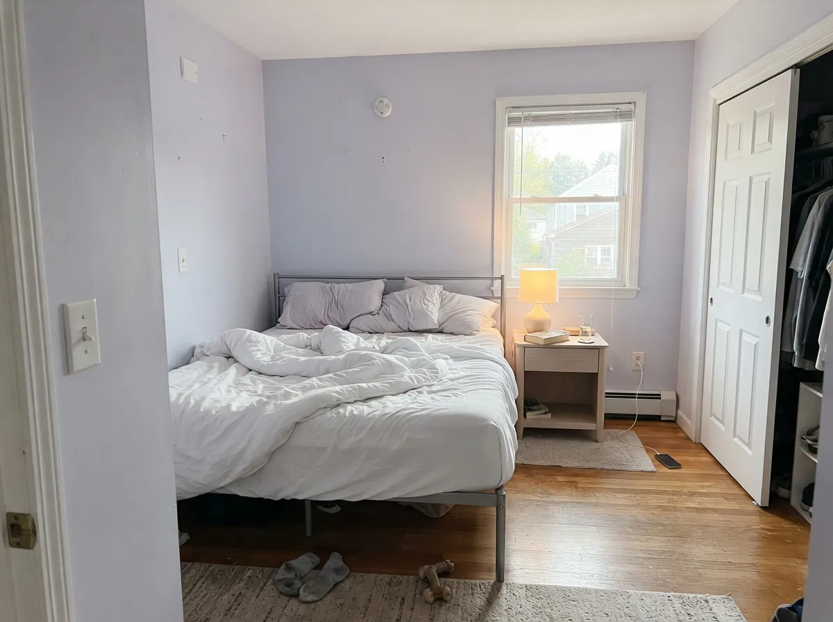
Give it a room with real daylight — even bright, indirect north-adjacent light is enough — and Inspired Lilac earns its name: a genuinely soft, cool lilac that reads like a whisper of color rather than a decorating decision. It is at its best in small, private rooms where the walls are close enough to actually see the tint: a nursery, a primary bedroom, a powder room. Next to crisp white trim and a little brass it looks intentional and quietly expensive, never sugary.
Where It Fails
Almost every disappointed review of Inspired Lilac comes down to one of three things, and all three are predictable before the first coat. None of them are the paint failing — they are what happens to any pale, cool tint in the wrong light or the wrong company.
Every pale color goes flatter in low light, and Inspired Lilac is no exception — in a dim, north-facing room without warm lamps it can settle into a dull, sleepy gray-lavender. That is not a defect specific to this color; it is what LRV 71 does anywhere the light is scarce. Add lamps, or pick something with more depth if the room stays dark.
At LRV 71 it is already close to white, so full direct sun bleaches out the little violet it has — the wall can read as a slightly cool off-white rather than lilac. If you want the purple to actually show in a bright south-facing room, size up to something with more depth, like SW Wisteria.
Blue-violet and yellow-orange sit opposite each other on the color wheel, so warm honey oak and a lot of brass under daylight tend to dull each other rather than clash outright — the wall can look washed and undefined instead of deliberately lilac. Pale or white oak, painted trim, or a rug between the two keeps the color legible.
Room by Room
Gentle enough for a nursery of any kind, calm without tipping distinctly pink or blue. Pair with white trim and let warm lamps carry the room after dark; the cool undertone is happiest with daylight during the day.
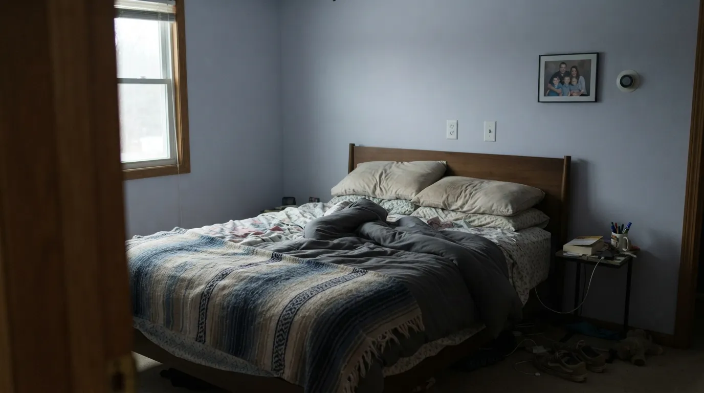
A restful, grown-up lilac for a primary bedroom that gets decent daylight. Eggshell hides texture without shining; pair with white or pale wood furniture rather than heavy dark wood, which can make the pale wall look thin by comparison.
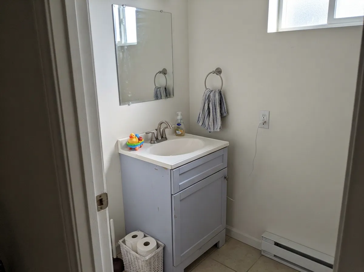
Small rooms carry pale color well, and a powder room gives Inspired Lilac exactly the close viewing distance it needs to actually read as purple. Especially good on a vanity under a white or marble counter; use satin for wipeability.
Calm enough to work in, colored enough to not feel like a blank box. Cooler light — task lamps, north windows — keeps it looking crisp rather than muddy; this is one room where cool LEDs are actually a plus.
In a bright, well-lit living room it can read as a barely-there neutral rather than a statement, which is fine if that is the goal. In a dim or north-facing living room it risks looking washed-out rather than intentional — test a large sample before committing an open floor to it.
It is light enough to survive on kitchen walls, but the cool undertone fights warm honey-toned cabinets and butcher block more than it flatters them. Outdoors, full sun bleaches it toward a flat, slightly lavender-gray that reads like weathering rather than a deliberate color — leave exterior work to a color built for it.
Your Light Is the Risk
A big window with no direct sun is the sweet spot — the cool lilac reads clearly and stays calm, never sugary.
Low light drains the pale tint to a flat, sleepy gray-lavender. Sample a large board on the actual wall before committing a dark room to it.
Cooler and clearly lilac in the morning; direct sun near golden hour can bleach it toward near-white for an hour before it settles back.
2700K lamps trade some of the lilac for a soft warm gray-taupe. Cool LEDs keep the lilac more visible but can feel a little clinical — a dimmer splits the difference.
Most complaints about Inspired Lilac are a light mismatch. Upload a photo of your actual room and see it on your walls — then ask for the same wall in north light or evening lamps before you buy a single sample.
Need It From Another Brand?
Any paint counter can custom-tint Sherwin-Williams SW 6820 directly. If you would rather stay in one brand's own deck, these are the closest stock matches, measured as ΔE2000. Under 2 is a difference you will not see on the wall.
| Brand | Closest color | ΔE | LRV | |
|---|---|---|---|---|
| Behr | Mauve Mist100E-2 · Behr | 1.0 | 72 | Color page → |
| Benjamin Moore | Violet Dusk1409 · Benjamin Moore | 4.5 | 70 | Color page → |
| Valspar | Purple Mist4002-9A · Valspar | 1.9 | 72 | Color page → |
| PPG / Glidden | Pale OrchidPPG1175-2 · PPG / Glidden | 1.1 | 71 | Color page → |
| Glidden | Pale OrchidPPG1175-2 · Glidden | 1.5 | 72 | Color page → |
| Dutch Boy | Iced Amethyst244-1DB · Dutch Boy | 3.3 | 72 | Color page → |
Similar Sherwin-Williams Colors
The nearest shades to Inspired Lilac within Sherwin-Williams's own range, ranked by perceptual color distance — useful when you want the same look a touch lighter, darker, or warmer.
WCAG 2.1: AA is 4.5 : 1 for normal text, 3 : 1 for large text, AAA is 7 : 1.
Inspired Lilac vs the Colors You're Also Considering
Every Inspired Lilac sample board has the same rivals on it. The numbers show the real lightness gap — then it comes down to which risk you would rather live with.
Pick this when you want a version that still visibly registers as lilac up close, not just a cool neutral.
Sherwin-Williams SW 6827 · LRV 72ElationPick this if you want it even quieter — Elation sits right beside it in SW's own Popular Purples lineup and reads closer to a soft gray from across the room.
Pick this for the cooler, more gray-grounded version that reads a little more grown-up.
Benjamin Moore 2071-60 · LRV 65Lily LavenderPick this for a warmer, more clearly lavender-pink version — a truer nursery lilac than Inspired Lilac's cooler gray-violet.
Inspired Lilac Coordinating Colors
The rule for coordinating with Inspired Lilac: stay cool and let the trim do the crisp work. It pairs cleanest with cool-neutral whites and true grays, layers well with deeper members of its own purple family, and takes brass and near-black accents without fuss. These are the partners that keep showing up in rooms that work:
Inspired Lilac vs. Radiant Lilac: Two Very Different SW Purples
The name causes real confusion, so it is worth settling: these are not the same paint. Radiant Lilac (SW 0074) is the deeper, more saturated mauve-violet Sherwin-Williams named its 2025 "Loneliest Color" — a marketing spotlight on one of its least-tinted shades, fronted by a national ad campaign. Inspired Lilac (SW 6820), reviewed here, is a completely different color number: paler, cooler, and quietly filed in SW's own Popular Purples collection alongside Wisteria and Elation.
If a headline or a search result sent you looking for "Sherwin-Williams lilac," it is worth checking the SKU before you buy. Radiant Lilac reads as a genuine mauve-purple statement wall; Inspired Lilac is the far more forgiving, everyday version — closer to a tinted neutral than a color of the year.
Inspired Lilac With Wood Tones and Metals
This decision gets made at the floor and the hardware, not the paint can. Pale or white oak, ash, and light gray-washed floors are the safest company — they don't fight the cool undertone, and the room reads calm and Scandinavian-adjacent. Walnut works too, in smaller doses, as a grounding contrast rather than a wall-to-wall floor.
The one pairing that needs a sample first is heavy honey oak or golden-toned trim: yellow-orange is blue-violet's complement, and together under daylight they tend to dull each other rather than clash outright — the wall looks washed instead of deliberately colored. Brushed nickel and chrome read cleanly cool against it; unlacquered brass is fine in small doses (cabinet pulls, a mirror frame) but heavy polished-brass rooms can tip the whole space warm enough to fight the lilac.
Three Ready Palettes Built on Inspired Lilac
A color is never alone on the wall. These are complete combinations in the 60-30-10 pattern, with the reason each one holds together. Every one opens in the visualizer.
Two depths of the same cool-violet family, separated by a crisp cool white, so the room reads deliberate instead of accidental. The Sleepy Hollow accent gives the eye one place to land without needing a bold color decision on every wall.
Try this palette in your roomCrisp white walls give the small room its close-up viewing distance, the vanity carries the color, and one soft near-black note on the mirror keeps the scheme from feeling accidental. Marble or white quartz and brushed nickel hardware finish the look.
Try this palette in your roomStonington Gray is a true gray, not a warm greige, so the handoff into a cool lilac room stays seamless instead of clashing. One trim white ties the whole floor together without flattening the color change between rooms.
Try this palette in your roomInspired Lilac FAQ
Is Inspired Lilac purple or gray?
Genuinely both, depending on distance and light. Up close and in even daylight it reads clearly as a pale, cool lilac. From across a bright room, or in low light, the high LRV (71) lets it settle toward a soft neutral gray. If you want it to unmistakably read purple from anywhere in the room, it is too pale for that job — look at Wisteria instead.
Is it good for a nursery?
Yes — it is one of its best rooms. The color is gentle and doesn't tip obviously pink or blue, and at LRV 71 it keeps the room bright. Give it daylight during the day and warm lamps at night, and skip it only if the nursery is genuinely dim with no windows.
What trim white goes with Inspired Lilac?
A crisp, cool-neutral white like SW Pure White is the safest match — it keeps the cool lilac feeling deliberate. A warm, creamy trim white can fight the cool undertone and make the wall look slightly muddy by comparison.
Does it work with honey oak floors?
Not its best pairing. Yellow-orange sits opposite blue-violet on the color wheel, so warm honey oak and a lot of brass under daylight tend to dull each other rather than complement — the wall can look washed-out instead of intentional. White oak, walnut, or painted trim work better.
Is Inspired Lilac the same as Radiant Lilac, SW's 2025 color?
No — they are two different paints. Radiant Lilac (SW 0074) is the deeper mauve Sherwin-Williams named its 2025 "Loneliest Color." Inspired Lilac (SW 6820) is a much paler, older shade that sits in SW's Popular Purples collection. If you searched for one and landed on the other, check the SKU before you buy.
How many coats does it take?
Two coats over any existing light color. If you are covering something dark or saturated, prime first with a gray-tinted primer — a pale color like this over a bold former wall color otherwise takes three finish coats to fully hide.
Have you painted with Inspired Lilac?
Rate it — one tap helps the next reader decide.
Ask a Question