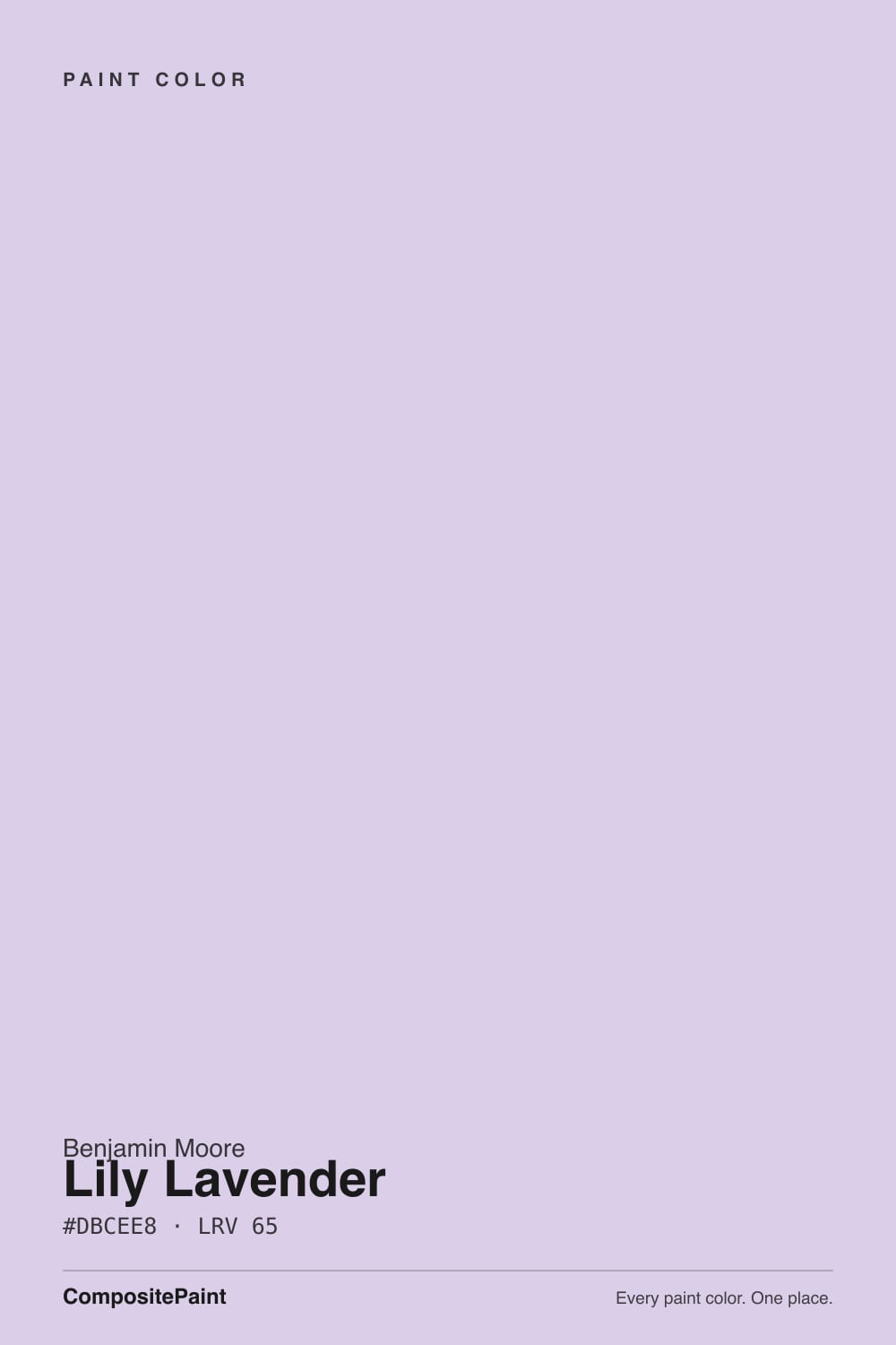
Lily Lavender
The lavender on Benjamin Moore's own popular-purples list, reviewed honestly: the nurseries and bedrooms it was made for, the light that flattens it, and what to pick instead if it reads too purple.

Jessica has spec'd whites and neutrals for more than 300 rooms and keeps a sample wall of painted drawdowns in her studio. Every color review is checked against real reader rooms in the comments and re-tested when a formula changes. About the testing process →
- 1Wisteria48
- 2French Lilac56
- 3Lily Lavender65
- 4Inspired Lilac71
- 5White Lavender76
The Fast Verdict
Lily Lavender is what happens when Benjamin Moore stops hedging on purple. At LRV 65 it is light enough to run a whole nursery or bedroom without going dark, but unlike most "barely-there" pastels it carries real pigment — on the wall it reads as an unmistakable, confident lavender, not a whisper of one. Owners who sampled it online consistently report it showing up more saturated in person than the chip promised. If you want color that actually commits, that is the appeal; if you wanted the faintest hint of purple, look one step lighter in the same family.
Nurseries and kids' or teen bedrooms · a primary bedroom that wants a real color decision, not just a tint · powder rooms and vanities · anyone who tried a paler lavender and wished it had more presence
You want the faintest "is that gray or purple?" whisper · your room runs cool, dim, and north-facing · your floors and trim are honey oak or golden pine · you're pairing it against warm butter-yellow tones
- A real, confident lavender — not just a hint of purple
- Light enough (LRV 65) to run a whole nursery or bedroom without darkening it
- Holds its color better than its own paler siblings, Lavender Mist and Misty Lilac
- Flatters white trim, brass hardware, and cream bedding
- One of BM's own most-requested purples, so it's easy to find in-store and cross-check
- Reads more saturated and more purple on the wall than the small chip suggests
- Fights honey oak floors and golden-toned wood trim
- Cool north light and cool LEDs flatten it to a chalky gray-lavender
- Too much color for buyers who actually wanted the faintest whisper of purple
What Color Is Lily Lavender, Really?
A genuine light lavender, and Benjamin Moore's fan deck makes the point by putting three related colors on the same page: Lavender Mist (2070-60), Lily Lavender (2071-60), and Misty Lilac (2071-70). Lavender Mist is the coolest and quietest of the three, Misty Lilac the palest, and Lily Lavender sits in the middle carrying noticeably more pigment than either sibling — real-world side-by-side comparisons describe it as holding its color even in strong daylight where Misty Lilac fades to a faint decorative glow. It is the family member that actually behaves like a color choice.
At LRV 65 it belongs in the light half of the deck — it will not darken a room the way a mid-tone violet would — but that lightness is deceptive. Multiple owners who painted from a small online swatch report the finished wall reading noticeably more saturated and more purple than expected, occasionally describing it as surprisingly vivid for a color marketed as a soft pastel. That gap between the sample and the wall is the single most common surprise with this color, and it is worth sampling a real 12-inch-square before committing a whole room.
Undertone in one line: a true violet base that leans blue-gray in cool daylight and warms toward pink-mauve under incandescent light — it is not a fixed undertone so much as a color that answers the light in the room. If your sample reads flat and slightly cold, that's north light or cool LEDs; if it reads rosy, that's a warm bulb or late-afternoon sun doing exactly what this color does.
Where It Shines
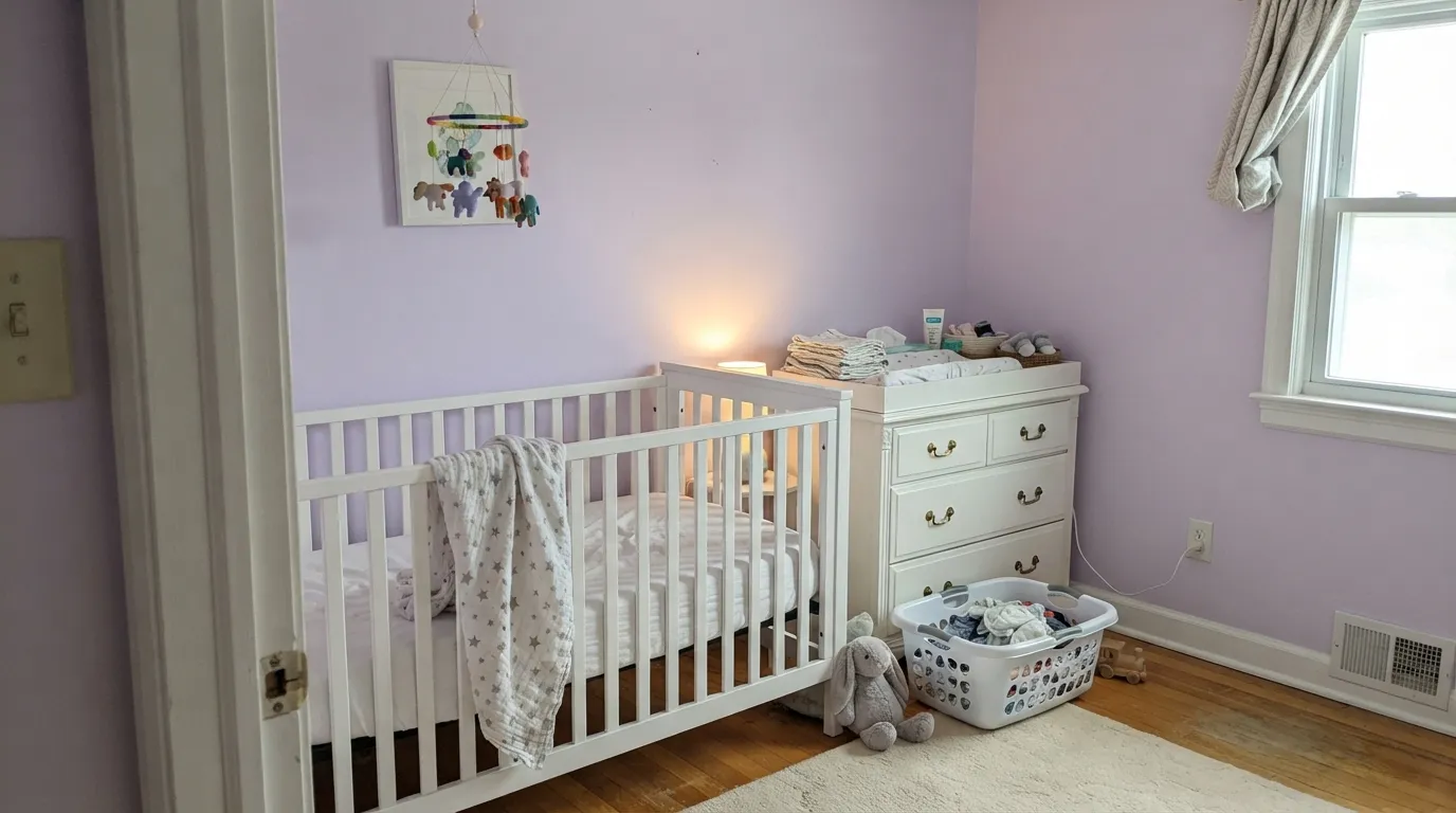
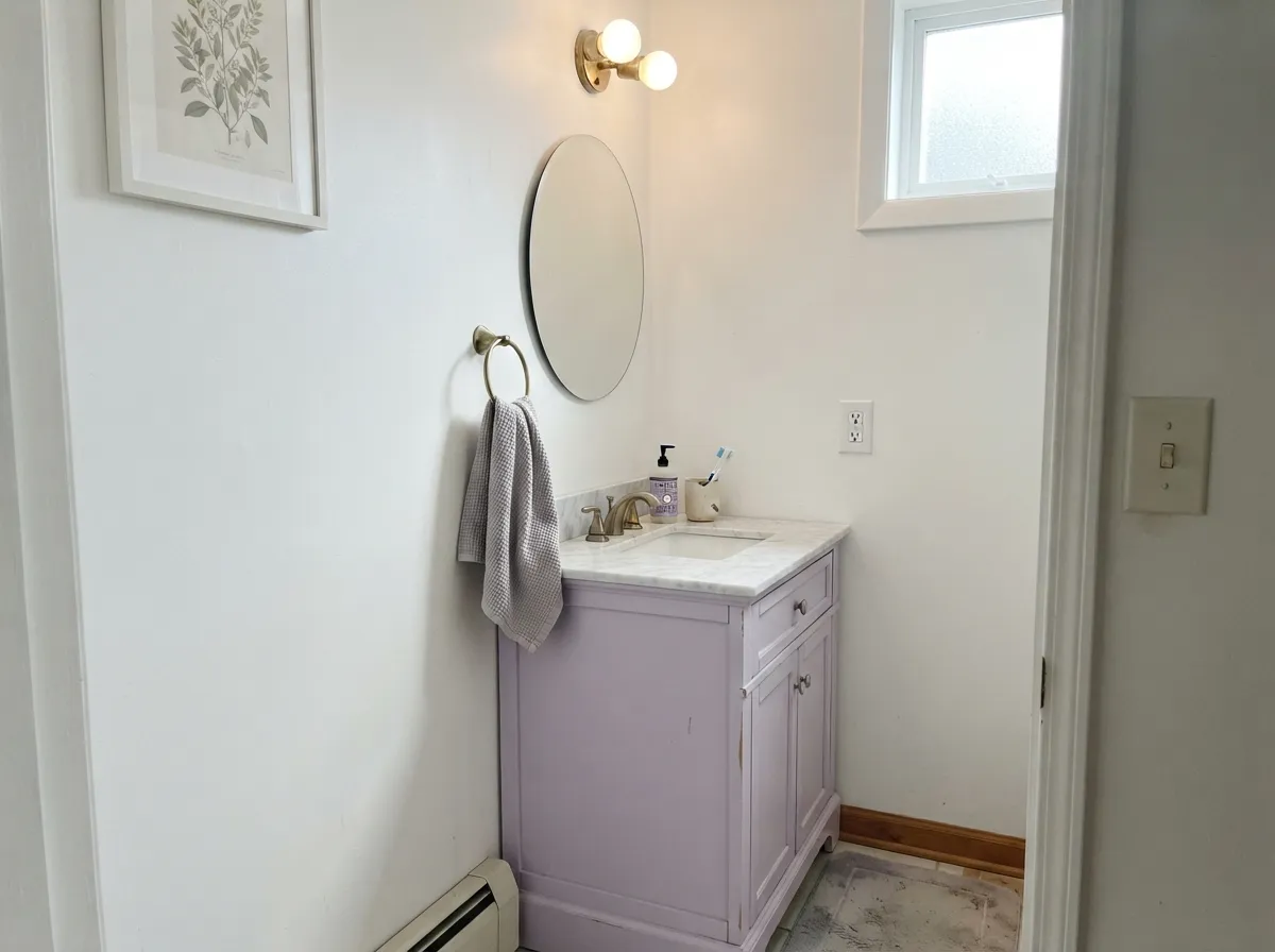
This is a nursery-and-bedroom color first, and it earns that reputation by doing the thing pale purples usually can't: reading as an actual finished color instead of an accident. Against white trim, white furniture and brass hardware it looks intentional and a little grown-up even in a baby's room. Its second home is the small commitment — a powder room or a single vanity — where a full dose of real lavender feels custom rather than risky, because the room is small enough that the color never has to fight an entire house's worth of daylight changes.
Where It Fails
Almost every letdown story with Lily Lavender comes down to one of three predictable mismatches, and none of them are the paint's fault — they're a buyer expecting a whisper and getting a sentence, or a room that was never going to suit any violet.
The small chip and the online swatch both undersell it. On four walls, especially in decent daylight, Lily Lavender reads as a confident, unmistakable lavender — not the faint gray-purple hint some buyers picture from the word "pastel." If what you actually want is barely-there, step down to Misty Lilac (2071-70) or the cooler, quieter Lavender Mist (2070-60); both are lighter-handed versions of the same family.
Violet and yellow-orange sit opposite each other on the color wheel, so warm honey oak floors or golden pine trim push against Lily Lavender instead of complementing it — the wood reads more orange, the walls read more purple, and neither side looks its best. White oak, walnut, or painted white trim are much safer partners.
Cool daylight and cool LEDs drain the pink out of this color and leave a flatter, slightly chalky gray-lavender that loses the charm people bought it for. It's not a broken paint job — it's the wrong light. Swap to warm 2700K bulbs before you consider repainting.
Room by Room
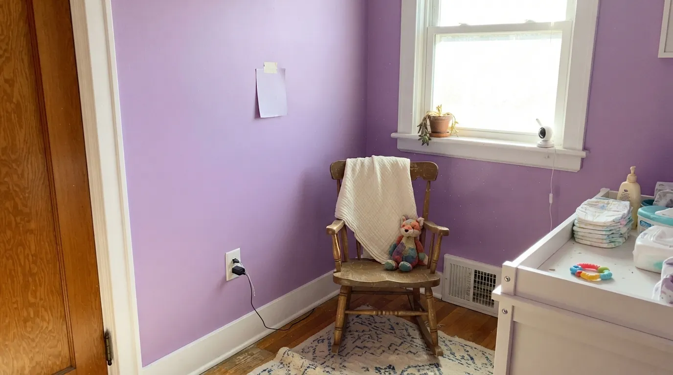
Soft enough not to overstimulate, colorful enough to feel finished. Pairs beautifully with white crib furniture, brass drawer pulls, and cream bedding. Eggshell for easy wipe-downs.
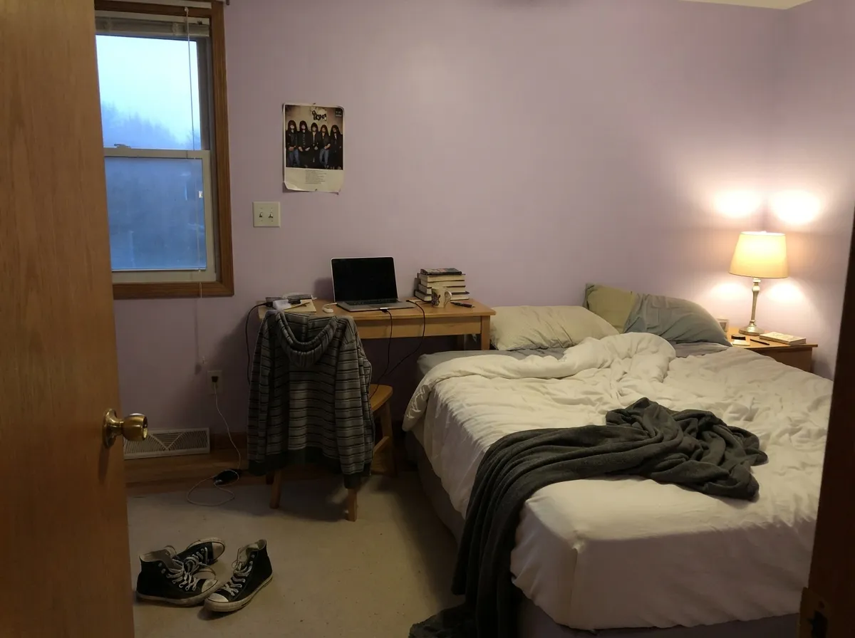
Reads sophisticated rather than candy-sweet, which is why it works for a wider age range than most "kid purple" paints. Holds up well against white bunk beds, desks, and gallery walls.
A real color statement without going dark or moody. Under warm 2700K lamps at night it turns gently rosy; keep bulbs warm rather than cool-white if you want the color to relax in the evening.
A full dose of Lily Lavender on four small-room walls, or just a vanity under white walls, reads custom rather than risky. Satin on the vanity for wipeability; pair with brass or matte black hardware.
Beautiful as a closed, defined room with white trim and neutral furniture. Riskier in an open floor plan, where it has to negotiate with a kitchen's wood tones and whatever color the adjacent rooms wear — an accent wall is the safer open-plan move.
Too much color commitment for cabinets or a full kitchen wall, and outdoors the pastel reads dated and washes out in full sun rather than glowing the way it does indoors. Keep it inside, on the walls it was designed for.
Your Light Is the Risk
Late-day sun and warm bulbs bring the pink forward — the color turns soft and rosy, the most flattering read it gets.
Cool, flat daylight strips the warmth and leaves a chalkier, slightly cold gray-lavender. Sample here first if this is your exposure.
Cooler and more blue-violet in morning east light, warmer and more pink-mauve as west sun comes in during the afternoon.
2700K warm lamps turn it gently rosy at night. Cool white LEDs push it toward flat, slightly icy gray — swap the bulb, not the paint.
Most complaints about Lily Lavender are a light mismatch. Upload a photo of your actual room and see it on your walls — then ask for the same wall in north light or evening lamps before you buy a single sample.
Need It From Another Brand?
Any paint counter can custom-tint Benjamin Moore 2071-60 directly. If you would rather stay in one brand's own deck, these are the closest stock matches, measured as ΔE2000. Under 2 is a difference you will not see on the wall.
| Brand | Closest color | ΔE | LRV | |
|---|---|---|---|---|
| Behr | Purple Cream670C-3 · Behr | 2.3 | 66 | Color page → |
| Valspar | Will o' the Wisp8001-48B · Valspar | 2.7 | 65 | Color page → |
| PPG / Glidden | Syrian VioletPPG1250-3 · PPG / Glidden | 2.8 | 63 | Color page → |
| Glidden | Syrian VioletPPG1250-3 · Glidden | 2.7 | 64 | Color page → |
| Dutch Boy | Sleepy Purple144-3DB · Dutch Boy | 2.0 | 62 | Color page → |
| HGTV Home by Sherwin-Williams | Violet CacheHGSW 1416 · HGTV Home by Sherwin-Williams | 3.6 | 62 | Color page → |
Similar Benjamin Moore Colors
The nearest shades to Lily Lavender within Benjamin Moore's own range, ranked by perceptual color distance — useful when you want the same look a touch lighter, darker, or warmer.
WCAG 2.1: AA is 4.5 : 1 for normal text, 3 : 1 for large text, AAA is 7 : 1.
Lily Lavender vs the Colors You're Also Considering
Every Lily Lavender sample board has the same rivals on it. The numbers show the real lightness gap — then it comes down to which risk you would rather live with.
Pick this when you want the color to actually read as lavender on the wall, not just hint at it.
Benjamin Moore 2071-70 · LRV 79Misty LilacPick this if you want the same family with almost none of the commitment — Misty Lilac is the whisper next to Lily Lavender's full sentence.
Pick this when you want the violet to hold its own instead of washing out.
Benjamin Moore 2070-60 · LRV 63Lavender MistPick this for a cooler, quieter lavender that leans blue and nearly disappears in daylight — the color to pick when Lily Lavender still feels like too much.
Pick this for the cooler, more classically lavender read — Wallflower drifts toward mauve-pink, Lily Lavender stays closer to true violet.
Sherwin-Williams SW 6281 · LRV 64WallflowerPick this if your painter works in Sherwin-Williams and you want the same honest, no-hiding purple with a warmer, pinker mauve lean.
Pick this for a lighter, brighter lavender that keeps a nursery or daytime bedroom feeling airy.
Benjamin Moore 2116-40 · LRV 29Hazy LilacPick this for a deeper, moodier lilac that still reads as real color in low light — Lily Lavender's grown-up, evening-friendly cousin.
Lily Lavender Coordinating Colors
The rule for coordinating with Lily Lavender is simple: keep whites warm rather than stark, keep wood tones out of the honey-and-gold range, and let it sit next to its own paler or deeper family members if you want a tonal look instead of a contrast. These are the partners that keep showing up in rooms that work:
The BM 2071 Lavender Family: Choosing Your Depth
Benjamin Moore didn't just make one lavender — the fan deck groups Lavender Mist (2070-60), Lily Lavender (2071-60), and Misty Lilac (2071-70) together as a family, and the differences between them are exactly where most buyers go wrong. Lavender Mist is the coolest and blue-leaning member, easiest to lose in a bright room. Misty Lilac is the palest, closer to a barely-there tint than a color decision. Lily Lavender sits in between in name, but carries more real pigment than either — real-world comparisons describe it holding its color in glaring daylight where Misty Lilac fades to a soft glow.
The practical upshot: if a paler swatch from this family didn't feel like enough color, Lily Lavender is the natural next step up in confidence, not the top of the range. If Lily Lavender itself still feels like too much, step back down to Misty Lilac rather than assuming purple isn't for you.
Lily Lavender With Wood Tones and Floors
White oak, ash, and painted-white furniture are the safe, easy partners — they don't compete with the violet and let it stay the focal color in the room. Walnut and other deep, cool-leaning browns work too, giving the lavender something grounded to sit against.
Honey oak, golden pine, and orange-leaning stains are the one real mismatch. Violet and yellow-orange sit opposite each other on the color wheel, so the wood reads more orange next to this paint and the walls read more purple next to the wood — neither side wins. If the floor is staying, keep the wood at arm's length with a light rug, or choose a warmer, grayer neutral instead of this color.
Three Ready Palettes Built on Lily Lavender
A color is never alone on the wall. These are complete combinations in the 60-30-10 pattern, with the reason each one holds together. Every one opens in the visualizer.
White Dove trim keeps the lavender feeling fresh instead of babyish, and Pale Oak gives the room one warm-neutral note to lean on without introducing the honey-toned wood this color argues with.
Try this palette in your roomA crisp white keeps the small room bright enough to carry a real lavender vanity, and the near-black frame gives the scheme one grounding dark note so it reads deliberate, not accidental.
Try this palette in your roomStacking two depths from the same 2071 family — walls a step deeper than the ceiling — reads as an intentional gradient instead of a mismatch, and White Dove trim keeps the edges soft and warm rather than stark.
Try this palette in your roomLily Lavender FAQ
is Lily Lavender purple or gray?
Purple — clearly and confidently, more so than the small chip suggests. It carries real violet pigment rather than just a gray tint, so on four walls it reads as an actual lavender, not a neutral with a hint of color. If you wanted the faintest whisper, look at Misty Lilac or Lavender Mist instead.
will Lily Lavender look too bright or too blue?
It can look more saturated in person than it did online — that's the single most common surprise owners report. In cool north light it can also read a touch blue-gray rather than the warmer lavender-pink you see under lamps. Sample a real 12-inch swatch on your actual wall before committing.
what's the difference between Lily Lavender and Misty Lilac?
They're siblings in the same Benjamin Moore family, but Misty Lilac (2071-70, LRV 79) is noticeably paler and softer — closer to a decorative glow than a color statement. Lily Lavender (2071-60, LRV 65) holds its color even in bright daylight and reads as a real, definite lavender.
is Lily Lavender good for a nursery?
Yes — it's one of the classic nursery lavenders in the BM deck. It's soft enough not to overstimulate but has enough presence to feel like a finished design choice rather than a pale afterthought. Pair it with white furniture and brass hardware.
what trim white goes with Lily Lavender?
White Dove for a warm, soft edge, or Chantilly Lace if you want a crisper, brighter contrast in a small room like a powder room. Avoid stark cool whites paired with warm lamplight — the mismatch fights the color's natural warm shift in the evening.
does Lily Lavender work with honey oak floors?
Not well. Yellow-orange and violet sit opposite each other on the color wheel, so honey oak or golden pine trim pushes against this color rather than complementing it. White oak, walnut, or painted white trim are much easier partners.
Have you painted with Lily Lavender?
Rate it — one tap helps the next reader decide.
Ask a Question