White Lavender
The palest lavender in Behr's deck, reviewed honestly: the light where it reads a soft dusty white, the light that flattens it to gray, and what to pick instead.

Jessica has spec'd whites and neutrals for more than 300 rooms and keeps a sample wall of painted drawdowns in her studio. Every color review is checked against real reader rooms in the comments and re-tested when a formula changes. About the testing process →
- 1French Lilac56
- 2Lavender Mist63
- 3White Lavender76
- 4Feathery Lilac81
- 5Barely Pink87
The Fast Verdict
White Lavender is Behr's answer to "a hint of purple, not a purple room." At LRV 82 it sits almost as light as a true white, so most of the time it just reads as a soft, dusty near-white — then daylight catches it right and the lavender shows up, quiet and unmistakable. It is Behr's default nursery pick for exactly that reason: enough color to feel intentional, little enough to never dominate. The tradeoff is that the same low chroma that makes it flattering also makes it fragile — take the light away and the lavender goes with it.
Nurseries and girls' bedrooms · calm bathrooms with warm-white fixtures · hallways and trim runs under a soft neutral · anyone who wants a whisper of color instead of a flat white
You want a true, zero-tint white · your room is dim and north-facing with no lamps · your trim and ceiling stay bright white · your floors are honey oak or golden pine
- A genuine whisper of lavender instead of a flat, characterless white
- Low chroma — pairs with almost anything without a fight
- Turns gently rosy-lavender under warm evening lamps
- Reads calm and grown-up enough to outlive a nursery phase
- High LRV (82) keeps small rooms feeling bright
- Goes flat, cold blue-gray in dim north light or under cool LEDs
- Reads dingy next to a true, brighter white trim
- Nearly disappears in full exterior sun
- Too subtle for anyone who actually wants a visible purple wall
What Color Is White Lavender, Really?
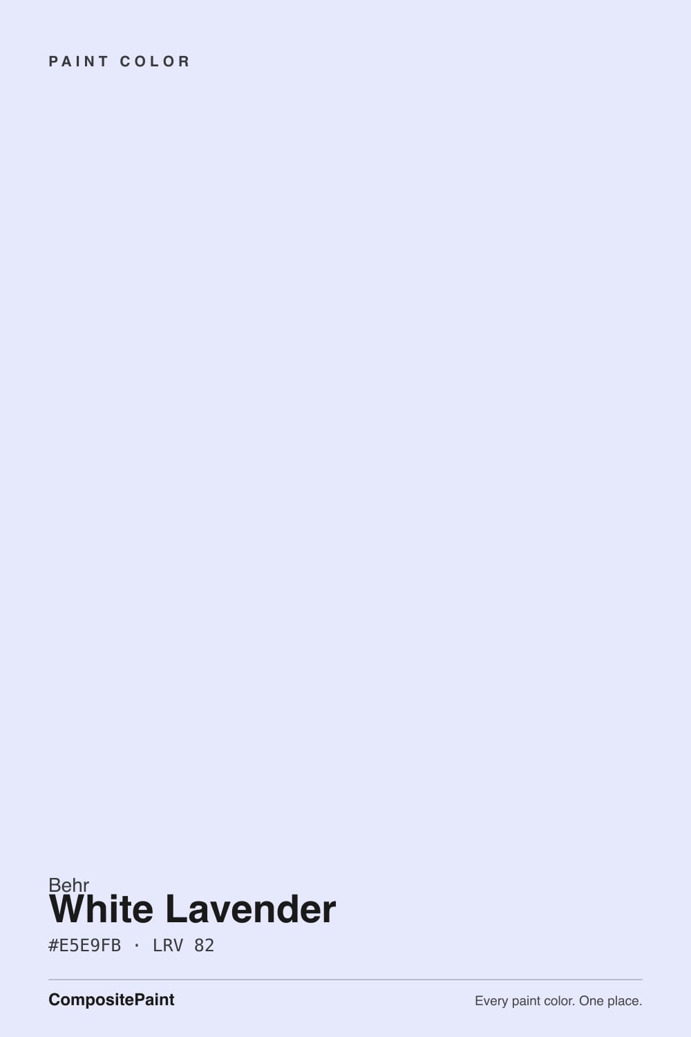
A near-white built on a faint violet-blue tint rather than a true purple base. Behr files it among its dusty "Heathered Hues" purples, but the pigment load is so light that on the chip it can pass for an off-white — the lavender is a cast, not a color statement. That restraint is the whole appeal: it gives a room a hint of personality without committing to a themed purple space, which is why it shows up so often in nursery and kids'-room shortlists.
At LRV 82 it reflects nearly as much light as a true white. Put it next to a plain white trim and the gap is obvious — White Lavender reads visibly cooler and slightly deeper, the same way a pale near-white always shows its hand next to a brighter one. On its own, in a room with real daylight, it just looks like a calm, slightly cool white with something quiet going on underneath.
Undertone in one line: violet-blue, cool and low-chroma — never warm, never pink. If your sample looks plain flat gray, that is the light draining the small amount of color it has, not a different can of paint.
Where It Shines
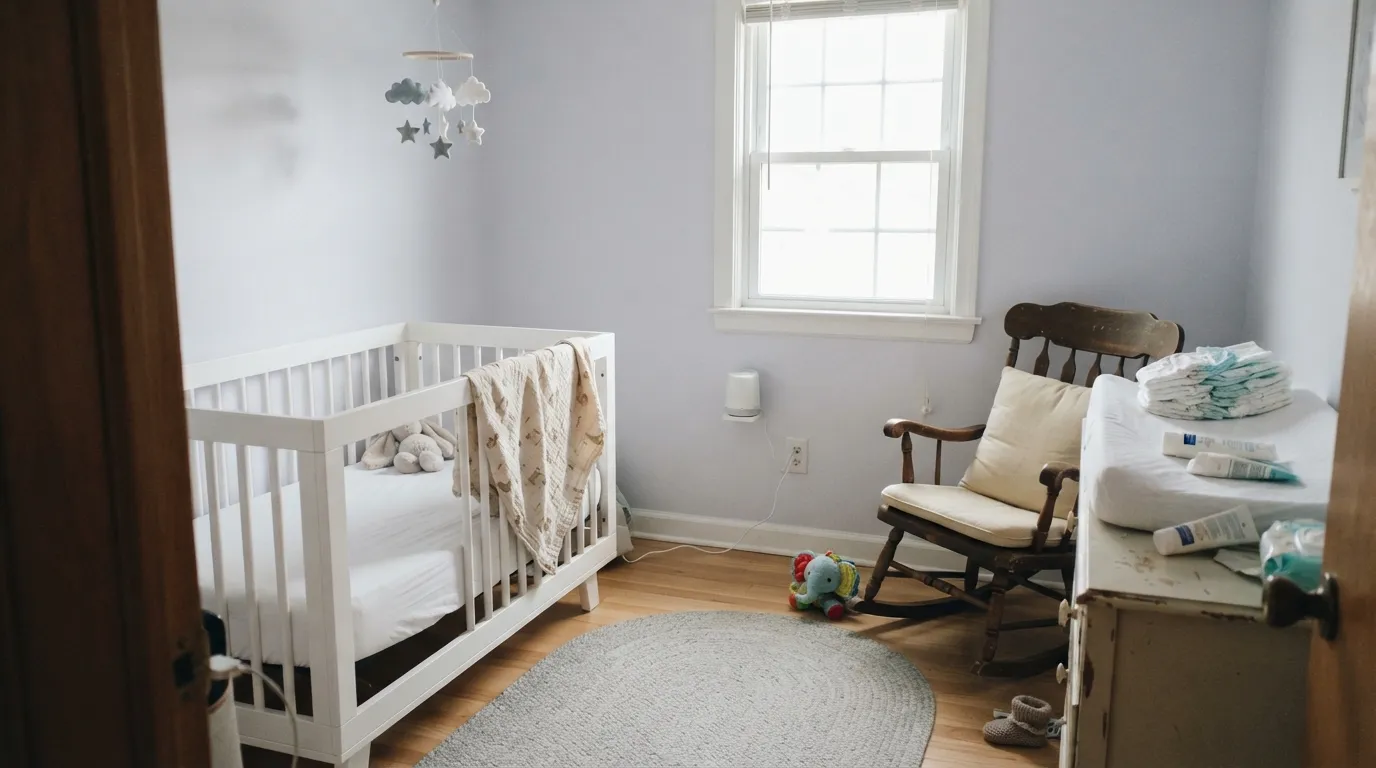
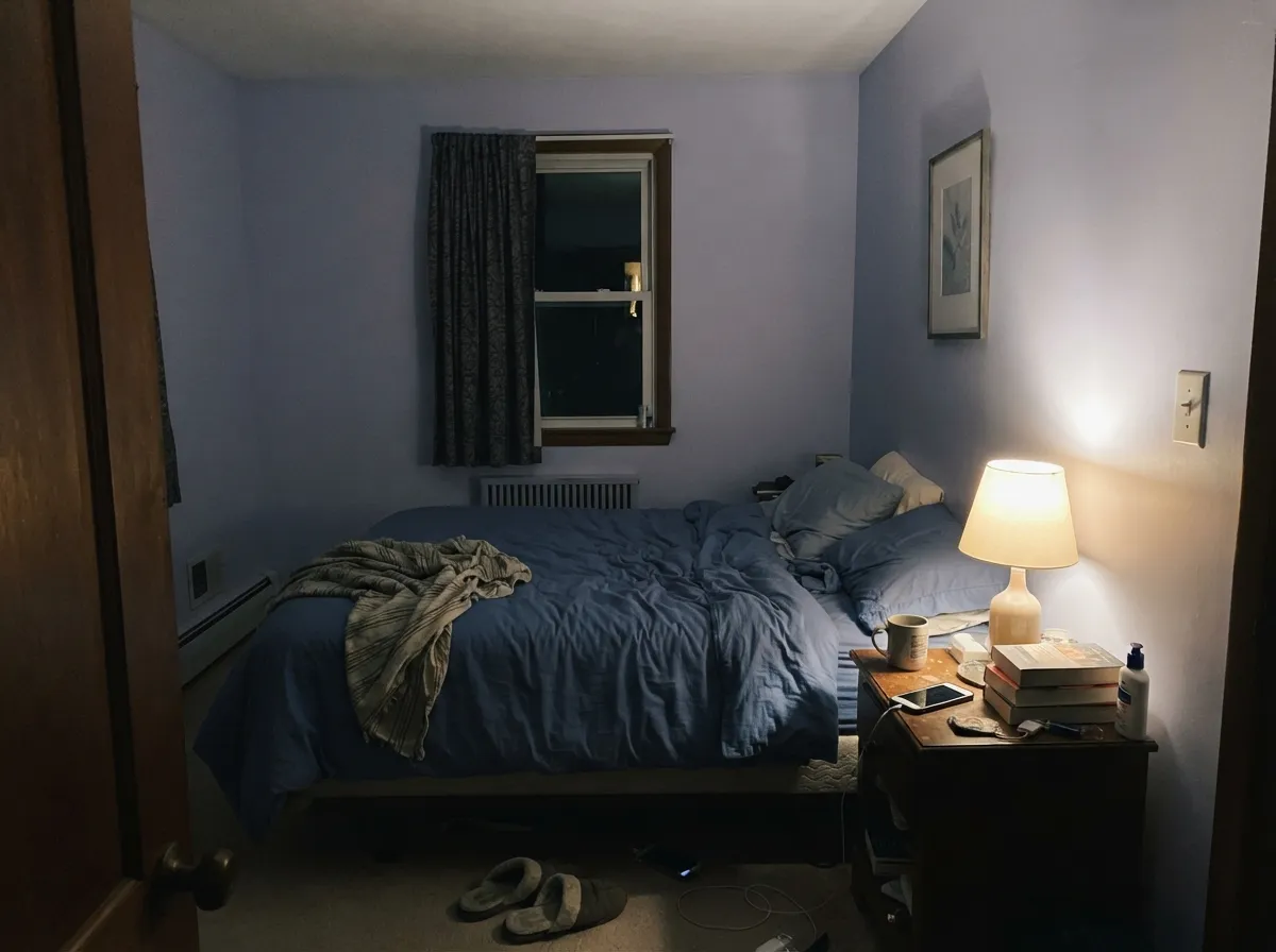
Give it bright, even daylight and a warm-white partner and White Lavender does exactly what its name promises: a wall that reads soft and dusty rather than stark or clinical. It is Behr's go-to answer when a nursery or a girl's bedroom wants "a hint of purple, not a purple room," and its low chroma means it rarely fights with anything else nearby. Under a warm lamp at night it turns gently rosy-lavender instead of going cold — about as cozy as a near-white this pale ever gets.
Where It Fails
Almost every disappointed review of a color this subtle comes down to the same handful of predictable scripts. None of them are the paint's fault — but if your room matches one, this is not your white, and a bigger sample will only confirm it.
Cool overcast daylight has almost nothing warm in it to begin with, so it strips out the little color White Lavender is carrying and leaves a flat, slightly institutional blue-gray. Readers expecting "soft lavender" get "plain gray" instead. The paint did not change; the light did. Add warm 2700K lamps or test a bigger sample before committing a whole room.
Next to a genuinely neutral white trim or ceiling paint, the cool violet-blue cast becomes obvious, and it can read "dingy" or "off" to someone expecting plain white. If a completely neutral white was the goal, this is the wrong can — try Behr Frost or White Moderne instead.
Yellow-orange sits opposite violet on the color wheel, so warm honey oak floors and White Lavender walls each make the other look slightly off — the floor reads more orange, the wall reads flatter and cooler. White oak, walnut, or painted floors are a much safer match.
Room by Room
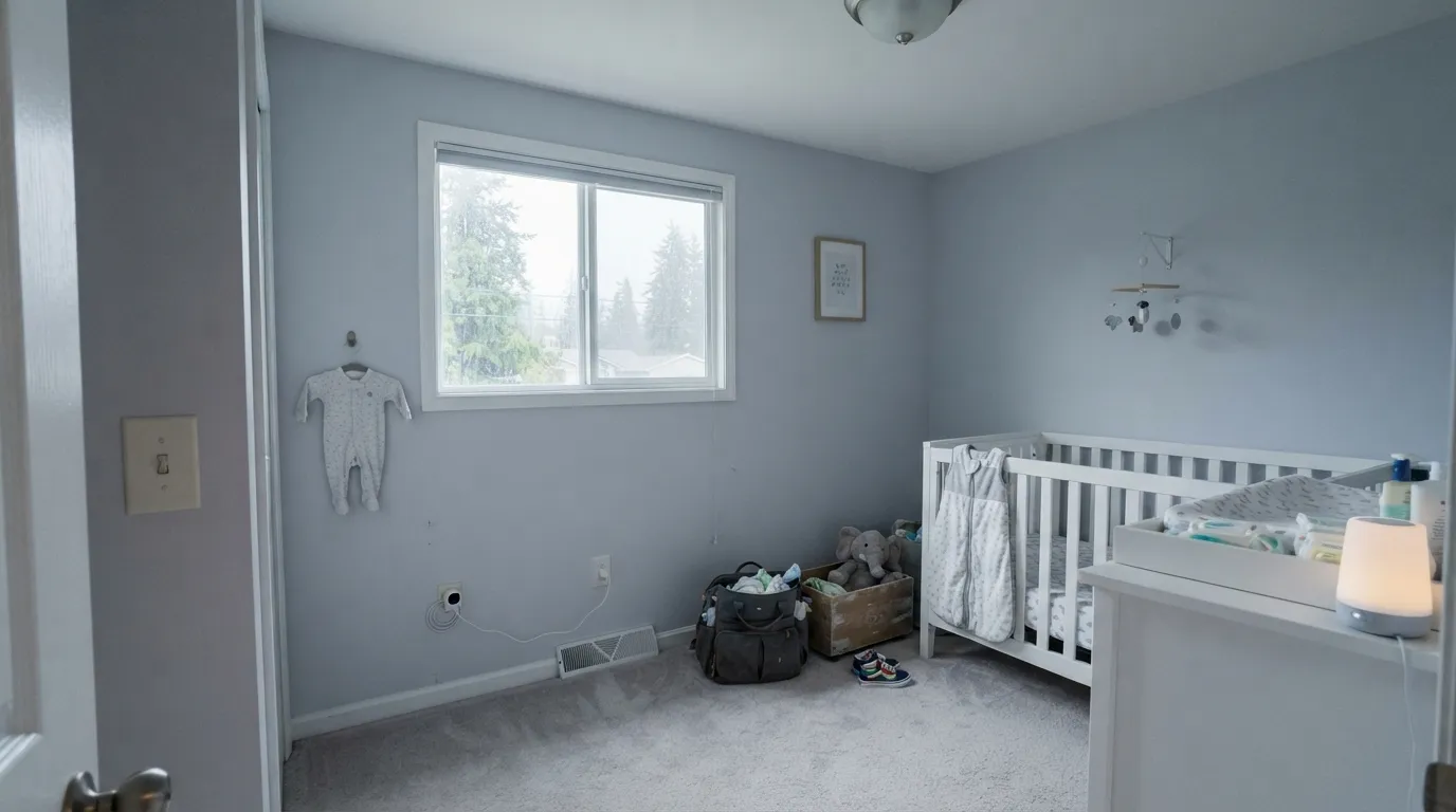
This is the job Behr built it for. In daylight it reads a hushed, dusty lavender that never tips into a full purple room, and under a warm lamp at night it goes gently rosy instead of cold. Eggshell on the walls, semi-gloss on trim and any built-ins.
Works the same way in an adult bedroom: subtle enough that it will not feel juvenile once the crib is gone. Keep bulbs at 2700K — cool white LEDs flatten the lavender into plain gray.
With warm-white tile, brass or nickel and a warm-toned vanity top, it is a soft, spa-quiet neutral. With cool blue-gray tile or stark-white subway everywhere else, the room can look like it is arguing with itself — sample a big board first.
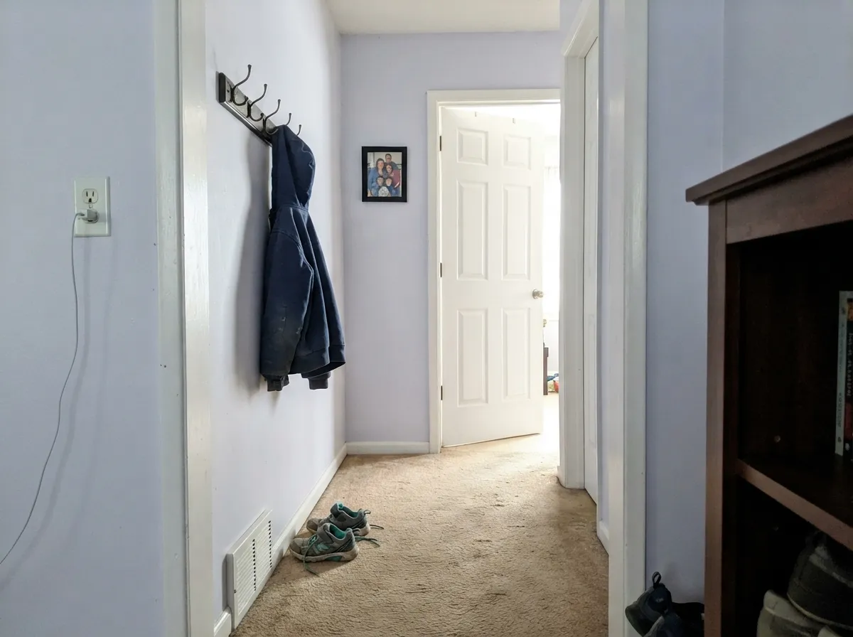
At LRV 82 it is close enough to white to run hallways and connect rooms without becoming its own decorating decision, but with just enough tint to feel less clinical than a true white. Semi-gloss on doors and trim keeps the cool cast from reading flat.
In a big, mixed-light open room the subtlety that makes it lovely in a small space just reads as an indecisive, slightly cold white. If you love it, keep it to one enclosed room rather than the whole main floor.
Behr does sell it as an exterior color, but full sun bleaches the lavender out almost completely — you are paying for a hint of color you will barely see on the siding. It earns its keep only on a shaded elevation, shutters, or a covered porch ceiling where direct sun will not wash it flat.
Your Light Is the Risk
A large window without a direct sun blast — the dusty lavender reads clearly without looking washed out or overly blue.
Cool overcast daylight strips out the little warmth it has and leaves a flat, slightly institutional blue-gray. Test before committing.
Warms toward a soft pink-lavender at golden hour, cools back to blue-gray as the sun drops. The swing is gentle, not dramatic.
2700K bulbs nudge it rosy and cozy. Cool white LEDs cancel the lavender and leave plain gray — swap the bulb before you blame the paint.
Most complaints about White Lavender are a light mismatch. Upload a photo of your actual room and see it on your walls — then ask for the same wall in north light or evening lamps before you buy a single sample.
Need It From Another Brand?
Any paint counter can custom-tint Behr M550-1 directly. If you would rather stay in one brand's own deck, these are the closest stock matches, measured as ΔE2000. Under 2 is a difference you will not see on the wall.
| Brand | Closest color | ΔE | LRV | |
|---|---|---|---|---|
| Sherwin-Williams | Lady's SlipperSW 7139 · Sherwin-Williams | 0.6 | 76 | Color page → |
| Benjamin Moore | Nosegay1401 · Benjamin Moore | 1.0 | 75 | Color page → |
| Valspar | London LightsV110-1 · Valspar | 3.8 | 76.1 | Color page → |
| PPG / Glidden | Water IrisPPG1170-1 · PPG / Glidden | 0.5 | 76 | Color page → |
| Glidden | Ming Dynasty White49BB 76/037 · Glidden | 0.9 | 76 | Color page → |
| Dutch Boy | Chalky Violet141-1DB · Dutch Boy | 1.7 | 77 | Color page → |
Similar Behr Colors
The nearest shades to White Lavender within Behr's own range, ranked by perceptual color distance — useful when you want the same look a touch lighter, darker, or warmer.
WCAG 2.1: AA is 4.5 : 1 for normal text, 3 : 1 for large text, AAA is 7 : 1.
White Lavender vs the Colors You're Also Considering
Every White Lavender sample board has the same rivals on it. The numbers show the real lightness gap — then it comes down to which risk you would rather live with.
Pick this if you want barely-there color that reads white from across the room.
Benjamin Moore 2070-60 · LRV 63Lavender MistPick this if you want the lavender to actually read as lavender — it carries more visible color at every hour.
Pick this for the soft violet lean instead of Nebulous White's plain gray-blue.
Sherwin-Williams SW 7063 · LRV 74Nebulous WhitePick this for the same pale, cool near-white with no purple in it at all — the straight gray-toned twin.
White Lavender Coordinating Colors
The rule for coordinating with White Lavender: pick a trim white that either matches its coolness or deliberately warms against it, and save real violet-blue depth for one small surface rather than the whole room. These are the partners that keep it looking intentional:
Where White Lavender Comes From
White Lavender sits in Behr's dusty "Heathered Hues" purple grouping — the collection Behr describes as evoking floral fields under soft summer skies — and it is one of the palest entries on that list, closer in practice to a tinted white than to any of its more saturated deck-mates. It does not carry a Color of the Year moment or a viral before-and-after; it is a quiet, workhorse pick that shows up again and again in nursery and kids'-room roundups precisely because it never asks for attention.
That low profile cuts both ways: there is not a large public track record of owner reviews to draw on for this exact SKU, so treat any specific real-world complaint you read online with the same caution you'd give a single data point — sample it in your own room before trusting someone else's light.
White Lavender With Wood Tones and Floors
Cooler and paler wood wins here. White oak, ash, driftwood-gray finishes and painted floors all sit comfortably next to White Lavender because neither side is fighting for warmth. Walnut works too, in smaller doses, giving the room one grounding dark note against all that pale cool color.
The pairing to sample carefully is honey oak or any golden-toned wood — trim, floors, or furniture. Yellow-orange is violet's complement on the color wheel, so the two intensify each other's flaws instead of blending: the wood can look more orange than it does on its own, and the wall can look flatter and cooler than it does over neutral flooring. A big rug or a switch to white oak solves most of this without touching the paint.
Three Ready Palettes Built on White Lavender
A color is never alone on the wall. These are complete combinations in the 60-30-10 pattern, with the reason each one holds together. Every one opens in the visualizer.
White Moderne's warm cream keeps the cool lavender from feeling cold once the lamps go on at night, and French Lilac gives the room one deeper violet note — on a closet door or a bookshelf — without turning it into a full purple room.
Try this palette in your roomForget-Me-Not is the same violet-blue family at real depth, so the vanity reads intentional rather than random; Starless Night's near-black frame is the one dark note the pale walls need to look finished instead of washed out.
Try this palette in your roomThree cool near-neutrals at different depths — white, near-white, pale blue-gray — layer quietly without ever introducing warmth or real contrast, which is exactly the point of a nook meant for winding down.
Try this palette in your roomWhite Lavender FAQ
Is White Lavender purple or white?
Technically purple family, practically a near-white. At LRV 82 it sits almost as light as a true white — the lavender only shows as a soft, dusty cast, not a colored wall. In flat, dim light it can read as plain gray; in good daylight the lavender is unmistakable if you look for it.
Will it look gray in my room?
In a dim, north-facing room with no warm lamps, yes — the lavender fades and leaves a flat blue-gray. Give it real daylight or warm 2700K bulbs and the lavender reads clearly again. Sample a board in your actual light before painting the whole room.
Is it good for a nursery?
One of its best jobs. It is soft enough for a newborn's room, calm enough that most parents will not feel like repainting once the crib comes down, and it works for either a boy's or a girl's room without reading as a themed purple nursery.
What trim goes with White Lavender walls?
A warm white like Behr White Moderne keeps the room from feeling cold; a cooler white like Behr Frost sharpens the contrast without clashing, since both sit near the same LRV. Avoid a starkly bright trim white — it can make the lavender walls read dingy by comparison.
Does it work with honey oak or golden wood floors?
Not its best pairing. Yellow-orange sits opposite violet on the color wheel, so honey oak floors and White Lavender walls each make the other look slightly off — the floor reads more orange, the wall reads flatter and cooler. White oak, walnut or painted floors are a much safer match.
Can I use it outside?
Behr sells it as an exterior color, but full sun bleaches most of the lavender out, leaving something close to a plain pale white. It is worth using on a shaded wall, shutters, or a covered porch ceiling, where the tint survives — not on a sun-blasted south-facing facade.
Have you painted with White Lavender?
Rate it — one tap helps the next reader decide.
Ask a Question