Etched Glass
A pale blue-gray with no fame and no marketing push, reviewed honestly: where it goes silvery, the light that turns it dingy, and what to pick instead.

Jessica has spec'd whites and neutrals for more than 300 rooms and keeps a sample wall of painted drawdowns in her studio. Every color review is checked against real reader rooms in the comments and re-tested when a formula changes. About the testing process →
- 1Heirloom Shade63
- 2First Star69
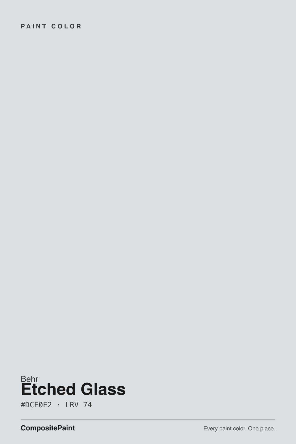
- 3Etched Glass74
- 4Alabaster82
- 5Chantilly Lace91
The Fast Verdict
Etched Glass is the color you find by accident flipping through the Behr deck, not the one anyone searches for by name — no Color of the Year campaign, no viral before-and-after, just a genuinely well-behaved pale blue-gray at LRV 74. In real daylight it reads close to silvery white; step into a dim or cool-lit room and a whisper of blue-green steps forward. It never does anything dramatic, which is exactly the appeal — and exactly the thing that disappoints buyers hoping for personality.
Bathrooms that want spa-quiet, not spa-dramatic · bedrooms and home offices with real daylight · kitchens with white cabinetry · anyone who likes Sea Salt's calm but is painting on a Behr budget
Your room is dim, north-facing, and lamp-free · you want guests to ask what color that is · your floors and trim are honey oak or brass-gold · you're chasing a color with a design-blog pedigree
- Genuinely quiet, cool blue-gray — reads nearly silvery white in good light
- LRV 74 keeps rooms feeling open without going stark white
- Bathrooms and white-cabinet kitchens: an easy, spa-fresh match
- Available across Behr's Marquee, Premium, and Ultra lines at Behr's usual price
- No trend baggage — a genuinely safe long-term neutral if you like cool tones
- Goes flat and dingy in dim, north-facing, lamp-free rooms
- Surprises buyers who grabbed it expecting a plain off-white
- Fights honey oak floors and gold-toned warm trim
- So quiet it will not read as a 'color' to most guests — a pro for some, a letdown for others
What Color Is Etched Glass, Really?
A cool, pale gray built on a whisper of blue and a trace of green — never yellow, never pink. That is the whole story, and it is a quieter story than most of Behr's marketed colors get: Etched Glass carries no Color of the Year push, no Trends-collection spotlight, nothing beyond an ordinary numbered chip (MQ3-27) sold across the Marquee, Premium, and Ultra lines. The only people who talk about it online are the color-matching databases and a handful of Home Depot buyers reporting the same thing — decent coverage, dries fast, does what a Behr paint is supposed to do. That is honest obscurity, not a flaw.
At LRV 74 it reflects most of the light that hits it, but it still has a body — this is not a near-white in the high 80s or 90s that washes out to plain white the moment the sun clears a window. In full daylight Etched Glass goes closest to silvery white, the blue barely readable. Pull the light back — an overcast afternoon, a north wall, a cool LED overhead — and the blue-green comes forward and the wall reads distinctly cooler and grayer. It is a color that visibly answers to its light, more than most pale neutrals in its LRV range.
Undertone in one line: cool, with a whisper of blue and a trace of green — never warm, never pink. If your sample looks beige or golden, that is reflected light bouncing off a wood floor or a warm bulb, not the paint changing its mind.
Where It Shines
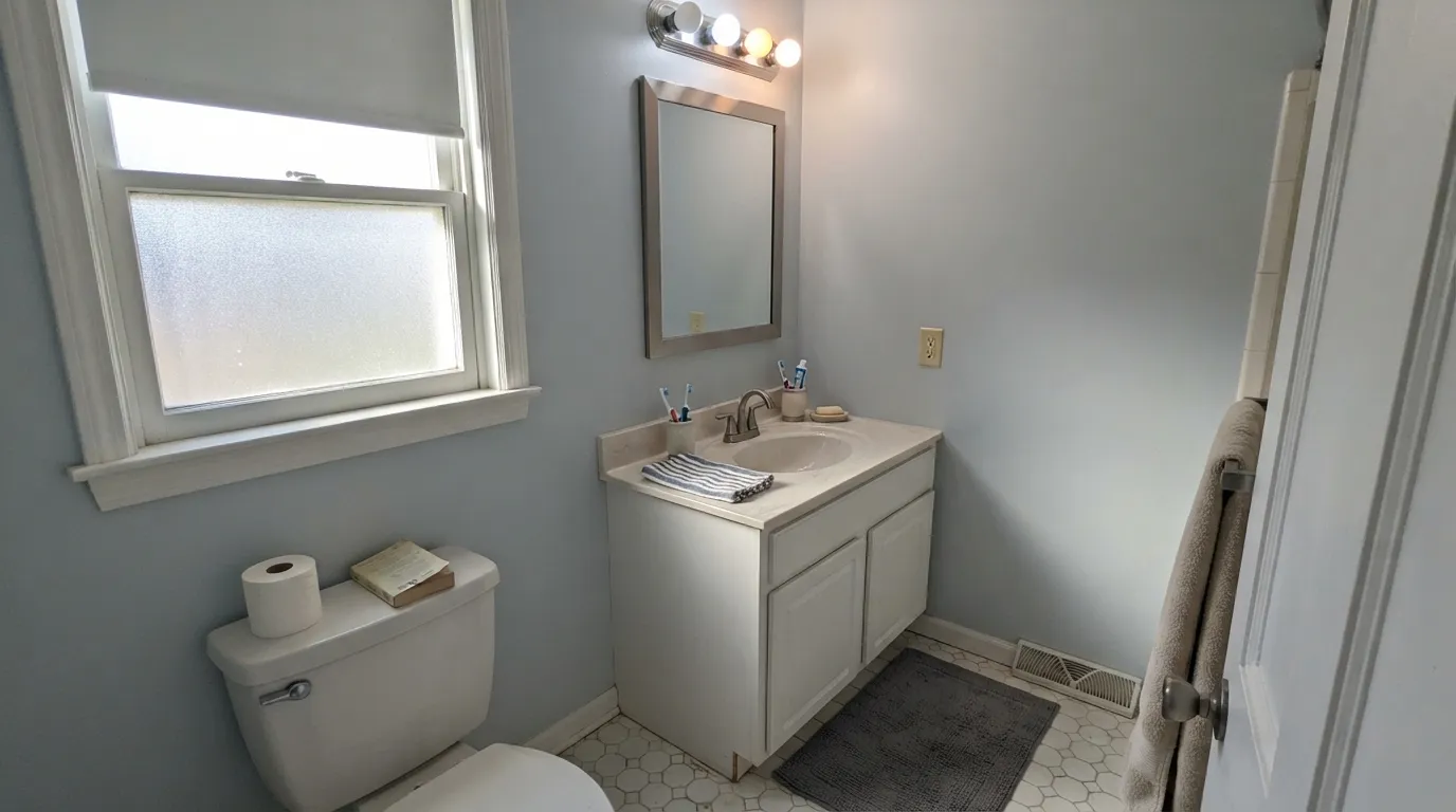
Give it real daylight and a quiet room and it earns its keep without asking for attention. Bathrooms are its natural home — against white cabinetry or a marble-look counter it reads clean and faintly spa-like without the greener, pricier reputation of a color like Sea Salt. Bedrooms and home offices in decent light get the same calm: a wall that recedes instead of announcing itself, which is exactly what a lot of readers actually want and rarely search for by name.
Where It Fails
Almost every disappointed review of a pale cool color like this follows one of three scripts, and Etched Glass is no exception. None of them are the paint's fault — but if your room matches one, this is not your color, and a bigger sample will only confirm the problem.
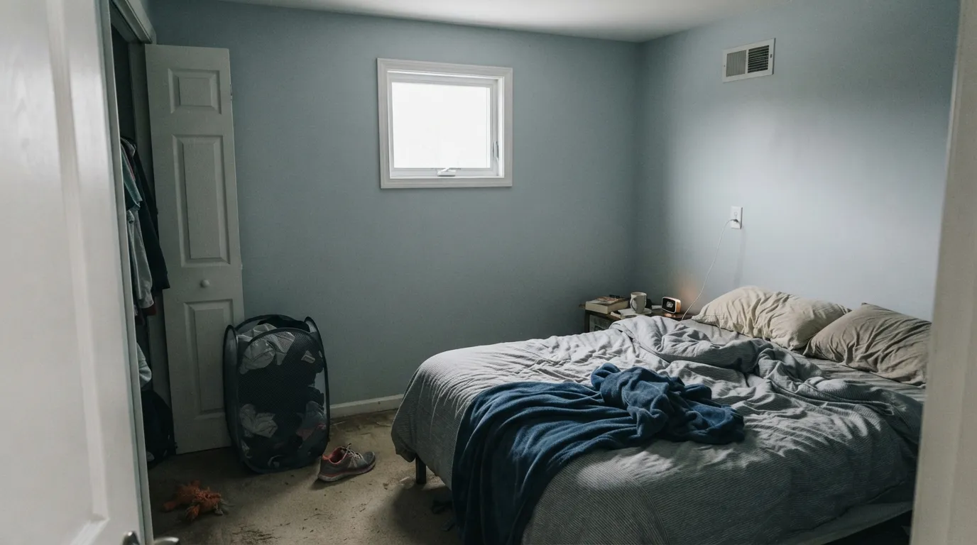
Cool north light and a pale cool paint are a bad combination for anyone who wanted 'fresh,' not 'flat.' The blue-green comes forward, the reflectivity that should make the room feel open instead reads dull and slightly dingy. The paint did not fail; the light did. Add warm 2700K lamps or test a warmer neutral like Behr Silver Drop instead.
At LRV 74, some buyers grab this off the fan deck expecting a near-white and are surprised by how visible the cool cast gets on four walls, especially next to a warmer trim white. Depth multiplies undertone — a paint chip this size never shows it. If you want a true off-white with no color story, this is not it.
Warm gold and cool blue-gray argue with each other: the floor pushes orange, the wall pushes blue, and neither side wins. Pale white oak, walnut, or a large rug between the two fixes most of it; wall-to-wall honey oak does not.
Room by Room
White or nickel fixtures, a marble-look counter, morning light: this is where Etched Glass earns the word 'spa.' Eggshell or satin for the moisture, and keep bulbs warm if the window is small.
Calm and recessive with a real window. In a dim or north-facing bedroom it drifts flatter and cooler than most people want to wake up to — check the light section before committing.
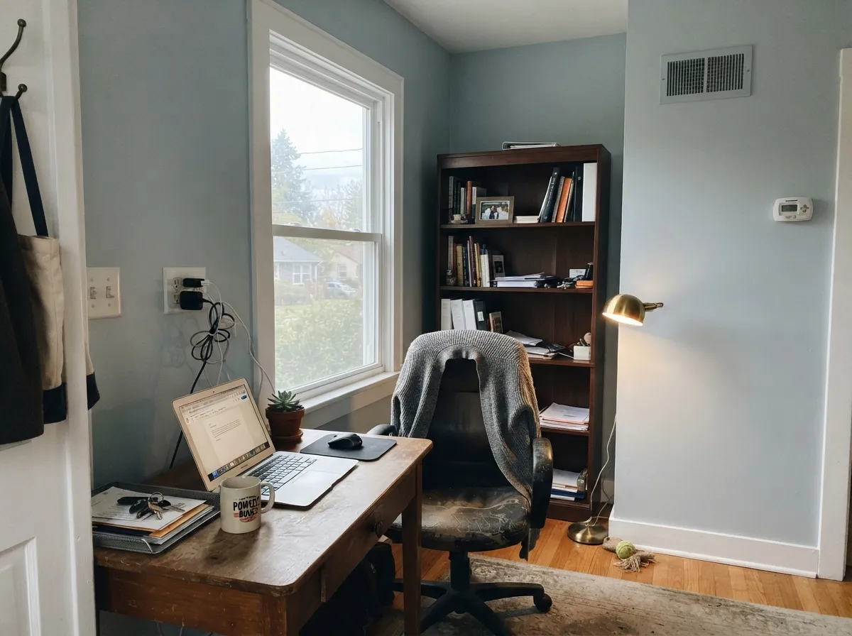
A wall this quiet does not fight a screen or a bookshelf. Pairs cleanly with white trim and a dark wood desk without turning the room cold, as long as the office gets some daylight during work hours.
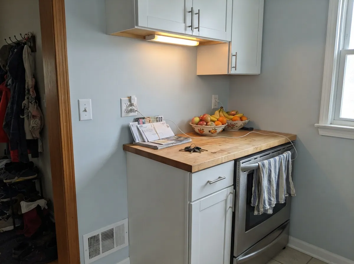
On an island or a full run of cabinets under white uppers, it reads soft and fresh rather than sterile. Skip it with honey oak cabinetry or brass-heavy warm kitchens — the clash described above shows up fast in a kitchen's mixed light.
Works best when the rest of the room's palette is already cool or neutral — gray sofa, black metal, pale wood. Next to warm leather and gold-toned lamps it can look like the odd color out.
Behr lists it across interior/exterior formulations, so it is engineered to hold up outdoors, but we could not find real exterior photos or reviews to confirm how it reads in full sun versus shade. Sample a large board outside before committing a whole house to it.
Your Light Is the Risk
South or open east light pushes it closest to silvery white — open, bright, barely a color at all. The most flattering version of the paint.
Cool, flat daylight brings the blue-green forward and can read dull or slightly dingy. Test a large sample before committing a whole room.
Brightest and coolest at the sun hours, quieter and grayer once the direct light passes. The shift is gentle, not a different color.
Warm 2700K lamps soften the blue and let the gray come forward; cool white LEDs sharpen the blue-green and can look sterile. Bulb choice matters more than usual with this one.
Most complaints about Etched Glass are a light mismatch. Upload a photo of your actual room and see it on your walls — then ask for the same wall in north light or evening lamps before you buy a single sample.
Need It From Another Brand?
Any paint counter can custom-tint Behr MQ3-27 directly. If you would rather stay in one brand's own deck, these are the closest stock matches, measured as ΔE2000. Under 2 is a difference you will not see on the wall.
| Brand | Closest color | ΔE | LRV | |
|---|---|---|---|---|
| Sherwin-Williams | IcicleSW 6238 · Sherwin-Williams | 0.6 | 73 | Color page → |
| Benjamin Moore | First Snowfall1618 · Benjamin Moore | 0.9 | 74 | Color page → |
| Valspar | Mais Oui8006-7A · Valspar | 1.7 | 75 | Color page → |
| PPG / Glidden | Harbor MistPPG1160-1 · PPG / Glidden | 1.6 | 74 | Color page → |
| Glidden | White Lagoon41BG 76/025 · Glidden | 0.6 | 76 | Color page → |
| Dutch Boy | Arctic Violet143-1DB · Dutch Boy | 4.1 | 74 | Color page → |
Similar Behr Colors
The nearest shades to Etched Glass within Behr's own range, ranked by perceptual color distance — useful when you want the same look a touch lighter, darker, or warmer.
WCAG 2.1: AA is 4.5 : 1 for normal text, 3 : 1 for large text, AAA is 7 : 1.
Etched Glass vs the Colors You're Also Considering
Every Etched Glass sample board has the same rivals on it. The numbers show the real lightness gap — then it comes down to which risk you would rather live with.
Pick this for the cooler, distinctly blue-gray character Drift of Mist doesn't have.
Sherwin-Williams SW 9166 · LRV 69Drift of MistPick this if you want the warmer, more classic greige version of the same quiet neutral — though it carries its own light risks, so read its review before swapping.
Pick this for the paler, airier version — Silver Strand carries more visual weight and shifts more noticeably room to room.
Sherwin-Williams SW 7057 · LRV 59Silver StrandPick this for a full step deeper, with the same chameleon gray-green quality that made it a Joanna Gaines favorite.
Sherwin-Williams Icicle SW 6238 at #DBDFE0 and LRV 73 is the closest cross-brand match, at a deltaE of 0.59. That is a true match, not an approximation. Glidden White Lagoon 41BG 76/025 at LRV 76 is similarly close at deltaE 0.62, and Benjamin Moore First Snowfall 1618 at #DAE0E3 and LRV 74 comes in at 0.92.
Dunn-Edwards Waterloo DE6330 measures a deltaE of 1.19, visually identical in normal room light on hue, but its LRV of 68 is six points lower, so it will look slightly deeper on a wall. PPG and Glidden Harbor Mist PPG1160-1 at LRV 74 is at 1.62, also visually identical in practice.
Further out, Diamond Vogel Divine Inspiration 0649 at deltaE 2.49 is very close but worth sampling first. Farrow and Ball Great White No. 2006 at #E4DFDC and LRV 74, at deltaE 4.54, is close but visibly different side by side, reading warm and pinkish where Etched Glass reads blue.
Etched Glass Coordinating Colors
The rule for coordinating with Etched Glass: stay cool or neutral, and keep gold-toned warmth at arm's length. It pairs cleanly with crisp and soft whites, charcoal and near-black accents, and gray-washed or pale wood — and it argues with honey oak and brass-heavy warm palettes. These are the partners that keep it looking deliberate rather than accidental:
Why Nobody's Heard of Etched Glass — And Why That's Fine
Search for Etched Glass and you will not find a designer profile, a Color of the Year press release, or a viral renovation thread. What you find instead is a handful of color-matching databases listing its hex code and a small stack of Home Depot reviews saying the paint itself performs the way Behr paint usually performs — decent hide, dries fast, cleans up with soap and water. That is the entire public record.
That absence is not a red flag. Most of the colors that get famous get famous through marketing budgets and Pinterest algorithms, not through being better paint. Etched Glass is a quietly competent, genuinely cool pale gray sitting in the same numbered part of the deck as thousands of other Behr chips nobody has written an article about. If you want a safe, undramatic neutral and do not care whether your painter recognizes the name, that anonymity is exactly what you're paying for.
Etched Glass With Wood Tones and Floors
This decision gets made at the floor, not the paint can. Pale white oak, gray-washed wood, and cooler-toned walnut all sit comfortably with Etched Glass because neither side is fighting the other's temperature. Gray or cool-toned LVP is an easy, almost invisible match.
The one honest no is warm and golden: honey oak, orange-stained trim, brass-heavy warm hardware throughout a room. Blue-gray and gold-orange sit close to opposite each other on the color wheel, so putting them together makes both look a little worse — the floor reads more orange, the wall reads more blue. A large rug or a run of white oak between them softens the clash; wall-to-wall honey oak does not.
Three Ready Palettes Built on Etched Glass
A color is never alone on the wall. These are complete combinations in the 60-30-10 pattern, with the reason each one holds together. Every one opens in the visualizer.
Two quiet cool neutrals share the same blue-gray family, so the wall-to-trim handoff never fights; Naval supplies the one deep, deliberate note a small bathroom can carry without feeling busy.
Try this palette in your roomExtra White is sharp enough to hold its own next to a cool wall color without the walls reading dirty; Kendall Charcoal at the door gives the one dark anchor the pale scheme needs.
Try this palette in your roomWhite Dove's warmth is an intentional counterpoint, softening Etched Glass's cool edge instead of doubling down on it — a trick worth trying if a fully cool room feels sterile. Wrought Iron's softness keeps the near-black from reading harsh against it.
Try this palette in your roomEtched Glass FAQ
Is Etched Glass warm or cool?
Cool — a pale gray with a whisper of blue and a trace of green, never yellow or pink. In bright daylight it reads closest to silvery white; in dim or cool light the blue-green becomes more obvious.
Is it basically white, or is it a real gray?
Both, depending on the light. At LRV 74 it reflects most light and can pass for an off-white on the chip. On four walls in real daylight the cool cast is visible enough that most people would call it a pale gray, not a white.
What colors coordinate with Etched Glass?
Cool and neutral whites for trim, charcoal or near-black for a single deep accent, and pale or gray-washed wood over honey oak. See the coordinating-colors section below for specific picks.
Does it work for a whole house?
It can, as long as most rooms get real daylight. In a house with several dim or north-facing rooms, expect those specific rooms to read flatter and cooler than the sunny ones — sample room by room rather than trusting one swatch for the whole floor plan.
Will it look blue or green on my wall?
A little of both, and it depends on the light. Sources describe it as everything from a barely-there blue to a soft blue-green, and reader photos would settle it faster than any description — the undertone is real but genuinely subtle, not a bold color statement.
Is Etched Glass a popular or trending color?
No, and that is worth saying plainly: we found no Color of the Year status, no design-blog buzz, and no viral before-and-after for this color. It is an ordinary numbered chip in Behr's standard deck. That makes it a low-risk, long-term neutral rather than a color you're buying for its reputation.
Have you painted with Etched Glass?
Rate it — one tap helps the next reader decide.
Ask a Question