Nebulous White
Sherwin-Williams' honest cool white, reviewed straight: the exteriors and daylight rooms where it reads crisp and clean, the dim rooms where it turns baby blue, and what to pick instead.

Jessica has spec'd whites and neutrals for more than 300 rooms and keeps a sample wall of painted drawdowns in her studio. Every color review is checked against real reader rooms in the comments and re-tested when a formula changes. About the testing process →
- 1Heirloom Shade63
- 2First Star69
- 3Nebulous White74
- 4Alabaster82
- 5Chantilly Lace91
The Fast Verdict
Nebulous White is Sherwin-Williams' honest cool white — a pale gray-blue at LRV 74, built to read fresh and clean in real daylight rather than cozy and cream. It isn't chasing Alabaster's warmth or Pure White's soft neutrality; it commits to cool, and in the right room — bright, modern, paired with black metal or brushed nickel — that commitment pays off. In a dim or north-facing room it charges a real price: owners who painted whole houses in it report the walls reading distinctly baby blue, not just "a little cool."
Exteriors — siding, brick, trim · bright kitchens and bathrooms with black or nickel hardware · modern coastal or Scandinavian interiors · anyone who wants a genuinely cool white, not another cream wearing a white name
Your room is dim or north-facing · your floors or trim are honey oak or golden pine · you're actually shopping for a warm off-white · you paint by lamp light and skip a daytime sample
- A genuinely cool, blue-gray white — not another cream in a white disguise
- SW's own pick for siding, brick, and trim; proven on exteriors
- High LRV (74) keeps rooms bright without going stark
- Sharp against matte black and brushed nickel hardware
- Reads clean and modern in any room with real daylight
- Turns visibly baby-blue in dim or north-facing rooms — a real, repeated complaint
- Fights honey oak floors and warm wood trim by contrast
- Cool LED bulbs push it colder and more clinical at night
- Little warmth to fall back on compared to SW's beige-based whites
What Color Is Nebulous White, Really?
Nebulous White is Sherwin-Williams' answer to the request for a truly cool white — not a warm cream wearing a white name, not a greige, an actual pale gray-blue. It sits in the narrow band of SW whites built on a blue-gray base instead of the beige or yellow-oxide base most "soft whites" use. That's the whole identity: where a color like Alabaster or Dover White adds warmth to stay approachable, Nebulous White leaves the warmth out on purpose.
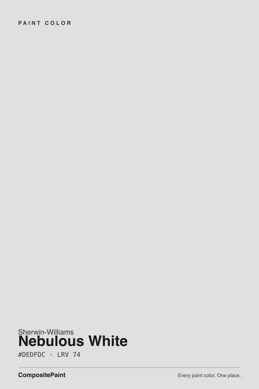
At LRV 74 it reflects a lot of light without going stark — closer in brightness to a mid-high white than to a near-white like Extra White (LRV 86). Its RGB comes in nearly balanced (222, 223, 220), which is a technical way of saying there is very little color for the eye to grab onto. That near-neutrality is a feature in good light and a liability in bad light: a color with almost no hue has nothing warm to fall back on once the daylight goes flat.
Undertone in one line: cool, blue-leaning gray — never warm, never yellow. Sherwin-Williams' own materials and independent color reviewers agree on that; the disagreement in the wild is only about how much blue actually shows, and that turns out to depend entirely on the room's light and what's painted next to it.
Where It Shines
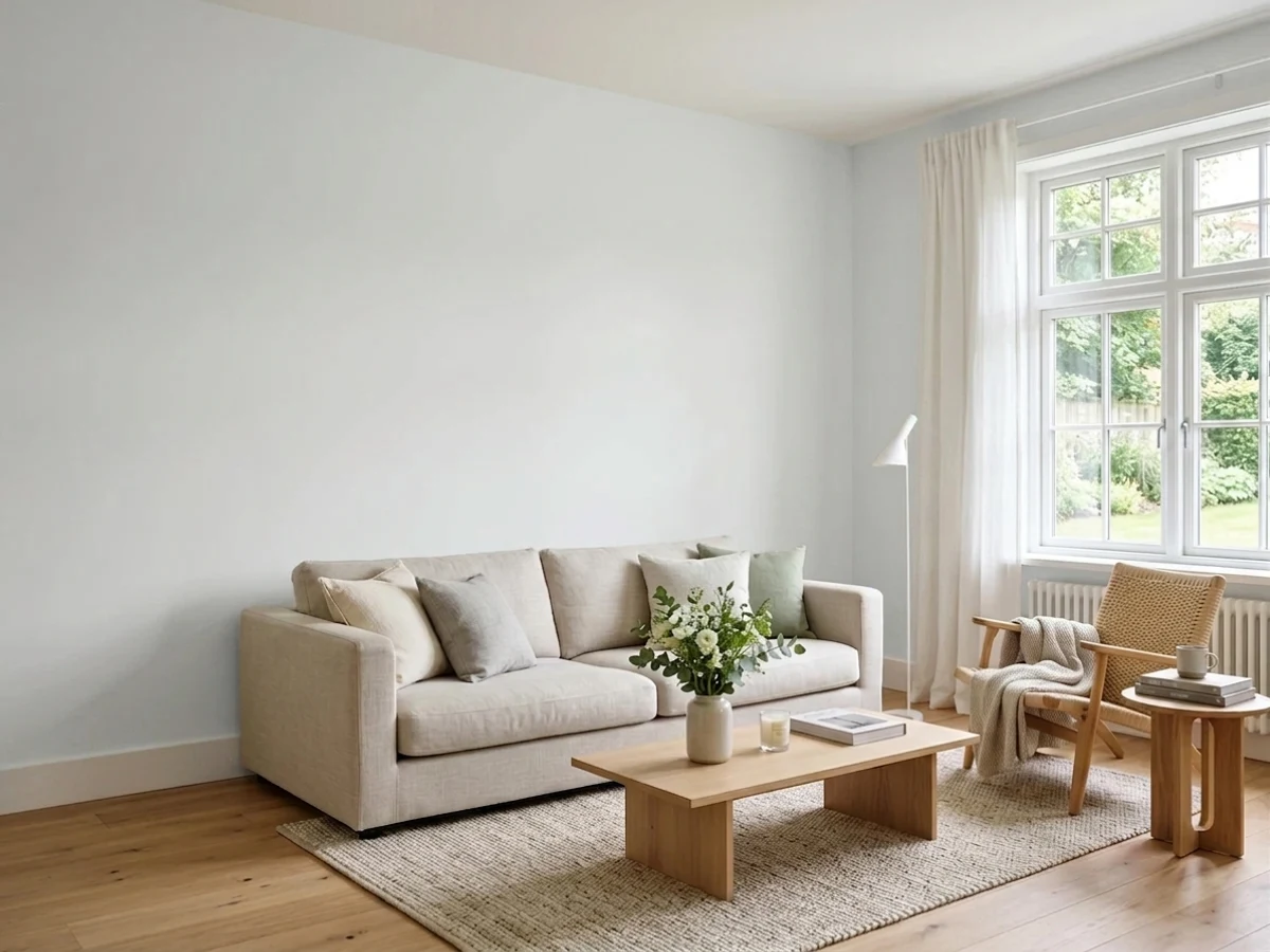
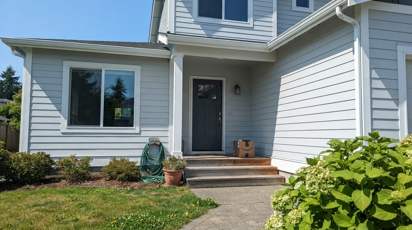
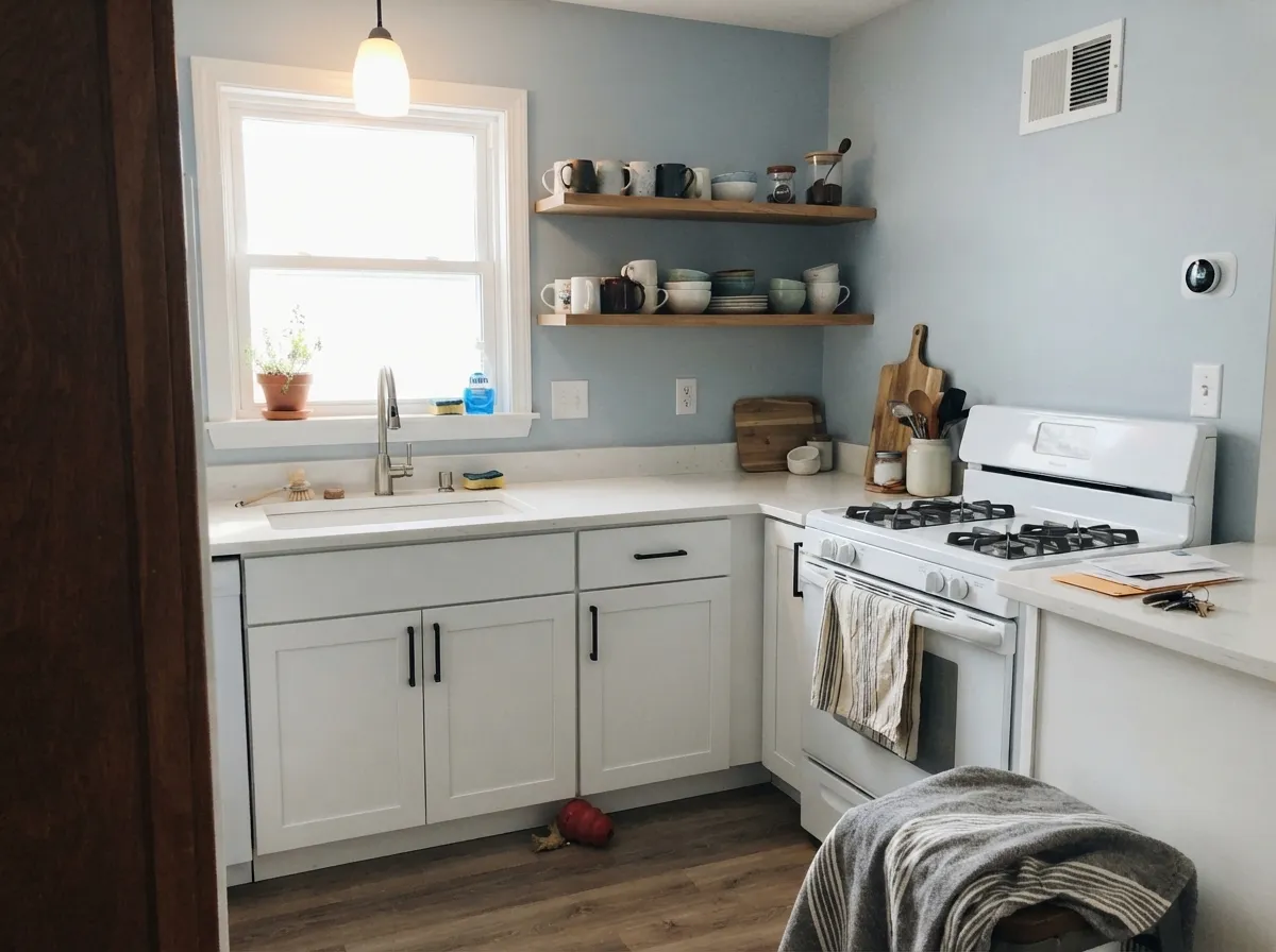
Give it real daylight and it does exactly what a cool white should: it reads bright, clean, and current without turning sterile. Sherwin-Williams markets it hard for exteriors — siding, brick, trim — and that is genuinely its best use, especially on a modern or coastal house where the goal is crisp, not cozy. Indoors, it's the white kitchens and bathrooms want when the hardware is matte black or brushed nickel instead of brass: cool fixtures look sharper against a cool white than they ever do against a warm one.
Where It Fails
The complaint pattern here is consistent and predictable: paint a whole house — or even one dim room — in Nebulous White, and the color that shows up isn't "clean white," it's blue. None of this is a manufacturing flaw; it's exactly what a low-saturation cool white does once the room's own light can't carry it.
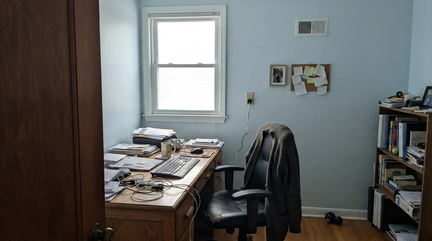
Nebulous White has almost no warmth to fall back on. In flat, cool north light the blue-gray base comes forward, and owners who repainted their whole house in it report the walls reading distinctly baby blue — not a subtle cast, an obvious one. If the room doesn't get real daylight, this isn't the white for it.
Warm wood pushes a cool white further toward blue by contrast — the same trick that makes a gray sky look bluer next to yellow leaves. Builder-grade honey oak floors or trim will make Nebulous White look colder than it does on the chip.
Daylight-temperature LEDs (4000K and up) amplify the blue instead of softening it, and the room can start to feel clinical after dark. This is fixable with a bulb, not a repaint — swap to 2700K before blaming the color.
Room by Room
This is what Sherwin-Williams built it for. Full sun reads it crisp and bright without the yellow flash cheap whites get, and it holds up well on siding, brick, and stucco. Pair with black or navy trim for a modern-coastal look.
A cool, clean backdrop for white quartz, marble-look counters, and matte black fixtures. Skip it if your cabinets or counters lean warm-veined or your floor is honey oak.
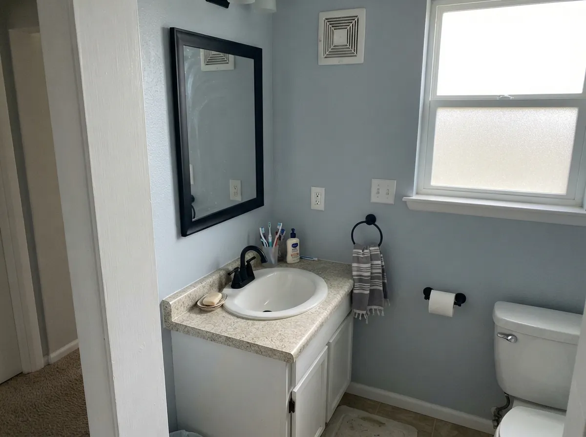
Cool tile, chrome or matte black fixtures, and bright daylight are Nebulous White's natural habitat. Under a small window or a dim vanity light it can look gray instead of white — add a warmer bulb if that happens.
In a bright, south- or east-facing bedroom it stays calm and restful. In a north-facing or lamp-lit bedroom, expect the blue to show more than most people want at bedtime; a warmer white will feel cozier.
Large windows and an open floor plan let it read the way it's supposed to — clean, not cold. Closed-off, heavily draped rooms lose the daylight that makes this color work.
Because Nebulous White itself needs bright light to look right, it makes a better wall color than a trim color for an otherwise warm-toned house. Pair a warm wall color with a warmer SW trim white like Pure White rather than trimming it in Nebulous White.
Your Light Is the Risk
This is the light Nebulous White is built for — clean, fresh, and quietly modern with no blue cast to complain about.
Flat, cool daylight has nothing to warm the color up, and the blue-gray base shows plainly. The most common source of the "baby blue" complaint.
Warmer and softer at the sun hours, cooler and grayer once the direct light passes. The shift is real but gentle in a room with any other daylight.
2700K lamps: calmer, a touch warmer. Cool 4000K+ LEDs: sharper and more blue — swap the bulb before you swap the paint.
Most complaints about Nebulous White are a light mismatch. Upload a photo of your actual room and see it on your walls — then ask for the same wall in north light or evening lamps before you buy a single sample.
Need It From Another Brand?
Any paint counter can custom-tint Sherwin-Williams SW 7063 directly. If you would rather stay in one brand's own deck, these are the closest stock matches, measured as ΔE2000. Under 2 is a difference you will not see on the wall.
| Brand | Closest color | ΔE | LRV | |
|---|---|---|---|---|
| Behr | TinsmithBL-W11 · Behr | 1.6 | 74 | Color page → |
| Benjamin Moore | Pearl River871 · Benjamin Moore | 1.3 | 73 | Color page → |
| Valspar | Blizzard Fog7006-18 · Valspar | 1.5 | 73.5 | Color page → |
| PPG / Glidden | Shaded WhisperPPG0995-1 · PPG / Glidden | 2.1 | 73 | Color page → |
| Glidden | Shaded WhisperPPG0995-1 · Glidden | 1.3 | 74 | Color page → |
| Dutch Boy | Vapor438-1DB · Dutch Boy | 1.0 | 71 | Color page → |
Similar Sherwin-Williams Colors
The nearest shades to Nebulous White within Sherwin-Williams's own range, ranked by perceptual color distance — useful when you want the same look a touch lighter, darker, or warmer.
WCAG 2.1: AA is 4.5 : 1 for normal text, 3 : 1 for large text, AAA is 7 : 1.
Nebulous White vs the Colors You're Also Considering
Every Nebulous White sample board has the same rivals on it. The numbers show the real lightness gap — then it comes down to which risk you would rather live with.
Pick this when you specifically want cool, not another warm-leaning white pretending to be neutral.
Sherwin-Williams SW 7005 · LRV 84Pure WhitePick this if you want a soft, warm-neutral white instead of a cool blue-gray base — it's the safer default in a dim room.
Pick this if Extra White feels too stark for a full room of walls; Nebulous White is the softer, calmer cool white.
Sherwin-Williams SW 7006 · LRV 86Extra WhitePick this as the crisp trim partner for Nebulous White walls — it holds its brightness where Nebulous White needs daylight to.
Rhinestone SW 7656 at LRV 74 and hex #DEE0DE is the closest sibling, a shade cooler and even more neutral. Rock Candy SW 6231 at LRV 75 and #DEE1DF is marginally lighter with a faint cool green lean instead of a warm one, so it is the better pick if Nebulous White looks too soft in your light. Original White SW 7077 at LRV 74 and #E2DEDB is the warmer, creamier alternative.
Across brands, Dutch Boy Vapor 438-1DB at LRV 71 is a delta E of 1.02 away and Benjamin Moore Pearl River 871 at LRV 73 is 1.26, both visually identical in normal room light. Glidden Shaded Whisper PPG0995-1 at LRV 74 sits at 1.27 and Valspar Blizzard Fog 7006-18 at LRV 73.5 at 1.46, in the same bracket.
Farrow and Ball Great White No. 2006 at LRV 74 is 3.08 away, close but visibly warmer side by side.
Nebulous White Coordinating Colors
The rule with Nebulous White runs opposite to most soft whites: stay cool, or at least neutral, and let warmth come from materials — wood, brass, leather — rather than from the paint next to it. It pairs cleanly with SW's other cool whites and true grays, and takes a dark near-black note well as contrast. These are the partners that keep it looking intentional rather than accidental:
Nebulous White's Real Story: A Workhorse, Not a Headliner
Nebulous White has never been a Color of the Year and doesn't show up in influencer color-of-the-month roundups the way Alabaster or Agreeable Gray do — and that's honestly the right amount of attention for what it is. It's a specialized tool: Sherwin-Williams builds and markets it specifically as a cool white for exteriors and modern interiors, not as a whole-house default for people afraid of picking wrong.
That narrower job is exactly why the reviews split so hard. People who used it where it's meant to go — siding, a bright kitchen, a bathroom with black fixtures — report exactly what SW promises: a clean, fresh cool white. People who grabbed it as a generic "safe white" for a dim guest room get the baby-blue complaint instead. It isn't an unreliable color; it's a color with a job description most buyers never read.
Nebulous White With Wood Tones and Floors
Wood is where this color makes or breaks a room. White oak, gray-washed floors, ebony or black-stained wood, and driftwood-toned furniture all sit comfortably next to Nebulous White because none of them push warmth at it. The color stays quietly cool and the wood reads intentional rather than mismatched.
Honey oak, golden pine, and orange-toned cherry are the real conflict. Warm wood behaves like Nebulous White's opposite in the room, and the contrast makes both look worse — the wood duller, the wall bluer. If the golden floor is staying, a warmer SW white like Pure White or Dover White will get along with it far better than this one will.
Three Ready Palettes Built on Nebulous White
A color is never alone on the wall. These are complete combinations in the 60-30-10 pattern, with the reason each one holds together. Every one opens in the visualizer.
Nebulous White siding stays bright and current in full sun, Extra White trim adds the crisp line Sherwin-Williams recommends for exteriors, and Naval on the door supplies the single dark, unapologetically cool note the scheme wants — nothing warm anywhere to argue with the blue-gray base.
Try this palette in your roomTwo cool whites at different sheens read as one clean plane, and Iron Ore's near-black grounds the room without adding any warmth for Nebulous White to fight. Matte black or chrome fixtures finish the look.
Try this palette in your roomPure White trim adds just enough warmth at the edges to keep the room from feeling cold, while Peppercorn's undertone-borrowing dark gray reads however the room's own light decides — a safe anchor for a color that otherwise depends entirely on daylight.
Try this palette in your roomNebulous White FAQ
Is Nebulous White warm or cool?
Cool — genuinely, not just "cooler than a cream." It's built on a blue-gray base with no yellow or beige underneath, which is exactly what makes it read fresh in daylight and blue in dim light. If you want a soft, forgiving warm white, this isn't it.
Why do some people say it looks baby blue?
Because in low or north-facing light it does. With almost no warmth to fall back on, the blue-gray base comes forward once the room's light goes flat — a pattern repeated by owners who painted whole houses in it. Test a large sample in your actual room before committing.
Is it good for exteriors?
It's one of Sherwin-Williams' recommended exterior whites — siding, brick, and trim all take it well, especially in full sun where the cool base reads crisp rather than blue. It's arguably a better exterior color than a whole-house interior one.
What trim white goes with Nebulous White walls?
Extra White or Pure White both work — Extra White for maximum crisp contrast, Pure White if you want a touch of warmth at the trim line so the room doesn't feel entirely cold. Avoid a warm cream trim like Dover White; the mismatch reads as dirty against the cool wall.
Does it work with honey oak floors?
Not well. Warm, golden wood pushes a cool white further toward blue by contrast, and the floor can start to look dull next to it. It's a much better match for white oak, gray-washed floors, or black-stained wood.
How many coats does it need?
Two coats over most existing light colors is standard. Going over a saturated or dark wall, use a gray-tinted primer first — a cool white like this shows undertone bleed-through more readily than a warm white would.
Have you painted with Nebulous White?
Rate it — one tap helps the next reader decide.
Ask a Question