Barely Pink
The sheerest blush in the Behr deck, reviewed honestly: how easily it disappears into plain white, why it can read lavender instead of peach, and the small handful of rooms where it actually earns the wall.

Jessica has spec'd whites and neutrals for more than 300 rooms and keeps a sample wall of painted drawdowns in her studio. Every color review is checked against real reader rooms in the comments and re-tested when a formula changes. About the testing process →
- 1Lavender Mist63
- 2Silver Peony68
- 3Barely Pink87
The Fast Verdict
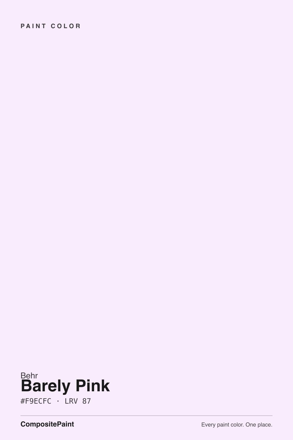
Barely Pink is exactly what the name says: not a pink wall, a suggestion of one. At LRV 87 it sits in the same reflectance band as Behr's own trim whites — White, Polar Bear, Ultra Pure White — with the faintest wash of color stirred in. Under a warm lamp it glows soft and blush; under a gray sky it can vanish into plain white, or worse, drift toward a pale lavender-gray that has nothing to do with the peachy blush most retail copy promises. Buy it for a nursery, a powder room, or a ceiling — not for a room that needs to visibly read "pink" from across the yard.
Nurseries and kids' rooms · powder rooms and small baths · a blush ceiling under white or pale walls · anyone who wants the idea of pink without committing to a pink room
Your room is dim or north-facing with no warm light · you need the color to visibly read pink from across the room · you're painting a large open-plan space that needs presence · your trim runs warm ivory rather than true white
- So pale it works almost like a warm white — a low-risk way to add "a little pink" to a room
- Genuinely glows soft and blush under warm lamplight and evening light
- Reads calm and grown-up, never candy-sweet or saturated
- Sits in the same LRV band as Behr's trim whites, so it plays well with white millwork
- A true small-room specialist: nurseries, powder rooms, ceilings all suit its scale
- Disappears into plain white in dim, cool, or north-facing rooms
- Reads cooler and more lavender-leaning than most marketing copy promises — test before assuming peach
- Too faint to anchor a large or open-plan room; whole-house use reads like an off-white gone wrong
- Needs both warm light and a true-white trim partner to reliably register as pink at all
What Color Is Barely Pink, Really?
Barely Pink is Behr's palest blush, and the honest way to describe it is: a near-white with a pink accent stirred in, not a pink with white stirred in. At LRV 87 it reflects almost as much light as Behr's own dedicated trim whites — Polar Bear sits at 86, White at 88, Ultra Pure White at 92 — and Barely Pink slots right into that cluster. It is sold across nearly every Behr product line, Marquee, Premium Plus, Ultra, even Behr Pro exterior formulas, which tells you it is treated as a genuine working neutral, not a niche accent shade.
The undertone is where buyers get surprised. Most retail copy calls it a warm blush with hints of peach and beige — but Behr's own color formula reads cooler than that description promises: the blue value sits fractionally ahead of the red, which is the signature of a color leaning toward pale lavender-pink rather than true warm peach. On the wall that shows up as a color that can't quite decide if it's pink, gray, or the faintest orchid, depending entirely on what light it's standing in. Neither read is wrong; they are the same paint being honest about two different rooms.
Because it carries so little pigment, depth is not this color's job — restraint is. It is built to soften a white room by a degree, not to announce itself as a pink one. Test it at real wall size before committing: a chip this pale looks like nothing on a fan deck and can still surprise you once it covers four walls under your actual bulbs.
Where It Shines
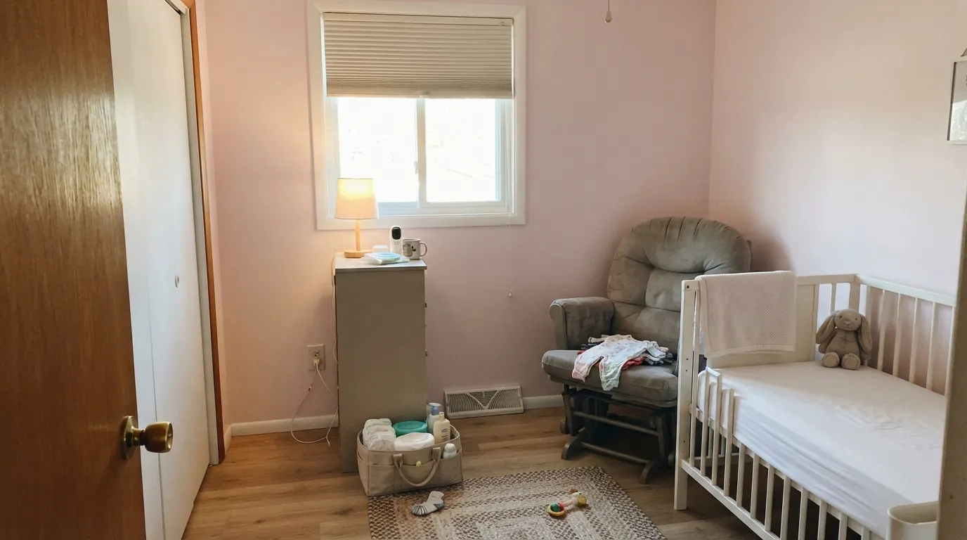
Give it warm lamplight, warm-white trim, and a small room, and Barely Pink does the one thing it was built to do: soften a space without committing to a theme. It is at its best in rooms people don't linger in reading the walls — nurseries, powder rooms, closets — where a whisper of color reads as intentional and a full-strength pink would read as a decision the next owner has to undo.
Where It Fails
Nearly every disappointed review of a color this pale traces back to one of three setups, and none of them are the paint's fault — a color built to reflect 87 percent of the light hitting it was never going to survive a dim room or a demand for visible presence.
Cool, low daylight has almost nothing to work with at this LRV — the pink drains out and what's left reads as a flat, slightly grayish white, sometimes with a faint violet cast in the shadows. If the room doesn't get warm daylight or a lamp left on, this color will not read as pink; pick something with real pigment instead, like BM Pink Bliss or SW Romance.
Because Barely Pink itself leans a shade cooler than its marketing description, a warm ivory or cream trim can make the wall look faintly lilac by contrast instead of blending in. A true white trim — Behr Ultra Pure White or Whisper White — keeps the pairing calm; sample both together before you commit to a warm trim white.
At LRV 87 this is not a personality color. Used across an open-plan main floor or a whole house, it just reads like an off-white that didn't quite turn out right — readers who wanted "a hint of pink" everywhere often end up with a house that looks accidentally beige-gray instead. Save it for one small room or a single plane, like a ceiling.
Room by Room
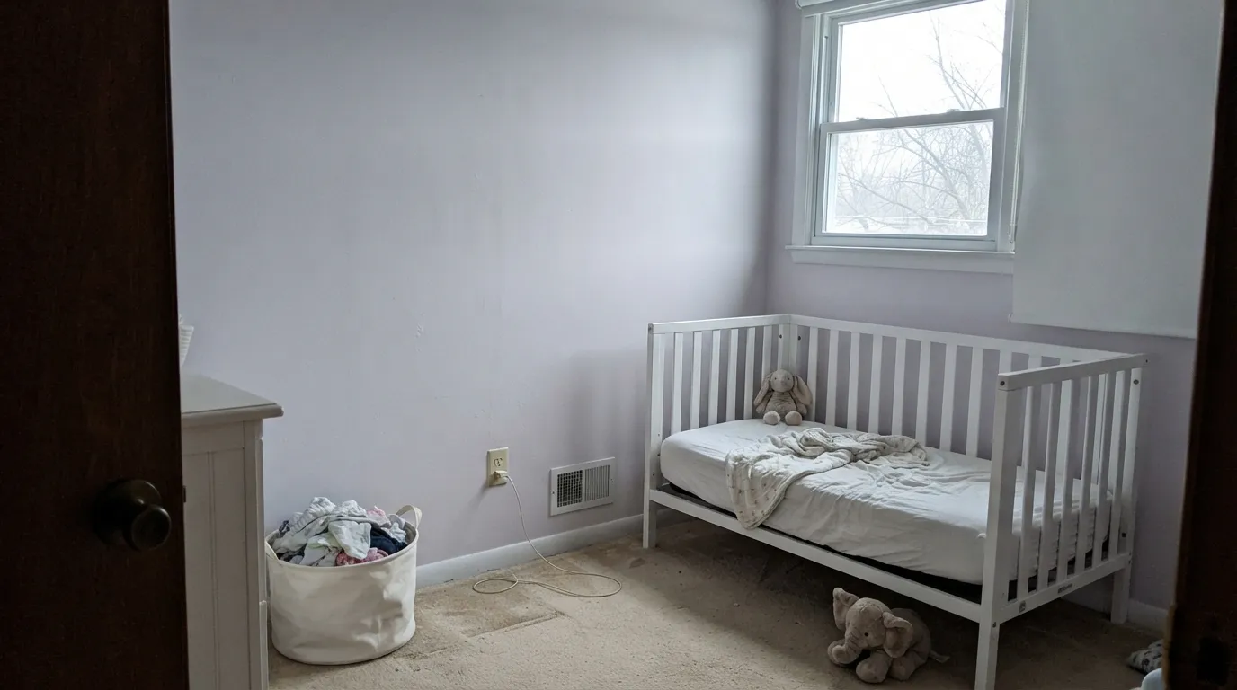
This is the room Barely Pink was made for: soft enough to feel calm at 2am under a warm night-light, pale enough that it won't fight a gender-neutral handoff to a sibling or a future toy room. Flat or eggshell, with warm white trim.
Because it reads so close to white, it doesn't lock a room into "toddler pink." It ages into a big-kid room, and eventually a guest room, without a repaint — one of the real practical reasons to choose it over a louder blush.
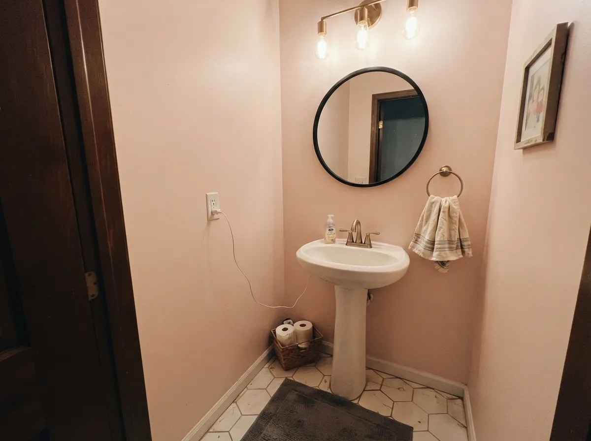
A small, warmly lit powder room is where the color's blush actually shows up reliably — enclosed rooms with a vanity light do the warm-light job for you. Satin on any millwork, semi-gloss on the door.
Beautiful with 2700K lamps and warm bedding; flat and undecided under cool overheads or in a north-facing room. If your bedroom runs dim or cool, this is not the pale pink to gamble on — sample it at the actual window before buying a gallon.
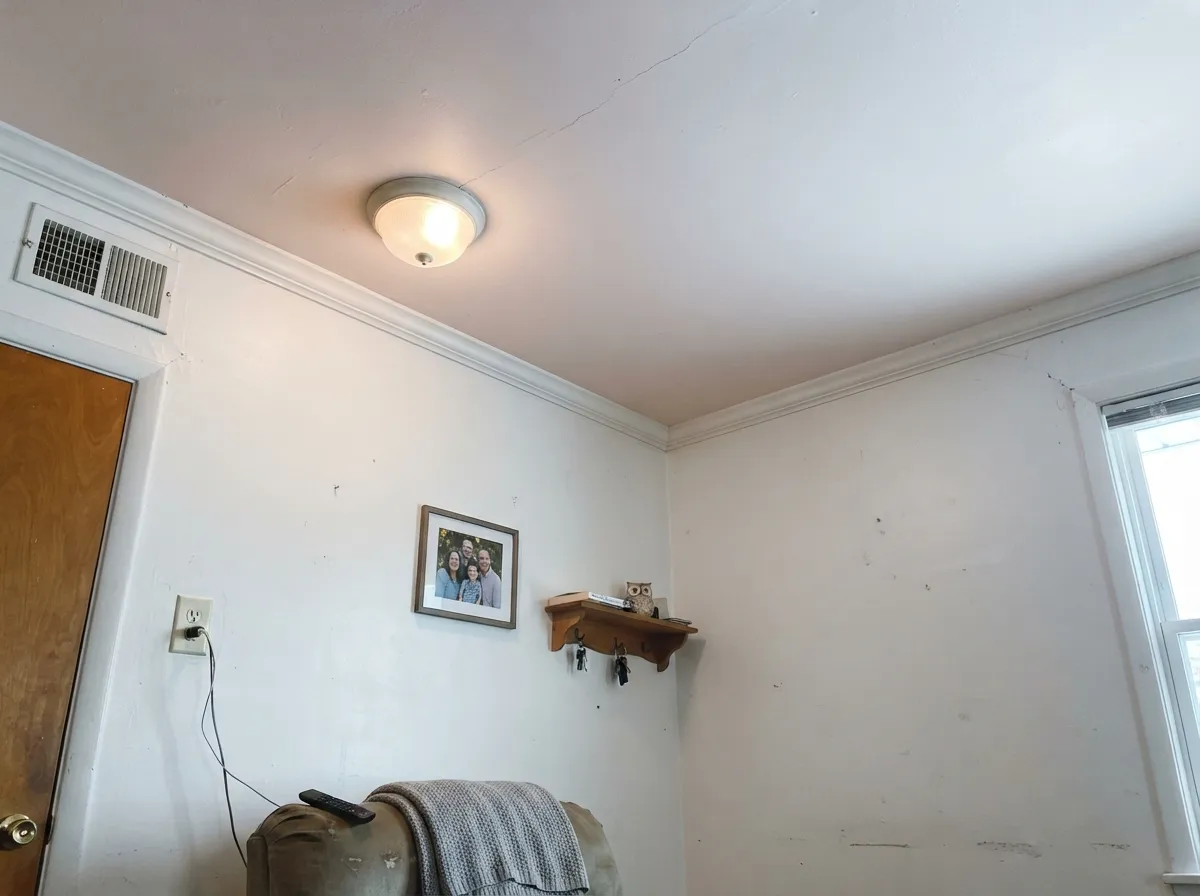
One of its most reliable jobs: painted only overhead, under white or pale walls, it gives a room a barely-there warmth from above without anyone quite clocking why. Flat sheen, and keep the walls a true white so the ceiling has something to contrast against.
Too faint to carry a large room and too pink to pass as a true neutral. If you love the idea, use it in one contained space — a nursery, a bath, a ceiling — rather than betting a whole floor plan on a color built to nearly disappear.
Your Light Is the Risk
2700K bulbs coax the pink forward and the wall goes genuinely soft and blush. This is the light the color depends on to read as "pink" at all.
Cool, flat daylight drains the color out almost entirely — expect a pale grayish white, sometimes with a faint violet cast in shadowed corners. Sample here before buying.
The most honest read: a crisp near-white with a whisper of pink at the edges, softening further at midday when the light washes it out.
Cool-white LEDs push it toward a flat, slightly cold near-white — closer to lavender-gray than blush. Swap to warm 2700K bulbs before blaming the paint.
Most complaints about Barely Pink are a light mismatch. Upload a photo of your actual room and see it on your walls — then ask for the same wall in north light or evening lamps before you buy a single sample.
Need It From Another Brand?
Any paint counter can custom-tint Behr 100A-1 directly. If you would rather stay in one brand's own deck, these are the closest stock matches, measured as ΔE2000. Under 2 is a difference you will not see on the wall.
| Brand | Closest color | ΔE | LRV | |
|---|---|---|---|---|
| Benjamin Moore | Pink Peony2078-70 · Benjamin Moore | 4.3 | 80 | Color page → |
| Glidden | Elizabethan Ice Pink90RB 83/030 · Glidden | 4.7 | 83 | Color page → |
| Dunn-Edwards | Partial PinkDE5994 · Dunn-Edwards | 2.6 | 83 | Color page → |
Similar Behr Colors
The nearest shades to Barely Pink within Behr's own range, ranked by perceptual color distance — useful when you want the same look a touch lighter, darker, or warmer.
WCAG 2.1: AA is 4.5 : 1 for normal text, 3 : 1 for large text, AAA is 7 : 1.
Barely Pink vs the Colors You're Also Considering
Every Barely Pink sample board has the same rivals on it. The numbers show the real lightness gap — then it comes down to which risk you would rather live with.
Pick this if you want Behr's cooler, even paler take, or you're already committed to a Behr project.
Benjamin Moore 2093-70 · LRV 82Pink BlissPick this for Benjamin Moore's version of the same idea — an equally sheer pink, a shade warmer and slightly deeper.
Pick this for something even quieter — First Light is confidently pink where Barely Pink is a suggestion of it.
Benjamin Moore 2102-70 · LRV 76First LightPick this for a pink that actually holds its color in daylight instead of nearly vanishing.
Barely Pink Coordinating Colors
The rule for coordinating with a color this pale is simple: keep everything else true and cool-leaning rather than warm-ivory, and save any real depth for one dark accent. These are the partners that keep the blush reading as pink instead of drifting toward lilac or beige:
Pink or Lavender? What the Formula Actually Says
Nearly every retail description of Barely Pink calls it a warm blush with hints of peach and beige — the kind of copy that gets written once and copied across a dozen paint-matching sites. Behr's own formula tells a slightly different story: the blue value in the mix sits just ahead of the red, which is the fingerprint of a color leaning toward pale lavender-pink, not warm peach. Neither reading is a mistake; they're describing the same very sheer pigment under different assumptions about light.
What this means at wall size: in warm lamplight or afternoon sun, the red and a touch of yellow warmth come forward and the wall reads as a gentle blush, matching the marketing description. In cool daylight or under blue-white LEDs, the same wall can drift toward a faint gray-violet that has nothing to do with peach. If you're choosing this color specifically for its warmth, test it under your own bulbs first — don't trust a fan deck chip or a product description to settle it for you.
Barely Pink on Exteriors
It's easy to assume a color this pale and delicate is strictly an interior pick, but Behr sells Barely Pink across several exterior product lines, including Ultra semi-gloss and flat exterior formulas and a Behr Pro exterior version — the kind of coverage a color only gets when contractors are actually specifying it, not just homeowners sampling a chip.
In practice that makes the most sense in small doses: a porch ceiling, shutters, a front door, or trim on a light-colored cottage-style house, rather than the full body of a house. At LRV 87, a whole exterior in this color will read as barely-there in strong sun and will show dirt, mildew streaks, and fading faster than a color with real pigment behind it — the same fragility that makes it lovely on an interior nursery wall works against it at exterior scale.
Three Ready Palettes Built on Barely Pink
A color is never alone on the wall. These are complete combinations in the 60-30-10 pattern, with the reason each one holds together. Every one opens in the visualizer.
Two depths of the same warm-pink family, separated by a true white trim, so the room reads soft and deliberate instead of like an unfinished coat. The deeper accent gives the eye one place to land.
Try this palette in your roomA near-black door is the one dark note this pale a wall color needs to read as a deliberate choice rather than an accident — the crisp white trim keeps the blush from drifting toward lilac.
Try this palette in your roomThe color's real job here: a barely-there warmth overhead that most guests won't consciously identify, while a true warm greige carries the actual color decision on the walls.
Try this palette in your roomBarely Pink FAQ
Is Barely Pink actually pink, or does it just look white?
Both, depending on the room. At LRV 87 it reflects almost as much light as a dedicated trim white, so in bright or cool light it can genuinely read as plain white. Under warm lamplight or afternoon sun the pink comes forward. If you need the wall to visibly read pink at a glance, this is too pale — pick something with real depth instead.
Is the undertone warm peach or cool lavender?
Retail descriptions mostly call it a warm blush with peach and beige undertones, but Behr's own formula reads a hair cooler than that — closer to a pale lavender-pink than true peach. In practice both are true at different times of day: warm light pulls it toward blush, cool or overcast light can push it toward a faint gray-violet. Sample it under your own bulbs before trusting either description.
Is it good for a nursery?
Yes — this is its strongest use case. It's soft enough for a newborn's room without locking you into a theme, and pale enough to repaint into a big-kid room or guest room later without much extra work.
What trim white goes with Barely Pink?
A true, cool-leaning white — Behr Ultra Pure White or Whisper White — keeps the pairing calm. A warm ivory or cream trim can make the wall look faintly lilac by contrast, since Barely Pink itself already leans a shade cool.
Can I use Barely Pink outside?
Behr does sell it in exterior formulas, but treat that as an option for trim, shutters, or a porch ceiling rather than a full pastel exterior body — a color this pale shows dirt and fading quickly in full sun, and a whole house of it will read closer to dingy white than pink within a season or two.
Does it work with wood floors and brass hardware?
Yes, easily — its pigment load is so low it rarely fights any wood tone, warm or cool. Brass and unlacquered hardware read especially well against it, since both share the same soft, warm-leaning quiet.
Have you painted with Barely Pink?
Rate it — one tap helps the next reader decide.
Ask a Question