Romance
The Sherwin-Williams pink nobody hypes, reviewed honestly: where the coral warmth glows, the exact light that turns it dusty, and what to pick instead.

Jessica has spec'd whites and neutrals for more than 300 rooms and keeps a sample wall of painted drawdowns in her studio. Every color review is checked against real reader rooms in the comments and re-tested when a formula changes. About the testing process →
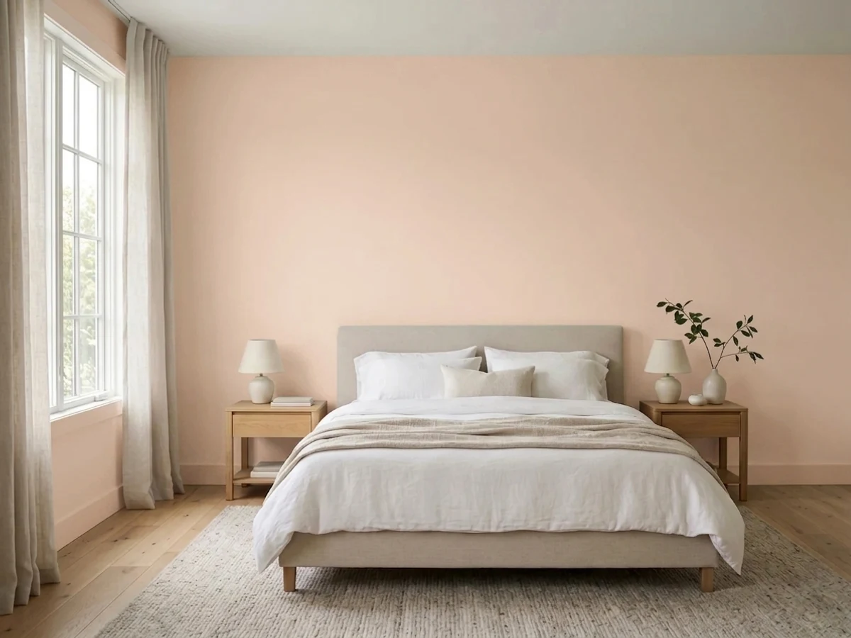
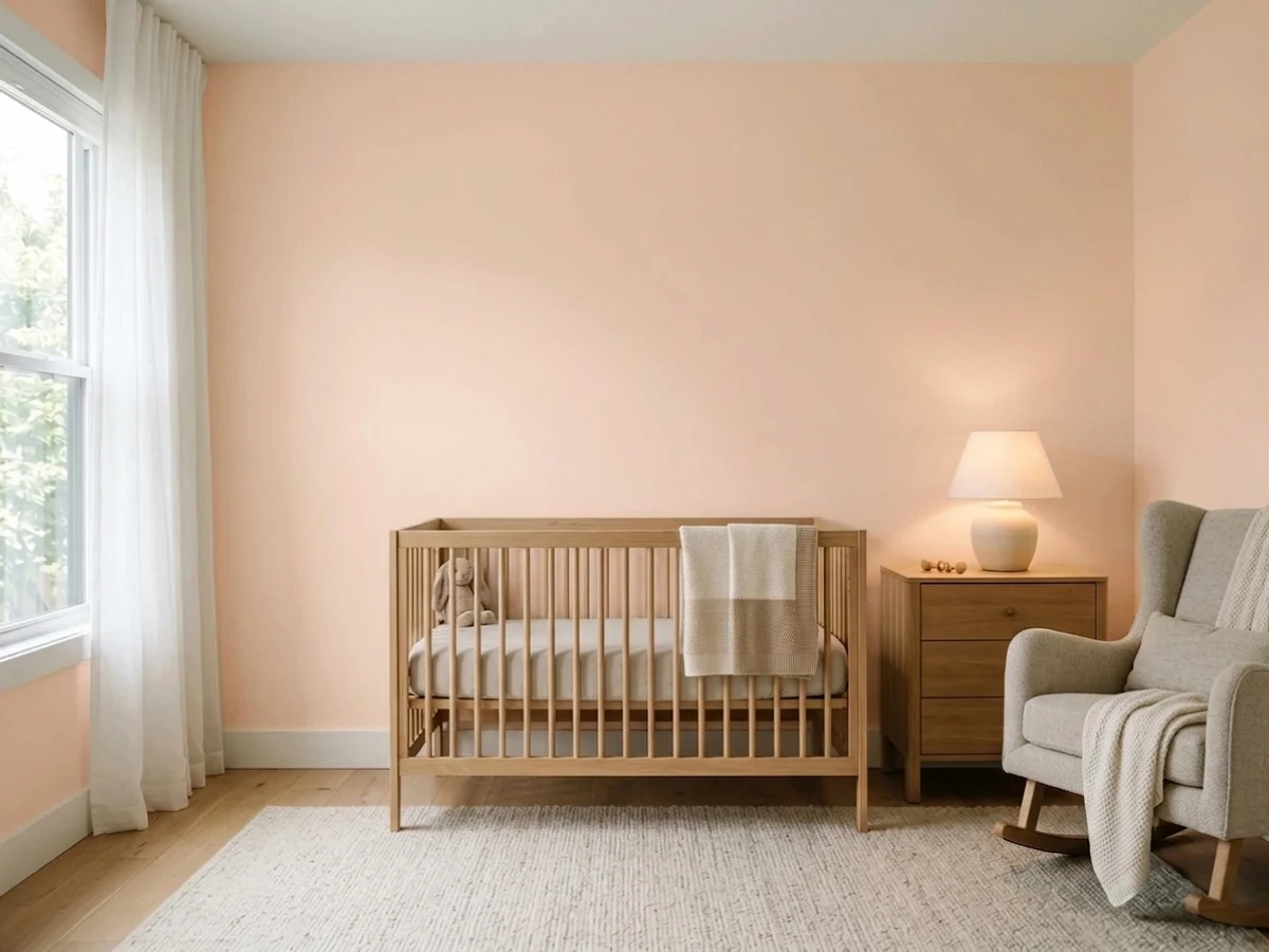
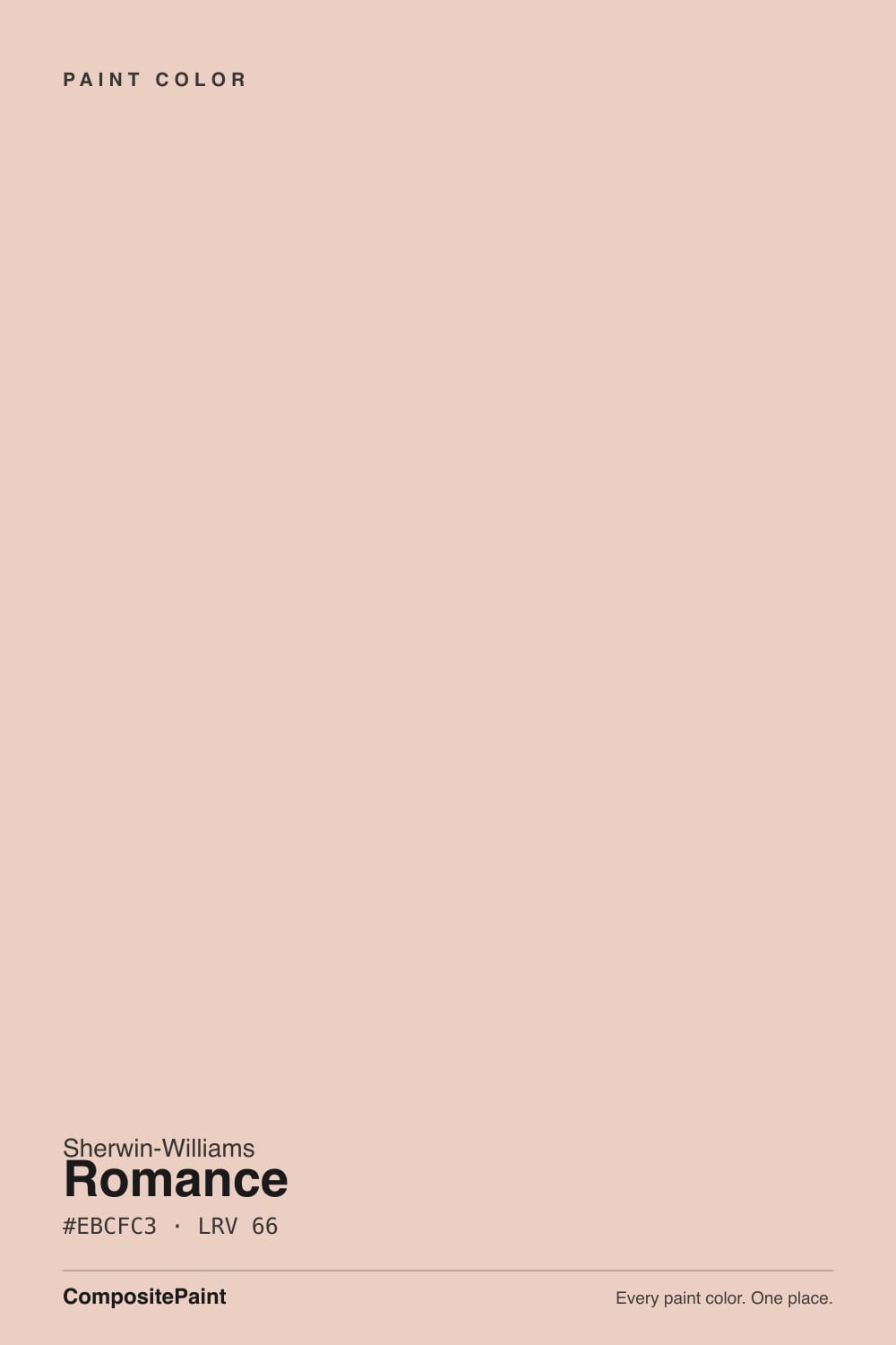
- 1Vintage Tea Rose47
- 2Pale Cherry Blossom61
- 3Romance66
- 4First Light76
- 5Pink Bliss82
The Fast Verdict
Romance is a real, warm, coral-leaning pink at a livable LRV 66 — not a Color of the Year, not a viral moment, just a quiet number sitting in Sherwin-Williams's deck one SKU away from paler blush colors that get more attention. Give it warm daylight, wood, and brass, and it reads adult and deliberate. Give it a north window and cool LEDs, and it goes flat and dusty fast. It has never chased fame, and it does not need to.
Nurseries meant to outgrow pastel · powder rooms and vanities · kitchen islands or hutches with brass and butcher block · anyone who wants actual pink on the wall, not a pink-flavored white
You want a warm neutral that only hints at color · your room runs on cool LEDs with no lamps · your floors are cool gray or your counters are icy white quartz · you are not ready to commit to visible pink
- A real, warm coral-pink that reads adult, not nursery-pastel
- Holds actual color at LRV 66 instead of washing out to near-white
- Flatters brass, walnut, and warm wood without a fight
- Small-dose rooms (vanity, island, powder bath) look deliberate, not themed
- Quiet and unbranded — no fad moment to date it, no fame to live up to either
- Not a neutral — buyers expecting warm beige get real, visible pink
- North light and cool LEDs mute it to a flat, dusty salmon
- Clashes with cool gray floors and icy white quartz
- Whole-room and exterior use are real commitments, not safe defaults
What Color Is Romance, Really?
A warm, coral-leaning pink — straightforwardly pink, not a cream with a blush rumor in it. Sherwin-Williams numbers it SW 6323, one digit past SW 6322, Intimate White, a much paler blush that reads almost as an off-white. Romance is the sibling that actually commits: more red than orange, more coral than mauve, with none of the cool violet undertone that turns some "dusty rose" colors gray in bad light. Tellingly, Sherwin-Williams files Romance under its Red paint-color family on its own site, not Pink — a small, honest signal about how much saturation is actually on the wall once you roll a full room. It has no Color of the Year moment and no viral design-blog story behind it; it shows up quietly in the HGTV HOME by Sherwin-Williams line as well as the core deck, a workhorse number rather than a headline one, and the honest version of this review is that it does its job well without needing to be famous.
At LRV 66 it sits in an unusual middle zone for a pink: brighter, easier-to-place colors like BM First Light (LRV 76) or SW Intimate White (LRV 77) are pale enough to almost pass for warm white walls. Romance is a full ten-plus points darker, which means it holds actual pigment on the wall instead of washing out. That is the trade this color makes — less safe than a blush-white, more usable on a full wall than a true dusty rose in the 30s and 40s.
Undertone in one line: warm coral-pink, leaning red-orange, never violet and never baby-pink-blue. If your sample reads salmon or slightly orange, that is strong afternoon sun doing exactly what it should; if it reads pale, chalky, or dusty, that is cool light draining the warmth out — not a different paint.
Where It Shines
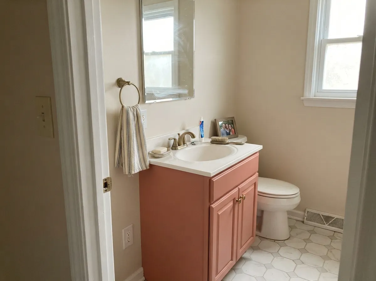
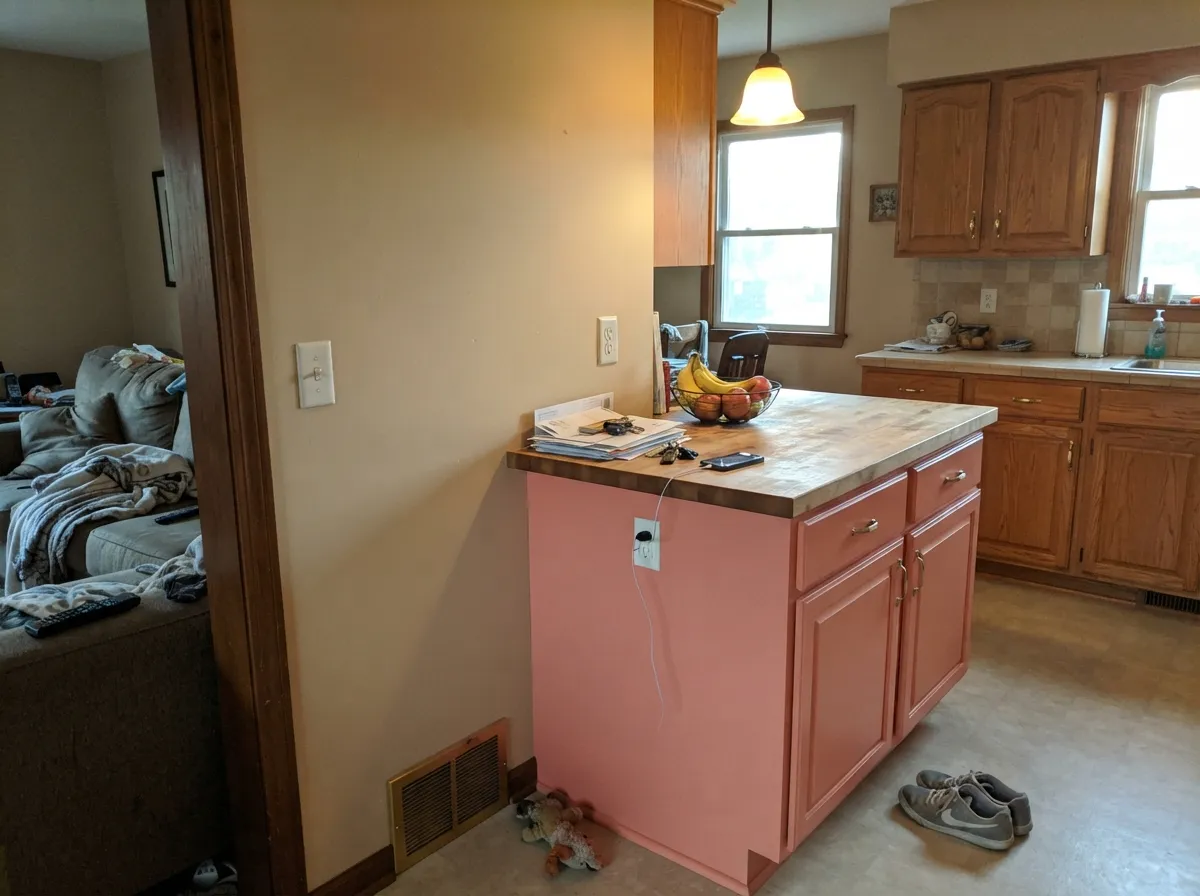
This is a color built for warm light and small commitments. Under real afternoon sun with oak or walnut nearby, the coral comes forward and the wall reads confident, not childish — the color earns the grown-up half of its name. Its best jobs are doses, not whole houses: a vanity, a powder room, a kitchen island or hutch, one accent wall in an otherwise neutral room. Give it brass hardware, warm wood, and a cream or warm-white trim, and it looks intentional in a way most "safe" pinks never manage.
Where It Fails
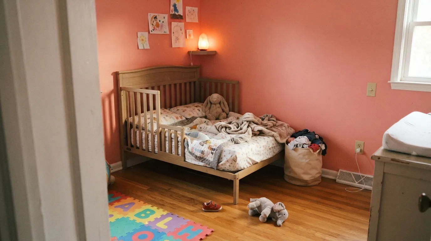
Almost every disappointed review of Romance traces back to one of three predictable situations, and none of them are the paint's fault. If your room matches one of these, sample it big before you commit a whole wall.
Cold light kills the coral and leaves a flat, chalky, slightly dusty salmon that reads more "tired" than "pink." This is the same failure mode every pale-to-mid pink in the deck shares — SW Intimate White and BM First Light both fight it too. Warm 2700K bulbs are not optional in a dim or north-facing room; without them, the color never shows its actual self.
On a small chip, the LRV 66 can read as a warm beige or cream at a glance. On four walls, the pink is unmistakable — pigment multiplies with square footage. If what you actually want is "barely-there warmth," this is the wrong color; look at the paler blush-whites (Intimate White, First Light) instead of Romance.
Cool gray floors, blue-white quartz counters, or a stark cool-white trim sit at the opposite temperature and make Romance look slightly off — almost bruised — instead of warm. Pair it with warm whites, cream, or wood tones instead, and keep chrome fixtures to a minimum in favor of brass or matte black.
Room by Room
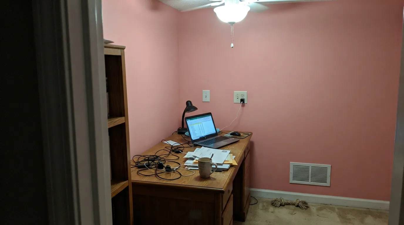
This is not baby-shower pastel pink; it is warm and grown-up enough to survive past the crib years without a repaint. Eggshell holds up to handprints and wipes clean, which matters more here than in almost any other room.
With cream linens, walnut furniture and warm lamp light it reads sophisticated rather than sweet. Skip it if the room is north-facing and lamp-free; the color needs its warm light to earn the compliment.
Satin Romance on a vanity under cream or warm-white walls, with brass pulls and a warm stone top, is a weekend project that reads custom. Full-room powder baths take it well too — small rooms carry deep color better than large ones.
On an island or a coffee hutch against a warm neutral wall it is charming without being twee. Keep it away from cool white quartz and stainless-heavy kitchens, where the temperature mismatch shows fastest.
One wall in an otherwise neutral, warm-toned living room works; four walls is a bigger bet that depends entirely on the rest of the room staying warm. Open-plan rooms need every neighboring color to agree with it.
Full outdoor sun tends to bleach a coral pink toward flat, slightly orange concrete over time, and it reads more dated than deliberate on a whole facade. A shaded front door on a warm-white house is the one exterior use worth trying.
Your Light Is the Risk
South or west daylight brings the coral fully forward — this is the color at its most confident, not childish.
Cool, flat daylight drains the warmth and leaves a dusty, slightly chalky salmon. Sample here before you commit.
Coral and lively at the sun hours, quieter and more muted the rest of the day. Most owners find the shift pleasant, not jarring.
2700K lamps keep the coral warm and glowing. Cool LEDs flatten it toward gray-pink — swap the bulbs before you swap the paint.
Most complaints about Romance are a light mismatch. Upload a photo of your actual room and see it on your walls — then ask for the same wall in north light or evening lamps before you buy a single sample.
Need It From Another Brand?
Any paint counter can custom-tint Sherwin-Williams SW 6323 directly. If you would rather stay in one brand's own deck, these are the closest stock matches, measured as ΔE2000. Under 2 is a difference you will not see on the wall.
| Brand | Closest color | ΔE | LRV | |
|---|---|---|---|---|
| Behr | AngelicoS180-1 · Behr | 0.7 | 66 | Color page → |
| Benjamin Moore | Precocious051 · Benjamin Moore | 1.3 | 64 | Color page → |
| Valspar | Morning Glow2002-8C · Valspar | 1.2 | 68 | Color page → |
| PPG / Glidden | Cameo PeachPPG1058-2 · PPG / Glidden | 2.8 | 66 | Color page → |
| Glidden | HoneysweetPPG1065-3 · Glidden | 2.2 | 66 | Color page → |
| Dutch Boy | Thinking Pink305-1DB · Dutch Boy | 1.4 | 66 | Color page → |
Similar Sherwin-Williams Colors
The nearest shades to Romance within Sherwin-Williams's own range, ranked by perceptual color distance — useful when you want the same look a touch lighter, darker, or warmer.
WCAG 2.1: AA is 4.5 : 1 for normal text, 3 : 1 for large text, AAA is 7 : 1.
Romance vs the Colors You're Also Considering
Every Romance sample board has the same rivals on it. The numbers show the real lightness gap — then it comes down to which risk you would rather live with.
Pick this when you want actual pink on the wall, not a suggestion of it.
Sherwin-Williams SW 6322 · LRV 77Intimate WhitePick this for the barely-there version — a warm blush white that flirts with pink instead of committing to it.
Pick this for more color — First Light looks almost neutral standing next to Romance's clear coral.
Benjamin Moore 2102-70 · LRV 76First LightPick this if you're shopping Benjamin Moore and want the same easy, pale pink-that-reads-off-white.
Its Sherwin-Williams neighbors separate by how much orange they carry. Rosy Outlook SW 6316 shares the LRV of 66 but at #EBCECB it holds more red and less orange, so it reads as a cleaner pink. Peach Fuzz SW 6344, also LRV 66, goes the other way at #ECCFBB and is clearly peach. Blushing SW 6617 at LRV 68 and Koral Kicks SW 6610 at LRV 68 are both a step lighter and slightly brighter, while Quaint Peche SW 6330 at LRV 65 is the closest of the group to Romance itself.
Across brands, Valspar Morning Glow 2002-8C at LRV 68 sits at deltaE 1.22 and Benjamin Moore Precocious 051 at LRV 64 at deltaE 1.29, both visually identical to Romance in normal room light. Behr Buff Tone S230-1 at LRV 68 is deltaE 1.67, in the same band. Farrow and Ball Pink Ground No. 202 at LRV 69 is deltaE 2.94, very close but worth sampling first, and Dunn-Edwards English Scone DE6108 at LRV 61 is deltaE 3.99, close but visibly different side by side.
Romance Coordinating Colors
The rule for coordinating with Romance is the same as with any warm pink: stay warm everywhere else, and let one near-black or deep neutral ground the room so the pink doesn't float. It pairs easily with warm whites and linens, welcomes walnut and brass, and even takes a muted sage well as a complementary accent. These are the partners that keep showing up in rooms that work:
Romance and the Rest of SW's Pink Lineup
Romance has no Color of the Year story and no viral design-blog moment behind it — it is a workhorse number sitting quietly in Sherwin-Williams's numbered fan deck, one SKU away from Intimate White (SW 6322), a much paler blush that gets more of the attention. That adjacency tells the real story better than any marketing copy: SW built a small ladder of related pinks at different depths, and Romance is the rung where the color stops being a suggestion and starts being a decision.
It is worth contrasting with Malted Milk, a nearby beige at a similar LRV that goes the opposite direction — a neutral that occasionally flashes pink in warm light, rather than a pink that stays put. Romance never pretends to be a beige. That honesty is exactly why it suits readers who already know they want visible color and are tired of paint names that promise pink and deliver cream.
Romance With Wood Tones and Metals
Warm wood is this color's best friend: walnut, oak, and butcher block all sit comfortably against the coral because their undertones meet halfway. Unlacquered brass and warm matte black hardware read as intentional; polished chrome and cool stainless are the one metal finish that fights it, pulling the room toward that bruised, off-temperature look the fails section describes.
Flooring is where to be careful. Cool gray LVP, gray-washed wood, and icy white or blue-veined quartz counters all sit at the opposite temperature and make Romance look slightly wrong rather than warm. Warm oak, walnut, or a cream-veined stone underneath solves the problem before it starts — sample a large swatch above the actual floor and counter before committing a whole room.
Three Ready Palettes Built on Romance
A color is never alone on the wall. These are complete combinations in the 60-30-10 pattern, with the reason each one holds together. Every one opens in the visualizer.
A warm-white trim keeps the coral from tipping sugary, and one near-black accent — a crib rail, picture frames, a reading lamp — ages the room past the toddler years without repainting a single wall.
Try this palette in your roomNatural Linen shares Romance's warmth almost exactly, so the wall-to-vanity handoff is seamless; the charcoal frame gives the small room one grounding dark note instead of letting the pink float.
Try this palette in your roomAccessible Beige is exactly the warm neutral Romance was built to sit inside, so the island reads like a deliberate accent instead of a clash. Alabaster trim keeps the rest of the kitchen from committing to full pink.
Try this palette in your roomRomance FAQ
Is romance a good nursery color?
Yes, and it is arguably its best use: warm enough to feel considered rather than candy-pink, and grown-up enough that the room does not need repainting when the crib comes down. Use eggshell for washability and warm 2700K lighting to keep the coral alive after dark.
Is SW Romance warm or cool?
Warm — a genuine coral-pink, not a dusty violet-mauve. In cool north light or under cool LEDs it can look flat and dusty, but it never turns blue or lavender the way some "dusty rose" colors do. Warm light and warm bulbs bring out the color it was mixed to be.
What white trim goes with Romance?
A warm white or soft cream — Alabaster or a similar warm-white keeps the pink looking intentional. A stark, cool-white trim makes the walls look slightly off, the same temperature clash that shows up with cool gray floors and icy quartz counters.
Does Romance work in a north-facing room?
Only with real help. North light is cool and flat, and it drains the coral out of Romance the way it does to nearly every pink in this LRV range. If the room is north-facing, plan on warm lamps doing real work, or sample big before you commit a whole wall.
What's the difference between Romance and Intimate White?
They sit one SKU apart in the Sherwin-Williams deck — Intimate White (SW 6322) is a pale blush that reads close to an off-white, while Romance (SW 6323) is ten-plus LRV points deeper and unmistakably pink on a full wall. Pick Intimate White if you want a hint of warmth; pick Romance if you want visible color.
Can Romance work outside a nursery — living room, kitchen?
Yes, in doses. A powder room, a vanity, a kitchen island or hutch, or one accent wall in a warm-toned living room all suit it well. A full living room or kitchen in Romance is a bigger, riskier commitment that depends on every neighboring color staying warm.
Have you painted with Romance?
Rate it — one tap helps the next reader decide.
Ask a Question