 1
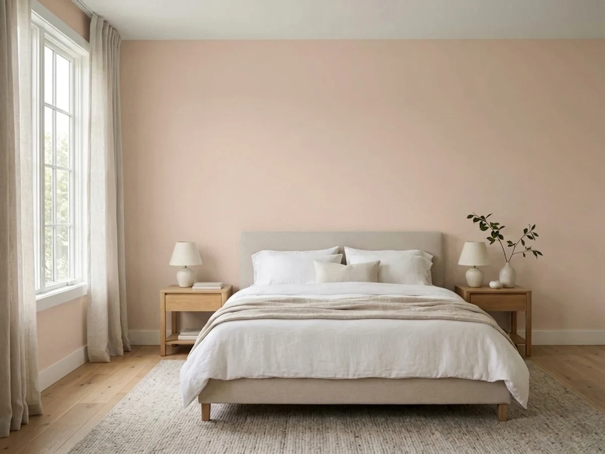
1Malted MilkSW 6057 · LRV 62
Malted Milk is a warm, dusty pink-beige that Sherwin-Williams itself calls "a flexible neutral with a dash of red" — and the dash is bigger than the marketing lets on.
10 curated pinks with undertones, LRV, and the honest reasons why, plus the full 126-color pink deck below.
Don't want to compare 126 pinks? These four cover most real projects.
Teaberry is a light pink that sits on the berry side of the family, not the peach side — and that one fact decides whether you love it.
Malted Milk is a warm, dusty pink-beige that Sherwin-Williams itself calls "a flexible neutral with a dash of red" — and the dash is bigger than the marketing lets on.
A soft coral-pink (LRV 66) that holds its warmth and glows in good light rather than fading to a washed-out blush.
Coming up Roses is a real, saturated rose-pink at mid depth — the pink you pick when blush has already bored you.
Numbered and curated. Tap any color for its full review, or see it on your own walls in the visualizer.
1Malted Milk is a warm, dusty pink-beige that Sherwin-Williams itself calls "a flexible neutral with a dash of red" — and the dash is bigger than the marketing lets on.
 2
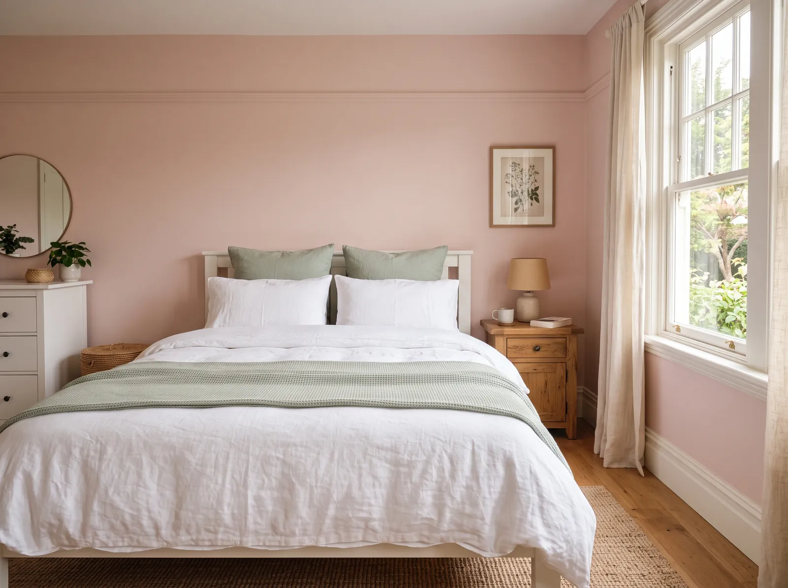
2A soft coral-pink (LRV 66) that holds its warmth and glows in good light rather than fading to a washed-out blush.
 3
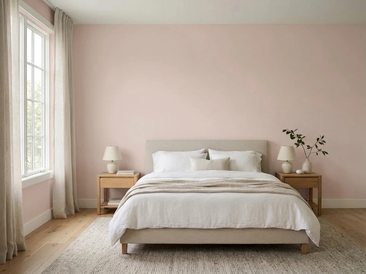
3Abalone Shell is what happens when a designer wants "warm neutral" and refuses to say the word pink out loud.
 4
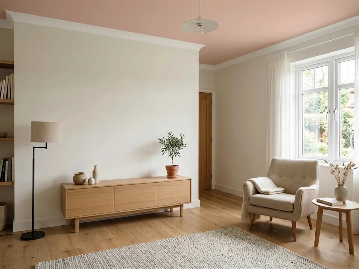
4Pink Shadow is a pink with the sugar taken out: a soft peach-blush muted so far down that it reads like aged plaster instead of a color chip.
 5
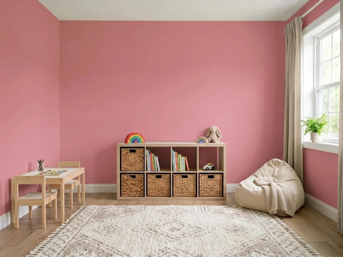
5Coming up Roses is a real, saturated rose-pink at mid depth — the pink you pick when blush has already bored you.
 6
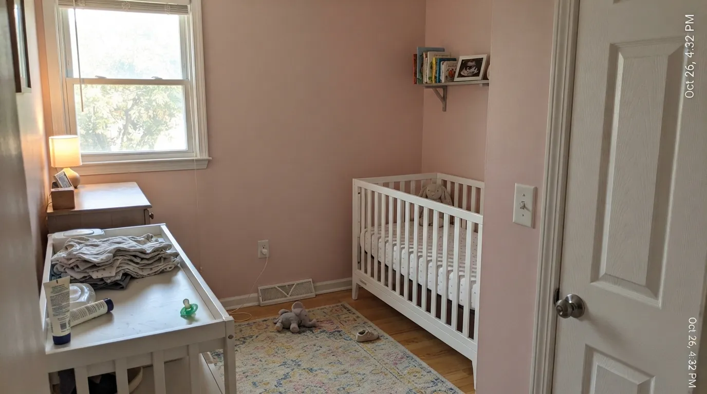
6A classic soft rose on Sherwin-Williams' expert pink shortlist — warm, calm, and easy in bedrooms.
 7
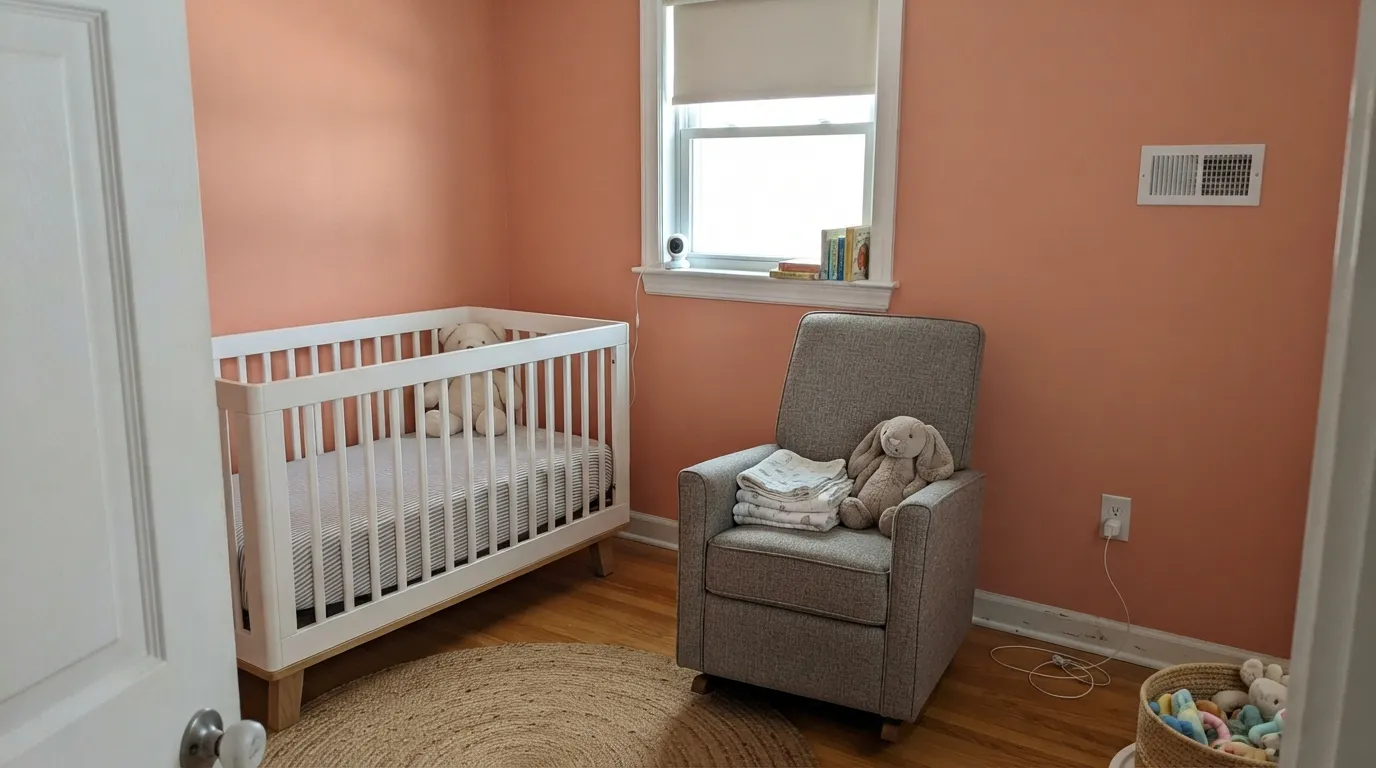
7A peachy apricot-pink Sherwin-Williams' experts recommend where blush feels too cool.
 8
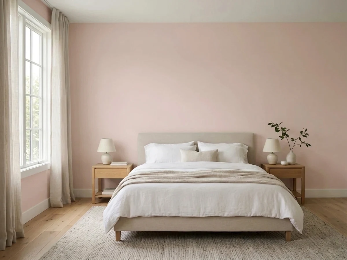
8Teaberry is a light pink that sits on the berry side of the family, not the peach side — and that one fact decides whether you love it.
 9
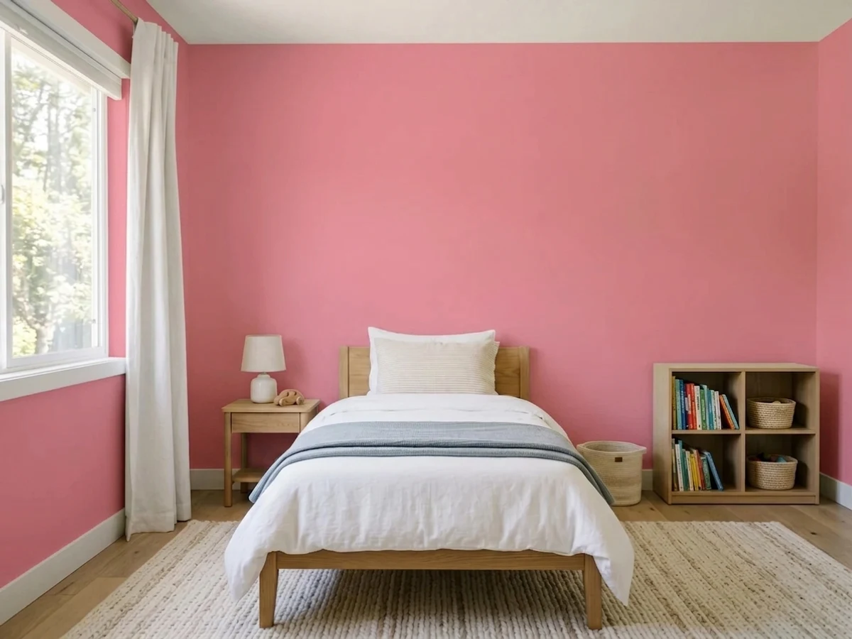
9Cheery is pink with no apologies and no dust in it — a clean rosy bubblegum that reads exactly as pink under every light, which is both the reason to buy it and the reason to ration it.
 10
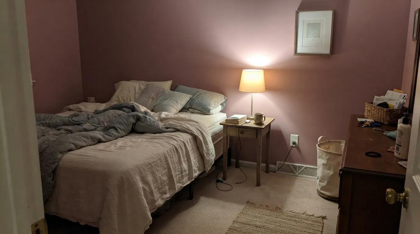
10Muted rose-mauve (LRV 37) — dark pink for people who don't want it to look pink-pink.
The whole Sherwin-Williams pink range by depth. LRV is the number to trust: the same pink looks two steps darker on a wall than on a chip.
LRV is just light reflectance value, a 0 to 100 scale of how much light a color bounces back. The pinks in this slice run from 17 at the darkest to 75 at the lightest, so this one family covers nearly the full range from airy to deep. The higher the number, the brighter and more open the room will feel.
For a barely-there blush that keeps a room light, look near the top: Faint Coral at LRV 75 or Innocence (SW 6302) at 68 read almost like a soft white with warmth. In the middle, Azalea Flower (SW 6576) at 60 and Tawny Tan (SW 7713) at 47 give you visible color that still works on full walls. Drop down to Resounding Rose at 34 when you want a pink that holds its own on an accent wall or in a moody space.
Each room page shows pink picks from every US brand side by side, so you can compare in context.
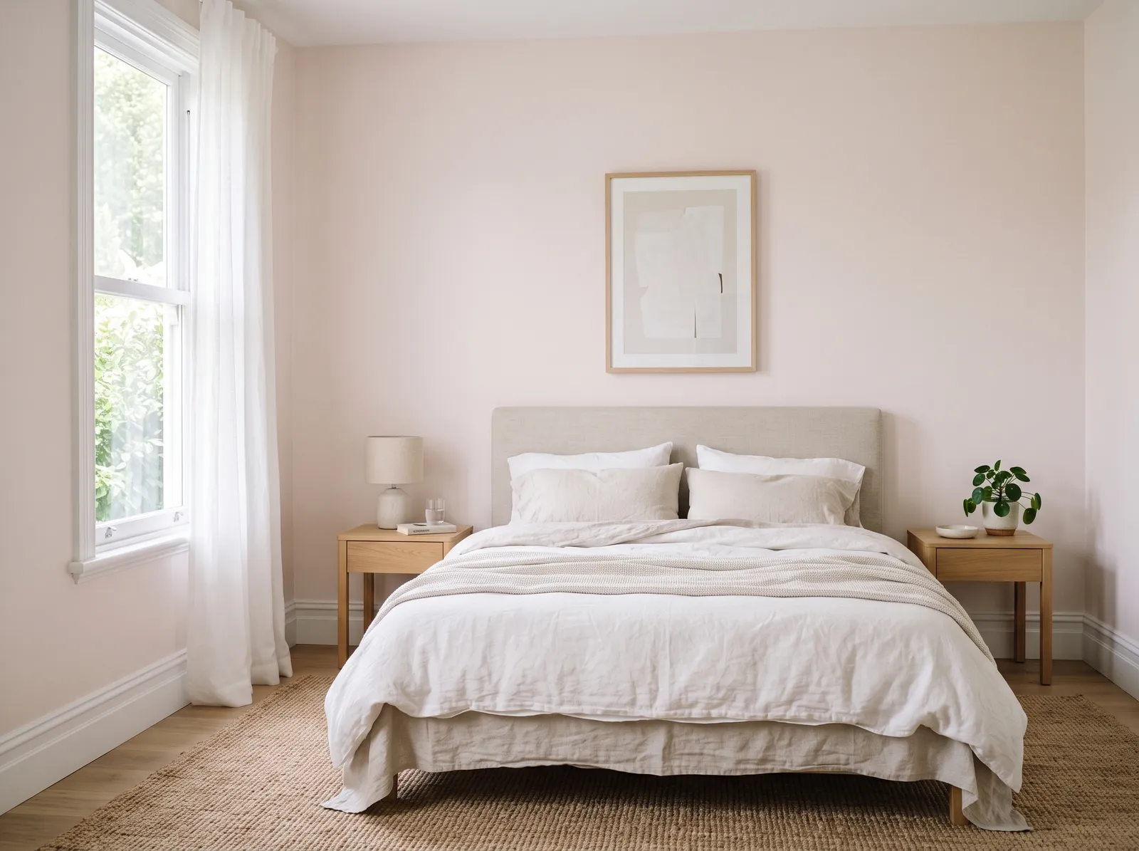

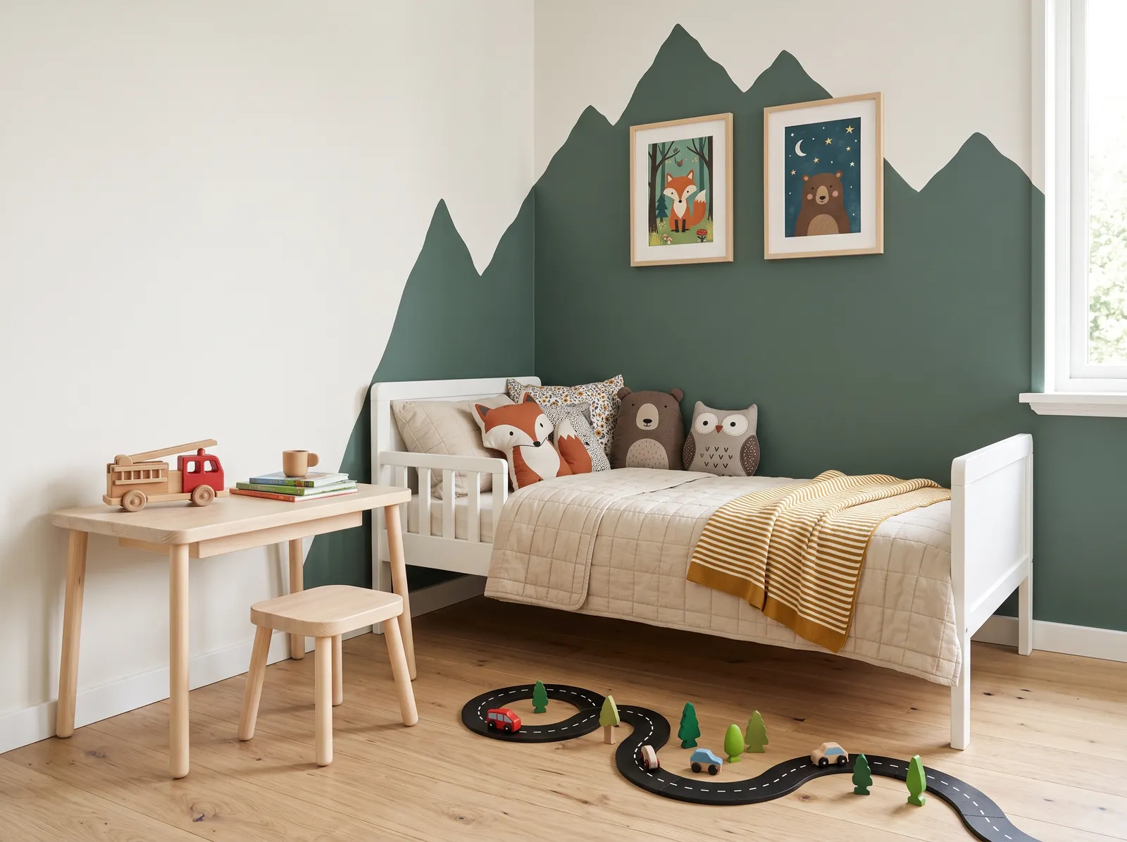
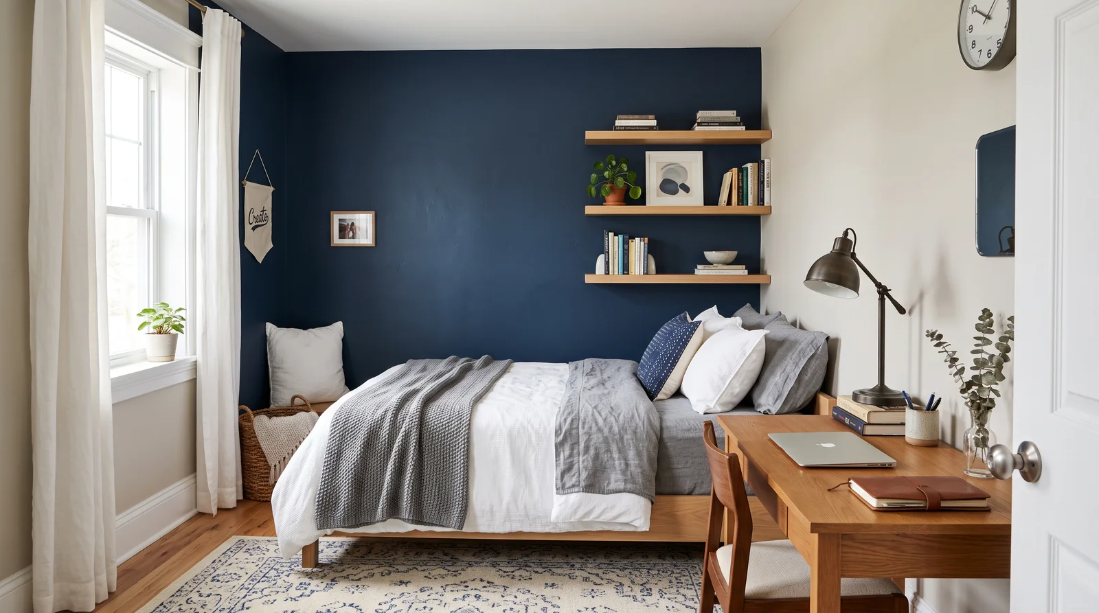
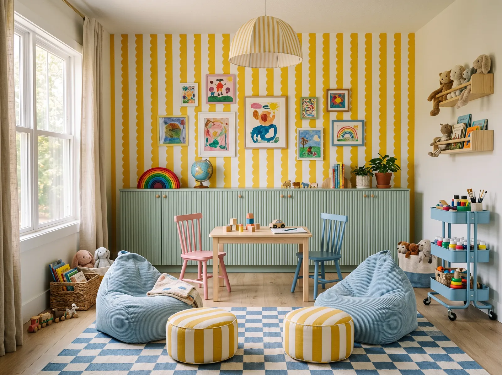

The lighter, warmer pinks are easy in spaces you want to feel calm and welcoming. Bedrooms, nurseries, powder rooms, and dressing areas all suit picks like Innocence or Quaint Peche, where a touch of color softens the room without taking over. North-facing rooms that feel cold are a good fit too, since the coral and peach undertones add back some warmth.
Save the deeper pinks for spots that can carry more drama. Resounding Rose works on a single accent wall, a dining room, or the inside of a built-in or bookcase. If you are nervous about pink on every wall, paint one wall in the deep tone and the rest in a soft neutral.
Every Sherwin-Williams pink, grouped by undertone, warm to cool. Filter by depth or change the order.
Hex values are display approximations from Sherwin-Williams's published swatch tools, not a physical sample under controlled lighting. Order a brand-direct sample before specifying.
Upload a photo of the room. We paint it in the pink you chose with your light and your floor, and you can swap colors until one holds.
Every Sherwin-Williams color is mixed to order at a company-owned Sherwin-Williams store or online, so any pink here can be made in the finish and quality line you want. The lines go good to best: Cashmere (about $55 a gallon), SuperPaint (about $68), Duration (about $75), and Emerald (about $80). Those are list prices, and Sherwin-Williams runs 30 to 40 percent sales almost constantly, so it is worth waiting for a sale before you buy. Note that the HGTV Home by Sherwin-Williams line sold at Lowe's is a separate, lower-tier brand, not the same thing as the store paint.
Because these colors are mixed from a formula, you are not locked into one store. A paint counter can color-match a Sherwin-Williams pink like Smoky Salmon into another brand's base, or match it into the featured Kompozit deck, by reading the color and tinting to it. Bring the name and code (they look like SW 6329) or a physical chip, and ask the counter to match it; the closer the chip, the better the result.
How many pink colors each brand carries, drawn with that deck's own pinks from light to dark. Pick your store first, then the color. Every brand equal, no favorites.
Sherwin-Williams keeps 140 pinks in its ColorSnap deck, and most of them lean soft and warm rather than loud. You will see a lot of coral, peach, and salmon in this family, which is why names like Faint Coral (SW 6329) and Smoky Salmon (SW 6331) sit right alongside the rosier picks. These are the kind of pinks that read as a warm neutral on a wall, not a candy color.
The brand is best known for dependable neutrals with undertones you can predict, and that same steadiness shows up here. A color like Quaint Peche (SW 6330) or Croissant (SW 7716) gives you a gentle blush without going pastel-sweet, while Resounding Rose (SW 6318) brings real depth for a feature wall.
Warm pinks pair cleanly with a soft white trim. Sherwin-Williams Alabaster is a popular warm white that keeps things gentle, and a true neutral like Agreeable Gray or Accessible Beige works well on adjoining walls or larger surfaces. Keep ceilings a simple white so the pink stays the star.
For contrast, a deep navy like Naval or a near-black like Tricorn Black grounds a blush room and stops it from feeling too sweet. If you want a calm tone-on-tone look, pair a light pink such as Croissant with a warm greige and let the trim do the brightening.
Malted Milk (SW 6057) — Malted Milk is a warm, dusty pink-beige that Sherwin-Williams itself calls "a flexible neutral with a dash of red" — and the dash is bigger than the marketing lets on. Teaberry and Romance and Coming up Roses round out the short list most people choose from.
This slice of the Sherwin-Williams ColorSnap deck has 140 colors in the pink family. They range from soft blush tones to deeper roses, with a lot of coral, peach, and salmon in between.
In this slice, Faint Coral (SW 6329) is the lightest at an LRV of 75, so it reads almost like a warm soft white. Innocence (SW 6302) at LRV 68 is another very light, airy option.
Resounding Rose (SW 6318) is the deepest here at an LRV of 34. It has enough depth to carry an accent wall, a dining room, or the inside of a built-in without looking washed out.
A soft warm white like Alabaster keeps the look gentle and clean. For more contrast, a deep navy such as Naval or a near-black like Tricorn Black grounds a blush room nicely.
Yes. Any paint counter can color-match a Sherwin-Williams pink into another brand's base, or into the featured Kompozit deck, by reading the color and tinting to it. Bring the name and code, like SW 6330, or a physical chip for the closest match.
They are mixed to order at company-owned Sherwin-Williams stores and online. Lines run from Cashmere (about $55 a gallon) up to Emerald (about $80), but the brand runs 30 to 40 percent sales almost constantly, so it pays to wait for a sale.
Ask a Question