Room Colors · Pink Children's Room
8 Best Pink Children's Room Paint Colors for 2026
ideas, combinations, and real rooms
8 curated picks from real pink children's rooms — with the exact colors, honest reasons why, and the combinations that hold the room together.

Former interior stylist who can spot a green undertone from across a room. Jessica writes the color and mood pieces — what to choose, what pairs, and why your "white" looks pink.
The Fast Answer
Don't want to read 8 picks? These four are the safe answers.

Top Picks for the Pink Children's Room
Tap a shade to see the pink children's room in it, then try it on your own room.
Pink Children's Room Color Trends 2026 — What's In, What's Out


- Pale Ballet-Pink Everything — Faint, powdery princess pink covering every wall now reads generic next to today's bolder, more saturated pink choices.
- Pink Paired Only With White Furniture — The all-white-furniture-plus-pastel-pink formula feels dated compared to warmer wood tones and bolder pairings now in style.
- Cool Bubblegum Pink — Cool-toned, almost neon bubblegum pinks are losing ground to warmer, richer pink shades with more depth.
The 8 Best Pink Children's Room Paint Colors
Every pick below is a real rendered pink children's room, not a chip. The lead color first; the swatches are the full scheme in the photo — walls, furniture, textiles, accent.

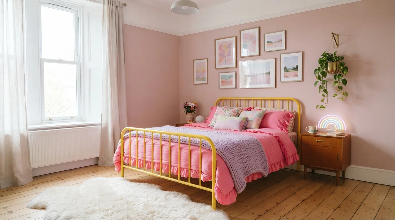
A joyful blend of soft blush walls, sunshine-yellow metal, and vibrant pink linens creates a dreamy, uplifting sanctuary.
Dusty blush pink is a soft, sweet tint with cozy warmth. In this room, that tender pink covers the walls, serving as the backdrop for a bright yellow metal bed frame, lively raspberry pink linens, and a super plush white rug. The space feels cheerful, creative, and delightfully snug. This combination works because the muted wall color gives your eyes a rest while letting the bright furniture and colorful art pop. It is the perfect look for anyone who loves nostalgic charm and bold, happy colors.
SEE FLOWERPOT ON YOUR WALLS →
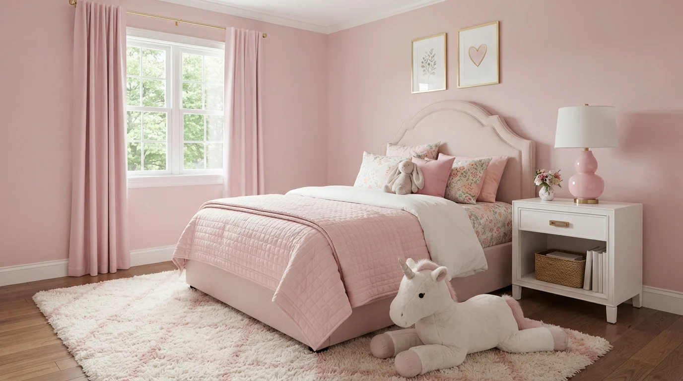
Soft petal pink walls and plush quilted textures wrap this charming bedroom in a gentle, dreamy fairytale glow.
Blush pink is a soft, rosy pastel that brings instant warmth and sweetness to any space. In this cozy bedroom, delicate pink coats the walls and matches the upholstered bed, quilted bedding, and breezy drapes. A crisp white bedside table and a fluffy cream shag rug keep the room feeling bright and open. The monochromatic look works beautifully because layering different textures in similar tones creates depth without clutter. It is the perfect setup for a joyful, fairytale-inspired kid's retreat.
SEE ACADIA BLOOM ON YOUR WALLS →
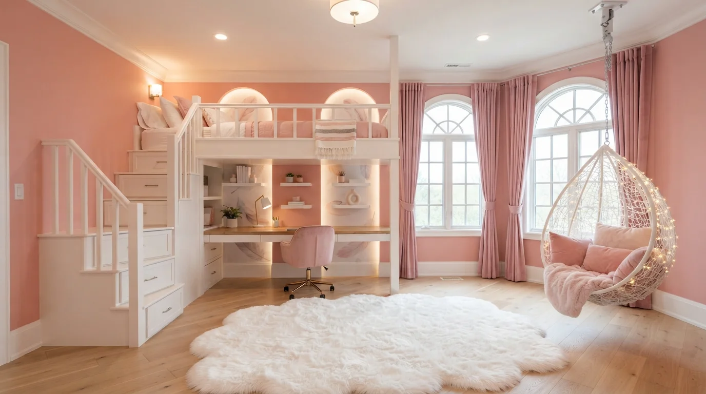
Warm blush walls and glowing fairy lights turn this clever loft bedroom into a cozy, magical sanctuary.
Blush is a soft, warm pastel pink with gentle peach undertones. In this space, powdery blush covers the walls and arched alcoves, while clean creamy white defines the loft frame, desk, and staircase. The room feels snug, cheerful, and delightfully magical. Pairing gentle pink walls with bright white built-ins keeps the multi-functional space open and fresh without feeling too heavy. It is a wonderful look for creative teens, children, or anyone who wants a playful, fairy-tale haven.
SEE IT ON YOUR WALLS →
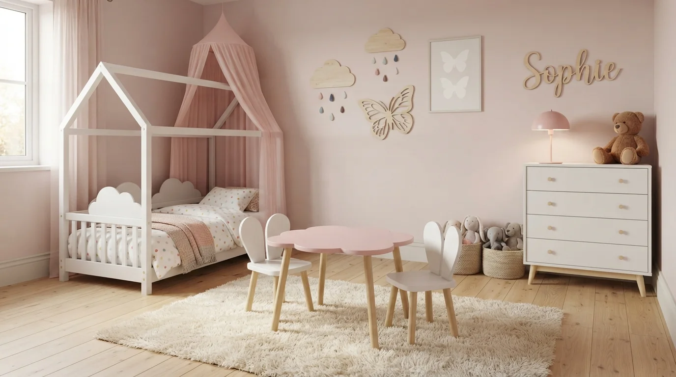
Soft blush walls and cloud-shaped accents create a cozy, whimsical haven filled with gentle pastel charm.
Soft blush is a gentle, powdery pink with warm, creamy notes. In this photo, the blush walls wrap the room in warmth, pairing effortlessly with crisp white furniture, a house-shaped toddler bed, and a sweet pink cloud table on a plush cream rug. The room feels incredibly cozy, sweet, and calm. This combination works because blending soft pastel pink with bright white and light wood keeps the space airy and balanced rather than overwhelming. It is perfect for anyone designing a fairytale nursery that feels soothing and timeless.
SEE PAISLEY PINK ON YOUR WALLS →
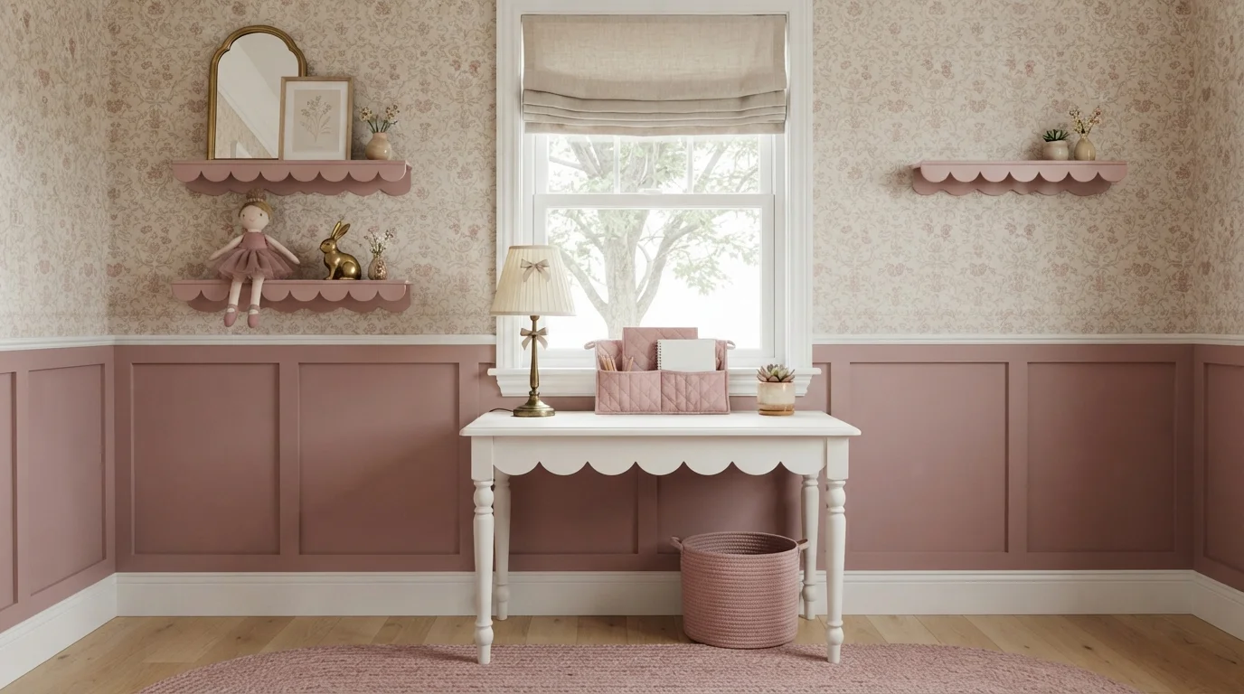
Gentle dusty rose wainscoting pairs with vintage florals and scalloped details for a sweet, storybook feel.
Dusty rose is a soft, muted pink with a warm, earthy quality. In this space, the dusky pink covers the lower board-and-batten wall panels and matching wall shelves, set against crisp white window trim and a bright scalloped desk. The room feels dreamy, sweet, and comforting. The combination works because the muted pink anchors the busy floral wallpaper while keeping the space light and airy. It is a lovely choice for anyone designing a vintage nursery, a young child's bedroom, or a cozy craft nook.
SEE IT ON YOUR WALLS →
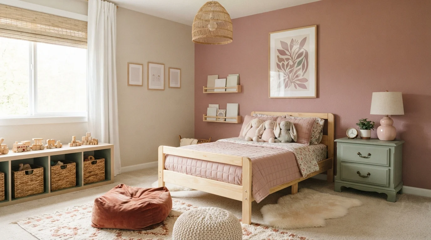
Soft dusty pink and creamy walls meet blonde wood and sage accents for a gentle, storybook retreat.
Dusty rose is a soft, earthy pink that feels warm and comforting. In this room, dusty rose covers the main accent wall, while creamy off-white coats the adjacent walls and muted sage green paints the little nightstand. The space feels gentle, snug, and sweet without being loud. The combo works because earthy wood and subtle green accents balance the pink, keeping the pastel vibe grounded and natural. It is a lovely choice for anyone designing a calm, storybook-inspired toddler room or nursery.
SEE RENNIE'S ROSE ON YOUR WALLS →
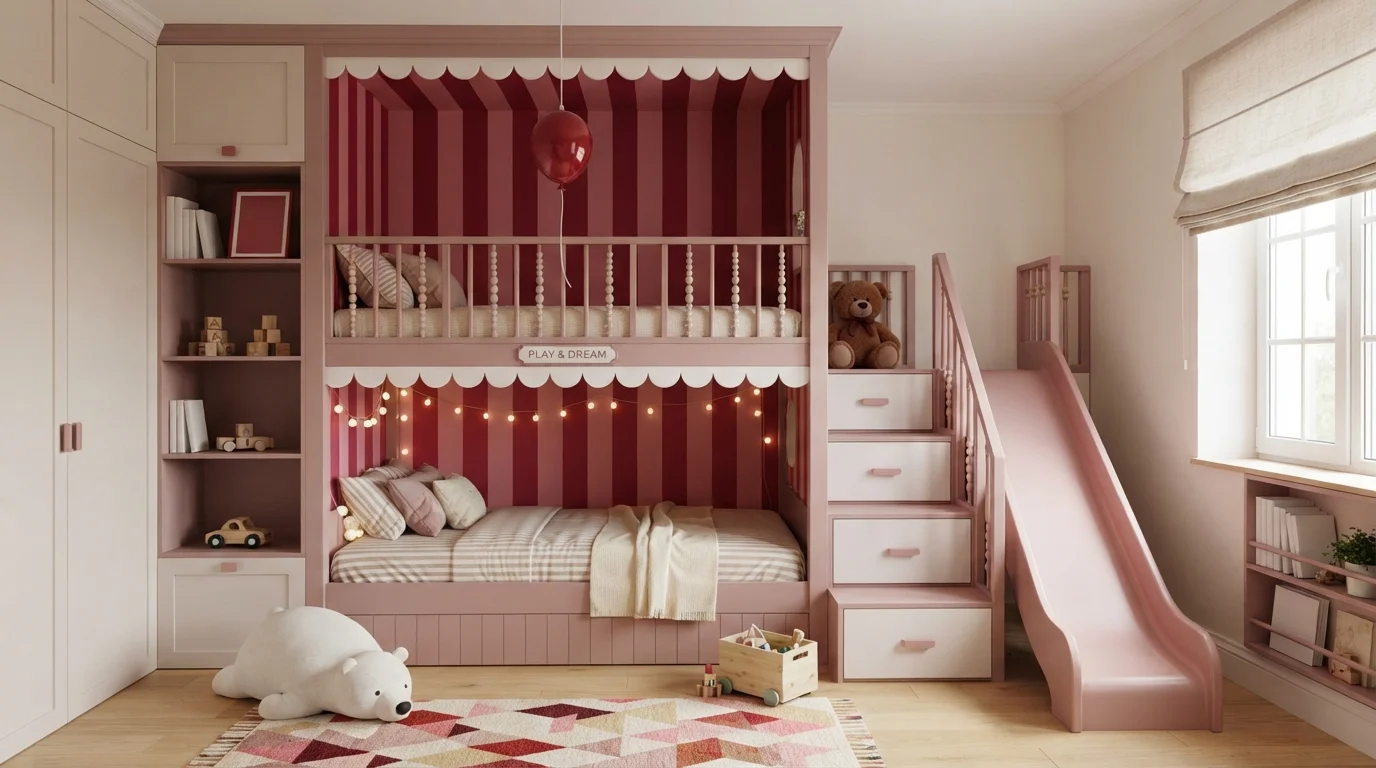
Dusty rose woodwork paired with bold crimson stripes creates a dreamy, storybook setting full of joyful energy.
Dusty rose is a soft, muted pink with cozy depth. In this room, dusty rose wraps the custom bunk bed frame and slide, paired with rich crimson stripes along the back wall and clean white drawer fronts. The room feels cheerful, magical, and snug. The combination works because pairing lively red stripes with a gentle rose tone balances high energy with soothing comfort. It is ideal for young children and playful spaces.
SEE TOASTED MAUVE ON YOUR WALLS →
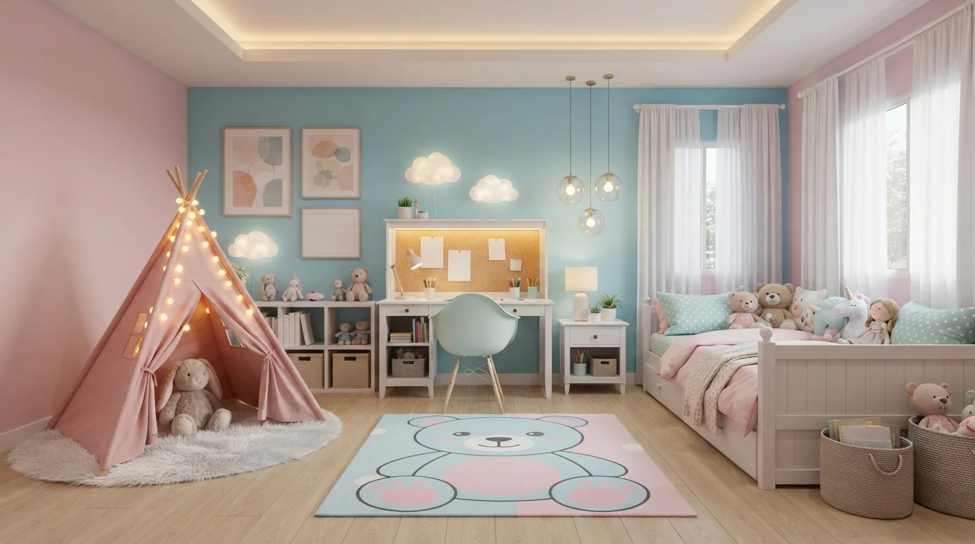
Soft pinks, mint accents, and glowing fairy lights turn this playful bedroom into an enchanting storybook haven.
Pastel pink is a soft, sweet blush that instantly feels gentle and welcoming. In this cozy room, the walls wear this cheerful pink shade, paired with a sky-blue ceiling cove, white furniture, and a playful mint-blue accent chair. The room feels snug, comforting, and wonderfully imaginative. This color mix works so well because cool pastel blue balances out the warm blush tones, keeping the whole space fresh and airy. It is ideal for anyone designing a magical, peaceful sanctuary for young kids.
SEE PANACHE PINK ON YOUR WALLS →Pink Children's Room Wall Color Combinations
A wall color never works alone. These are the full schemes from the rooms above — the lead color first, then the supporting colors that make the photo work.
A joyful blend of soft blush walls, sunshine-yellow metal, and vibrant pink linens creates a dreamy, uplifting sanctuary.
TRY THIS PALETTE →Soft petal pink walls and plush quilted textures wrap this charming bedroom in a gentle, dreamy fairytale glow.
TRY THIS PALETTE →Warm blush walls and glowing fairy lights turn this clever loft bedroom into a cozy, magical sanctuary.
TRY THIS PALETTE →Soft blush walls and cloud-shaped accents create a cozy, whimsical haven filled with gentle pastel charm.
TRY THIS PALETTE →Pair the palest picks with crisp white trim and light wood: Pink Bliss or First Light against white baseboards and a light oak crib or dresser keeps the room feeling soft and current instead of themed. Odessa Pink's peachy undertone reads best next to warm wood tones like maple or natural pine and brass hardware, since a cooler white trim can make it look slightly muddy by contrast. Teaberry and Clare Pop both work as a full-wall color under white trim and still leave room for a bold accent piece, a rug or bedding, to carry the personality instead of the walls doing all the work.
For a room meant to last, pair Pink Shadow with white or off-white trim and walnut or other dark wood furniture; the contrast reads more like a designed dusty-rose bedroom than a kid's room, so it doesn't need to change when the child gets older. Pale Cherry Blossom sits in between, muted enough to pair with either light or dark wood, which is why it's the pick to use if you want one wall color that won't force a furniture change later. For a stronger pop of color, use Cheery on a single accent wall or door and keep the surrounding walls in Pale Cherry Blossom or Odessa Pink so the room has one bright note instead of four walls of saturated pink.
More Children's Room Color Ideas
Set on a color family already? Each page has its own real rooms and picks.
Light or Dark Pink Children's Room Colors?
Go Light (LRV 60+) If…
The room is small, faces north, or has to work at every hour. Light warm colors make it feel bigger and stay calm in evening light — the light you actually live in.
Go Dark (LRV Under 20) If…
You want the cocoon effect and the room has real daylight. Dark works best on one feature wall — or fully color-drenched in a large room with good windows.
Go light with Pink Bliss (LRV 82) or First Light (LRV 76) in a nursery or any room that gets limited daylight, since both stay soft and airy instead of turning dusty-rose in low light. They're also the safer pick if the room is small: a pale pink at this LRV won't close a space down the way a saturated color can. The tradeoff is that very pale pinks can shift more than people expect once they're on a full wall under real light instead of on a small swatch, so testing a sample patch on the actual wall matters more here than it would with a neutral.
Go darker with Pink Shadow (LRV 50) or Cheery (LRV 41) when the room gets strong, direct sun that would wash out a pale pink, or when you want a color that reads as a deliberate design choice rather than a nursery default. Pink Shadow's lower LRV also means it holds up as the child ages, since it's muted enough to read as dusty rose or mauve rather than kid's-room pink by the time they're a tween. Cheery is the one shade here saturated enough to work best in smaller doses, an accent wall or a closet door, rather than covering every wall in a room a child sleeps in every night.
See It. Love It.
Paint It.
Upload one photo of your pink children's room and try every color on this page on your own walls — in your own light, before you buy a drop of paint.

First CrushBeforeWhole Room Vs Accent Wall
Cheery and Clare Pop are strong enough that most parents use them on one wall, usually behind the bed or crib, rather than all four. That keeps the room from feeling like a solid block of color and gives you an easy way to tone it down later by repainting a single wall instead of the whole room. The paler picks, Pink Bliss, First Light, and Teaberry, read comfortably as full-room colors because they're close enough to white that four walls of them still feel light rather than saturated.
Odessa Pink and Pink Shadow both work as full-room colors too, but for a different reason: they're muted enough that a whole room doesn't feel like a theme, it feels like a paint choice. That's the distinction worth making when choosing between these picks. The palest and the most muted shades both work on every wall, while a mid-saturation pick like Cheery works better contained to one surface.
Sheen For A Room Kids Actually Use
Children's rooms take more wall contact than almost any other room in the house: crib rails, handprints, marker, tape from artwork. An eggshell or satin finish on any of these picks holds up to a damp cloth without the sheen going patchy the way flat paint does when you spot-clean it. Satin is worth the extra step up from eggshell on the lower section of the wall in a toddler's room specifically, since that's the zone that takes the most abuse.
Avoid semi-gloss on the full wall even though it's the most washable option. On a pale color like Pink Bliss or First Light, semi-gloss will show every roller mark and wall imperfection under a nursery lamp or overhead light. Save the higher sheen for trim and doors, and let the wall color stay in eggshell or satin.
The Mistake That Forces An Early Repaint
The most common regret with a pink children's room isn't the color itself, it's picking the brightest, most saturated pink for the whole room instead of one wall. A color like Cheery covering all four walls reads as a toddler's room specifically, and many parents end up repainting within a few years once the child starts asking for something less babyish. The fix is simple: use the saturated pick as an accent, and let a muted shade like Pale Cherry Blossom, Odessa Pink, or Pink Shadow carry the rest of the room.
The second mistake is trusting the paint chip over a wall sample. Pale pinks in particular, Pink Bliss is the clearest example, can look noticeably brighter and pinker once they're on a full wall under real light than they did on a small swatch. Paint a large sample patch and check it morning and evening before committing to a full room.
About Pink Children's Room Paint Colors
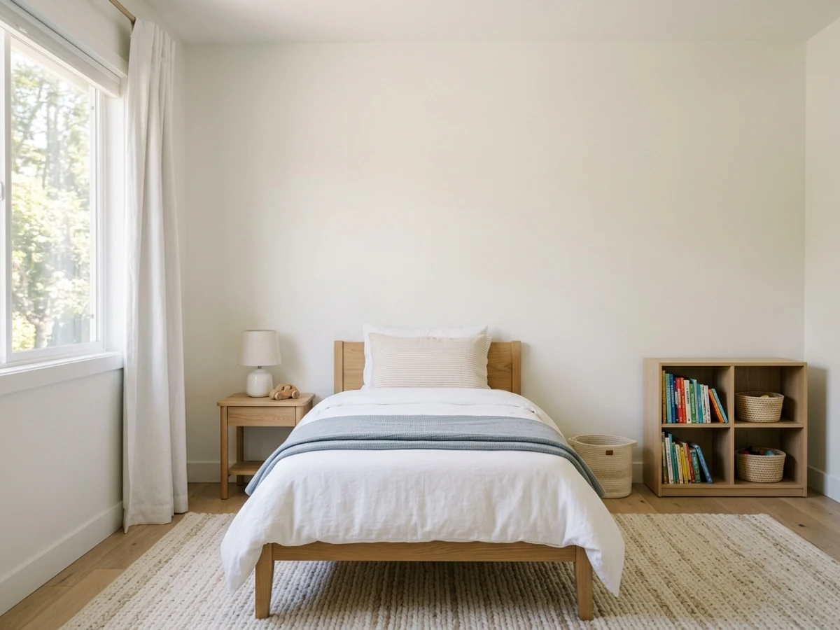
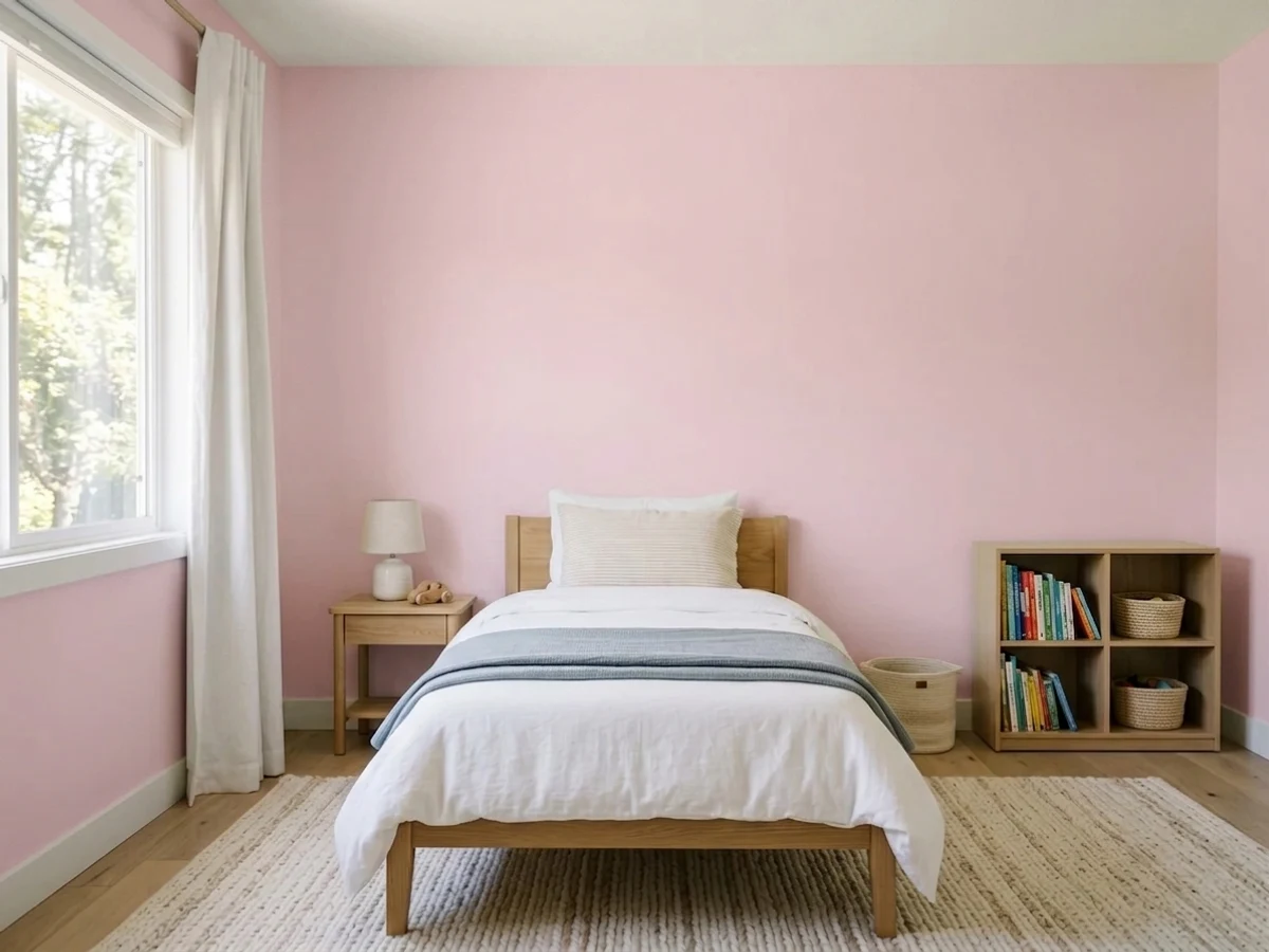
Pink works in a children's room because it can do two different jobs depending on which shade you pick, and this room's picks span both ends. Benjamin Moore Pink Bliss (2093-70, LRV 82) and First Light (2102-70, LRV 76) sit close to white, so they read as a soft glow rather than a candy-colored statement — good for a nursery or a small room where you still want the walls to bounce light. Sherwin-Williams Cheery (SW 6584, LRV 41) sits at the other end: it's saturated enough to feel like an actual color choice the moment you walk in, which is what makes it work as a playroom accent wall rather than an all-over wall color for a room a child sleeps in.
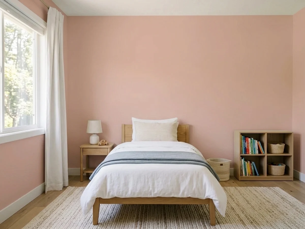
The middle of the range is where a children's room usually lands once parents start thinking past year one. Sherwin-Williams Teaberry (SW 6561, LRV 69) and Clare Pop (PNT100-LT-26, LRV 66) are pale enough to still photograph as a nursery pink, but Benjamin Moore Pale Cherry Blossom (2101-60, LRV 61) and Odessa Pink (HC-59, LRV 59) pull toward dusty rose and peach — the tones designers reach for when a family wants pink that doesn't scream toddler. Odessa Pink in particular reads warmer and peachier than the others in this group, which changes what it pairs with in the room.
Sherwin-Williams Pink Shadow (SW 0070, LRV 50) is the outlier worth calling out: it's dark and muted enough to look intentional and grown-up, which is exactly why parents choose it when they want a room that survives past the toddler years without a repaint. A pink children's room only feels cohesive when the shade matches how the room is actually used, nursery vs. bedroom vs. playroom, not just the general idea of pink.
The Questions Everyone Asks
What color should I paint my pink children's room?
If you want one answer, start with the safe picks above — Flowerpot, Acadia Bloom, California Coral, Paisley Pink. They read well in any light and survive furniture changes. Then check the light: strong afternoon sun wants a step cooler, a north-facing room wants a step warmer.
what is the best pink paint color for a girl's room?
There isn't one best pink, it depends on the child's age and how long you want the color to last. Pink Bliss or First Light work well for a nursery because they're pale and soft. For an older kid's room that should hold up for years, Pale Cherry Blossom or Odessa Pink are muted enough to not look like a toddler's room by the time they're eight or nine.
will my child outgrow a pink bedroom?
A bright, saturated pink like Cheery is more likely to feel outgrown within a few years, since it reads clearly as a young kid's color choice. Muted shades like Pink Shadow or Pale Cherry Blossom age better because they lean dusty rose rather than candy pink, so the room can go from toddler to tween without a repaint.
should i paint the whole room pink or just one wall?
For paler picks like Pink Bliss, Teaberry, or First Light, painting all four walls still feels light and airy rather than overwhelming. For a stronger color like Cheery or Clare Pop, most parents paint one accent wall, usually behind the bed or crib, and keep the rest of the room lighter so the color doesn't dominate every surface.
is pink a good color for a nursery?
Yes, especially a pale pink with a high LRV. Pink Bliss (LRV 82) and First Light (LRV 76) stay soft and reflect light well, which keeps a nursery feeling bright rather than closed in. Test a sample on the wall first, since pale pinks can read brighter in person than they do on the paint chip.
what trim color goes with pink walls in a kids room?
White or off-white trim is the safest match for nearly every shade here, especially the paler picks like Pink Bliss and Teaberry, where a crisp white keeps the room feeling clean. For warmer picks like Odessa Pink, a slightly warm white avoids a cool-vs-warm clash; for Pink Shadow, plain white trim gives the strongest, most deliberate contrast.
What two-color combination works best in a pink children's room?
The reliable pattern is a quiet main color plus one deep accent on a single wall. Keep trim and ceiling in one warm white so the two colors are the only event in the room — the combination cards above show complete schemes from real rooms.
What colors make a pink children's room look bigger?
High-LRV, slightly warm colors — LRV 60–75 is the sweet spot. Paint the walls and trim close to the same light color so the corners blur, and keep the ceiling white. Stark cool white actually works against you; it creates hard shadows that show the room's edges.

Ask a Question