Teaberry
Sherwin-Williams' own teen-bedroom pick, reviewed honestly: the berry lean nobody warns you about, the light that turns it lilac, and when a quieter blush wins.

Jessica has spec'd whites and neutrals for more than 300 rooms and keeps a sample wall of painted drawdowns in her studio. Every color review is checked against real reader rooms in the comments and re-tested when a formula changes. About the testing process →
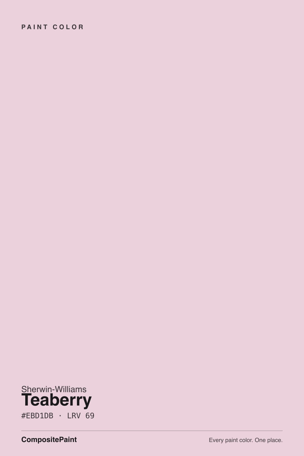
- 1Vintage Tea Rose47
- 2Pale Cherry Blossom61
- 3Teaberry69
- 4First Light76
- 5Pink Bliss82
The Fast Verdict
Teaberry is a light pink that sits on the berry side of the family, not the peach side — and that one fact decides whether you love it. Sherwin-Williams puts it on its own short list of teen bedroom colors, and it earns the spot: soft enough to sleep in, clearly pink enough that a fourteen-year-old feels heard. Just do not buy it expecting a blush that hides. At LRV 69 on four walls, everyone who walks in will call it pink.
Teen bedrooms · kids' rooms and nurseries that still have to look good in five years · powder rooms · the wall behind a bed · anyone who wants a pink people can actually see
You wanted a blush that could pass for beige · the room runs on cool 4000K LEDs · your floors are honey oak or orange-toned red oak · your trim is a butter-cream white · nobody else in the house agreed to pink
- A pink that reads as an actual choice, not an accident
- Sherwin-Williams' own teen bedroom pick — soft but not babyish
- LRV 69 keeps a small room bright while still carrying real color
- Berry lean pairs cleanly with black, sage green and blue-gray
- Ages better in a kids' room than any candy or bubblegum pink
- Goes pale lilac in north light and under cool LEDs
- Too pink for anyone hoping for a hides-in-plain-sight blush
- Fights cream trim, honey oak and orange-toned red oak
- A whole-house or exterior color this is not
What Color Is Teaberry, Really?
A light pink with a berry lean — and the lean is the whole review. Most soft pinks in a paint deck are built on the peach side: a little orange under the pink, which is why they read warm and skin-toned on a wall. Teaberry goes the other way. Its blue channel sits slightly above its green, which in plain language means the pink tips toward magenta and mauve instead of toward coral. The name is literal — teaberry is the wintergreen berry, a cool, bright red-violet, not a peach.
Sherwin-Williams cannot quite agree with itself about this. On sherwin-williams.com, SW 6561 is filed under Red paint colors. In the HGTV Home by Sherwin-Williams deck, the identical color is filed under Purple. Both are defensible, and the disagreement is the most useful thing you can know about it: Teaberry lives exactly on the line where pink starts turning violet, so your room's light gets to cast the deciding vote.
Undertone in one line: pink with a violet-berry lean — never peach, never coral. At LRV 69 it is light and it bounces light well, but it is a color, not a neutral. If your sample reads lilac, that is cool light pulling the blue side forward. If it reads bubblegum-sweet, that is a warm 2700K bulb doing it. Both are the same paint telling the truth about the room.
Where It Shines
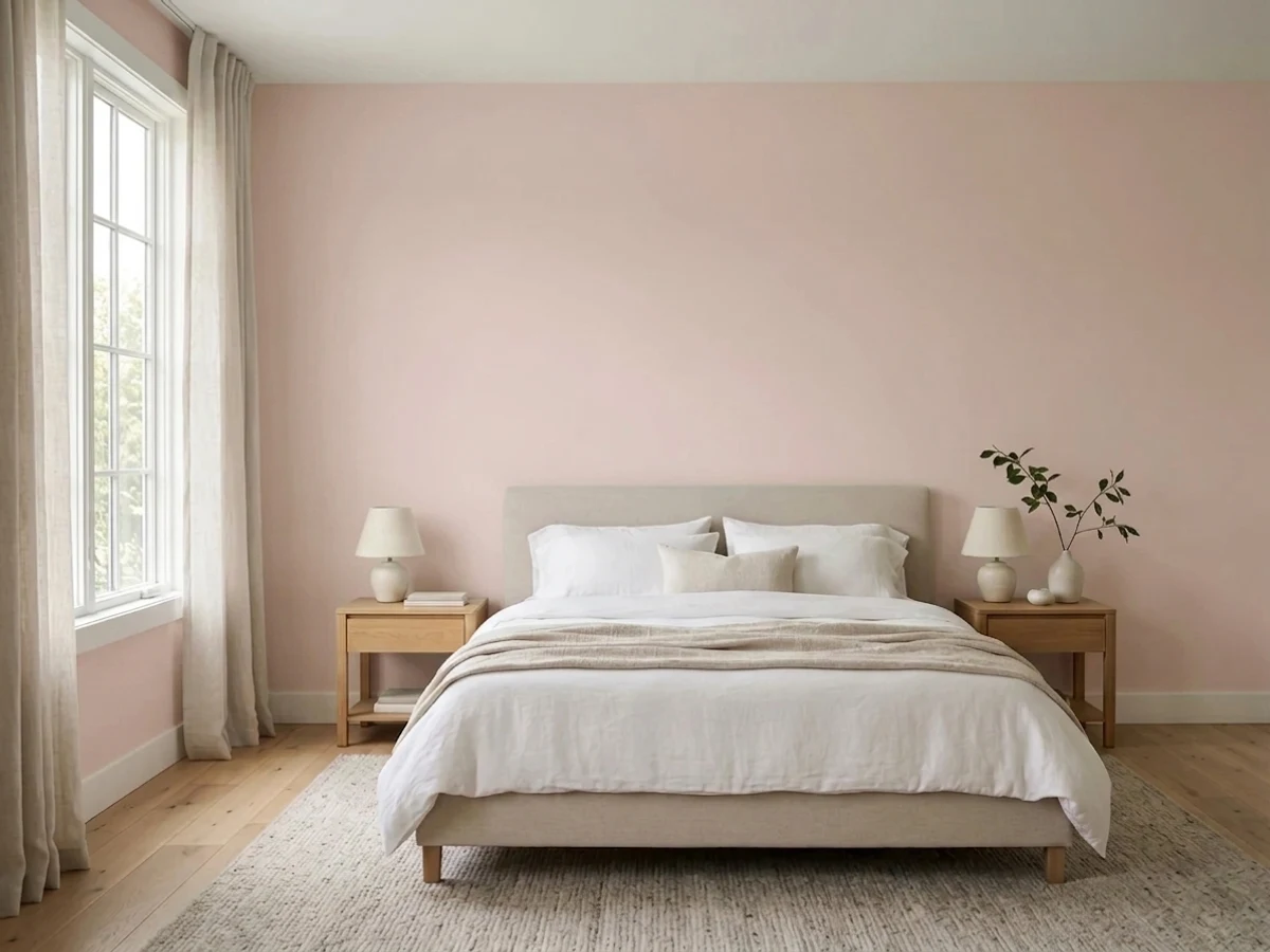
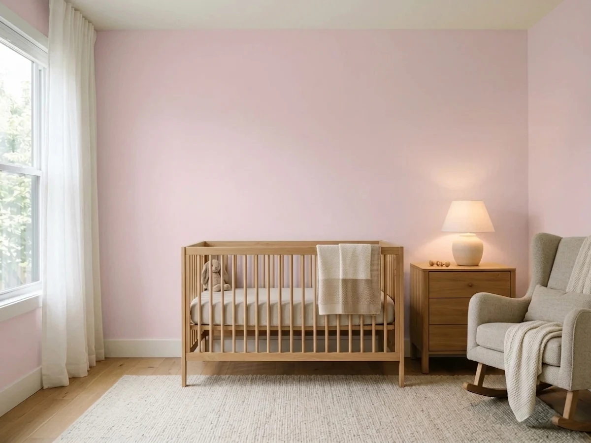
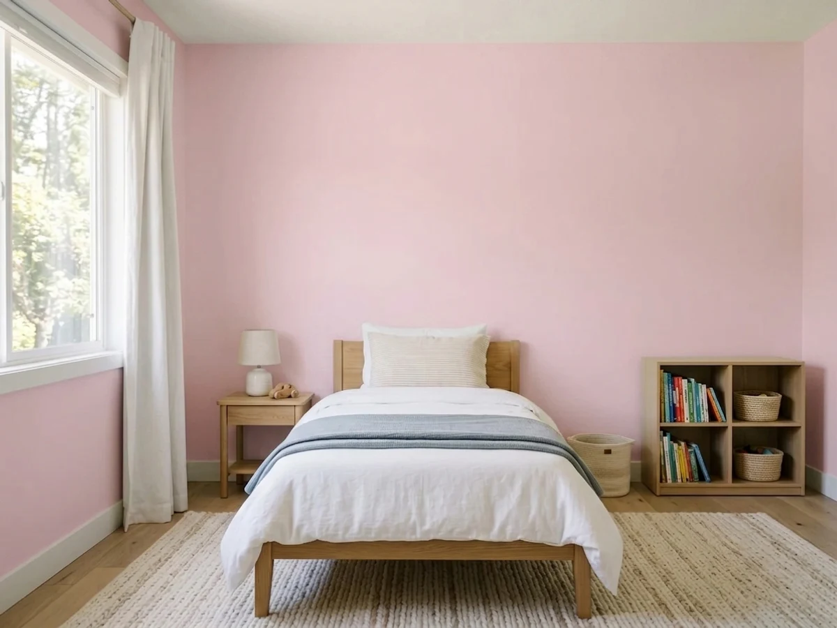
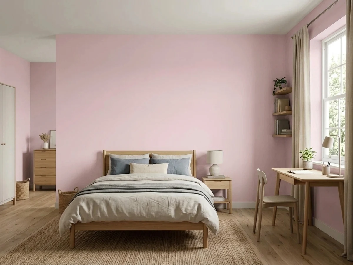
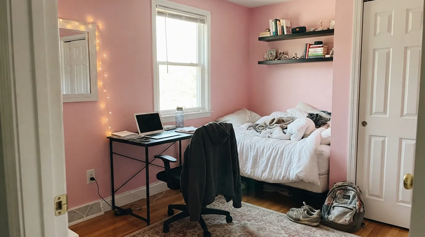
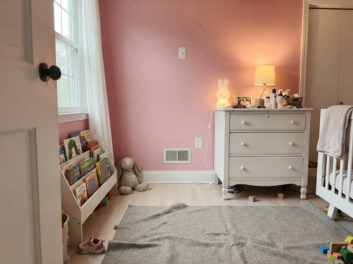
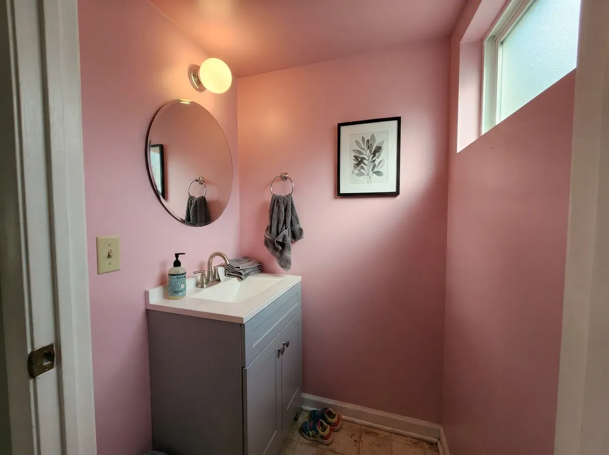
Teaberry is at its best in the rooms it was picked for: a teen bedroom that has to feel personal without turning into a theme, a kid's room whose owner will be twice as old before it gets repainted, a nursery you would rather not redo. It is also very good in small doses — a powder room, the wall behind a bed, the inside of a closet or dressing nook — where a light pink reads confident rather than sweet. Give it clean white trim, one dark note, and something green or blue-gray in the room, and it stops reading like a color you outgrow.
Where It Fails
The complaints about a color like this are predictable before you open the can, and all three come down to the same berry lean. If your room matches one of these, sampling bigger will only confirm it faster.
This is the one that surprises people. In a north-facing room on a gray day, or under 4000K and cooler LEDs, the blue side of the berry steps forward and the wall reads pale lilac and slightly chalky instead of pink. About half of owners like the lilac version fine. The other half bought a pink and got a purple. Warm the bulbs to 2700K or 3000K before you blame the paint.
LRV 69 sounds safe, and the chip looks harmless in your hand. Four walls do not work that way — a light color multiplies its own hue across a room, and Teaberry will read decisively pink from the hallway. If what you actually wanted was the "wait, is that pink or beige?" effect, Proposal at LRV 70 does that job at the same lightness. Teaberry commits.
Yellow is the enemy here. A butter-cream trim white next to Teaberry looks dingy and the walls look chalky beside it — pick a clean, low-yellow white like Pure White or Snowbound instead. Same problem on the floor: honey oak and orange-toned red oak sit opposite the violet lean, so the floor goes more orange while the walls go more lilac. A big rug helps; a whole house of golden oak does not.
Room by Room
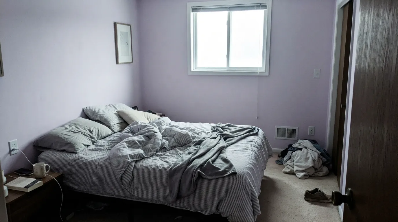
Sherwin-Williams lists it on its own teen bedroom short list, and it deserves the spot. It is pink enough to feel chosen, quiet enough to survive a change of taste, and it takes black hardware, band posters and a cluttered desk without looking babyish. Matte or eggshell, clean white trim.
A soft berry pink is a better long bet than a candy pink, because it does not need repainting the year the crib leaves. Pair it with white furniture and one grown-up accent color rather than a matching pink set, and the room ages up instead of out.
It works, but not as a neutral. Give it walnut or black-brown wood, cream or white bedding rather than beige, and one muted green or blue-gray in the room, and it reads calm and deliberate. With warm lamps at night it flushes rosier — pleasant if you expect it, sweet if you do not.
The classic argument for pink in a small room is that it flatters everyone in the mirror, and Teaberry does. All four walls plus the ceiling, white trim, chrome or matte black fixtures. A guest is in there for two minutes, so a color that would be a lot in a living room is exactly right here. Satin or eggshell for wipeability.
Behind a bed, behind open shelving, or inside a dressing nook, it does the job an accent color should: adds depth without redecorating the room. This is also the cheapest way to test whether you can live with the color before you paint everything.
Open-plan living rooms and kitchens force Teaberry to negotiate with cabinet colors, counters and every wood tone in the house, and it usually loses. Outdoors is worse: full sun bleaches a light pink toward washed-out beige-lilac, and it reads as faded siding from the street rather than as a color choice.
Your Light Is the Risk
Clean, cool-ish morning sun keeps it fresh and clearly pink without tipping sweet. A bedroom's best hour and the color's best hour line up.
Flat gray daylight pulls the violet side forward and the wall goes pale lilac and a little chalky. If the room faces north, sample it before you buy the gallons.
Midday south sun is the brightest, truest read and bounces pink light onto the ceiling. Late west sun deepens it toward rose for an hour — most people's favorite moment of the day with this color.
2700K warm bulbs push it warmer and sweeter, close to bubblegum on a big wall. 4000K and cooler LEDs push it back toward lilac. 3000K sits in the middle and is the safest choice for this color.
Most complaints about Teaberry are a light mismatch. Upload a photo of your actual room and see it on your walls — then ask for the same wall in north light or evening lamps before you buy a single sample.
Need It From Another Brand?
Any paint counter can custom-tint Sherwin-Williams SW 6561 directly. If you would rather stay in one brand's own deck, these are the closest stock matches, measured as ΔE2000. Under 2 is a difference you will not see on the wall.
| Brand | Closest color | ΔE | LRV | |
|---|---|---|---|---|
| Behr | Creamy FreesiaM130-2 · Behr | 0.5 | 68 | Color page → |
| Benjamin Moore | Pink Petals2085-60 · Benjamin Moore | 2.6 | 67 | Color page → |
| Valspar | Pink Diamond8002-4A · Valspar | 1.7 | 69 | Color page → |
| PPG / Glidden | BeauteousPPG1183-2 · PPG / Glidden | 2.0 | 70 | Color page → |
| Glidden | Pink PailPPG1050-2 · Glidden | 1.8 | 66 | Color page → |
| Dutch Boy | Pixie146-2DB · Dutch Boy | 2.7 | 70 | Color page → |
Similar Sherwin-Williams Colors
The nearest shades to Teaberry within Sherwin-Williams's own range, ranked by perceptual color distance — useful when you want the same look a touch lighter, darker, or warmer.
WCAG 2.1: AA is 4.5 : 1 for normal text, 3 : 1 for large text, AAA is 7 : 1.
Teaberry vs the Colors You're Also Considering
Every Teaberry sample board has the same rivals on it. The numbers show the real lightness gap — then it comes down to which risk you would rather live with.
Pick this when you want people to actually see pink, not squint for it.
Benjamin Moore 2102-70 · LRV 76First LightPick this if you want a pink quiet enough to work as a warm off-white — and a peach lean instead of a berry one.
Pick this for the cooler berry version that never drifts toward coral.
Sherwin-Williams SW 6323 · LRV 66RomancePick this for the warm, peach-side pink at almost the same lightness — it glows in west sun where Teaberry cools down.
Teaberry Coordinating Colors
The rule with Teaberry is: keep the whites clean, add one dark note, and bring in something green or blue-gray so the room is not carried by pink alone. Cream and butter whites are the partners to avoid — yellow and berry pink make each other look tired. These are the colors that keep showing up in rooms where it works:
Red or Purple? Sherwin-Williams Files It Both Ways
Look up SW 6561 on sherwin-williams.com and you will find it under Red paint colors. Look up the same number in the HGTV Home by Sherwin-Williams deck and it is filed under Purple. That is not a mistake by either side — it is what happens to a color sitting on a boundary.
The numbers explain it. Teaberry's blue value sits about ten points above its green value, which is the technical way of saying the pink is tilted toward magenta and away from peach. Tilt a pink that direction and it behaves like a very pale berry: clean and crisp in bright light, quietly violet in flat light. Tilt it the other way and you get the familiar warm blush that reads almost beige. Teaberry is the first kind.
What this means for you is simple. Do not judge it from a chip in the store, where the fluorescent overhead lighting is doing something completely different than your bedroom will. Put a large sample on the wall you actually plan to paint, look at it at nine in the morning, at two in the afternoon and at nine at night with the lamps on, and decide whether you like all three versions. If you only like two of them, the room will annoy you.
Teaberry With Wood Tones, Floors and Fabrics
Wood is where this decision is actually made. Walnut, black-brown and espresso are excellent — dark cool-leaning wood makes the pink read intentional and a little sophisticated. Pale unstained white oak is the other easy win and gives the light Scandinavian look most teen and kids' rooms are aiming for anyway. Gray-washed floors and gray LVP are fine, and painted white furniture is the safest of all.
The honest no is anything golden or orange. Honey oak floors, orange-stained trim and red oak with its natural pink-orange cast all sit opposite Teaberry's violet lean, so the floor looks more orange and the walls look more lilac. A large rug between them fixes a lot; wall-to-wall golden oak does not get fixed.
Fabrics and metals follow the same rule. White and true-cream bedding is fine, but yellow-beige linen goes muddy against it. Black and matte-black hardware are the strongest partners, chrome is clean and neutral, and warm brass is the one metal that tips the whole room toward candy — use it only if that is the look you want.
Three Ready Palettes Built on Teaberry
A color is never alone on the wall. These are complete combinations in the 60-30-10 pattern, with the reason each one holds together. Every one opens in the visualizer.
All three sit on Sherwin-Williams' own teen bedroom list, and together they explain why the color works there. Black is what keeps pink from reading nursery — one hard, graphic note tells the eye this was a design decision. Pure White is neutral enough to stay out of the argument.
Try this palette in your roomMuted green is the oldest answer to pink, and a grayed sage is the grown-up version of it — enough contrast to be interesting, too soft to look like a color scheme from a party store. Snowbound stays clean without going butter-cream, which Teaberry does not forgive.
Try this palette in your roomDrenching a small room in a light pink is the cheapest way to make it feel finished, and a muted blue vanity cools the sweetness down without fighting the walls. Chrome or matte black fixtures both work here; polished brass is the one metal that pushes the whole room toward candy.
Try this palette in your roomTeaberry FAQ
Is Teaberry a warm pink or a cool pink?
It leans cool for a pink. Its blue side sits just above its green, which puts it on the berry and mauve edge of the family rather than the peach and coral edge. In practice that means it stays crisp in daylight instead of glowing warm, and it looks best with clean whites rather than creams.
Will Teaberry look purple on my walls?
In some light, yes. North rooms, gray days and cool LEDs all pull the violet side forward and the wall reads pale lilac. Warm 2700K or 3000K bulbs pull it back toward pink. Sherwin-Williams itself files this color under Red on its main site while the HGTV Home by Sherwin-Williams deck files the same number under Purple, which tells you how close to the line it sits.
What trim white goes with Teaberry?
A clean, low-yellow white. Pure White at LRV 84 is the safe default and Snowbound at LRV 83 is the slightly softer version. Avoid butter-cream whites — yellow next to a berry pink makes the trim look dingy and the walls look chalky. Semi-gloss on the trim, matte or eggshell on the walls.
Is it too much pink for a teenager's bedroom?
It is more pink than a blush and less pink than a bubblegum, which is roughly the right place to land. The thing that makes it feel intentional rather than childish is contrast: black hardware, a dark desk, real art on the walls. If your teen wants a louder pink, Cheery at LRV 41 is the deeper option; if they want it barely there, that is a different color entirely.
Is Teaberry a good nursery color?
It is a good long-term one. Candy pinks look right for about eighteen months; a soft berry pink still looks deliberate when the crib becomes a bed and then a desk. Pair it with white furniture and one non-pink accent so the room is not locked into a theme. Note that Sherwin-Williams lists it for teen bedrooms rather than on its nursery picks — it is a slightly more grown-up pink than the usual nursery blush.
Will a pink room hurt resale?
A whole pink house would. One pink bedroom will not — buyers expect a kid's room to be a kid's color, and a light pink covers in two coats over primer. The real resale advice is to keep the trim, doors and hallway neutral so the pink reads as one deliberate room rather than as a taste you imposed on the house.
Have you painted with Teaberry?
Rate it — one tap helps the next reader decide.
Ask a Question