Vintage Tea Rose
The dusty rose Behr never markets, reviewed honestly: the light where it reads pink, the light where it reads muddy taupe, and what to pick instead.

Jessica has spec'd whites and neutrals for more than 300 rooms and keeps a sample wall of painted drawdowns in her studio. Every color review is checked against real reader rooms in the comments and re-tested when a formula changes. About the testing process →
- 1Razzle Dazzle20
- 2Retro Pink38
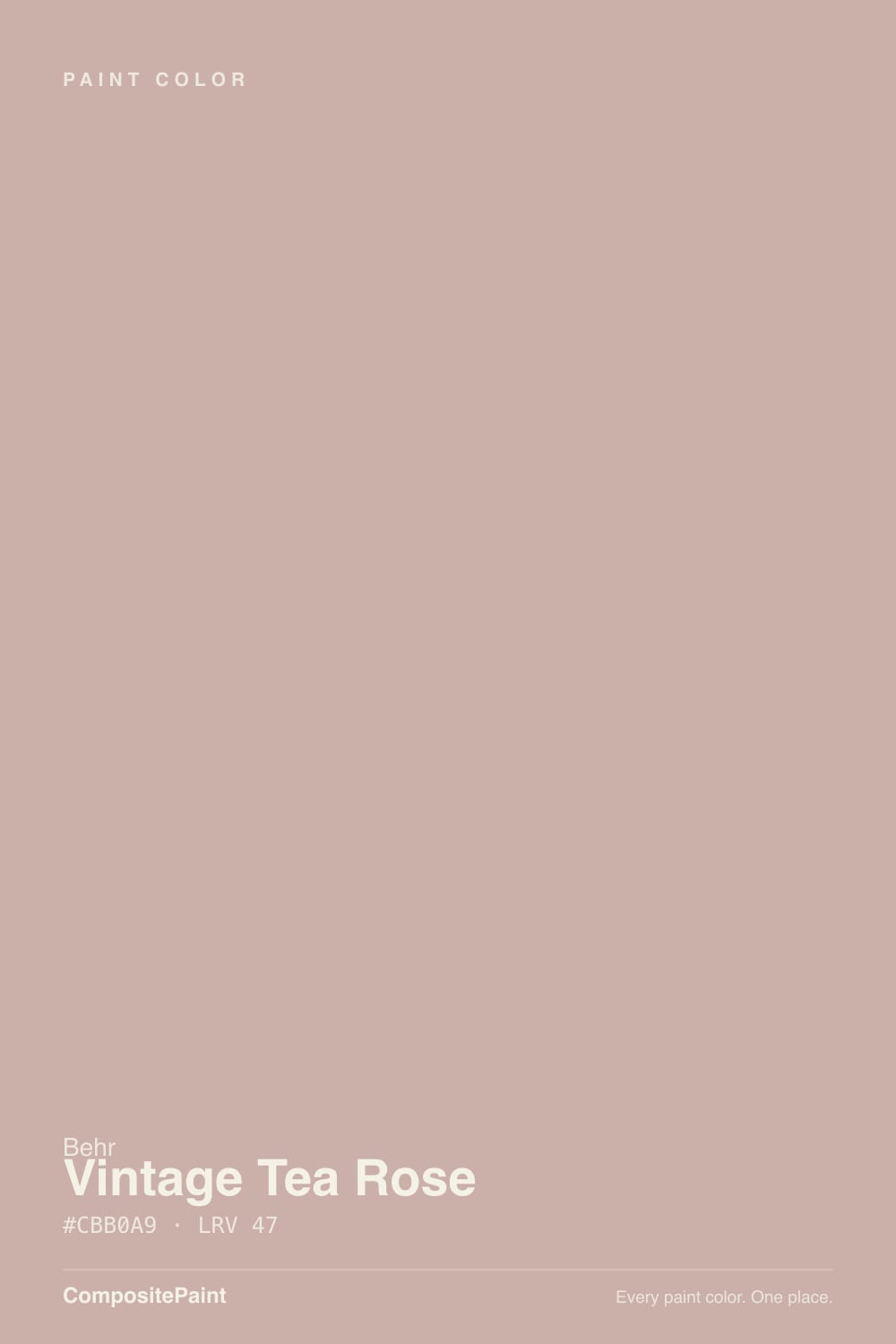
- 3Vintage Tea Rose47
- 4Pale Cherry Blossom61
- 5First Light76
The Fast Verdict
Vintage Tea Rose is a warm rose-taupe crossover, and that split identity is the whole review. In afternoon sun and lamp light it settles into a genuine faded-rose warmth — soft, grown-up, nothing like a nursery pink. In cool daylight or under a cool bulb the rose drains out and what's left reads like a slightly muddy warm beige. It never became a name anyone searches for, and honestly, it doesn't need to be: it is a quietly competent color for a buyer who wants "greige with a secret" more than a color that announces itself.
Bedrooms and powder rooms wanting rose warmth without a full pink commitment · pairing with brass, walnut, and cream trim · anyone who wants a taupe that occasionally blushes instead of a flat neutral · vintage and traditional interiors
You want a true taupe or greige with zero pink flash · your room runs on cool-white LEDs or stays dim and north-facing · your existing furniture and metals are cool-toned (chrome, black-and-white, cool gray) · you want a color guests will immediately name "pink"
- Genuinely warm, faded-rose personality in the right light — vintage, not nursery
- Mid-tone LRV 47 holds its color better than a pale blush would
- Reads as a quiet neutral from across the room, then rewards a closer look
- Flatters brass, walnut, and warm cream trim
- Low-commitment rooms (vanity, powder room, accent wall) let it shine without risk
- Loses its pink identity fast under cool light or cool LED bulbs
- Reads muddy or indecisive next to cool grays and chrome
- Not a true greige — buyers hoping for zero-pink neutral will be surprised
- Obscure enough that few painters or forums have real-room photos to compare against
What Color Is Vintage Tea Rose, Really?
A warm rose muted almost all the way to taupe — the hex tells the story: red, green and blue sit close together (203, 176, 169), which is the fingerprint of a heavily grayed, low-saturation warm color rather than a clear pink. Behr files it under the HDC-CT prefix, the Home Decorators Collection color-trends line curated for Home Depot's furniture brand rather than the mainstream Behr wall of chips most people sample from — one reason it never built the name recognition of a Behr Marquee hero color. "Vintage Tea Rose" is an honest name for what it is: a faded, dried-flower rose, not a fresh bloom.
At LRV 47 it sits squarely mid-tone — noticeably deeper and warmer than a pale blush like Pale Cherry Blossom (LRV 61) and considerably lighter and less saturated than a true clay-pink like Redend Point (LRV 27). That middle position is exactly why it can read two different ways depending on the room: next to warm whites and wood it leans into the rose, next to cool grays or under cool light it slides toward a flat warm taupe with barely a hint of pink left.
Undertone in one line: warm rose over a heavy brown-taupe base, never cool and never bright. If your sample reads dusty-pink, that's warm light or warm neighbors doing their job; if it reads muddy beige-brown with the pink gone, that's cool light exposing the taupe underneath — same paint, different room.
Where It Shines
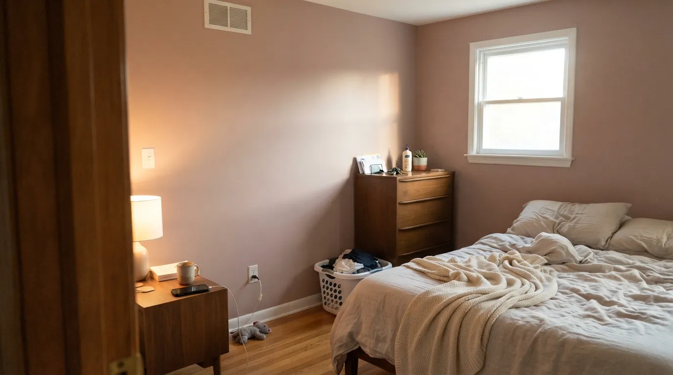
Give it afternoon sun, a warm bulb, or a wood-and-brass room and the rose comes forward in a way that reads deliberate and a little vintage — closer to a faded rose petal than a paint-chip pink. It is at its best in small-commitment rooms: a bedroom, a powder room, a vanity, a single accent wall, where the color gets to be the whole point without asking an entire open floor plan to agree with it. Cream trim, walnut furniture, and unlacquered brass are its natural company, and against them the taupe base recedes and the rose steps up.
Where It Fails
Almost every disappointed review of a color like this follows one of three scripts, and all three are predictable before the first coat goes on. None of them are the paint's fault — but if your room matches one, sampling a bigger swatch will only confirm the problem, not fix it.
Buyers scanning for "warm neutral" sometimes land here off the LRV and hex alone, then get surprised when afternoon sun pulls real pink out of the walls. If your goal is a neutral that never reads as a color, this one occasionally will — try Revere Pewter instead, which stays taupe in every light.
Under a north-facing window or cool-white LEDs, the rose drains almost completely and what's left is a flat, slightly muddy warm beige that some readers will call dingy rather than dusty. The paint didn't change; the light removed the one thing that made it interesting. Swap to 2700K bulbs before you blame the color.
This color needs warm company to make sense. Set against cool steel-gray furniture or icy white trim, it looks indecisive — not quite pink, not quite gray, not clearly anything. Warm woods, brass, and a warm-white trim resolve the identity in the color's favor; cool partners expose the muddiness instead.
Room by Room
Warm lamp light at night and afternoon sun by day both flatter it; the rose reads soft and calming rather than sweet. Eggshell on the walls, White Dove trim, and it settles into a genuinely restful room.
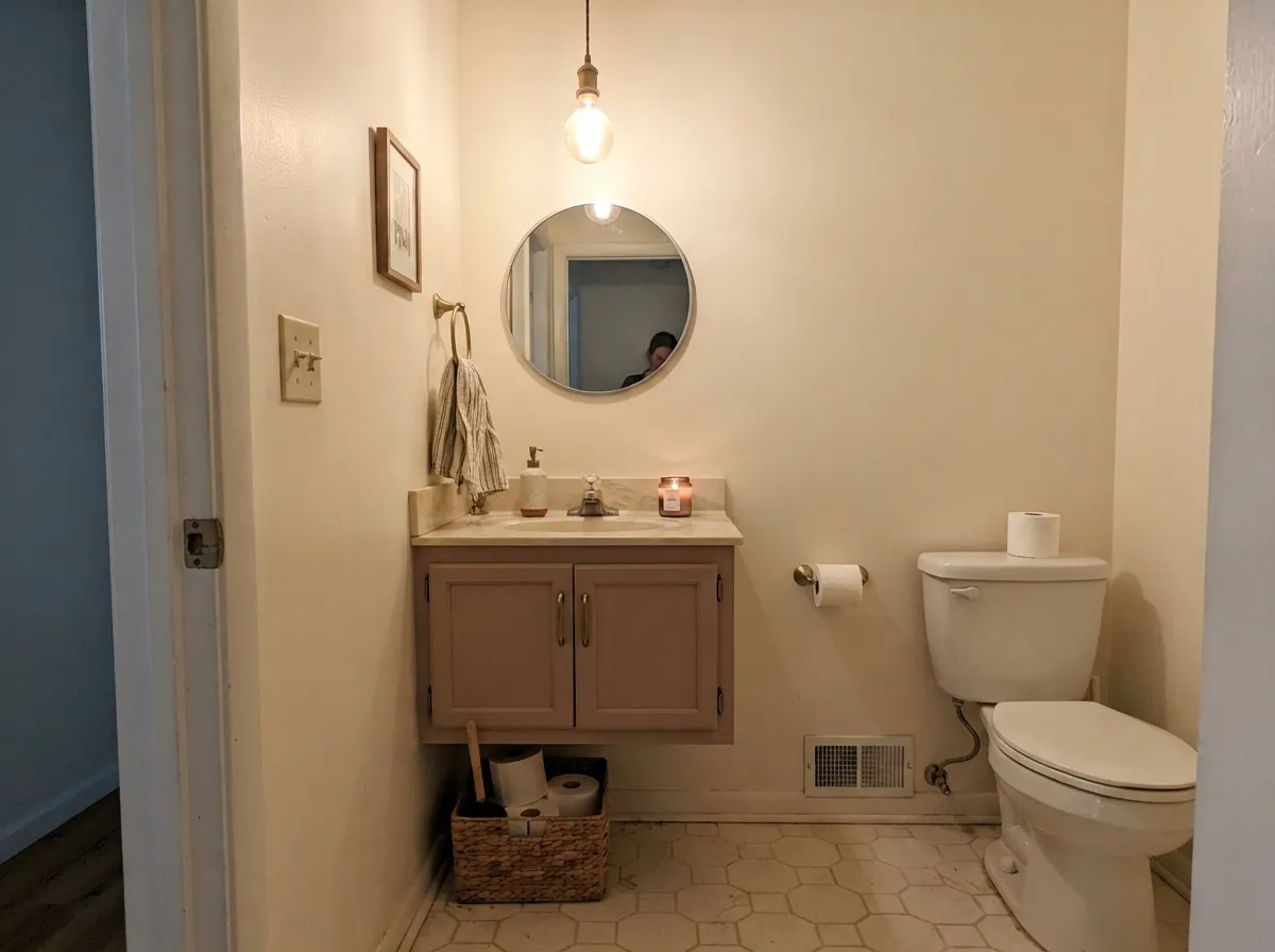
A Vintage Tea Rose vanity under Swiss Coffee walls, with a marble or butcher-block top and brass pulls, is a small enough bet to feel custom without committing a whole house to a pink-adjacent color. Satin finish for wipeability.
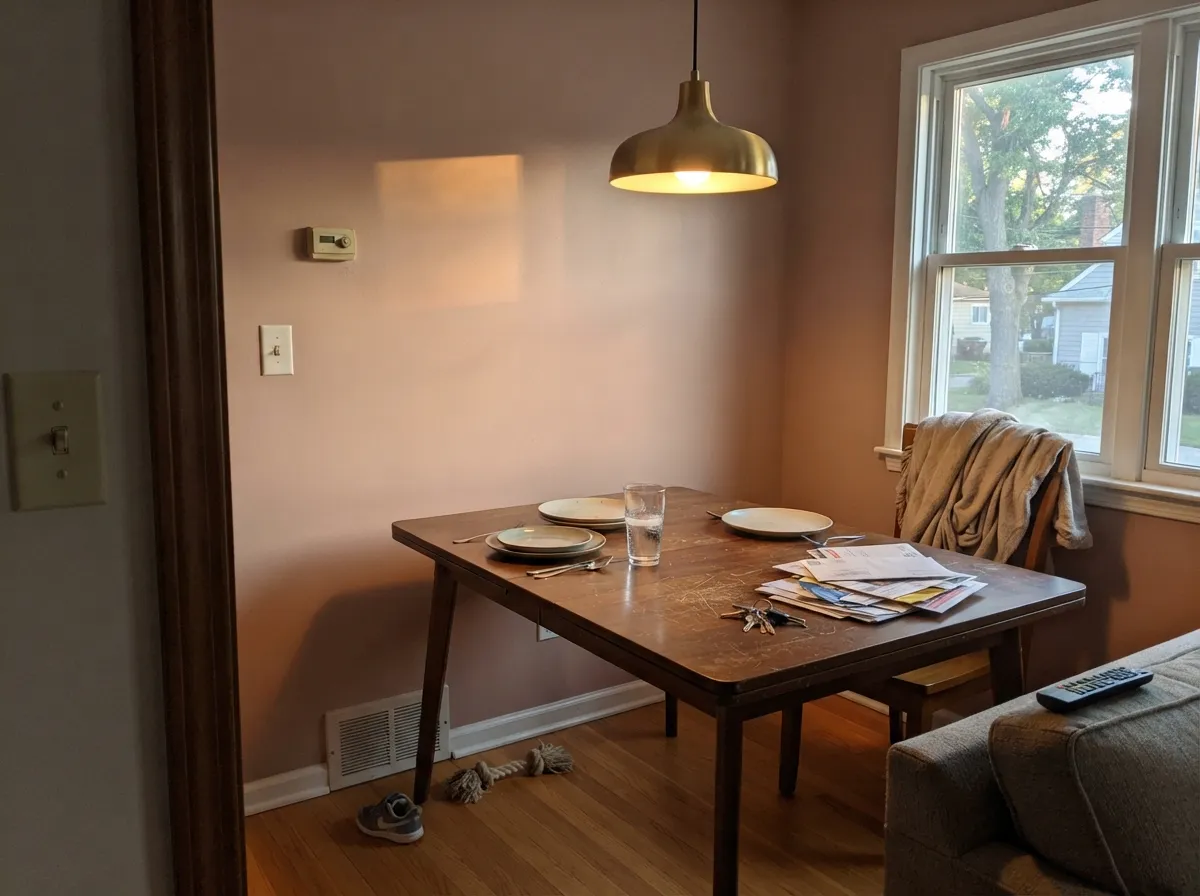
Over a walnut table with brass fixtures and evening candle or lamp light, it turns genuinely elegant. In a bright, all-daylight dining room with cool overhead LEDs, sample it first — the color can go flatter than expected under fluorescent-leaning bulbs.
Works as a full-wall color in a warm, lamp-lit, wood-furnished room. In an open-plan space that has to negotiate with a kitchen's cooler finishes or a media wall's black electronics, it reads muddier than a dedicated greige would.
On an island or a single hutch under a warm white, it is a genuinely charming, vintage note. Across full cabinetry it is a bigger commitment than most kitchens want from a color with this much light-dependence; satin cabinet enamel either way.
Full outdoor sun tends to bleach the rose out and leave a chalky, slightly pink-tinged taupe that reads as weathering rather than a deliberate color choice. It is not a color this review can recommend for siding; a shaded front door on a warm-toned house is the one exception worth sampling.
Your Light Is the Risk
The rose comes forward and the taupe base recedes — this is the color doing what its name promises.
The pink drains out almost entirely, leaving a flat, slightly muddy warm beige. Test before committing a whole room.
Steadier through the day than east/west exposures, but still noticeably more taupe at midday than in early or late sun.
2700K bulbs pull the rose forward and warm it further. Cool-white LEDs flatten it toward beige-gray — swap the bulb before you swap the paint.
Most complaints about Vintage Tea Rose are a light mismatch. Upload a photo of your actual room and see it on your walls — then ask for the same wall in north light or evening lamps before you buy a single sample.
Need It From Another Brand?
Any paint counter can custom-tint Behr HDC-CT-07A directly. If you would rather stay in one brand's own deck, these are the closest stock matches, measured as ΔE2000. Under 2 is a difference you will not see on the wall.
| Brand | Closest color | ΔE | LRV | |
|---|---|---|---|---|
| Sherwin-Williams | Insightful RoseSW 6023 · Sherwin-Williams | 1.0 | 46 | Color page → |
| Benjamin Moore | Cappuccino2096-50 · Benjamin Moore | 3.4 | 45 | Color page → |
| Valspar | Lovebug1005-10B · Valspar | 1.2 | 45 | Color page → |
| PPG / Glidden | Velveteen CrushPPG1060-4 · PPG / Glidden | 1.5 | 45 | Color page → |
| Glidden | Velveteen CrushPPG1060-4 · Glidden | 1.5 | 46 | Color page → |
| Dutch Boy | Allegory401-2DB · Dutch Boy | 1.0 | 46 | Color page → |
Similar Behr Colors
The nearest shades to Vintage Tea Rose within Behr's own range, ranked by perceptual color distance — useful when you want the same look a touch lighter, darker, or warmer.
WCAG 2.1: AA is 4.5 : 1 for normal text, 3 : 1 for large text, AAA is 7 : 1.
Vintage Tea Rose vs the Colors You're Also Considering
Every Vintage Tea Rose sample board has the same rivals on it. The numbers show the real lightness gap — then it comes down to which risk you would rather live with.
Pick this for the lighter, mid-tone read that stays closer to dusty rose than to clay.
Sherwin-Williams SW 9081 · LRV 27Redend PointPick this for the deeper, more clearly terracotta-clay version of this same warm rose-brown family.
Pick this for more visible color and depth — Pale Cherry Blossom nearly disappears into beige, this one commits further.
Benjamin Moore 2101-60 · LRV 61Pale Cherry BlossomPick this for an even paler, quieter blush — it reads more like a warm off-white than a pink from across the room.
Pick this for a color that commits more fully to rose instead of hovering near plain beige.
Sherwin-Williams SW 6057 · LRV 62Malted MilkPick this for the same rose-or-beige identity crisis at a lighter, brighter-room-friendly depth.
Pick this when you want that same warm-greige base with a rose whisper Revere Pewter doesn't have.
Benjamin Moore HC-172 · LRV 56Revere PewterPick this if you actually want a true warm greige with zero pink flash — Revere Pewter never blushes the way this color can.
Within Behr, the closest neighbors separate by direction rather than weight. Iced Copper S200-3 is #D0AFA3 at the same LRV 47 but visibly warmer and more orange. Mauvette PPU17-10 at #C4B1AB and LRV 46 is cooler and leans violet. Balcony Rose PPF-10 at #C8B4AC and LRV 48 is a hair lighter and greyer, and Vintage Charm N160-3 at #C8B4B6 and LRV 48 is the softest, most neutral of the group.
Across brands, Dunn-Edwards Dusty Trail DE6052 at deltaE 0.75 is a true match. Sherwin-Williams Insightful Rose SW 6023, Dutch Boy Allegory 401-2DB, and HGTV Home by Sherwin-Williams Sweetened Plum HGSW 3016 all sit at deltaE 1.03, so they are visually identical in normal room light, as is Valspar Lovebug 1005-10B at 1.23. Farrow and Ball Pink Drab No. 207 at LRV 49 and deltaE 2.14 is very close but worth sampling. Benjamin Moore Cappuccino 2096-50 at deltaE 3.35 is close but visibly browner side by side.
Vintage Tea Rose Coordinating Colors
The rule for coordinating with Vintage Tea Rose: warm whites, warm woods, and one dark near-black note — and keep cool grays and chrome at a distance. It shares its taupe base with several greiges, which makes tonal pairing easy, and it needs warm light more than almost any other decision you'll make about the room. These are the partners that keep it reading rose instead of muddy:
An Honestly Obscure Color — and Why That's Not a Knock
Vintage Tea Rose isn't a Color of the Year, hasn't been on a design-show reveal wall, and doesn't have a stack of Reddit threads arguing about it — the HDC-CT prefix places it in Behr's Home Decorators Collection color-trends line, curated for Home Depot's in-house furniture brand rather than the headline Behr Marquee deck most shoppers sample from the paint aisle. That's a smaller stage than a color like Sleepy Hollow or White Dove gets, and it means fewer real-room photos exist to check your own room against before you buy.
It is still a genuinely usable color for what it is: a quiet warm rose-taupe that behaves like a neutral until the light gives it permission to blush. Buy it for what it actually is — a mid-tone crossover color that rewards warm rooms — and it does its job well. Buy it hoping for a famous, forum-tested "safe pink" and you'll be disappointed there isn't more to find.
Vintage Tea Rose With Wood Tones and Floors
Warm wood is this color's best friend. Walnut, red oak, and honey-toned floors all sit comfortably against it because the wood's warmth reinforces the rose instead of competing with it — the same relationship that makes it work well against brass hardware and cream linens.
Cool, gray-washed floors are the one flooring choice that needs a sample first: the coolness pulls the color toward flat taupe and the rose can disappear almost entirely in a room with gray LVP and cool overhead lighting. It isn't a hard no — a warm rug and lamp light can rescue it — but test a large sample above the actual floor before committing a full room.
Three Ready Palettes Built on Vintage Tea Rose
A color is never alone on the wall. These are complete combinations in the 60-30-10 pattern, with the reason each one holds together. Every one opens in the visualizer.
Revere Pewter shares the same warm-taupe base as Vintage Tea Rose, so the accent reads like a tonal shift rather than a clash; White Dove trim keeps the room from tipping too pink.
Try this palette in your roomCream walls give the vanity enough warm light to hold its rose identity instead of sliding toward mud, and one near-black note in the mirror frame keeps the small room from feeling washed out.
Try this palette in your roomAgreeable Gray's warm base means the handoff between rooms never fights the rose accent; Kendall Charcoal trim supplies the one dark note that makes the whole scheme read intentional instead of accidental.
Try this palette in your roomVintage Tea Rose FAQ
Is Vintage Tea Rose pink or taupe?
Both, depending on the room. The hex value is a heavily grayed warm rose — in warm light and against warm neighbors it reads as dusty pink; in cool light or against cool gray it reads as a plain, slightly muddy taupe. If you need it to be reliably one or the other, sample it in your actual room before buying a gallon.
What trim white goes with it?
A warm white — White Dove or Swiss Coffee — keeps the wall reading rose instead of muddy. A stark, cool bright white pulls the color toward drab by comparison. Semi-gloss trim, eggshell walls.
Is it good for a bedroom?
Yes, arguably its best room. Warm lamp light at night and afternoon sun by day both flatter it, and the color is calm rather than saccharine. Keep bulbs at 2700K and pair with cream or white bedding.
Does it work with oak floors?
With warm oak, walnut, or espresso floors, yes — the wood's warmth reinforces the rose. With cool gray-washed or heavily orange builder-oak floors, sample first: gray flooring tends to pull the color toward flat taupe, and very orange oak can compete with it rather than complement it.
Can I use it on a vanity or cabinets?
Yes, especially in doses — a bathroom vanity or a kitchen island under a warm white wall is the color's sweet spot. A full kitchen of cabinets in this color is a bigger, more light-dependent commitment; satin urethane-fortified cabinet enamel either way.
Is this a trend color, or will it date itself?
Honestly, it isn't a hyped color — it hasn't won a Color of the Year title and doesn't show up in viral before-and-afters. That obscurity cuts both ways: fewer real-room examples to check against, but also less trend risk than a color riding a specific moment. As a muted, grayed-down rose rather than a saturated millennial pink, it should age closer to a neutral than an accent color does.
Have you painted with Vintage Tea Rose?
Rate it — one tap helps the next reader decide.
Ask a Question