Vintage Charm
Behr's dusty rose-mauve, reviewed honestly: the bedrooms where it goes soft and taupe, the north light that turns it pink, and what to pick instead.

Jessica has spec'd whites and neutrals for more than 300 rooms and keeps a sample wall of painted drawdowns in her studio. Every color review is checked against real reader rooms in the comments and re-tested when a formula changes. About the testing process →

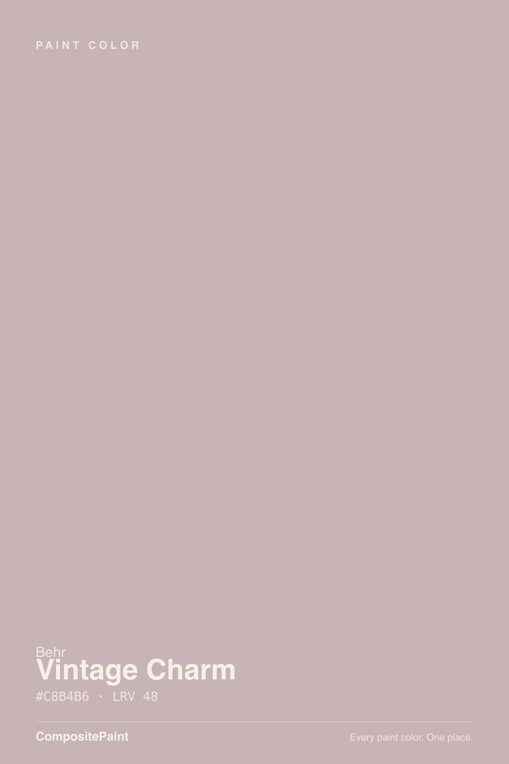
- 1Anonymous20
- 2Dorian Gray39
- 3Vintage Charm46
- 4Agreeable Gray60
- 5Pale Oak69
The Fast Verdict
Vintage Charm is a mid-light rose-mauve that Behr files as a Neutral — which tells you how they hope it will behave, not how it always does. In warm daylight and 2700K lamps it reads like dusty taupe with a blush, old china gone slightly gray. In cool north light the rose comes forward and nobody will call it taupe. If you want a bedroom that feels quietly vintage, this is the gallon. If you wanted gray, keep walking.
Bedrooms and powder rooms · older dining rooms with cream trim and brass · a single accent wall in a lamplit living room · anyone who wants dusty rose without candy pink
You actually want gray or a no-shift greige · the room faces north and pink is a dealbreaker · your floors are honey oak or cool gray LVP · you need a resale-safe whole-house color
- Dusty rose that can pass as a quiet taupe in warm light
- Bedrooms and powder rooms feel finished without candy pink
- Deep enough (LRV 46) to have body against cream trim
- Flatters walnut, brass, linen, and older-home woodwork
- Mauve-revival mood without a trend-color name on the chip
- Not taupe — cool light makes the rose unmistakable
- Fights honey oak and cool gray LVP
- Too-bright whites make the walls look dingy-pink
- More repaint risk than a greige if dusty rose dates itself
What Color Is Vintage Charm, Really?
A grayed rose-mauve with a brown shoulder — dusty pink first, taupe second. Behr puts N160-3 in the Neutral family even though the color is a blush, which is the whole sales pitch and the whole trap. Straight pinks go nursery on four walls; Vintage Charm is muted enough that in the right light it almost passes for a brown-gray. It is not Sleepy Hollow. Sleepy Hollow is the grown-up way to paint purple. This is warmer, browner, and a full step lighter: rose-taupe, not violet-gray.
At LRV 46 it is a genuine mid-tone, sitting in the same depth neighborhood as Pashmina (LRV 44) and Vintage Tea Rose (LRV 47). That number is why it works in a bedroom and why it fails as a whole-house greige. It has enough pigment to look like a decision against cream trim, and enough depth that a dim room will feel held rather than bright. Plan for four walls to read a step deeper and a step pinker than the chip — muted roses always do this, and it is the number-one surprise in sample photos.
Undertone in one line: rose first, taupe second — never green, never blue. Cool north light and 4000K LEDs pull the mauve-pink until the Neutral filing looks like a joke. West sun and 2700K lamps dust it toward taupe and the blush sits in the background. Both versions are the same gallon being honest about the room.
Where It Shines
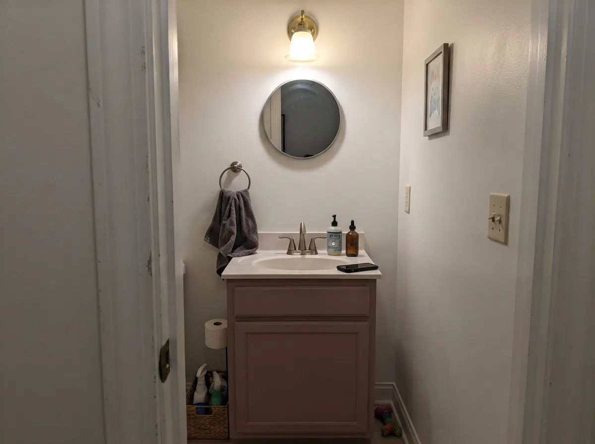
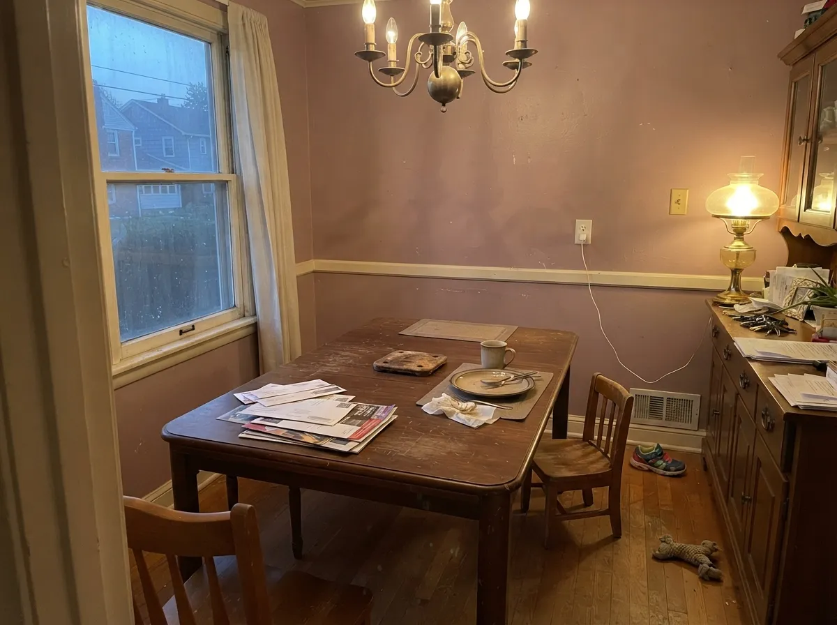
This color is built for rooms you use at night and for older rooms that already have cream, walnut, and brass in them. Under 2700K lamplight the rose goes quiet and the walls read dusty, expensive, slightly faded in the good way — the vintage the name is aiming at. Its second home is the small commitment: a powder room, a vanity, one dining room, an accent wall, where the mauve looks chosen instead of thematic. Give it linen, unlacquered brass, and a warm white, and it looks like it was always there.
Where It Fails
Almost every regret story about Vintage Charm follows one of three scripts, and all three are visible on a big sample before the first coat. None of them are a bad batch — but if your room matches one, this is not your color, and painting the whole room will only confirm it.
On the chip it passes for a dusty brown-gray. On four walls in cool light the rose is unmistakable — depth multiplies undertone. If your goal is "taupe with a little warmth," this is too much warmth; look at Pashmina or Smokey Taupe and let the pink stay a risk instead of the identity.
The second bad review is a pairing mistake: Vintage Charm walls, Polar Bear or a gallery white on the trim. Polar Bear sits at LRV 94 — a dependable everyday white, not a creamy stand-in — and the 48-point gap makes the mauve look dingy-pink, like the walls need a wash. The fix is a softer warm white: White Dove on trim, or Behr Swiss Coffee if you want the vintage cream-and-mauve look and can live with a cream that shows.
Golden honey oak plus dusty rose is the 1980s ranch palette, and neither side looks expensive. Cool gray LVP does the other job: it sits opposite the rose and pulls the pink forward until the walls look like blush against a parking-garage floor. Vintage Charm wants walnut, espresso, pale white oak, or a big rug between it and the problem.

Room by Room
Quiet all day, dusty-rose at night. Matte finish hides wall texture and keeps the color from going shiny-pink; White Dove trim keeps the edges soft. With cream bedding and 2700K lamps it is the rare blush wall that still reads restful. A north-facing bedroom with no lamps is the pink-surprise room — sample there first.
Four walls of Vintage Charm in a windowless powder room under warm bulbs is a weekend project that looks custom. Satin on a vanity under a cream or marble top and brass pulls is the even smaller version. This is the room where the mauve is allowed to be mauve.
Cream trim, a walnut table, brass, and west light are its natural company. The mid-tone hides chair-rail scuffs better than a pale beige and makes a formal room feel lived-in instead of staged. A lamp-only dining room needs the bulbs at 2700K or dinner happens inside a pink box.
Beautiful in a closed, lamplit living room with cream and walnut. Riskier in open plans, where it has to negotiate with kitchen wood tones and whatever the adjacent rooms wear. Pale Oak next door is the safe handoff. If the open floor is staying greige, put Vintage Charm on one fireplace wall and stop there.
On an island or a coffee hutch under Swiss Coffee or Alabaster walls it is genuinely charming, vintage without being cute. A full kitchen of dusty-rose walls is a bold bet, and a losing one over honey-oak floors or cool gray quartz. Satin cabinet enamel either way; test it at night under the actual under-cabinet lights.
Full outdoor sun washes the taupe out and the remaining rose reads as faded siding from the street, not as a color choice. The exception is a shaded, north-facing front door on a cream or pale-gray house, where the dusty mauve looks intentional. Do not bet the facade on it.
Your Light Is the Risk
Warm, steady sun holds the taupe and the blush in the same frame. This is the light where it earns the Neutral filing — dusty, porcelain-soft, not baby-pink.
Cool gray daylight pulls the rose forward until the walls are clearly mauve. Fine if you wanted dusty pink; disappointing if you bought it as taupe.
Cooler and pinker in east morning light, dustier and more taupe through west afternoon. Sample it at 8am and at 5pm — you are buying both colors.
2700K lamps keep it dusty rose-taupe and a little velvety. 4000K LEDs sharpen a cooler pink-gray — swap the bulbs before you blame the paint.
Most complaints about Vintage Charm are a light mismatch. Upload a photo of your actual room and see it on your walls — then ask for the same wall in north light or evening lamps before you buy a single sample.
Need It From Another Brand?
Any paint counter can custom-tint Behr N160-3 directly. If you would rather stay in one brand's own deck, these are the closest stock matches, measured as ΔE2000. Under 2 is a difference you will not see on the wall.
| Brand | Closest color | ΔE | LRV | |
|---|---|---|---|---|
| Sherwin-Williams | Insightful RoseSW 6023 · Sherwin-Williams | 2.3 | 46 | Color page → |
| Benjamin Moore | Cappuccino2096-50 · Benjamin Moore | 2.3 | 45 | Color page → |
| Valspar | Woven CashmereT563 · Valspar | 2.4 | 46.8 | Color page → |
| PPG / Glidden | Velveteen CrushPPG1060-4 · PPG / Glidden | 3.1 | 45 | Color page → |
| Glidden | Velveteen CrushPPG1060-4 · Glidden | 2.9 | 46 | Color page → |
| Dutch Boy | Allegory401-2DB · Dutch Boy | 2.3 | 46 | Color page → |
Similar Behr Colors
The nearest shades to Vintage Charm within Behr's own range, ranked by perceptual color distance — useful when you want the same look a touch lighter, darker, or warmer.
WCAG 2.1: AA is 4.5 : 1 for normal text, 3 : 1 for large text, AAA is 7 : 1.
Vintage Charm vs the Colors You're Also Considering
Every Vintage Charm sample board has the same rivals on it. The numbers show the real lightness gap — then it comes down to which risk you would rather live with.
Pick this when you want the same dusty blush filed as a Neutral — a little more taupe, a little less "I painted pink."
Behr HDC-CT-07A · LRV 47Vintage Tea RosePick this if you want the dusty rose more committed — it spends half its life pretending to be taupe, but the pink is the starting point.
Pick this for the lighter rose-taupe that can still pass as a dusty beige when the light is warm.
Benjamin Moore 1454 · LRV 28Sleepy HollowPick this if you want the grown-up purple — deeper, smokier, and more clearly violet after dark.
Inside Behr, the differences are subtle because everything nearby sits between LRV 47 and 51. Moonlit Mauve (N130-3) at #C2B6BB carries more violet. Oak Ridge (740A-3) at #BEB6BB is the most gray. Georgian Pink (HDC-CL-25G) at #C6B8B4 is a touch warmer and more beige, and Balcony Rose (PPF-10) at #C8B4AC swaps the rose for a peach lean. Plymouth Notch (180E-3) at #CFB7BE and LRV 51 is the lightest and clearest pink of the group.
Across brands, Glidden Grey Fuchsia (90RR 49/061) at deltaE 1.16 is visually identical in normal room light. Dunn-Edwards Young Fawn (DE6038) at 2.64, Benjamin Moore Victorian Mauve (2114-50) at 2.74, and PPG High Society (PPG1046-4) at 3.14 are all very close, but sample first, since High Society at #C9B6BF pulls more violet. Sherwin-Williams Imagine (SW 6009) at 3.47 and Farrow and Ball Pink Drab (No. 207) at 4.27 are close but visibly different side by side, with Pink Drab reading noticeably warmer and browner.
Vintage Charm Coordinating Colors
The rule for coordinating with Vintage Charm: warm whites, tonal plums, and near-blacks — and keep yellow wood and icy whites at arm's length. It pairs with cream far better than with beige, loves walnut and brass, and layers with deeper members of the mauve family in rooms that have real daylight. These are the partners that keep showing up in rooms that work:
A Neutral That Is Not Neutral
Behr put Vintage Charm in the Neutral family and gave it a Quiet name. The chip still reads as a rose-mauve. That filing is not a lie so much as a hope: muted enough, grayed enough, that a dusty blush might pass in a taupe-friendly house. Behr has even used it in a pink-aesthetic palette next to Polar Bear, which is the other honest tell — when the brand stages it, the rose is the point.
It is not a Color of the Year and it is not a famous TV-house color. That obscurity is useful. Sleepy Hollow and Cinnamon Slate carried the mauve revival with names people recognize; Vintage Charm is the Home Depot version of the same mood, a step lighter, a step browner, and easier to return if the sample fails. You get the current dusty-rose atmosphere without betting the room on a color everyone can name. If the trend passes, a grayed rose-taupe ages closer to a neutral than a saturated pink does — but it still carries more repaint risk than Greige.
Vintage Charm With Wood Tones and Floors
This decision gets made at the floor, not the paint store. Walnut and espresso are the color's best friends — the dark red-brown depth makes the rose read dusty and deliberate. Pale white oak is safe and gives the room a softer vintage cast. Cream carpet is fine.
The one honest no is golden honey oak, orange-stained trim, and yellow-beige carpet. Dusty rose plus orange wood is a dated pairing, and each side makes the other louder. Cool gray LVP and blue-gray tile do a different kind of damage: they pull the pink forward until the walls look blush against a cold floor. If the golden floor is staying, put a large rug down or choose Pashmina and keep the mid-depth quiet without the fight.
Metals are the easy part: unlacquered brass, antique bronze, and matte black all work; polished chrome is the one that leans cold against it.
Three Ready Palettes Built on Vintage Charm
A color is never alone on the wall. These are complete combinations in the 60-30-10 pattern, with the reason each one holds together. Every one opens in the visualizer.
Tonal rose layering is what keeps this sophisticated instead of themed: two depths of the same family, separated by a warm white. White Dove matters here — Polar Bear's everyday brightness would make the walls look dingy-pink. Cinnamon Slate is beautiful in real daylight and unpredictable without it, so keep that accent on a wall that sees a window.
Try this palette in your roomCream and mauve is the classic vintage pairing. Behr Swiss Coffee is the warmest of the safe off-whites — and it shows — which is what you want in a tiny room that could otherwise go pink-on-white. Wrought Iron is the softest near-black for one grounded note; brass hardware finishes the argument.
Try this palette in your roomPale Oak is beautiful in good light and moody in bad light — the same light-dependence Vintage Charm has — so the dining-to-living handoff reads like the house getting quieter, not a color change. White Dove trim ties both back together without the dingy-pink edge a brighter white would cut.
Try this palette in your roomVintage Charm FAQ
Is Vintage Charm pink or taupe?
Both, and that is the point — and the complaint. Behr files it as a Neutral; on the wall it is a rose-mauve. In warm south or west light and under 2700K lamps it can pass for dusty taupe with a blush. In cool north light it is clearly pink. If taupe is what you actually want, this is the wrong color; that mismatch is behind most of the bad samples.
What trim white goes with Vintage Charm?
A warm, soft white — White Dove is the default. Behr Swiss Coffee if you want the vintage cream-and-mauve look and can live with a cream that shows. Polar Bear is Behr's own everyday white and the pairing they have used in pink-aesthetic rooms, but at LRV 94 it can make these walls look dingy-pink. A crisp gallery white like Chantilly Lace is the worst match. Semi-gloss on the trim, matte or eggshell on the walls.
Is it good for a bedroom?
It is the best room for it. The color is calmest in low, warm light — exactly a bedroom's operating conditions. Use matte, keep the bulbs at 2700K, and pair with cream or white bedding rather than beige, which reads yellow against the rose. Sample a north-facing bedroom in morning light before you commit.
Does Vintage Charm work with oak floors?
Depends entirely on the oak. Walnut, espresso, and pale unstained white oak are excellent. Golden honey oak is the honest no: dusty rose plus orange wood is the 1980s ranch look, and each side exaggerates the other. A large rug helps, but with wall-to-wall honey tones pick Pashmina and keep the mood without the fight.
How does it compare to Vintage Tea Rose or Sleepy Hollow?
Vintage Tea Rose (LRV 47) is the sister dusty rose — more clearly pink, still pretending to be taupe half the day. Sleepy Hollow (LRV 28) is deeper and more violet, the grown-up way to paint purple. Vintage Charm sits between them: lighter than Sleepy Hollow, more Neutral-filed than Tea Rose. If you want purple, go Sleepy Hollow. If you want pink, go Tea Rose. If you want the fence, stay here and sample in your actual light.
Can I use it on cabinets or a whole house?
Cabinets in doses — a vanity, an island, a hutch — yes, in satin enamel. A whole kitchen of it is a strong commitment. A whole house is a no. At LRV 46 with a rose that moves, it is a room color, not a hallway-to-basement greige. Run it in the bedrooms and the powder room and keep the main floor on Pale Oak or a real greige.
Have you painted with Vintage Charm?
Rate it — one tap helps the next reader decide.
Ask a Question