Malted Milk
The cottagecore blush everyone put on cabinets in 2023, reviewed honestly: where it glows cream, the exact light that turns it bubblegum-pink, and what to pick instead.

Jessica has spec'd whites and neutrals for more than 300 rooms and keeps a sample wall of painted drawdowns in her studio. Every color review is checked against real reader rooms in the comments and re-tested when a formula changes. About the testing process →
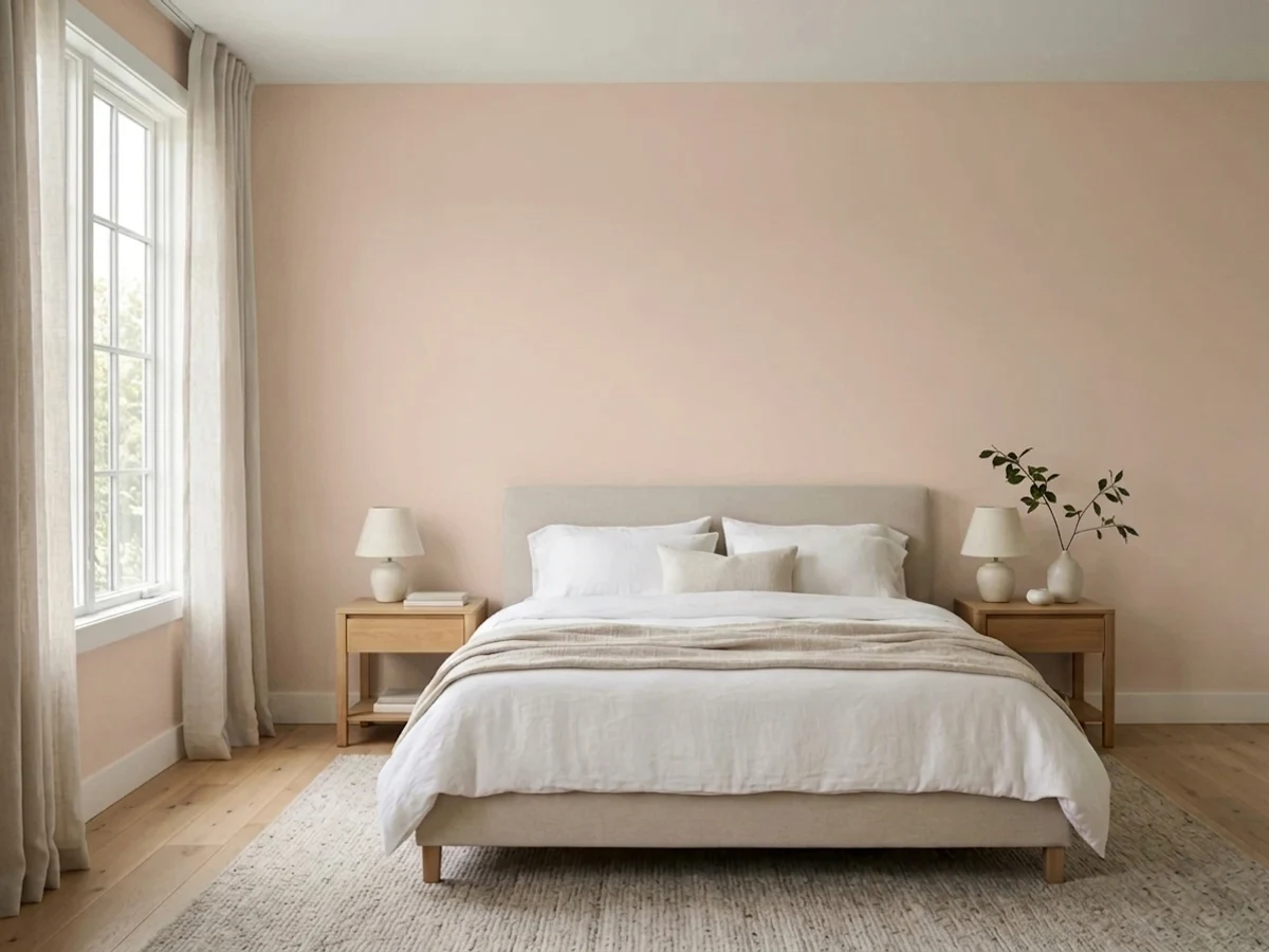
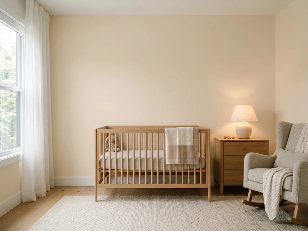
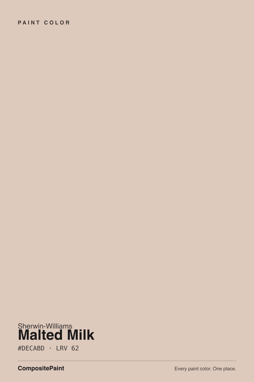
- 1Vintage Tea Rose47
- 2Pink Quartz53
- 3Malted Milk62
- 4First Light76
- 5Pink Bliss82
The Fast Verdict
Malted Milk is a warm, dusty pink-beige that Sherwin-Williams itself calls "a flexible neutral with a dash of red" — and the dash is bigger than the marketing lets on. In the right light it is genuinely lovely: creamy in the morning, softly blushed by afternoon, cozy under a lamp. In the wrong light — cool north exposure, stark white trim, cool LEDs — it drifts toward a flat, muddy pink that owners did not sign up for. Buy it because you want a little pink, not because you were told it was "just a beige."
Kitchen cabinets and small jewel-box rooms · nurseries and bedrooms with warm evening light · cottagecore, farmhouse and vintage-leaning kitchens · anyone who actively wants a hint of pink and is willing to say so
You want a true, no-drama beige · your trim is staying stark white · your room is north-facing and dim · you are pink-averse and hoping it will "read neutral"
- A genuinely pretty, cozy blush-beige — not a generic neutral
- Cottagecore/vintage kitchen cabinets are its signature win
- Small rooms (powder rooms, nurseries) take the color beautifully
- Warm evening lamplight makes it feel calm, not candy-sweet
- Listed for exterior and cabinet use, not just interior walls
- Reads distinctly pink in daylight — a real surprise for beige-seekers
- Clashes with bright, stark white trim — looks muddy, not clean
- Goes flat and gray-mauve under cool LEDs and north light
- Less predictable than a true neutral like Accessible Beige
What Color Is Malted Milk, Really?
A dusty, blush-leaning beige with a real red undertone — Sherwin-Williams files it in the Orange family and describes it as "a sweet, blushing, and snuggly hue," and named it Color of the Month for April 2023 as part of a cottagecore-leaning palette. That is a real but modest honor: a monthly feature, not Color of the Year, and the color had sat quietly in the deck for years before the cottage-core moment found it. The name itself borrows straight from the soda-fountain drink, which is exactly the vintage, nostalgic mood the color is built to sell.
At LRV 62 it sits in the same brightness range as a soft greige, but it does not behave like one. Color sites that photograph it in real rooms consistently describe the same shift: morning light reads it creamy and warm, while afternoon and west sun pull the red forward until the wall reads distinctly pink. North-facing rooms cool it down toward a flatter, grayer blush; south and west rooms let the warmth — and the pink — come all the way forward. Plan on the color moving through the day more than a typical beige does.
Undertone in one line: red-pink first, a little orange second, and it never fully lands on neutral beige. That is the honest complaint behind most of its bad reviews — buyers who wanted "a nice warm beige" and got a color their guests immediately call pink. If that is not the deal you want, this is not your color; if you are fine with a little rose in the room, it is a genuinely pretty one.
Where It Shines
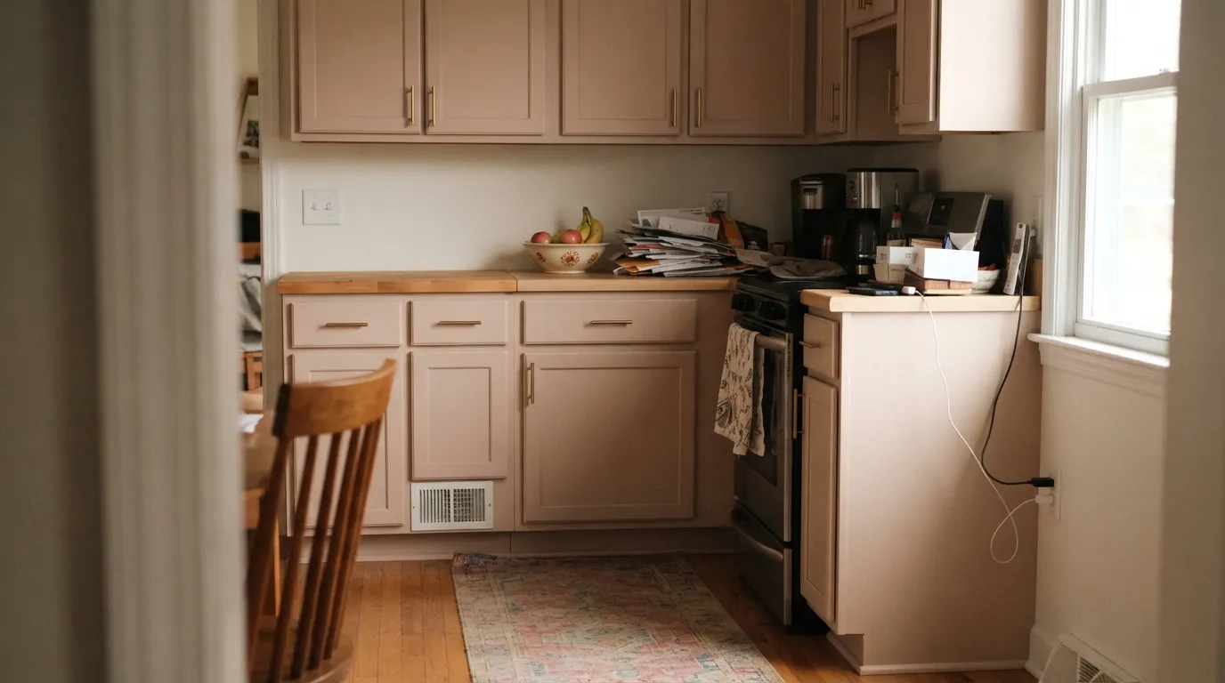
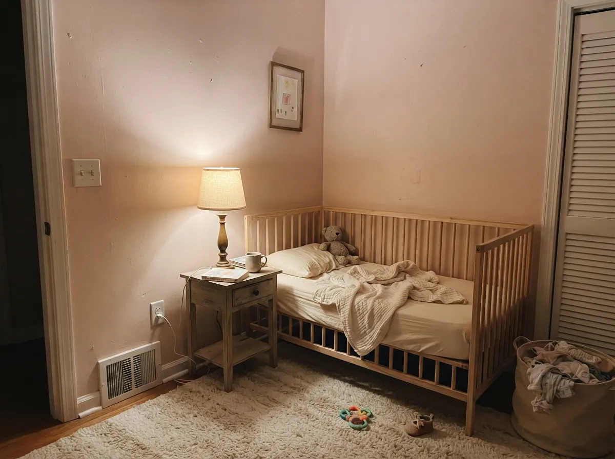
This color is built for a small, deliberate commitment, not a whole-house safe choice. On kitchen cabinets it is the cottagecore favorite for a reason: against a warm white wall, brass hardware and butcher block it looks like a vintage bakery case, not a nursery mistake. Its second home is exactly that — nurseries and bedrooms that want a soft, blush-warm calm, especially under evening lamplight, where the red comes forward and the color turns genuinely cozy instead of candy-sweet.
Where It Fails
Almost every disappointed review of Malted Milk comes from one of three predictable mismatches, and none of them are really the paint's fault — they are a buyer expecting "beige" from a color that was always going to lean pink.
This is the single most common complaint: on the chip it reads as a soft warm neutral, on four walls in daylight the red comes forward and it is unmistakably pink to anyone standing in the room. One widely echoed comment calls it out directly — "way too much of a pink undertone." If your goal was a safe warm beige, this is the wrong pick; go to Accessible Beige instead and let this one stay a cabinets-only color.
Pair Malted Milk with a stark, cool white — Extra White, a builder-grade bright white — and the contrast does the walls no favors: they read muddy and slightly dirty next to the crisp trim. The fix is a warm white on the trim, not a repaint of the walls; Alabaster or White Dove keeps the temperature consistent instead of fighting it.
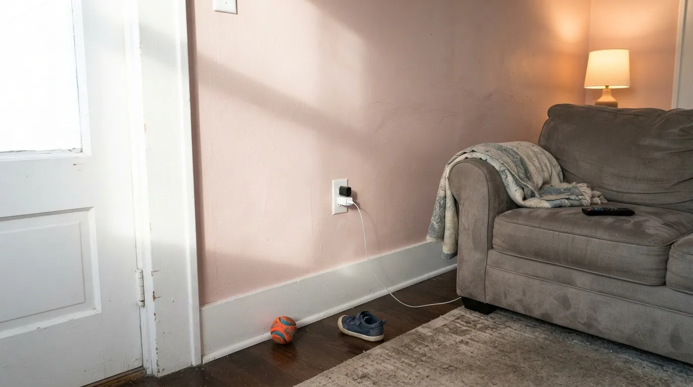
Cool light kills the red the color depends on and leaves a flat, slightly gray-mauve cast that reads more "dated" than "blush." This is the least-flattering version of Malted Milk, and it is exactly the version a north bedroom with stock cool-white bulbs will show you. Swap the bulbs to 2700K before you blame the paint.
Room by Room
The cottagecore signature use: cabinets in Malted Milk under a warm white wall, with brass pulls and butcher block, read like a deliberate design choice rather than an accident. Satin urethane-fortified cabinet enamel; small kitchens take the color especially well as a "jewel box."
One of its most common real-world jobs, and a good one: under 2700K lamps it turns soft and calming rather than sugary. Keep bedding cream or white, not beige, which flattens the color's warmth by comparison.
Beautiful with walnut, brass and cream upholstery in a room with real daylight. In an open-plan layout it has to negotiate with every adjoining wood tone and wall color, so test it big before committing the whole floor.
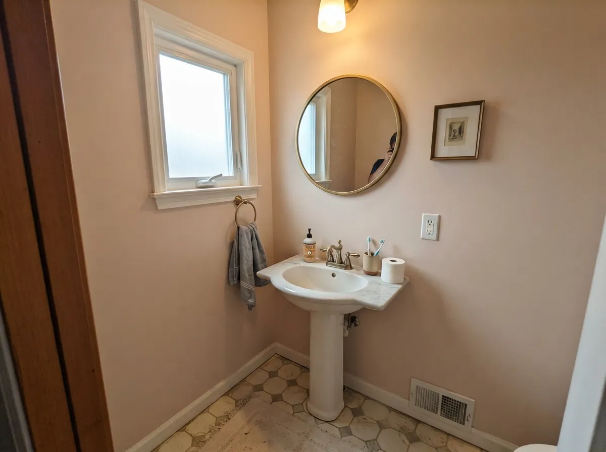
Exactly the kind of low-commitment room this color was made for: four walls of Malted Milk with a marble-top vanity and brass fixtures looks custom without betting the whole house on pink.
Sherwin-Williams lists it for exterior use, and full sun keeps the red honest without turning garish, especially on farmhouse and cottage-style trim work. Pair with a near-black trim color to ground it rather than a bright white, which will fight the same way it does indoors.
This is where the color's reputation takes the biggest hit. Without direct sun and with cool bulbs, the blush goes flat and grayish and loses the exact quality that makes it worth buying. Sample it on the actual north wall before committing a whole room.
Your Light Is the Risk
The red comes all the way forward and the wall reads a confident, warm blush-pink. If you want the color's personality, this is the light that gives it to you.
Cool daylight mutes the red and leaves a flat, slightly gray-mauve cast that reads dated rather than blush. Sample here before you commit.
Owners consistently report a creamy, quiet morning read that noticeably pinks up by afternoon. It is not your eyes — the same wall genuinely looks like two different colors across the day.
2700K lamps pull the red forward into a cozy blush. Cool white LEDs flatten it toward gray — swap the bulbs before you swap the paint.
Most complaints about Malted Milk are a light mismatch. Upload a photo of your actual room and see it on your walls — then ask for the same wall in north light or evening lamps before you buy a single sample.
Need It From Another Brand?
Any paint counter can custom-tint Sherwin-Williams SW 6057 directly. If you would rather stay in one brand's own deck, these are the closest stock matches, measured as ΔE2000. Under 2 is a difference you will not see on the wall.
| Brand | Closest color | ΔE | LRV | |
|---|---|---|---|---|
| Behr | Stonewashed BrownN190-2 · Behr | 1.6 | 62 | Color page → |
| Benjamin Moore | Pinky SwearCSP-340 · Benjamin Moore | 1.9 | 61 | Color page → |
| Valspar | Manilla RopeV133-2 · Valspar | 3.1 | 61.7 | Color page → |
| PPG / Glidden | Bermuda SandPPG1074-3 · PPG / Glidden | 2.0 | 61 | Color page → |
| Glidden | Bermuda SandPPG1074-3 · Glidden | 2.0 | 61 | Color page → |
| Dutch Boy | Sandstone Quarry408-2DB · Dutch Boy | 0.0 | 62 | Color page → |
Similar Sherwin-Williams Colors
The nearest shades to Malted Milk within Sherwin-Williams's own range, ranked by perceptual color distance — useful when you want the same look a touch lighter, darker, or warmer.
WCAG 2.1: AA is 4.5 : 1 for normal text, 3 : 1 for large text, AAA is 7 : 1.
Malted Milk vs the Colors You're Also Considering
Every Malted Milk sample board has the same rivals on it. The numbers show the real lightness gap — then it comes down to which risk you would rather live with.
Pick this when a little rose is exactly what you're after — Accessible Beige will never give you that.
Sherwin-Williams SW 7036 · LRV 58Accessible BeigePick this if you want a genuinely safe, predictable warm beige with no pink surprise waiting for daylight.
Pick this when you want the pink to actually show — First Light is the whisper version of the same idea.
Benjamin Moore 2102-70 · LRV 76First LightPick this for a much lighter, quieter blush that mostly passes for a warm off-white until the light changes.
Abalone Shell SW 6050 (#DBC7BD, LRV 60) is the nearest sibling, marginally darker and a touch pinker. Lightweight Beige SW 6092 (#DAC8B8, LRV 59) trades the blush for yellow-tan, so it reads as a more conventional beige. Beige SW 2859 and Townhouse Tan SW 7712 share the same hex (#DFC8B5, LRV 60) and both sit a step warmer and more golden than Malted Milk. Reticence SW 6064 (#D9CDC3, LRV 62) matches the lightness but is grayer and calmer.
Across brands, Dutch Boy Sandstone Quarry 408-2DB and HGTV Home by Sherwin-Williams Malted Milk HGSW 3057 both share the exact hex and LRV 62. Behr Brazilian Tan N250-2 (deltaE 1.65), Farrow and Ball Scallop No. 311 (deltaE 1.7), and Benjamin Moore Pinky Swear CSP-340 (deltaE 1.94) are all visually identical in normal room light. Valspar Manilla Rope V133-2 (deltaE 3.09) is very close, so sample first, and Clare Flatiron PNT100-LT-17 (deltaE 4.71) is close but visibly different, reading grayer.
Malted Milk Coordinating Colors
The rule for coordinating with Malted Milk: warm whites to keep the temperature consistent, and either a soft mauve for tonal depth or a near-black for grounding contrast — skip anything stark or icy. These are the partners that keep showing up in rooms that work:
The Story: Cottagecore's Favorite Blush
Malted Milk had sat quietly in the Sherwin-Williams deck for years before it found its moment: the brand named it Color of the Month for April 2023, positioning it as part of a cottagecore-leaning palette that traded gray-decade minimalism for "the cozy-warm, welcoming vibe of a countryside cottage." That is a real, if modest, honor — a monthly feature, not the Color of the Year spotlight Cinnamon Slate or Cavern Clay got — and it is worth being honest about the difference. Malted Milk did not become a household name; it became a favorite inside a specific design niche.
Where it actually took off was kitchen cabinets: designers leaning into cottagecore and vintage-farmhouse looks reached for it as an alternative to the sage-green and navy cabinet trends that came before, pairing it with brass hardware and butcher block for a soda-fountain, bakery-case feel that matches the nostalgic name. That niche popularity is exactly why this review calls it a small-commitment color rather than a whole-house one — it earned its fans in one specific role, and it has not really tried to be more than that.
Malted Milk With Wood Tones and Floors
Warm, mid-tone woods are the easiest pairing: butcher block, oak in its natural range, and light walnut all sit comfortably with the blush and let the pink read as intentional warmth rather than an accident. Brass and unlacquered metals reinforce the same warm, vintage mood the color is going for.
Two floor situations deserve a sample first. Very orange-heavy honey oak pushes the same warm-versus-warm competition that trips up other pink-adjacent colors — both sides can read a little muddy together, so test a large sample above the actual floor. Cool gray floors or gray-washed wood are the other risk: the temperature mismatch between a cool floor and a warm-pink wall can make the color look less deliberate and more like a clash. Pale, less-orange white oak and true walnut are the safest bets either way.
Three Ready Palettes Built on Malted Milk
A color is never alone on the wall. These are complete combinations in the 60-30-10 pattern, with the reason each one holds together. Every one opens in the visualizer.
Alabaster's warm white keeps the blush cabinets from looking pink-on-pink, and Wrought Iron's soft near-black grounds the room so the cottagecore mood reads curated instead of candy-colored. Brass hardware finishes it.
Try this palette in your roomTwo warm pink-leaning neutrals at very different depths give the room dimension without a clash — Malted Milk stays light and calm, Sleepy Hollow's smoky mauve grounds one wall. White Dove trim keeps both from tipping candy-sweet.
Try this palette in your roomOutdoors the blush reads warmer and less pink than it does indoors, and a near-black like Iron Ore gives the facade the contrast it needs instead of the muddy look a bright white trim would cause. Alabaster's warm white keeps the trim from fighting the siding.
Try this palette in your roomMalted Milk FAQ
Is Malted Milk a pink or a beige?
Both, honestly — Sherwin-Williams calls it a blushing neutral with soft red undertones, and on the wall the red is real. Morning light and cool rooms let it pass for beige; afternoon sun and warm bulbs push it toward a clear pink. Buy it expecting some pink, not a plain beige.
What trim color goes with Malted Milk?
A warm white, not a stark one. Alabaster or White Dove keep the temperature consistent; a bright cool white like Extra White makes the walls look muddy by contrast. Satin on the trim, eggshell on the walls.
Is it good for kitchen cabinets?
Yes — this is its most popular and most successful use. Paired with a warm white wall, brass hardware and wood counters, it reads vintage and deliberate rather than accidental. Use a satin, urethane-fortified cabinet enamel.
Will it look too pink in my room?
Depends on your light. South and west exposures, and any room with warm 2700K bulbs, will show the pink clearly. North-facing rooms and cool LEDs mute it toward a flatter mauve-gray. If you are worried about pink, sample it on your actual wall in both daylight and evening light before committing.
Does Malted Milk work on exteriors?
Yes — Sherwin-Williams lists it for exterior projects, and full outdoor sun keeps it warm without the daylight-pink swing being as dramatic as it can be indoors. Pair it with a near-black trim like Iron Ore rather than bright white for the cleanest farmhouse look.
How is it different from Accessible Beige?
Accessible Beige is the safer, more neutral warm beige with far less pink drama; Malted Milk is a deliberate blush with a real red undertone that shows up in daylight. Pick Accessible Beige if you want predictability, Malted Milk if you actually want the pink.
Have you painted with Malted Milk?
Rate it — one tap helps the next reader decide.
Ask a Question