Abalone Shell
A dusty rose-beige everyone describes differently, reviewed honestly: the warm light where it glows blush, the cool light where it turns flat gray, and what to pair it with either way.

Jessica has spec'd whites and neutrals for more than 300 rooms and keeps a sample wall of painted drawdowns in her studio. Every color review is checked against real reader rooms in the comments and re-tested when a formula changes. About the testing process →
- 1Vintage Tea Rose47
- 2Pink Quartz53
- 3Abalone Shell60
- 4Romance66
- 5First Light76
The Fast Verdict
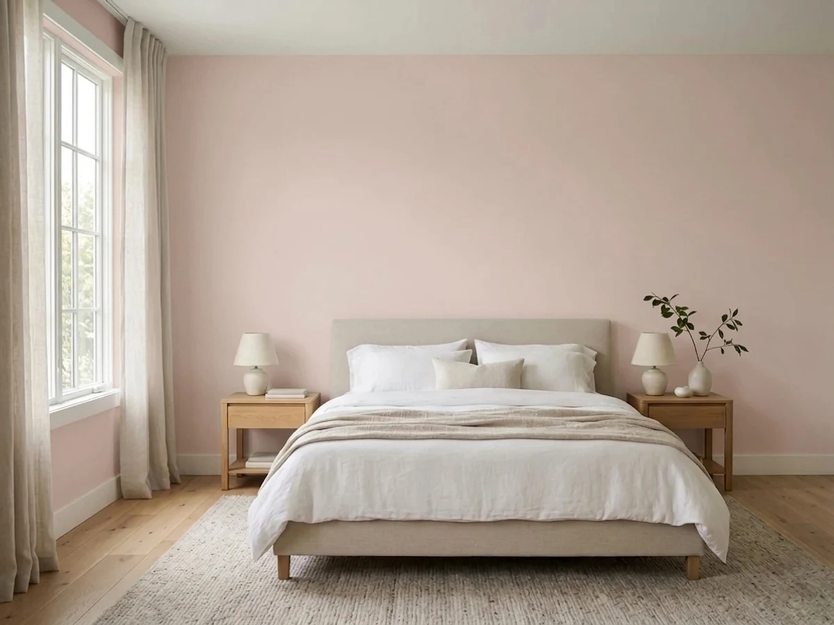
Abalone Shell is what happens when a designer wants "warm neutral" and refuses to say the word pink out loud. It is a dusty rose-taupe with a real gray backbone — genuinely warm, genuinely restrained, and genuinely unstable depending on the light in the room. Under a lamp it goes soft and blush; under a north window it goes quiet and almost gray. Sherwin-Williams files it under Red, and that one fact tells you more than any swatch: the pink is real, it is just well-behaved.
Bedrooms and powder rooms that want warmth without going full pink · small commitments — a vanity, an accent wall, an island · anyone circling a warm neutral but bored of straight greige · rooms with brass, walnut, or cream linens nearby
You want a color that reads the same in every photo · your room runs on cool white LEDs with no lamps · you need a dependable true gray · your fixtures are polished chrome and cool marble
- Genuinely warm without tipping into a full pink room
- Bedrooms and powder rooms turn soft and lamplit at night
- LRV 60 keeps it light enough for small or dim rooms
- Reads as a believable neutral next to brass, walnut and cream
- A real alternative for buyers who find straight greige boring
- Not a stable gray — the pink shows up no matter how the photos looked
- Cool LEDs and north light flatten it to a dull, muddy taupe
- Fights cool marble, quartz and chrome instead of complementing them
- The undertone genuinely shifts by light, so one sample chip won't tell the whole story
What Color Is Abalone Shell, Really?
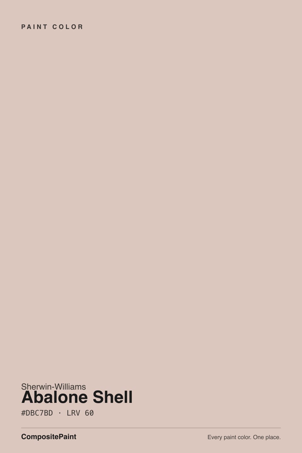
Abalone Shell is a warm neutral built on pink, not gray — Sherwin-Williams itself files it in the Red family, the same bucket as its dusty clay and blush cousins, even though most people who buy it are shopping for "a nice warm greige." The trick is restraint: the pink is real, but a heavy dose of gray and a whisper of violet keep it from ever reading as a paint-chip pink. What you get is a color that behaves like a neutral in a room and only reveals its pink parentage up close, on the can, or under the wrong light.
At LRV 60 it sits in the same light-reflecting neighborhood as Accessible Beige (58) and Shiitake (51) — mid-light, easy to live with, not a bright white and not a moody deep. That depth is exactly why the pink survives: a paler tint would wash out to baby blush, but Abalone Shell holds enough body to read as a considered, grown-up neutral instead of a nursery color. Put it next to a true taupe like Pashmina and Abalone Shell suddenly looks warmer and pinker by contrast — that contrast is the whole personality of the color.
Undertone in one line: pink-violet over a gray base, warm-leaning but never far from neutral. This is also why paint blogs disagree about it so openly — some call it a soft gray with lavender, others call it a warm beige with a peachy glow, and both are describing the same paint in different light. If your sample looks distinctly pink, that's warm lamplight or afternoon sun doing its job; if it looks flat and gray, that's a cool bulb or a north window doing the opposite. Neither reading is wrong.
Where It Shines
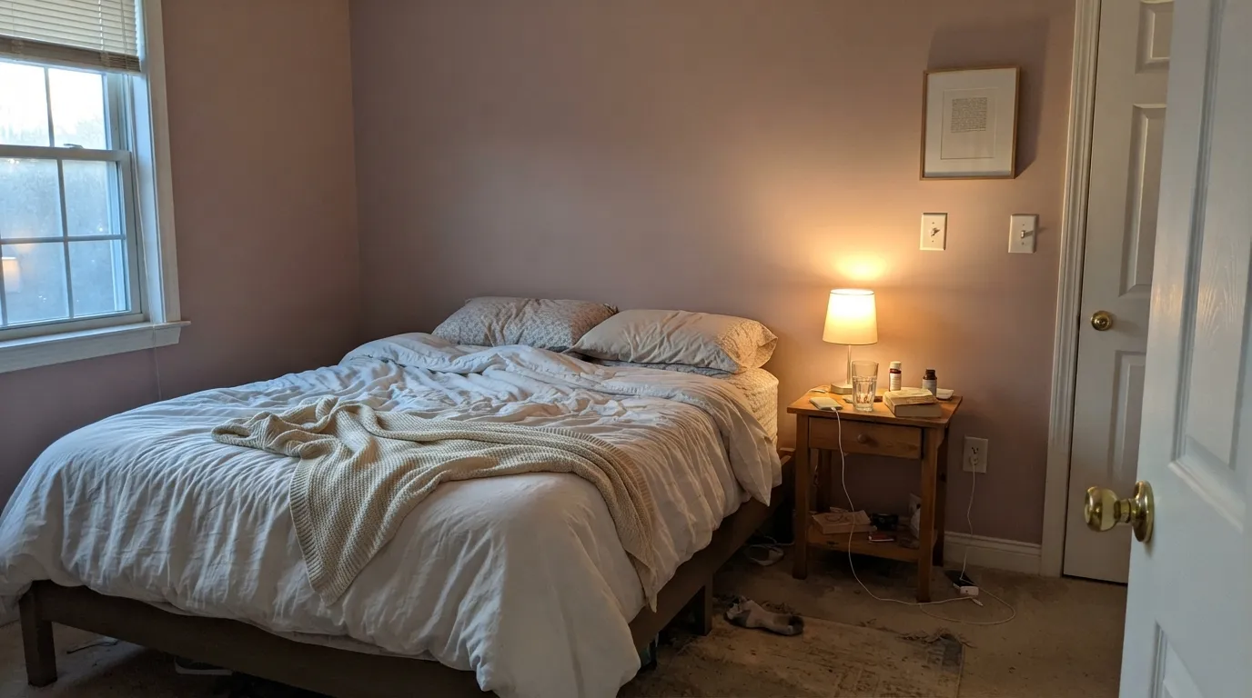
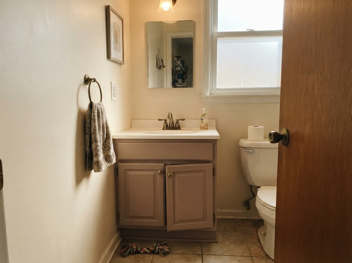
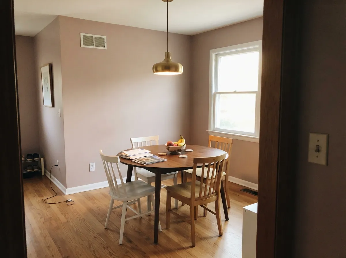
Give it a lamp and a decent amount of daylight and it turns into the color people can't quite name — warm, a little dusty, unmistakably soft. Bedrooms are its best argument: under 2700K light the rose comes forward and the room reads calm without tipping precious. Its second home is the small commitment — a powder room, a vanity, a single accent wall — where the color earns its keep without betting the whole house on a pink-adjacent neutral.
Where It Fails
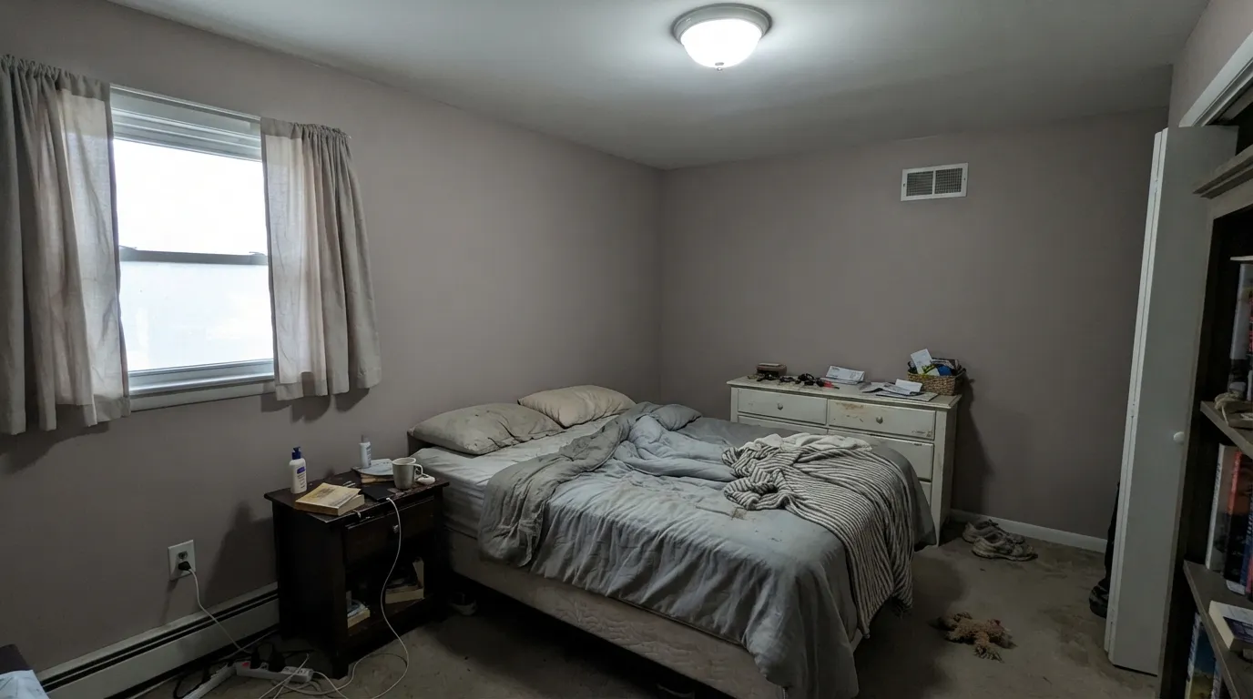
Nearly every disappointed review of Abalone Shell comes down to one of three mismatches, and all three are avoidable if you know what to expect going in. None of them are a defect in the paint — they are what happens when a genuinely light-sensitive color meets an unprepared room.
Plenty of buyers pick Abalone Shell off a gray-leaning photo and are startled by real pink on their own walls. The color has never hidden this — Sherwin-Williams lists it under Red — but product photos and other people's rooms can make it look grayer than it is. If gray is the actual goal, this is the wrong can; look at a true greige like Shiitake or Worldly Gray instead.
Cold artificial light and cool north daylight both work against the warmth the color needs. Strip the pink out and what's left reads dull, slightly muddy, almost dirty — the opposite of the soft, expensive look the color is known for. The fix is cheap: swap to 2700K bulbs before blaming the paint.
Blue-white quartz, gray-veined marble, and polished chrome all sit at the opposite temperature and make Abalone Shell's pink look accidental instead of intentional — like the wall clashed with the counter instead of complementing it. With cool stone, choose a genuinely neutral gray; save Abalone Shell for warm brass and wood.
Room by Room
Warm lamps bring the rose forward and the room settles into something between blush and taupe — restful, not sweet. Eggshell on the walls, White Dove or Alabaster trim in semi-gloss.
A satin Abalone Shell vanity under a warm-toned mirror and brass hardware reads custom without the risk of a full pink room. Painting all four powder-room walls works too — small spaces carry the color's warmth well.
Beautiful with cream, walnut and brass in a lamplit room; trickier in an open plan where it has to negotiate with a kitchen's cooler tile or stone. Accessible Beige next door is the easy handoff — close in LRV, same warm lean.
On an island or a breakfast nook under a warm white it's genuinely charming, especially with brass pulls. A full kitchen of Abalone Shell cabinets over cool quartz can look pink by accident rather than on purpose — sample against your actual counter first.
A single lamp and warm wood furniture is all it needs to read as a considered neutral rather than an accent color. Under fluorescent overhead office lighting it goes flat fast — add a warm desk lamp.
Full sun can push it toward a dusty, slightly chalky pink that reads more like weathering than a deliberate choice. It occasionally works as a soft blush cottage body color with warm-toned trim, but it is not a common or dependable exterior pick.
Your Light Is the Risk
The rose glows softly all day without going candy-pink. The best-case reading of the color.
Cool gray daylight strips the warmth out, leaving a flat, slightly muddy taupe-gray. Test before committing.
Distinctly blush at the sun hours, quieter and grayer the rest of the day. Most owners like the movement.
2700K lamps: rosier, cozier. Cool LEDs: dull and gray-leaning — swap bulbs, not paint.
Most complaints about Abalone Shell are a light mismatch. Upload a photo of your actual room and see it on your walls — then ask for the same wall in north light or evening lamps before you buy a single sample.
Need It From Another Brand?
Any paint counter can custom-tint Sherwin-Williams SW 6050 directly. If you would rather stay in one brand's own deck, these are the closest stock matches, measured as ΔE2000. Under 2 is a difference you will not see on the wall.
| Brand | Closest color | ΔE | LRV | |
|---|---|---|---|---|
| Behr | Regal760A-3 · Behr | 0.5 | 59 | Color page → |
| Benjamin Moore | Acapulco Sand2105-60 · Benjamin Moore | 1.1 | 61 | Color page → |
| Valspar | Desert Fortress2008-10B · Valspar | 4.4 | 60.9 | Color page → |
| PPG / Glidden | Cheerful HeartPPG1016-3 · PPG / Glidden | 1.7 | 59 | Color page → |
| Glidden | Cheerful HeartPPG1016-3 · Glidden | 1.7 | 60 | Color page → |
| Dutch Boy | Wine Cork412-2DB · Dutch Boy | 3.3 | 59 | Color page → |
Similar Sherwin-Williams Colors
The nearest shades to Abalone Shell within Sherwin-Williams's own range, ranked by perceptual color distance — useful when you want the same look a touch lighter, darker, or warmer.
WCAG 2.1: AA is 4.5 : 1 for normal text, 3 : 1 for large text, AAA is 7 : 1.
Abalone Shell vs the Colors You're Also Considering
Every Abalone Shell sample board has the same rivals on it. The numbers show the real lightness gap — then it comes down to which risk you would rather live with.
Pick this for more light and a slightly cleaner, more settled version of the same warm-neutral idea.
Sherwin-Williams SW 9173 · LRV 51ShiitakePick this if you want the murkier, more contested cousin — Shiitake leans the same pink-or-gray both ways, just a step darker and dustier.
Pick this for more color and confidence — Eider White is closer to a true off-white, Abalone Shell commits further.
Sherwin-Williams SW 7014 · LRV 67Eider WhitePick this for a lighter, whiter version of the same story — great in daylight, same mauve risk in a dim room.
Within the Sherwin-Williams deck, Unfussy Beige SW 6043 at LRV 60 and White Truffle SW 6029 at LRV 60 are the closest, but both hold more grey and less red than Abalone Shell's #DBC7BD, so they read as steadier neutrals. Lightweight Beige SW 6092 at LRV 59 and Simplify Beige SW 6085 at LRV 59 push toward yellow instead of pink.
Across brands, HGTV Home's Pink Phenomenon HGSW 3047 shares the same hex and LRV. Behr Regal 760A-3 at LRV 59 and Diamond Vogel Summer Beige 0132 at LRV 59 both fall under one deltaE. Benjamin Moore Acapulco Sand 2105-60 at LRV 61 is visually identical in normal room light.
Farrow and Ball Scallop No. 311 at LRV 60 is very close and worth sampling first, since it reads a shade more tan. Valspar Desert Fortress 2008-10B at LRV 60.9 and Rust-Oleum Blush Pink 285142 at LRV 64 are close but visibly different side by side.
Abalone Shell Coordinating Colors
The rule for coordinating with Abalone Shell: stay warm, keep gray for contrast rather than for the wall next door, and let brass and walnut do the heavy lifting. It hands off cleanly to other warm neutrals and takes a near-black far better than it takes a cool mid-gray. These are the partners that keep showing up in rooms that work:
Why Sherwin-Williams Files This Under Red
Abalone Shell has no Color of the Year moment and no viral before-and-after behind it — it's a quiet, dependable catalog color, and its own listing gives away why. Sherwin-Williams groups it under Red on its own color-family pages, right alongside its dustier clay and blush relatives, even though almost nobody shopping for it is looking for a red. It's also cross-branded as HGSW6050 in the HGTV Home by Sherwin-Williams line sold at Lowe's — the same paint, sold to a different aisle of shoppers who never see the word "Red" attached to it at all.
That split identity is the honest story here: this is not a trend color riding a moment like Sleepy Hollow or Cinnamon Slate, both of which have real Color of the Year or design-press pedigree. Abalone Shell is the workhorse version of the same mauve-taupe family — less famous, less risky, and easier to live with for exactly that reason. It's the color you land on after you've already decided the trendier options are too much.
Abalone Shell With Wood Tones and Metals
Warm wood is the easy pairing. Walnut, cherry and honey oak all sit comfortably with Abalone Shell because their warmth meets the paint's warmth head-on instead of fighting it — this is one of the few pink-adjacent neutrals that gets along with golden-toned floors rather than clashing with them.
Cool-toned wood is the one to sample first: ash, gray-washed oak and pickled floors sit at the opposite temperature and can make the wall's pink look slightly out of place, almost like a design mistake rather than a deliberate choice. Metals are straightforward — unlacquered brass, warm bronze and matte black all read as intentional; polished chrome and nickel are the only finishes that pull cold against it.
Three Ready Palettes Built on Abalone Shell
A color is never alone on the wall. These are complete combinations in the 60-30-10 pattern, with the reason each one holds together. Every one opens in the visualizer.
Two warm neutrals a step apart in depth read as intentional layering, not a mismatch; Cinnamon Slate adds one deeper, browner-mauve note so the room doesn't stay all one temperature.
Try this palette in your roomCream walls keep the small room bright while the vanity carries the color; Iron Ore's near-black gives the scheme one grounding note so the blush doesn't read too sweet, and brass hardware finishes the look.
Try this palette in your roomAccessible Beige and Abalone Shell share the same warm-neutral family, so the handoff between rooms feels like the same house getting a little more color, not a change of mind; Peppercorn's warm dark keeps doors and trim from disappearing.
Try this palette in your roomAbalone Shell FAQ
Is Abalone Shell pink or gray?
Both, honestly — Sherwin-Williams files it under its Red family, so the pink is real, but a heavy gray base keeps it from ever reading as a true pink on the wall. In warm light it leans blush-taupe; in cool light it leans smoky gray. That flip is the color's whole personality, not a defect.
What trim white goes with Abalone Shell?
A warm soft white — White Dove or Alabaster — keeps the pairing gentle. A stark, cool-toned bright white makes the wall's pink look like an accident by contrast rather than a choice. Semi-gloss on the trim, eggshell on the walls.
Is it good for a bedroom?
It's arguably the best room for it. The color is calmest and rosiest under low, warm lamplight, which is exactly a bedroom's usual condition. Use eggshell, keep bulbs at 2700K, and it reads soft rather than dated.
Does it work with gray or white quartz countertops?
Depends on the quartz's own temperature. Warm-veined or cream-based quartz gets along with it fine. Blue-white or gray-veined quartz, and polished chrome fixtures, pull the pink into relief and make the wall look mismatched — pick a true neutral gray instead if that's your counter.
What's the difference between Abalone Shell and Shiitake?
Close cousins. Shiitake (SW 9173, LRV 51) is a step darker and dustier, with the same pink-or-gray ambiguity but a murkier, more contested read. Abalone Shell is lighter (LRV 60) and reads a touch cleaner and more settled.
Will it look too pink in a small or windowless room?
A small room with only cool overhead light and no lamps will drain the pink and leave a flat, slightly dull taupe-gray — not a disaster, just not the color's best self. Add a warm 2700K lamp and the same room turns soft and rosy instead.
Have you painted with Abalone Shell?
Rate it — one tap helps the next reader decide.
Ask a Question