Pink Quartz
The dusty rose reviewed honestly: where it glows warm and terracotta, the cool light that flattens it to beige, and what to pick instead.

Jessica has spec'd whites and neutrals for more than 300 rooms and keeps a sample wall of painted drawdowns in her studio. Every color review is checked against real reader rooms in the comments and re-tested when a formula changes. About the testing process →
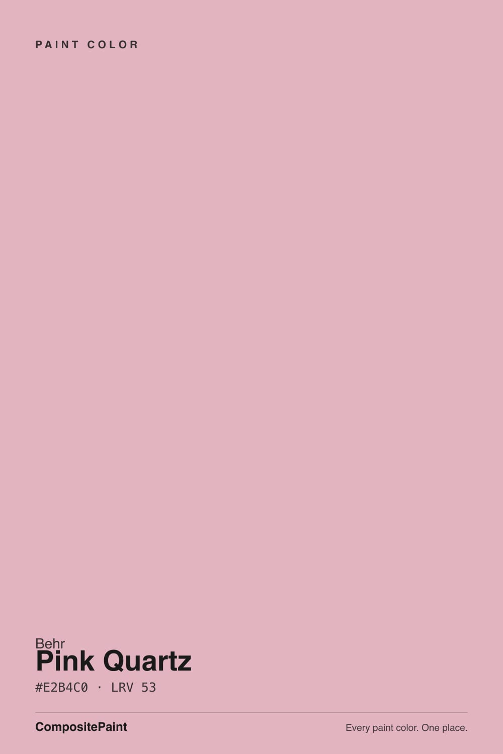
- 1Retro Pink38
- 2Vintage Tea Rose47
- 3Pink Quartz53
- 4Pale Cherry Blossom61
- 5First Light76
The Fast Verdict
Pink Quartz is what happens when dusty rose grows up: a low-chroma blush built on a peachy-beige backbone instead of anything candy or cool. Next to unlacquered brass or matte black iron it reads sophisticated, almost terracotta; under a cold overhead light with no lamps it can slide toward plain dusty beige. At LRV 53 it is deep enough to hold real color on four walls, which is exactly why buyers who wanted "just a neutral with a hint of pink" end up surprised — this one commits.
Primary bedrooms with brass hardware and black iron accents · powder rooms lit by warm bulbs · dusty-rose-and-sage color schemes · anyone who wants pink without it reading candy-sweet or baby
You actually want a neutral, not a pink · your room runs on cool white LEDs with no lamps · your floors are cool gray LVP · you want the classic pastel bubblegum nursery pink
- Reads as a sophisticated, grown-up dusty rose — never candy-pink or babyish
- Glows warm and almost terracotta under 2700K lamplight
- LRV 53 holds real color on four walls instead of washing to a pale tint
- Flatters unlacquered brass and matte black iron equally well
- Pairs naturally with sage and olive for a dusty-rose-and-sage scheme, no wallpaper required
- Cool white LEDs with no lamps drain the warmth into flat dusty beige
- Fights cool gray LVP flooring and icy-blue textiles
- Buyers who wanted "barely-there neutral" get an unmistakable pink on four walls
- Not the classic soft pastel — too grown-up for a traditional bubblegum nursery look
What Color Is Pink Quartz, Really?
A muted warm pink with a beige-and-peach backbone, not a cool mauve. Behr built it soft on purpose: low-to-moderate chroma keeps it from ever reading candy-pink or juvenile, and the earthy peach undertone gives it more in common with a sun-faded terracotta than with a nursery pastel. It is sold through Behr's Marquee and Premium Plus lines and shows up again and again in the same sentence: "a pink for people who don't think they like pink."
At LRV 53 it sits at real mid-depth — noticeably deeper than a whisper-pink like BM First Light (LRV 76) or SW Rose Pink (LRV 65), and close in weight to BM Conch Shell (LRV 54), a warm neutral-passing pink from a different deck entirely. That depth is the whole trick: a paler blush like Rose Pink can wash to nothing in a bright room, but Pink Quartz holds its rose color in daylight and then warms further into a cozy terracotta glow once the lamps come on.
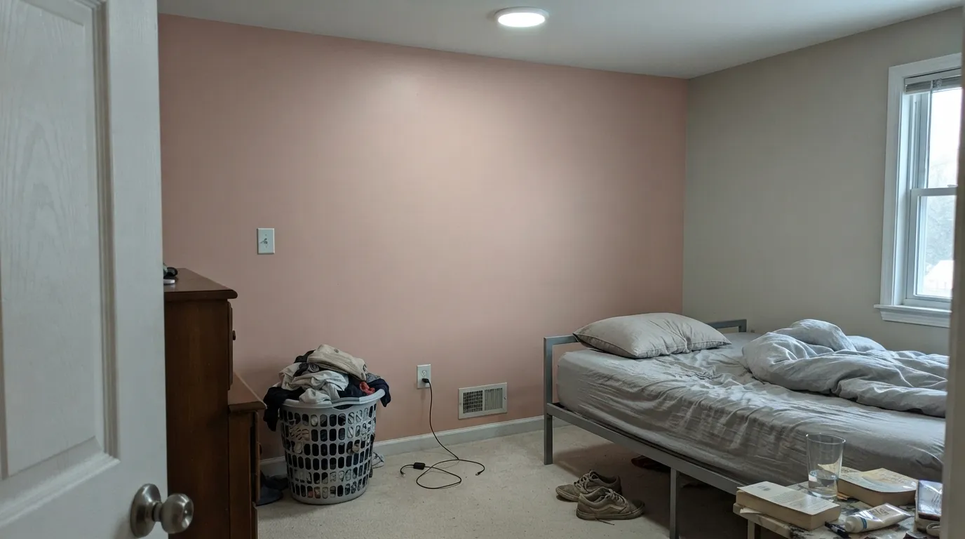
Undertone in one line: warm, peachy-beige rose — never a cool gray-mauve. If your sample reads flat dusty beige with the pink barely there, that is cool light or gray flooring pulling the warmth out, not a different paint; if it reads almost orange-terracotta, that is a warm lamp or afternoon sun pushing it forward.
Where It Shines
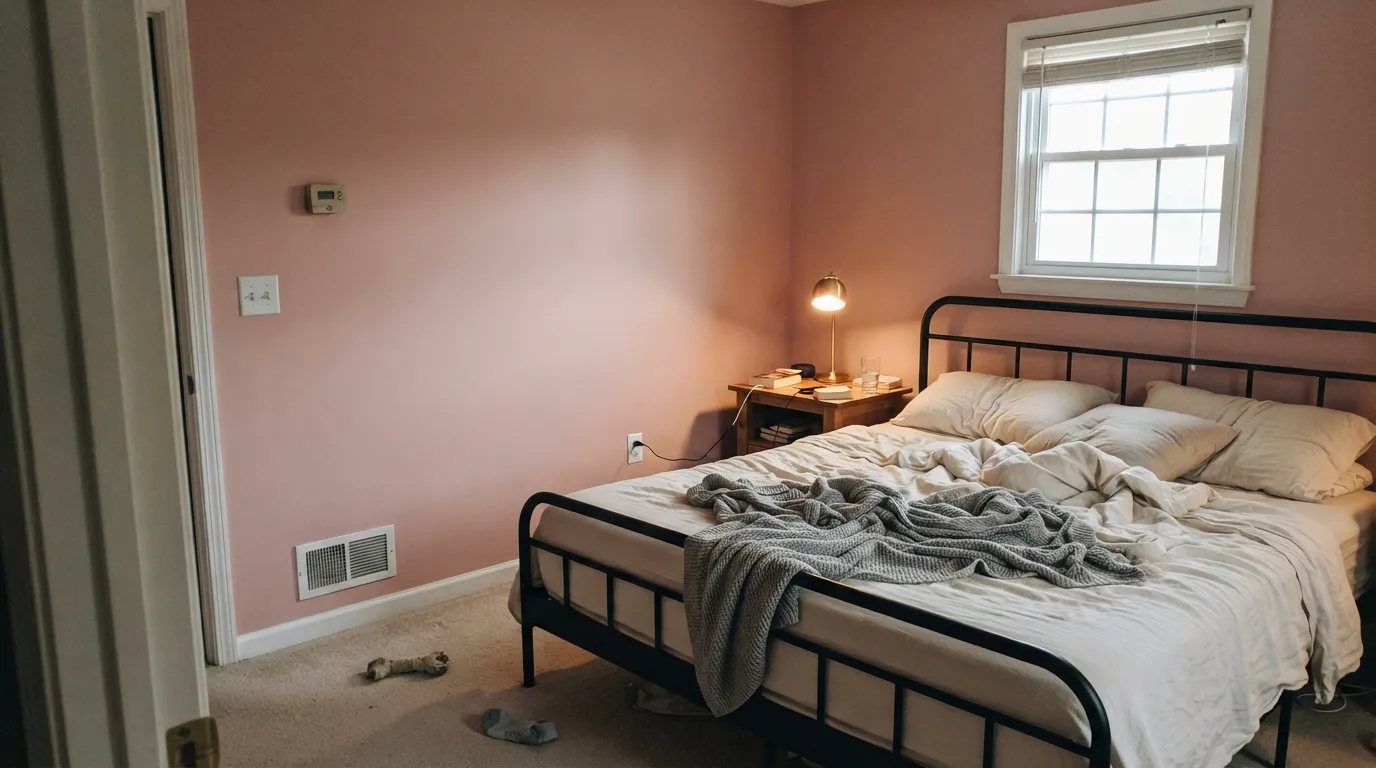
Give it warm 2700K light and metal with some age to it — unlacquered brass, matte black iron — and Pink Quartz stops reading like "a pink" at all and starts reading like a considered, grown-up neutral with warmth built in. Its best room is a primary bedroom at night: the walls glow a cozy, almost terracotta warmth under lamplight, the exact opposite of the cold, flat pink amateur painters worry about. Its second home is the small commitment — a powder room, a vanity, a dining nook — where the color reads intentional and expensive without staking the whole house on pink.
Where It Fails
Almost every disappointed review of Pink Quartz comes from one of three predictable situations, and none of them are the paint's fault. If your room matches one of these, this is not your pink, and a bigger sample will only confirm it.
Under cold overhead light the dusty beige side of this color takes over: the rose fades, the room goes flat, and the effect reads moody and shadowed rather than warm. It is not the paint failing — it is the exact light it was never built for. Swap to 2700K bulbs before you touch the walls again.
Gray-toned luxury vinyl plank and stark icy-blue fabrics sit at the opposite temperature from this color, and the mismatch shows immediately — the floor looks colder, the wall looks pinker, and neither side wins. Warm wood, cream linens, and unlacquered brass are the fix; gray flooring is the one honest no.
On a small chip, the low chroma can read as "barely-there color." On four full walls the rose is unmistakable — depth multiplies undertone, and LRV 53 is not a pale wash. If the goal was a warm neutral that merely flirts with pink, look at Conch Shell instead and let this one stay a pink.
Room by Room
Matte finish on the walls hides texture and deepens the color; White Dove trim keeps the edges soft instead of stark. With brass hardware, warm lamps, and cream bedding it is the rare "pink" that reads sophisticated instead of sweet — this is the room Behr's own styling consistently points to.
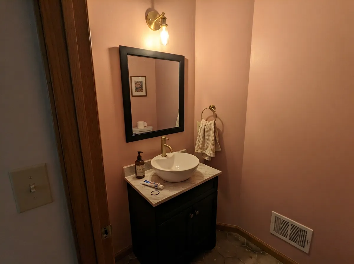
A small, warmly lit powder room is where this color earns a design fee's worth of impact for a weekend's worth of work. Under 2700K sconces it glows cozy and terracotta-warm; under a cool overhead fixture the same room goes moodier and beige-shadowed, so choose the bulb before you choose the paint. Satin finish for wipeability.
It works, but it is not the classic pastel nursery pink — it reads closer to aged terracotta than bubblegum, which is exactly why parents who don't want a stereotypically "baby" room reach for it. If you specifically want soft pastel sweetness, a paler wash like BM Dream Whip is the better fit.
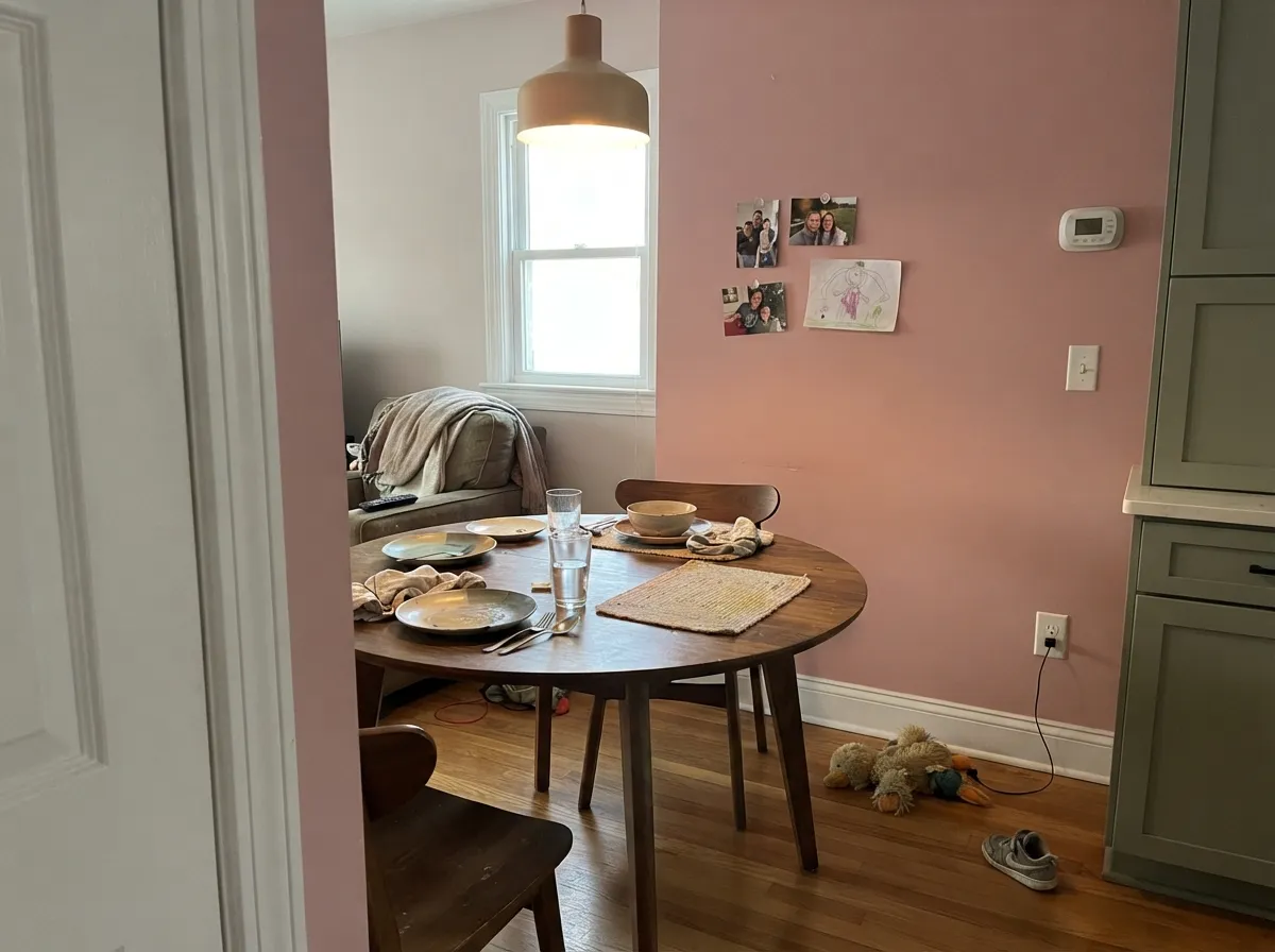
In a room used mostly at night, the warmth this color needs is already built in. Walnut table, brass chandelier, warm bulbs — the room leans inviting rather than pink. Eggshell holds up to chair-back scuffs better than matte here.
Beautiful in a closed, lamplit living room with warm wood and black iron accents. Riskier in an open floor plan, where it has to negotiate with the kitchen's cool countertops or gray floors on the other side of the room — sample it under the room's actual daylight before committing the whole space.
This is an interior wall color through and through; nothing in Behr's own guidance or real-world use points to it as an exterior pick, and full outdoor sun would push the beige side hard. Keep it inside.
Your Light Is the Risk
2700K bulbs bring the peach forward and the walls turn cozy, almost terracotta-warm. This is the light the color was styled for.
Flat gray daylight with no lamp on lets the dusty-beige side take over and the pink nearly disappears. Sample it on a cloudy day before you decide.
Brightest and clearly pink at midday, warming further toward terracotta through the afternoon and into golden hour.
2700K warm bulbs: cozy, rosy, alive. Cool white LEDs: the same wall reads dull and dusty-beige. Change the bulb before you consider repainting.
Most complaints about Pink Quartz are a light mismatch. Upload a photo of your actual room and see it on your walls — then ask for the same wall in north light or evening lamps before you buy a single sample.
Need It From Another Brand?
Any paint counter can custom-tint Behr S160-2 directly. If you would rather stay in one brand's own deck, these are the closest stock matches, measured as ΔE2000. Under 2 is a difference you will not see on the wall.
| Brand | Closest color | ΔE | LRV | |
|---|---|---|---|---|
| Sherwin-Williams | Gracious RoseSW 6317 · Sherwin-Williams | 1.9 | 53 | Color page → |
| Benjamin Moore | Desert Rose2094-50 · Benjamin Moore | 0.6 | 52 | Color page → |
| Valspar | Semi-Precious2001-8B · Valspar | 1.4 | 53.7 | Color page → |
| PPG / Glidden | Shrimp SaladPPG18-15 · PPG / Glidden | 2.5 | 53 | Color page → |
| Glidden | Shrimp SaladPPG18-15 · Glidden | 2.5 | 53 | Color page → |
| Dutch Boy | Softened Peach306-3DB · Dutch Boy | 2.5 | 53 | Color page → |
Similar Behr Colors
The nearest shades to Pink Quartz within Behr's own range, ranked by perceptual color distance — useful when you want the same look a touch lighter, darker, or warmer.
WCAG 2.1: AA is 4.5 : 1 for normal text, 3 : 1 for large text, AAA is 7 : 1.
Pink Quartz vs the Colors You're Also Considering
Every Pink Quartz sample board has the same rivals on it. The numbers show the real lightness gap — then it comes down to which risk you would rather live with.
Pick this for the peachier, more terracotta-leaning dusty rose — better with brass and warm wood.
Behr MQ4-04 · LRV 55Noble BlushPick this if you want less beige-peach and more true rose — same Behr family, almost identical depth.
Pick this if you want the wall to read unmistakably pink, not just a warm neutral that flirts with it.
Benjamin Moore 052 · LRV 54Conch ShellPick this if you want the BM equivalent — nearly identical depth, but marketed and used more like a warm neutral than a pink.
Within Behr, Japanese Rose Garden HDC-SP16-10 at LRV 54 and hex #E4B6C4 is the closest match and will be hard to separate on a wall. Bridal Rose 170E-3 at LRV 52 with hex #DBB6C1 carries more gray, so it reads dustier and less sweet. Peony ICC-54 at LRV 50 has hex #DBB2B8, which is redder and less blue, closer to a soft rose than a pink. Tea Room S150-2 at LRV 51 moves the other way toward lilac.
Across brands, Benjamin Moore Tara 1270 at LRV 53 has a deltaE of 1.25, visually identical in normal room light. Valspar Sweety Pie 1008-4B at LRV 53.7 is 1.88 and Kompozit Acadia Bloom 0111 at LRV 54 is 1.94, both in the same bracket. PPG Love In A Mist PPG1050-3 at LRV 55 is 2.04, very close but sample first. Farrow and Ball Nancy's Blushes No. 278 at LRV 54 is 3.43, still close but leaning warmer, and Dunn-Edwards Pencil Eraser DE6024 at LRV 49 is 3.95, close but visibly different side by side and noticeably grayer.
Pink Quartz Coordinating Colors
The rule for coordinating with Pink Quartz is simple: warm metals, muted greens, and soft near-blacks. Unlacquered brass and matte black iron are the two materials it was styled around, and it pairs with grayed sage far more naturally than with anything bright or icy. These are the partners that keep showing up in rooms that work:
The Dusty Rose Trend: Why Grown-Up Pink Is Everywhere
Millennial pink was flat, cool, and a little candy-sweet; the current wave of dusty rose colors like Pink Quartz is its warmer, muddier, more grown-up cousin. Instead of leaning bright or blue, these colors are built on beige and terracotta backbones, which is exactly why they show up paired with brass, black iron, and sage rather than white and gold — the palette of a considered room, not a themed one.
The practical upside of that muddier build is durability against changing taste: a low-chroma, beige-backed pink ages more like a warm neutral than like a trend color, which is why designers reach for it in rooms meant to last — primary bedrooms and powder rooms — rather than treating it as a temporary accent-wall experiment.
Pink Quartz With Wood Tones and Floors
Warm wood is this color's best friend. Walnut, honey oak, and cedar all sit comfortably against Pink Quartz because both are working from the same warm, earthy side of the color wheel — the wood grounds the pink and keeps it from feeling decorative.
The one flooring that needs a sample first is cool gray: gray LVP, gray-washed wood, or anything with a blue-toned finish pulls against the wall's warmth and can leave both looking slightly off. It is not always a dealbreaker — a warm rug and brass fixtures can bridge the gap in most rooms — but test a large sample above the actual floor before committing to the whole room.
Three Ready Palettes Built on Pink Quartz
A color is never alone on the wall. These are complete combinations in the 60-30-10 pattern, with the reason each one holds together. Every one opens in the visualizer.
White Dove keeps the trim soft instead of stark against the rose, and one near-black accent — a bed frame, door, or light fixture — is what makes the pink read sophisticated instead of sweet. Brass hardware completes the look the color was styled for.
Try this palette in your roomA small, warmly lit room is where this color does its most convincing work — satin walls for wipeability, a near-black vanity and mirror frame for the masculine contrast that keeps the pink from feeling delicate, and a warm-white ceiling so the box doesn't feel closed in.
Try this palette in your roomDusty rose and grayed sage is the grandmillennial pairing designers keep reaching for without ever touching wallpaper — both colors are muted enough that neither one shouts, and the warm white trim keeps the combination from feeling dated.
Try this palette in your roomPink Quartz FAQ
Is Pink Quartz warm or cool?
Warm. It is built on a beige-and-peach backbone, not a cool mauve-gray one, so it never reads icy or bruised. Under cold light it can look drained of color, but it drifts toward flat dusty beige, not blue-pink.
Is it good for a nursery?
Yes, but understand what you're getting: this is a grown-up, terracotta-leaning rose, not the classic soft pastel nursery pink. Parents who don't want a stereotypically "baby" room like it for exactly that reason; if you want the traditional pastel look, choose a paler blush instead.
What trim white goes with Pink Quartz?
A warm white, not a stark bright one — White Dove is the safe default. A cold, blue-white trim will make the walls look muddier by contrast; keep the trim on the same warm side of the fence as the wall color.
Does it work with gray floors?
Not well with cool gray LVP or gray-washed wood — the mismatch in temperature shows on both the floor and the wall. Warm oak, walnut, or a cream-toned rug bridges the gap; if the floor is staying gray, sample a large swatch before committing to the whole room.
Will it just look like a neutral, or will it read as pink?
It will read as pink. At LRV 53 it is a genuine mid-depth color, not a pale wash — the rose is unmistakable on four walls even though it can look understated on a small chip. If you want something that merely flirts with pink and mostly reads neutral, look at BM Conch Shell instead.
What accent colors pair best with it?
Unlacquered brass and matte black iron are the two materials it was styled around, and both work in any room. For a color pairing, a grayed sage or olive green is the classic dusty-rose partner; a warm white keeps trim from fighting the wall.
Have you painted with Pink Quartz?
Rate it — one tap helps the next reader decide.
Ask a Question